playdeadweb
PlayDead
My First Curatorial Experience
31 posts
Don't wanna be here? Send us removal request.
Last Seen Blogs

hanguloppa
My journal of beauties

workingstyle
WORKINGSTYLE

tazumihanako
TazumiHanako
zuko-always-lies
Zuko-Always-Lies

enriquetan59
Untitled

Photo
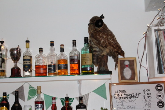


More documentation of works installed, photos taken during the opening.
0 notes

Text
Play Dead
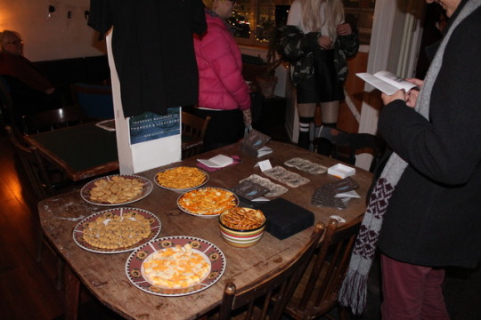
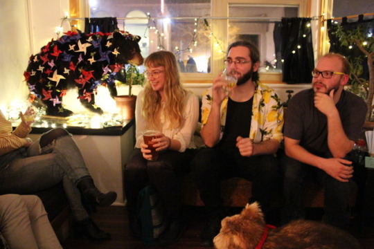
The last group’s show ended at around 7:25pm so we had approximately one half hour to do any finishing details before our audience arrived. Nick had to made some adjustments to his makeup for his art piece while Logan and I ran to her apartment to grab the snacks. When we got back to the bar, we set up the snack table, put out the catalogues and patches, tested the audio (made sure that Evan’s playlist worked) and quickly checked each animal and their art piece to make sure that everything was presentable.
Our class audience arrived at 8pm, it was so cool to see everyone walking around and interacting with each piece. We put so much time into putting this show together that it was a bit surreal that this was actually happening. After a few minutes of mingling and exploring the art, we gathered as a group to talk about our process and the show in general. I presented the work of Izzy Frankolini (owl), Kevin Melanson (bear) and Savannah Harris (blowfish). We did our best to talk about each artist’s approach to this project and to present their work in a way that they would want it to be presented.
After our introduction we went back to mingling. Anne Koval bought every one in the class a drink (which was so nice! thank you!), and it was so great to sit down in a casual setting and discuss the highlights and mishaps of our shows. I got the drink special, The Party Animal, which was created specifically for this opening, it was delicious!
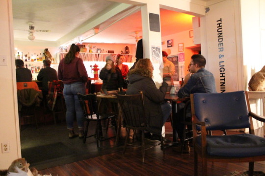
At 9pm the show was open to the rest of the public. All the artists showed up, we handed them a catalogue and a handmade Play Dead vinyl sticker. We also bought each artist a beer to thank them for their participation, we wouldn’t have had this amazing show and turnout if it wasn’t for them.
A lot more people showed up than I expected, it was so busy! I’m guessing around 40 people attended. At one point in the night I was having a discussion with Anne and Glen and they said that they were so happy with our show and that events like Play Dead are what they want to see more of at their bar. At that point I was reassured that all of our hard work payed off and that our show truly was a success
If I were to do a show like this again, I would be tougher on artists when it came to deadlines. Originally we wanted the work one week in advance along with any write ups they wanted included in the catalogue but our artists seemed to ignore these deadlines and gave us everything last minute. I’m not sure if this was because we are students and not “professional curators” or if the artists were unable to meet deadlines because of other academic commitments (which is totally understandable). I just feel as though there should have been better lines of communication between artists and curators to notify when deadlines could not be met. I’m sure this is something that a lot of curators who work with living artists struggle with- how do you handle artists who are not responding to emails and important deadlines without without over-contacting or overwhelming the artist?
With that being said, everything worked out in the end and I am so proud of my contribution to Play Dead.
0 notes
Text
Opening Night, Gallery Crawl
It’s the day of the opening and I’m feeling really good because everything is set up, all we need to do is install one artist’s work and the show is ready to go!
At 6pm we met in library theatre to see the first group’s show. Angela and Rona presented the videos of Canadian film marker and photographer Catherine Bussiere. Bussiere was originally from Quebec but is now located in Nova Scotia. The artist was able to attend the opening which was, for me, what made this show stand out from the others. It was great to receive background information on the motivation behind her work as well as her process of making.
My favourite piece was the video of her children reflecting on their experience of homeschool. They were very charming and cute. Her children had written and narrated the stories and poems behind her video work and her husband, who is a musician, played guitar in the background. It was a giant family collaborative piece, I’ve never seen anything like it!
The second group also had their show in the library, on the ground floor. This group curated a selection of works from the Mount Alison archives. This show represents the history of Mount Allison through an assortment of odd historical relics, along side the works of two current Mount Allison fine arts students. I really enjoyed this show because it was clear that this group put a lot of time into selecting each work, all of the relics coexisted in the space beautifully. Artwork from the archives doesn’t often see the light of day so it was amazing to have the opportunity to see this selection of work up close and to have the detailed descriptions and backstories that this group had provided.
P.S the baked goods at these shows were A+, 10/10
0 notes
Photo
The Setup
Monday afternoon, my team and I met at Thunder and Lightning to go over final details with Glenn, the owner of the bar, and also to collect the works from our artists. Glenn gave us permission to move the furniture around and to move the animals if we needed. He moved the TV that was original on top of the fridge into the back room and brought out the deer hear for us. In the end he said that the deer head goes much better with the atmosphere of the bar and that it will stay there from now on.
We stayed at Thunder and Lighting until 4pm as artists popped in to drop off their art pieces. Some of the artists insisted on installing their pieces themselves which we had no problem with. Logan contacted Lesley, the secretary at the Purdy Crawford, and got labels printed for each artist. I felt a sense of relief as we started to place the labels, the show started to become real and was looking very professional. By the end of the day, we had 10/11 of the works fully installed. One artist was unable to make it until the following afternoon but this was not concerning since we had everything else set up.
Above are some photos that were taken during the setup.
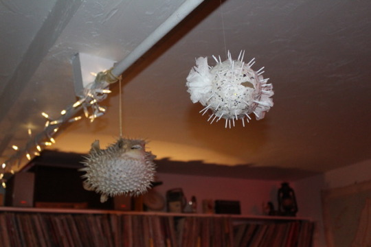
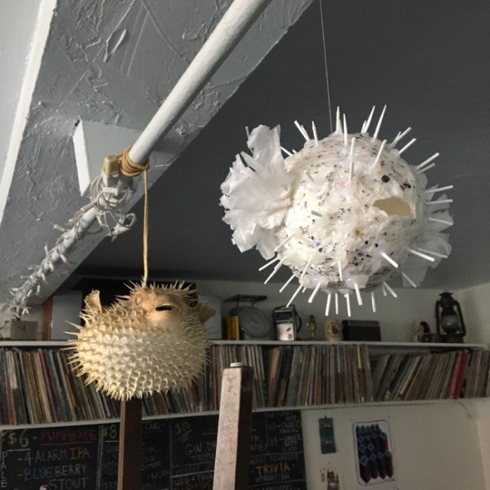
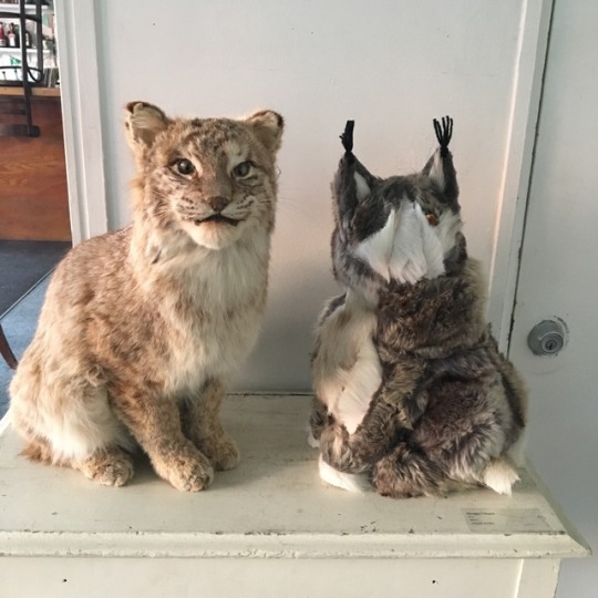
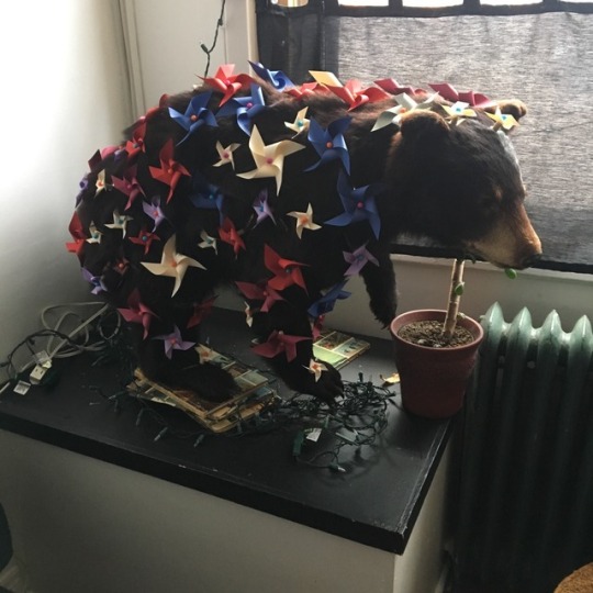
Blowfish sculpture is by Savannah Harris, Bobcat sculpture is by Meagan Chaput and the Bear is Kevin Melanson
0 notes
Photo
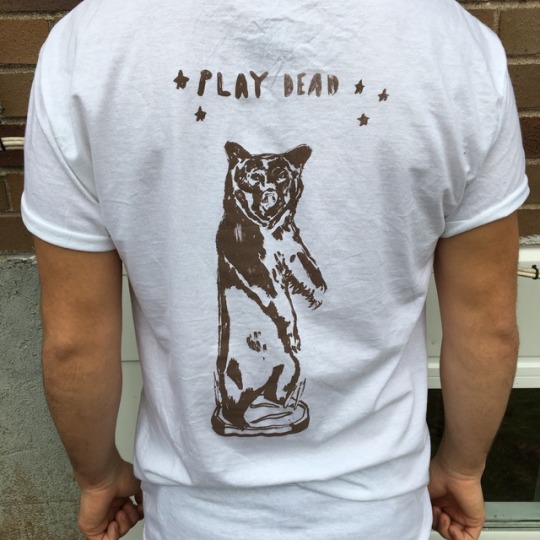
T-shirts for Play Dead. We included an order form at the opening and at the Show and Sale, each shirt was 15$ (we sold 7 shirts!!!).
0 notes
Photo
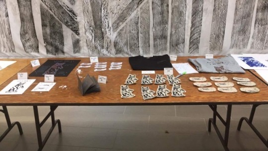
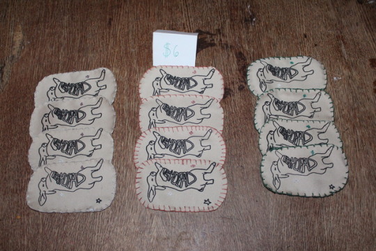
All the merch we made to promote the show!
This includes: T shirts, prints, patches, posters and stickers
0 notes
Photo
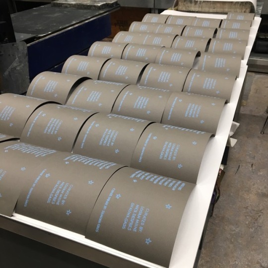
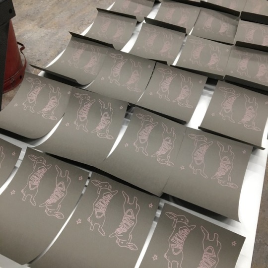
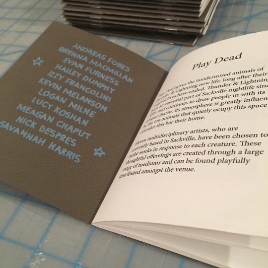
Printing the Catalogues
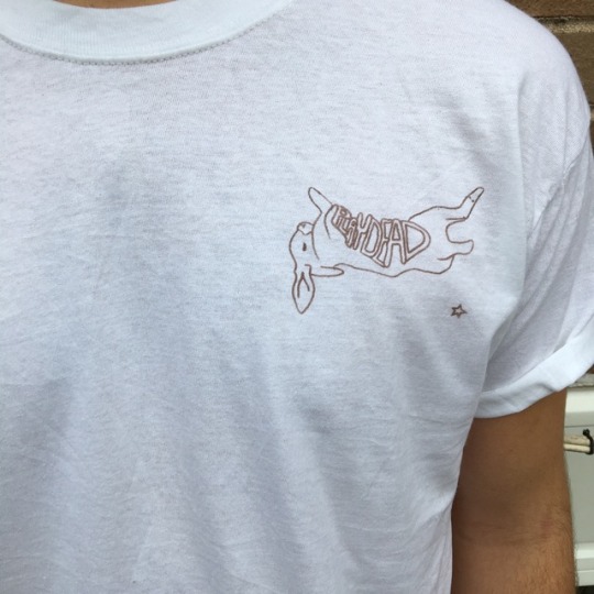
The covers of the catalogues are screen printed. I designed a logo of a bunny with the words “Play Dead” across its stomach. I’m really happy with how it turned out. On the inside front cover I have a list of all the artists involved and the back mentions members of the curatorial team.
Printing the digital portion of the catalogue also went smoothly. As I previously mentioned, Lucy MacDonald had given me a demonstration on how to use the program InDesign. This program was really easy to use and I had no issues adding my photos and information. We did, however, have some issues figuring out how to go about physically printing the pages of the catalogues.
The ladies at the Mount Allison bookstore are amazing and were so helpful through this entire process. I was not super familiar with how to go about printing at the bookstore so I had some difficulties with choosing the paper and whether or not to print in colour. We were on a tight budget since we already spent quite a bit on the printing paper for the posters and catalogue covers. With 35$ left in our budget, we managed to print 24 catalogues and I personally think that they came out great!
0 notes

Text
Gemey Kelly Talk
Tonight, Gemey Kelly gave a presentation on her career as a curator and what curating means from her point of view. Gemey has been the Directer and Curator of the Owns Art Gallery since 1989. Her approach to curating is looking at the overall content of the gallery every 1-2 years allowing for more diverse content and artists.
Gemey is an institutional curator and therefore her institution defines the kind of projects and exhibitions that she curates. Her institution, the Owen’s Art Gallery, likes to focus on maritimes artists, the history of Mount Allison University, the ladies college of this university, and the gallery’s personal collection. The Owens has a very impressive collection and it’s important for these works to be experienced outside of the vault.
Gemey points out that curators today often focus on contemporary art, and this can lead us to forget that there are also historical curators. Gemey is passionate about historical curating and finds great importance in keeping the work of artists who are no longer living, alive. Finding information on artists who are deceased can be extremely strenuous if they are not “famous” artists. This is where historical curators step in, like private detectives, and scan through old newspapers, archives, letters, obituaries, and so on, looking to find any information on this artists that is completely obscure.
An example of a mysterious, obscure artists is Elizabeth Cann. Cann is a Halifax artist, she was born in Yarmouth NS in 1901 and passed in 1977. She was an amazing Canadian painter who was extremely talented, but still no one seemed to know anything about her. After sleuthing through archives and contacting the family, Gemey was able to find some information on this artist.
Cann came from a wealthy family, she was privileged and able to travel the world to receive artistic training. She did paint landscapes but her primary focus was portraiture. Cann only painted women, and Gemmey questioned why that might be. Maybe she was uncomfortable with men being in her studio, or she simply had a strong relationship with women. Next Gemmey said something that really stuck with me:
“what you don’t find is as interesting and important as what you do find”
The Owen’s Art Gallery is now the home of many of Cann’s original paintings. Gemey is amazed that these paintings are not housed in the National Gallery of Canada.
0 notes
Text
Revised Checklist
CHECKLIST
1. Make catalogue:
a. Design? _____
b. How will it be put together? _____
c. Cost? _____
2. Collect artist statements from the artists _____
3. Print Catalogue _____
4. Make Facebook page/invite _____
5. Email Lesley, send out mass email about the show _____
6. Align a budget: Price out the food at the grocery store so we know the costs/buy food _____
7. Collect the work from the artists (week of November 20) _____
8. Final meeting with Anne and Glen about the layout of the show ____
9. Ask Anne and Glen to make a special cocktail for the show, funny name/theme ____
10. Install the show ____
11. Document the work _____
12. Put out the food ____
13. Have the opening ____
14. Documentation during the show ____
15. Clean up ____
16. Return works back to artists ____
Possible Thank You gifts for participants/merchandise:
a. Patches
b. Pins
c. Stickers
0 notes
Photo

Ruins, large-scale installation by Erik Edson
https://store.openstudio.on.ca/erik-edson-s/1880.htm
0 notes
Text
Other Stories, Work by Erik Edson
Erik Edson is a professor at Mount Allison University, he is currently exhibiting a large-scale installation of his most current work on the main floor of the Owen’s Art Gallery. Edson is a known as a print maker but his work often incorporates a lot of sculptural elements, this can be seen through his use of construction and found objects.
Erik’s work is very bizarre. It’s necessary to spend time with each piece to try to figure out what’s being said. To some viewers his work appears unfinished but I feel as though he is able to contextualise it well through the writing on the didactic label.
There seems to be 2 common themes used to connect his body of work. He is inspired by nature, more specifically how the natural world tends to be romanticised through popular culture. He also draws a lot of attention to the act of viewing as he often references theatre settings and the theatre itself in his work. In a way, his work is a set made up of sculptural elements and prints. The idea that nature, much like fine art, is a spectacle that exist for our viewing pleasure.
In the high wall gallery, he plays with the idea of representing landscape, how obscure you can make a shape before it becomes unrecognizable or completely abstract. The large organic shape is covered in thousands of printed dots, which work to unify the piece but could also be a representation of thousands of eyes looking back at the viewer since he has referenced eyes through circle and oval shapes in past works.
I really enjoy Erik’s work because he isn’t super heavy handed. His goal is not to make a beautiful print of a picturesque landscape like so many Canadian artists seem to do. Erik’s work demands that the audience spends some time viewing and reflecting on abstract ideas, his image may not be literal or obvious but they still spark conversation on how we view art and our natural world.
0 notes
Photo

If you look closely you can see the information that was lost. The biggest loss was the word “lightning” in “Thunder & Lightning” but with a little bit of ink and a very thin paintbrush, we were able to restore each poster allowing them to read more clearly.
0 notes
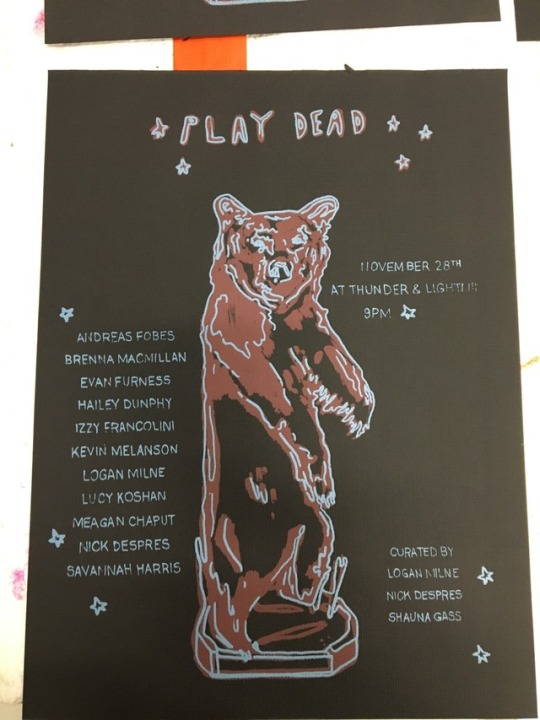
Photo
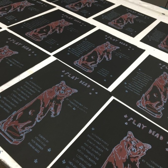
The posters are finished and ready to be distributed all over town!
For these posters I silkscreened 2 colours onto black canvas paper. Logan designed the bear and I added the information (artists, location, ect..) and did the physical printing. Im happy with how they turned out but there were some difficulties. The font of the names of the artists and the date/location were made with a very fine light blocking pen. When I went to print these areas of the posters, some of the letters were too thin to come through the screen and also the canvas paper, being more heavily textured than normal paper, also caused some difficulties. After the posters dried, I had to go back with a thin paint brush and silkscreen ink to hand paint all the information that was lost. It was very time consuming and could have been avoided if the font was a bit thicker.
I will use this experience as a learning tool for when I go to print the covers of the catalogues. I will be using a much smoother paper and also a thicker pen to write any important information. Lucy MacDonald, from the Owen’s Art Gallery, offered to give me a demo on how to use a design website called InDesign. This is the program that the Owens uses, as well as Struts, to create all their posters and catalogues for all upcoming events and shows. I’m excited to learn how to use this program, it will not only be helpful in allowing us to create a clean and professional catalogue for PlayDead, but will be a tool I’ll be able to carry with me and use for my own personal art practice as well.
0 notes