plutocenturion-blog
Pluto Centurion
"Small company big ideas"
25 posts
Don't wanna be here? Send us removal request.
Last Seen Blogs
touristmochi
I wish to visit San Fransokyo
itskthlw
I AM A L♡V𝙀R I AM A L𝘖$E𝙍
grace-ashley
Grace Ashley
alcoholicyoungadult
Gabbie ~
Photo

Week 8: Social Media
This week I have been working on creating a social media presence for our company. Together with our lecturer Craig, I developed a banner for our twitter page that encapsulates our app’s focus on health and allergies. I also created a poll on twitter to use as research for our rebrand audit. I asked users whether or not they would like to be able to access their original Club Penguin profile. The result of this will enable us to further develop our rebrand of the virtual world to best suit our users. In addition I have tweeted a link to our tumblr blog to draw peoples’ attention to all that we have been working on. I have used our new account to follow twitter users relevant to the subjects of health, technology and gaming, in the hope that we will achieve a good response.
RC
#yorkstjohn #YSJ #twitter
0 notes
Photo

This is my first potential design for our re-brand of Club Penguin. I went with the idea of creating a page whereby users can access the club penguin profile that they created during Club Penguin’s active years (2005-2017). I used an image from Club Penguin’s original setting to capture a user’s desire for a nostalgic return to the game of their youth. My choice of font also reflects the style used in video gaming of the 1990s. I wanted to create a fun and intriguing poster that would encourage users of our age to want to explore the world of club penguin once again. This is why I chose to have the penguin character.
RC
0 notes
Photo
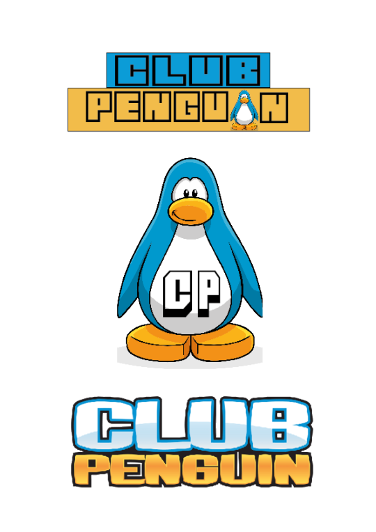
This past week I began working on the designs for the re-brand logo. Our group chose to do the computer game Club Penguin as it was a bit hit during our generation growing up, and many players were upset when it’s shut down was announced. Additionally, the mobile app game that was released in the wake of Club Penguin being shut down, Club Penguin Island, didn’t take off well and a majority of fans were disappointed with the game and we felt, being of the generation who mostly played the game, we could bring fresh new ideas that would appeal to the players and fanbase.
I used the original logo as a reference point and liked the block capitals as it makes the name easy to read for an audience. After playing about with backgrounds and colours I made my first logo, using one of the game’s penguins in place of the ‘I’ in the word ‘penguin’ however, I wasn’t happy with design as I didn’t feel it looked right of had the right feel for the game.
Next I worked on a different design, using the Club Penguin penguin as the background I found a font that was a bit different but still easy to read and worked the text onto the image. I personally preferred this design as I felt it was clearer and easier to read than the first design. i then went on to make another similar design but slightly smaller to show how the logo would look on a smaller image. I felt the whole phrase ‘Club Penguin’ would look a bit too small or difficult to read if at a very small size so changed the text to just ‘CP’ to represent the name and game and there is also the penguin still clear so an audience would be able to still know what the game is by the image.
- A.C
0 notes
Photo
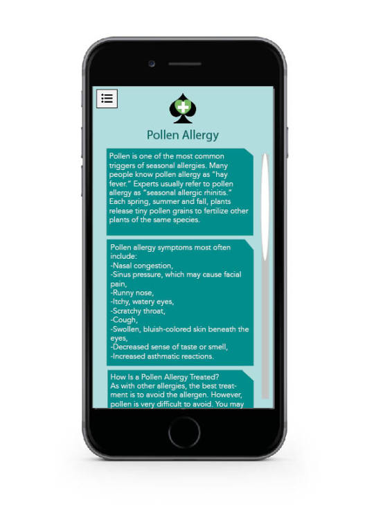
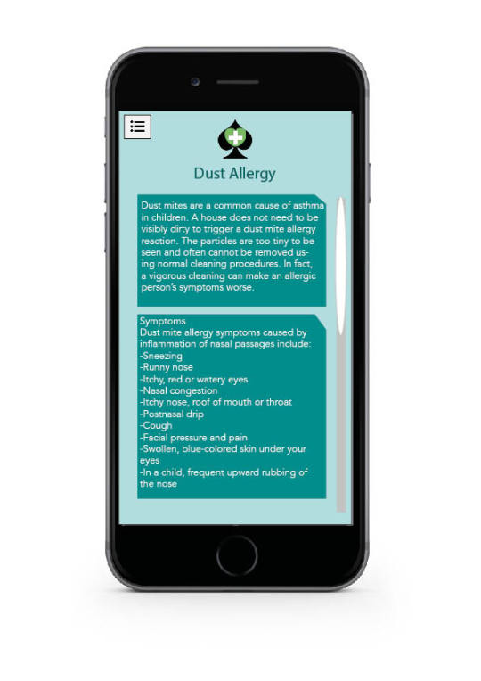
Similar to the dust allergy I created this page on pollen allergy has a sophisticated layout however lack imagery. With the two images acting as links to the relevant pages. The text includes a brief description/explanation, symptoms and treatments.
-E.J.
0 notes
Photo
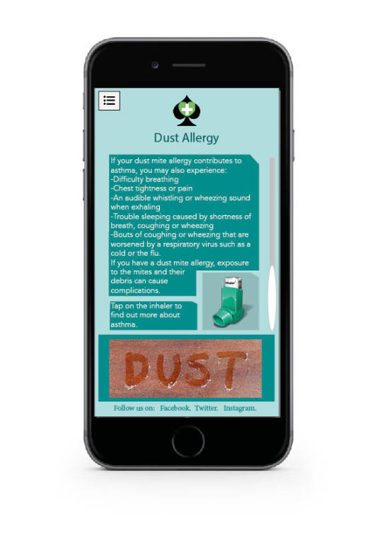
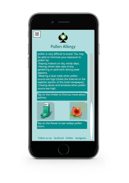
Following on with the app designs i am working my way through the different aspects shown within the menu. Using the same style as the other pages i have done the house-style is now clear. Although a little text heavy at the moment I am unsure how to include more images. The inhaler picture acts as a link to find out more about asthma since it is relevant to the dust allergy.
-E.J.
0 notes
Photo


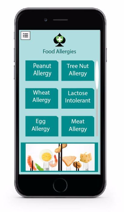
These are two designs following on from the food allergy page each give a brief outline of the food as well as the main foods including these types of food anymore text may distract from the important information. The two different aspects of the app show harmony through the use of the same style and layout with one of the only differences being the colour of the subtitles as I decided to link each to their own image through selecting the main colour from each of the relevant images. Again, the layout remains the same throughout the app with the logo, menu icon, scroll and social media referencing being in the appropriate places.
-E.J.
0 notes
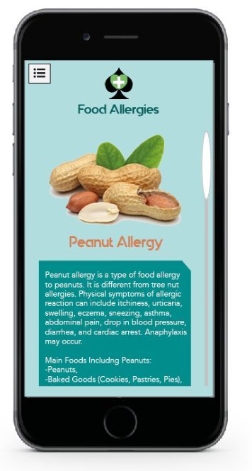
Photo

These two designs show my ideas for the food allergy aspect of the app, with the first of the two images being my initial thoughts and the second being the final piece. By getting rid of food jargon, changing the font to make the subtitles easier to read and putting the image into a box to define it against the background and make it overall appear more sophisticated.
Through braking food types into more specific groups it simplifies the process of the app whilst allowing more space for text/images/etc once the appropriate title is selected. The scroll bar signifies that there is more to be shown. With the menu icon in the top corner and the options hidden (unlike some of our other designs) this shows the how the other icons work well in the small space of the phone screen. Keeping with the house style used in the apps homepage with the same colours and font styles used, I am pleased with the simplicity and flow of the final image.
-E.J
0 notes
Photo
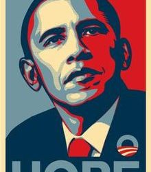
The Poster displays Barack Obama who was running for president during the 2008 presidential election. The main political stance of the poster is to get the viewer to notice Barack Obama as not just a political advocate but also as a person. It uses a large image of himself using the words hope underneath in bold lettering. The take home message from the poster is that no matter what you want in life by voting for Obama he will give you that hope of achieving what you want to achieve. The poster uses simple yet effective word imagery to stick in people’s minds.
The Poster uses three basic colours throughout its design. Red, White and blue. These are the colours of the American flag and when seen together often create a patriotic mood for the viewer. In doing this the Obama campaign is reminding people that although he is a new candidate he is truly an American and people can trust in him. The image of Obama himself is of him looking very stoic and powerful. His gaze is on the horizon. This is a metaphoric image showing the American people that he has big plans in the future.
‘Hope’ is the only typography within the image. The definition of the word means ‘a feeling of expectation and desire for a particular thing to happen.’ which is seemingly the main ideals that Obama is trying to portray within his campaign, he wants to inspire ‘hope’ within Americans and additionally, be the main force with achieving this goal by providing the ‘hope’ that they desire. Furthermore, the use of the word has a powerful effect upon the onlooker, it connotes the ‘hope’ that by voting for him, Americans would be achieving something groundbreaking, electing in a black president for the first time in American history.
In my opinion the poster is very effective. This is because it is simple and easily analysed by its viewer. This is because it uses three simple tools to get its point across. It uses the American flag, hope and Obama himself. The American people want somebody who will represent them as a country and somebody that will provide them with something new. This poster answers all these questions.
1 note
·
View note
Photo

This is my design of the app home screen. I designed it to show what the page would look like with a drop-down menu. The articles and useful links to the app’s additional features (such as the Humidity Tracker and the list of Worldwide Emergency Contact numbers) to the side of the menu would move to the left when the menu is hidden and they would be centralised. As a group we decided on a turquoise and teal colour combination for the app as it fit with the theme of the app as it looks clean and sharp, we also thought that by having a specific colour theme and pallet for our app would give a more crisp and professional look than just having different colours for different sections. i decide on the idea of a drop down menu as it would make the app easy to navigate and give more space for there to be additional and useful information and articles present in relation to what our app does and give the users of our app something extra than just the information we provide about allergies and other health related aspects.
- A.C
0 notes
Photo
Week 5: Designing the pages of our app
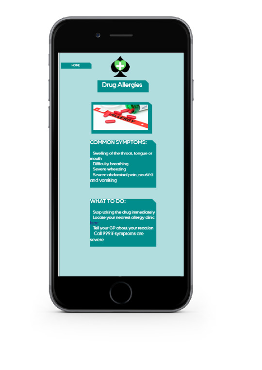
This is my design for the drug allergy page of our app. It was important for my design to be consistent with my colleagues designs and colour schemes. We decided that we didn’t want each page to have too much text on them, and so I limited the information to the most important facts that a user needs to know in an emergency. I also included a link to a locating page, so that users can easily find their nearest allergy clinic, where they can go for further medical advice and attention.
Designed by Rebecca Connolly
RC
0 notes
Photo


These are the designs for the opening of the Asthma information page on our app.The first initial design used a lot of text and had boxes surrounding them in order to emphasise their importance. Upon further examination we decided that the first design was a bit to complicated. This is because there was too much happening on the screen and the font made it difficult to read. This then made way for our second design choice. We ditched a lot of the heavy boxes and changed the font to a basic book font. We added a scroll bar to indicate to the user that the page can be moved up and down to provide additional information. The logo of the app will always remain on the top half of the app in order to incorporate a house style.
Designed by Harry Langley
-HL
0 notes
Photo

Week 4: designing a menu for our app In this week's workshop we began thinking about how we wanted the inside of our app to look like. Firstly we discussed how we wanted all areas of our app to be consistent, both in colour and in style. This is why I chose to include the green heart from our logo in my menu design. I also wanted to make the menu easy to use and therefore I included the top allergy categories so that customers can easily navigate themselves to the allergy information they need. Next week, we are going to compare the ideas that we worked on individually and decide which ones we will develop. RC
1 note
·
View note
Photo


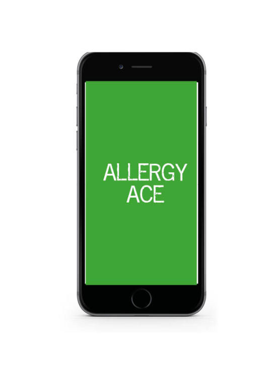

These are the designs for the splash screen e have created as a group. The first design we decided to use the company logo as a splash screen icon as it showed the user who made the product on its initial launch. However we soon realised that the importance of the brief needs to be with the app rather than the company. The 2nd design uses the app icon we created. We soon realised that the box in the background created a problem. This is because it did not look as sleek and elegant as we would like it to. The third and fourth designs focused on colour and the use of system logos. We dabbled with this idea as we wanted to add an element of creativity and change with our app. For example in the summer the app could use sun flowers or seasonal imagery in order to reference an event or yearly timeframes. We eventually decided using a seasonal system logo was a good idea but needed more refinement. Finally we decided to go with the simple logo without the box background with the words allergy ace underneath. This is a sophisticated and professional design that straight away tells our users what app they are using. We have decided to go with a white background because it represents the clean and medical side of a hospital. As our app is health related we thought having medical metaphors and connotations would help put the apps purpose across.
-HL
1 note
·
View note
Photo

Once opening the app the user will be greeted by two splash screens the first of which showing the company logo, made animated through the use of the two words gliding in from either side to sit as they should within the logo. After research of other apps such as Pokemon Go we took inspiration and decided to also include the companies logo before introducing the actual apps splash screen. The colour scheme remains black and white in order to appear professional and sophisticated, the two colours creating contrast and clearly showing the logos. Using the Ipad screen as the template it gives another example as to how the logo works in a larger size and on different mediums.
After doing this and and discussing its use as a group we came to the conclusion that the two aspects of the module brief need to be kept separate with the app being its own piece of work unique from the company.
-E.J.
1 note
·
View note
Text
Mission Statement:
-Education and unity are of the paramount importance. We help bring reliability and safety to peoples pockets one idea at a time.
To show our companies brand and direction connoting the principles set by us as a group for Pluto Centurion. Revealing to the target audience the companies goals and what to expect.
Core Values:
-Education and growth help build knowledge on everyday living.
-Providing an outlet for unity amongst humanity within everyday life and striving to help those less fortunate.
-Providing reliable tools to protect and preserve health.
-Creating a sage environment promoting equality, love and respect.
Building from our mission statement the core values empathise the companies identity implying the brand and linking it to charity, consideration and a focus on the customer. These four positive points show the companies benevolence.
-E.J
0 notes
Text
Online Media Companies
As a group we have looked at three online media companies that specialise in their particular fields. For example we looked at: Brand8, Fists of Fury and Brave, All of these companies are very similar however each present their own unique qualities that make them stand out in the market place. For example all of these companies use plain and simple colours and patterns on their websites. This allows users to quickly and afficently navigate their way around the website and find what they need. Their online material is bold and quirky drawing in its users attention. For example Fists of Fury use bold lettering and words that stand out. A gigantic letter B is splashed across the screen indicating to the user a quick way of reaching the companies blog. This makes navigating the website fun and not tedious. Brand 8 does a similar thing by having the words our work highlighted across the screen for ease of access and flare. These companies use media effectively by using: GIFS, pictures, videos and social media links. These all joined together create a very fluid and interesting website. As a group we have decided to use bright colours and large pictures to make our website much more interesting and unique. Having a website with blocks of text becomes boring and will put the reader off from using our product. These media websites have inspired us to use vivid colour palletes and interesting visuals.
-HL
0 notes
Photo

As a group we decided to analayse the company BMW. BMW is a very succesful car manufacturing company that sells their products all around the world. First we thought about the name of the company itself. The word BMW is an annagram for Bavarian Motor Works. This as a company name is quite a mouthful to say so they shortened it to just BMW. This was a good move as it allowed the name to be: quick, snappy and easy to remember. This is because it has a nice ring to it and elequently rolls of the tongue when said out loud. As a brand we established that BMW is a very masculine brand prodominently aimed at the male audience however not exclusively towards them. As a result of this we established BMW as a brand is associated with values such as: power, strength, masculinity, austerity and success. All of which many males strive towards achieving,
-HL
0 notes