
projecttimelineblog-blog
Conflict Timelines: Middle East
27 posts
Don't wanna be here? Send us removal request.
Last Seen Blogs
kaari888
見た映画とか

blueemerald99
||Blue Emerald||

relkefitness
Christina @ relkefitness

impressionmedia1
Untitled

its-me-jamo
Me...
Photo

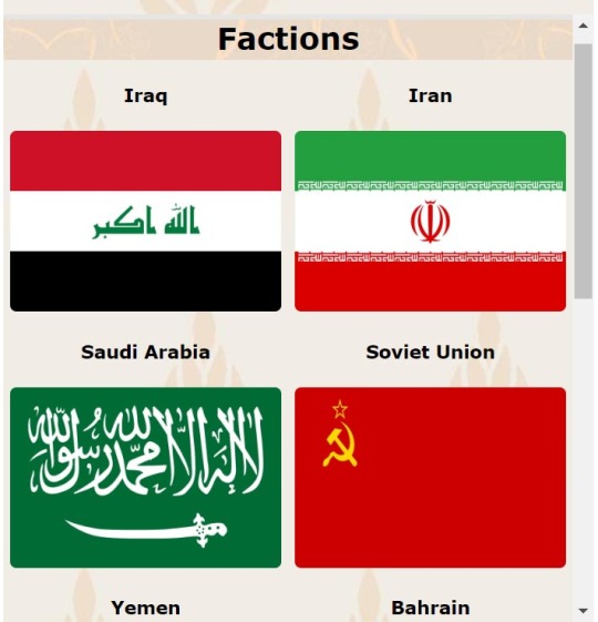
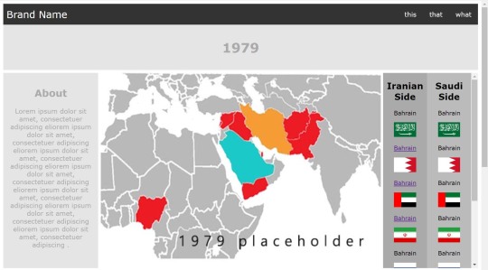
Hierarchy Data After Changes
From the data it can be seen that reducing the brightness has lowered the faction selection in the hierarchy below the more important elements.
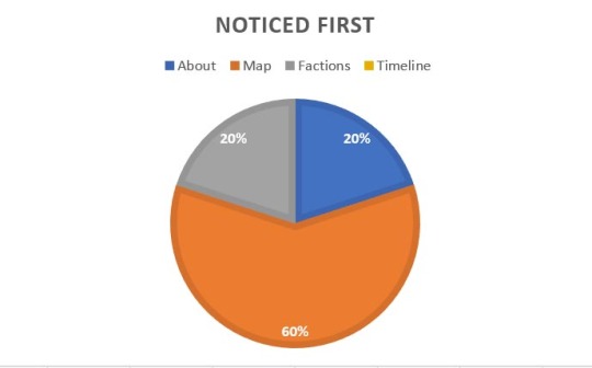
The Map is now comfortably first which is what this project desires.
0 notes
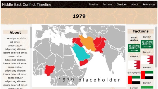
Photo
Hierarchy Solved
To reduce the faction selection in the hierarchy I reduced the brightness by 50%. Only when hovered over, selected or focused will an individual flag be at 100% brightness.
0 notes
Photo
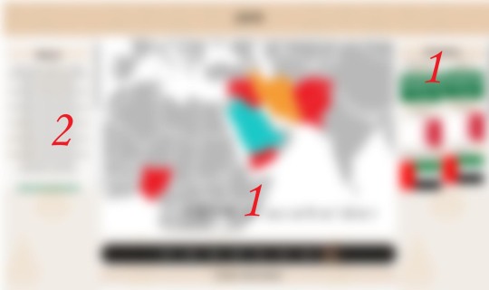
Hierarchy Test
In my own observation after blurring the design it is apparent that the faction selection does compete heavily with the other sections confirming previous testing data.
0 notes
Photo
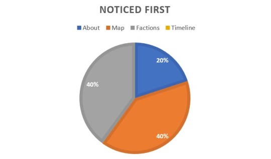
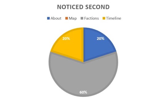

Hierarchy Data
Here it shows the faction selection is competing heavily with the more important information in the hierarchy.
The About or Map section should be ahead, between these two is unimportant as both of equal standing. Faction selection must be brought down however.
Survey testing was done to quantify how much competition each section has.
0 notes
Photo

(Second Round of Testing)
Hierarchy.
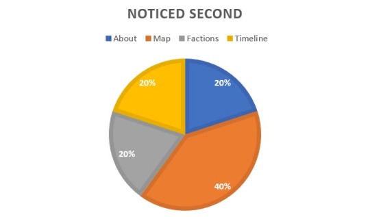
Now with colour scheme added it is time to test visual hierarchy.
This will be tested by survey of users, asking the question what draws the eye first, second and third.
0 notes
Photo


(Second Round Testing)
Mobile Faction Map Icon Size Test.
Using A/B testing to find preference, all testers agreed that the larger icons were more suitable. This is also inline with the project aim to be accessible to people of poor sight.
Text font size adjuster buttons have recently been added.
0 notes
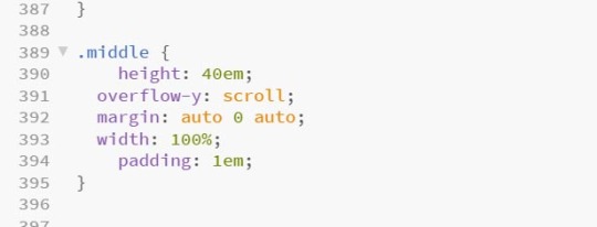
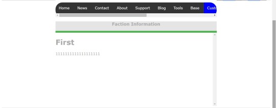
Text
Design Change
After feedback from an observation it was found that listing factions by a side in the conflict reduces the freedom of interpretation by the user in a very complex conflict. This was agreed with especially as factions change side.
As such headings of faction sides have been removed.
0 notes
Photo
Scroll Error Fix
To fix the scroll error padding was added to the above div to allow an island between the two scroll areas. The user can now scroll from that area up and down the page. Once the colour scheme is added it will become more noticeable.
0 notes
Photo
Mobile Issue Found (Scroll Error)
From tester vocal feedback it was found that a user can be stuck scrolled down the page without the ability to scroll back up as the only available place they can scroll is in other scroll areas. For the user to scroll up they must first scroll to the top of those areas.
0 notes
Photo

Navigation Systems Mobile
All test subjects thought that the navigation worked as expected. While supervising this also seemed the case.
0 notes
Photo

Testing Mobile Infrastructure of Final Skeleton Design.
Testing ease of use and navigation with user observation. Checking for errors or faults in usage picked up by tester or observer.
0 notes
Photo
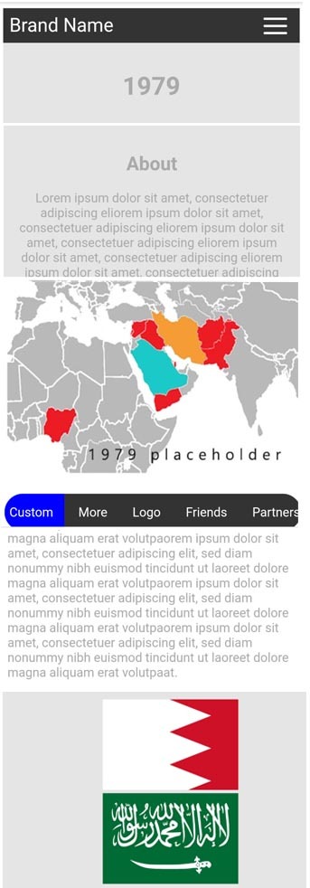

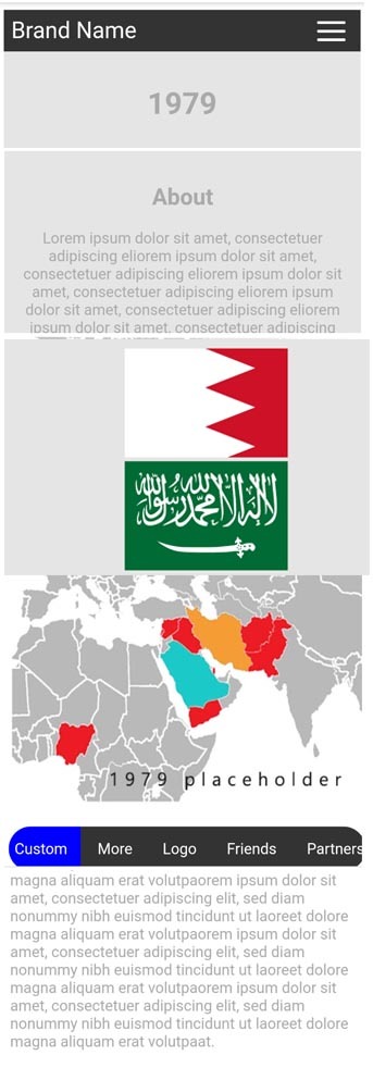
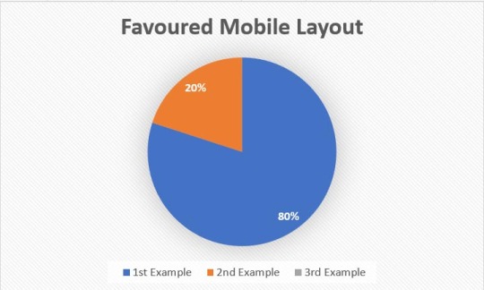
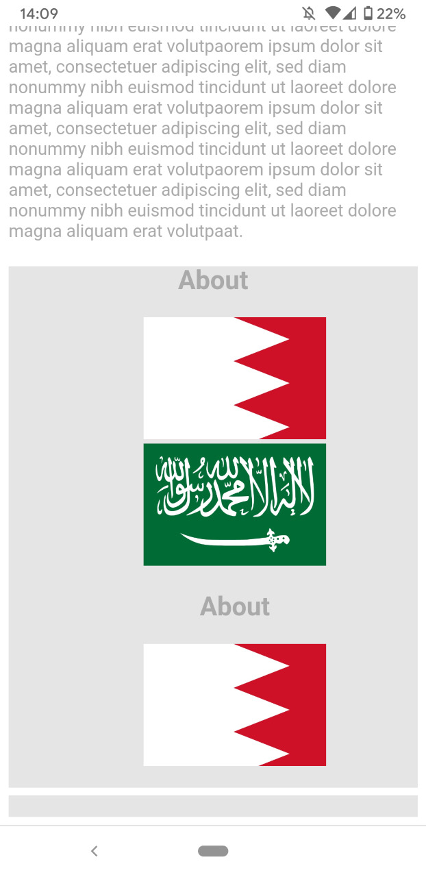
Mobile Structure Test
Here are three different layouts of the mobile design that were made using the data from the previous test.
This is to confirm the final design to ensure what looked good on paper also works in actuality.
80% agreed with the preferred layout from last test. This is enough approval to start the next phase of mobile website creation.
0 notes
Photo
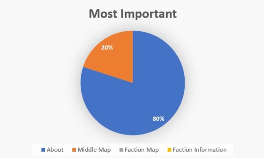
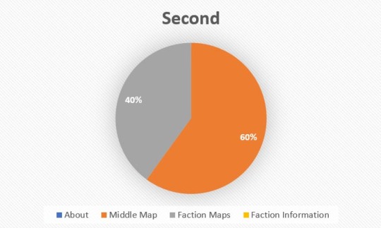

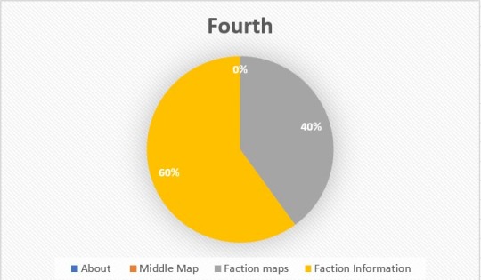
Order of Information
The desktop visual hierarchy will be tested on a later date.
Here the testers were asked as a questionnaire what aspects of the timeline are most important and should be displayed first.
A questionnaire was decided so the tester can keep track of previous answers to make a cohesive selection as well as ease of picturing final product.
This data will be used to create the mobile version of the site as well as the reduced sized window on desktop.
The data found that the preferred order is:
About (Synopsis)
Middle (large) Map
Faction Information
Faction Maps
0 notes
Photo
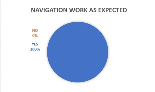
Navigation Systems
All test subjects thought that the navigation worked as expected. While supervising this also seemed the case.
0 notes
Photo
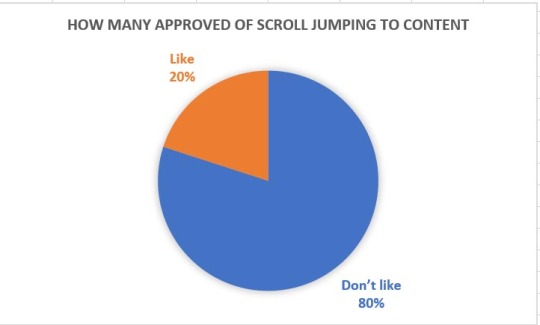
(First Round)
Ease of Use
Of the 5 observed for feedback, 80% did not like the feature of scroll jumping to the relevant content. This was seen to be too “jerky”. To remedy this it can either be removed or a smooth scroll can be implemented. One tester responded that they did not like that control was being taken from them. This is antithetical to the desired experience and so the feature will be removed. Desired experience being the user exploring the timeline freely.
0 notes
Photo
(Desktop) First Round of Testing - Infrastructure Skeleton Complete
Testing ease of use, navigation systems, order of information.
This will be recorded by observation. This method will allow for precise data on errors and experience faults. Allowing for the specific changes needed in the next iteration.
Test subjects will provide user data from a non-developer perspective, testing elements in ways maybe unexpected by the developer.
0 notes
Photo
Competitor Review
Here are two competitors that have a more elaborate design compared to the overwhelming majority of basic designed competitors.
1. PBS
The analogous colour scheme is visually calm and is relevant to the topic. Font colour in top nav-bar does not stand out enough as well as there being too much going on in a confined space. Difficult to focus on specific header information.
The header decoration adds to enjoyment of usage.
Visual hierarchy is not clear with side bar competing against top nav-bar which has problems of its own hierarchy.
Problems in usage are once scrolled a long way down the side nav-bar to navigate to another decade is at the top. A scroll to top button should be implemented or have the side nav-bar move with scroll.
Interesting addition is the inclusion of a Glossary, once button clicked opens a small window with an alphabet nav-bar at top.
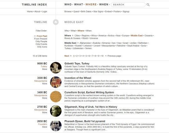
2. Timeline index
Monochrome colour scheme with some brown highlighting where the user is on the nav-bars. This works well however the menu selection of places, “who, what, where and page numbers are too condensed. Difficult to focus on a specific area, this could be improved by increasing the visual hierarchy distance in the elements.
Unlike with PBS each link has a hover change ensuring the user knows it is a link. The images shrink a little as their hover adding to the enjoyment of usage.
This timeline emphasises individuals, there are country names that are small with a “more” button which leads to the same as clicking on an individual. Many buttons on this site share destinations which after realising appear superfluous. Appears more complex than it is.
Once a name has been clicked their information opens up in the timeline. The timeline is still present which allows for ease of continued use without having to think where I am.
Advise to take away.
Ensure a strong hierarchy in elements.
Do not group elements too close together.
Allow user to navigate easily without having to try hard to find nav-bars.
Ensure the user knows where they are even after clicking links.
Make sure all links are obviously links to the user.
Ensure text stands out from background.
PBS
https://www.pbs.org/wgbh/globalconnections/mideast/timeline/text/index.html
Timeline Index
https://www.timelineindex.com/content/select/1424/45,1424?pageNum_rsSite=2&totalRows_rsSite=208
0 notes