
Last Seen Blogs

moncada56
Untitled

key-anon
🗝

papricameilin
:):

priyankastimesfiles
Untitled

lostgirlegc
Musings of self-discovery in middle age
Text
youtube
~Transition from actual world to the world inside the pixels~
This video aims to highlight the compositional importance of space connecting and coordinating it with music.
After lots of discussion, we came up with this fun storyline based on Urbanization, expressing happiness which can be found in every transition of kids life. From the playful ground to enjoying hide & seek in the confined walls of the house as well as communicating in the World of pixels.
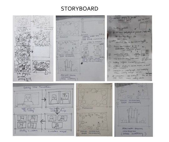
~My part in the making~
To bring out the best in this group project, I contributed in the ideation of last frameworks i.e the virtual meeting. Also presented and acted the role of cute girl.
Even though, we are living in different states, I personally didn't feel any communication gap. We had different ideas and opinions, but we did work together really well. I feel the bond of the group developed in this whole process and grew stronger. We worked until long hours with fully enjoying it.
~Team members and Credits~
Sound : Yamini Deepshikha,Sudhakar Swamiprasad Maurya
Actor : Divyanshu Singh, Reetika Roy, kriti Sachan, Yash Choudhary
Editing :Ojasi , Ruchit Dhakite
Animation :Swati Bouddh
2 notes
·
View notes
Text
~Behind the scene~
Transition from actual world to world inside the pixels.
During the shooting of my parts, I did numerous retakes. Four of us were shooting a part , sending it in whatsapp , discussing it , talking on calls and again have to retake it for the coordination. The hardest part was the coordination and managing accordingly as we were throwing balls to each other , playing hide and seek, doing dhappi and all other shots are linked.
I enjoyed it fully and this short video is about my fun journey I had.
0 notes
Text
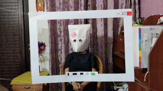
My Role- The Cute Girl ?
Glimpse of my character from the video. Is she a cute girl? Yes she is... though she gets irritated as she is always hit by the ball from her friends.
Also a lot of time went in adjusting the frame which I hanged using thread by sticking it on wall from one end to other.
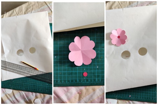
Even I had to use double sided tape on my forehead to adjust the mask.
1 note
·
View note
Text
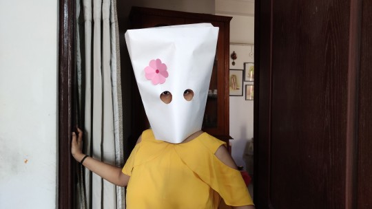
~Roll Camera Action - Preparation ~
I chose the character of cute girl , though she is little bit of Tomboy and gets irritate. It was fun from making the mask, finding the place where to shoot and facing the difficulty to hang the zoom frame as well.
1 note
·
View note
Text
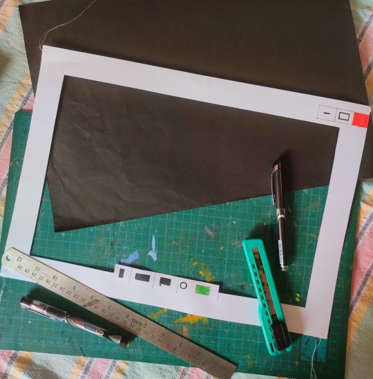
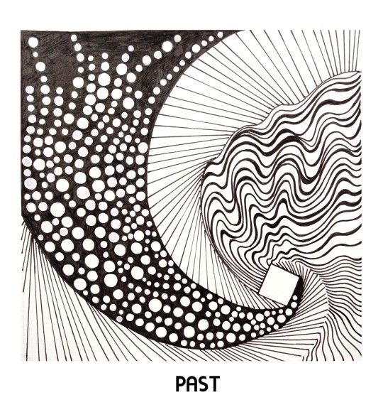
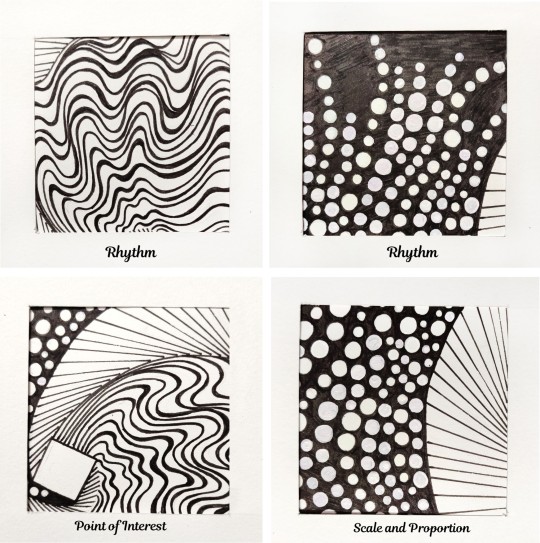
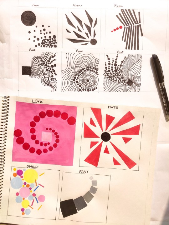
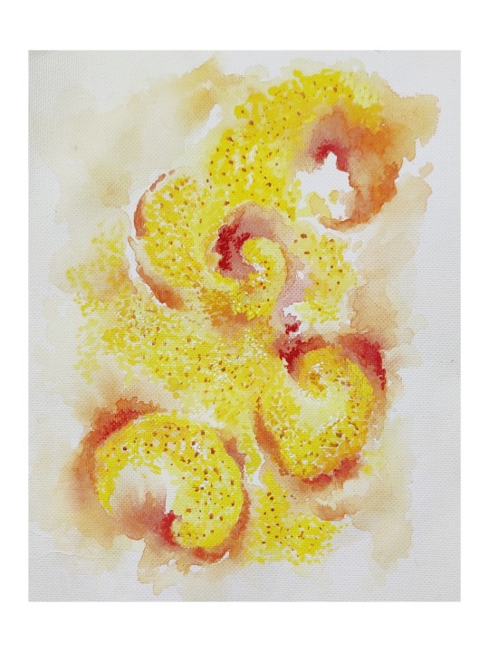
~Word Composition 2~
My idea of Past is a connection with all ups and downs of the past life, good and bad memories , rhythmic moments which were smooth and neutral. I have showed all of these in spiral motion fading into the past through the square.
I made this intricate as to give the essence of my style to it and used lines , dots and a square.
Observed rhythm, point of interest and scale of proportion in this composition.
1 note
·
View note
Text
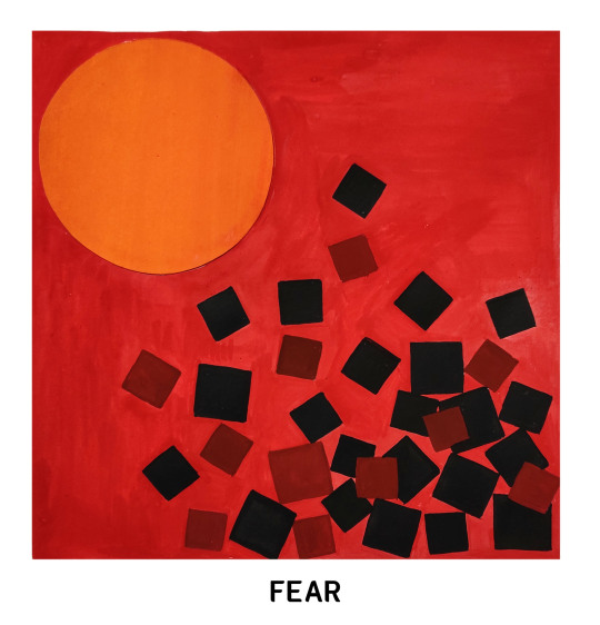
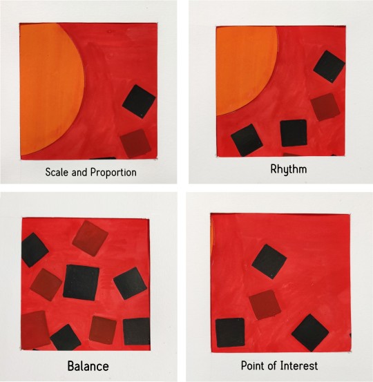
~Word Composition~
It's interesting to explore and understand how basic geometric shapes coordinate with each other to express a feeling and forms principal of design in it.
I showed Fear and the concept is the small squares are running away from the giant circle and started hiding in the corner.
The background colour is red to display the terror feeling, the circle with orange to highlight it and squares in black , reddish-black to convey they are frightened.I observed four principle in this composition.
1 note
·
View note
Text
~Word Composition - Exploration~
The first step for the explorations is thinking about the feeling, thoughts and other words which come in my mind related to the words given. Colours plays a vital role in expressing the feeling through the composition. Explored few words and tried to depict it with shapes, lines, dots and colours.The whole composition is based on what colour and shapes we choose.
1 note
·
View note
Text
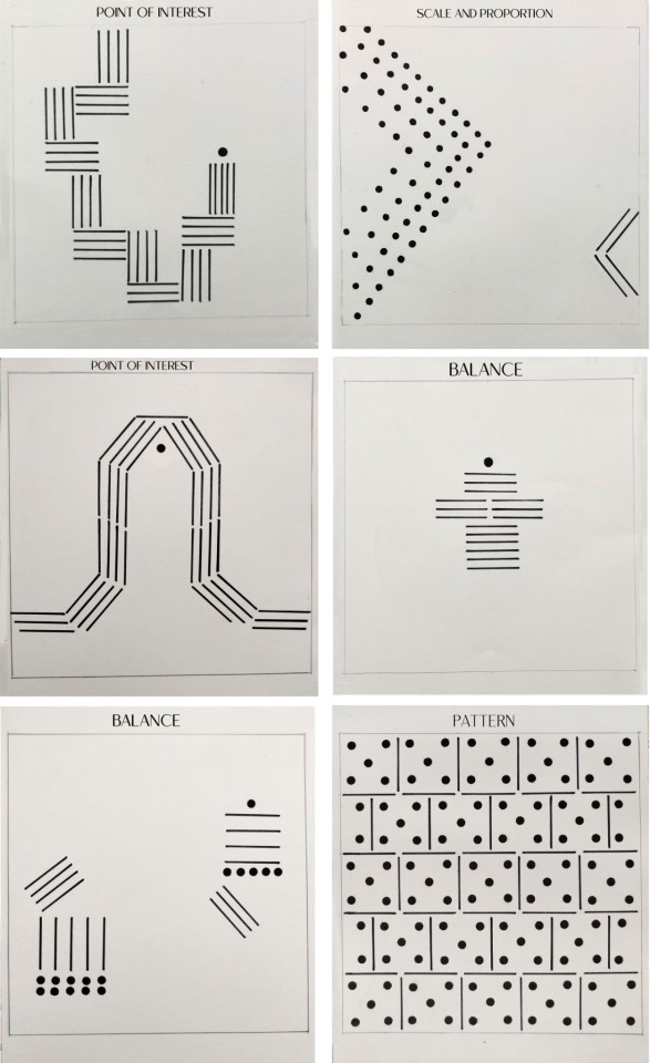
PRINCIPAL OF DESIGN
DOTS and LINES - Final Output
This six compositions I chose to make it on 20cm x 20cm square which I think have the balance of space as well as minimal use of dots and lines as much as I was able to do. I'll explore more to come up with interesting ones.
I learned that the execution of the elements gets differ when I transferred the thumbnail ideas to the main space and the look of the composition somehow changed.
0 notes
Text
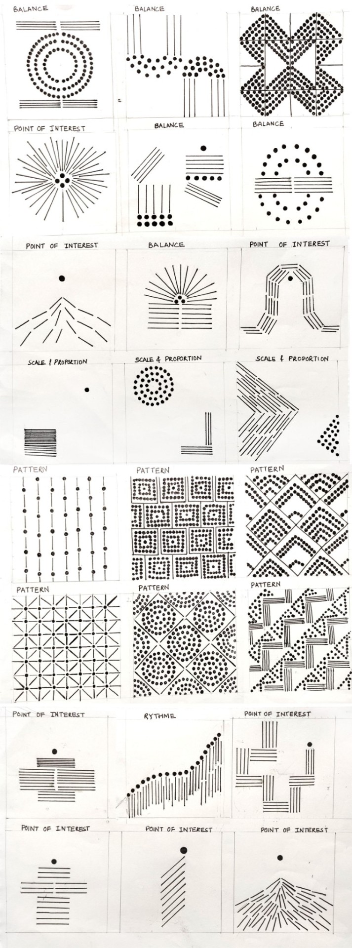
Principle of Design
~DOTS and LINES - Explorations
Initially I started doing very intricate composition as it is my way of creating design. Gradually I tried to explore and make minimal using less dots and lines. It's a great learning for me to understand how with few elements a interesting composition can be created by balancing the space as well.
0 notes
Text
~Colours of Nature - Final Work ~
After the feedback given for our first draft, we all decided to come up with a storyline.
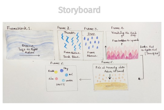
This Video is a depiction of five elements of nature that is air, water, atmosphere, fire, land which is shown in different tints and shades of colours with natural music. The story is how all of these five elements come together to form a beautiful mother earth.
0 notes
Text
When Colour meets Music - First Draft
This video is a exploration and depiction of colour through music. The concept is that the primary colours - Red, Blue and yellow has given specific tune to it . As it started mixing with each other to form secondary colours the tunes also mix in the same order. It progresses to the concept of tints, shades, color scheme , colour wheel and all of the tunes together form a beautiful song at the end.
It's a stop motion video and the audio is made playing instrument digitally.
0 notes
Text
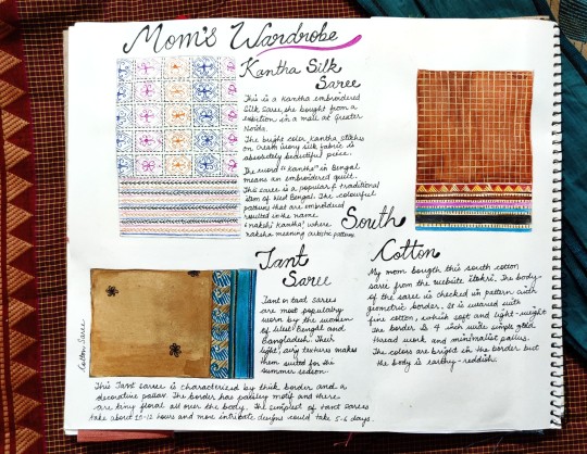
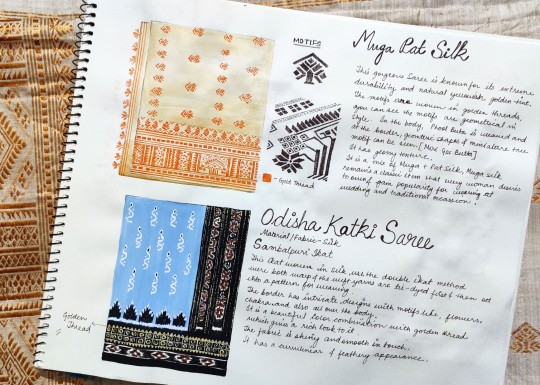
~Mom's Wardrobe- Colour Journal~
Had a look into my mom's collection of sarees, observed and painted the colors , texture and pattern. Also noticed how different fabric quality display distinct tones of colour. Saree itself is a composition of colours, motifs, borders, embroidery, weaving techniques showing identity of a region.
0 notes
Text
Connection of Food and Music {1} -Abstract painting of the Taste and feeling
Shorshe Chingri bhapa is an authentic reciepe of Bengali cuisine. Shorshe means sarso, Chingri means prawns and bhapa is steam. The prawns are steamed by wrapping it on bottle gourd leaves with sarso paste, mustard oil and chillies.
Artwork: I have painted it by stippling with lemon yellow paint to portray the texture and thickness of the gravy. Added tinch of red- orange color to evoke the feeling of spiciness.
Music : "Majhe Majhe tobo dekha pai, chirodin keno pai na " is bengoli song which means kabhi kabhi tum milte hon, hamesha kyun nhi milte ye dikhai dete. There is longing, desire feeling in this song which I have for this dish as it is made occasionally.
Play the video,added Bangla lyrics to it and feel the music.
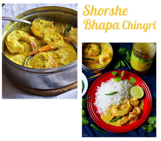
Turn on the sound and feel the music
1 note
·
View note
Text
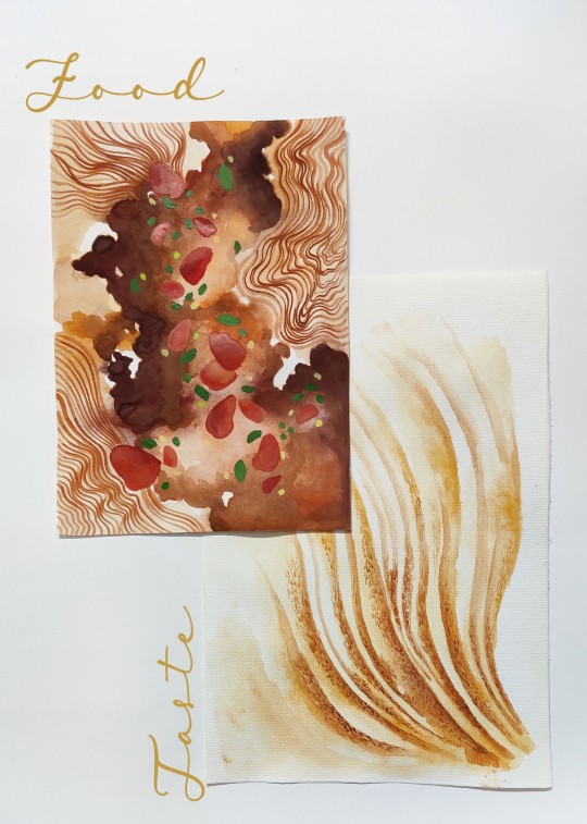
Connection of Food & Music {2} Abstract painting of the taste and feeling
Chilli chicken with noodles is one of my favourite dish. I love the pleasing aroma and harmonious blend of spice and sweetness.
Food: I have painted the dish in abstract form with brown tones depicting the flowy fluid and red - green patches for chicken pieces & veggies. Wavy lines for noodle.
Taste: Painted a rhythemic flow starting from brown- reddish tiny strokes depicting the tinch of spice I get in the first bite which slowly blend in a very pleasing and smooth taste.
Music : Thinking of this dish remind me of very pleasing Chinese flute. Play the video, sound on and feel the music.
1 note
·
View note
Photo

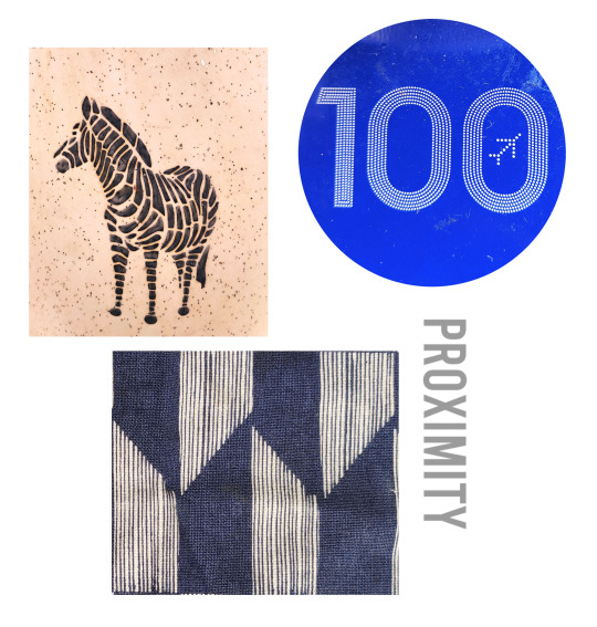
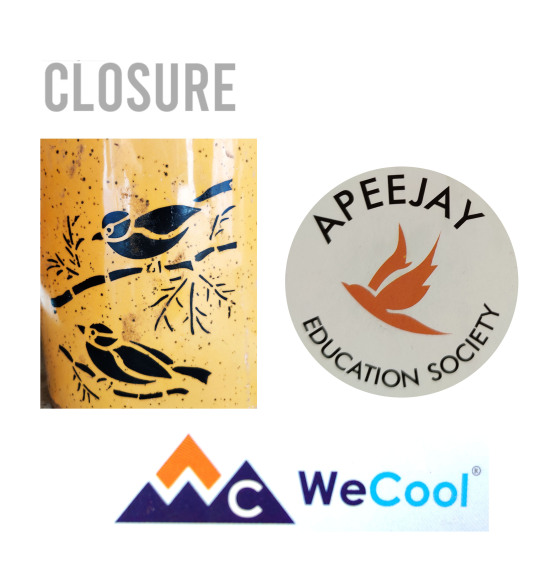
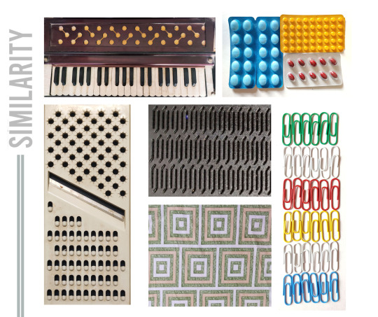
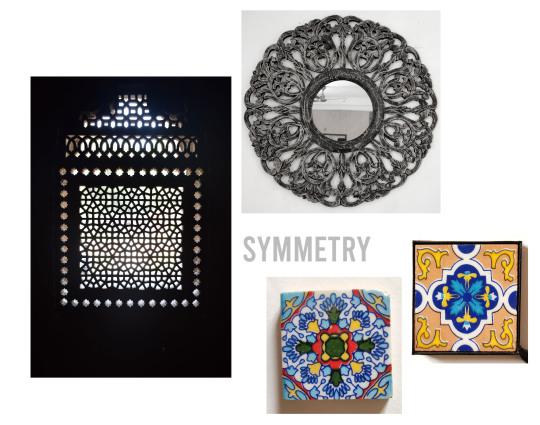
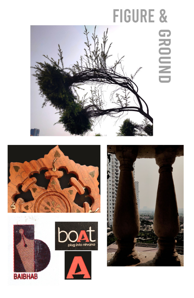
~ GESTALT PRINCIPLE~
I tried to understand Gestalt theory & principles by observing my surroundings and capture some simple and basic pictures to comprehend it in a much better way. There are six individual principles commonly associated with gestalt theory:
Similarity
Continuation
Closure
Proximity
Figure&ground
Symmetry
It was fascinating to find out objects related to these principles at my home, all the little details which I never noticed. I also went to the central park, where i saw a tree that was looking like a eagle face to me and my mind clicked directly to the figure& ground principle.
0 notes
Photo
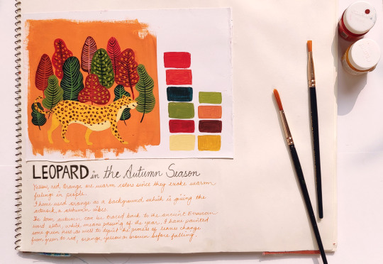
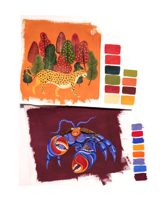
~ COLOUR JOURNAL ~
The play with colours is an instrinsic part of evoking different feelings and bringing life to the concept.
Leopard in Autumn Season : I have used the background colour as orange to give an autumn vibe and some green trees to depict the change in colour of leaves overtime to red and brown during the fall.
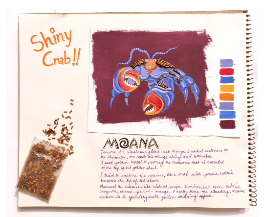
Shiny Crab : I watched the movie Moana, tried to capture the colours of Tamatoa, the giant Crab. Observed and painted the colours like violet, purple, luminescent blue, reddish-magenta, chroma yellow-orange.I really loved the vibrant marine colours in it, specially the golden shiny shell.
1 note
·
View note
Photo
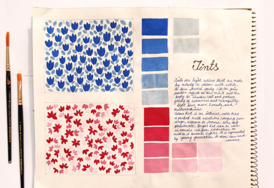
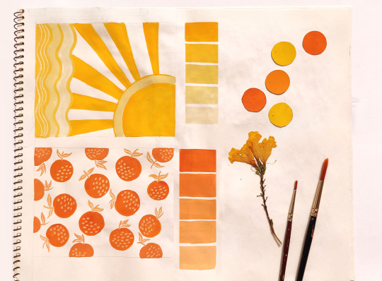
~COLOUR JOURNAL - T I N T S ~
It was wonderful to paint tints of yellow,orange, blue and red. I explored how the combination between these range of tints bring out a good composition.
1 note
·
View note