
sami-davison
Kaitiakitanga
Web Design Project - Sam Davison - 20004256
112 posts
Don't wanna be here? Send us removal request.
Last Seen Blogs

colourmeinkindneess
Do you sleep anymore?

allyourcars
مؤسسة كل سياراتك

sparksflywhenevertaylorsmile
Step into the daylight

ayomural
Ayo Shani - Mural

Text
Rationale - WebDesign
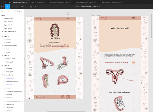
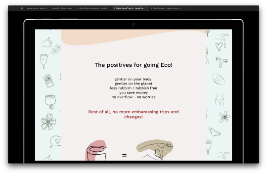
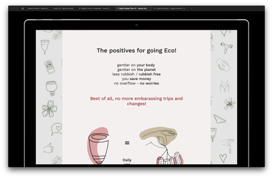
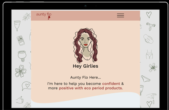
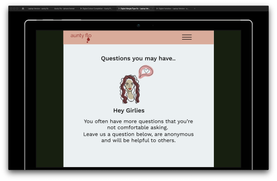
Throughout this website design, the key idea of proposing a solution to an environmental, social or ethical issue was achieved by design for the purpose of reducing Menstrual Waste. Specifically, the targeted audience for this design was for girls between the ages of 12 – 17. Designed for girls who have started or are ongoing, the website caters to a positive approach of gaining confidence during menstruation. Specifically, this audience was mainly target as I could gain a bigger impact when educating and persuading new menstruators into using eco products.
Based on my persona, I have aesthetically choice simple line illustrations that are easily communicate visually information. I’ve also created an influence, “Aunty Flo” as a guide through the website for the user to communicate a new confidence to eco period product. Due to the mainly scroll design, I have mostly design for a mobile usage, as my choice persona is most likely to come across this page on a mobile phone.
Overall, my design visually is simplistic and easy to navigate, along with the guideline of speaking positively to enforce a small change to gain a big impact.
0 notes
Text
Minor changes
Some changes were made to some details in my design. This included logo, fixing colours and trying to fix scroll on hover buttons. Unfortunately, some of my hover button don’t like hovering and scroll at the minute. Hopefully will change before hand in
0 notes
Video
I realised there’s a problem with a hovering button here. When you move away it disappears. This could make it hard to view or follow it you want to scroll or move to some where else. So I’ll change them to click buttons to enable this process
0 notes
Video
I’ve buttons to this page - Why? I believe its a user interest if they want to know how to use the product. And it somewhat my user interactive as they have to find out the information
0 notes
Video
I’ve decided to add buttons like this into some components of imagery into the mobile. This will be added to the laptop version too
0 notes
Video
Buttons like these I’ve found don’t work when used on a actual mobile phone.
0 notes
Video
I firstly add a changing colour button, to match the laptop verison. This is across each page
0 notes
Video
I have only added one aspect of interactive experience into my mobile verison. I have realised that my Laptop Version is a lot playful in term with creating. I would like to add more to my Mobile set up.
0 notes
Link
Laptop - further development - some of these changes will be applied to my phone set up - due to some of the dramatic changes
0 notes
Text
Background Colour contrast
Has an element of green and trying with a off white/pink. These are 2 tones....
Personally, I like both but the left one is quite harsh on the eyes
0 notes
Photo
Changing the off - white configuration. So it doesn’t look werid
0 notes
Text
Background addition
With along with the margins, I was asked to try incorperate a contrasting colour, and specifically to try the green I’d used in on of the illustrations. This is the result. Not sure I like it, I would like to try another colour first
0 notes
Text
Class Critique
I was asked to create a larger margin so it looks more like a website page and not a powerpoint. With the extra margin left, i’m going to look at examples of what I could do with this, maybe add a background or something
- As well as these things - making the character more interactive on each page
0 notes
Link
Mobile setup - iPhone 8 - development and recolour stages/interactive development
0 notes