
Last Seen Blogs
t-r-a-s-hh
Tômi
fficsnsajt
Jimin & Nayeon

zensyguillama
Untitled

sambrody-blog1
T-Girls

nelsonkickblog
Untitled
Text
Final Evaluation
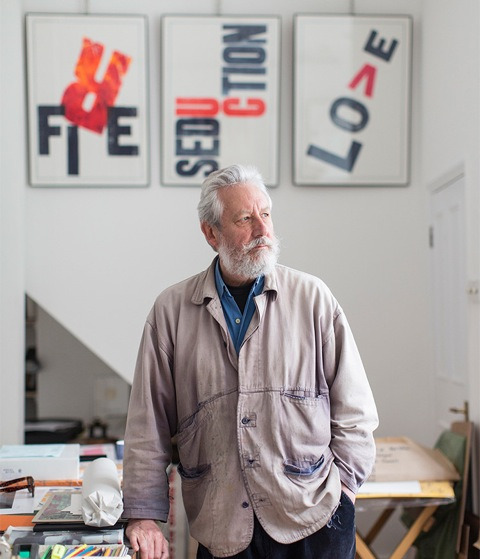
My initial thoughts came from the “curiosities”/objects we collected the week prior to starting our Final Major Project – these objects for the most part belonged to family members and had been passed down and kept throughout the years, either as memories or keepsakes. So I originally thought my theme would be family and I would somehow communicate what that means to people through some kind of design; the objects were also old so I considered making something that would some how relate to that/time – like heirlooms from family or famous heirlooms or even timelines. I initially decided to stick with the theme of family but soon changed it to keepsakes as this would broaden the possibilities a little for me. I decided quite early on that I wanted my specialism to involve print – possibly poster making or something similar to – I made this decision because I know I prefer to work in a more hand-rendered way as opposed to working digitally. Once I knew for definite that my theme would be keepsakes, I wanted to make sure I knew what the purpose was before actually creating anything – I wanted to create something from an existing object and use it to create something more unique that would represent a memory of something or someone – this meant the project turned into quite a personal one. I think the biggest problem you face throughout a self-initiated project is not having as much guidance as we previously had – we’re in charge of everything we decide to do – ideas, experiments, processes and outcomes. We have to be able to make sure we’re doing everything we need without being spoon fed but remembering to ask questions and for help when appropriate or needed.
My research started with the few guided workshops at the beginning of FMP (the connector workshop, Robert Rauschenberg and David Carson workshops), the letter press/Carson workshop is where it really started for me – this was the first primary investigation that impacted my work, I’d never done letterpress before but I enjoyed the process and outcome and kept the possibility of using this in my work as an idea, while continuing to develop my ideas and research. A lot of the inspiration for my work would come from the objects I’d been collecting throughout – I had to be able to find interesting shapes to create prints out of, while also making sure that there was definitely some kind of sentimental value to the objects. Alan Kitching was also particularly inspiring for me, he’s a typographer who uses as little mechanical means as he came when letter pressing, he’s trying to keep the craft in graphic design – which is also what I want to do, even more so after researching him.
Coming into graphics from art, I thought majority of work would be digital based and I like to work in a more analogue/hand rendered way so being able to keep that feel in my work was great for me, it kept me motivated as it was something I wanted to do and I wasn’t going to lose interest by working in a way which is a lesser interest of mine. My research was all presented either on my blog or in my sketchbook over at least two pages, I included all basic information I could find on research of people but didn’t ever go into much detail on their personal lives as that tended to not be relevant for what I was researching but I made sure to always analyse their work or quotes – when analysing quotes I feel it gives you more of an understanding of them – their ideas/the way they think or why they might work in the way they do/ideas behind the work, and any practical investigations were also recorded in my sketchbook or blog. Throughout FMP, I’d say my research got more specific, at the beginning I was looking for inspiration and ideas so everything was a possibility – as long as it somehow started with the objects, the Design Museum was probably the broadest thing I looked at, there was nothing I wanted to specifically look at there so I looked and recorded a bit of everything, where as later on when researching artists/designers that was because they used a certain process or there was something I wanted to know more about. Even if I didn’t take anything from their work to inspire mine – their ideas/beliefs often interested me, and I would take that on board when working (like Alan Kitching).
I’d say my experimentation and development could have varied more – I did experiment a small amount with 3D, but I quickly decided that I didn’t think that was the best way of showing my skills and nor do I enjoy focusing in on 3D work. The reason I did was after creating our display box, an almost 3D mind-map, I thought that could be a way to show the keepsakes (like a memory box) but I decided it wasn’t very original and wanted to go more unique with my outcome, which is why I chose to keep it quite handmade. Which is when I started exploring more with print, mostly mono printing and letter press – my exploration didn’t really go much further than that other than exploring ideas digitally that would then become something I print. Although I already had my idea, after speaking with Barry and the second year degree students, I decided to show the keepsakes through generations which just gave it a bit more depth and meaning – especially since the objects I originally collected for my display box were from all different generations in my family, giving it more of a link. For the most part my time management wasn’t bad – definitely improved from previous projects – I made sure I used time to practise and experiment and also actually spend a day creating my final prints, with spare days to create more if necessary – even if that meant coming in off timetable to do anything. I kept practical work for at college so I could take advantage of any resources or workshops and the theory side at home, for the most part. I’d say I’ve almost refined the mono-printing process just through working with it a fair amount over the past two years, I’m now confident in working that way and I think I could quite easily teach another person.
For me, mono-printing was the right process to choose and I think it was very appropriate – since prints are handmade, they feel personal and each print is unique – I didn’t want to make something that anyone could recreate. It’s also a process I’m interested in which meant it was easy to keep my motivation for doing it and it wouldn’t lose any potential quality because of boredom and I think this was the best way to show my skills as I know my skills are stronger in print than in digital work.
However, I think I could have used type more effectively if I had put the time into it earlier on in the project, I could have given the type used more meaning/depth by using a specific typeface or creating my own – I just found what worked and stuck with that, not really exploring much further. I still communicated what I wanted successfully, the prints are created using objects that hold some kind of memory – I’m aware that not everyone will understand the significance of the objects used but that’s because they’re personal, if I’d have used someone else’s things then that person might be the only one to understand the deeper meaning behind it. Although I didn’t completely stick to my plan, I did quite loosely. I did what I needed to do when it needed doing – even if that meant leaving something off that was on the plan and coming back to it when the time was there.
Most weeks I worked efficiently, although the theory side did start dropping in the last few weeks, I started focusing more on the outcome to get it complete for the deadline. Once I had majority of my final piece done, I did try picking the pace back up with it. The most successful aspects of my outcomes are the messages/ideas behind them, the prints won’t be to everyone’s taste, whether that’s because of colour choice or the shapes, but I used colours the owners of the objects liked and that I could make work but the idea that I’d wanted to communicate the whole time is still there regardless. The discussions with tutors and peers helped me to give more depth to my work, once I had my idea, I was stuck for who’s objects to use and why until speaking to others. If I could do the project over again and change any aspect of productivity, it would definitely have been more practical exploration, I think I would have been able to come up with something that would have been a more exciting outcome if I’d have spent more time on that and trying many more ideas or pushing myself even further.
Word count: 1,536
0 notes
Text
Creating my final outcome..
I took 4 objects to create my stencils from, these objects were from 3 different generations. My nan - my mum - me. Except I had two options for my generation - it was either a teddy from when I was a baby, or Will’s sonic screwdriver toy, from about 10 years ago.

The rabbit was mine - you could sew your own pattern into the back to personalise it and so my mum did this for me when I was a baby. The cassette, the Communards (a duo pop group) was my mums from when she was about 18. The brooch - my nans, she always used to wear brooches, as most people did her age, and this was just the one I was most drawn to.
From the connector workshop, I learnt that I like the simplicity behind just using the outlines and took that approach when creating my stencils.

I’d previously asked for the favourite colours of the three people and from that I got:
Nan - pink
Mum - green & purple
Will - orange & yellow
Mine - orange too
I wanted to use all different colours as I’d learnt from the practise run that it was going to hard to make a series using the same colours, so I decided to have the exception of one to keep them tied together, and I thought blue would work best. I knew I wanted/needed at least 3 layers for each and so three colours would be necessary.
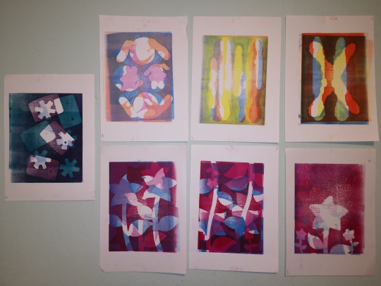
These were some of the prints I created - I did at least 3 of each generations (they’re all in my portfolio). With these three or more, I asked a few other which they thought were the best and for the most part everyone agreed on the same ones.
Some prints didn’t go great where as others were the complete opposite and I was really happy with them. For example, the bottom right didn’t print great - the stencil isn’t sharp/solid and I think that’s down to the ink being quite dry and there not being enough packing, which is why it was so important to get that right! Especially when being compared to the bottom left version of the exact same stencil, the lines are so much clearer.
I think since I made these and know what the objects and the sentimental value behind them, it makes it “obvious” what it is and what the purpose behind is. Where as someone else might look at it and have no idea - which I think is fine, the project was fairly personal and I used personal items. This is also the reason I decided to use my bunny instead of the sonic screwdriver, I wanted to keep the outcome family orienated (much like my original idea). I think if I took keepsakes from another family, it would only be them that would understand the true meaning behind why them objects are important.
Getting onto the letterpress..
After spending a day in print to create what would be the main part to my outcome, I also letter pressed the three words ‘grandmother’, ‘the communards’ and ‘bunny’ onto a blank sheet.
I took the best ones of them and scanned them into Photoshop, along with my 3 best prints. This was so I could try different colours and placements. In the end I decided I did want to use colour because using black for me made the words stand out too much - which could also be a good thing but that isn’t what I wanted. I asked a few people again which colours were best and settled for, dark purple for the cassette print, pink/red for the brooch and orange for the rabbit.

My prints were dry the next day and so that’s when I added the letter press. I had a spare piece of plain paper beside me so I could print the words 3 times and make sure everything was okay (colour, packing and the blocks) and then also used the spare prints I'd done if I wasn’t sure about the ink colour just to see it against the colours it’ll be with, as apposed to on plain white.
There were two minor mistakes I made - I accidentally put the wrong letter down and luckily realised before pressing and then also moved a word while putting my packing on which made it look really thick and smudged. These were on two of the cassette prints and so I decided to keep the original one I wanted as I know from all the printing over the last two years that it’s almost never perfect, but there was also nothing drawing any major attention to it.
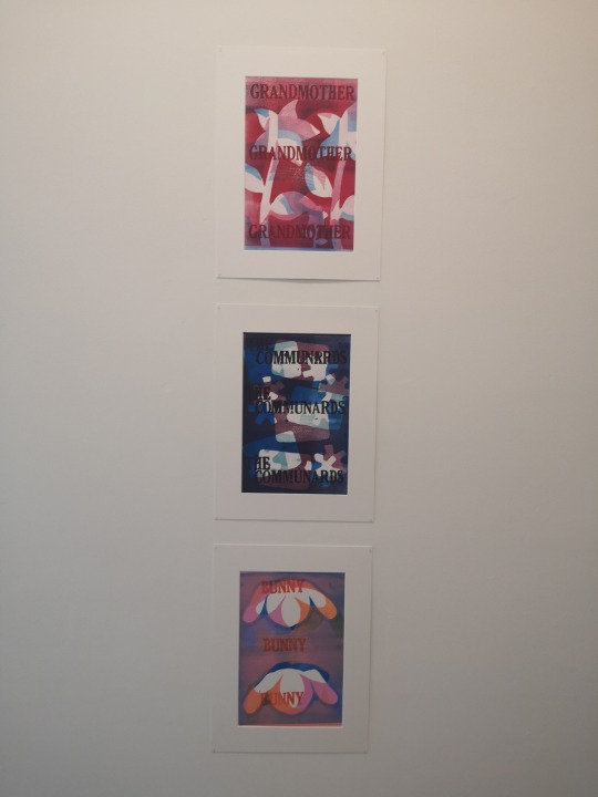
This was my final piece once it was up on the wall. The mounts meant it was a cleaner looking print because there was no ink smudges or finger prints and the edges were clean and straight. I’m fairly happy with the outcome, it gives the message/has the meaning behind it that I wanted which was to have something to remind you of something or someone from the past and for me it does that. The only thing I think I'll add before final hand in is a picture of each object next to the print - just so people who are taking a first look have a little more understanding what the items are.
0 notes
Text
Alan Kitching
I researched typographer Alan Kitching to see if there was something else I could do with the type/letter press, I wanted to push it a little further.
British typographer, born in 1940, is renewed for his expressive use of wood and letter forms (letter blocks). He was appointed Royal Designer for Industry, and elected member of Alliance Graphique International. He conducted workshops and gave talks in the UK, Europe, Australia and South Africa. So his works likely recognisable around the word.
Video: https://vimeo.com/106398773
Kitching avoids using computers and technology, he tries to print using “as little mechanical means as possible”, even if that means ripping paper and not cutting it. He always wanted to be a poster artist.
What is a poster artist? Someone who designs posters - large printed pictures, either for decoration or advertising, etc., designing a poster means figuring out the imagery, type, colours and whatever else may be on the posters and the placement of these things.
His process? Identifying the typeface he wants to use, cuts the type from card and makes&mounts the block onto the press, ink up and print.
He wants to keep the element of craft in graphic design, he says there’s nothing to touch or feel in digital art - even when you print out something created digitally, you don't get the same texture as when you print something, for example.
When asked how he’d describe his style he said “precise use of type and colour in a random way” (in short). What does this mean? Is his work experimental? Any plan to it? Does he just go with the flow?
Alan Kitching’s way of thinking is inspirational from me - I prefer to work by crafting over digital work and so I like and agree with what he says about having nothing to touch, I like that aspect of it. Which did make me re-consider my idea of applying the handwriting in Photoshop, as I wanted to use Kitching’s way of working as “guidance”.
His work:
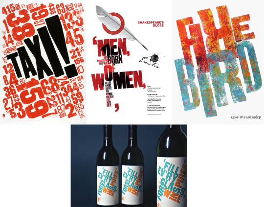
Type is obviously the main focus of his work, but the purpose differs.
“Taxi” is a poster created in 2009 and was one from a series of 20, the other 19 were created by other designers. They were made for the London Poster Project - posters needed to be created to ‘celebrate London as creative capital of the world’, so how does this piece relate to that? London is well known for their black cabs and I think the numbers could be taken as numbers for the cabs or even just number plates. The word taxi is in bold, black writing which sets it apart from the red letters - it stands out.
He also created several posters for Shakespeare plays and the type tends to be quotes from the plays and is the main focus for the whole thing, down below in what we usually consider to just be “normal” type - like what you’re reading now - is the information on the play, dates, prices, etc.
I think what I’m using type for differs to what he uses it for - I don’t want it to be the main focus and what people see first, I just want to use it to give a little more understanding of the print without taking anything from it, I don’t want the attention to go directly to that, so I think I’m going to try keep to the simplicity of what I’ve got.
How could I make it so the type isn’t as bold on my prints? I think making it a similar colour to the ones used would help to make it not stand out as much. It wouldn’t contrast as much to the colours in the background - which is what I don’t want. But could I try making my own typeface to print - similar to how Kitching does?
0 notes
Text
The mock-up
For the mock-up of my final piece, I used 4 objects from my display box - the shell, bottle opener, dice and spoon. These were where I got the shapes for my stencils from, I like the simplicity from the connector workshop where we layered the outline of an object and so that’s how I created my stencils.
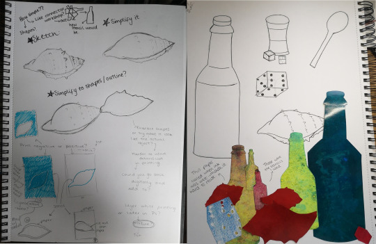
The process:
To print these I went with the mono-printing process. Why? Each mono print is unique and can’t be created again so I knew I could keep that aspect of it, for me it also feels more handmade because you do everything by hand. How? I cut the stencils using scissors and a scalpel for the more detailed parts. Then when actually printing, I inked up the acetate/lino with the roller and put the stencils on top, then the paper. The packing went on (newspaper to add pressure) and then through the printing press.

And the type?
I got the type from a sentence I asked my mum to write about the objects (stuck into my sketchbook), as the objects were hers. The sentences she gave me were: 1. I found the shell on the beach at Dungeness Nuclear power station on a day, about 4 years ago, 2. The Double Diamond bottle opener belonged to my paternal grandfather. I chose the words which felt best suited, these ended up being: double diamond, Dungeness and grandfather.
I think I could have explored the different types on the letter blocks, but I also think these ones worked well - the size worked well on the A4, weren’t too big or too small.
Process? Letter press is really similar to mono print, the surface needs to be lower on the press so the blocks go through/under properly - you then ink up the letter block, put the paper and packing on and roll it under the press.
To make sure I liked the outcome, knew how much packing and what letters would print best, I used photocopies of my original prints to letter press on.
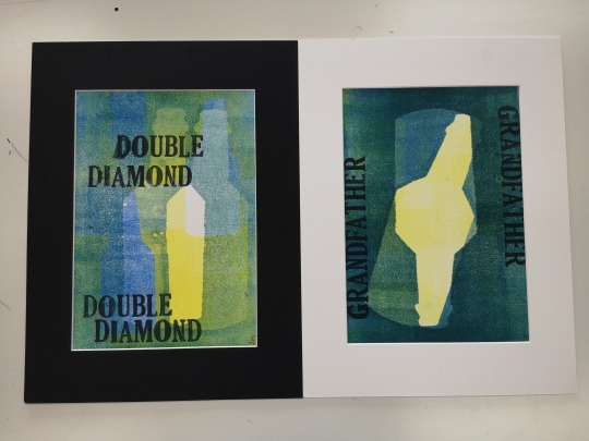
I think adding the wall mounts made the prints look cleaner and more “professional” in a sense, it also works for putting it up on the wall for exhibition - and it works out cheaper than buying 3 frames.
What did I learn from doing this?
The shell and bottle both printed the best - I think this is because they were the most simple - the smaller parts of the stencils didn’t tend to print.
The layers needed to be lightest ink to darkest ink, lighter colours didn’t show up over darker colours.
Packing NEEDS to be perfect - the prints won’t turn out the best quality when there’s too little or too much pressure - especially in letter press.
Checking the letter blocks aren’t damaged is definitely helpful - some blocs just didn’t print from where parts had been chipped off or were dented.
Creating a series of prints isn’t easy with mono, the colours very easily differ depending on how think it’s put on when inking or how dry it becomes and how the colours might layer. But using only one object did help. Could using different colours throughout help? Or using one to tie it together - like the type on the blocks?
What am I going to do differently with my final outcome prints?
Use paper bigger than A4 but make my print sizes A4, using the bigger paper will make it easier to stick to the mount.
Plan where I’m going to put the text instead of winging it, the placement could end up looking off or unbalanced.
Experiment/plan with more colours to see which ones work together - even if that’s through another process aside from printing.
Definitely use different paper for the stencils - I think cartridge paper works best as it doesn’t curl.
0 notes
Text
Roman Typefaces
Roman typefaces originated from the original Latin alphabet - letter forms from Ancient Rome. Over time, these forms have developed into the standard serif typefaces we use today. Roman type is the “norm” as it’s most commonly used - vertical lines are straight up and not slanted. Most fonts will come in Roman, Italic (slanted), bold & bold italics.
Six standard Roman typeface:
1. Caslon Oldstyle
Historic American typeface
Seen in 18th century school books and paper money (banks notes - £10, £20, £5, etc).
Still used in some forms today.
2. Scotch Roman
19th century English, Scotch & Americans took Bondoni’s typefaces and redesigned them - more along mechanical lines and filled corners to round them more.
Best known as modern Roman type.
3. Cheltenham Oldtype
Developed/Changes made over years - now 30 series within this typeface family.
When designed, beauty & legibility was a must - designers noticed space between the lines made it more legible and so they designed lower case letters with long ascending and short descending lines - what we now now as serifs.
4. Cloister Oldstyle
The standard typeface that’s based on Roman letter forms.
A creditable copy for general use was made in 1914 - made avaliable for everyone to use.
5. Bodoni Books
Chosen for its refinement and legibility.
Scientific tests proved that small sized fonts (like sizes used in pieces of text) that have a considerable contrast of hairlines and heavy strokes can strain your eyes - Bodoni = moderate.
6. French Oldstyle
This typeface is tall, formed with liberal space between strokes of lower-case letters.
Open characters and large lower-case demand that it can’t be crowded - plenty of space.

How could I create a more personal type?
Handwriting! - Every person writes in a different way, not one person could have the exact same handwriting - maybe similar styles but never the same.
Who? - This depends on the purpose.
So, what’s the purpose? - As I’m looking to create some kind of keepsake, it’s likely to be some kind of gift or something bought by someone for quite a personal use - keeping memories from special events/occasions/experiences, from births, to weddings, to keeping things in memory of a loved one who’s passed.
Could be who we’re trying to remember, who was there, your favourite person - it could be anyone you wanted it to be.
Where? - could find the handwriting from birthday cards, postcards, letters, old school books, anywhere.
How? - same process used in Michael Craig-David workshop, tracing the handwriting so it’s a black outline - making it clearer. Scanning that in, tracing it digitally, then treating it like the digital development in Lost and Found, Part.1.
Issues with this would be that I couldn’t necessarily create a whole alphabet as I’ll potentially be relying on writing that has already been done so won’t include all 26 letters & all/most common punctuation.
0 notes
Text
Paul’s Workshop - Digital Development
During the trip to the design museum, we had to find objects that were somehow connected, whether that was by fabric, colour, use or cultural relevance, and photograph and draw them - and then the digital work would come in.
With these photographs and sketches, we had to draw another that has simplified details and thick lines. Why? We were taking inspiration from Michael Craig-Martin - a contemporary conceptual artist, born in Ireland. In particular, his work where he takes sketches from real life (everyday objects) and refines them to the contours, making it take on the character of having an ‘objective’, similar to those found in catalogues or children’s colouring books.
“I’m not interested in objects, consumerism, I’m not interested in design, I’m interested in language and the way in which we interpret the world, understand the world, through the things we make” - Michael Craig-Martin
(https://www.youtube.com/watch?time_continue=202&v=t4PQA0QH9xs)
This is what it means to be a conceptual artist - the ideas and thoughts behind the art piece is what’s the most important, not the final outcome. What does he mean by language? The way we read a painting, when we look at a painting there’s things we automatically assume - like the bigger things are closer or the darkest areas are shadows, I think Craig-Martin is attempting to turn this idea of how we all generally read an art piece on its head - to create his own language, his own style as such.
He does this through many mediums, including print, painting, drawing (analogue and digital) and sculpting out of powder-coated steel that still stick to the same style/language, they’re common objects that are completely oversized - changing our perspective on what we consider the norm.
Back to the process... Once we’d traced our sketches down to the simplified outlines, we scanned them in and opened them up in Illustrator. The image was locked as a layer, and then on a new layer we had to trace the same lines we’d scanned in to create our vector.
Why did it need to be a vector? Having it as a vector allows you to change size and move it around without losing any of the quality, meaning we can experiment with placement in the work we create.
After creating our vector drawings, we were able to play around with any colours or line thickness, positioning or size we liked.
I think having something other than a white background makes the objects on it really pop, lighter colours on a dark background really worked well for me. I think if I was to develop this and take it further I would actually fill in spaces on the objects and this might set it apart from the background more. Not having to worry about proportion of things made the outcomes much more interesting, it wasn’t the usual that we expect to see.
0 notes
Text
The Design Museum
We took a trip to London, Kensington on Thursday 21st to the Design Museum - this trip was to give us a chance to explore objects, ideas & contemporary design.
What’s contemporary design? Contemporary = 2. ‘existing or occurring at the present time’; 3. ‘conforming to modern ideas in style, fashion, etc.’ , so following the current “rules/ideas” in design.
As we were going through the museum, we needed to record what we were looking at and thinking through drawings and photographs.

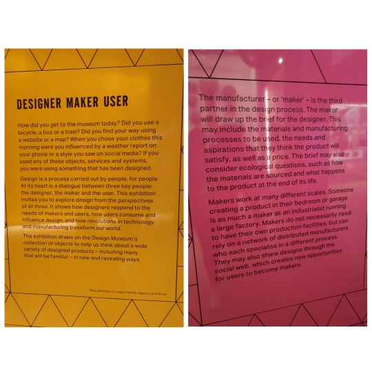
The exhibition we looked at was ‘Designer Maker User’, it featured nearly 1000 items from the 20th and 21st century - from all 3 view points. The objects covered a very broad range of design - from architecture to digital to fashion, basically anything you can think of.
We needed to choose 5 objects and have them drawn, these drawings will then be developed digitally in a Friday workshop. The objects needed to have some kind of link, whether that be colour, material or use.
What is a designer? maker? user?
Designer - The person who decides how it’s going to look, function and go together.
Maker - The person who actually puts it together - whether that’s one person or a whole factory.
User - The consumer/customer, the person buying the product for its intended use.
The connection and importance? The maker can’t make something without knowing what’s it’s going to look like and how it needs to function so someone needs to decide that and the user is like our audience - these designs are being made for them, without a user it becomes a pretty pointless process, things would be being created for no reason.
First point - Eduardo Paolozzi:
Who? Sir Eduardo Paolozzi, 1924 - 2005 - a Scottish artist, sculptor & print maker. His work is instantly recognisable and chronicles the significant changes in British art from 1950s to the post-modern late 1990s - he took the time to learn a great deal about Dada (a movement in WW1) and surrealism (used to try express things from the imagination - i.e. dreams and visions).
Our first point was the sculpture created by Paolozzi, ‘The head of invention’, it’s a surrealist piece and shows the displacement of a human head.

But what does that mean? What’s he trying to suggest/show? My perspective?
The displacement is different pieces of the head being separated through words, these words stick out of the gaps - but what are they? why? where did they come from? On the back, there’s what looks to be bits of machinery exposed, for me this would represent the brain - it’s what makes us go (work), which suggests thinking and something completely man made and unnatural. There’s also written on the end of the neck a Leonardo da Vinci quote; “through human genius in its various inventions with various instruments may answer the same end, it will never find an invention more beautiful or more simple or direct than nature, because in her inventions nothing is lacking and nothing is superfluous” - where has this come from/why did he use this/what does it mean? and do the words separating the head have anything to do with it? Who’s her - Mother Nature?
Superfluous = 1. ‘exceeding what is sufficient or required’
So Mother Nature is only creating the necessary, where as people take on design in many different ways yet nature will always be the most beautiful - no matter what tools and materials are used. But what has this got to do with the sculpture?
Considering that it’s a surrealist piece, it’s got something to do with imagination; I think imagination is a beautiful thing and the piece for me suggests that’s what Paolozzi might think. The way the words from the quote are breaking the human head apart says to me that he’s letting his imagination/genius out in the form of design and that’s how he chooses to fit in and express himself.
Paolozzis quote - ‘I suppose I am interested, above all, in investigating the golden ability of the artist to achieve a metamorphosis of quite ordinary things into something wonderful and extraordinary’.
What’s Eduardo Paolozzi trying to say and how does it relate to our project?
He likes to explore the mundane and try to turn it into something exciting, like everyday objects. The links the ordinary things, our collection of curiosities are things we’ve found or already had - nothing too extreme and we’re trying to take ideas from these objects and turn them into something more than what they are at face value.
0 notes
Text
Starting Task One.. Collecting.
The list of 30:
Something made from fabric
5 words others have used to describe you
Something you found on a walk
An interesting story told by a relative on your phone
Something associated with a memory
Something malleable
Something in your favourite colour
A piece of text from your favourite book
Something that can make a mark that isn’t a traditional drawing material
A motivational quote/lyric/poem/saying
10 words to describe you and your interests
An image of the cover/poster of your favourite book/film/album/TV show
An old bottle or vase
A curious object (physical pieces based on use/material/strangeness/mystery)
Something from the 1980s
Something from your kitchen drawer
Something brand new
A description of your own alter-ego (super hero or villain)
An artwork created pre-19th century (including an image of the art and the biography)
5 printed photos that are over 18 years old
An image/photo of an amazing building or space you’ve visited
Something fragile
An object with lots of detailing and texture
A set of paper instructions, with diagrams
A house plant
A children’s toy
A cunning disguise
Something second hand
Something made from recycled/sustainable materials
Something to help you survive the end of the world
Out of these 30 we need to collect 10 objects, these can be anything so long as it fits the descriptions listed.
My (original) items:
A teaspoon - out the kitchen draw
An old bottle opener - curious object (I didn’t have any idea what this was at first)
Rubber bands - found on a walk
A Winnie the Pooh key ring - made of fabric
A cat that holds rings - second hand, this was my Nan's originally
A cactus - house plant
Huion (drawing tablet) instructions - paper instructions
Russian dolls as the Three Wise Monkeys - a children’s toy
A putty rubber - something malleable
A mini mannequin for drawing/design
After finding out what these items will really be used for and that they’ll need to be put in a display box I decided to look for some replacement objects that were more intriguing and possibly better linked - which wasn’t really too important.
My final items:
Old bottle opener
Rubber bands
Shell
Three Wise Monkeys as Russian dolls
Three Wise Monkeys, wooden decoration?
Cat that holds rings
5 pictures 18+ years old
Mini mannequin
Old dice + dice thrower
The cactus
Although I have all 10, I don’t think all of them will be used in my display box, I’ll just have what works or even looks best together but also most importantly, the ones that give me the most ideas - as these could be potentials for my starting point.
0 notes
Text
Display Boxes
The pitch
What is a display box?
A visual mind map - we need to put the objects we find most interesting in physical form, that hold a memory, they inspire you and so on into a box that’ll be displayed on walls and used in presentation.
Why?
This is our very start point, this will be where we respond to our objects through drawing and documenting through investigations and research. Responding to our objects is going to help create a strong understanding of the possibilities around them, for our projects. Once we know the possibilities, we’re going to be able to look at the broader context, then come to narrow it down to more specific areas to get to the main ideas for our FMP.
Requirements?
The depth of the box can be no deeper than 10cm, as they’re going to be fixed to the wall and would cause problems if they’re any deeper - other than that other dimensions are up to us, taking that into consideration too, the box will need to be sturdy enough to be exhibited.
The things in the box should be the main areas of interest, not everything.
Placement and organisation is going to need to be considered, what’s the narrative? What are you trying to convey?
Examples?
What do you first notice? Is there anything you might take from that?

Very organised, a lot of the items look quite old - like things that might be found or dug up, each shelf has something in the background (book/newspaper pages, fur, paper), the shelves look made to fit the specific objects - can see they’ve considered that.

Collage background (music notes/pages, book, green paper?), old objects - collected? Dug up? Found? Not much specific organisation, there’s no shelves but each thing has a place where it can be seen, box looks old too - matches aesthetic.
I like the idea of having something behind rather than just painted, I think it adds more dimension and interest as there’s more to look at and I think I’ll use shelves as it’ll be easier to organise my objects in a way that they’ll all be clearly visible - I think this is important because each object has a different story and meaning to it, so they should be individual.
Things to consider & opportunities?
Collections: What are they? Why do people collect and gather?
A group of things, like coins, stamps, models.
I think people collect when it’s something they really like or something that might mean something to them, I’d say it can definitely be a hobby for some people to go and collect things to keep and organise for their own enjoyment.
Provenance: The beginning of something’s existence, place of origin or earliest known history.
Planning my box
I knew from looking at the examples in the introduction that I’d want my display box to be on the more organised size - I wanted each thing to have it’s own space, I wanted this because I thought I’d be easier to see each object and they’re not distracting from each other and also they’re all in there for different reasons - they’re all individual items so for me it made sense to have their own space.
I sketched a few ideas out and had a basic idea but I couldn’t work out any measurements until I was actually making the box so I could use the items to know how big each shelf, etc. needs to be.

I went out collected all the materials I would need then started making.
Making my box
Materials: Length of wood (skirting board plank), strip of wood, MDF board, picture frame, araldite - epoxy resin, and screws.
Tools: Drill, handsaw, set square, ruler, chop saw, screwdrivers ,& rasp/file.

The process:
Measured the frame so I knew how long to cut each piece of wood - which was done using the table saw and cut at angles so they’d fit together perfectly, although some parts of the wood were bowed and there was no way round that. Using the same measurements I cut the MDF for the back using the handsaw.
Attached the sides using blocks of wood, from off cuts, and screws and attached the back in the same way - with more blocks.
Then screwed strips of wood on the inside of the box, on the sides - this would stop the frame falling into the box one on the front. I also attached wood strips to the frame to help support it on the other strips, I done this using araldite.
The edges of the frame needed to be filed because it wouldn’t slide down into the box from the top without force, this made it fit snug.
A strip of wood then needed to be screwed to the bottom with holes drilled in, this was so pins on the frame would have something to slot into to secure it and keep it from falling out - the top was adapted to sit inside the box with the pins in and then the final outside piece was attached to the frame, rather than the box.
To hide the blocks of wood holding the box, I cut 4 lengths of MDF to line the inside so it was all clean and flat, these were screwed in.
We used an ‘L’ bracket in the top so the box could be locked and the frame wouldn’t slide out. Each of the top pieces needed a hole cut in the centre, using a dremmel tool. The bracket was rounded off and would slot into the holes, allowing the padlock to poke through the bracket.

This then later on made me want to create a much simpler version of the box to put items from events or specific objects, as memories in - basically a memory box. Which would then be personalised - using a print/s like my original idea. Once I’d created the box I almost went off the idea straight away. I wanted to create something that would be unique and very personal, but I already knew everyone could create a box from this workshop so it was something anyone could do and essentially already had done. IF I was to do it again and properly (like for an actual final outcome) I would do everything properly - e.g. painting it and measuring & cutting correctly because the one I did do was very uneven and scrappy looking, which was fine for what it was because it was to see how it might look and to see if I even wanted to follow up on that idea.
But I did like the idea of using items that someone might put in a memory/keepsake box and so that’s where I started heading after that.
0 notes
Text
‘Curiosity’ - Our Final Major Project (FMP).
Breaking down the brief:
Unlike our previous briefs, this one hasn’t got a set theme or area of specialism to explore - ‘curiosity’ is our only starting point.
It’s our job to decide the theme and specialism, through exploration and experimentation. The only “rule” is that we use primary objects and secondary sources, these primary objects would be the 10 things we had to collect the week prior to starting the brief.
To decide the theme and other choices, we need to look back on skills and experience from the start of our extended diploma year and use that to make independent decisions. We need to identify possible subjects & research and decisions about techniques, processes, and materials we’ll explore to create exciting outcomes - on top of this, we’ll need to reflect (weekly & after every workshop) how our peer group motivates us to create the exciting work we do.
Creatively problem solving and critical reflection need to be demonstrated, this will help us develop ideas - knowing what does and doesn’t work is going to help make important decisions towards process, materials, etc. Along with these skills, effective presentation & display methods need to be shown, through a final showing of outcomes and also in our submission, and also a written project proposal, timetabled action plan and a bibliography - these need to detail research sources.
The tasks:
Task one: Collect & Observe.

We were given a list of 30 curiosities the week before starting this brief to help with the first task - the 10 objects will be used to help start generating ideas, alongside influences of designers/artists we are inspired by or admire.
Using these things, we’re aiming to create drawings, mindmaps and diagrams based on observations, reactions and thoughts in response to our research. These activities need to be recorded in sketchbooks, by annotating imagery, mood boards and visual case studies.
Task Two: Proposal & Display box.
The way in which we choose to work is up to us, we might choose one specific technique or fuse techniques/processes together. These processes could be 2D, 3D, craft, digital, photographic or so on. It doesn’t matter what we do, as long as it’s kick-started by our primary, physical objects and secondary collected imagery. We’ll then need to create a display box (like Robert Rauschenberg and Alison Stockmarr) using primary and secondary imagery and our physical items, this is going to support our written proposals.
Our proposals are going to be a detailed 500 word document, it’ll have clear categories and formal sections.
Our collections will be exhibited on the week starting the 1st of April, they’ll be reviewed and reactions are going to be needed to be recorded formally.
Task Three: Researching & Recording.

Analysing primary and secondary research needs to be done, but more importantly there’ll need to be direct links to our own ideas and the work we produce.
Sketchbooks and blogs will need to be kept up to date and be consistent. Daily or weekly entries will need to be done as well as formal mid-project review. All secondary research needs to be clearly referenced using the Harvard method (it’ll need to be included as part of our bibliography), this will support our investigations.
Task Four: Experimentation & Development.

Evidencing all the experimental art & design work we do will make sure we meet certain criteria. Presenting the work in our sketchbooks and loose work in our portfolios will show our investigation of materials and processes.
Reviews and reflections at timely intervals will be where we discuss the potentials and limitations of our work, these will need to be in our sketchbooks or blogs.
Task Five: Refinement & Presentation.
This is when we’ll need to start developing a collection of final outcomes - the media/format we use needs to relate back to the specialist areas in our Project Proposals, and to the ideas and concepts that develop during the FMP.
We need to make sure we consider who the audience is going to be for our outcomes and how we’re going to present them at the end of year show (and how we’re going to present them for final submission and how we’re going to organise and display evidence - it needs to be clear, concise & show professionalism.
Task Six: Evaluation.
The final presentation for the FMP project needs to have clear headings and reflect on this project, as well as the past two years at college/on the course. The evaluation should be word-processed and a minimum of 1000 words.
Maybe consider doing video/audio logs discussing ideas informally alongside the written evaluation, as a different way of approaching evaluation.
Dates:
Completion of presentation box - w/c 18th March
Project proposal draft - 28th/29th March(depending on timetable)
Final Project Proposal - 25th April/26th April
Assessment day - 30th April
Exhibition installed - 23rd/24th May, by 12:00 PM
ALL practical work, sketchbooks and blogs - 31st May, also by 12 noon
0 notes
Text
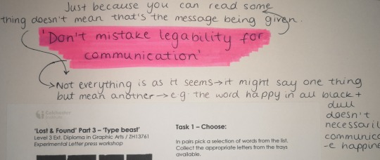
‘Lost and Found’ - Part Three, Type Beast
David Carson
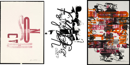
‘Don’t mistake legibility for communication’ - David Carson
What does this mean? Not everything is as it seems - just because you can read one thing doesn’t necessarily mean that’s the message it’s trying to give. For example, the word happy written in heavy, dark right with a dull background probably wouldn’t convey happiness in the same way a bright colours would.
Letter Press
Process?
Find the letter blocks you want to use, get the ink ready with the rollers on the side to ink the letters, put the blocks upwards on the printing press and the position the paper on top then with enough packing (newspaper between the paper and press) roll it through.
My prints
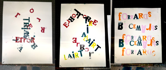
Considering David Carsons quote, I don’t think my word was particularly successful because the words are showing quite a literal meaning - trial and error looks like and was a trial and error, especially the first and backwards is literally printed backwards. But, as a process I think it was fairly successful, I did struggle with the correct amount of packing, sometimes it worked fine and other times it didn’t. If I did it again then I’d need to make sure my letters were the right way round when they needed to be, like the ‘d’ in forwards.
This work shop has made me want to continue working with type, whether that’s digitally or analogue, I know from this that print is almost definitely a process I’d like to keep doing.
0 notes
Text
‘Lost and Found’ - Part two, Screen Print
Robert Rauschenberg
‘Curiosity is the main energy’ - Rauschenberg
What does this mean? Curiosity is his motivation, it’s what drives him to do what he does.

This workshop involved 5 exposed screens each one colour; the screens had logos/signs, objects, statues of famous figures, different types and a blank screen (we’d need to use newsprint to block of parts of the screen - which we were encouraged to do on the other screens too). We’d each 20 minutes at each screen then have to swap round and print on the same pieces of paper as the previous print, it was up to us whether we used every screen for each print or not.
How does Rauschenberg link?
Like Rauschenberg, our screens had recognised logos/signs, objects, people/statues and so we were bringing real life things into our prints. We were also limited to colour and had to make sure we were layering the images - much like Robert Rauschenberg.

Printing
Process?

Expose the screen - coat screen in emulsion, stencil of art work, then expose (uv light) - the artwork stops the light getting through.
Put ink at the bottom of screen & flood - flooding is pushing the ink up at a 45 degree angle to push the ink into the holes (stencil), this means it’s ready for the next print and wont dry up as easy.
Put the paper under the screen where you want to print and pull the squeedgee back towards you, applying pressure at a 45 angle again - flood screen again.
My prints

Looking at Rauschenbergs quote, I think the second and third print are most successful, because there’s more going on - even though I’ve only used three screens in them all, I think the fact there’s more colour and it’s more scattered about suggests more energy, as for the second, everything being layered, mostly in one corner gives the sense there’s more going on than in the first and you have to look a bit harder to see the lime green in the back. The third print for me conveys a type of warning, there’s the sign in the back saying no parking and a gun with the word hint.
This workshops reminded me of the process of screen printing and shown me how detailed you can actually get the prints to be. I’d also like to continue experimenting this process with my own imagery and possible use this to create a final outcome.
0 notes
Text
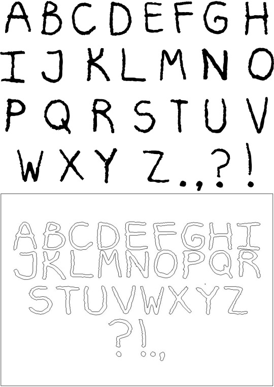
‘Lost and Found’ workshop - Part One, Typefaces

What needs to be included on a type specimen?
Upper and lower case letters, common punctuation (full stop, comma, colons, question mark, etc.), each letter needs to be the same size (cap height=upper case and x height=lower case) , maybe example sentences, the name of the typeface.
Task 1&2:
In our pair, the first material we were given was tin foil, I think we were one of the more fortunate pairs because the foil was quite easy to work with; it was easy to crease, fold, bend and it kept its shape really well which made it easy to create the right forms for each letter.
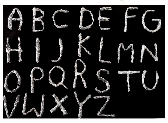
These were the letters after putting them in Photoshop and adjusting the levels. With the foil, we rolled/folded it into one long piece then bent them into each letter. This ended up being quite time consuming so we only made capital letters, but if I was to use these to create a type specimen then I would go on to create lower case letters and punctuation too. For the most part, I think the letters we made were all quite uniform and the heights were mostly the same - but I know this isn’t the end of the world because this can always be corrected later digitally, using Photoshop and Illustrator.
For me the foil letters communicate quite a futuristic or space feel, due to the silver and shininess. Next time I’d probably make sure that the letters are around the same thickness, as some are more 3D than others and some parts are really thin compared to other parts, but I think that could be something that’s embraced in the type as well. The letters forms are quite effective, they’re all easy to recognise and read and they all work side by side. I’d say legibility is important in a typeface, you’re creating an alphabet and so you need to be able to read and recognise the letters in order to make any kinds of words, sentences, etc., but readability I don’t think is as important - in the type specimen I think it is, as people won’t want it if they can’t read it but once someone has that typeface and uses it in the way they wish I don’t think so as much, because they might choose to layer it or change sizes which would make it more difficult to read.
Task 3&4:
When choosing the material I’d use to create my typeface (pipe cleaners), I need to consider if it was going to hold the form well or if it would just fall apart and was it going to be controllable enough that I can put in that form but still embrace it if it doesn’t hold or work the best. I didn’t think I would need any tools that were too complex, most likely scissors or a craft knife at most. I based the process on task 1, I liked the way I could just bend the foil once it was in the cylinder-like shape and so wanted a material that I could control in a similar way. I don’t think control is necessarily the most important thing but it’s definitely needed to some extent - if there’s no control it’s going to be hard to get a recognisable form.
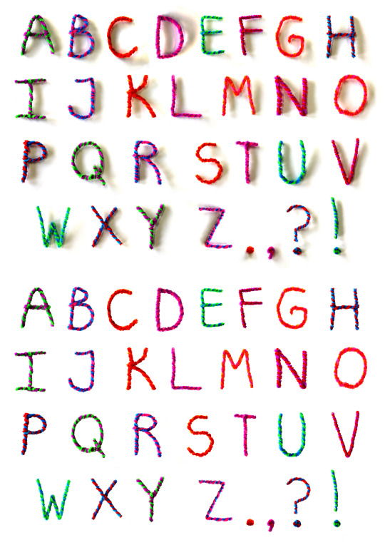
With the pipe cleaners, I twisted two colours around each other then bent them into the letters and punctuation, I thought this would make it much more interesting than just one plain colour. As a typeface before going any further than above, I think it looks quite child-like because of all the colours and pipe cleaners are something I’d associate with kids arts and crafts - so would be usable for somewhere like a nursery for example. I think next time I wouldn’t bother with the twisting as it just ended up being really time consuming and I don’t think in the end it would have actually made a big difference to my final typeface. Also if I was to create this again, I would definitely make sure my pictures had better lighting and were better quality, the shadows in the first image caused a lot of problems when trying to threshold the letters and so I had to remove them in Photoshop, which took up a lot of time, but I think the outcome looks much cleaner and more like an actual typeface.
After cleaning up the pipe cleaners, we had to threshold them and then put them into Illustrator (Ai) to adjust them. Although I had tried to make the letters roughly the same height/size, they needed to be made the same through Ai. Every character needed to be made separate and then adjusted.
The linework and threshold is what made me feel I didn’t necessarily need to twist the pipe cleaners together as it’s not something you can tells been done.
I’d say the letter forms are still just as successful and work well. The letters are easy to read and recognise and the once I’d adjusted the sizes I think they looked really uniform and like an actual usable typeface.
0 notes
Text
The connector workshop
This was our first workshop, there were 3 parts, being run by Charlie, Dave and Darren: two focused on drawing and one on photography. The aim of this workshop was to be able to change/approach the way we looks at and work with the objects differently; for example, I would usually just look at the object and draw from observation - photography would never be my first choice. It makes us interact and work differently with out objects, which could potentially push us to find new ways to work that we enjoy or that might work for an idea we have.
Part one.
The first part of the workshop was the photography being run by Darren. There were four different places set up to take photos, each with different kinds of lighting. Two would need flash and two wouldn’t.

These photos are the ones that didn’t require flash and so I was able to use my phone (to use flash the cameras needed to be synced up with the lights - this is something I’d learnt from doing the workshop). The top two photos are using only daylight, it was put closer to the window for this - I’d say the colours are more true to the actual items, but the rays of light (from the sun) shining directly onto the things does cause them to look just white. The bottom two look warmer to me, the lighting was more yellow/orange than the daylight, and I think being able to control where the light source is coming from means you can make sure the light is where you want it to be on whatever you’re photographing.
Part Two.
The second part was drawing with Charlie, we had to take quite an abstract approach to the drawings we created, like drawing with our non dominant hands or with our eyes closed using a continuous line. Doing these unusual things while drawing meant we removed any expectations we have for ourselves and so we’re not trying to make any of our drawings look a certain way or how we think they should look - nothing’s right or wrong.
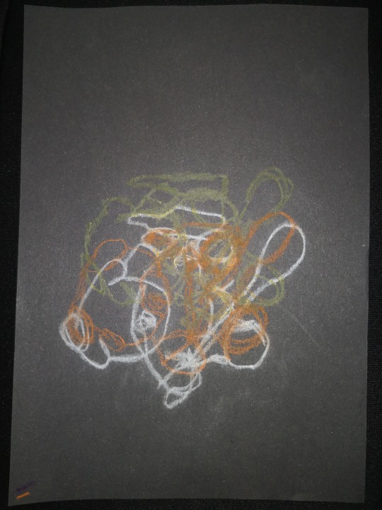
The first drawing: oil pastel and chalk, using continuous line.
We had to draw one of our objects three times, each time moving the the drawing over so it’s overlapped in different places. I like how this one turned out and the process itself was fun, however I wish I had chose different colours; I don’t think these colours work very well overlapped together, and the yellow not much at all as it didn’t show too well.
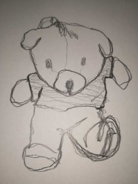
Second drawing: Pencil, non-dominant hand & continuous line.
This one for me was quite hard to draw, like the first, using a continuous line meant you couldn’t get any details in the middle, like the eyes and texture on the t-shirt of the bear. I mostly just used less pressure on the pencil where I didn’t want it to be as obvious as other lines.
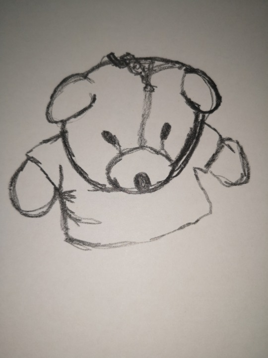
Third: Pencil, using continuous line.
This one was much similar to my second one, except I had much more control over the pencil - this made me draw slower because I felt I could and should be getting it to look as much like my object as I could, so in a sense, I prefer the second drawing because nothing was being forced and I think that shows.

Fourth: Oil pastel and pencil, with our eyes closed.
For this one we were only allowed to feel our objects and not look - we had to completely forget about form, which closing our eyes helped with. Although I don’t particularly like the outcome, it did help me get to know my item and what materials worked to show them textures; I think other peoples that covered the whole page did have an interesting outcome.
The words were written around after the drawing to describes the textures we’d tried to convey with the drawings.
Part Three.
This final part was still drawing but in a more traditional way. It was all materials and techniques I was familiar with, apart from some of the approaches were a bit different.
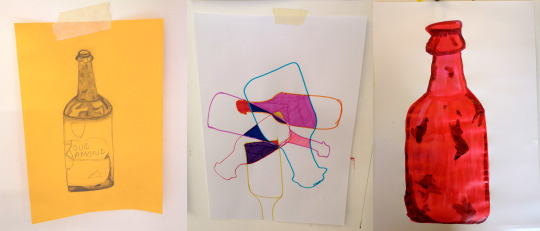
(From left to right)
The first drawing we had to use whatever drawing material we had handy to draw one of our objects as realistically as we could - I think this is because that the first thing people tend to do and it’s probably the easiest for someone to just draw what they see - it’s traditional. Then the second we had to draw only the outline (using markers), turn the page and draw it again - at least three times, then colour in the shapes where it over laps.
When looking at the first second and comparing, I think the difference comes in when it comes to detail; when drawing something to make it look like the actual object you have to consider and include all the details that make that thing what it is. The first drawing actually has elements of the object I object, where as the second one has no details so could be any generic bottle.
The third drawing needed to be a combination of the two so I kept the form simple and block colour for the most part; the colour I chose was a bright red/pink ink as the second drawing only used colour. To take something from the first too I used to black ink to create some marks/stains that were on the bottle.
Overall I think this workshop really helped to push me out of my comfort zone in terms of working and the work environment. The space we had to work was where everything was happening, so all three courses were in there and there was a lot going on and I feel I don’t always work to the best of my ability in these situations. The drawing side of things were something I’m not used to but that I like the majority of outcomes for, I think a lot of them worked well and I enjoyed them for most part - I’d definitely consider using some of these processes again as exploration of objects or materials.
0 notes