
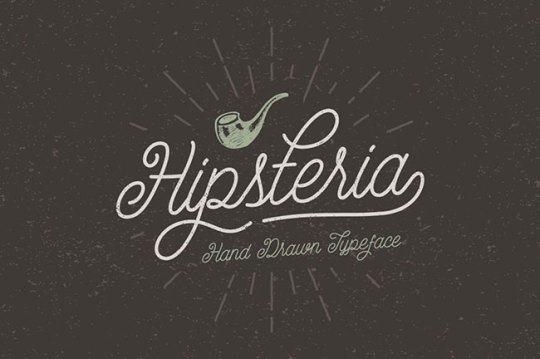
somefacesforbooks
some faces for books
Not to be confused with another book containing different kinds of (not type) faces.
42 posts
Don't wanna be here? Send us removal request.
Last Seen Blogs

corruptedcaps
CorruptedCaps

casorolls
Still beautiful, Still Dean Winchester

lovingmakerbonkherring
제목 없음

tentakitten
Tentakitten

konyvklub-2-videa-film
FILM ▷ Könyvklub 2 A következő fejezet Teljes Film Magyarul
Photo

Deals of the week: Amazing Fonts & Font Bundles:
EXCLUSIVE Script Font Bundle: 10 Gorgeous Typefaces - only $27!
Sensational Script Font Bundle that’s just bursting with goodwill and cheer! Loaded with 10 fantastic, high-quality font collections, you’ll add a real aura of fun, professionalism and class to your designs. This Exclusive Font Bundle includes 10 beautiful script font sets that range from whimsical to incredibly high class.
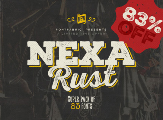
NEXA RUST - Mega Pack of 83 fonts (5 sub-families) - only $47!
Nexa Rust is a super pack of 83 fantastic fonts! A multifaceted font system consisting of 5 font sub-families, you’ll get your hands on various font weights and even a few spiffy extras to really spice things up!
Fontfabric Font Bundle of 90+ Fonts - only $29!
With just 1 deal, you’ll get yourself more than 90 different fonts! You’ll get yourself some of the greatest Sans and Art fonts around. These 18 unique font families are delivered to you all in an .OTF file format.
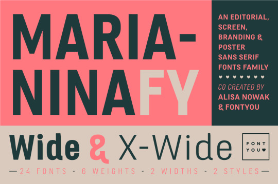
Marianina Extended Font Family (24 Fonts) - only $27!
The Marianina Extended Font Family is a beautiful, contemporary sans-serif typeface. With 6 different weights and 2 unique widths, all offered in regular and italics styles, you’ll get yourself 24 different fonts!
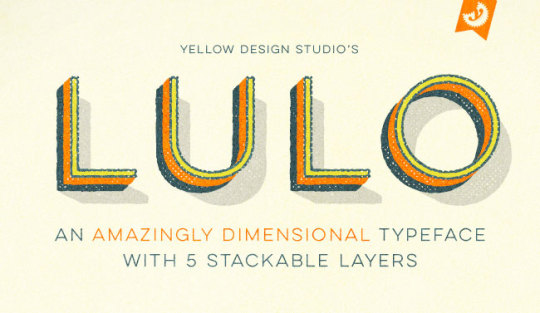
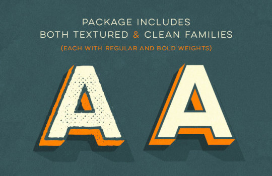
FONT BUNDLE: Lulo Font Families (textured and Clean) - only $14!
Versatility and depth. That’s the best way to describe the high-quality, professional Lulo Font Family. This deal from Yellow Design Studio brings you all 20 Lulo and Lulo Clean typefaces in all their textured, 3-Dimensional glory! Easily customize these fonts by adjusting colors in each of the 5 stackable layers.
The Design Blog: facebook | twitter | pinterest | subscribe
322 notes
·
View notes
Video
Mike Parker was one of the modern giants of type, responsible for rather a lot:
For more than 50 years, print historian and industry leader Mike Parker has been shepherding the development of typography: from hot metal, to photocomposition, to digital. As Director of Typography for Mergenthaler Linotype, he managed the production of more than a thousand typefaces. In 1981, he and Matthew Carter co-founded Bitstream, the first all-digital type company. And in 2000, Parker joined David Berlow and Roger Black at the Font Bureau as a consultant, type historian, and type designer. In 2009, he released Starling, a new typeface series based on the 1904 proto-Times Roman designs of Starling Burgess.
Deep among the more than 1,000 typefaces he brought into the canon (and into popularity) while at Linotype on are some of the modern classics we all know—perhaps the most memorable of which is Neue Haas Grotesk, better known as Helvetica.
Mike Parker was 74.
1 note
·
View note
Link
Typography and font choice is often used to create a sense of futurism in movies. Indeed, it’s got to the point where you can set your calendar to FUTURE simply from the presence of Eurostile Bold Extended on the wall of a passing spaceship.
This site is dedicated to typography and iconography as it appears in sci-fi and fantasy movies and TV shows. It’s inspired by the Typeset In The Future trope I added to TV Tropes.
1 note
·
View note
Video
youtube
Gizmodo:
While we now take crisp-looking typography for granted, it wasn't always that way. Back in the 80s, low-res fonts looked dreadful—but fortunately two men changed all that.
When John Warnock and Chuck Geschke left Xerox PARC in 1982, they had with them years of experience in computer graphics, laser printers, fonts and design. In time, they set up Adobe, developed the PostScript typography language, and solved the problem of hideous fonts for good. In this video, Professor Brailsford from the University of Nottingham tells their fascinating story.
0 notes
Photo

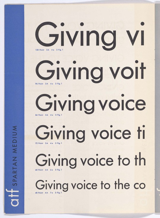
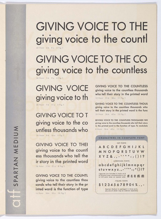
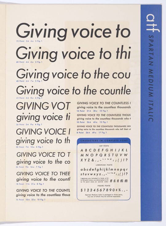

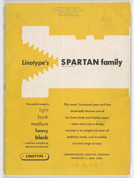
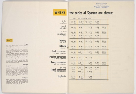


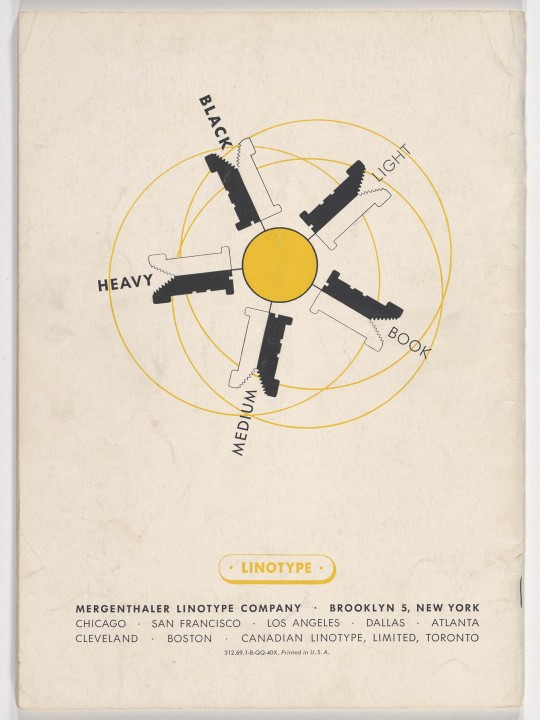
Spartan, produced in the late 1930s, was Mergenthaler Linotype and ATF’s knockoff of the extremely popular Futura (Bauer). If you see Futura in a magazine or newspaper published in mid-century America, there’s a good chance it’s actually Spartan (or the other followers: Twentieth Century, Tempo, or Vogue). As is the case with many imitations, Spartan offered some things the original did not: such as a double-story alternate ‘a’ (shown in the Linotype specimen), special “Advertising Figures”, and unique “Classified” cuts (released later) for very small type. The originality of the Classified fonts could explain why they are the only styles available in digital form. For a digitization of Spartan that emulates a rough printed impression, check out Mark Simonson’s Metallophile.
The images above are excerpts from the complete specimens found in The Silver Buckle Press Collection at the University of Wisconsin. Direct links: ATF specimen, Linotype specimen.
326 notes
·
View notes
Video
vimeo
During my service in the Korean military, I worked for two years as special intelligence personnel for the NSA, learning first-hand how to extract information from defense targets. Now, as a designer, I am influenced by these experiences and I have become dedicated to researching ways to “articulate our unfreedom” and to continue the evolution of my own thinking about censorship, surveillance, and a free society.
Created by an ex-intelligence officer and acting like a CAPTCHA in your type library, ZXX is a font family designed specifically to be illegible to computer reading (optical character recognition) software and is available as a free download.
0 notes
Photo

“OpenDyslexic is created to help with some of the symptoms of dyslexia. Letters have heavy weighted bottoms to indicate direction. You are able to quickly figure out which part of the letter is down which aids in recognizing the correct letter, and sometimes helps to keep your brain from rotating them around. Consistently weighted bottoms can also help reinforce the line of text. The unique shapes of each letter can help prevent confusion through flipping and swapping.” This new font was developed specifically to help those with dyslexia.
940 notes
·
View notes
Link
Google Web Fonts is now just Google Fonts, finally acknowledging that most of the fonts they've been commissioning are among the best free fonts for web or print out there today.
0 notes
Photo
A new article on I Love Typography explores a 30 year old East German typeface that, in many ways, is one of the first screen fonts as we know them today, Videtur, and its recent rebirth.
In the 1980s, the German Democratic Republic’s state television broadcasting service commissioned Axel Bertram to develop a custom typeface. The result was “Videtur,” a remarkably independent serif design that was intended to define the on-screen graphics of East German television for years to come. But by the beginning of the 1990s, the GDR no longer existed. With it went its state broadcasting service – and Videtur, too. Another 20 years in the now reunified Germany would have to pass by before Andreas Frohloff could finally help bring a modernized FF Videtur to market.
0 notes
Quote
Today in Typographic Nerdery – Magic: The Gathering cards and Monocle magazine use the same typeface. Plantin: the font for everyone.
Frank Chimero on Plantin
1 note
·
View note
Text
Constructing books
An incomplete guide to everything you might ever want to know about fancier binding techniques
To say there's many of different ways to bind books might give you the impression that there is some upper limit to that number. There isn't. To fall back on the initial metaphor of the class, there are as many book construction techniques as there are ways to build a house—or a blue condominium building with rough-faced cinder blocks on two sides. Here, though, are a few of the most popular and prominent techniques for book binding and the guides to using them. Do read this guide thoroughly well before you print, as it almost certainly will alter the way in which your design will actually be output.
For those working with signatures whether with a hard or perfect bound cover, follow this guide as it goes. For those considering stab binding, skip to the end.
Sewing signatures (along with extra information for hardcovers, if that's the route you wish to take)
More than likely, whether you want to or not, you'll have signatures as your final output from InDesign just due to your page counts. If you're using signatures—regardless of how you'll actually be constructing the cover—the initial process remains nearly the same. First, make sure your page count is a multiple of the number of pages in a signature (signatures of a variable number of pages are messy—don't take on that challenge quite yet). In essence, it's one of saddle stitching each signature, but with actual stitching*. I've actually found this guide to be immensely helpful for the basics—the images are shown below, but you really should click through to view the guide in all 32 glorious photos with descriptions of the actions happening in each.
Depending on how you want to progress with your book, you might choose to ignore anything relating to the bands—which hold the book block to a hard cover—and instead finish by sewing the signatures together. A thinner thread and a minimal knot is advisable for those of you considering perfect binding, as they're far more visible there than against a more solid spine.
For those wishing to learn more about hardcovers, don't ignore the bands (although those bands are kind of gnarly—a simple band of fabric tape is generally preferred). Press on with this guide until the bitter end and you'll have a wonderful hardcover treasure to sit proudly on your bookshelf.
Does this signature assembly demo have you in stitches (in a bad way, which I guess is not how that phrase is normally used, but whatever)? Check YouTube for more demos of how to sew and assemble signatures. If you're interested in the dozens of different, awesome hardcover bookbinding methods, YouTube has answers for you there, too.
Perfect binding: not just for perfectionists
Once you have your stitching done, the time has come to actually put a cover on your book. But wait! Your cover isn't in your actual page flow anymore because, in perfect binding, it wraps around as a single sheet. Make sure to take the front and back cover out of your file, replacing them with something else. I might suggest a second title page, which I almost certainly guarantee you found in other books you looked at for research. You might create an index for the back, or split up some of your museum-related information a bit more, or create something else totally fictional. You could even leave a few rear pages totally blank, as is not uncommon.
So, with your pages printed and stitched per the above guide, get to gluing! This is a pretty solid video tutorial I found that lets you use materials you already have lying around, like binder clips and art history textbooks and bricks (please do not take the bricks that make up the walls of this building for bookbinding).
Once you have the initial block of signatures glued together, then it's time to finish your cover. I'd wait to print it until here, because you'll far more easily be able to set up your cover this way. Use a spine calculator like this one to figure out how big your spine should be based on your paper weight and number of pages, but check it against the actual width of your assembled spine to be sure. I'd suggest setting your cover up as a single page with thin crop markers in the bleed or slug for where the spine should be (as the video suggests, leave a bit on the sides for safety and for the space taken up by the binding thread). Then, print that thing as a whole sheet on a good piece of cover stock. Fold it with a bone folder and glue it as the video instructs.
Voila! Perfect binding done perfectly!
Is perfection still not enough? Check YouTube for more perfect binding demos.
Stab binding: for single sheets, the best way to go
Maybe you can't print signatures because of the stupid page resizing bug that breaks Print Booklet in InDesign. Maybe you like having your cover in your file. Maybe you just want a book that is a little more honest about how it holds itself together. In any and all of these cases, stab binding may be the way to go.
Why not glue pages together, you might wonder? The signatures hold themselves together through more than just glue, for one, and for another, glue ages, cracks, dries, and does things which are not necessarily amenable to heavy use. There's a reason page a day calendars and postcard books are set up this way—the pages will fall out eventually.
Stab binding creates a cover by wrapping around the page block with thread, leaving part of your page area beneath the binding. This is one of the most important concerns when considering this method: that it requires a significant inner margin and will undoubtedly alter your page size rather a lot. An inch is what the video suggests, but somewhat less than that can still work. Be sure to either alter your design with that in mind or be prepared to crop your book with that in mind. Once your single sheet pages are made, follow the tutorial below to set up your binding. Once that's done, you'll have a book that looks as good as it works.
For far more information than you could ever require, check YouTube for more stab binding demos.
* I've seen some perfect bound books that do use staples to hold together signatures, but this often looks crummier than it should. If you're careful with it and don't have the time or the skill for actual stitching, though, it might turn out okay.
7 notes
·
View notes
Photo
Perhaps it's fitting that we should end this exploration where it began: on that greatest of all time-wasters, Facebook.
Klavika, once Facebook's all around display typeface of choice, has recently seen its use drop as Facebook has evolved from edgy tech startup to lumbering social media giant. It had never made its way into the interface beyond the modified version in the logotype, but even in the site's many splash sites, it's use has all but disappeared. Audience may well have something to do with it—after all, with a billion users, comforting may be better suited to chats between family members than edgy is. Klavika's pointed edges, too, are evocative of old fashioned cell phones of the kind that hardly anyone carries anymore. Facebook's new primary medium is the smartphone and so even in the latest desktop site redesign, the Facebook logotype has been reduced to little more than what's on the homescreen of an iPhone: the minuscule "f" in a color field.
On those splash sites, Klavika's heir seems to be a lesser known typeface called Freight Sans Pro. With the launch of the Facebook Stories blog late last year, Fonts In Use guessed that the choice was made because Lucida Sans & Grande, Facebook's preferred UI type, were specifically for small sizes and lacked decent display options. With the latest redesign placing the Lucidas out to pasture in favor of Helvetica, perhaps the better reason is that it just worked and blended well between them.
As designer Joshua Darden describes it, Freight Sans "eschews mannerisms of form in favor of a studied balance of organic and geometric shapes," giving it a feel that blends well with a variety of type. By their own admission, its softened angles and rounded curves offer a " warm formality in text and an authoritative, helpful tone in display." More importantly, it looks as good in body text as it does at small sizes—something that screen type only recently began to consider as important with the advent of the 300 ppi display.
Perhaps because of being featured on one of the most heavily visited sites on the planet, this typeface can now be found in dozens of places across design. Both Medium and Svbtle, two recent curated blogging services, use it in various capacities across their sites. Freight Sans is also part of a serif-rich superfamily—and, in this case, it really is quite super: comprised on the serif side of an extra large display variant, a more traditional display variant, a text variant, and a strange-looking-at-large-sizes-but-it-sure-will-print-nicely micro-text variant, as well as a condensed sans-serif, it's one of the more complete groupings you could get today. Hard to believe that the earliest of any of these is from 2005.
Also hard to believe: the price. Don't ask what getting all of these together might be, because if you have to ask, you can't afford it (and I know I can't). Part of me is surprised to offer this as the lower cost alternative, but Proxima Nova—a modern classic that, as the text describes, "straddles the gap between typefaces like Futura and Akzidenz Grotesk" with its semi-geometric humanist curves, shares many of the same concepts and appearances as Freight Sans, but with slightly more legacy behind it and a considerably lower starting cost, with single fonts costing on average $15 less than their Freight counterparts. Unfortunately, with that comes a family that isn't quite as super; there's a rounded version, but that's about it. On the free size, Ascender's lovely Open Sans does a decent job where either of the others might work but can't, and has enough weights and styles to at least keep you from wanting for extras for a little while; Lato's wide counters and geometric curves remind me a bit more of Freight, even though it lacks a bit of the precision of its paid counterpart.
1 note
·
View note
Link
We all need to use them but hardly any of us know how to type them. Here is a brief guide of how to type smart quotes and accented characters (and dashes) on a Mac. If you’re on a Windows computer or some nerdy space machine, I’d recommend googling “keyboard commands for accented characters”. If you use a non-English keyboard, you probably already know how to find all the accented characters you need. Made by Jessica Hische for your enjoyment and enlightenment.
0 notes
Photo

The word "grotesque" was first applied to a typeface by William Thorowgood, who used it to describe a new 7-point Egyptian (as was the preferred term for the sans-serif, coined by their creator, William Caslon IV, only a few years earlier in 1816) he had made in 1832. What was most notable about that typeface wasn't the use of the term, though. It was that it was the first ever sans-serif to have lowercase letters. Given that fact, it shouldn't be a surprise that even he may have felt a bit disturbed by the monster he'd created.
That monster, though, is what serves largely as the basis for our modern typographic landscape, full of a wider variety of type than was ever imaginable then. Often daunted and nearly wiped away completely during the 1980s' obsession with seeing Helvetica on every surface, Grotesques have persisted and have in many ways made a resurgence in the same way serifs have. Like many of the serifs we looked at last week, part of the reason is due to newspapers taking more of an active interest in design, and it's in headlines and dense type layouts where Grotesques work best.
Monotype Grotesque, surely one of the classics and a personal favorite of mine, is great. Arial, which is decidedly not great, is based on it, with its letterforms twisted and squished to fit Helvetica's metrics rather than its basis. Despite this, or perhaps because of it, Grotesque MT carries on into the present, its distinct and intriguing weight shifts and compressed/extended variants making for lots of enticing compositional possibilities. It's frequently made a bit of a comeback—many galleries use the tracked out compressed versions paired with their more useful normal-width brethren.
Hoefler & Frere-Jones have lots of grotesque-esque typefaces to choose from as well that exude all the beauty of the era of wood type from which the grotesque as we know it emerged. Champion Gothic, with a nice set of options within its family, leveled up to become the more popular and distinctive Knockout. Neither, though, are terribly versatile, lacking options suitable for text and basic variations like an italic. If wide is more your style than the variations on the theme of condensed that the previous two options are, H&FJ even have Leviathan, a wider woodcut revival that does actually include a quite stylish italic with it.
Founders Grotesk is stylish, slightly cheaper than Knockout, and looks good as well. Fans of local artist/writer/musician/filmmaker Miranda July may recognize it from the cover of her recent book/project It Chooses You.

A more contemporary grotesque, Geogrotesque wrenches the form from its cold metal and wood origins into the digital age. Its slightly rounded terminals remind slightly of Klavika, as do the squared proportions, which feel like vector re-drawings of the type of bitmap typefaces you'd find on phones five or ten years ago. It even has a stencil variant, presumably for the cover of a high-fashion digital-art-meets-graffiti Taschen book.
All those options, though, are rather far above what most students feel comfortable paying for type (and some are above what I even feel comfortable paying). Grotesques by and large are expensive, perhaps simply due to their sheer unbridled unpopularity with the masses. There are a few options if you must have one: buying through FontShop with your .edu email address and entering the coupon code EDUCATE10 will knock 10% off the regular price for students (HOW DID I NOT KNOW ABOUT THIS).
If even that's too rich, though, Omnibus Type's Chivo neogrotesque—available free through Google Web Fonts—captures at least some of the feel of Leviathan and Champion's wider variations with no money down. Their Archivo family too, both in Narrow and Black, gives more options and peels away some of the more wild things happening in Chivo.
0 notes
Photo

Hey, sophomores!
The schedule for review and info sessions for the 2013 review is now available and is helpfully reposted above for your scheduling concerns. The first info session is coming up next week on Tuesday in right next door in room 160 of the Annex at noon, with another session on Wednesday—same bat-time, same bat-channel (by which I mean location).
If you're thinking at all about review, and I'd guess you are, getting into one of these ASAP to learn all you need to do to succeed is highly encouraged.
0 notes
Photo
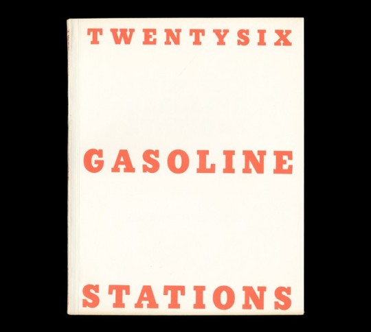
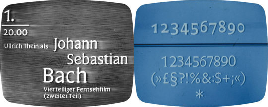
Due to our slightly reduced schedule (which is to say, the exciting things happening on Wednesday) and the fact that exhibition catalogs and the like are often hard to find good covers of, I thought the best thing to do would be to share with you a great source for them that not only picks out some of the best material from lots of industries—including art—but links to the specific typefaces used: Fonts In Use! The site has dozens of classic and contemporary materials from art exhibitions and breaks down explains what typefaces each is actually using.
Pictured above is Ed Ruscha's Twentysix Gasoline Stations, part of a series of small artist books he created in the 1960s and set in (a slightly modified version of) Stymie, a great slab serif that works as an alternative to other geometric-y slabs like Rockwell, Memphis, and Glypha. I can only imagine Stymie made it to the digital age because of Ed Ruscha's use of it, because it's name isn't doing it any favors.
0 notes
Photo
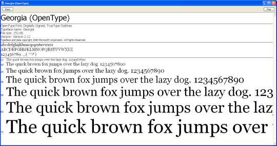
Why is it that Georgia works so well on screen, but looks listless and bizarre when actually printed? And why is it that many typefaces that print fine seem not to look it when you're actually using them?
The answer is simple: some of them are cheating. But how they're cheating is interesting because, frankly, the cheat is one that's been with typography for almost as long as there's been typography at all.
Even though we tend to think of fonts as being simple, infinitely rescalable vector outlines, that isn't strictly true. Many fonts are made of different sets of vectors specifically tuned—or, to be more precise, hinted—to look good on screen. At first, this was just to make fonts break down more cleanly into solid pixel lines, but when smoothed on-screen type appeared, nearly everyone kept at it. If you're on Windows, you may notice that nearly everything but the core set of typefaces look awful, which is because Windows' ClearType rendering system is really meant to push those hints even further. OS X still does this as well, but overcomes it slightly by choosing a type size larger than it should and scaling it back down in an attempt to look more crisp.
Why do both do this? Because of your screen's resolution. A seven point size on screen at 72dpi has much less detail than in print at 300 or more. All those fine details that make type work at different scales would be either lost or making the letterforms look like a smudgy mess.
But this cheat isn't new, as I mentioned earlier. Nearly every pre-digital typeface has some relic of this in its past (and some, like the different scales of serif based on intended usage like we looked at last time, still do) simply because of the way they would be used for print.
Things like dot gain were much more prevalent in early printing and typographers had to be conscious of the fact that the thicks and thins of their letterforms would either not stand up when shrunk down or smear together. Since they had to use different type blocks anyway and go through the trouble of redrawing at different scales, it made sense to make each typeface adapt itself to each size change as needed. In some cases, there would only be one point-size option to work with and, if you wanted to go larger or smaller as a printer, you'd have to find an alternative set of type to suit your needs regardless of similarity to what you'd used before.
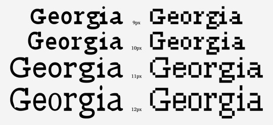
Early bitmap typefaces employed this same system—each one had to be drawn at specific sizes and using them at sizes above or below what was offered was impossible. Chicago, the old system font for the Mac and the iPod, was only ever drawn by its creator, Susan Kare, to be at 12pt. When type first became digitized as vector outlines, though, a whole new world of non-adaptable but entirely scalable type became available. Any size could be used anywhere, regardless of how well it stood up. I Love Typography explains this a little better:
Before digital typesetting and offset printing, there was the letterpress. A typeface was composed of fonts, one font for each size. These size-specific fonts consisted of individual letters made from metal alloy. Single letters were placed by hand to create words, words were aligned into sentences, sentences were stacked to make paragraphs, and these were inked and pressed into paper. As a printing process it is fairly basic. Woodcuts and potato stamps use a similar method.
However, cutting a 7-point lowercase ‘g’ takes a lot more skill than making a smiley-face potato stamp! The old masters of typeface design spent decades perfecting their craft. Each font of type was designed to work at a specific size. For instance, when Bodoni needed a font for text size, he cut a font at 9 point. When he needed a larger size for headings, he cut another font at 36 point. The 9 point worked beautifully for text and 36 point worked for display. If one were to blow up the printed impression of the 9 point to the same size as the 36, the differences would be readily apparent. The 9 point has sturdier details: the serifs are thicker, the contrast is lower, and the spacing is more generous. The 36 point has much finer lines and the spacing is tighter. This is as much a technical consideration as an aesthetic one: the 9 point needs to be sturdier to withstand the printing process. If the details are too fine then the metal will quickly wear or serifs will break off when pressed into paper.
This practice takes on new meaning when we consider that there can never be a definitive Bodoni, Garamond, Jenson, or Fleischmann typeface, as their oeuvres consist of a multitude of single, size-specific fonts. It is like mashing up Othello, King Lear, Hamlet and a touch of The Tempest and publishing it as ‘The Shakespeare’.
Why is this relevant? Well, in the rush to adapt to digital typesetting technology, type foundries digitised classic typefaces. The nature of digital fonts is to use one outline and scale as desired. Typefaces went from being cut in a multitude of sizes to a single, all-encompassing outline. A digital typeface can be optimised for a few sizes, but hardly for all. Bembo, for instance, is a digital copy of a metal interpretation of an original typeface cut in 1495 – a copy of a copy. So, the process of digitisation poses a problem: which point size should be digitised?
The answer, unfortunately, isn't a good one: whatever the typographer likes, meaning that that not every typeface looks good or even acceptable at most point sizes. To preserve one detail, the typographer doing the redrawing had to abandon some other characteristic. It's why most Didones don't hold up to scrutiny at small sizes like they once were able to (because most who redrew them liked the contrast in stroke weight more in a slightly larger point size) and why text for body doesn't hold up nearly as well in
All this comes down to is this: if you haven't printed your type choices, you don't really know what they look like. Your screen is lying to you and has been the whole time. If you're working out typeface options, why not do a type study? It may not be fun, but at least it's more honest than our friend Georgia is.
2 notes
·
View notes