southeastgallery
SOUTH EAST GALLERY
PHOTOGRAPHY/ PAINTING/ PRINTMAKING
165 posts
Don't wanna be here? Send us removal request.
Last Seen Blogs
tuldoksociety-blog
arvie guardian

pizatt
Untitled

zerogpt4
ZeroGPT

angelica1234sworld
Untitled

ovenstream0
The Journaling of Mcgowan 456
Photo
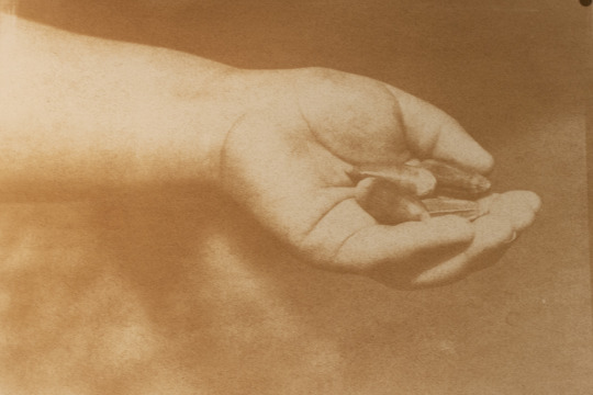
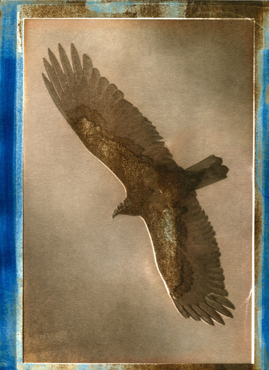
Paper: Fabriano Artistico preshrunk in hot water
Sizing: pva
Ratio: 1:3
Pigment: M. Graham Artists' Gouache
This print has a cyanotype base with a gum print on top. I really like the way I can control the pigment from the gum print without losing the definition in the cyanotype. I do wish I would have made the burnt umber on top of the cyanotype a little lighter. Besides that, I was pleased with this last process.
0 notes
Photo


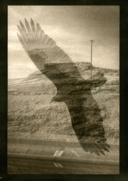
First image on the top:
Paper: BFK Rives preshrunk in hot water
Sizing: Gesso
Ratio: 1:6
Pigment: Watercolor
The first attempt at this print I had a couple problems. The first being the paper that left a speckled effect on the image that I’m not too partial to. The first layer on the photo is burnt umber and the second is a layer of phthalo blue.
Second image on top:
Paper: Fabriano Artistico preshrunk in hot water
Sizing: pva
Ratio: 1:3
Pigment: M. Graham Artists' Gouache
The next image has the same layers as the first plus a layer of red on top. I was going to add one more layer of blue on top of the red as the red overpowered the blue layer.
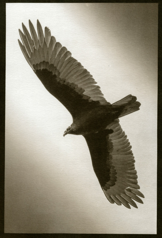
The last image was the final print I worked on with the California Mugwort. This image was a little different as the base of the image is a cyanotype instead of a gum print. I found this process works to give a denser more well-defined base to put color over giving the additional layers on top more vibrance and definition. This was my favorite process overall and wish to explore further combinations in the future.
0 notes
Photo

Paper: Fabriano Artistico preshrunk in hot water
Sizing: pva
Ratio: 1:3
Pigment: M. Graham Artists' Gouache
This print only has one layer of burnt umber. I was hoping to put at least one more layer of phthalo blue.
0 notes
Photo

Paper: Fabriano Artistico preshrunk in hot water
Sizing: pva
Ratio: 1:3
Pigment: M. Graham Artists' Gouache
After trying the 3 color RGB process I decided I wanted to work with a different palate of colors. I decided to use burnt umber and phthalo blue to give me a look I wanted to achieve. When previously exploring cyanotypes, I wanted to combine them with van dyke brown prints, but the results were too unpredictable. Now with the ability of gum printing I was able to control the color better and chose where I wanted more of the certain color. The first layer on these prints are burnt umber and the second layer is a light exposure of phthalo blue. Overall I like this print and me made want to explore this process further.
0 notes
Photo

Paper: BFK Rives preshrunk in hot water
Sizing: Gesso
Ratio:1: 10
Pigment: Daniel Smith Watercolor
This image gave me trouble, but it was also my first attempt at a gum bichromate print. I used too much pigment in my sensitized solution, and it did not was out like I would have hoped. paper was not properly shrunk, and the registration was off. Time of exposure was about 2 minutes on each layer
0 notes
Text
Ryan Christopher Jones
Ryan Christopher Jones gives me a different perspective on photojournalist. Typically, photojournalist and mainstream media don’t rub me the right way as I see their profession often exploiting their subjects for shock value. While not all photojournalist fall under this category, I feel like the majority do. Jones on the other hand respects the subject behind his lens. I feel like when working with extremely sensitive and emotional subjects complete respect and discretion should be used. A first thing that stood out to me during the lecture was the way the illegal housing in queens story turned into a more personal piece about an individual person. I feel like Amado Sanchez struggle is a common one with migrant workers making it important issue to know about. In a sense Amado is speaking for the illegal immigrants that are to scared to tell their stories for fear of reprisals from the authorities. I also really liked the way Jones uses different photographic styles to express certain situations and feelings. For example, the way he comes in close for the photograph of the stove, as not to show too much of the scene protecting the tenants and the location, or the way he takes a city photograph to show us a sense of scale within the community. This is something I would like to explore in my photography as I believe it will make my work completer and more thoughtful. Overall, I enjoyed the lecture and it made me think a lot of how one approaches their subjects in a respectful and humanizing way.
0 notes
Photo

Paper: Canson xl watercolor
Double coated
Similar to the previous images they came out too dark and dull looking. I believe there's something I can add to bring that light quality back. Further exploration needed.
Exposure: top: 4mins
Bottom: 3 mins
0 notes
Photo

Paper: Canson xl watercolor paper 9inch x 12inch
double coated pre shrunk paper
exposure: Top: 3.5 mins
Bottom: 4.5 mins
These images came out a little too dark but over all I like them. The screen does add a lil more luminance than exist in the prints as the print looks flat and kind of dull for my taste. I'm going to try applying a light gloss to see if it brings some of that luminance.
0 notes
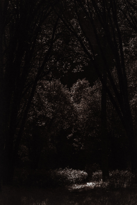
Photo

This is the van dyke version of the last cyanotype. it was way too flat and needs more contrast. I'm kind of liking the painterly borders too.
0 notes
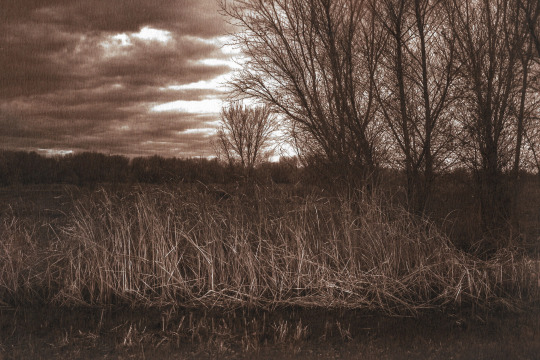
Photo


Paper: Canson xl watercolor paper
double coated paper not pre shrunk
Overall these images came out the best. The first two images exposed in 4 mins in the sun. There was some minor issues with the cyanotype chemicals but nothing major.
The bottom two images are meant to be van dyke brown prints. Originally the negatives are made for that process but they came out to flat. I didn't want to waste the negatives so I tried a cyanotype and they look good. Exposure: 14 mins/ indoor
1 note
·
View note
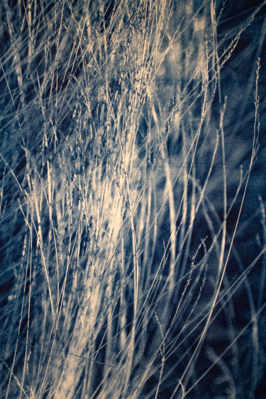
Photo


Canson xl watercolor paper 9 inch x 12 inch
Double coated paper not pre shrunk
Exposure time: top: 16 mins/ indoor
Bottom: 4 mins/ sun
I used a similar curve to the first curve but toned down a bit. This batch of paper all had ugly chemical marks so I'm guessing the cyanotype chemicals were contaminated.
0 notes
Photo

Paper: Canson xl Watercolor Paper 24 inch x 18 inch
Double coated pre-shrunk paper
Used the curve by Jim Read https://www.alternativephotography.com/?s=curves
The curve worked well but the highlights kept blowing out. Next time I will use the same curve but lower the highlights to get a better tonal range. the size of the images also gave me some problems as the negative was lifting in some areas giving a soft effect I don’t care for. The solution would be to make the images on a suctioned light table.
0 notes
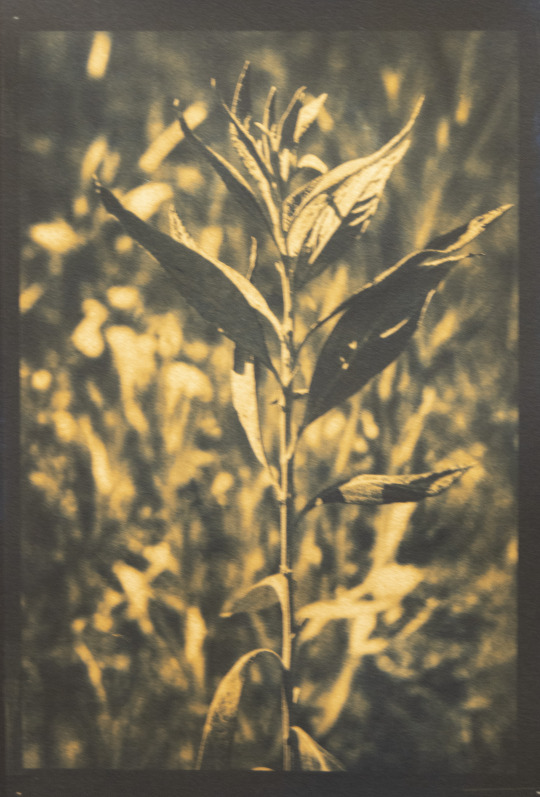
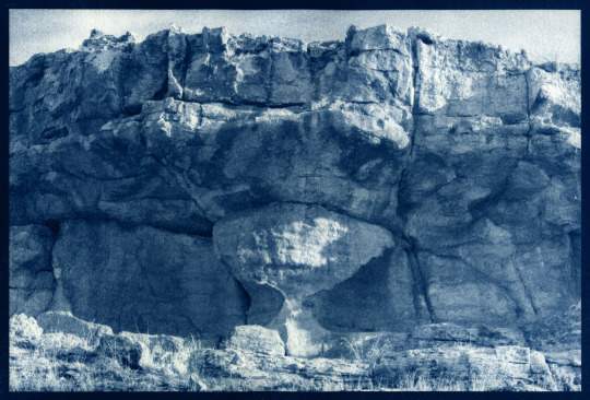
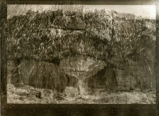
Photo
Van Dyke Brown on Cyanotype, Double exposure Van Dyke Brown, Van dyke Brown
0 notes
Photo

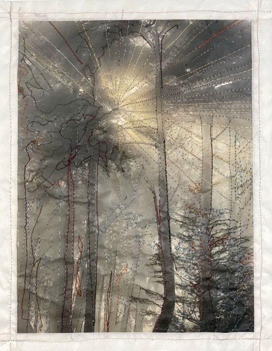
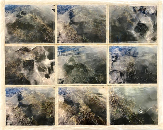

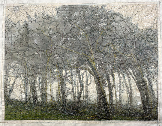
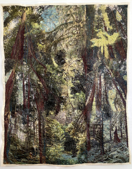
Charlotte Schmid-Maybach
Charlotte Schmid-Maybach is a Los Angeles based Multimedia Artist. She received her MA in Photojournalism from the University of Missouri in Columbia then began her career photographing as an archeological photographer in Pakistan. In addition to photographing in Pakistan she was a photojournalist for 15 years. Recently Maybach has begun to show work in galleries and her career has really kicked off since the start of the pandemic in 2020. The series that particularly was drawn to was the Phototapestries series called Altered Landscapes. The work consists of inkjet prints combined with embroidery and a thin layer of acrylic medium. The thread she uses is mostly metallic and gives great depth to her work. I was particularly interested in the paths that the threads seem to form. They remind me of the interconnectedness between all living things through a network of fungus or roots that connect all. In her statement she adds that as sewing is typically associated as being a woman’s job, she wanted to elevate it to a higher art form. This brings another layer to her work. Making her an up and coming artist that has more to say.
https://www.charlotteschmid-maybach.com/phototapestries
0 notes
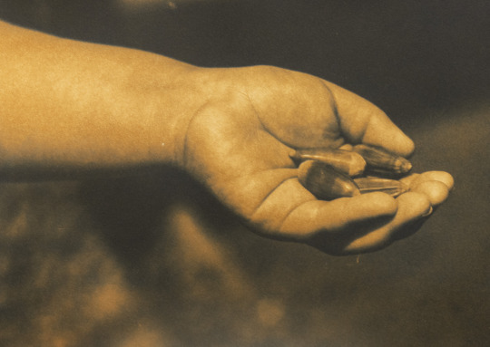
Photo

Yokut Kitchen
Van Dyke Brown on Cyanotypes, Cyanotypes, double exposure Van Dyke Brown
0 notes
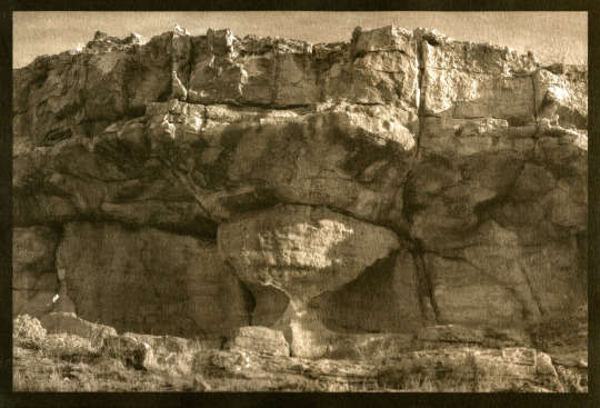
Photo


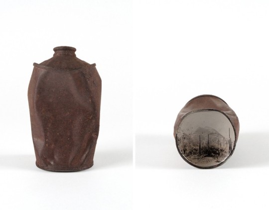
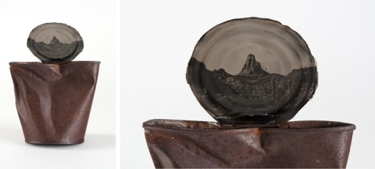
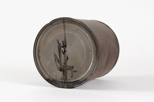
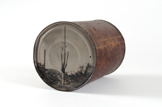
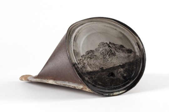
David Emitt Adams
David Emitt Adams was born in Yuma Arizona in 1980. Living in Arizona Adams was no stranger to desert landscapes but as he explored the desert, he couldn’t help but notice the traces left behind by man. He quickly began to see the desert landscape as something different than the desert landscape that was portrayed by photographers like Timothy O’Sullivan in the 1860’s. Adams began to create photographs with a wet collodion process that allowed him to print directly on to found desert objects. The series I examined is called Conversations with History. I find his methods intriguing as he’s connecting man directly to the landscape by using someone’s garbage to describe the intrusion of man on nature. This forces viewers to think about these wild desert landscapes in a different light. More than just a dumping ground for humans, the desert is complex ecosystem that deserves our respect. The images themselves are beautiful and the symbolism they carry is powerful. These pieces of art work can potentially bring awareness to desert conservation, reminding humans that our trash doesn’t disappear simply by dumping it in the desert.
http://www.davidemittadams.com/portfolio/traces/
9 notes
·
View notes