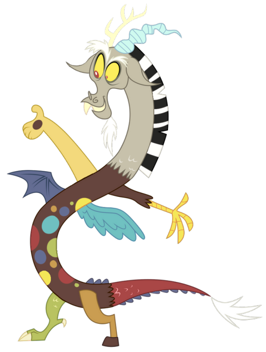
#It's a little scary guys
Text
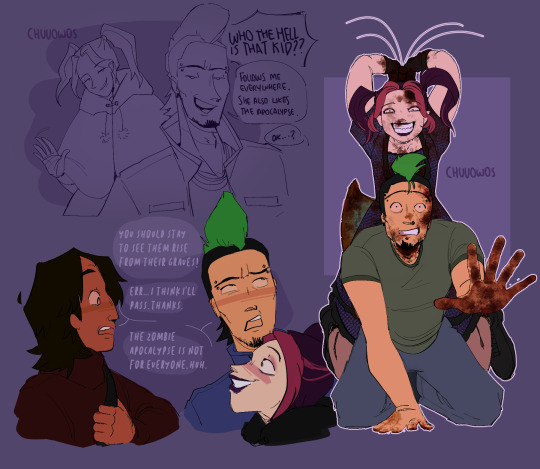
This is actually what happened when I was born guys
8 notes
·
View notes
Text
analog horror needs to let go of daisy bell I am FED UP
#plutoposting#it isn’t scary anymore you guys have run it into the ground#hell it wasn’t even scary at all#it’s just a song about a guy wanting to provide for his bride with what little he has#that’s lovely
8K notes
·
View notes
Text

#sorry ill stop posting manga panels now i just like when she draws him like this#this silly fun loving guy loves his friends. also he is an immovable object with unconventional morals who is a little bit scary.#heehee!#dungeon meshi spoilers#dungeon meshi
7K notes
·
View notes
Text


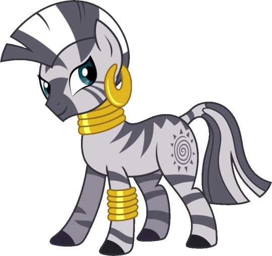
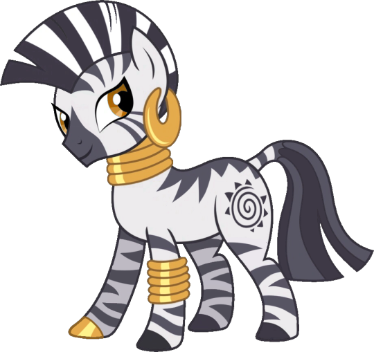


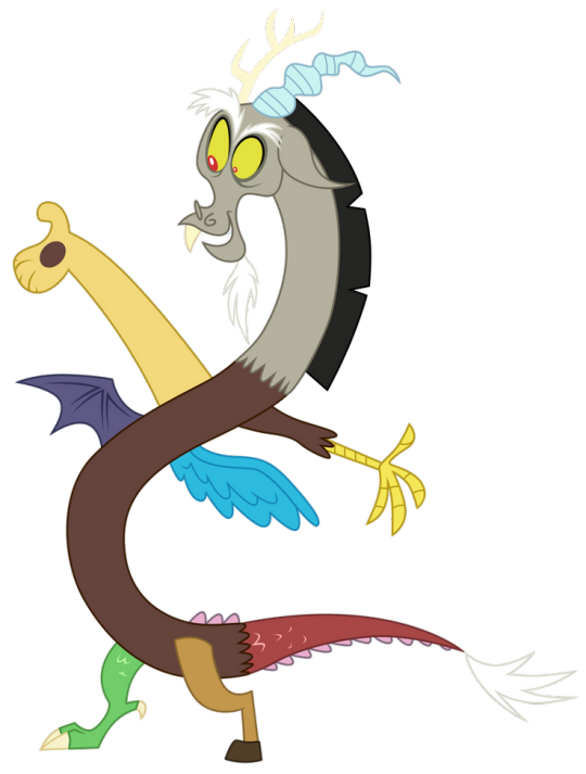


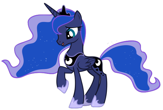
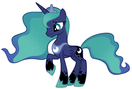
TEN GAZILLION PONY ATTACK!!!!! this is a part 2 of my subtle animation-friendly redesigns!!! I only made changes that could have happened in the show. hair gradients can be seen in cadence, and white markings on sunburst, for example.
feel free to ask me questions about the design choices!! (just mentioning: I love the CMC's actual cutie marks, just wanted to try designing individual ones this time around!)
Part 1 with the mane 6!
#mlp#my little pony#twinkleshine#lemon hearts#minuette#mlpfim#mlp fim#mlp g4#princess luna#luna mlp#sunburst mlp#mlp redesign#starlight glimmer#vinyl scratch#discord mlp#cutie mark crusaders#sweetie belle#apple bloom#scootaloo#SO MANY TAGS. DEAR GOD#lyra heartstrings#zecora#mlp gen 4#mlp designs#some of the outlines might be a bit crunchy!!! it was difficult to find transparent vectors for some of these guys#long post#hi scary amount of followers. ponies happening to you okay?
2K notes
·
View notes
Text
do any other artists feel like. yeah you're a 'good artist' because you draw things that look nice, but like. TECHNICALLY? you're really not great
i really hate that i can recognise that yes, my art is good, but is it VARIED? is it dynamic?? is my anatomy good? is it full of texture and colour theory? do i know how to do This? can i do That? no, not really. and that's quite painful actually
#ramble#yes this is the artist's perspective bs and yes this is anxiety because it's 1am#and yes i'm forever learning and growing but also#aaaaaaaaaaaaaaaaaaaaaaaaaaaaa.#drawing my little guys is fun but i am not good enough for the industry right now and that fucking sucks#i really feel like if i walked into a studio with my portfolio right now they would laugh at me#one of those days where i wish i'd done a more useful degree y'know#i'm going back through the phase where i don't know what i'm going to be anymore and it's scary#some days i really want to give it up and never draw again and do something worthwhile because i Know my life would be easier#and i hate that something i love so much makes me feel so hopeless#signs that i should go to bed ^^^^#i will resume my pity party tomorrow
1K notes
·
View notes
Text
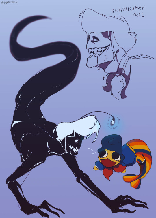
Oh no! How will Wally the fish defend itself from the terrible anglerfish?! (He can handle it)
#Wally the fish swam too far!#art#my art#welcome home#wally darling#welcome home arg#wally fanart#welcome home wally#wally#sketch#skinwalker au#skinwalker#skinwalker wally#fanart#It's getting scary! He's in danger!#silly little guy
2K notes
·
View notes
Text
i think i'm hilarious -- aka i made blood blossom danny au memes
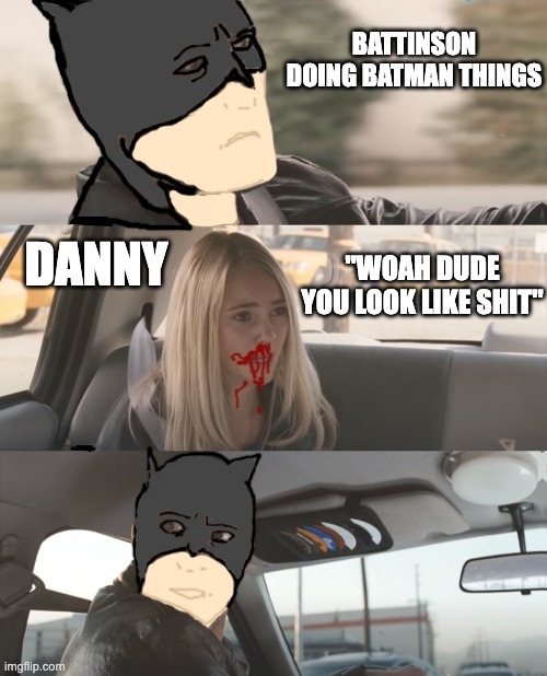
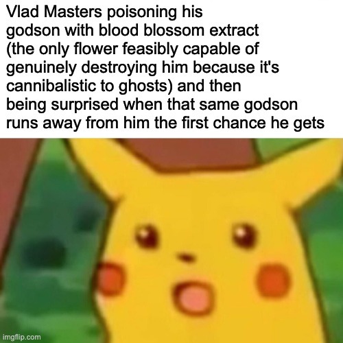
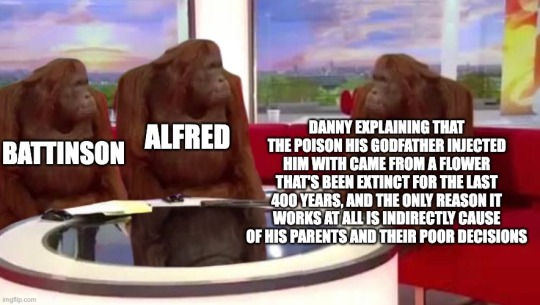
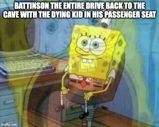
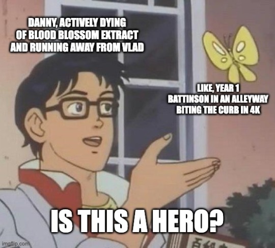
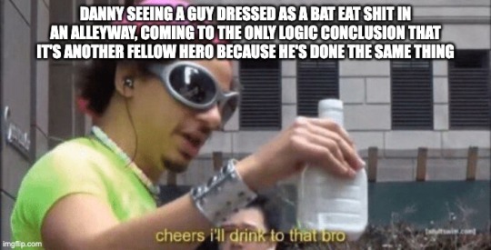
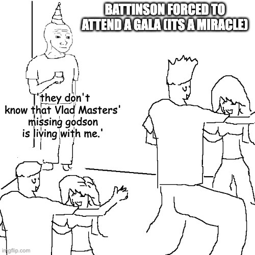
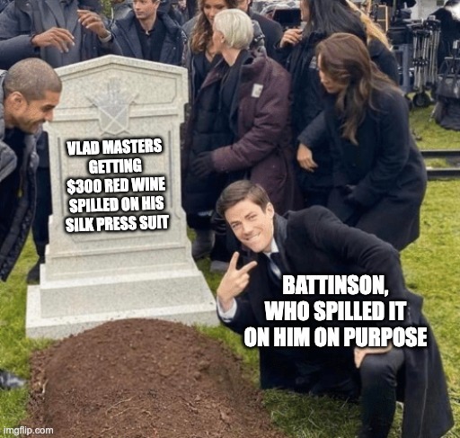
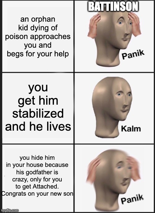

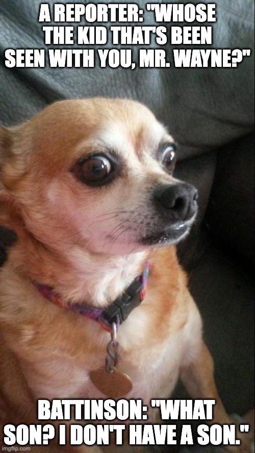
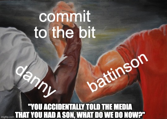
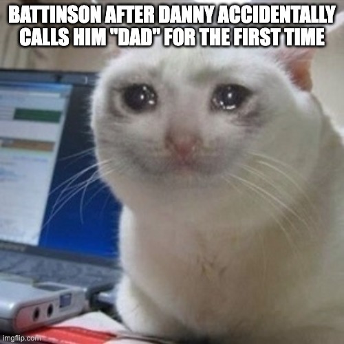
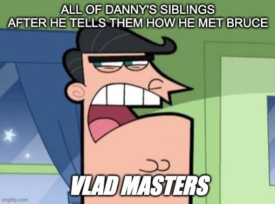
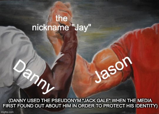
all of these come from my DpxDC prompt "i am pushing the batdad agenda--" and it's corresponding additions in the reblogs ksdjlf.
i am. rotating them in my head. forever and always. personally i think there should be more batdad aus in dpxdc, their dynamic could be neat. :)
#THAT FIRST ONE TOOK ME A HOT MINUTE TO MAKE. i have never been more careful with a trackpad. imgflip doesnt have an undo button#i think its fucking hilarious#its a batdad au#danny fenton is not the ghost king#dpxdc#dpxdc crossover#dp x dc crossover#dp x dc#dc x dp#mmm i need to come up with a name for this au#found family ftw WHOOOO. i could just do a generic 'blood blossom au' tag but i want a specific one because i like being unique#eldest batkid danny au#chronically ill danny au#danny: im grateful he's helping me but im still kinda apprehensive...#battinson: vaults over a car to escape reporters. likes rock music. isn't fucking evil. punched a cop. actively looking for a cure#danny: ...huh. okay.#furiously pushing the batdad agenda for my own gain. just look at them guys. they're funny little guys.#unofficial witness protection to adoption pipeline.#bruce wayne accidental teen acquisition. save a teenager gain a son#its about the adventure of them going from strangers to friends to family :)#im bored of the bruce slander guys in the words of hermes from hadestown:#“[its] about someone who *tries”*#danny saw a funny man in a funny costume eat the side of a dumpster and has never related more with someone on a spiritual level#“brother eugh i feel that. oh heY WAIT HERO BUDDY?? SAME HAT??? SAME HAT?”#danny's been the only hero he's known since he was 13. on god he is leaping at this opportunity. like YES. PLEASE BE ANOTHER HERO#HELP ME GET AWAY FROM CERTIFIED CRAZY MAN. HELP. YOU'RE SCARY AND HIDING IN THE DARK. EVEN BETTER. HELP A BROTHER OUT HERE#blood blossom au#for the time being thats the name
504 notes
·
View notes
Text
ralsei!
#ralsei#deltarune#utdr#ralsei being my favorite character in deltarune is a little scary. you guys keep theorizing that he's evil :(. can't he just be nice#<- voice of a guy who loses his mind over any flowey/ralsei parallels#FORGOT MY ART TAG.#.art
569 notes
·
View notes
Text

So I never stopped thinking about my giant human form rouye...
First part here
#mxtx#tgcf#heaven official's blessing#e ming#rouye#baby eming has my whole heart#and scary horror monster rouye is just a little (big) guy#xie lian definitely still cuddles with giant rouye#hua cheng does not
1K notes
·
View notes
Text
At least let the man walk around
#Ryoma hoshi#Drv3#danganronpa v3#an art#Officer please hes just a little guy#Look I'm just saying. The Yakuza has members in prison and you generally don't wanna fuck with them right#Get Ryoma a big scary Yakuza buddy to watch his back in prison at least
2K notes
·
View notes
Text
EVERYONE VOTE SONIC FOR ME ON THIS MONTHS SONIC CHANNEL ART POLL PLEASEEEE FOR THE LOVE OF GODDDD
#ROUGE AND INFINITE ALREADY APPEARED IN SONIC CHANNEL ART THIS YEAR#AND SONIC IS MY FAVORITE LITTLE GUY AND I WANNA SEE HIM IN A CUTE OUTFIT#PLUS KNUCKLES IS THE ALREADY CHOSEN CHARACTER AND I WANNA SEE THEM TOGETHER#PLEASE#hes winning right now at the time im typing this. thank god#hes only 5 percent ahead of rouge but considering its a 3 way poll this time. the votes are divided more#so a 5 percent difference isnt as scary. since a vote against sonic isnt automatically a vote for rouge#and infinite is way further behind#thankfully for most of the polls involving characters who have already appeared in sonic channel art this year#people have been good about choosing the one that hasnt gotten to be in any art yet. like omega beat shadow which was kinda shocking#so sonic definitely has a chance
1K notes
·
View notes
Text
me, explaining feedism to my partner and showing him stuff that’s hot to me: ITS WEIRD I KNOW ITS WEIRD IM SORRY I LOVE YOU
him, perfectly calm: I appreciate how difficult this is for you and how you’re trusting me completely and being very vulnerable but really all you’ve shown me are pictures of hot fat guys and, hear me out, I don’t think it’s really that weird?
#had another great discussion with him last night#guys maybe feedism isn’t this big scary thing we should be fucked up about liking for years and years#maybe it’s just. not that weird????#personal chub#I’m also just very lucky that my partner is the incredible person he is#and also a nasty little freak who likes equally weird shit as me
624 notes
·
View notes
Text
wow another zombie AU how original😒😒
#total drama#td au#td zombie au#dont play with pychos guys#but yeah#scary girl td#duncan td#noah total drama#just a little
340 notes
·
View notes
Text

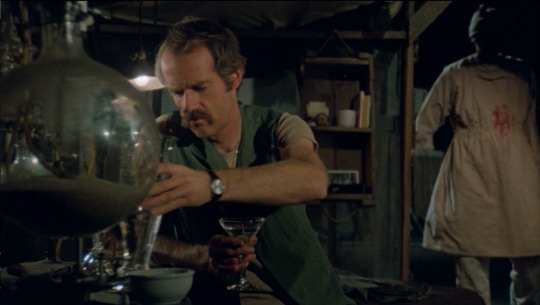
Digging through some files and found an old drawing of one of my favorite shots of Hawkeye in M*A*S*H, from Preventative Medicine, where he sort of gets framed like a horror villain.
#mash#art#mash fanart#hawkeye pierce#he looks so . scary in that frame lmao it stuck out to me when I first watched and I remember really wanting to try to draw it!!!!#disclaimer I am in . no way an artist i'm a silly little guy having fun with a pen#mash art
1K notes
·
View notes
Text
yeah
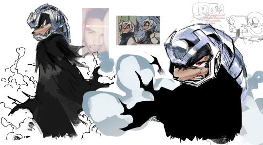
#spectre the echidna#art#archie sonic#if ancient and ruthless and kinda scary then why a little guy?#sonic fanart#sth
279 notes
·
View notes
Text
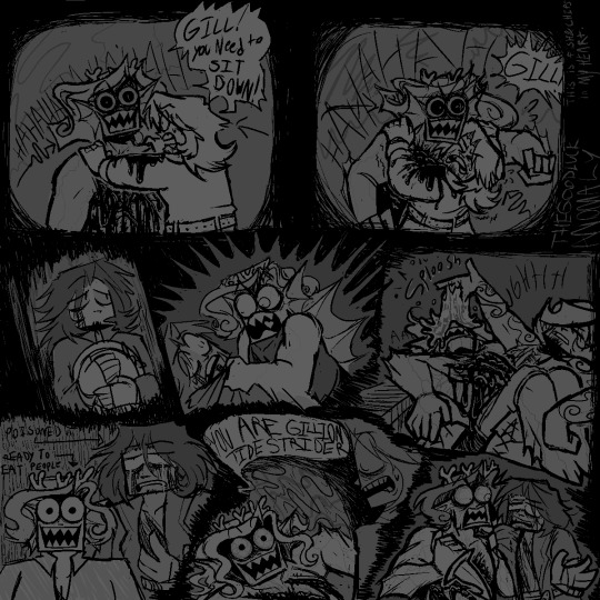
[OLD ART ALERT] A COLLECTION OF SCENES FROM THE GILLIONS CATSCRATCH ARC THAT BROUGHT ME GREAT JOY. i love fishy chips especially when its just gillion being delirious and violent and hostile
#jrwi fanart#jrwi show#jrwi riptide#jrwi riptide spoilers#JUST NOTICED A MILLION MISTAKES FUUUUUUUUCK BUT WWHATEVERRRRR IF I STARE AT THIS ANYMORE IM GONNA HHUURRRLLL#SO I REALLY LIKE FISH AND CHIPS RIGHT. IVE BEEN IN LOVE W THE SHIP EVER SINCE THAT NAT 20 KISS#BUT I THINK I SHIP IT WRONG. OR LIKE. I AM CORRECT BUT EVERYONE SHIPS THEM DIFFERENTLY#THE FISH N CHIPS I SEE EVERYWHERE ELSE IS SO FLOWERY AND SWEET AND ROMANTIC. AND THATS NICE! THAT STUFFS NEAT#but gillion and chip would NEVERRRR enter anything similar to a romantic relationship. chips too damaged and gillions too uninterested#I LIKE MY FISH N CHIPS ONE SIDED AS FUCK#bc 2 gillion chip is his best friend in the whole wide world but hes also kinduvagross little man that took him a MINUTE to really warm up2#but to CHIP gillion is this powerful and gorgeous and heroic paragon of destiny and his best friend in the whole world who will#bring about the eschaton. 'i didnt believe in destiny until i met you' until i met a champion radiating with a light thatll alter the world#OHH REMEMBER THE FIRST ICE ARENA?he was so mad.still probably shaking from the ordeal.NEVER had he felt true divine radiance CLEAVE through#his SOUL like that.do you remember that moment in the forest w the bugs. an alien from the ocean; lacerating the land w lightning#when the realization flickered in chip for a moment.that the thing standing before him was more powerful than he could ever fathom#remember when grizz mentioned that the nat20 kiss was the 'best kiss chip ever experienced'. that has nothing to do w this. where was i.#LOST MY TRAIN OF THOUGHT. BUT HEY. I THINK at the beginning chip absolutely knew that gill was smth grand n powerful n scary#when gillion revealed what exactly the prophecy was;chip got defensive and mad.sure he was sleep deprived but OOH. HES SCARED!#he believes gillion too! he believes that his destiny is to eradicate either the sea or land and that scares him!#but then he gets past it bc ultimately he trusts his bestfriend gillion so so much. he fuckin loves this dude.#he would throw himself intothe path of fire for this dude. he would boat across the ocean for this dude.he would build arenas for this dude#even if this dude will end half the world.even if this dude wields the power and the obligation to eradicate him at any second.#even if this dude is going to throw himself into harms way for his own comrades.even if this dude is just going to sacrifice himself.#one way or another one shall die for the other.these self-sacrificial bastards click so well with eachother!!#chip believes his body is best used to pave roads and gill believes his body is destined to pave prosperity.WHATEVER!!#i really love their dynamic!! they care for eachother so much!in MY heart tho. the icing on the cake here is the fantasy that chip is#just a bit more In Love w gillion than he realizes. like this powerful fish guy is HOT and PRETTY and KIND and FUNNY and LOYAL and STRONG#but gillion would never rly feel that same sort of attraction towards chip. its just not rly his thing. aroace as fuck man.#thats how it is in MY little heart atleast. and i sit here and play w my touys in my brain n i explore my silly lil one sided fish y chips.
190 notes
·
View notes
Last Seen Blogs

reike
R E I K E

crazyboyviking
Sans titre

w0lfbld-blog
equinox.

letscryy
we're heading straight to hell

etwinkboi
Untitled