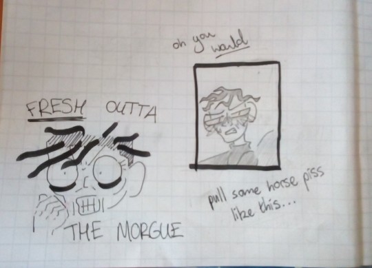
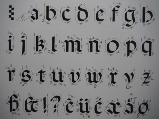
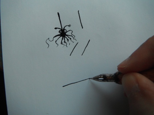
#i got some new pens so that's why there's so much variation in line width
Text

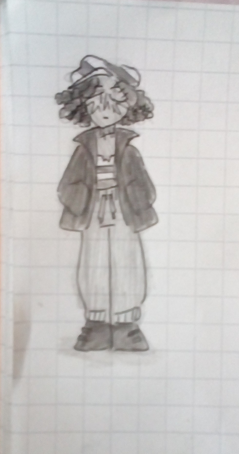
Omg it's Frances Bigtopburger my beloved. I might colour in the first one at some point cos I'm quite proud of it :>
Plus some Cesare doodles just for giggles
[ID in alt]
#i got some new pens so that's why there's so much variation in line width#line width? oh boy i better slow down i'm gonna start being a real artist soon#bigtop burger#frances btb#cesare btb#my art
35 notes
·
View notes
Text
QUICK PEN BRAND PRIMER!
Buying your first (or second, or third) fountain pen is a pretty heavy decision when there are dozens of manufacturers to choose from and hundreds upon hundreds of models! For better or worse, there’s no single perfect pen for anyone - you’ll totally find plenty that scratch different itches. As of this post I rotate between around 5-7 for everyday carry and drawing!
This quick guide is meant to serve as a springboard for anyone who’s still not sure where to begin on homework - I’ll highlight the ups and downs to each company’s pens! While there are tons and tons of top 10 “beginner’s pens” lists out there, I found the lion’s share of them didn’t really offer much in terms of education, just a short list of handsome, inexpensive potential suitors. What I hope this does is give you a broader scope of each brand and what to expect in terms of overall performance and build, as well as some different options to look and grow into depending on your needs.
Just bear in mind that there are way, way more brands out there than what I’m covering in this post - my picks are ones I’m confident you’ll be able to find readily from online retailers!

My very first fountain pen (brush pens aside) was a charcoal black Lamy Safari ($30), and I’d still posit it as one of the best pens to buy if you’re new to the fold. All of Lamy’s entry-level pens follow the Safari in design, with the Safari itself and the Joy ($36) being made of ABS (the same stuff as Lego bricks), and the AL-Star ($38) and LX ($56) made of anodized aluminum. They’re about as stereotypically German as it gets - proudly engineered, few frills, robust and reliable, ready to get lots of work done.
What’s much more unique about them would be the section they all share - the part of the pen you grip. It has an ergonomic, triangular shape to it, such that folks who write with tripod grips will feel right at home holding the pen in the right position. If it works for you, you’ll probably find it to be the most comfortable writing instrument ever, something with which you could easily destroy a crossword puzzle book with no breaks. If you’re of the alternative gripping type or just prefer thinner pens, Lamy’s still got you covered! The Logo ($40) is another handsome option, a metal pen that’s comparable in width to a #2 pencil, and for a few dollars more you could upgrade to the matte-lacquered, gorgeous CP1 ($55).
While it’s a pretty common design choice for fountain pens to have replaceable nibs, Lamy’s solution is ingenious and unlike anything else on the market. All of their pens have the same style of shoulderless nib that’s tension fit to the feed, and can easily be slipped on or off. It’s convenient enough just for maintenance, but given how inexpensive they are, it’s also a breeze to swap between nibs if you have more than one. Spare nibs are easy to get a hold of for only 10-12 bucks, so you could buy yourself an EF Safari and maybe throw in a 1.1mm stub too, so you can have two options without having to buy two whole pens!
PROS: Swappable nibs, great section for FP newbies, durable as hell
CONS: So-so nib performance, annoying for alternative grips, samey models
GO LAMY IF: You want to try lots of different nib sizes on the cheap and can’t be fucked to keep track of how the nib is oriented on the paper

Hailing from Japan, Pilot’s been around for a while and has itself quite a spread in the fountain pen market. Covering everything from the disposable Varsity ($4) to the high-falutin’ adjustable Justus ($315+), there’s a lot to grow into with these guys.
Pilot sees off many a new fountain pen enthusiast’s maiden voyage with the Metropolitan ($15), which is the industry’s greatest example of daylight robbery. A pen with a metal body, included converter and a halfway decent nib? For fifteen bucks? They’re either taking a loss selling these bad boys or have a shady deal with some keebler elves because there ain’t anything else this polished and complete for the price. The Varsity ($3) is just about the cheapest worthwhile fountain pen money can buy, and is a great choice for anyone who wants to check out what they’re about without making a huge commitment. They’re built to be disposable, but you can jimmy out the nib and feed to eyedropper-fill it up again if you’re so attached! If you’re looking for an alternative to the Metro at this price range there’s also the Kakuno ($13), which is a nice, no-frills beginner pen. If you’ve got a bit more cash to spare, the Prera ($32-38) is definitely worth a look as well - it’s a really compact, pocketable pen with one of the most satisfying cap clicks known to man.
Special mention goes out to the Falcon ($150), which carries a hefty price tag but remains one of the most beloved pens for drawing due to its softer, springy gold nib. Though not advertised as such, with a bit of flexing you can get some very respectable line variation out of it - just make sure to be gentle enough, you wouldn’t want to spring a nib at that price! If you’re on the lookout for a next-level pen, there’s not a soul out there who’d regret a Falcon.
PROS: Fine grinds, a pen for every budget, great for low-grade paper
CONS: Westerners miss out on a lot of models, some are on the fragile side
GO PILOT IF: You prefer thinner, drier lines and have a sturdy pencil case

Another German manufacturer, Faber-Castell’s been around for a long time, to the tune of 250 years, and has a bit of a reputation now for being the go-to fine arts supply company. On top of things like paints and colored pencils they also crank out some fountain pens, albeit mostly out of a normal artist’s budget. There are two qualities that make Faber-Castell stand out: an eye for design, and some really nice nibs. The Loom ($40) is one of their more affordable offers and the best example of their ethic on the market - it’s got a really handsome, showy design, and the steel nib on it is jaw-dropping. It has a metal body with a bit of texture to it, so the section isn’t slippery, and feels nice and substantial with or without the cap posted. Just south of that in price is the WRITink ($28), which has a plastic body but still carries some flair of its own. The big schtick on this is that it’s supposed to be for students, with an eye-catching textured thumbprint motif, in case you’ve got a homeroom teacher to impress. While I’ve yet to grab one of these myself due to how new it is, the reviews so far have been warm so I thought it was worth a shoutout!
If you’re looking to dig a little deeper into your pockets and hold your pens farther back from the nib, I’d also recommend the Ambition ($70+) in a heartbeat. You can get it in different materials, from resin to pear and coconut wood, and feels as great in the hand as it looks. It has an extremely small section for cosmetic reasons, so it’ll probably be uncomfortable if you’re prone to gripping it as close to the tip as possible, but that’s really the only minus going on for this model. Great build, great nib, handsome as all fuck.
PROS: Superb steel nibs, unique and eye-catching designs
CONS: On the dry side, still need to buy converters on pricier pens, some models just kinda suck
GO FABER-CASTELL IF: You’re an Apple Tax kinda person

I don’t like to play favorites, but TWSBI is kinda my favorite. A bit of a younger company from Taiwan, they’re focused on cranking out really solid pens in the $30-60 dollar range. What sets them apart is their choice of making all their pens either piston or vacuum fillers, methods typically only seen in more expensive/premium fountain pens from other companies. This carries the advantage of a fill capacity waaaay larger than the typical cartridge/converter pens out there!
Also important to note, TWSBI’s pens are easy to disassemble and put back together, which is great for cleaning and really neat in general if you like to tinker and are curious about the inner workings of pens.
If I had to recommend two models, I’d go with the Eco and the Mini. The Eco ($30) is their least expensive model (short for ECOnomical) at 30 bucks and THE fountain pen I’d recommend to any newcomer because it’s so damn perfect. Huge ink capacity, sturdy, glassy-smooth nibs, and it’s pretty good-looking, to boot. The Mini ($50) is a more lilliputian iteration of their flagship Diamond 580, and it costs the same. So, it’s smaller and has a smaller capacity, why would anyone give a single dingle? Well, for one, it’s a perfect pocket pen, and two, the 580 isn’t exactly built to be posted while this one is. You can cram the cap of a 580 on its ass but it’s friction fit right on the plunger knob, meaning you might unscrew it and make a mess while capping and uncapping. The Mini has threads back there to screw the cap onto, so it’ll sit tight without fucking with the plumbing.
TWSBI doesn’t currently have a whole lot of models on the market right now, but they’re all about as worthwhile as the next. If you’re interested in something more unorthodox, you can always give their VAC700R or VAC Mini ($60-65) a spin. They’re vacuum fill pens, which fills the body by means of forming a vacuum for ink to rush into from the bottle. Not only is it neat, but it carries even more ink than its sister piston-fillers! The one rub to these models is that the company’s still hung up on a pain in the ass they consider a feature, which is that the pen, when the plunger is secured after a fill, prevents more ink from reaching the feed. While leaving the knob unsecured/open will remedy this, most owners would rather opt to remove the small stopper that causes the blockage. If using or losing that stopper ain’t a dealbreaker to you, go for it!
PROS: Generous flow, nibs are heavenly, great build quality
CONS: Can be hard to catch in stock due to demand, not great on shitty paper
GO TWSBI IF: You want a smooth and juicy pen and hate refilling
Another company from - you guessed it - Germany, Kaweco’s been around the block and they know exactly what they’re about: pocket pens. Nearly every Kaweco model wants to be a Tic-Tac when it grows up, most famous of which being the Sport ($20+). There are a LOT of permutations of the Sport, from the Classic (gold-colored steel nib and plastic body), to the Skyline (just like Classic but with a silver colored steel nib), and the Ice (translucent plastic body, silver nib). More expensive metal variants exist in the aluminum AL-Sport and Brass Sport, but they all share the same form factor, design, and optional metal clips. There’s also the Liliput ($52+), which has a similar size but more subdued, capsule design.
Kaweco’s little pens all take standard international short cartridges, but if you want any freedom whatsoever in your choice of ink, I’d highly recommend going for one of the plastic models. For one reason or another, they’re the only ones compatible with converters, of which neither are particularly great, but what’s great about the Sport is that it can totally go eyedropper. That means instead of using a cartridge or a converter, you fill the entire pen body up with your favorite ink, slap some silicone grease and an O-ring on the threads and close that bad boy up for some serious ink capacity. If you really wanna spring for one of the metal models, more power to you, you can still syringe-fill an empty short cart or stick with whatever options you get... The Sport’s mighty cute but I’d really recommend barking up a different brand’s tree for a metal body pen.
There’s a brand-new model from Kaweco coming out sometime in August called the Perkeo ($16), looks to be a sturdy, beginner-friendly deal. It’s also big enough to accept SI long cartridges and converters which should really open folks up to Kaweco’s game - as imperfect as the pens are, I can’t possibly overstate how slick and comfy Kaweco’s nibs are. It stands shoulder to shoulder with the likes of TWSBI and Faber Castell!
PROS: Itty bitty footprint, smooth nibs, the most pocketable pens overall
CONS: Smaller ink capacity, some models are cartridge-only, big hands beware
GO KAWECO IF: You want a nice, smooth pen as well as an inhalation hazard
When most newcomers think brush pens, they probably just have the Pentel Pocket Brush in mind. While the Pocket Brush ain’t the worst you can do, it’s cartridge only, feeds slowly and isn’t really made with longevity or pockets in mind. Other brands certainly produce brush pens of one kind or another, but when it comes to refillable, reusable ones, I don’t think there’s a brand more accessible and primo as Kuretake. Starting with the no.8 ($8-10) you get a lightweight but sturdy model with a synthetic tip, and for a few bucks more you can go for the 13 ($17+) which has a metal body. As far as I can tell the only differences between the 40 and 50 ($26-33) are cosmetic, but they both have sable hair tips as opposed to petroleum-based fibers. Which one of these is better really comes down to preference; synthetic tips are springier and stiffer, eager to snap back to their original shape, while sable brushes are softer and more relaxed.
One thing to note about Kuretake’s pens is that, while it ain’t recommended by the manufacturer, you can totally pop the protective cap off the pen’s tip, exposing the full length of the brush. I can’t vouch for the longevity of the pen once that’s done, but it’s fun to mess with on the 8 since there’s so little to lose. These pens are also unusual in that they don’t have their own proprietary converter and it doesn’t accept standard international - you actually need to grab a Platinum PLAT500 ($6-7) to fill up on your favorite ink.
PROS: Extremely affordable, light and comfy, better flow than its competitors
CONS: Just paying for body/design until the no. 40, which has a sable tip
GO KURETAKE IF: You want a brush pen that actually works
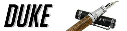
Okay, I’ll admit, compared to everyone else on the list Duke’s pretty hard to navigate. They’re a joint venture between a Chinese company (Shanghai G Crown Fountain Pens) and some unknown German R&D (some folks say Staedtler but I can’t confirm) that’s registered as a German LLC, and their availability seems to be pretty spotty in the west. Despite all this, they’re a bit of a hidden gem for fountain pen enthusiasts, offering some unique and robust models for a modest price. I personally got invested in Duke because they happen to carry some mighty fine fude-nibbed pens!
I’d better mention this out the gate, if you’re looking for Duke pens on the likes of Amazon and eBay, they most certainly are there, but the naming and availability of shit is all over the place. They don’t often go by their model names, instead being advertised by their descriptive features and nibs - whoever shills them seems to take the Etsy approach to advertising. Nonetheless, I’d highly recommend a quick image search of any of the below models to get a feel for what they look like, that way you can easily identify them when it’s time to go shopping. While their standard nibs are pretty nice, middle of the road affairs, I’d highly recommend gunning for their fude nibs, particularly the much larger one that’s almost a half-centimeter in length - you’ll know it when you see it. And it’s way more fun to use than you can imagine.
One other thing you should know before going sleuthing is that you might get burned on quality control with these things. They’re almost always sold through a third party and I’m not sure how your luck would turn out on returns/exchanges should your pen be off-kilter. I’ve gotten a 551 fude with absolute garbage feeding issues, something forumgoers have also complained about with some regularity. You might be able to fiddle with it for better results if you’re feeling frosty! On top of that, the standard international converters they include tend to be buttwater, but that’s an easy replacement for an inexpensive and potentially very worthwhile pen. Caveat emptor!
One of the better known models is the Duke 116 ($20-32), which given its prevalence might just be their flagship. It’s a good length, a little on the thinner side and comes in a shitload of finishes, most common of which being a black and burgundy rhombus pattern. I love this thing because it’s extremely sturdy and well-balanced for a lower-end fountain pen, and if you’re lucky you might just be able to find one with the larger fude nib advertised as an “emerald black barrel” with a calligraphy nib.
The Duke 209 ($10-16), nib style be damned, might just be one of the best deals out there when it comes to fountain pens - it’s a full-metal body, compact little bastard and the best gamble I’ve ever taken on something yet to be extensively reviewed. It’s thin, lightweight and sturdy which is great for extended drawing sessions, though the metal section might get a bit slick if you’ve got ultra-oily hands. I can’t even knock it for the quality of the included converter, because it’s actually included with a pen in this price level. Step up your fucking game, Lamy and Faber-Castell! You can often find the 209 bundled with both a standard nib and the fude/calligraphy nib in one set, which is really nice. One thing to note is that the fude nib on the 209 is quite small, more in line with the likes of Sailor’s fare than the monster ski-jump you can find on the 116 and next model on deck. Still gives you a lot of variation, and might be the better choice if you’re looking for more control over your lines!
Last one I’d like to mention is the Duke 551 ($40-60), commonly found as the Compound Art or Confucius Fountain Pen. This is the model that really sold me on Duke because it’s fat, it’s gorgeous and the fude tip is enormous. If you’ve got bigger hands this’ll probably be a better fit for you than the 116 if you’ve got your sights on that nib. Only drawback I have is that it’s not really a pen you’ll wanna use posted, because the cap’s heavy and sits shallow and friction-fit on the back, which really throws off the balance. Other than that, it’s a sheer pleasure, and one of the easiest Duke models to get a hold of for westerners due to its developing reputation.
PROS: Best fude nibs on the market, sturdy build, great price for what you get
CONS: Quality control is apparently conducted by blind cave salamanders
GO DUKE IF: You’re willing to take a QA gamble for nibs you can’t get anywhere else
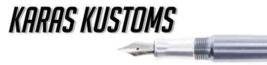
Last on the list has a bit of a steep cost hike, even on the lowest-end pens they produce, but I feel like their outstanding traits make a compelling case for a newbie with deeper pockets, or perhaps someone looking for their next step up from a beginner’s model. Karas Kustoms is an American machining company based in Arizona that manufactures things like phone cases, keychains and toys, but they’ve recently gained traction as a pen manufacturer.
As of this post they have two different models of interest, the Ink ($100-200) and the Fountain K ($80-130), the former being full-sized and the latter being a bit smaller, but both are made of the same machined materials. You can get ‘em in solid brass, copper or aluminum (raw or in a slick anodized finish), which explains their higher ticket price, but you’re getting a goddamn solid metal pen. You can whip one of these bastards against concrete for hours and all you’d have to show for it are a few scuffs. They’re built to survive, and in the case of the brass and copper models they’ll develop a nice patina over time as a bonus. Depending on where you do your shopping you can even mix and match the materials for the body, cap and section!
Really the only knock I can give Karas Kustoms is that they use Bock nibs in all their fountain pens, which I’ve personally had some trouble with in terms of overall QA. Still, they’re #6 nibs, which you can easily buy a replacement for if you don’t dig what comes standard. After popping a Jowo EF in my brass Ink it’s never left my pocket!
PROS: Will outlive you and your next of kin, highly customizable, industrial design
CONS: Heavy as balls, pricey, limited availability
GO KARAS KUSTOMS IF: Your art supplies are in danger of being run over by a semi

Like I said before, this doesn’t even begin to scratch the surface on good companies out there, and someone’s probably gonna slap me for leaving out the likes of Jinhao, Noodler’s and so on. If anyone else out there has a particular favorite they’d like to shill, feel free to add it to the post!
As always, Inkpiss is happy to help, so get a hold of me if you’ve got any questions or grief to sling my way!
585 notes
·
View notes
Text
Dip pen tips
Alright, here is a list of advice/tips based of my own experience with using dip pens.
I don’t pretend that it’s the end all of it and if you have questions, want more details let me know and I’ll do another post (feedback is always appreciated).
Also, this isn’t meant to turn you into a pro with the dip pen, but rather help you start/progress. It’s not an easy tool but the effort is worth it in my opinion.
It’s a long post so it’s all under the cut.
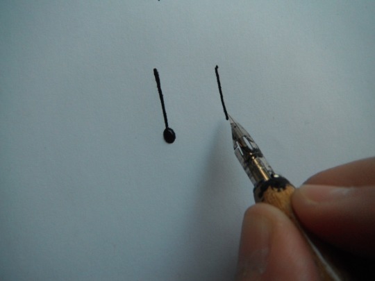
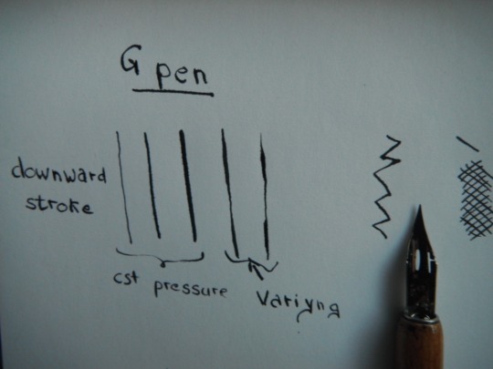
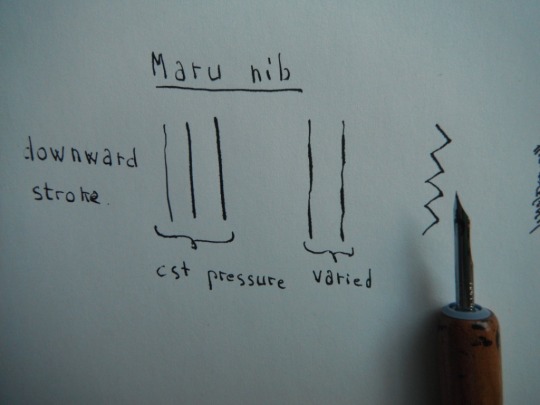
Let’s start with the nibs and the ones I’m using at the moment (I have a dozen more gathering dust).
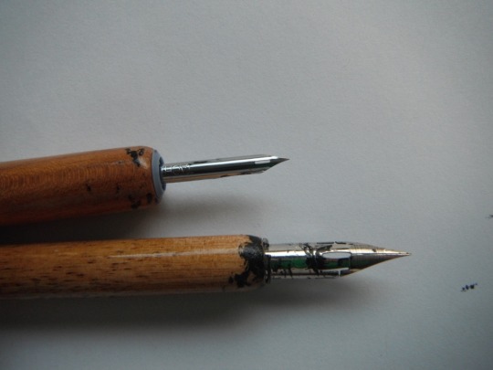
I have a maru nib (top) and a g-pen nib (bottom). I’m using those because I like how they feel and they are easy to find. Before the maru nib I used a crow quill nib, but it started feeling weird and the maru nib was easier to find. If you don’t own any nib or pen holder Speedball has a good set for drawing with different nibs and two nib holders (that’s what I started with). The pen holders I have, the one for the g-pen is a generic nib holder that you can find anywhere; for the maru nib I got a Tachikawa T-25, it’s harder to find nib holder for small nibs and I didn’t like the one that came in the speedball set (too narrow hurt my fingers...).
I use these two because the line weight variation in the two kind of cover me from a 0.5 to 0.05 size for fineliners with only two tools.
Now about the nibs, although they might feel like a solid object they have a certain amount of flexibility, which is what allow for varying line width. Look at the space for this older g-pen nib (I applied more pressure than necessary though).
As the name says you have to dip the nib in the ink for drawing, and do it often. You’ll want to dip the pen past the eye in the nib (you can see “tide mark” on my nib in the first picture) and then give it a little tap on the rim of you bottle to get rid of excess ink (or beware of ink drops). It can get messy, and I’ve started to use an eyedropper to drop the ink on the nib (concave side).
Just a note about paper: you’ll want paper that’s as smooth as possible to avoid the nib snagging on the paper fiber. If not smooth produces an obvious scratching noise but in some cases one of the nib point snags causing the two half to either temporarily overlap or be spread wider than you want, as well as potentially messing up your line work.
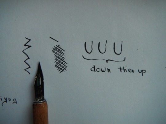
Now onto techniques. If you have time I’d recommend having a look at calligraphy examples Why? Well if you look at different hands and how to make each letter you’ll notice that all strokes are downward or to the side. Very rarely is there an upward stroke.
See? the reason for that is that the nib doesn’t handle upward strokes well. Unless you apply little to no pressure and even then it’s best not to go for a true upward but have a slight angle to it (look at copperplate and italic hands). My first go with nibs was for calligraphy (and I’ve been writing with a fountain pen forever) so I’ve build a muscle memory of no upward stroke, or little pressure on the up movement. I’m not saying you should do it but in my opinion it’s a good exercise for familiarizing oneself with using a nib, no need to try a specific hand, your usual writing is fine just pay attention to when you feel the snag, how you instinctively end up putting a little more pressure on a downward stroke and get a thicker line for it.
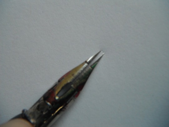
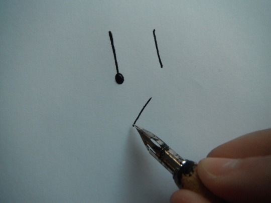
Now about how to hold the pen, I’m not talking about how to hold it in your finger but in relation to the paper. On the photo above the little glyph looking think just on the left of the “a” shows the angle at which to hold the pen, about 30degree.
For a full on downward stroke I’d recommend holding the pen at 90degree it’s easier.
Like so. Warning do not leave the pen on the paper too long or the ink will leak and make a puddle which is what happened with the first stroke.
For any other stroke hold the pen at a 30 to 45 degree angle.
By the way ink puddles can be used to add embellishments to your drawing they don’t always mean it’s a total disaster.
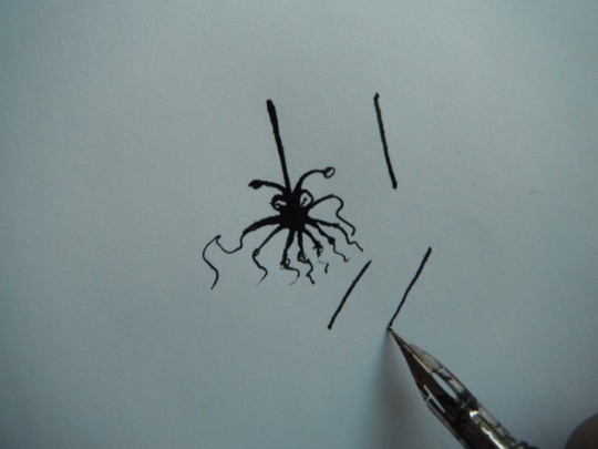
Changing the angle of the pen can make drawing some lines easier, like a full on horizontal line.
You can also rotate the paper, which I do just as much as varying the angle of the pen. The short version: always pull the nib, never push!
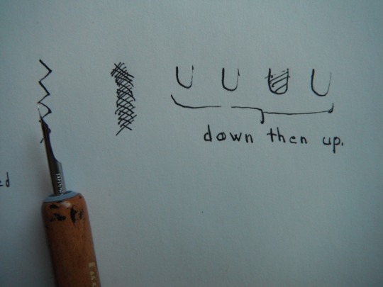
Next varying line width/weight. It all comes down to how much pressure you apply, keep the pressure constant and you’ll have a nice line, but you can also vary it for effect. The photo belows are for both of my nibs for different stroke: downward stroke with constant and varied pressure; zig-zig; shading strokes; and a ‘U’ for a downward followed by an upward stroke and you can see clearly the difference in line weight when doing that (the g-pen tolerated the upward stroke better than the maru nib).
At the start I’d recommend using slow strokes, a fast strokes work best with little pressure to avoid the nib tip from separating too much
Now about some various practical aspects:
-the ink doesn’t dry as quickly as when using other pens, so there is a risk of smearing some of it. So I plan my inking in such a way that I’ll not need to go over an area that isn’t dry (start in a corner, ink from top to bottom, ....) and I keep a piece of paper to put under my hand, because sometimes the ink look and feel dry (tap it lightly with your fingers) but one corner with overlapping lines might not be fully dry and it will get you, believe me it happened.
-dip the pen often generously, don’t wait for it to run dry in the middle of a stroke, best is to ink it in between stroke.
-keep your ink bottle away from your paper to avoid accidental spillage.
-if the nib snags a lot it can be a few things: the paper isn’t smooth enough, you are pushing the nib, or you are moving fast while applying a lot of pressure and the nib point is spread more than necessary.
-clean your nib after each use dip it in water and use some absorbing paper to make sure you get all the residue out. I have some nib cleaning liquid for when the accumulated dry ink impact the nib function (likely because I use india ink, which has a lot of “particles”)
-You can use any ink with a nib, india ink, sumi ink, acrylic ink, etc. The viscosity of the inks is a little different so I’d recommend doing a few marks on scrap paper when using a new ink to see how different.
.... I’ve run out of things to say. Hope it helps and do let me know if you’d want to know more or I forgot about something.
100 notes
·
View notes
Text
How to Calculate Board Footage? (The Lumber Rule)
If the very mention of the Lumber Rule doesn’t ring a bell at all to you it means that you may not have as much experience at woodworking as much as you think you do. Fear not, we will explain this whole new matter if you’re a complete novice and provide some useful tips that will benefit more advanced craftsmen too. Board footage is essential when you go out to acquire materials for your wood works projects.
As with all other crafts where something is used to create objects – you will have to know how much you need in order to save resources and not create an unnecessary waste. If up until now you had doubts and unknowns and asked yourself – “how do I calculate board feet” too often – keep reading to learn and excel at this important and often overlooked skill.
What Is A Lumber Rule?
In the days where people had to find creative ways to speed up work and not bother with paperwork they decided to use thin boards with different scale markings. Thus the lumber rule was invented. It helps process large piles of timber which in the old days simply was the easiest and most practical method of measuring build material.
This method uses the simple formula by calculating the multiplication of Length, Width, Height or Thickness and dividing it by 144 ( cubic inches of rough lumber) and it looks like this for the final measurement in inches:
Board Feet = Length(in) x Width(in) x Height(in) (or thickness) / 144
And this is the mathematical formula for calculating in feet:
Board Feet = Length (feet) x Width(in) x Height(in) (or thickness) / 12
This formula is applicable to measurements that include fractional wood dimensions as long as it is in decimal form.
Pen And Paper Or Digital Calculation?
Seeing how it’s the 21st century and all – we kindly advise that you check out and use some of the ready-made online calculators. They are free and accurate and very useful if you do a lot of board material calculations for your projects.
Plus, it is just as effortless as going online and typing in measurements and you’re done in a matter of seconds! This saves you lots of time and in fact, most of the timber processing plants use their own digital calculators to keep their operations fast and efficient.
Why Calculation Of Board Footage Matters
While it may not be important ( to some) in this line of work, the amount of wood resources on our planet is, in fact, limited and according to scientific data, the supply is lessening every year. We cut more trees than we plant and this creates shortages and price hikes of raw materials. Surely you see the difference between various types of timber and if that annoys you now – watch what happens in about years to come.
This is precisely why resource planning and reduction of waste material matters in this trade. Logically and rationally calculating board footage helps minimise resource wastage and saves money too. By using rather simple math or consulting online calculators you can find out how much you need for your next woodworking project with more precision than ever before.
Your Measurements Vs The Lumberyard
This is something that happens often and we simply have to address it as it also happens to us too. In fact – more often than we’d like to admit. Sometimes when you get to the lumberyard you might have to face the difference in measurements that they provide you with. This is to be expected since they have more experience and lower error tolerances with measuring.
After all, they do it for a living! Be patient and go over your findings again and try to see if it’s really you who got it wrong. Most of the time it is because of the variable thickness of certain kinds of lumber so do not cause unnecessary trouble for some small variations.
Remember that the point of all this new knowledge is to minimise your spendings and better plan your projects. As you get better acquainted with timber and boards made out of different hardwood you will learn the varying thickness and dimensions. This will help you become more adept at lumber rule calculation with time.
Should You Make The Lumber Rule Stick?
We bet that this has been on your mind ever since you started researching this topic. You might have even seen some of the guides that instruct you on how to make one too. Well, we have to disappoint you and say that the short answer is no. Why bother to do something that is considered obsolete and unnecessary.
With time and experience, you will do board feet calculations using only your wit and even make pen and paper calculations unnecessary.
Online calculators are far more practical and time-saving since you can use them on your phone or tablet in your workshop or even on the lumberyard site if needed. We say, go with the times and be as pragmatic as you can.
Conclusion
So now that you have the knowledge to perform the measurements that will help you with the acquisition of raw materials you can focus on other important things. You save more resources and your financials start to improve noticeably. We guarantee that you will be surprised how much less you will be spending from here on out. When you also consider the ecological impact and how the benefits of your actions will add up to from now – gives a whole new perspective on sustainability.
Remembering that the forests are rapidly shrinking in size is a harrowing fact that already haunts us. If you can – plant that Christmas tree back into the woods instead of using or throwing it away.
And if you like this handy guide be sure to check out some of our other useful guides and pro tips for wood craftsmen alike!
The post How to Calculate Board Footage? (The Lumber Rule) appeared first on TopRouterTables.
from TopRouterTables http://ift.tt/2icLlor
via IFTTT
0 notes
Last Seen Blogs

thisheartsmadefullmetal
Sans titre


jinfoxie
jin

cornerhouse
111

super-ultra-mega-lesbian
My names Keylee and I like girls