#nancypage
Text
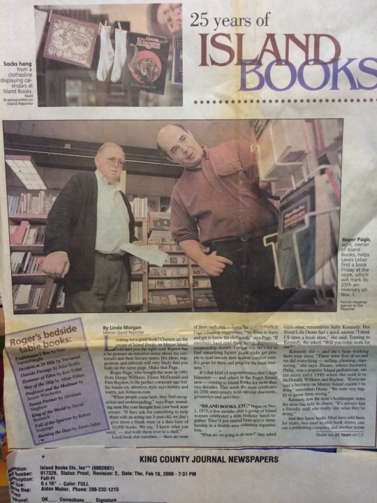
50 Years of Island Books: Roger Page, Part 1
Roger Page says even though his wife Nancy’s successful wedding floral business was more profitable than Island Books in the early days, they committed to Island Books because the scheduling and lifestyle were a better fit for having a family. Nancy Page would tell you that her final and most enjoyable career was the 15 years she spent working at Island Books. These days both Pages are enjoying their retirement, still reading plenty of books and traveling to visit those not-so-small children, Emma and Lewis, who were the deciding factor in ownership of Island Books all those years ago.
Miriam: Roger, tell me what it was like during the first month you owned Island Books. Did you have a moment that made you realize what you could bring to the community?
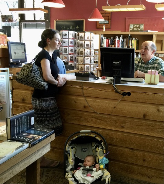
Roger: Remembering the first month of owning Island Books is hard. It's a bit like the frog in the boiling water story. You sit in the pot for a long time enjoying the warmth, and suddenly, you realize you're the one being cooked. In 1984 I called every bookstore in Seattle looking for a "Christmas season" job, and Island Books was the only one that called back. I did realize in the first month that I was very lucky to have landed in a much-loved bookstore on an affluent island. I was the only male and only full-time employee among 19 well-educated part-time women. Everyone was recognized, everyone was appreciative, and everyone really read. The bookstore felt big, full of surprises, and full of energy.
I decided to stay on and went to something called Bookseller School the next spring. Full of "new ideas," I returned, and thanks everlasting to the generous and kind three women (Marge Wilkens, Fam Bayless, and Elinor MacDonald) that ran the store, they made space for me and entertained my ideas. I didn't deserve a seat at the table, but I think it was easier to deal with me than all their friends that worked with them. After a year, I was titled "floor manager," I focused on streamlining the systems, culling the aging inventory, and rebuilding sagging shelves. The customers were great, but not friends yet and there was much to be simplified, for the store had suffered a bit from too many cooks. I was single and willing to heft, nail, or come in early or late.
After six years, I really felt I had found my calling, and I was married to Nancy, the wedding florist, who came to work at the store later down the road in 2000. As we began to think about a family, I approached the ladies about buying in, and they again took a generous and gracious turn and said they would back me if I wanted to take the reins alone. So with a Volkswagen bus as collateral, we had a lovely afternoon drinking fine Washington wine and signing the papers at the Bayless home. What changed in the first few months of owning the store was that the community began to recognize me.
I had a role and a responsibility to maintain the standards of hospitality and good books. Honestly, supported by the ladies, I felt confident and excited and loved making real friends of all ages and stripes. I (and eventually Nancy) had fallen into the arms of a big warm family, and I loved coming to work and unlocking the door each morning.
Miriam: Tell me about when the unmentionable online and big box retailers came on the scene. What were the in-store clues that wisdom and humanity could endure up against the algorithms?
Roger: My time at Island Books from the late eighties to 2015 parallels the most dramatic period of change in the history of the book retail industry. In some ways, we were the canary in the coal mine for a set of revolutions in the information industry and general retail. When I started, we were in the mom-and-pop store era of bookstores. This model led to great diversity, strong community ties, and low competition between stores. People (especially people on Mercer Island) had their store, and the store was catering to that community as much as making a profit.
Everything began to shift in the late eighties. First, it was a trickle of Walden and B. Dalton chain stores in Seattle. I wrote a now prescient memo—you can look at our old blog post about that infamous memo here—
https://mercerislandbooks.tumblr.com/post/62015474728/island-books-in-1986
about the specter of the discount chain of Waldenbooks and the need to strengthen our service and ties to the community. Then the first direct blow to business came in 1993 when Barnes and Noble opened a big box store in Bellevue. We had always prided ourselves on our children's section, and overnight there was a store twice our size 10 minutes away. Then Costco became more popular and, as a sign of things to come, they used books as a loss leader and broad-based customer attractor. Finally, Microsoft and personal computers made their mark on homes in the early 90s. The bookstore as a storehouse of knowledge for adults and kids faded fast when they could look it up "on their computer."
Honestly, my reaction to these existential changes was largely terror. I was starting a young family, the store was our sole means of support, and it seemed like a new battle to fight every year. We reacted by working hard to speed up our special-order business ("We don't have that title but can get it for you Wednesday!") and to emphasize our free shipping and the expertise of the booksellers. The community appreciated our efforts, and despite plenty of dips and valleys, we continued to grow slowly despite the competition. In the late 90s, Amazon arrived and presented a different magnitude of the challenge. For the first time between the growth of the web and Amazon's "free" home delivery, many customers never saw the need to visit our store.
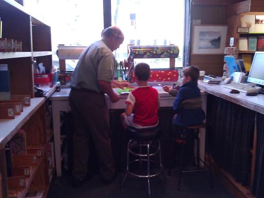
If we never saw them, our knowledge and service would be useless. So, we turned our focus toward marketing and events doing all we could to draw them in. This led to huge Harry Potter parties and hundreds of tiny evening gatherings of self-published Island authors. We also began to emphasize our school fundraisers to connect and show our commitment to the community.
Throughout these roughly twenty-five years of change and increased competition, almost three-quarters of the independent bookstores in the country closed. The Mom-and-Pop store model was defunct. We learned about lean inventories, just-in-time ordering, niche marketing, shopping as entertainment, and the value of "third places" in the community. Our deep ties to the community ultimately helped us weather the storm.
One moment stands out. At some point in 2005, Amazon tried out a new idea on Mercer Island to use school communities to raise funds for the school. We had been doing this for a decade and had raised several hundreds of thousands for local schools. One day a big "Buy from Amazon " banner appeared outside a local school. We felt like jilted lovers: angry, scared, and sad. This was very close to home, and we knew if Amazon lured away families, we would not survive. I said as much to some long-standing customers, and their response exceeded all expectations. The school's foundation sided with the store, and the banner disappeared. The unspoken loyalty of the community was voiced out loud, and it was a turning point for the store.
It became clear that our fate was tied to the choices they made. From that point on, it felt that there was a deeper appreciation for the bookstore and, in turn, for our community. We were joined at the hip. Through the spring of 2009 with the Great Recession, the Kindle was the darkest hour for independent bookstores. We bounced back quickly and had some of our best years (2010-2015) at the end of our tenure as owners.
Miriam: That was right around when I came on the scene after I’d defected from the Amazon Books team and moved to the island from Capitol Hill. I remember we had lunch across the street from the store, and you gave me a lot of this oral history over Thai food. As I listened, I was thinking, how can I use all the knowledge I gained at Amazon to help Island Books thrive? And thrive it did and continues to endure. It’s like the little engine that could.
To our Island Books community: stay tuned for part 2 in this conversation, coming soon. Once Roger and I get going on the subject of Island Books, it’s hard to stop us...
—Miriam
#islandbooks#miriamlandis#rogerpage#nancypage#indiebookstore#bookstore#Miriam landis#50 years of island books
4 notes
·
View notes
Text
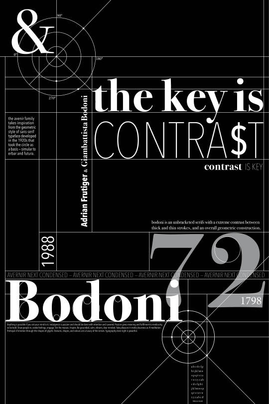
Assignment A
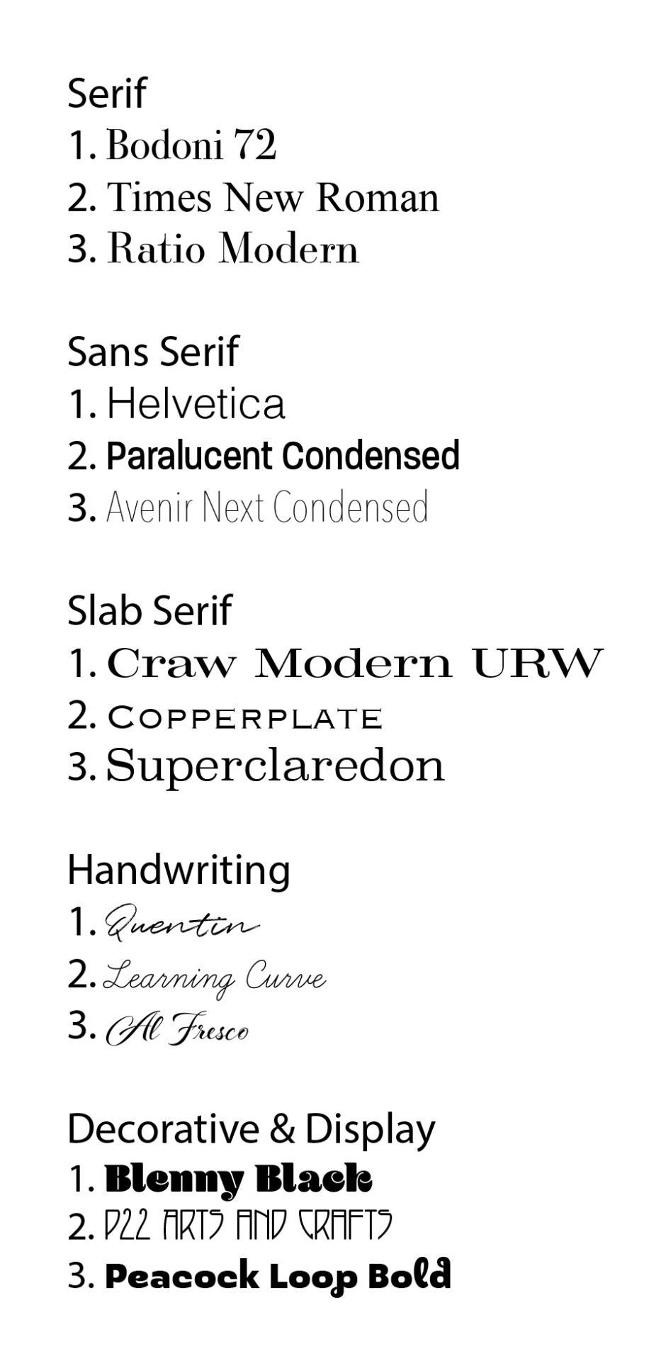
Serif - I chose these 3 fonts to be in my go to serifs because each is easy to read and would work well in body texts as well as display. Bodoni has a destrincted contrast between thick and thin lines and is slightly more condensed. Times New Roman is a classic and you can’t go wrong with a typeface that has been used for years. I like Ratio Modern for the light stroke weight and flare on the serifs, gives a little more elegancy to the typeface.
San Serif - As for these choices I wanted to have a mixture of stroke weights and denseties. Helvetica is also a classic font that i think you can’t go wrong using, I like the width this typeface has. Paralucent Condensed has a soft and pleasant feel to it. Its a bit more playful than Helventica and Avenir Next Condensed. I chose to include Avenir Next Condensed because of the variety of weight they have created, it is a very versitile font choice.
Slab Serif - Craw Modern URW has a unique height and width that I think will be useful as a display font or a logo. As for Copperplate it has a very posh look to it, could be used in advertising or business sign. It is a font that means business, yet is simple and legible. Superclaredon comes with 4 weights and like Craw Modern has a very full look, however it has more of a bubbly look. I think I like this one because it is simular to my own writing.
Handwriting - Quentin is one of my go to fonts when needing a display font or title. It has paintbrush stroke lines which gives it an airy and delicate look. Learning Curve is simular to my own cursive handwriting, I like this font because its got a more personal yet legible style making it a versitile font. Al Fresco on the other hand is more fancy, I can see this font being used on an Italian or French resturant menu or store front window.
Decorative & Display - Blenny Black is beautifully curvy with elegant hairline whitespace. It has a bit of a 70’s vibe to it with the exaggerated ball terminals. P22 Arts and Crafts is such a different looking font, its been used in museums and record covers. Its not the more conventional but its definetly a statement display font. Peacock Loop is a fun and young typeface with a little flare. I like the inperfect playfulness of this font.
1 note
·
View note
Text
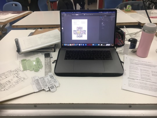
September 16, 2019 - Second Class
Today in packaging we went over our mock up from Assignment 1, Part 1. We discussed the complexities that even a small package has. Such as box thickness, tricky cutouts and all the intricate measurements. We spoke about the content companies need to have on their packaging and the content that is purely marketing.
We then were introduced to Part 2; this part of the activity we were paired up and instructed to switch all three parts of Part 1. Unfortunately not everyone’s diagrams are accurate, resulting in some of us to have to re-sketch and measure out the packaging. In saying this it is a good lesson because in the design world you are not always given a perfect outline/design. I am looking forward to the challenge as well as bring a 2D image into a 3D structure.
1 note
·
View note
Text
Revised Case Study
ARTG 476 – Portfolio
Studio Blog Post 10
Waste No More
Pull Quote Options
“Waste No More aims to educate and support restaurant owners and employees regarding the environmental impact food waste has on the industry and our planet.”
“Food and Beverage business owners feel that they often compromise their environmental responsibilities to be more efficient.”
“75% of waste that ends up in the garbage is in fact food.”
What I Did
Branding, Environmental Design, Illustrations, UI UX, Copy Writing
Challenge
Working for years in the restaurant industry I have seen first-hand how much food is thrown away. Research shows that 75% of waste that ends up in the garbage is in fact food. I have always thought there must be a better way. After meeting with local businesses I discovered that more often than not owners feel they compromise their environmental responsibilities to be more efficient.
Moreover, food ends up in the landfill and breaks down into methane which is 25 times as potent as carbon dioxide. In effect the food and beverage industry is significantly contributing to the climate crisis. I want to change that.
Approach
I looked at the broken system and it is clear that the current waste management system is not working for the food and beverage industry. There is a need for a new way to disperse and dispose of both edible and non-edible food.
However, project Waste No More is more than a waste disposal/management system, it’s a way of life. We need to change the way we look at food and help business utilize their waste in a more effective, efficient and beneficial way.
First I needed branding, the face for my idea. The logo was inspired by the recycling symbol, the idea that all food waste can be a part of one continuous cycle. This was a paired with a warm, professional yet eye catching colour palette.
The inhouse signage, a infographic poster and an informational brochure were next. Even though these deliverables would most likely live in the back of house it was important that they have a professional and adaptive look. It’s during this process that I decided to draw 20 different types of half eaten food items on procreate to make a fun and multifunctional pattern.
The last step was to design an app that would function as the middle man (or woman) in the distribution process. I wanted the user experience to be as easy and streamline as possible, leaving little to no room for confusion. The app is divided into two main sections: Project Leftovers and Project Compost.
Project Leftovers is a program that takes all edible food out of the garbage. Food will be logged into the app were people in need can order and pick up food free of charge. This will eliminate edible food being thrown away due to mistakes and end of service throw-a-ways.
The compost system will allow businesses to connect with local members of their community that are in need of compost. By utilizing a compost system businesses can use their own compost for gardening around their properties and ultimately cut down on what goes into the garbage.
Programs
Illustrator, inDesign, Procreate, Photoshop, XD
0 notes
Text
Revised Rationals
ARTG 476 – Portfolio
Studio Blog Post 9
Bridge the Gap
What I Did
Brand Identity, Illustration, Typography
(indicate picture and caption)
Challenge
(indicate picture and caption)
(pull quote – “3 different port cities have come together to feed the hungry and promote local acts”)
Despite working 60 hour work weeks a group of dedicated lawyers and business professionals from 3 different port cities have come together to feed the hungry and promote local acts of kindness. These busy volunteers find time to make a difference for those in need. Inspired by their dedication I designed an iconic logo to capture their mission.
Approach
(indicate picture and caption)
(pull quote – “two clasping hands in an organic line drawing to represent the human connection”)
For this logo I illustrated two clasping hands in an organic line drawing to represent the human connection. I also used nature elements to reflect their natural surroundings. A clean contemporary san serif keeps the logo readable at different scales while full colour, monochrome or black and white versions work for different applications.
Programs
Procreate, Illustrator, Photoshop
Finding your way through Benson’s Mist
What I Did
Environmental Design, Wayfinding, Branding, UI UX, Illustrations, Copywrite
Challenge
(indicate picture and caption)
The city of Nanaimo also known as the harbor city is home to 100,000 people and is located on the east coast of Vancouver Island. Like many cities it faces challenges of growth and expansion. This has resulted in a wave of new shops and restaurants opening all over the city, thus taking away business from the downtown core.
The goal of this project was to revitalize the heart of our city through the design and implementation of a strong wayfinding system. My design choices were fueled by the hope of creating a space that is warmth and family friendly.
Approach
(indicate picture and caption)
Nanaimo is known for having a stunning backdrop of Mount Benson, a 1,023m tall mountain that sits in the middle of our city. I let the elements from our lush green forests influence my logo design and branding. Rooftop green spaces and green walls to be installed throughout the downtown centre, creating a dreamy atmosphere. Solar powered string lights would also be installed throughout the narrow streets to add ambience and promote safety at night.
Each district is defined by a colour coding system shown on light poles, bike racks and waste bins. Three solar powered information stations would be installed, which include an interactive map with unique icons, a directory of shops and restaurants and a QR code link to a mobile app. The stations include a help button to connect to local authorities if needed.
Programs
Illustrator, inDesign, Photoshop
Base Camp App
What I did
UI UX, Branding, Illustrations, Typography, Copy Writing
Challenge
(indicate picture and caption)
Millions of Canadians claim to be mortgage poor; and a third of Canadians spend more than 50% of their income on housing. I recognize that not every homeowner has the ability to rent a room or have the extra income to purchase that secondary property to rent out. As a previous homeowner myself I understand the financially stress and toll that it can have on a family. I want homeowners to feel impowered by their investment not burdened by it. I created this app so that homeowners can make the most of their properties and hopefully get a little ahead financially.
Approach
(indicate picture and caption)
With a similar business model to Airbnb, my app connects homeowners to people in search of an affordable place to set up camp or enjoy a glamping experience. I have gone to a couple music festivals in my life and one thing that always seems to be an issue is the cost and lack of options for accommodation. Either hotel rates go up by 50%, campsites are full and noisy or everything is sold out. This app opens up the field of accommodation even further. I kept my design for this app clean and modern looking, with easy to use navigation. I wanted the focus to be on the properties and what the homeowner is offering so I didn’t overcomplicate the design.
Programs Used
Illustrator, XD
0 notes
Text
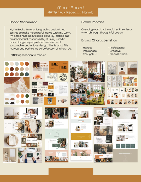
Identity & Mood
ARTG 476 – Portfolio
Studio Blog Post 6
Moodboard & Visual Identity
1 note
·
View note
Text
Ideal Workplace
ARTG 476 – Portfolio
Studio Blog Post 5
A. Who are they? (use somewhere you dream about working). Include their name and a description of what they do. Include a link to their website
Loop is a creative agency that uses design to help social impact organizations address the world’s most pressing challenges.
https://weareloop.com
B. How are they a good fit for you? How do they align with your own personal and professional goals? What might you learn? How will you develop further as a designer?
My ideal workplace would be to work for a design agency whose clientele who have socially and environmentally responsible businesses. I would love to be a part of an agency like Loop because my drive and love for design stems from what they are going. I think working for a place like this would help me develop in all areas as an empathetic designer.
C. How are you a good fit for them? What skills and unique qualities do you bring to the table? As a human being and as a new designer.
I believe I would be a good fit for Loop because of how my interests of social justice and equality drive the majority of my designs already. I can’t imagine doing anything else with my career as a graphic design then creating change, support and bridging gaps in society.
D. What are you offering to them, specifically? (think about your value statement, your skills, your strengths, your characteristics).
As a human I’m empathetic, kind, logical, rational, intelligent, driven, creative and an inclusive thinker. I want to make a difference in my life and giving a voice to businesses, organizations, and volunteer programs that want the same would fulfill me in every way. I thrive when I’m inspired and surrounded by likeminded designers.
1 note
·
View note
Text
Self Audit
ARTG 476 – Portfolio
Studio Blog Post 4
Links I will use in my portfolio:
Home, About, Resume, Design, Photography, Shop, Contact
Projects I will showcase in my portfolio:
Graphic Design
Re-Imagining Downtown Nanaimo (School Project - Environmental Design)
Base Camp - App Design (School Project – UX UI)
Packaging Re-Design (School Project – Packaging)
Waste No More Project (Brochure, Poster, Project Compost, Project Leftover, App Design)
Waywest Construction Logo Design (Freeland Project)
Bridge the Gap Logo Design (Freeland Project)
Cruisetopia Logo Design (Freeland Project)
Heavy Meadow Design (Freeland Project)
Artez Pricelist (Freeland Project)
Illustrations (Freeland Projects)
Photography
A Pandemic Reunion - Family Photoshoot (Freeland Project)
Landscapes – Prints (Freeland Project)
People (Freeland Project)
Wedding Photography (Freeland Project)
Product Photography (Freeland Project)
Hole fillers in showcase:
Use of mock-ups, case study and photography. I would like to create some small animations to help with engagement. Links under illustrations that take you to my Esty shop.
Portfolio Platform:
I will be using Squarespace
Domain:
Current Portfolio Domain - https://rhanelt.wixsite.com/graphic-designer
New Portfolio Domain - www.greenvelvetcreative.com
Wireframe
1 note
·
View note
Text
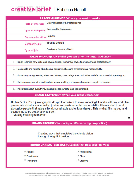
Finished Brief
ARTG 476 – Portfolio
Studio Blog Post 3
0 notes
Text
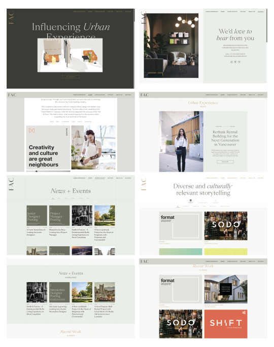
Portfolio Inspiration
ARTG 476 – Portfolio Studio
Blog Post 2
Below are some screenshots from the website: https://www.freeagencycreative.com
I really like the over all look of this website because its, clean, simplistic, dynamic, and something that I myself could actually design. The subtle details dedicated to the typography make a huge impact on the refinement of the website. The colour palette is neutral, which allows the work to not be overshadowed. The subtlety of the colour also brings out the typography and allows for some room to play with its colours. I also like that they use photography and a couple animations; this adds complexity and helps with engagement.
0 notes
Photo
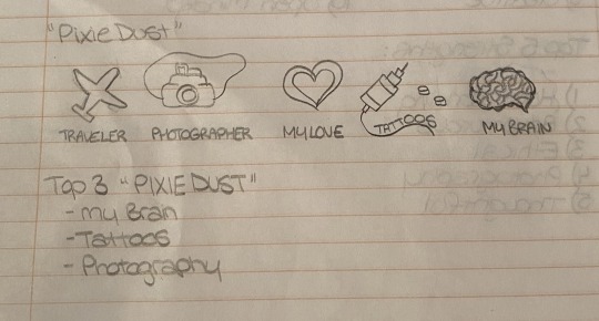
Pixie Dust
ARTG 476 – Portfolio Studio
Blog Post 1
Week one is done and I’m excited by all the new and interesting projects we will be learning about. Portfolio Studio will teach us about who we are and how to brand ourselves to our truest form.
Personal Brand Self-Assessment Worksheet – We have been asked to dive deep and think about who we are, what makes us unique, what we are good at and where we are headed. This assignment was interesting for me because I realized that I’m way to hard on myself, I need to give myself more credit for the things I’ve accomplished as well as the things I'm good at. We also touched on our weaknesses which made me realize the areas that I should spend a bit more time working on.
The Pixie Dust portion of this exercises was to highlight what makes us different from one another. My 5 illustrations included that I’m a traveler, photographer, intelligent, passionate, and I hold memories via illustrations on my skin. My top three being my intelligence, photography and tattoos.
Intelligence: I pride myself on being a very logical and rational thinker, however I have the ability to dream up ideas and express my creativity through multiple facets in my life.
Photography: I see through a lens most of the time, I constantly am thinking this would be a good shot, this is the better angle even when I don’t have my camera on me. I think this is valuable because I see the world a little different from most people.
Tattoos: The artwork that I have on my body tells a story, it shows where I came from and where I'm going. I love that I wear the art I've drawn and that I’m able to visually represent the adventures I’ve been on. It reminds me to stay true to myself and to never settle for a path that isn't fulfilling.
0 notes
Text
Blog Post #8
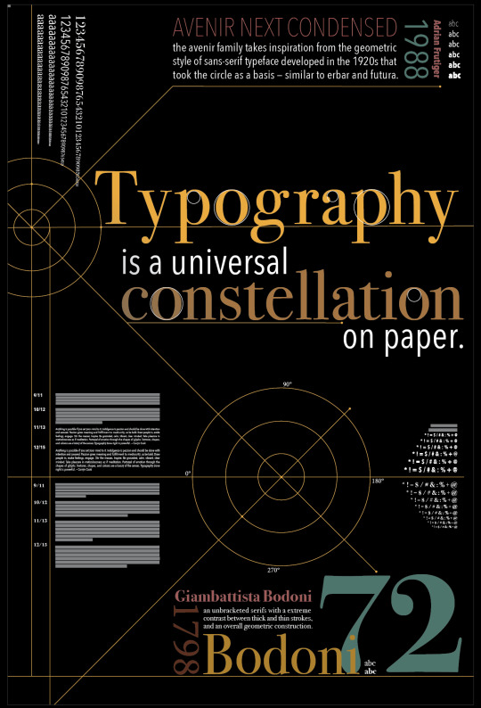
Today is the the last day of class and it is bitter sweet. I have learned a lot this semester and I feel that I have made progress with my typography skills. We got more critique today and worked on our type specimen poster further. I played around with more colours and different layouts. I am excited to see the final project on proper poster paper and size. I think that between getting critique and going through so many rounds of iterations my concept got stronger and stronger. Obviously, I could finesse forever but I will settle with a couple more final tweaks and will let it go. Typography is hard, but essential to in becoming a great graphic designer.
0 notes
Text
Blog Post #12 — Rational
Branding Package Series
Challenge
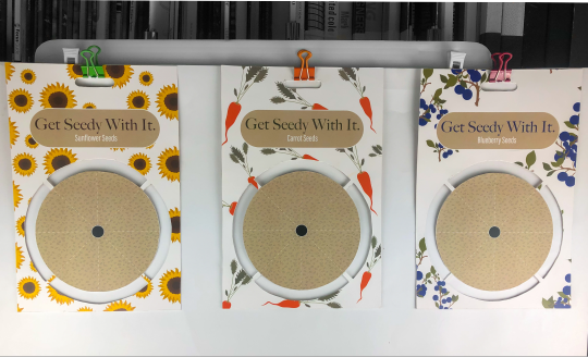
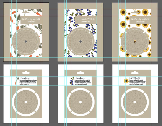
The biggest challenge I faced was designing packaging that was 100% environmentally friendly while being esthetically appealing. I also had difficulty with making my packaging structurally sound, as someone starts ripping the triangle off it will weaken. My idea behind having the 8 individual triangles to actually use all the seeds provided and to appeal to newbie gardeners.
Approach
My approach was to design packaging that was 100% biodegradable and I wanted to challenge myself with the design. When it come to the packaging of seeds normally they are in a large wax paper pouches, which contributes to unnecessary waste. I went with a creative and artistic approach, I want my design to attract the eye and to appeal to the younger generation — hopefully encouraging them to get into growing their own food etc. I think with the updated design it would make for great gift. I designed my packaging to be made with 100% biodegradable material and with minimal surface area to reduce what goes in the compost. You tear one of the triangles out and place it directly into the ground. It is so very important for people to be conscious when shopping for products and as designers we have a huge role in the packaging world.
Outcome
I produced a packaging design that is environmentally conscious, packing that is trendy yet practical. I think the goal of any packaging design now a days it to reduce the amount of waste we contribute. This is something that I am very conscious of and always make a point to think about while I am shopping. I want the user to appreciate environmental impact and the thought and care that “my company” puts into their products. Planting our own foods and is not only good for the bank account but essential for our planet.
0 notes
Text
Blog Post #11 — Creative Application
Branding Package Series
We had the privilege to have the guys from Hired Guns come and critique out banding designs. The feed back they gave was awesome, they don't tiptoe around what works and what doesn't — which is so helpful. They suggested I work on the structural components to my design, however with the time given I won't be able to. I will play around with the typography size, colour and placement. I am excited to see my designs come to life and hopefully I might be able to take it further in the future.
0 notes
Text
Blog Post #7
Today we printed out out poster full size and hung them up for some feed back and critique. This process really helped me see things that I didn't necessarily catch or elements that I skipped over. It was interesting to see the different directions that everyone took, it gave me some ideas to bring into the second round of drafts. I think that critique is one of the most important parts of design, learning to take critique and give it is something that I know I've had to work on. I give my critique based on my initial reaction to the design, does it make me intrigued or want to pass by. I base a lot of my choices on gut feeling and I think thats what has made me a better designer.
0 notes
Text
Blog Post #11 — Visual Brief
Branding Package Series
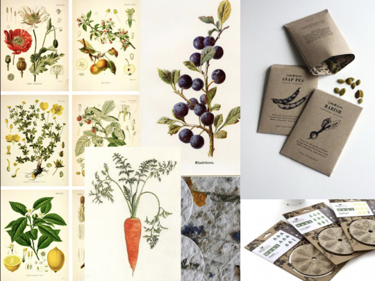
Today I did further discovery and research about how I want my packaging to look. I will be going with a minimalistic design similar to the one above. I want the illustrations to look vintage and to have a botanical poster feel mixed with modern typography. I am planing on calling my brand “Get Seedy With It” and the subcategories to be: for the bee’s, for the trees, for the leaves. I will be creating packaging within the 3 categories of fruits, vegetables and seeds. The material used will be seed paper that is scored to into stripes that will be torn off and planted directly into the ground. My goal is to create packaging that is 100% biodegradable while maintaining a funky new brand. My hopes are that people will choose my product for its environmentally conscious efforts.
0 notes
Last Seen Blogs

ilovemycurls-blog
eyes wide shut

atr3m1s
The Former Gifted K1d

weekly-zazee
Weekly Dose of ZaZee

mickelspixels
Untitled

artolkien
«stormborn»