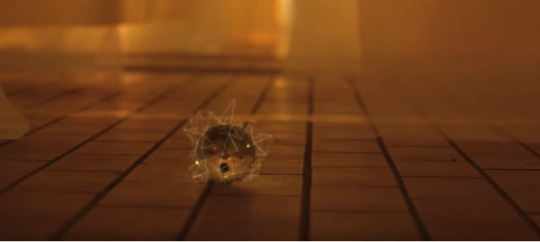
#went copy-paste thinking it would duplicate the whole thing onto the dark background but it only took the highlights
Text

Lil’ minimalist 2am notes app drawing 🌘
(WIP it came from below the cut)

#dan and phil#dnpgtumblrtag#wanted to brainstorm what my next piece would look like digitally but don’t have access to my laptop rn#so I put it in the Freeform app which is like notes but pure doodle function#went copy-paste thinking it would duplicate the whole thing onto the dark background but it only took the highlights#and now it’s a cool minimalist doodle#ser sketches#btw the next artwork itself is inspired by phil = moon and the eclipse shirt#so that’s why sun & moon#dnp
105 notes
·
View notes
Text
Astronaut theory
first of all, I am confusion lol
SKZ broke me in a way that my mind is overthinking so many things that now I believe that anything from their MVs might be a sign. And may I add that Chan's recent live only made me even more confused PLS BOY IF YOU SEE THIS DROP THE THEORY YOU SAID WAS QUITE CLOSE TO THE TRUTH cause I'm nearly losing my mind, I need answers!!!!
so here I am again trying to understand their concept and trust me, it's not easy or short and I don't even know if it's right which makes me even more frustrated... also, we may have lost some important pieces to connect the whole story bc we don't know what was taken from the original MV with ot9, so yeah…
anyways... let me put a guide for you guys cause I'm not gonna write the title of the songs all the time, so AS = Astronaut; DK = Double Knot; MH = Miroh; SE = Side Effects; VS = Victory Song; YW = Yellow Wood (teaser); D9 = District 9; IAY = I Am You
Alright, let’s go back to the beginning! In I Am Not teaser we see that each one has a specific function inside the system or is doing sth very particular, Felix is dancing in front of mirrors on a rooftop (where they always are on their MVs) with a building nearby that shows a sign with FAKE on it – clearly indicating that either Felix is fake or their reality is fake, or maybe both; Changbin is in a room full of TVs like MIA; Seungmin is drawing sth that looks like a map (but I guess it was supposed to be sth else?) but he’s also the one in charge of the maps in Double Knot; we have Hyunjin trying to control a VR system, he looks quite frustrated with it, and after Hyunjin removes the headset, we hear a sound similar to when a program is being interrupted on tv and his image is frozen, probably bc he was disconnected from the main system.

and the most intriguing part: we have Jeongin in a bus – also sth reoccurring in their MVs – and he sees another Jeongin sitting on the bus stop, as if waiting for him. We all know by now that it’s a double, a clone, or whatever you may call it (like I mentioned previously on my Side Effects analysis that clearly shows they have ‘shadows’ like other selves copying their moves).


we don’t see what happens afterwards, but I’m gonna assume he finds out something is not right in the system and probably tells Chan (their leader) about it. Why I think this? Because in MIA they both sing the following lines: “Something is different, carefully look around you” (which is exactly what Chan does in D9) and “Something is changing, even if you hide it so hard, I can see it all” (which is what Jeongin does on the bus and also in Miroh, cause he’s the one in the control room, right?). But the thing is… I believe that the fake Jeongin is the one with SKZ in District 9. The double took his place after he got off the bus and is acting like Jeongin would, helping SKZ and all, but his line “better watch out” shows sth different, it seems somehow too menacing, almost like a threat – at least to me. So SKZ better watch out now cause there’s a fake among them, but SKZ is unaware

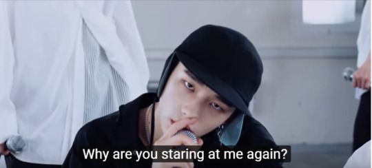
moving on.. it’s also in MIA that we see SKZ being duplicated – it looks like it can’t be helped. We know for sure that there’s a double for Chan, Woojin and Felix. In the MV it seems like Hyunjin also has a double that is watching himself from the other side of the door while the one inside the room says “Why are you staring at me again?” and then we see a surveillance camera (they’re onto Hyunjin, but Hyunjin seems to notice it).

this may seem dumb, but Changbin is duplicated in Get Cool (and like I said, any evidence is evidence lol). I don’t remember seeing Jisung, Seungmin and Minho being duplicated in any MV, and isn’t it weird that they’re the ones we see on the cage in AS?
in My Pace we have seven numbers shown behind them when they’re dancing: 137, 163, 191, 223, 241, 271 and 307. I thought they wouldn’t put this randomly so I searched what these number might mean and I found that they’re prime numbers (as you know, prime numbers can only be divided by themselves), and that prime numbers are very useful for creating keys to decrypt data by hackers. So I thought… what if Jeongin and Chan were trying to decrypt the system in order to mess with it but they need a key and Hyunjin was the key? And after DK happened, they managed to create glitches even more powerful than before? (like I explained in my theory).
anyways… moving on to Astronaut. ASTRONAUT = a person who is trained to travel in a spacecraft. But what if in SKZ concept an Astronaut is someone trained to travel their realities? And as we can see in I Am Not, Hyunjin is the one being trained in the VR apparatus.

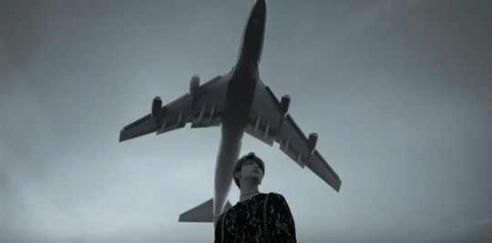
also, he’s the one with an airplane behind him in Victory Song (and by now I think every little thing in these MVs are clues, sorry)
so what I take from this is that Hyunjin is like the tester of the realities they’ll have to face in order to escape District 9, like he is on a trial mode, if that makes any sense…
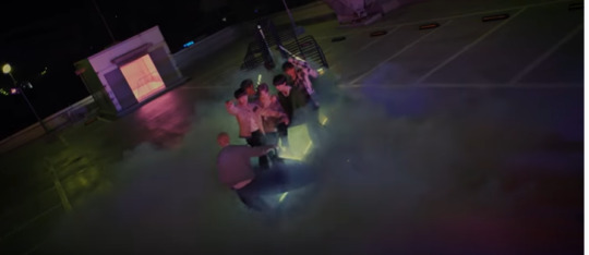
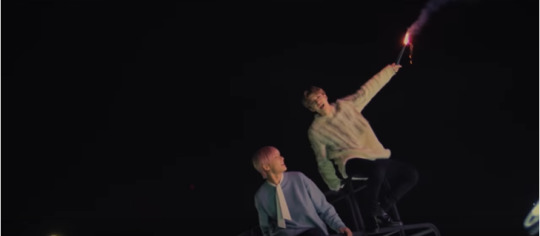
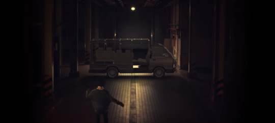
in the Astronaut MV, as we all noticed, we have some references from past MVs such as I Am You (the spinning thing); Victory Song (the red flares Chan & Jeongin are holding); Miroh (the boxes); Side Effects (the cart) and Chronosaurus (the plastics)
it’s interesting that Jeongin and Chan are the ones together when the music begins and I think this might mean sth because they’re always referenced as one, like in IAY; and Chan in AS is probably talking to MH’s Jeongin, because if they know what’s happening in the system, they might be able to keep in touch with each other even from different realities – but this is just me speculating too much!
in the MV we see 3 orbs: the 1st one is blueish with a green center; the 2nd is dark blueish/purple with a yellow center, and the last one is transparent with a black center.
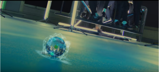

so I googled those orb colors and found out that the first one may signify communication, neutrality, healing – might be applied to a master/guide; the second one may signify caution, insight, notice; while the last one may signify insecurity, being trapped or tortured. I don’t know if this makes sense, but I put it in here bc I strongly believe that these orbs represent Chan, Hyunjin and Jeongin, since they’re the ones that seem to be the focus of this storyline (and the color scheme of the scenes the orbs appear reminded me of IAY, 19 and SE)
going back to the AS MV, we also see Felix glitching like he did in MH and I was able to see in the background glasses being smashed, lightening, buildings, a road and a bridge, storm, moon, etc., and these are all elements that are present in their MVs, like showing what they already faced so far.
the cage scene made me think of District 9. When we first see it, Jeongin is the only one inside, but then we also see Han, Minho, Seungmin with him – and they’re slightly glitching, btw.

some other things happen to Hyunjin, he keeps on running, and now he’s outside on a dark road with a storm coming up – which reminded me of SE a lot, especially because of the two moons -, but he seems quite peaceful facing all those terrifying elements

he runs towards the end of the road that he can’t even see what’s waiting for him there – but maybe it’s because he already knows what happens next.
Hyunjin finds Chan in front of a door (maybe the exit?) and they all go through – to me it looks like Felix is the one about to close it, like he did with the gate in D9. Chan then shoots sth towards the sky like he did in VS (which caused a storm), but here it only makes a beam of light appear for them – as if they’re asking to go up? Like ‘beam me up Scotty’? you guys know this Star Trek reference, right? lol
and now we see the sky, but we don’t have two moons… I know it’s probably bc it’s morning, but in SE it was also morning and we saw two moons, so I’m assuming Hyunjin was able to find the finish line of the VR simulation (because I’m assuming that everything with the two moons is actually the VR)
at the end, we see Jeongin walking to the spinning thing like a glitch – like Chan also did when he went to the door, as if teleporting from here to there – and he’s alone, probably left behind. But why would SKZ leave him behind? Probably because they didn’t know he was there...

alright, so what does it all mean? I’m gonna try my best to comment everything and try to link the MVs with the lyrics to create a somewhat decent storyline.
on the released picture of the AS track list, this is what is written (it’s a rough translation, so I’m sorry if it’s wrong): “when we were happy together, we could do anything, where we chatted and laughed carelessly until dawn. Suddenly, I saw a bead… what is it? As soon as I got close, I heard a strange sound. At the end of the sound was a faint mixture of familiar voices calling my name. Without thinking, I started getting drawn by the sound”
To me, the first part means the I Am You setting. They were all happy after being free, they created their own world where they could do anything as long as they were together. In AS we see Hyunjin in this same environment and that’s also when the first orb appears. Hyunjin is attracted by the orb that could possibly be SKZ’s way to communicate with him inside the VR. Because remember, Hyunjin is there but what he’s seeing and experiencing is not real. He’s testing the ways out for SKZ. But he was so happy in that reality that he lost himself, he didn’t know what he was supposed to do anymore. And SKZ sent something to guide him out of this fake environment as we see in AS. He then started his journey back to where the real SKZ are, going through all the tokens from the realities he’s been through (like the boxes with the confusing mazes, but that are easily destroyed bc is not real; the cart from SE, the gate from D9, etc…). What also gives him hints is how the members start to act after he begins his running in AS. After he destroys the boxes, Felix is standing there like a heroic figure, glitching with Changbin, looking almost unapproachable or as if he can’t see him. we see Chan on the floor, so Chan is probably grounded like Hyunjin.
then he sees his friends trapped inside a cage. But the thing is that this cage is really ridiculous, any of them could climb or help the other to get out of there, so I think they’re trapped bc they’re not real, it’s all a simulation, – except for Jeongin, but I’ll get to this point later on, hold on!! – and this cage represents D9.
Hyunjin runs endlessly until he reaches the road I mentioned already, and he finds Chan, they all go through the door (how could they if four of them were trapped? unless nothing of that is real) and they are all dressed in white, like when they escaped D9, dancing happily on the rooftop.
to me, after Jeongin got off the bus he realized the system’s plan and told Chan (their leader), and they came up with ideas to escape, but they needed someone that could control the reality, and Hyunjin was being trained for it – although he was frustrated with it - so they asked him to go unlocking worlds (or roads, or whatever) and he did it, but as farther he went, he started getting lost in the system bc he didn’t know who he was anymore, was he a clone already? What he’s seeing is reality or virtual reality? What’s the truth, what’s the answer?
Chan and Jeongin were able to guide Hyunjin throughout the MVs to continue with their plan, but Hyunjin’s mind was starting to lose itself, although he had a feeling that something seemed off… And Astronaut is nothing more than a recap of all what they’ve been through and Hyunjin’s journey to the unknown in order to find SKZ again and help them escape.
so what about that last scene with Jeongin? Well, I think the Jeongin in white clothes with them at the end is not the real Jeongin, and the Jeongin we see sitting alone is in fact the real one that is trapped inside the VR. Chan was guiding Hyunjin but lost Jeongin in the meantime and didn’t realize it or Chan knows it and is also a clone anything is possible, because to me the Jeongin we see in their MVs isn’t the real Jeongin since D9, like I said in the beginning of this analysis. Maybe the reason Seungmin and Minho were found on DK by the drone is bc Jeongin was with them and he’s part of the system? The others weren’t seen except for these three. I also believe this hypothesis because the gate in AS represents D9 and Jeongin is the only one moving after Hyunjin leaves, probably showing that the real one was lost in D9, but since there can’t be two “Jeongins” in a same place, he needs to wait for them to realize that they’re dealing with a fake one and come back for him.
alright, to summarize this huge analysis...
EVERYTHING THAT HAPPENED DIDN’T HAPPEN!! HYUNJIN WAS DECRYPTING AND TESTING THE REALITIES (IN THE VR THING) THEY HAVE TO FACE IN ORDER TO ESCAPE AND OVERTHROW THE SYSTEM AND NOW THAT HE’S FINISHED THE TRIALS HE’S BACK TO DISTRICT 9 AND CAN SHOW SKZ THE RIGHT PATHS TO FOLLOW BUT HE DIDN’T REALISE THAT THE REAL JEONGIN IS TRAPPED INSIDE THE VR AND HE LEFT HIM BEHIND AND NOW SKZ WILL HAVE TO GO BACK TO GET HIM OUT OMGGG I CANT ANYMORE
how else would we explain Hyunjin, Jeongin and Chan’s hairstyle looking almost the same as the one they had in D9?

some other thoughts I had: what if they’re duplicating themselves to leave the clones on the system so the real ones can escape?
ASTRONAUT also has 9 letters... this might mean something?
why is Chan singing all the time “I’m not me” in the background of Mirror? can he be trusted? I’m still not sure about Chan’s role in all of this bc he seems shady like Jeongin lol sorry Chan
from the Victory Song unveil track we have Chan saying this “we are Stray Kids, the owners of Clé. Roll the dice. Our beginning is District 9. We break the frame, escape from the system, and go beyond the fixed line towards STAY. We came to listen to Victory Song. So ring the 승전가”. Isn’t it weird that he says “break, escape, go” instead of “broke, escaped, went” ?? he only says “we came” bc the question is about their entrance in Miroh and Victory Song is after it, but if everything else also happens after D9, shouldn’t the other verbs be on the past tense too?
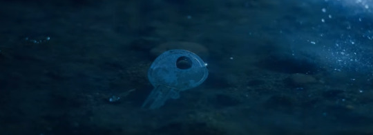
in Chronosaurus we see someone picking up three keys from the floor and I’m pretty sure it’s Jeongin.

one key for each – Chan, Hyunjin and him. But what can they do with the keys? I thought that maybe they could go spread themselves through the realities these keys unlock and place signs for them so they don’t get lost or forget about what they’re doing, like easter eggs? there are some black balloons on SE that reminded me of 19

in TMT there’s a billboard that Chan sees saying “do what you wanna do” (a message he left for himself there? and look at the background, it’s the space)

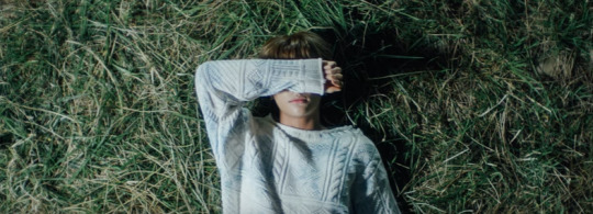
and what about Hyunjin? I’m not sure, but maybe the scene where we see him laying on the grass at the end of SE is actually because he just arrived in that reality and lost the key of that reality on that weird pond??? is the easter egg in SE himself??? I still think it’s weird the way Jeongin looks at him and smiles brightly in this scene lol
this is just what I was able to put together, but I still have a lot of questions and a lot of concerns, but unless Chan spills the tea I don’t care if it’s hot we’ll stay clueless about all of this lol
and he says we’re not clowns… right…
#stray kids#skz#stray kids theories#astronaut#stray kids astronaut#skz astronaut#stray kids comeback#skz comeback#bang chan#lee know#changbin#hyunjin#han jisung#felix#seungmin#jeongin#stray kids reactions
286 notes
·
View notes
Photo
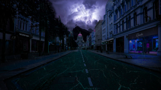

Today we used what we had learned this past term to non-destructively edit a picture of Nottingham to look post-apocalyptic, or at least dystopian. I decided to go the more dystopian root with my edit.
The first thing that I did was to duplicate the original picture. This was so that I always had the original on hand in case I made a mistake or wanted to back, and sometimes I forget to use a mask so this is useful for me. After doing this, I then duplicated the base image again but this time I didn’t lock it - I went to Image > adjustments > hue and saturation and edited the sliders so that the photograph looked more dark and purple in colour and general atmosphere. Since I had decided to try a dystopian style, I generally associate dark purple and blue colours with a dystopia which is why I made the choice to use that colour scheme here. Since I had copies of the original photo I was able to do this confidently as if I made a mistake I could delete the layer and still have the original to try again with. After I had done this, I used the magnetic selection tool on the edited image to erase the edits to the sky. This was so that I could edit the area the sky was in to a different image later.
Now that I had the whole sky behind the cathedral transparent, I wanted to add another picture behind it to give the city of Nottingham a more sinister vibe. I went onto Unsplash so I could get a high res image that was royalty free, and decided to go with a dark mountain shot that had stormy purple lightning coming off it. I thought that having a dark, foreboding mountain behind the council house would give a dark feeling to the image, although in hindsight this doesn’t do much to push the dystopian aesthetic - if anything, it causes the image to look a bit more traditionally fantasy-like which was not the look I was going for. However I am happy with how I managed to make a clear and neat selection of the area initially so I didn’t have to toil over cutting out the background behind the building for too long.
However, the selections near the treeline in the upper left had not been made clearly and still had traces of the original sky left behind. I spent some time thinking on how I could edit this out, and I experimented with using the clone stamp tool and sampling the leaves to try and make the trees ‘branch out’ more and hide the original sky. However, the end product of this made the treeline look very blurry and unrealistic in my point of view, so I decided to use the lasso tool to make a selection near the treeline and simply use hue and saturation settings to darken the sky to match the stock image I used behind it. I think this worked well and although I wasted some time on trial and error here it was worth it as I solved an issue I had with the edit.
Unfortunately I began to ran out of inspiration and time for this edit, so I decided to try and focus on some small details to see if that would bring me any good ideas on where to proceed later. I felt like a dystopian city would have some element of ruin, so I decided to try and make the road looked cracked to add some slight aesthetic. To do this, I went back to Unsplash again and searched for a cracked texture. Using the ctrl+t shortcut I then began to scale the texture against the road, occasionally right-clicking so I could switch transformation modes and fit the texture against the road better (most notably the perspective mode). I then lowered the opacity of the layer and added a mask layer so I could erase the texture everywhere except the areas of the road that I wanted it to be on. While this was a small addition it helped me become a little more familiar with mask layers and I think it was a nice touch.
In the end, I ran out of time and personally I am not as pleased with this edit as I have been with others. I think I should have probably chosen another theme, or at least another photograph of Nottingham that would have fit the dystopian theme better - I saw a classmate do a very well edited image where Nottingham was enveloped in flames, and manipulated the hue and saturation alongside stock images to make a very believable image. In the end for a dystopian theme I would have needed to use stock footage to edit in too many small details, and I think it shows when I only had time to edit the colours, add clone stamps and overlay textures over the photograph. If I were to do this again I think going for a much more obvious and explosive theme may have been better.
2 notes
·
View notes
Text
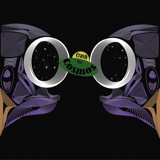
Designing My Final Album Cover
I then tried using the owl skull I drew that was inspired by Patrick Seymour. I previously mentioned that this piece of work is probably my most successful piece from the last 2/3 weeks of work.
Here, I started by placing a black grainy background which I did by creating a square using the ‘rectangle tool’. I then duplicated this to which, I layered it over the top of the original one. I then went into ‘effect’ and ‘effect gallery’, where I chose the ‘grain’ which you can find under ‘texture’. I then played around with the settings as I wanted to still keep the shape being a dark as possible as this would then mean a stronger contrast between the owl skull. I only wanted a slight grain as this would then give a little bit more interest to the whole piece. Once I was happy with the effect, I clicked ‘ok’ but then went the opacity setting at the top of the page. I wanted to decrease the opacity of this textures shape so then the black shape I originally placed can somewhat show through. Doing this would give an overall darker effect, while still showing the grain.
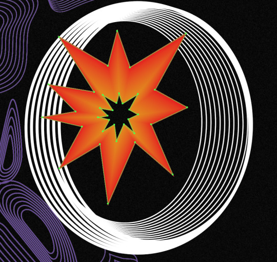
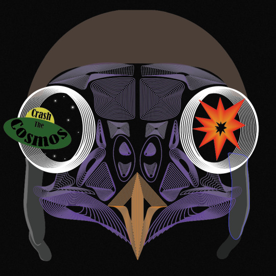
After this, I simply just opened up the file from when I drew this owl skull and copied and pasted it, onto this new page. I positioned this in the centre of the page. I then had the idea to use the eyes to capture the viewers attention as I think this part is the most striking. As the theme is multiverse, I thought of showing stars in the eyes with a spaceship flying into one of the eyes. For the other eye, I felt that I could almost show the impact of the spaceship going through the eyes. To represent this, I had the idea of showing an explosion.
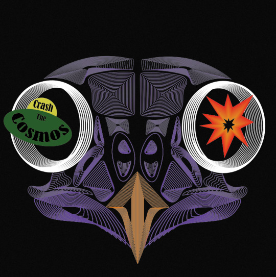
To create the explosion, I knew straight away at how I could produce this. I used the technique that I have recently learnt which is when I used the ‘blend tool’, but this would be a very basic method out of all the other things I created, as I wont do anything special when blending. To get this effect below, I used the ‘pen tool’ to draw the spikey effect for the look of the explosion, where I then copied and pasted this shape and decreased its size. To do this I just held down ‘shift’ and ‘alt’. When drawing the shape, I chose to create a very simply looking explosions I want the viewers to be able to see what it is at first glance. Then, I chose the larger shape to be a red colour and the centre shape to be orange. Next, I selected the ‘blend tool’ and just clicked on the two corners. I double-clicked on the this tool in the settings, where I was playing around with the number of steps as I felt that I didn't really want any of the lines showing. I can’t quite remember what number it ended up being, but it was definitely a higher number than I have been previously choosing. This is the end result of this, to which I think it achieves the look I was hoping for as it is very simple but I felt it needed to be.
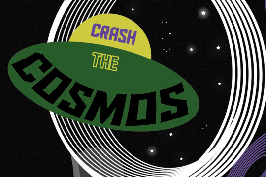
I then created a simple looking spaceship too. I thought to have the band name in this so the type is almost apart of the design. As you can see, I have curved the word ‘cosmos’. I got this idea from one of the scans I did when I was distorting type. I was going to use the actual scan itself but found it could look a bit messy so I just created the same effect but digitally. To do this I went into ‘object’, ‘distort envelop’ and ‘make with warp’. But before I even created this type, I produced the spaceship first. Again, I went very minimal, and used the ‘ellipse tool’ to draw a perfect circle (holding down ‘shift’) for the top part and a circle where I stretched it further out sideways so it created this flying sorcerer effect. My inspiration for drawing it like this, was from old images or drawings from how people used to draw them. I found in old designs, they would be shown in a very simple way. I then show use the two colours, yellow and green. At the time, I thought these colours work so well together and reminded me so much of colours that would have been put together quite often in the past. When it got to creating and positioning the type into the spaceship, I went through all of the past fonts I have used in this project. I saw this font I used when distorting type using the scanner. I felt it looked very attractive. It doesn't scream sci-fi or space, but I was fascinated at how effective it looked. The font is called ‘Bernard MT Condensed’. I felt it gave a sense of professionalism but it wasn't boring nor anywhere near hard to read. I arranged the type do the first word was in the top section of the space ship and the other two words were in the bottom area. I made the word ‘the’ a smaller size than the other words. This is because it is less important and doesn't need to be the first word that catches the viewers attention.
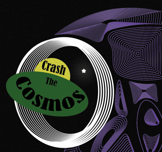
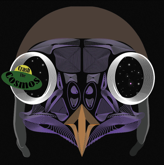
Next, I decided it was time to add the stars which I was going to place in the eyes. I thought adding this element into the design would really help to give the effect to the end result as these objects will show the viewers what their looking at. My inspiration for this was one of the poster designs in my Pinterest board (https://www.pinterest.co.uk/Libbym220/multiverse-ideas/) as the stars easily stood out as the object they the artist was implying them to be.
Below, is the poster I was referring to when creating my own stars. When I looked more closely at how they created them, to me it looked like they have drawn a normal star and then copied and pasted it and slightly rotated it but this new shape has been decreased size. There had then been a glow effect added as well.
This method of how I thought the object was created was exactly what I did to produce my own. Once I had assembled the shapes, I went into ‘effect’, ‘stylize’ and ‘outer glow’. This then brings up a tab, to which I just played around with the settings until I was happy. I started by changing the colour to white as this will then match with the start shade. For the first star, I made the opacity quite high and the blur low. Doing this means the star will be quite bright and the glow won’t be very gradual.

I did generate some more stars which were different to these settings. I copied and pasted all the different ones and arranged them in different places. I also added some very small circles in the design too, as this will then cover more of the negative background space.
As well as this, I added this flying helmet/hat to the owl as I had the idea that this would then relate to the of flying the spaceship. When I was looking for images to use to then trace, I found it very hard to find one where the helmet is from the front as most of the images were from the side. I did eventually find one. I traced the main features of the design where I could have added the goggles as well but felt this wasn't really necessary and could cover some of the owls face.
Here, you can see I have now taken away the explosion from the right hand side. I then added stars to it instead. I did this because I found it didn't really improve the design and almost looked a bit random.
I then wasn't too sure on the hat. I couldn't tell what the problem was so I tried changing the colours so the hat was all one colour. here, I have swapped the bottom section to brown but immediately knew this made it worse. I think its the brown and purple that wasn't working.
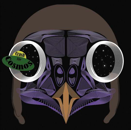
I then tried this silver colour to which I think it looked a lot better.

When looking at the screenshot above, I still thought something wasn't right as it almost seemed a it boring, all of a sudden. I thought that it might have been the black type so I tried to add some more interest to this by changing colours and adding just a stroke. As you can see, I have also changed the font as well. This one is called ‘Aldo The Apache’. This gives me a sense of space a bit more so I thought this could add to the design.
Although when I zoomed back out to look at the whole piece, it still didn't seem right. I decided to change it back to the original font and style, to which I had the idea of moving the composition of the owl. I thought as this owl is the exact same on both of the sides it could look interesting to place half the owl on one side of the and the same on the other side. Doing this, meant that the eyes were right next to one another. I slightly moved the spaceship so it now looks like its come from one of the eyes and going through the other. At this point, I can definitely see my ideas of how to arrange the elements are improving. I felt I was getting to a point where I was getting exited on how the end result was going to turn out.
0 notes
Text
Updating InDesign Photobook
I have now gone back into InDesign where I have adapted and adjusted some of the pages from last time. There was quite a few things I still wanted to change but I just didn't have enough time. Although there are also pages that I completely changed and I wasn't expecting to as I thought I was happy with them.
This is the way I left these two pages last time where I didn't have enough time to complete the pages. This time, I went straight back to this page as I wanted to finish as I knew what the plan was, but I just didn't know how to make it work. Previously, I had the idea to line up these two rectangles so that it created a pointed part at the top of the page. The problem I had with creating this was that I couldn't get the shapes to line up properly so there was always something sticking out.

I tried to draw the shape with the ‘pen tool’ which allowed me to draw this shape below. The line showing at the bottom of the page was not intended. I then realised that when I tried to go into ‘file’ and ‘place’ that it didn't actually go in the shape I drew.
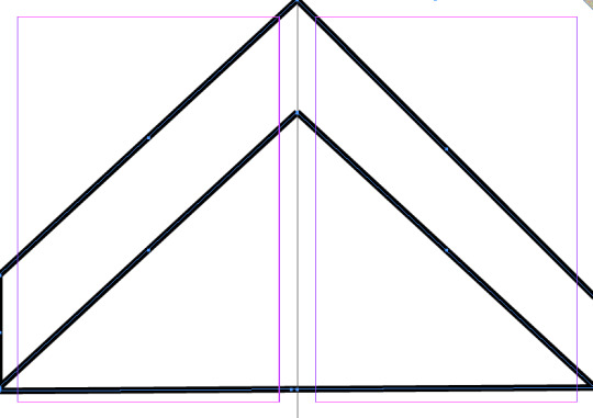
At the time, I didn't know how to fix this although I learnt that I can use the ‘direct selection tool’ to move some of the points. Doing this then achieved a very effective look now that there was nothing out of place.
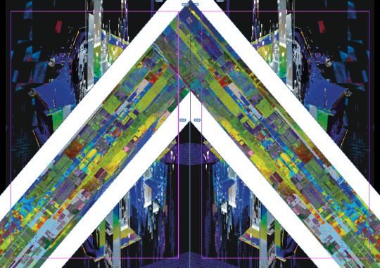
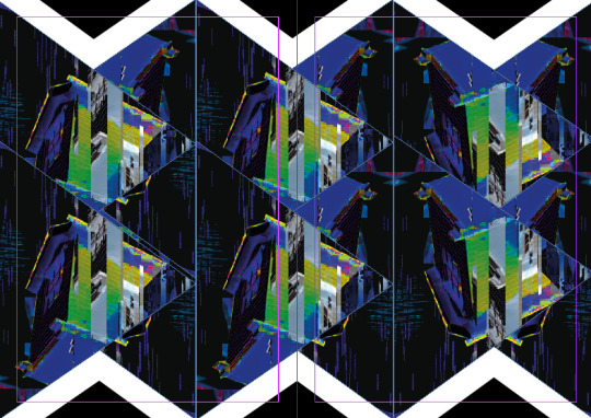
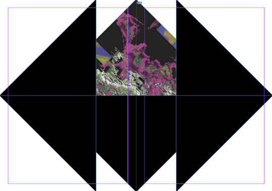
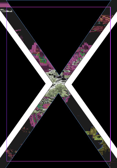
This is the next page that I was going to edit because even when I produced this page last time, I said how I wasn't very pleased with it. I felt that the dripping effect created with the ‘pencil tool’ didn't look right. Another reason to change it was that I felt there was too much negative background. I decided to get rid of the dripping effect and the triangle so that I could get some ideas of what to fill the page with instead.
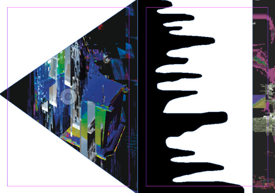
I then remembered how I saw a Zine where a certain part of the image has been repeated but overlapped to create this weird pattern. I decided to try this idea out where I drew a triangle and placed an image inside it. I then duplicated this shape multiple times to have the shape eight times. Next, I arranged it so that there was two triangles pointing the same way and then another two triangles pointing the other way. Doing this creates this effect below. I was then going to increase the size of the rectangle (on the right side of the page) but when I did so, something didn't look quite right. I’m not sure if I was overcrowding it with too many of the images I created.
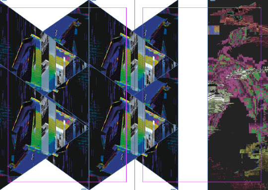
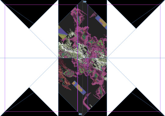
Although, I still wasn't completely happy, I was going to focus on the pattern that I had just created first. I wasn't sure if the white background against the dark pattern was too harsh so I drew a black shape behind the design so that the contrast wasn't overpowering. After doing this, I wasn't sure which one worked best as I thought that adding the black blended the pattern and the black together which I didn't want. I was drawn by the zig zag at the top and bottom of the page so I didn't want to get rid of this.
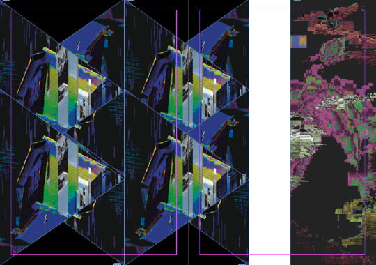
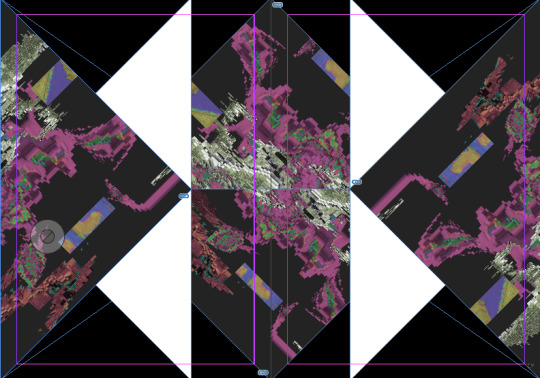
I then wanted to delete the rectangle as I found that I wasn't doing any improvements to the pages. I then extended the triangles so that they covered the rest of the other page. This now mean that the whole two pages were covered by this design. I felt doing this, made the pattern a lot more effective as there was more to it. I then created a black shape again to cover the top white space. I thought doing this would improve the piece. However I found it didn't look very effective doing this and needed something else.
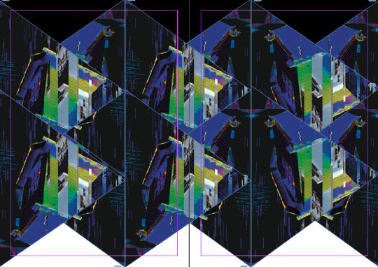
I then created this white outlining with a black background. I made the stroke of the outlining very thick as I tried other thicknesses but it didn't look any where near as effective. I feel doing this makes the outline of the shape very distinct which was what I wanted.
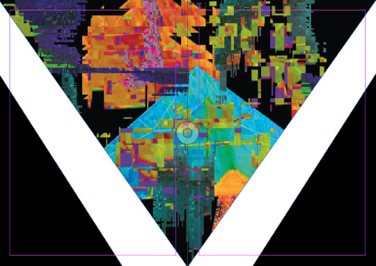
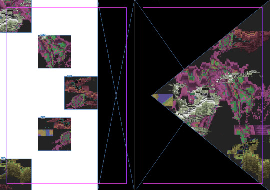
The next page I was going to improve was the fifth and sixth pages of the book. I wasn't very pleased this design last time, even though I changed this page quite a lot last time, I still don't think this page really stands out.
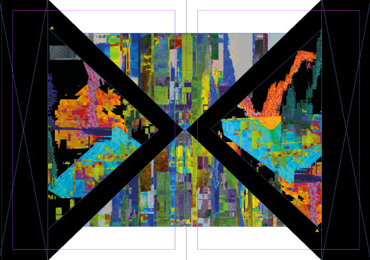
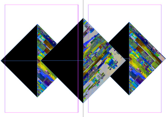
First I decided to get rid of all the shapes and start fresh. I thought that as some of the pages already have been quite symmetrical with the use of triangles, I felt I might try another page including these themes. I started by creating a horizontal triangle in the centre of the page to which I copied and pasted and placed that one underneath it. I then drew two more triangles either sides of the page. At this time, I wasn't really sure what pattern I was actually creating and I was just trying to experiment with the triangles to create something effective.
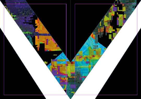
I then copied and pasted the two triangles that I had already drew on the page. I then rotated them the opposite way. At the time, I turned all four of these shapes into white and the background I made black, which I did by drawing a rectangle and sending it to the back. I screenshotted at this stage as I felt I was getting somewhere.
I then placed some of my work into the two outside shapes. I felt this pattern and design was quite attractive as shown below. I decided that I shouldn't really add more elements to the page. I think these two pages fit in well with the rest of the book and also includes the two themes of symmetrical and triangles.
While looking through the pages, making sure I was happy with them, I noticed this page which caught my eye, not because it was interesting but because I felt it looked a bit empty and needed just another aspect added.
I quickly realised that there was way too much of the triangle with my work inside it. I realised I either needed to decrease the size of the triangle or cover the shape over with another shape. I decided to cover it over with another triangle where this triangle is a lot small than the original but still shows some part of my work.
Here, I have started my back cover which I never started last time as I never got round to it. I didn't really have much of a plan for this design however I knew I needed to create something that was different from what I have been doing. This is for two reasons, one being that its only a single page rather than a double. Another being that the back page almost rounds the whole book of so it needed to standout but in a different way from the designs inside. I decided to draw four triangles covering the edges of the page, two being white and the other two being black. I then added one of my pieces of work to cover the background spaces. This then means that there's only some of the work showing through the gaps.
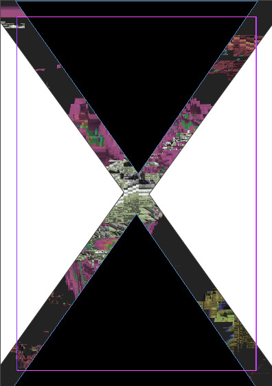
I then wanted to included another bit of work where I drew another triangle inside the bottom and top two triangles. These shapes were slightly small so that the black still shows. I used the same work in both. I then drew two triangles inside the other two to balance it out.
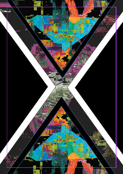
Once I had done that, I noticed that I had overcrowded the design and the extra pieces of work were the problem. I got rid of the images so it is left with just a black space. I left it like this as I was happy with it as it is. I feel this is an effective page to round of the whole book.
Lastly, I came back to the first two double pages of the book as I realised that they really didn't work with the rest of the design. This doesn't show the tow themes that I decided on. This is also very boring compared to the rest of my designs too.
I decided to start drawing some triangles on the page to which something would come into mind on an idea. I was very limited with the time I had left, but I managed to come up with these diamond shapes. I created this so that there was a bigger diamond shape in the centre of the page with two smaller shapes either side. To make them show that they are triangles, I had them be black on the left side of the shape with the image on the right side. I wanted to have them all the same sides as I felt they stood out more. I think this idea started off well and next time I will come back onto these two pages to finish the idea off.
Overall, I feel that I have improved my book massive this time and I will only need one more session to fully complete it.
0 notes
Last Seen Blogs

pinkmochi1004-blog
❤ BTS enthusiast ❤

da-cinebuff
VIDY WELL, LIL BROTHERS

nikehuarachecheapuks5-blog
nike huarache cheap uk - nike air huarache size 3

agalactichalo
Galactic Halo

filmjohnny
Johnny on the road