
thinkinglookingdoingspring2023b
NYU Design 2 Spring 2023 Thursday
Class blog.
159 posts
Don't wanna be here? Send us removal request.
Last Seen Blogs
natp20
Accursed

fuenfseenlandde
fuenfseenland.de

060-300-6662bw-blog
060-300-6662 폰팅 폰섹 여대생만남

ozkanyorusun-art
Baun- grafik sanatlar

wittlebutton
angel baby!
Text
Schyler Hoard - Design Review 4 (Acupuncture)
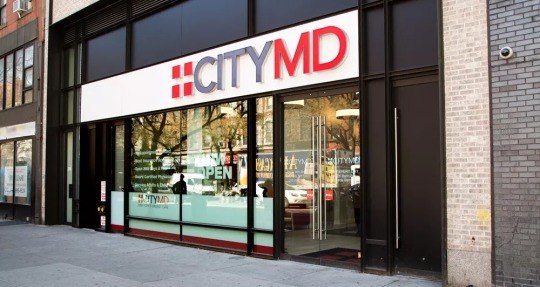
This is the City MD on East 14th Street in Union Square. It is a popular spot for urgent and health care needs, and is easily recognizable as it is part of a wider chain of clinics with the same name and branding. Since City MD is a chain operation, I find it helpful that the branding, color scheme, logo, and fonts are simple and legible, which allows for ease of recognition and association. This makes City MD accessible for a variety of patients around the city.
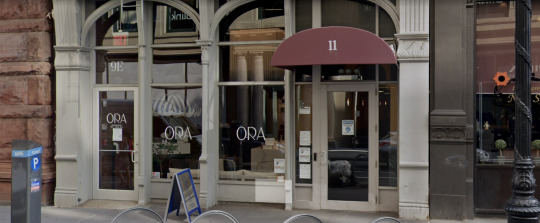
This is a high-end acupuncture business called ORA located in the Noho area. It is near NYU on West 4th, and appears to take on the appearance of a sophisticated wellness and spa center, based on the outside signage and inside decor. I think that the branding, composed of a simple, clean capitalized font and minimal color usage successfully conveys the ambiance that ORA is trying to get customers to perceive. This branding, tied with the interior, makes for a cohesive aesthetic that is attractive.
2 notes
·
View notes
Text
Abhishri Design Review 7
This design portfolio is one of my favorites due to how cohesive the design and navigation are and how eye-catching the work is. Despite the layout being somewhat uniform to other portfolios, this agency really took advantage of its own works and embraced the animations and color and because of that the work really speaks for itself.
This portfolio is also unique regarding the designers style and presentation. However, I found it hard to navigate and the transitions were slow and awkwardly stopped whenever I tried to move to the next project. The vibes and color were playful and fun, but the navigation can be worked on to make the portfolio more seamless.
0 notes
Text

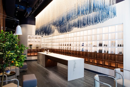
This Soho Acupuncture clinic is an example of good design and branding. The color scheme is very well throughout and uniform throughout the different design elements and interior design. The light pink and grey and serif font relaxes the brand image and is comforting yet trustworthy. One thing to note, however, the grey font color and weight makes it a bit hard to read and legibility can be improved.
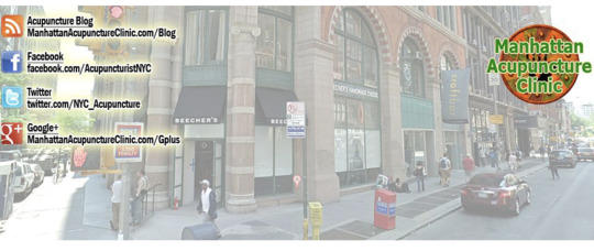
The Manhattan Acupuncture Clinic is an example of bad design. The banner is incredibly outdated and does not give off a professional and sterile atmosphere. The logo almost reminds me of Rainforest Cafe with the green and orange colors and thick font. The social media logos and accounts are also very outdated, as people no longer use Google+, Blogspot, and Twitter for business information. Staying up to date with the trends is really important to stay relevant.
-Abhishri Manukonda Design Review 4
0 notes
Text
Abhishri Design Review 1
This website is so unique in that it explores text and its interactiveness. I've never seen one where the text summarizes the business while linking to all their work. It is easy to digest, quick to navigate, and overall a very efficient way to relay information.
This website is also really simple and straight to the point as well. This website uses color and animation to emphasize their creative projects and overall elevates the work. I also think the font choice is very interesting and different from the usual san serif type, its concise and clear to read and overall a very effective portfolio.
0 notes
Text
Schyler Hoard - Portfolio Reviews
This portfolio is by Brooklyn based graphic designer and illustrator Sarula Bao. I first became familiar with her work through The New Yorker, for which she designs frequently. I appreciate her portfolio because of the fact that the simple, white background really grants the platform for her artwork to pop. Her illustration and design style is very maximalist and colorful, so having a white backdrop is beneficial for seeing her work clearly. I also liked how the homepage of the website demonstrated her works in enlarged format and with ease, as the viewer can scroll and look through as soon as they open up her website. Overall, I love her design style and the applications of her work - I think her portfolio very effectively displays and conveys her talent.
This portfolio website is from one of my favorite photographers, Elizaveta Porodina. Porodina's photography style is so distinct and creative, and I adore her work. I found this portfolio interesting because I am mostly familiar with Porodina's work through Instagram, and I believe that is the platform she is most active on, so I enjoyed comparing the ways in which she displays her work via curated website and curated Instagram grid. On her website, I liked how her works were displayed via a scroll feature, and were organized through a clear, easy to follow grid system. I also liked little playful features such as the animation of Porodina's name when I hovered over it with my mouse. What I found the most interesting was that all of her works were not on her website - she had a section dedicated to select works - but she also included a link to her Instagram, which is a lot more extensive. My experience and perception of Porodina's portfolio is that she may use a dual-portfolio system, with using Instagram and social media to enhance her traditional website. I think this is unique and a great way for designers to distribute their work.
0 notes
Text
Schyler Hoard Design Review 6: Package Design
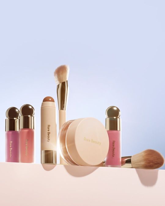
My first examples good package design are the Rare Beauty makeup products. Rare Beauty is a makeup brand founded by Selena Gomez, and is known for how the shape of its products encourage accessible use. Selena Gomez, the founder, has lupus herself and has spoken openly about her desire to create makeup products that are easy to hold and use for application. She cites her experience with lupus as a primary source when looking for inspiration for how to design her packaging. I appreciate Rare Beauty Packaging because it is indeed accessibility friendly, as evidenced by the large, globe like modules as handles on the lids of each makeup product. The brush handles are also larger than average, compared to the normal skinnier makeup brush, which make them easier to hold and use. All in all, the ease of functional use when using Rare Beauty products makes for good package design. I currently use the blushes, which are great!
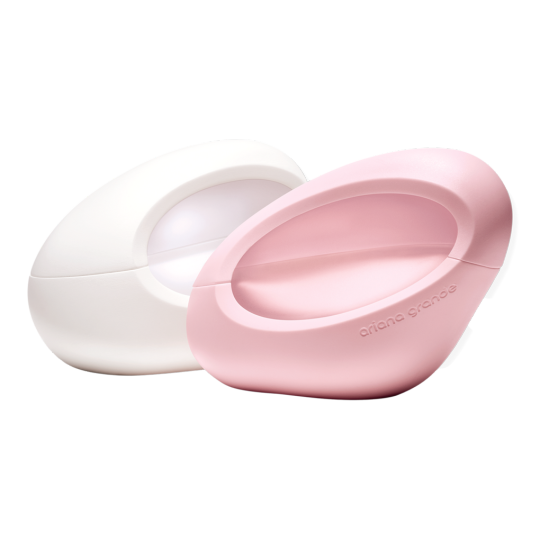
Though I am a huge fan of Ariana Grande, I must say that her most recent perfume bottle packaging is an example of bad package design. The bottles are meant to be evocative of her mod, 60s spacegirl aesthetic, which make for bottles that are gorgeous to look at but extremely difficult to use. I currently use the one pictured (it's a vanilla scent), and I often have to hold the entire bottle within the palm of my hand and support it on the sides with my fingers while pushing down on the nozzle to spray with my thumb. When I am in a rush, this coordination often proves to be excessive and leaves me dropping the bottle or putting the lid on incorrectly (the unique shape allows the lid to only snap on correctly when you orient it the exact way it is supposed to). Overall, due to issues of coordination and the just the fact that the bottle makes for cute room decor more than functional perfume spray, I would say that this is an example of bad packaging design.
0 notes
Text
Classroom Review
https://docs.google.com/forms/d/e/1FAIpQLSeIniUwzCyCxBv32_aR45RijUuNbHAcfEY8dIQLxD5jQhPfHg/viewform
0 notes
Text
Homework: Due May 4
Revise your final project. Upload PDFs to our shared Drive. Print 20 copies of your sticker or your business card to share with your classmates.
The last thing we will do in class is make sure that every assignment from the semester has been uploaded to our shared Drive. You can get a head start (and leave early) if you make sure that everything is there in advance.
0 notes
Text
Design (Portfolios) Review 7
I really like the simplicity in this portfolio. Despite the variety of works presented they’re all tied together through the similar color scheme and size that they share. I also think that the limited inclusion of text is effective as it allows the viewer to explore and understand the works based on their own interpretations. I think the website generally works very well as a portfolio as it includes well-divided categories of all the works that represent the artist’s artistic identity and work.
This portfolio is also one that really stood out to me. I like how it combines images and text boxes to give a clear description of what the artist does. This combination works very well here especially since what Jessica Hische does is very specific in comparison to Tommy Li in the previous website. Making sure that the audience gets a visual as well as a textual explanation of what her work is a perfect fit for her portfolio. I also like how she kept her color pallet very minimal. The white background helped with avoiding an over cluttered look for the page. I also like how each part of the page is responsive once hovered on, these elements make the website more interactive and appealing to the viewer.
-Dhabia
0 notes
Text
Design (Packages) Review 6
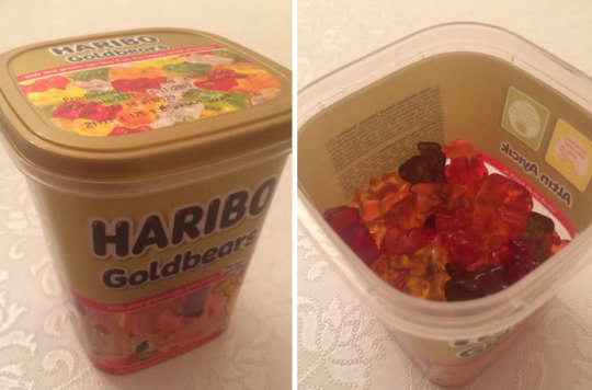
The packaging of these gummy bears is bad for a multiple reasons, mainly being that is misleading. Looking at the package from the outside one would assume that it is entirely full when in reality it’s almost only half full. The idea of having the golden section cover the entire top part of the package makes it deceiving. Also the fact that there is small opening that allows for a few pieces to be dispensed from the large package is really bad especially since this box is not made to be for one serving. Having the only access to the gummy bears be by opening the entire lid promotes the growth of bacteria and makes it very inconvenient for restoring. A change that I would recommend to make this package a bit better is perhaps having the part on the lid with image of the gummy bears be transparent. This way it will be a more honest package and it’ll also tie the design of the package together in a better way.
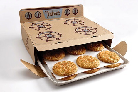
I think the the packaging of this cookie box is very interesting and good. First of all its made of cardboard which is not what’s usually seen especially with cookies. This makes it stand out and it also is more environmentally friendly. The prints on the top of the box are very aesthetically pleasing. They make the box entertaining to look at and they communicate the idea that the cookies are freshly baked. I also like how despite being a high end looking design, it doesn’t not use unnecessary material. The cookies are not individually packaged nor do they have specific placeholders. They’re all just placed on parchment paper on a tray much like they would be placed in the oven. The only thing that I think should be improved with this design is indicating the number of cookies in the box to avoid misleading the consumers. Especially since its a large looking box which makes it easy for people to assume there is more than there actually is in the box.
-Dhabia
0 notes
Text
Design (Political Posters) Review 3
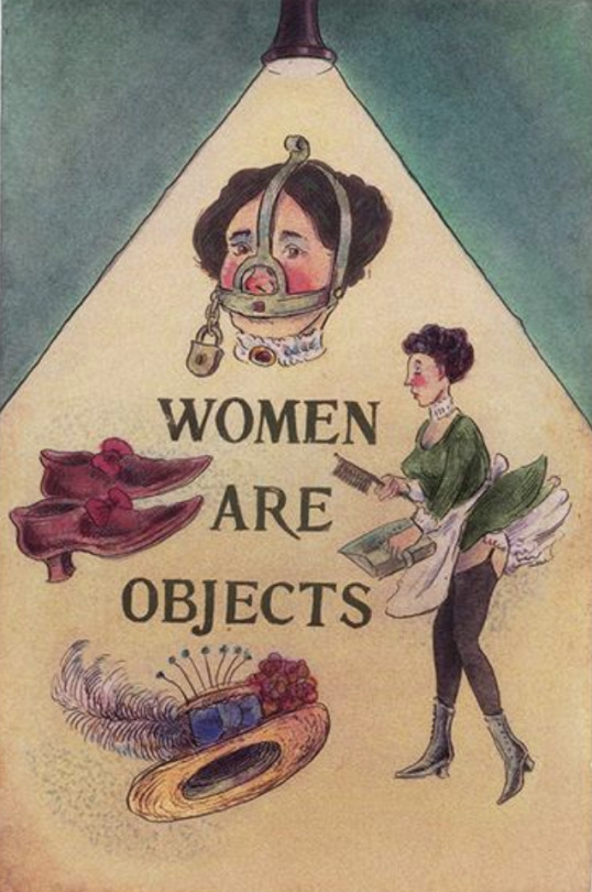
Using dull colors and hand drawn images, this poster is very effective in confronting the issue of female objectification. The use of very simple design tools give the poster a vintage or old effect allowing the viewer to associate the concept presented on the poster with the old times. That is, the argument made associates female objectification with old, backwards, anti feminist and sexist societal notions. Furthermore, the use of the phrase “women are objects” here is intended to strike the viewer which I believe is a solid method to raise awareness on the severity of the issue. Keeping the letters of the phrase all uppercase further supports that emphasis on the issue. Overall, I think this poster is a very effective feminist poster, however I am not sure it would stand out amongst other posters on the streets of New York especially with its dull look and hand drawn effect.
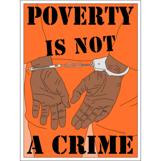
Similar to the previous poster this poster again uses the confrontational method through the phrase it presents to the audience. What I really think is interesting about this poster is how it keeps its color pallet very basic with mostly just orange and black, yet it is still able to include a very strong image that is well tied with the phrase and is able to drive the message of the poster forward and deliver in a stronger manner. The font used for the phrase is also very well suited for the topic as it is very similar to the typefaces used on cautionary stickers or signs, making the text on the poster immediately eye-catching. One other thing I like about the poster is the way the words “IS NOT” are tilted. The tilt emphasize the effect of a cautionary sticker which grabs the audience’s attention.
-Dhabia
0 notes
Text
Homework: Due April 27
Your final project is a mock portfolio. We’re calling it a mock portfolio because this assignment is actually only a step toward your actual portfolio, which would include several examples of your work, as well as a sort of design history. For the purposes of this assignment, we’re just concerned with establishing the overall look and feel. Your job is to create a visual identity for a client — and you are the client.
The default for this assignment is to build a portfolio around you and your name, however you may want to design for another one of your classes, or one of your side projects. For example, you might want to begin promoting your own magazine, or your own freelance business, or a political group you belong to, or your friend's band. Your real work here is to go all the steps of the final assignment. Ask if you need clarification or permission to adapt the assignment to a particular project.
Your final project will be submitted as a PDF, but you will need to print your business card or your stickers in multiples -- at least 20: one for every student in the class, one for me, and one for you. Feel free to use either Illustrator or Indesign or whatever program you like. You do not have to create an actual webpage, but you can, or you could use software like Adobe XD or Figma to show us how the site would work.
* A color palette with five colors that will be used throughout your portfolio.
* Type. Choose one typeface, two complements, or an extended type family that will be used throughout your portfolio. Plan for hierarchy and use in separate contexts.
* A personal tagline. What are you promoting? Who are you? * An original graphic. Can be a photo, a drawing, collage, or avatar that helps you tell the story of you.
* A logo or wordmark. The cornerstone of your identity.
* Social media identity. Either: a facebook page cover (1640 x 924), twitter header (1500 x 675), instagram profile icon (360 x 360), or Tik Tok profile icon.
* A website portfolio home page (2560 × 1440). This does not have to be a working web page, but rather a design that could be translated to a Wordpress-style site.
* A mobile portfolio home page demonstrating a responsive design grid (iphone or android).
* A business card or sticker. This item must be printed. Bring 20 -- a copy for each of your classmates, and me.
Here is the breakdown for due dates:
April 27: High-res mock-ups due for entire project, printed out. (You do not need to bring all 20 copies of your card or sticker -- just the mock up for it.)
May 4: Final presentations. PDFs are fine, with printed card or sticker.
Final Project Deliverables:
color palette
type
tagline
original graphic
logo or wordmark
facebook cover or twitter header and instagram profile picture
portfolio for web home page
portfolio for mobile home
page business card or sticker
0 notes
Text
Tutorial: Wireframes
Exercise and Tutorial(s): Create a set of rough, lo-res wireframes that you can convert into hi-res wireframes for your portfolio final. You can use any design tool you like, including Figma, Illustrator, Indesign, or Adobe XD, or Balsamiq. You will find some detailed instructions for Figma, Illustrator, and Indesign below. Here's a general article about wireframes:
https://www.creativebloq.com/web-design/jargon-wireframes-mockups-prototypes-51514898
This is what wireframes look like:
http://webdesign.tutsplus.com/articles/a-beginners-guide-to-wireframing--webdesign-7399
Difference between Lo-Fi and Hi-Fi wireframes:
https://www.youtube.com/watch?v=UU_eyUGWIEI
FIGMA
There is a guide to wireframes built into Figma called Wireframing in Figma. (You might find it in Drafts.)
If you want a video to walk you through the process, this one is very good: https://www.youtube.com/watch?v=HZuk6Wkx_Eg
And here is an alternative from Linked In Learning:
https://www.linkedin.com/learning/search?keywords=wireframes&u=2131553
If you already are pretty familiar with Figma, this tutorial will walk you through how to make simple animations:
https://www.youtube.com/watch?v=gofICZUqltY
(And by the way, this is a useful way to copy svg files from Adobe Illustrator into Figma:
https://www.youtube.com/watch?v=4W9t84vwfBc )
INDESIGN
Linked In tutorial: Indesign for UX Design, Part 3, Creating Different Size Layouts
https://www.linkedin.com/learning/indesign-for-ux-design/creating-different-size-layouts?u=2131553
Linked In Learning tutorial: Illustrator for Web Design, Part 3, Wireframe Overview
https://www.linkedin.com/learning/illustrator-for-web-design-1/templates?u=2131553
ILLUSTRATOR
At this point, using Illustrator for wireframes is pretty dated, but here's a tutorial, just in case you feel most comfortable in the program:
https://www.youtube.com/watch?v=KiXzz9tXIho
Also dated but useful:
https://www.rubbercheese.com/insights/why-wireframes-are-the-most-important-part-of-web-design/
0 notes
Text
Rena Ikenishi
This is a portfolio for David Heckhoff. I love the 3-D animation of himself that he shows in different variations throughout his portfolio. It almost feels like I am playing sims or some type of simulation game which I think is super interesting and it also made me feel like I wasn't looking at a portfolio.
This is a portfolio for Niccolò Miranda. I think it is very interesting that everything seems to be structured as a newspaper but I do think that it seems a little confusing. There are so many head titles and I feel a little overwhelmed at times because I am not really sure where I should be looking.
0 notes
Text
Ruby Portfolio Reviews
This is a portfolio of Jessica Hernandez. The overall aesthetic is cute and playful - which shows her strengths and personality as a UX researcher very well. Most of her content is in large sizes and she intentionally used a variety of typefaces and animations. I love this work!
This is a portfolio of Timothy Maurer. He is also a UX Designer like Jessica Hernandez, yet his portfolio is more centered around the products he worked on. He utilized the landing page to display his work, which I found convenient and effective in instantly understanding the person.
0 notes
Text
Maya - Design Review 7
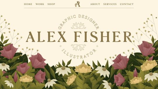
I really love this design portfolio website by Alex Fisher, I feel that the navigation and design of this website reflects her illustration work that is recognized for its warmer nature-like color palette.
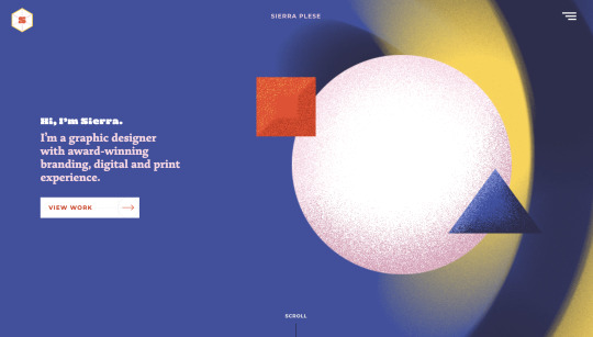
This portfolio is really interesting as well. I like how Sierra uses geometric images that are interactive on her site. I like how the minimal information is presented in a neat and clean way and has a dynamic feeling to it with the color and shapes.
0 notes
Text
Gabriel Murjani
KASHIWA SATO
Kashiwa Sato is one of my favorite graphic designers, mainly for his use of minimal color (up to 3) and simple shapes. He is most notably known for designing the Uniqlo logo, and is in charge of many cultural projects. I think this website does a perfect job of capturing his simplicity, with a white background and simple text in the header, Kashiwa Sato lets the work speak for itself. Not super fancy in terms of interaction, but a plain old simple website that looks just good enough, and the eye-catching designs are the first thing you see. In my opinion, that is a well-designed design website.
TOMMY LI
This is yet another example of a really good design being showcased by a simpler website. Tommy Li has a clear image of his style, his brand, and his visual taste that is well captured on the website itself. I believe the website should not interfere ore contradict the design styles of the products, logos, type, and other design work that the designer has made. The work itself is a little greyed put, as to have less contrast until you lick on a particular work. It makes the home page looks very light and dreamy.
0 notes