
Last Seen Blogs

alester
Alester

fyhollyoakshunks
fuck yeah hollyoaks hunks

tabuart
I Waited ‘Till I Saw The Sun

elicohenchang-blog
(a)ddictive (l)iterature

empressmedic
Empress Medic
Text
EVALUATION
oh I dont know where to begin, I genuinely had so much fun with this project, which is weird because honestly I started quite late due to not really knowing what I was doing before I got my final 3 ideas. But learning the software and creating an entire 3d scene for my final ident was far from what i thought i was going to do, but i love every minute of it. From modelling the TV to dealing with renders nearly killing my macbook, it was fun.
If i were to do this brief again, i think i would probably just try and add more in a scene, even though i went for an empty vibe with this ident, using infinite rooms and minimal object, i still feel like a few extra things could have been added to give more of a hint towards the Simpsons. A few things I wanted to add but didnt because of time were stuff like Barts Skateboard and Lisas Saxophone. although adding the duff can i feel was a must because i feel that made the difference from, kind of knowing it was the Simpsons to definatly knowing it was the Simpsons. Also if i were to do it again, i would probably aim to give myself an extra week, so that once i would call my video done, i could then go around and show people to allow them to rip into it and give me their opinions which i would actually have time to alter to. Besides that from the comments ive had so far and also just how i feel about it, im super happy withthe outcome considering it was my first time properly using 3d software and now ive started learning, im not going to stop! :D Heres to the next project!
0 notes
Text
FINISHING THE IDENT.
Once i had finally rendered both version of my ident, i opened them up in after effects where i could then continue editing my video.
first thing i done was bring both videos in and align them perfectly so when i changed the opacity of the top video, it wouldn’t be out of place framing wise.
As you can sort of see, i just used simple key framing on the opacity for the top layer so when it changes between it shows the bottom layer which just gives the effect of the tv flickering.
SOUNDS
For the sounds to the piece, i simply used creative commons to search which then took me to youtube which i downloaded from. although i could get most of the sounds, certain sounds wasn’t easy to get, but i got the whole story in another snapchat video so here ya go.
youtube
So once i had all of my sounds down and complete, i done an overall grade to the composition and this is the final video i had made!
FINAL IDENT
vimeo
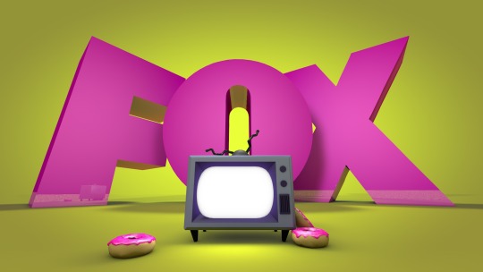
I also then went back into cinema 4d and re adjusted the camera to a really zoomed out position as i wanted a shot that showed how small, the huge letters are within the ‘room’ it wasnt intended to be the poster at first but josh mentions how cool it would look so then i used it.
POSTER

0 notes
Text
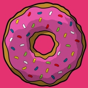
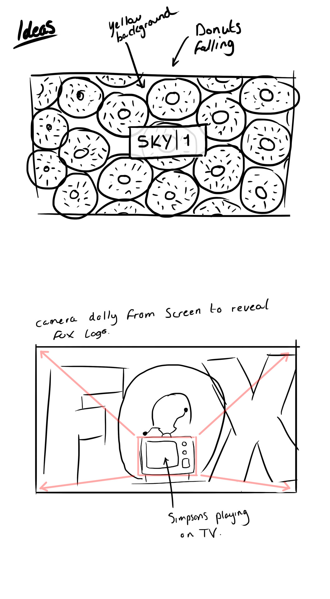
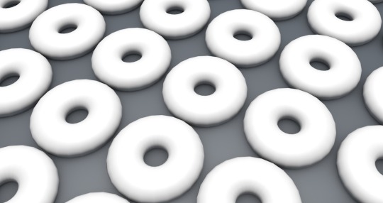
DONUTS AND LOGO.
So, i didn’t really want to waste all the work i done for the donuts, and since i’m still doing the Simpsons, there isn’t any reason I should waste them, so i think by adding them within the scene somehow will make sure i did do pointless work but also make sure the audience can tell that its for Simpsons on fox. Now obvious i dont want to add to many donuts because then it just cause the same problem i previously had, so i’m thinking of adding 3-5 Most.
I was trying to figure out how i was going to frame the logo within the scene as i knew i wanted the camera to pull out from the screen. Now i done this drawing to show how the lens changes the angle of something. If i were to pull the camera out and stay at a consistent 50mm focal legnth, the feeling conveyed wouldnt feel very powering as nothing in the scene is changing, just more being exposed.
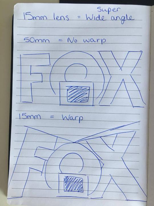
Whereas if i use a 50mm to start with and do a dolly zoom effect to pull from a 50 to a 15, the scene would give a much different mood, with more drama being conveyed and also giving the logo a more powerful stance.
youtube
This video explains camera angles and how you can create emotion with different angles. He talks about how a low angle shot can create power and authority for the character. So for my scene the logo will be treated as a character, looking down on the TV. To achieve this effect i first need to bring my logo into the scene and then extrude it to make it 3d.
I first start of by downloading the PDF logo and bringing it into photoshop.
I then done a path selection of the logo and exported it as a Illustrator file.
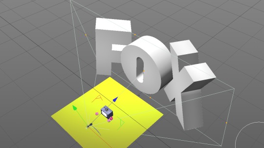
I then added it to my tv scene and extruded the logo. As the paths wasn’t connected, each letter to the logo was separate models. This allowed me to change the letter position and rotation, so for the F + X, i turned them slightly to towards the camera to give a more emphasised look.
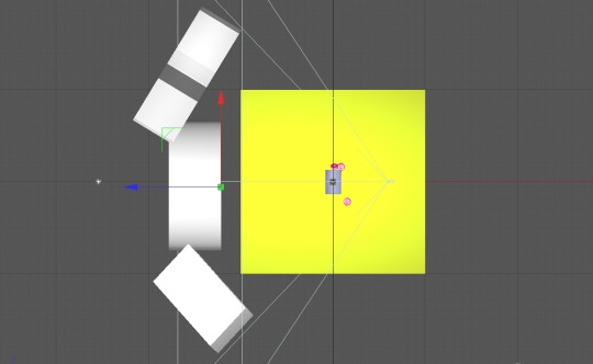
I added the donuts into the scene making two rest against the tv and one slightly away from the tv.

I then animated the position of the camera to move from point a to b using keyframes. and then keyframed the camera lens to change from a 50mm to a 15 mm as the camera moves from a to b.
Here you can see how it changes:
50mm

15mm
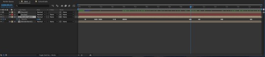
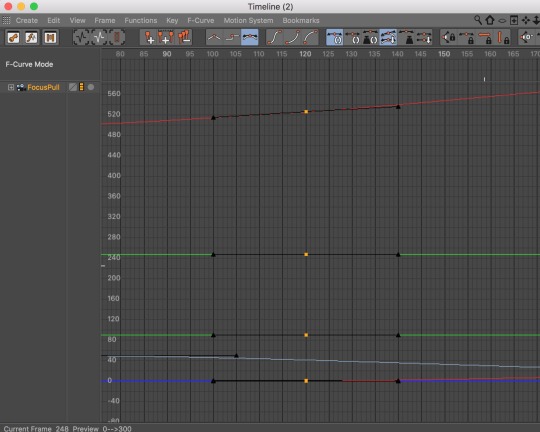
Using keyframes, like in after effect i then easy eased the frames to move more fluidly from start to finish by going into the F-Curve window.
Now i wanted the television to emit light but adding a light infront of the screen didnt give me the look i wanted as the tv screen material chose to spread the light that hits it and cause shadow, which lights dont do if you shine one at another, so i had to find a way to make the actual material of the screen emit light as if it was its own light. (sorry for the jumble but it should make sense)
So i found a video on how to use objects as lights, and simply followed it through but with my screen instead. to actually get the light to show i then had to turn global illumination on which does some magical things to the scene and allows the light to reflect of other objects etc.
This is the look i got once rendered.

as you can see there is light coming from the screen and being emitted on to the floor.
I also tried changing the colour of the text to the same colour pink on the donuts but after asking a bunch of different people, the overall answer was to keep the white which i completely agree with, although it was good to just try it.
That was pretty much the entire scene, i just had to render it twice, once with the screen on, and once with it off.
UPDATE:

This is the render time of a full render. 5 hours 28 minutes, which wasnt too bad and way better than what it could have been if i were to re do the donuts. all i have to do now is re render again but this time with the screen turned off and not emiting light so i can take it into after effects.
0 notes
Text
THIRD IDEA - MODELLING THE TV
So, i left my work to render overnight while i slept so i could wake up to see my wonderful master peice... i say lightly. Anyways out of the 6 seconds i needed to render, only 1 and a half seconds rendered... which was just stupid as it had been rendering all night..
youtube
This was a bad quality render i done just to show the generic idea i had. anyways because of this, i feel the only option i have now is to scrap the idea and move on because its not reasonable with render time and deadline.
I start all my sentences with so, not sure if you noticed, but anyways i’m moving on with my new idea, i dont want to waste time if i dont need to and trying to fix the idea i already have just isnt the best option when the new idea seems more do able. so from the storyboard, i drew the camera starting with the tv filling the frame, so that its practically showing the screen as a whole, and between the space of around 10-15 seconds the camera pulls back to reveal a huge fox logo behind.
STARTING
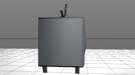
so i began by starting with reference image to model from, like the TV. A quick google search and i had the tv i wanted, which was the older one from the original Simpsons episodes. The reason i chose this was because i felt it was way more iconic than the newer one which is more like a flatscreen tv. this one had more character.

This is the image i went from for the TV modelling. I first started with a simple cube, and then extruded the inside of the tv in. and then by adding a sphere and playing with the roundness it gave me the screen of the tv which keeps the same style the old ones use to have where the screen actually comes out of the TV. Like so.
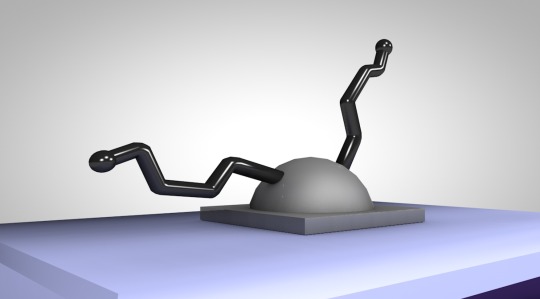
as you can see the screen has that slight bit of depth. I also then used another sphere and cut it in half for the base of the Aerial and created the antennas using cylinders where were extruded in different directions to give that broken, simpsons look
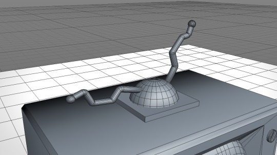
I made them slightly thicker than the original ones as i didnt think it looked that good when the thickness was the same as the photo. I then added materials to everything to make the tv look like the actual simpsons tv. I want to show the material i created for the antennas as i needed them to have some reflectance and shine to give the metal feeling.
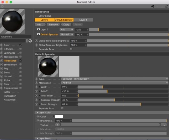
I used a blin and reflectance layer combined and ‘added’ the reflectance to the blin which gives a nice shine, i made the fall off a medium size and the width slightly smaller and with all that, this is the look i got for the antennas.
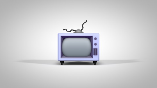
Also i added colour to the tv itself and a separate colour for the depth of the tv and this is the final result i had for the TV.
0 notes
Text
MODELLING THE DONUT AND ANIMATION
Time to get my modelling head on and start creating, ahh i’m so excited for this! So what i have in mind is similar to how i done my testing, by using a torus shape and working from there. I think thats the easiest way but also the most accurate. I looked for donut modelling tutorials on youtube and google but there wasn’t any to find, but there were time lapses, although that didn’t help.
First of, i started with a torus because its practically a donut without the icing. I then tried to think of ways to create the icing on top of the donut, The first idea i though of was to extrude the polygons on top of the donut individualy and create an icing shape as close as i could, although i thought there must have been an easier way to do it than that. I then found a video on sculpting in cinema 4d. Its really long but i skimmed through it and found out what certain tools do to objects and polygons.
youtube
So after getting an understanding i first took my Torus shape and subdivided it, over and over again until i had A LOT of polygons. I done this because i wanted the icing on the donut to be as smooth as possible and for that to be done, more polygons need to be introduced.
Heres a timelapse of me modelling some of the icing.
https://www.youtube.com/watch?v=YxVQWR9SpBw
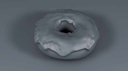
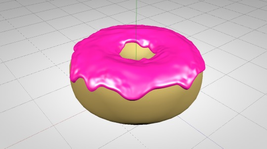
After using the sculpting tools this is the result i had, im really happy with the look of it and i think i got the icing to look really even over the entire donut.
Now i’m going to start texturing it too look like an actual donut. These are the images i have/and will be using to reference from in order to make the donut as accurate as possible.
With my donut i want to make the pink bright and shiny to make it look like a sticky sort of icing, so im going to need to make sure i have the right material applied to the donut in order to achieve that effect.

After this i then tried to change the colour of the dough seperatly but because it was connected to the icing, it made it pretty much impossible. To get around this i decided to just add another torus and place it on top of my donut but scale it down so it covers the dough but not the icing.... if that made sense.
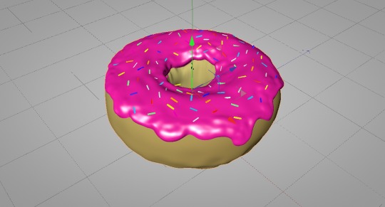
This is the result i had with doing this. Honestly, although it looks slightly more chunkier, it also looks more animated and Simpsons like i feel. I will still use the sculpt tool to give the torus texture and make it non perfect.

Adding the sprinkles were fairly simple, i just used a cylinder type shape and used a cloner to spread them throughout the donut, and although some were not actually on the surface of the donut, i will later fix it using a trick i figured out myself.
I then sculpted the donut and removed the polygons of the original where it was showing to the camera so that it would hopefully make it less laggy as its starting to stutter.
This is what the model looked like when i showed the polygon lines within the view options.
But the donut was done! which i’m really happy with, i honestly think it looks pretty good for what it is and the time it took.
So before i start cloning my donut, i wanted to render it with all the settings to see how it would look and how long it will take.
SNAPCHAT STORY
youtube
So now i have my donut, i can use the effect i learnt earlier with the cloner but instead of using squares, i’m going to try and do it wth the donut. Beforehand however, i think im going to have to some how try and make the donut cause less lag as its currently killing my macbook.
youtube
I used the video as a guide on how to reduct the polygons. once i reducted the polygons of the donut, I went in and removed any polygons that wasnt visible to the camera.

Once i had done that i wanted to get the donuts into a cloner and start creating the ident. I didn’t take screenshots, but i did record it on snapchat, so heres the story.
SNAPCHAT STORY
youtube
Once i had done that, i decided to remove the sprinkles off the donuts which drastically changed the speed of everything, i was able to add more donuts easily without any lag and also render much faster. IT WAS THE SPRINKLES
ADDING THE LOGO
first thing i done was clone the donuts untill i had enough to fill the frame of my camera.

This is much closer to the amount i wanted for my ident, although it was enough to fill the frame of the camera which is what i initially set out to do so if i can not add more this will have to work.
Once i done this i used the tutorial i found where it projection maps a logo on to object and makes the texture stick to each object. So i took the ‘1′ from the sky 1 logo and turned it yellow within photoshop on a white background as the projection doesn’t register the white.
once i had followed the tutorial this is what i had.
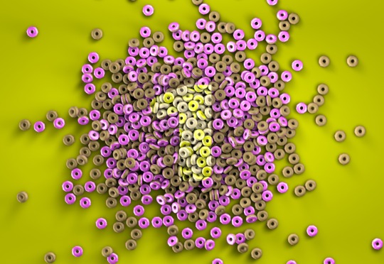
I pulled the camera back as it was really hard to make out the ‘1′ within the donuts when they filled the frame, and for me to add more donuts that would have been near impossible with my laptop.
the next thing i tried was to just go back to my original second idea which was just to have donuts bouncing and filling the frame. I had done that by using the cloner and adding dynamics to the objects in order to make them fall. I followed this video.
youtube
0 notes
Text
CHOICE - DEVELOPMENT
Okay so after looking at all of my ideas, I think i’m going to give the donut idea a go as I feel it could look really cool when completed. So what i’m going to do is just follow up the idea with a bit of research, maybe some testing although that could be in another post. So lets just get started.
So first thing i done was go straight to the good ole google to see what i could find on Itv 2. I was mainly trying to find some sort of behind the scenes video to see what software they use and get an idea of how they make them.... Well, i was completely took when i found a video behind the scenes (sort of)
vimeo
I didn't believe it at first when i seen a man in the thumbnail, but yep, unfortunately its real, and the ads are 90% practical... which honestly i was just so surprised because in the short idents they look so animated and smooth its to good to be real... but obviously not. What even gets to me is the fact that the letters are also real, there is literally a shot of a guy sanding a wooden ‘2′ down, What!
Prior to Itv 2, i tried to look for other channels that fill the frame with items for an ident, and honestly it was very difficult, but an obvious one that i completely missed was, believe it or not, channel 4. I had in my mind that they still use the camera moving to reveal a logo but then i stumbled across a video on Vimeo called ‘Channel 4 Rebrand’ gave it a watch and not all, but some shots had the channel 4 pieces filling the frame entirely, and it gave a really cool look, which also gave me an expansion on my already existing idea.
Although it isnt 3d, its worth mentioning that i also found another couple of idents that do the whole, fill the frame idea and thats ‘freeview’ but like i said they do this with people, alot of people and non of it is 3d. Still worth mentioning.
vimeo
Following this i also found a behind the scenes of how they make the idents:
https://vimeo.com/184987476
So originally I was thinking of having donuts which would be modelled as close to homers donut as possible, which would be tiled to the point where it fills the entire frame, i would then have all of these dropping and hitting the ground, bouncing around in slow motion... But after finding that channel 4 video, it reminded me of their very famous reveal idents in the city sky’s etc etc.. instantly it gave me a new idea to extend my donut idea.
youtube
So i traced my memory and found a video i watched a few years back on youtube, because it used an illusion which was the extension to my idea. I imagined having a lot of donuts falling, and as they all fall and fill the frame, individual donuts have different coloured Icing which, when the donuts come to a stop, reveal the number ‘1′ Representing Sky 1, This would then have the sky 1 logo fade on screen like normal. So i thought it was a really cool idea and gave it a go. Here is another video that does the same effect:
youtube
So after this i went to youtube and Vimeo to see if this effect had been done before, or something similar to it, and hopefully find some sort of tutorial so i can do the effect my self.
UPDATE:
So its been like an hour and i’ve been searching youtube and vimeo, and i came across a video by Greyscalegorrila whom is a youtuber that purely does cinema 4d.. He had actually done the exact effect i was looking for within cinema 4d, and even gave a tutorial, so props to him for that.
youtube
0 notes
Text
IDEA DEVELOPMENT
Okay so before choosing my final idea i want to do some testing and drawings and stuff just to see if my ideas are simply going to work. so the first thing i want to do is just sketch out the ideas i have for each channel that i have chose, because i still havent decided between what channel im going to chose yet.
SKETCHING
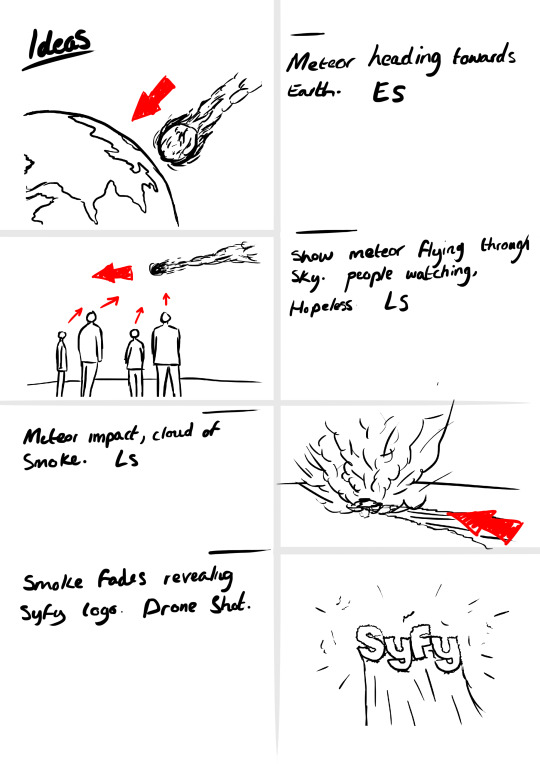
FIRST IDEA
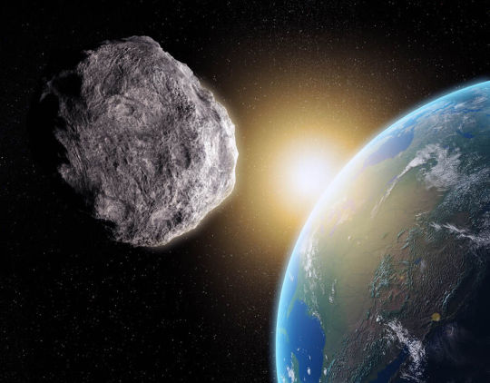
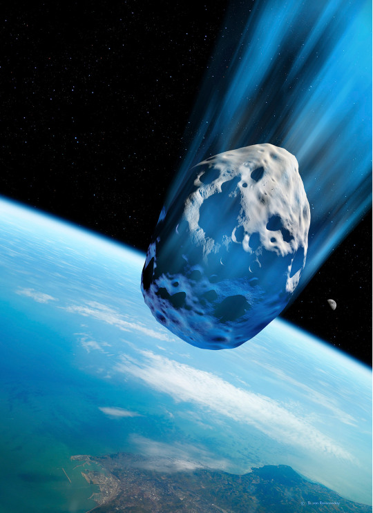
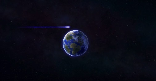
So with the first idea i planed on having 3/4 shots, the first being completely cinema 4d. the idea was to have the earth shown in large and slowly turning peacefully and within a few seconds of silence, a slight noise can be heard becoming louder and loud and suddenly a meteor fly’s past the camera causing it to wobble, realise its heading straight towards the earth. as it gets closer and closer this would then cut to a very low angle medium shot behind roughly 3 to 4 people looking up as they see the meteor flying through the sky, getting closer and closer. This would be followed by a shot where we see the meteor hit the ground causing a huge explosion of dust and particles, which would probably be in a field. Now if possible i would like to have this shot as a continuous motion shot where the camera goes from being eye level to an aerial shot where we see the smoke fade away to reveal the Syfy logo imprinted into the ground.
The next two ideas are revolved around the Simpsons as I realised that both of the channels air the Simpsons with a whole lot of other channels also. one of the main reason i chose this is purely flexibility because if 1 idea doesn’t work with a certain channel, i can change the channel to any of the others and it will still work with the channel and their branding as they play the Simpsons.
SECOND IDEA
For the second idea, it was much more simple than the first, and i really wanted to go for an itv 2 like style for the ident. Originally what my mind set was would be that hopefully i could create something thats so visually pleasing that it would look super cool duplicated near a hundred times, and moving very rough, but played in slow motion to show the rough motion with a very smooth effect. I would then just use the normal sky 1 logo which would fade on screen as i dont feel that making anything fancy would add to the ident, but maybe take away from it.
THIRD IDEA
The final idea i have is one of my favourite ideas, I think its on par with the first idea in how much i like it. The basic concept is that i would have modelled the Simpsons TV from the shows which would be placed in an infinity yellow room. The camera would start off with the Tv filling the frame (i’m thinking roughly 50mm lens) and after 1-2 seconds of the camera staying static while something happens on the tv, the camera will then dolly backwards while the lens moves from the focal length to a much smaller one, something like 15-20mm which will give an extreme wide angle shot which i’m hoping will look really cool with the letter and make them look very powering within the scene. The tv will continue to do something and towards the end i’m thinking of having the screen flicker until it switches off, which then turns all the lights off within the scene causng a black screen which will end the Ident.
DEVELOPMENT.
Before jumping straight in to my ideas I think its best I actually look for some stuff and make sure i’m not either blatantly copying someone or doing something that isn’t reasonable with stuff like the time I have for the project or even smaller things like if my Mac book can handle this sort of editing. Although it sounds silly it could play a huge factor within the whole thing, so i think its best i just double check.
IDEA 1:
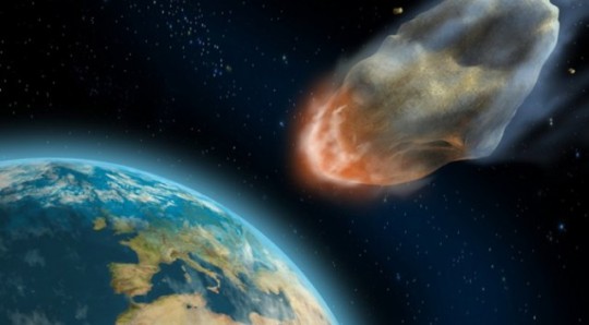
Now for my meteor idea, honestly i dont think i’ve seen the exact idea before, but i feel like i’ve seen a lot of shots that use the same idea in films etc.. i feel a meteor shot heading towards the earth is quite a cliche shot, but it does look super cool and thats why you see it in so many films and photos. Heres a few i found on google:
One film that popped to mind when thinking of this idea was actually the good dinosaur, but after finding the part i had in mind, it was 100% what i remembered so it was slightly different, but still could have been a possibility for a shot within the ident.
Idea 2:
Now to be honest, the only channel that really uses object that are cloned to fill the frame are Itv 2 which i have already researched so i dont need to do more on them, but what i do want to do is learn how to clone objects within cinema 4d if i do end up using this idea.
So i looked up on youtube that exact thing and this is the tutorial i came across which is really clear and informative.
youtube
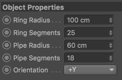
Although the video was posted in 2011, the basic layout is still the same and i still managed to copy the video clearly. After using the tutorial i decided to test it to make sure i could clone properly. I first selected a Torus as its a donut like shape.
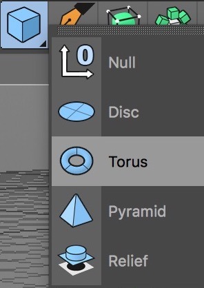
I then made adjustments to the torus to make it more donut like.
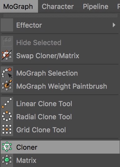
Once i had this i went to the ‘MoGraph’ tab and selected a cloner, while holding ‘alt’ which makes the ‘Torus’ a child of the cloner.
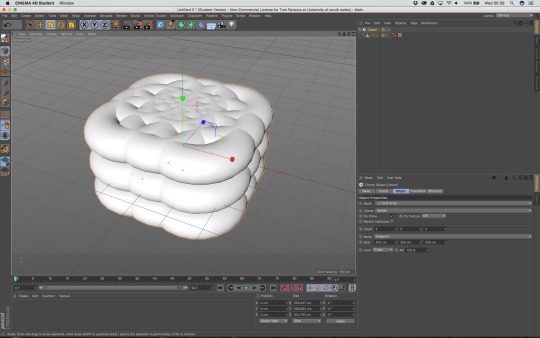
Once i done this, well, this happened and its pretty messy, but it worked, and cloned my object.
So i went into the cloner settings and made adjustments to the amount of donuts, spacing between and also the height.
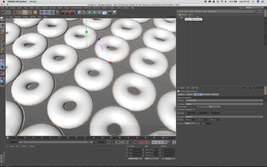
after doing everything i managed to clone the objects evenly in a tillable matter. Josh also told me that by adding ambient occlusion and global illumination it gives a much better looking render, which i must say he was correct. It gives a nice shadow to each object and does something magical with the lighting.
IDEA 3:
Okay so for my third idea, like my 2nd idea, research isn’t as important, its more about learning the software and getting to grips with how everything works as my 3rd idea is completely 3d and means i will need to create 3d models. The best place to start i think is just to simply look up tutorials and learn.
youtube
This is the tutorial i am watching and usig to learn the basics of the software as its obviously a good starting place. Ill probably do more research in to tutorials and the idea in general if i end up choosing this idea.
0 notes
Text
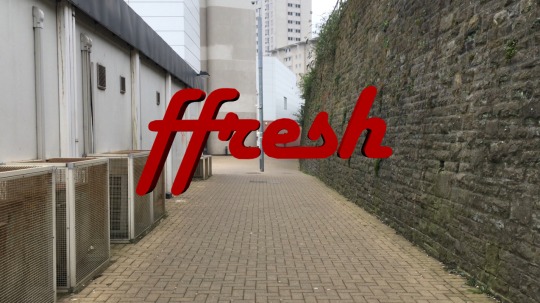
FFRESH
To start of the Brief, we have been tasked to create 3 Ffresh videos, being a Sting, Lower Third and Category Divider. I like this task because I feel its a nice way to ease in to the software and get to grips with using 3d.
For me, this was fun because i have chosen to use cinema 4d which i dont know how to use, so its time to learn! wooo!
MY IDEA:
ok so before starting this i wanted to wait and just hold back so i could get an idea for what everyone else was doing, not because i wanted to copy, but actually for the opposite reason. I like to try different things so when i asked a few questions and got an idea of what most of the people in class were doing, that then allowed me to stay away from that and go a different route.
I started by going behind the university and filming down the ‘ally way ish thing’ which i could then use to just track the Ffresh logo into using c4d’s Cineware built in to after effects. The Idea was just to walk forward holding the camera, litteraly filmed on my iphone and just track it within the scene, which the camera would then pass through. as i wanted a reveal effect i just reversed the footage and because i used warp stablizer, you cant tell which way i was originally walking so it worked fine.
But, After i got the footage smoothed and tracked and placed the logo within the scene, as soon as i played it a few times, i realised i hated it. so i didn’t continue to blend it in to the scene and colour correct, as it would have been a wast of time, so i went back to the drawing board and started again.
I wanted to keep my Idea simple, meaning i didn’t want to go through the effort of tracking the footage in 3d space again and then creating a 3d object and placing it in my scene while linking c4d and AE, soooo I tried to think of an idea where i could just use a still and animate it to look like video. Ive done the trick before many times for my own Instagram where i would animate photos to let others know i’ve posted a new image
EXAMPLE:
youtube
So knowing i can do it, i decided it was the best option for me and would also be helpful with time as i would preferably want to put as much time in to my main ident as possible.
IDEA:
PART 1:

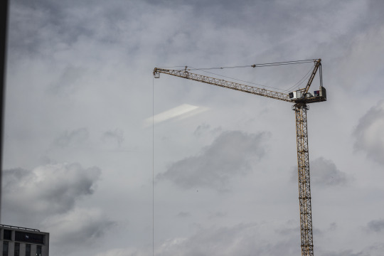
I was sat in lesson, looked out the window and seen the crane in the skyline, and straight away thought how cool it would be if the fresh logo was dangling from the wire. So i waited for lesson to finish, pulled out the good ole camera, chucked the 50mm 1.8 on and snapped a photo of it. Luckily the weather was near perfect so it was my lucky day.

I took the image as flat as possible by bringing down the settings in camera and also slightly under exposing the image which was fine as i was shooting in raw so i wanted the details in the sky.
saturation: -1
sharpness: -1
contrast: -3
Once i had the image i took it to photoshop made some adjustments in Raw. This was little things like increasing clarity and also adjust the yellow luminance
As the windows dont open anymore in our room, i had to just deal with the reflection in the window, so i used the spot healing brush to simply paint it out along with the edges of the frame which i didnt wanted like the bilding and window frame.
This then gave me a clean image with just the sky and Crane. I then removed the saturation and used a levels to crush the black and increase the whites and much as possible. Like i said earlier the sky was perfect as the cloud were nice and white, so this part was pretty easy.

I then converted the white to an alpha channel, and to do this i simply duplicated the main image, and added a mask. Then i used the colour picker to select the black within the matte i had created.
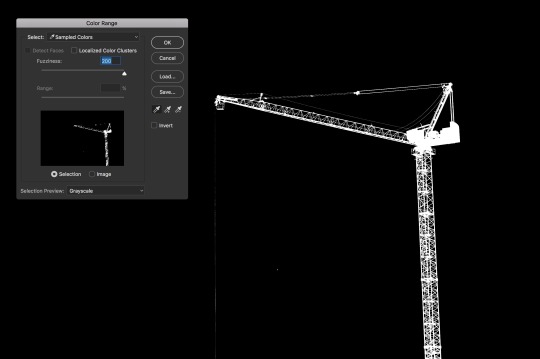
This then converted the black(white when selected) in to a matte which had a transparent background.
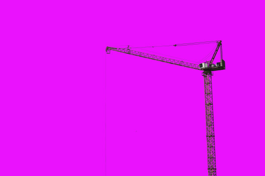
Quick test by placing a vibrant background behind crane to see if any white spill was made, which it wasnt so we were all set.

I then simply removed the crane from the image so i had both the crane and sky on separate layers which i could later use to animate in after effects.
PART 2:
I had to find out how to import a logo in to c4d and for that i found this tutorial. There are better ones out there but this is the one i happened to use.
youtube
To get the Logo 3d, I had to first take it in to illustrator, from this, I could create a path around the entire logo which when exported as an illustrator file, can be opened in c4d. After this I then simply use an ‘Extrude’ on the import and thats how I get the logo.

To make sure everything was correct, when setting up a camera, i made sure the focal length matched the lens i used for the photo.
Texturing it was fairly easy, I just changed the colour to red and added a reflection, although this didn’t really show in the render so I add it back in within after effects later on.


Once I had this i then added 4 lines which would be support guides as if they were attached to the crane. I then rendered the sequence out as a Tiff sequence in 720p, the reason is purely because it was faster but also because the video itself is 1080p and I was going to be scaling down the logo to fit the crane so it didn’t need the full resolution.
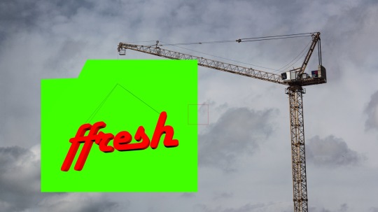
I then placed the logo where i wanted it to be on the crane. As i rendered it out with a green plane behind, i used keylight to remove the green which would alpha the channel, making it transparent. I changed the colour of the crane to a red tone also to match the Ffresh logo as i felt it just added something else.
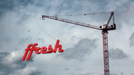
I then made more adjustments like adding a bird within the scene and camera shake to make the difference between video and photo, along with keyframing the sky to move and reflection, and this is the final result.
vimeo
LOWER THIRDS:
when making a lower thirds i simply went to google and just browsed what was already made, i then usd that as inspiration for my lower third. when looking at the logo, i first tried fitting the entire thing in but was having problems with how the text would sit next to each other, but then the idea came to my head of just having a singular F which was the start of the lower third, and by using a write on style effect, having everything smoothly appear on screen.
youtube
CATEGORY DIVIDER:
For the category divide I wanted to match the same style as the lower third so they could both be used in sync together and just overall work well as a combo if wanted to be. This time I used the full logo as I felt it was important from an advertisement point of view to make sure it was all shown. this is just because its an opening to a category and for people who may turn up late or half way through a showing, this will make sure everyone knows the Name. This didn't need to be done within the lower thirds as it plays throughout a category so the ‘F’ is enough to resemble to logo. I also looked at previous category dividers and what was clear was the fact that all of them have previously been on the left hand side of the video, and even ones being made by people in our class, i’m not sure why but people really like the left hand side. So me being me, obviously i put mine on the Right.
youtube
0 notes
Text
SOFTWARE
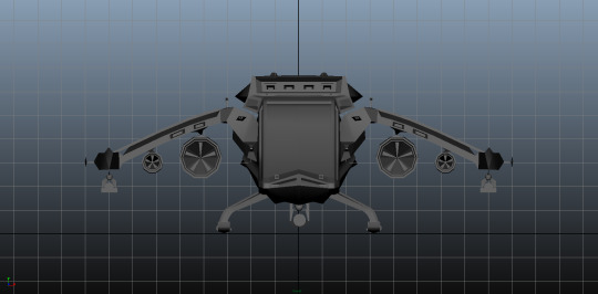
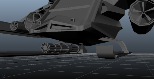
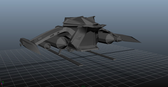
The last time i used it was back in my first year of college when they introduced us to Maya, after getting the hang of the generic tools i moddeled a spaceship, but although it looks good, proportionally its wrong, and this is why i want to get an understanding of 3d properly so i cant use it in this brief, but mainly for future projects.
SPACESHIP MODEL.

WHAT TO USE?
Well When it comes down to what software i’m going to be using, honestly i would really like to try cinema 4d. This is for many reason such as the fact that i have used maya in the past and like to learn new software but also because from what i have read about cinema 4d, it works much better with after effects than maya does as the Lite version is built in which may come in handy for my project as I do all of my visuals and motion graphics in after effects. Also from downloading both programs and testing both, i much prefer the overall layout of cinema 4d, i like how it has all of the necessary buttons organised and also how it uses Layers within the software. Im not sure why but i really dont like working without layers and is a reason i havent yet moved over to Nuke.
0 notes
Text
CHOOSING A CHANNEL
Okay so I feel like its finally time to start getting in to some practical work now i have a clear understanding of Tv idents. I feel that choosing an idea is going to be difficult because being the person i am, i feel i could think of an idea for any Broadcast channel. So deciding on one may be a task but im excited to get in to it and choose something to start creating.
So the way i’m thinking of going around this is thinking 3d visual prioritised over anything else. I want to create something that will require me to do some modelling and compositing using 3d because I have barely used 3d software before. This will obviously change the way i look at idents as i’m going to aim more towards the ones that use purely 3d Like the ITV 2 ones and BBC.
I also feel like its going to be challenging for me to choose a channel as i dont watch TV. I mean, does anyone these days? so thats at my disadvantage, but its easily fixable, im just gunna actually have to sit downstairs in my living room and watch normal tv.. sooo exciting right?
So its been a few days and I done it, i actually sat downstairs and spent some time watching normal Tv shows with my mother, it wasn't all to bad, haha! but the good thing is, we watched a lot of shows, and i came across a lot of channels. As it said in the brief, I tried so hard to look for channels that are not as popular as the others, but every time i came across one, an idea would come to mind but i just never felt like it hit the standard i try to aim for.
The main ones i came away with were
SyFy
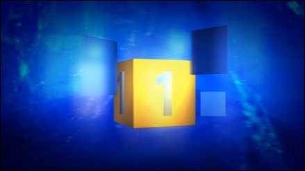
SKY 1
FOX
So I know that they aint unfamiliar ones, but they were the only ones i though i had good ideas for and honestly i put that over choosing a small channel and having a worse idea.
0 notes
Text
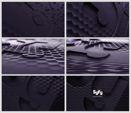
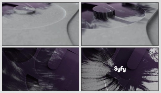
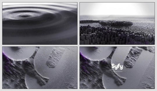
SYFY.
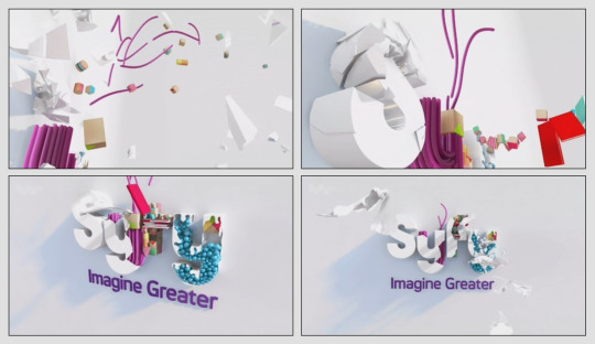
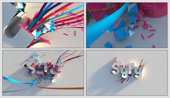
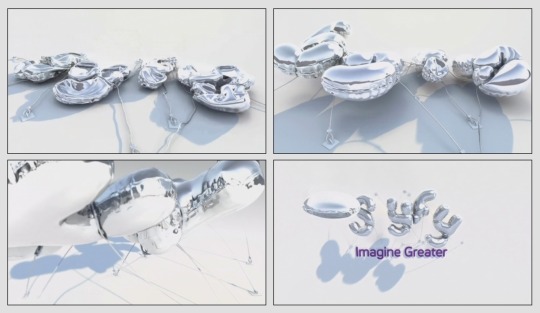
Stepping away from the other channels idents, Syfy do something pretty fascination when it comes to idents, and honestly i think they do a perfect job of it. Each ident has a resemblance to that channels tv shows and dont seem to drag or be over done.
For pretty much 9/10 of the idents, the logo is simply extruded to create a slight 3d depth to the ident, which is usually emphasised with shadows and lighting.
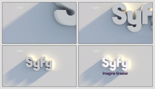
But besides this, they also like to make very abstract Idents, which i think represents the channel and is the reason they do it.
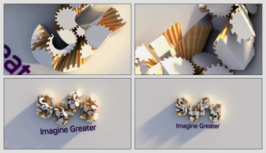

As you can see the generic style is always used to end the ident, but what happens before usually always varies in style and genre. Syfy has also done idents different to these, but yet still keep a similar format.
And recently, being 2016 onwards, the idents have completely changed in style and honestly, i think they are much better.
The new format usually has a 3d background with a camera moving throughout, and very subtly, the word SyFy is engraved onto the texture, but never showing the full word. This is where the simple 2d logo is then shown on screen over the top of the background. Simple and get to the point.

0 notes
Text
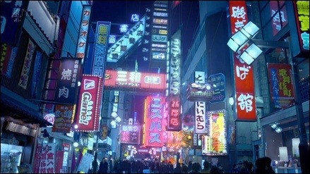
CHANNEL 4.
Gods of the Ident. Lets be honest, Channel 4 are by far, the best channel for creating some amazing Tv Idents, i mean you cant argue otherwise, from the style they chose to way they do it, they’re just perfect in every way.
I mean, ive even been sat watching tv with my mam and as a channel 4 ident has played, shes gone ‘woah thats cool’ like thats my mum. hahaha, anyways shes im obviously on about the amazing 3d Idents they create where the logo is part of the scenery.
Like this one.

and this one:
or this one:
and even this one:

yeah.. i could go on, but i wont, for the fact that i ont need to because just from saying channel 4, any tv watcher would probably mention the amazing tv idents they create. Its nice to see a channel take tv idents to the next level and put the same amount of effort in that you would see in a short film/tv show.
and although recently they have moved away from the 3d environment blending style, they still create outstanding idents that are very subtle but are still recognisable.

Like this one for the Simpsons. although they havent used the same style as the older Idents,they have stil kept the blockness from the parts of the number and as the video plays the blocks all move individually to the beat of the sound, but for a split moment create a 4 like shape. and obviously they have been designed to look like a Simpsons character with the big plain eyes and the yellow and blue. everything about the ident is right and any causal watcher can know what tv show is about to begin and on what channel. which is the main point, right?
0 notes
Text
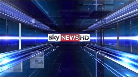
SKY.
i take my hat off to sky, they are one of the only brands i know that actually try new things all of the time when it comes to tv idents. i mean, they have litteraly done everything in the book, so yeah, im just gunna talk about a few.
SKY ONE.
So with sky 1, they dont tend to always go for the same style. I mean, there are a lot of similarities, but along with that, there is always something different to follow.
Breaking the forth wall.
I love when channels do this, they treat the logo as if its part of the enviroment, as if the actors can actually see and touch the logo, i love that, it works so well and kind of creates a connection between the audience and the show/channel.
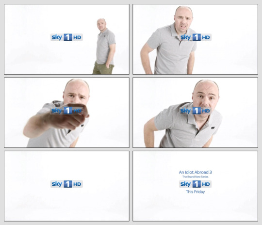
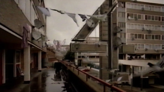
As you can see from the image example, the logo has broken the forth wall as the actor, Karl Pilkington walks on screen, notices the logo in frame, walks up to it and tries to scratch it off. Personally this is a perfect tv ident as i feel it captures the genre perfectly, considering Karl is a comedian, but also shows the channel along with not dragging out to long. everything about it is right and sky seem to be able to do this with all of their Tv Idents.
This is done in other ways also, for example, the character may not acknowledge the logo themselves, but it can still be placed within a scene as if it was actually there.

Although its subtle, you can see that the characters is actually stood on the bench, in-front of the logo, giving the illusion of depth and that the logo was actually there when filming. and although nothing spectacular happens, it doesn’t seem to need it and the focus is on the character, while still informing the audience of the channel.
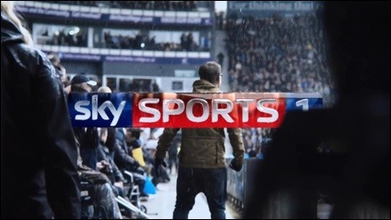
SKY MOVIES
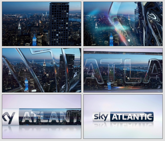
when you think of a sky TV Ident, usually you think of sky movies, right? regardless, sky movies have really taken Tv Idents to the next level, without actually changing the tv ident it self.
what i mean by this is that they have taken different film locations, scenes, iconic objects etc and merged them into a small, but big universe that the camera moves throughout, showing all of the related genres and films to the channel. Its pretty much 100% CGI with a flat image of the logo that fades on screen towards the end of the short clip, but yet again it gets to the point and gives viewers a quick taste of the channel.

so yeah, nothing fancy here, besides the film like CGI, but just a short TV Ident that gets straight to the point.
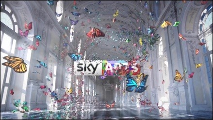
OTHER SKY IDENTS
Im not going to bore you with talking about each and every ident sky has, so here are the other styled idents sky has to offer for there individual channels.
0 notes
Text
ITV.
like BBC, ITV always use idents, like all the time. before every show, every cut, in-between adverts sometimes, yeah they use them a lot, but they also do it in a much simpler way.

With itv, its more of a motion graphics style logo, where there isnt any fancy hidden work that goes in to it, just a fade on while the video being shown plays out for a few seconds before cutting to the program.
One thing to note is that the only real change with each tv ident is the colour of the logo, which changes to the same tones as the video being played. as you can see from examples, kind of blending the word in to the enviroment.
This is strongly shown with the hot air balloon as the text is almost camouflaged into the video.
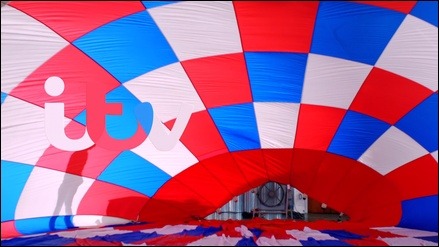
and honestly, ITV hasn't really seemed to move from the flat graphics they are known for using, and thats probably why. the furthest they got was pretty much basic 3d , using stuff like lighting to show depth, and also shapes like cubes etc.
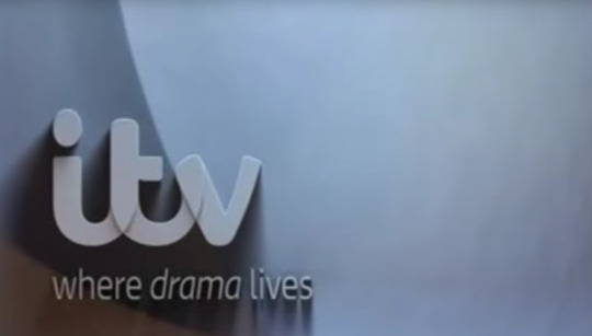
its very basic 3d like i said, but they dont really use it, and as you can see, in the instances that they did, there wasnt a huge change from the iconic flat image.
Personally i feel it would be wrong if ITV started bring out insane mind blowing 3d Tv idents, for many reasons.
ITV has gotten to the point where everyone knows and loves the flat 2d logo.
it doesn't fit the channels branding. ITV is known for its reality tv shows, and just casual tv in general, so if suddenly they started to make complex, 3d animated tv idents that had stuff happen that wasn’t relevant to the brand itself, it just wouldn’t work and may throw people off or even confuse them.
Waste of time. Although its cool to see an amazing Tv ident, I feel it would just be a waste of time for ITV as it wouldn't be benefiting them in any way shape or form. ITV is extremely successful with what they are doing and how they are doing it and making complex tv idents, I feel wouldn't help them gain more success. so why would they do it.
0 notes
Text
BBC - CIRCLES
So, obviously, BBC being the first company to introduce the Tv ident, i wanted to go into more depth about the infamous ‘Circle’ so the first thing i done was go to google and just do a simply google search on the topic.
To my surprise, i couldn’t believe that BBC actually have a full wiki page dedicated to the ‘circle’ like thats how important the circle was, IT HAS A WIKI PAGE. anyways after reading through what the glorious wiki page had to say, this is what i found:
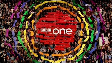
The circle style was an adaptation to the history of globe styled Idents while shying away from the globe itself, they still wanted the idents to have the same meaning as the older ones, while giving off the same iconic circle look. lets be fair, when you see a BBC ident, you expect to see a circle of some sort. This time however they wanted to create a circle, without actually showing a solid circle, which is what they done, by using people, animals, shapes, colours etc.

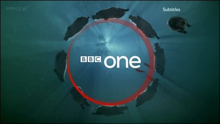
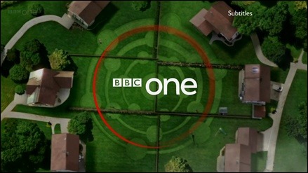

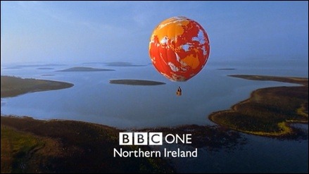
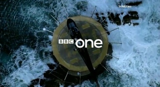
before the more modern circular idents, the circle has always poped up in idents thoughout all of its time, for example, the shape of hot air balloons were shown to give of the same impression.
and this was done in so many, subtle ways, like for example this ident used a helecopter pad with the bbc logo over the top, but because the pad is shaped as a circle, its gives that iconic BBC ident look that everyone knows and loves.
0 notes
Text
HISTORY
Before I start working on the project, I think its best if I do some research into the history of TV Idents so I got some sort of knowledge of what I have to work with.
BBC
Logie baird was the first person to create an ident which involved a 30 line method he had created. This was then developed and heres the start of BBC idents.
This video shows 60 years of tv idents within the bbc and how they have changed throughout the years.
youtube
After baird had developed his 30 line system, it later became a 240 line system in 1936 which created a higher definition image to display the idents.
Everything then came to a hold as the war began but later on in 1946 aired yet again, this time to stay.
FIRST IDENT.
The first BBC symbol was aired in 1953 and contained a circle with two eyes inside. This rotated around and was meant to symbolise the power of vision. The circle itself was to represent the never ending power along with the earth itself and on either side, was a wing. These were shown with fades of light that were in a way meant to represent the possibilities of television.
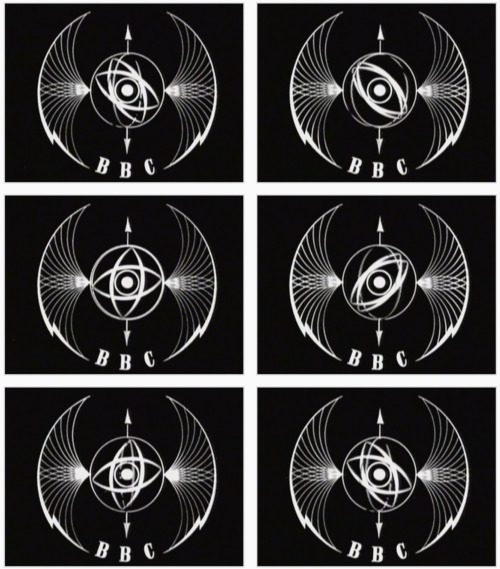
The BBC had gone with a circle styled logo which was meant to represent the world, and obviously circles also have a resembles to infinity, which was another trade BBC was aiming for. as the years went on and more idents were created, we see the same circular idea stick throughout, and even change to an actual earth. Its on up until recently where the BBC logo has shied away from using the iconic earth/circle style in every ident, As you can see towards the end of the video.
0 notes
Text
WHAT & WHY
okay so first off, before i just jump in to creating a tv ident, its probably best i explain what a tv ident actually is. so thats what im gunna do, starting with:
WHAT?
So in short (kinda), a tv idents is pretty much a short video of a brand logo that plays in-between adverts and the start of a tv show, and in some cases, in-between cuts of a tv show. this logo will be of the company that produces the show being played. for example, the first show that uses this, i can think of is ‘fox’ with the Walking Dead. Every time something big in the story happens and the scene changes, its usually done with a cut showing the brands logo, being Fox.
although i cant find the one they use in the show, i can find the same styled ident or American dad.
thats the generic shape of the ident. Obviously because this is for American dad the ident is bright and vibrant.... and blue, obviously. But for the walking dead they have made it dark and gloomy with a image previewing the episode.
but it just goes to show how easy it is to make 1 ident that can be used for multiple shows while still using the basic preset layout.
WHY?
well, Branding really. yeah its that simple, a tv ident is simply there to show what brand the show is being played on and is also purely for advertisement. for example, amazon prime and netflix do this all the time, because they are growing as tv show platforms and their videos are being shared across media. so when a video for example plays on facebook showing off a certain show thats only available on that platform, when audience see the short ident, they know where to go to watch the full thing.

that seemed really complex in how i explained it, but it does make sense.
0 notes