
typeanatomy
The Anatomy of Type
The Anatomy of Type
Nov 2012, Harper Design, US
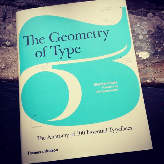
The Geometry of Type
Jan 2013, Thames & Hudson, UK
By Stephen Coles
Foreword by Erik Spiekermann
Design by Tony Seddon
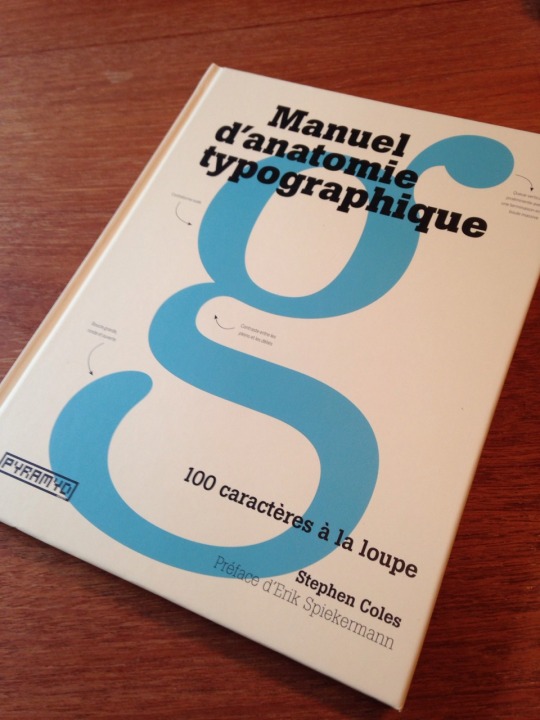
Note: This is one book. There are two covers and titles (due to regional publisher requirements) but the content is the same.
Buy the book:
From the author
(Signed, $25 + sh.)
Bookshop.org (Support indie shops)
Biblio (Buy used from an indie shop)
Amazon (Last resort)
This book was written and designed specifically for the printed format. The author does not recommend the Kindle version.
Excerpts
Reviews
On the Shelf
Further Reading
Fonts used on this site: Benton Sans from Webtype
26 posts
Don't wanna be here? Send us removal request.
Last Seen Blogs


socialmediastrategiessummit
Social Media Strategies Summit

karasukakikomi
Certified Reiji Simp

Text
When I began working on The Anatomy of Type, it became clear I’d need a bank of pithy words that could be used to illustrate the distinctive characteristics of each featured typeface. With the help of tools like Nina Stössinger’s word-o-mat, combined with my wife Laura Serra’s multilingual knowledge, we built a list. The criteria has since expanded a bit and I added a few extra phrases, and now I’m sharing it with you.
These short strings might be useful to type makers for creating specimens, or to type users for testing fonts, when pangrams or other texts occupy too much space.
0 notes
Photo
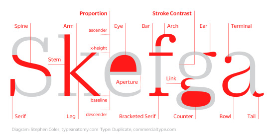
Type Anatomy in Six Letters
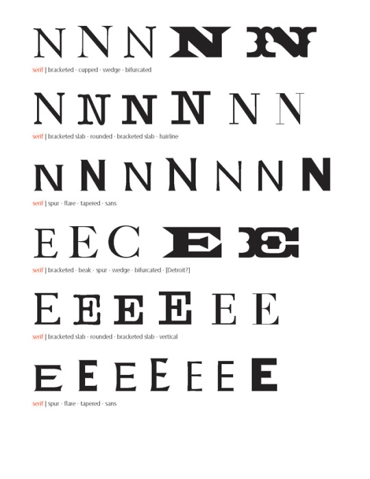
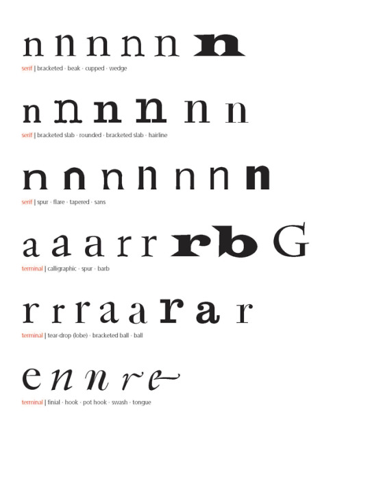
Ever since the book came out I’ve had several needs for an even more compact version of the anatomy chart from the introduction — one that explains as many basic terms as possible within a few glyphs. Here’s a stab at it, initially made for a Letterform Archive workshop. Yes, there are many parts missing here (e.g., apex, overshoot, or shoulder — the connection between straight and curved strokes), but them’s the breaks when you’re working in a small space with limited characters. Share this image freely, but please link back here.
3 notes
·
View notes
Photo
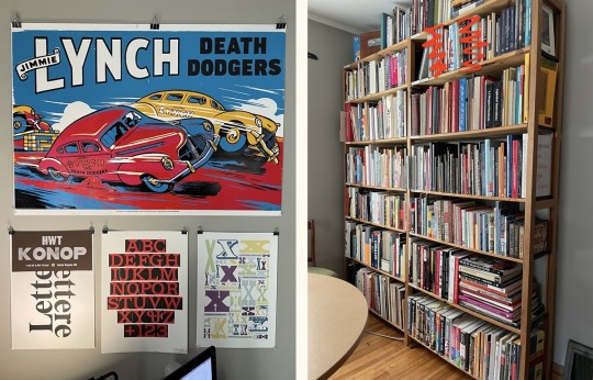
Mark Simonson, one of my favorite type designers, updated his studio tour, and I spotted a copy of The Anatomy of Type. I’m honored!
1 note
·
View note
Photo
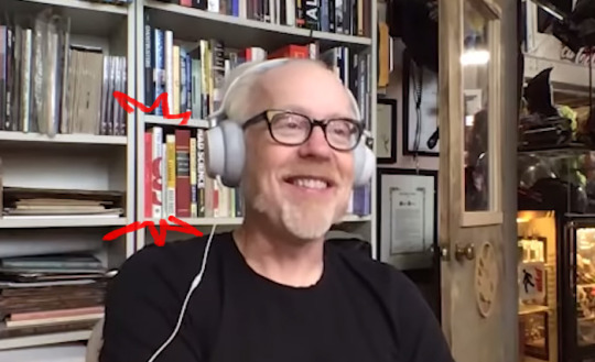
Adam Savage is learning about type. Or he learned. Or he just thinks the spine is shelf-worthy. Thanks for the tip, Doug Wilson!
1 note
·
View note
Photo
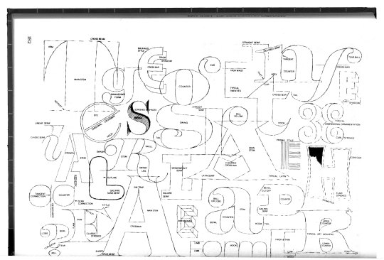
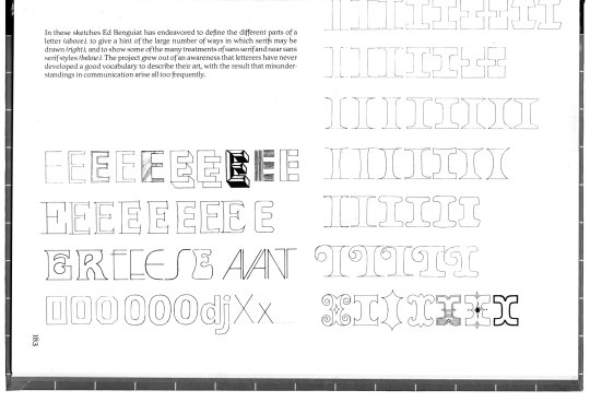
Ed Benguiat (1927–2020, RIP) tossed together a spread in Ed Rondthaler’s 1981 book, Life With Letters, that arguably remains the best type anatomy diagram ever. One could quibble about a few omissions and the odd definition for “tittle” (maybe one of his jokes), but it’s damn near perfect. I should have just put this at the front of my book and been done with it. Here’s a larger image.
5 notes
·
View notes
Quote
We never post pics of our son online, but if we did, he would be reading Anatomy of Type. He reads it every day, multiple times, reading aloud every page. He can now recognize the double-decker lowercase ‘g’ in multiple faces. He’s 2, and yes, I’m a proud Papa.
— Tom Mullaney. Best review yet!
1 note
·
View note
Photo
Paul Shaw:
Having criticized most existing letterform terminology diagrams it seems only fair that I show what I use. These sheets were begun a few years ago for my SVA students…
I was fortunate to get Paul’s advice when we were wrapping up The Anatomy of Type. Many of his edits and suggestions made it into the book. Paul is one of the foremost experts on type design, and perhaps the most prolific living writer on the subject. This useful catalog of terms – posted on his site in 2014 – references one of the many times he’s covered the topic. I’ll post another example soon – his unpublished book from the 1980s.
1 note
·
View note
Photo
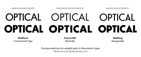
Maybe I need to make a category on this blog for Regrets. Here’s one: I always wished we had more room in the book for two of the most important ways to examine a typeface: its text setting and its family (weights, widths, italics and other variants).
If we had the space to illustrate weights, something to show would be the compensations that type designers make to their design as they add weight. Even the most geometric typefaces are adjusted to preserve counters, maintain overall balance among glyphs, and allow fonts to function at a greater range of sizes. Here we can see some examples of these adjustments, such as larger bowls (P), lower crossbars (A), wider shapes, and more contrast (difference betaween thin and thick strokes). Even Platform, with its intentionally extreme proportions, is adjusted.
One way to determine a quality, professional font family from an amateur or rushed product is to check all the weights and be sure the appropriate adjustments were made.
Typefaces shown: Platform, Futura ND, Battling (based on Elegant-Grotesk)
9 notes
·
View notes
Link
Type Detail is an ongoing project by Wenting Zhang, inspired by The Great Discontent’s “100 Day Project” and The Anatomy of Type. Zhang annotates typefaces specifically available for web use using the same structure from our book, designed by Tony Seddon.
Thanks for the mention and link, Wenting! I only wish there was a place to add comments on your analysis.
1 note
·
View note
Quote
The comments are historical, biographical, artistic, and commercial, and no matter how much you think you already know, you'll learn something new on nearly every page.
Michael K. Smith, customer review
1 note
·
View note
Photo
The Anatomy/Geometry of Type is now available in French from PYRAMYD. I don’t know enough French to vouch for the translation (by Émilie Lamy) but Jean François Porchez tells me it’s pretty good despite a few missteps.
9 notes
·
View notes
Link
Tal Leming is a typeface designer who just launched a really good website for his Type Supply foundry — the kind of site that represents some of the best of what independent type makers are doing right now. Today he posted an in-depth background story on the making of his latest typeface release, Balto. In it, he articulates why small decisions, like the angle of terminals and openness of aperture (the sort of stuff described in The Anatomy of Type), really do matter:
These tiny things may seem like inconsequential details but they are very important. I teach type design and I like to tell my students that while these minuscule changes won’t be noticed by most people, they will be felt. Type design is a great example of the whole being greater than the sum of its parts. A small change like this will echoed by other glyphs and all of these can be multiplied hundreds of times across a single page.
6 notes
·
View notes
Quote
It is a down-to-earth but playful and helpful tool for users in search of a distinctive typographic tone. A cautiously plotted but worthwhile attempt to shake type classifications to the core.
Sébastien Morlighem, Eye Magazine
3 notes
·
View notes
Quote
There are many things I like about Stephen Coles’ recent book; the bright, clean design and the accessible structure allowing you to dip in and out; but most of all, it’s the lack of fluff or filler. … In highlighting and comparing the features that give each typeface its character, anyone exploring this subject can begin to make informed choices between similar typeface options.
Jamie Clarke, Type Worship
2K notes
·
View notes
Quote
Stephen’s book couldn't have come at a better time. It presents just what those new to designing with type need to know. This is a book that could, and probably should, become a staple for a generation of typographic designers
Richard Weston, Ace Jet 170
1 note
·
View note
Quote
The Anatomy of Type provides a glorious opportunity to taxonimize another everyday visual encounter. As your knowledge accumulates, and your vocabulary grows, you, too, will begin to appraise these fonts with a critical eye. You will gaze at them alongside Coles, nodding at his insights.
Seth Stevenson, Slate
4 notes
·
View notes
Quote
Coles does a wonderful job of initiating the layman to the field of modern typography.
Michael Stasiak, Imprint
1 note
·
View note