verity-viscom
Vis-com
Blog showing work done at AUB on Visual Communication course-
274 posts
Don't wanna be here? Send us removal request.
Last Seen Blogs
emptyygallery
tiktok dump

etc983
(๑→ܫ←)

degenerate-modes
lydia //

ninjashome
Love is louder
loriedit
lori's edits
Photo
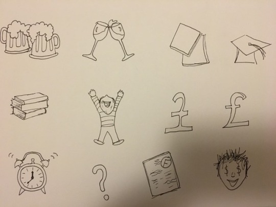
illustrations for D&AD
Here are a few small illustrations I did done in a really simple icon style which could be potentially used on the board or elsewhere in the packaging. I simply tried to think of anything which related to uni or education or money and went from there. I think these are quite sweet and if we do decide to move forward with them I will draw them out again better and adobe capture them onto illustrator.
0 notes
Text
https://cardsagainsthumanity.com/
TONE OF VOICE INSPO
Cards against humanity is the perfect game to get inspo from in this case because Yaz and I are on agreed on the fact the tone of voice needs to be quite sarcastic and maybe even a little dark which cards against humanity provides. It wouldnt be as rude however still really good inspo for what we could potentially be writing on the cards.
We have set out a plan of action and I will be designing the cards and money and packaging and will go from there.
0 notes
Photo
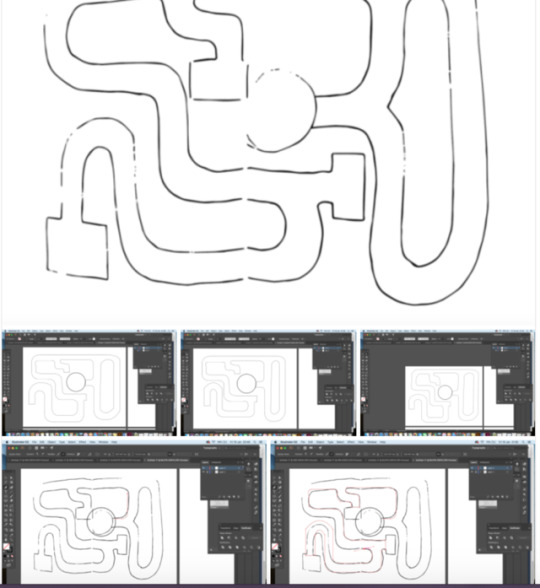
Today I showed Yaz the amazing app that is Adobe Capture which Scott had shown us previously in a session. So we simply adobe captured her sketched out game design and then manipulated it on illustrator to neaten it up. This was a really quick and easy way of getting the style we wanted.
0 notes
Text
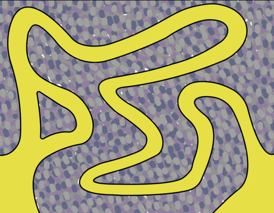

experimenting with colour and texture.
Yaz showed me her inital game board design which was this but she showed me some experiments with colour and texture which I think are cool however I agree with the fact the cobbled effect is too busy and distracts the players from the game. I do think the board is too abstract and needs to be more like the game of life style because at the moment it looks too artsy and not very easily playable.
0 notes
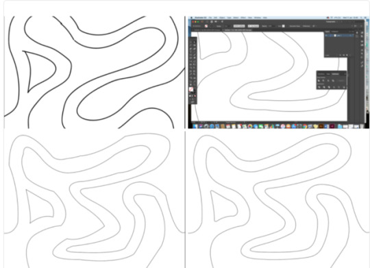
Text
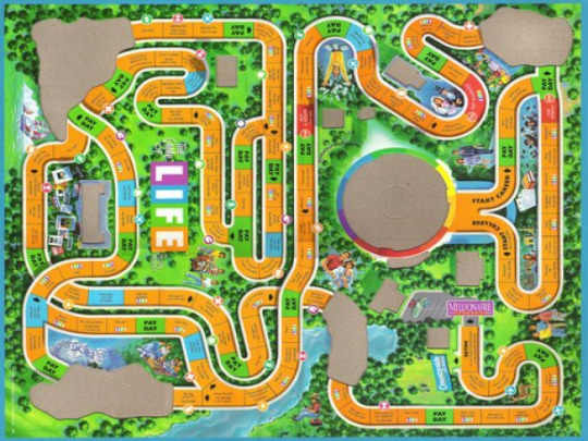
Yaz had looked at the game of life board and discovered there was no way that a board this complicated and large would be playable in half an hour so her first general draft drawings are much simpler but shes kept the same kind of rounded edges style to keep it recognisable. To start the game you either pick gap year or uni unlike the orignial which is start career or start college. We have taken lots of inspo from the original game but have put a fun youthful twist on it.
0 notes
Photo
D&AD inspo
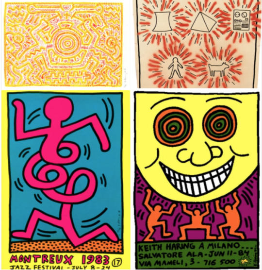
As I paired up with Yaz late into the project she had told me the concept of the game and it was going to be a twist on the classic ‘game of life’ which I for one love, we will be creating ‘the game of student life’ which I think is such a fab idea because its really relatable and could be really funny to play. Here is inspo Yaz showed me to help me get a gist of the vibe she was thinking.
These examples are from Keith Haring and these illustration styles I think will work super well for our game because its going to be that quite fun and not perfect kind of vibe.
0 notes
Text
d&ad
I have decided to pair up with Yazmine on this project because we both realised that there were quite a few deliverables and on our own was just too much. I think this is a great decision and we will work well together so I am feeling a lot happier about this decision as I was really stressed about this project.
0 notes
Text
D&AD Brief
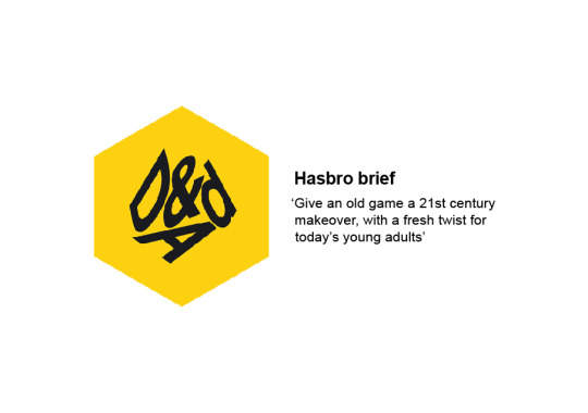
After much deliberation over the Christmas holidays I did finally decide to go with the hasbro brief because it screamed out at me the most and I think it will be such a fun challenge.
0 notes
Text
presentation feedback
Ben started by congratulating us all on our presentation, and the work we had shown him. He seemed overall impressed, however put forward some ideas or questions to help our process.
He really liked the fact we had provided not only a menu but the milk bottles too, showing how our logos would work on different medias - Clients always like something to hold while you present. Makes it more real.
He stated to never mention time. I talked about how we planned to laser cut the back of the menu, however could not book a slot. He told us to come up with an alternative. For example, “we can laser cut the back, this is what it would look like”.
Work on timing. Although we did practice, we didn’t keep within the five minute mark. Ben said we could cut things out. Only include the main points, and explain them well.
lastly, be prepared for any questions. The client will always ask questions about your work. We did prepare for this and made sure we could answer his questions. He was impressed with how we flipped his question into positives, providing good solutions.
Overall I was proud with what we had to show and think the client was impressed. This was a really useful experience, and one that will help in the future, whether interview or pitch.
0 notes
Photo
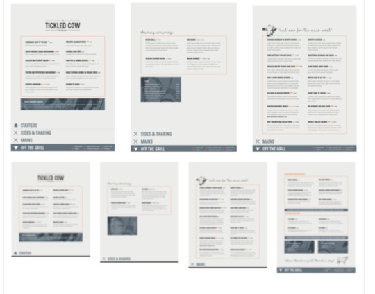
final menu pages
The presentation went really well and we are so happy with all our outcomes. The presentation could have been practised a tad more as we ran over a little on the time however we think we answered the tricky questions at the end really well and really thought we pitched our idea well and he said he really liked what we had produced so overall I think weve done a really good job on this project considering we only had a week we have achieved a lot.
0 notes
Photo

icon developement
We discussed different ideas for an icon but did settle on the cows head because it looks classic and memorable.
0 notes
Text

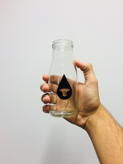
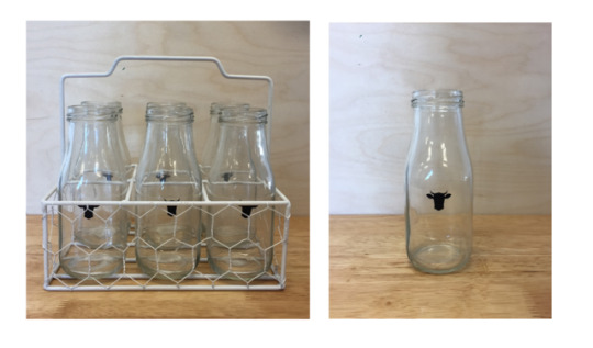
We did fortunately have time to vinyl print stickers for our bottles. We really wanted to do this right from the start so are really happy with the outcomes. The first set we decided againt as the water droplet was too large and we infact just wanted to keep the consisent icon throughout all aspects. We are excited to show these in the presentation
0 notes
Text
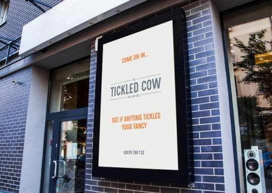
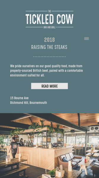
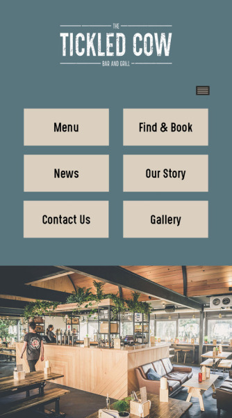
Outside we wanted a poster to draw people in. We wanted to keep it simple and easy to read as people walking or driving past would only be seeing it for split second. We first invited the customer in, our name and what we do is stated in the logo. Then we injected some fun by adding a nice pun including the word tickles which relates to the name we wanted to ensure that customers knew it was a fun relaxed vibe and we dont take ourselves too seriously yet still provide well on quality.
0 notes
Text
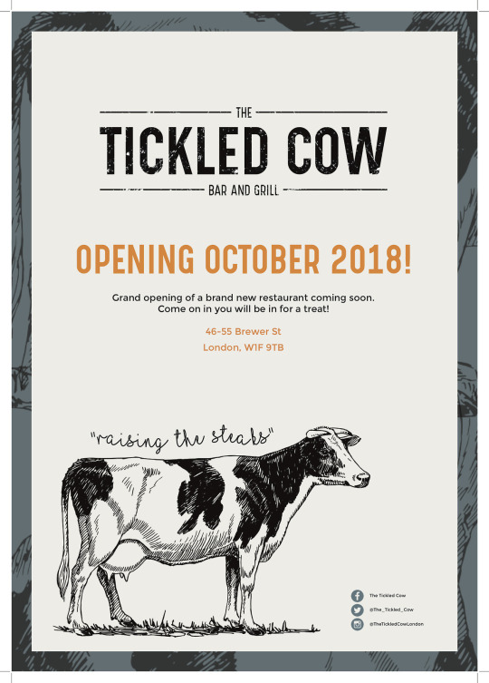
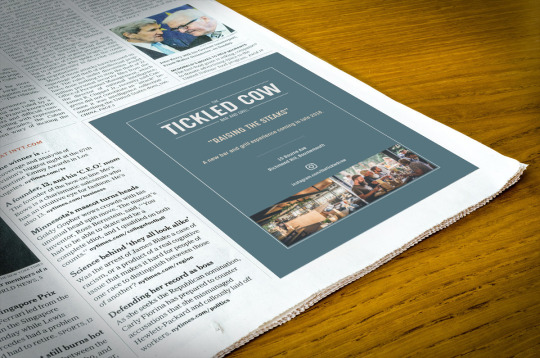
Today I designed the promotional poster for our restaurant. I wanted to keep a consistent theme so have used the same illustration and boarder to tie in with the menu. Ive also kept it short and to the point because people dont tend to stop and read lots of information when walking down the street. I am happy with it however if improved it needs a call to action, to engage with customers and actually get them into the restaurant.
0 notes