
victoramt2001
Victor's mindset
This is my domain to show all of the cool things I have going on
15 posts
Don't wanna be here? Send us removal request.
Last Seen Blogs

lizarcher
A Creator Of Worlds

levolcandessens
Ecolodge le volcan des sens


somebo4
abyss of (?)

carinaar
Bloop
Text
designer spotlight power point
https://docs.google.com/presentation/d/1Z2LBsyRZalHv2NhlHP-H7grUQbcprbhDrRplSl1nSeQ/edit?usp=sharing
0 notes
Text
Free Library trip
This was my first time going to to the public free library and it was pretty cool. the architecture of the building was very interesting and being there for the first time really hit me with the feeling of wow. I got there a little bit early with a group of other and we went up to the floors above to look around and the amount of books they had for the various topics was surprising to me. Something that I learned is the way that library was structured. the organization of different genres and where they were located was something I haven't seen ever.
some examples of design that interested my was some of the cases in the voyager exhibition. the use of the blue and green to represent the land and the water of both poets was a very interesting concept. Also, the way that the quotes of the people commenting on writing pieces was interesting as well. Seeing this, my exception of working designers was changed because of the talk we had with how long it to to set up everything for the exhibition. It gave me a new view on how designers view.
0 notes
Photo
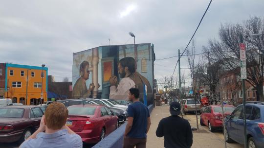
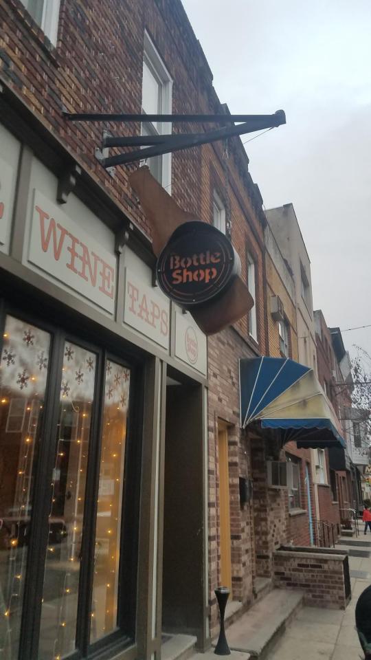
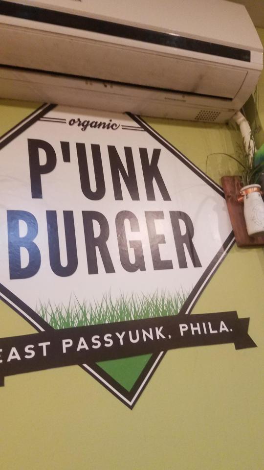
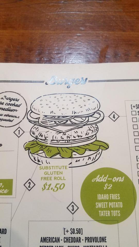
Eat And Explore
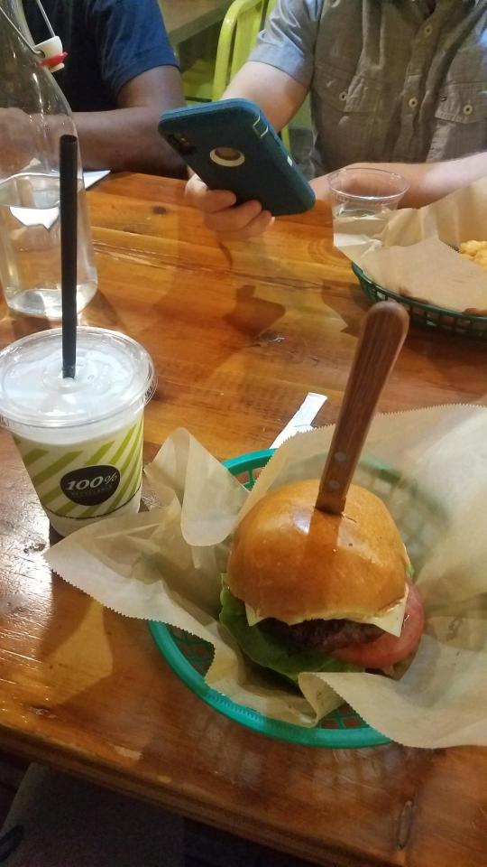
For the eat and explore project, my group traveled to East Passyunk. Getting there was an adventure. we took the normal Market blue line and then we went on the orange line, That was my first time taking that route. the train was bigger and the stations were a bit smaller. Once we got to our destination, I saw lots of small businesses with nice typography and logos. our decided to head to a burger joint named P’unk Burger. The prices were normal for the city, but the burger was amazing. I had a vanilla milkshake to compliment the main entree. After lunch, we walked around the main road stopping by some of the little shops and boutiques that were on our path. We found thrift shops, barbershops, and other types of business and organizations. Once the sky started to get dark, we figured that we were going to head back to campus. By coincidence, it started raining, so our trip was cut short. We managed to find designs and eat our meal at least. I had a great time and I would be willing to go back with a group again.
0 notes
Photo
Designer Spotlight- Part 2
For the second, more well known designer/designers, we chose the biggest independent designer firm, Pentagon. Researching this group I found a lot of really cool unknown logos and companies that caught my attention with the abstract nature and scenario of the design. looking into their website a little bit more, I found a lot of recognizable designs like Microsoft, Warner Bros., and others that made me say “I know that one”. That was one of the reasons why I like this design firm. They have made unknown companies have logos that look amazing and it gives them an identity. I really liked the different types of design other than logos. Pentagram also makes animated designs, product designs, and many more things that attracted my attention.
0 notes
Photo

Designer Spotlight-Part 1
The designer that we chose for the first half of their career was Jack Daly. At first, I was skeptical about his work. looking on on his behance page, I found some cool vector images. Some things that drew me into his work was the wide range of colors that Daly uses in many of his pieces. Also, the way that Daly has a great understanding of a human figure really makes his work pop. It doesn't seem that Daly follows a theme but that does not matter with his skill in making the images. I feel like this images can be used in advertisements and/or maybe in games and television. It is overall a great artist creating amazing vector images.
0 notes
Text
I have been into shoe designing for some time now and there are lots possibilities in creating images and transferring them onto something people wear everyday. There are lots of shoe stores in the Philadelphia area but the one that I found and want to visit the most is called UBIQ. This is a store that I found online and from other shoe distributors. The cool thing about UBIQ is that you can create a custom shoe from the ground up. from the soles to the upper, this is something pretty cool to try one day. I have a small sneaker collecting and I want to use UBIQ as a inspiration and a resource to continue this mini hobby.
https://www.ubiqlife.com
0 notes
Photo

Advertisements
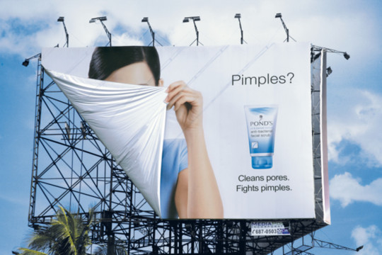
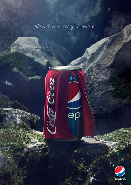
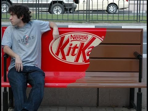
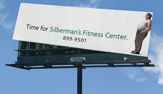
Ads are everywhere now a days because companies are trying to get their names out into the world. The advertisements that I found all made me say that is cool or even made me laugh with how silly or clever the design is. For example, the Silberman’s fitness center ad looks very unappealing, but when you see the reason the ad is tilted, That is where it caught my attention. Also, companies like Pepsi and Kit Kat had clever brand promotions as well.
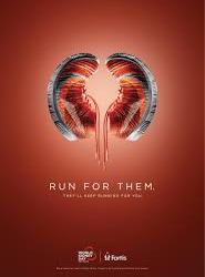
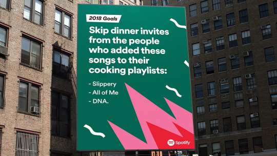
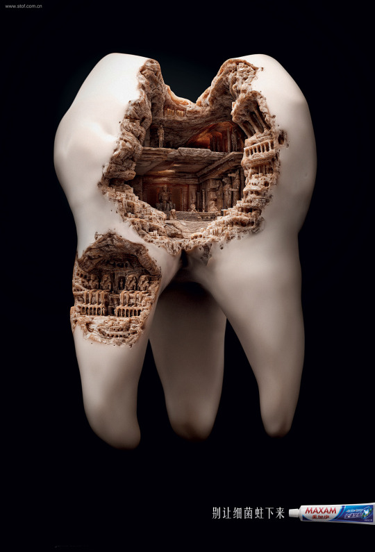
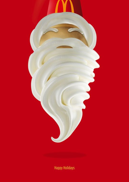
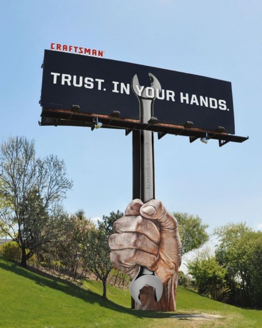
When driving around see can see most advertisements on billboards or screens around towns, cities, and long roads with nothing in sight. Companies like Spotify took advantage and made funny quotes with their ads. The vibrant colors also made the board look interesting.The Craftsman billboard has to be the most creative one because the whole entirety was decorated. the wrench is part of the billboard stand and the actual ad as well. Other people use photoshop to the next level in their ads. The toothpaste brand has a rotting city in a tooth to represent cavities and other dangers to your teeth. For the holidays, McDonalds took a ice cream come and turn it into Santa. You need to be on your toes to create something that make the consumer say “hmm, I want to find out more”, and I think these companies succeeded in doing so.
0 notes


Photo
EAT AND EXPLORE
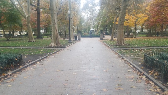
The group that I went with headed over to Rittenhouse square for the eat and explore assignment. This would be my first time going to this area and was exciting. The group took the subway from 34th street to city hall and then we walked from there. While walking to Rittenhouse square I could see the shift in aesthetics from the city hall area to our destination. It was a blustery day and we were all bundled up for this trip.
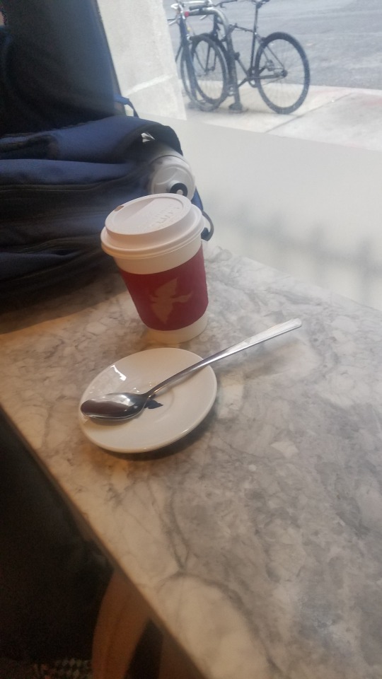
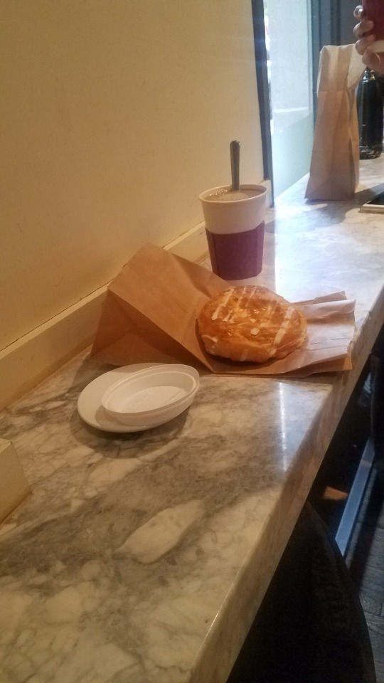
Once we arrived, Rittenhouse square was a beautiful park that had huge buildings surrounding it., I believe this was one of the wealthier areas and we could see the stores and boutiques everywhere. They all looked pricey. The place were we went to eat was a cafe called La Colombe Coffee Roasters. Once we got inside, It was like walking into a coffee bean factory. The blasts of the smell of coffee overwhelmed me. It was a rustic setting and it felt cozy. I purchased a pretzel (since I don't drink coffee) and enjoy a snack with my group. we had great conversations and stories to tell. It was a successful trip and I would go back again and bring some other people so that they can see this location.
0 notes
Photo
BOOK REVIEW
The book that I have chosen for this book review is a bit of an older book. The book is called “The Big Book of Logos 3″ by David E. Carter. I was hesitant to pick the book because of the cover. It was plain and simple, but when I opened the book, The pages were filled with logos of many companies and that is what caught my attention. As I flipped through the pages, I saw old logos, boring ones, exciting ones, and logos that I still see out in public. As a person who makes logos for fun, that book really spark a lot of ideas. I saw a mix of typography and Images alike.
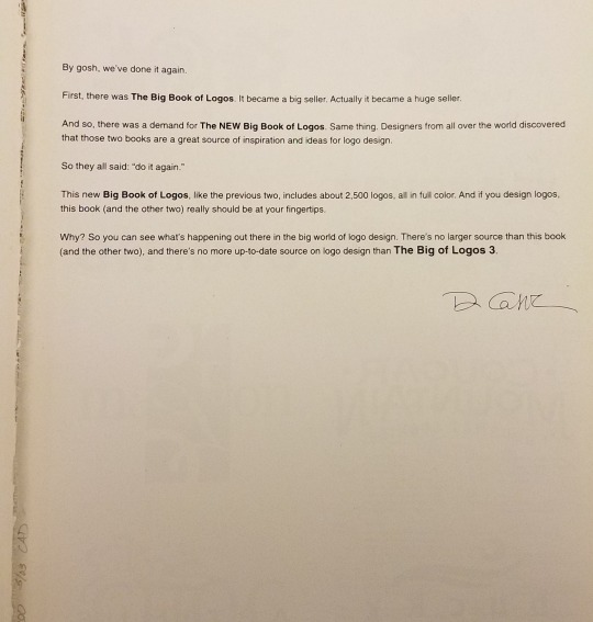
The message in the beginning replaced the table of contents and it gave a comedic sense as readers opened the book. I liked the little detail because it made me think that this book was not just a textbook. It was a visual book of the past in design and it was very interesting to say the least.
0 notes
Photo


WESTPHAL EVENT
The Westphal event that I attended was the opening reception of “What Might This Be? The Art and Science of Rorschach Inkblots” by Eric Zillmer and Kanya Zillmer. this event had many inkblots test and it showed how these test connect to science as well as art. It had a wide range of design and there were lots of panels explaining the history behind them. I saw many interesting pieces but the one that caught my attention was the one where all of the viewers got to try and guess what they though the inkblot was. I thought is was an elephant, but there were many peoples guesses on the walls like birds, people, and other things as well.
one thing that I learned about was the different backstories of each piece. some were simple in the fact they were just ink dumped onto a piece of paper. Other stories were more in-depth of psychology of the people that influenced the art. I really enjoyed this exhibit one, because I went with friends that had different views of the installations, and two, it was something new that I have never done. This was my first time going to an actual opening of an event and it felt very formal. This was a great experience and if there is another Opening like this in the future, I will gladly go again.
0 notes
Text
Paula Scher is one of the most influential female designers ever. Once I started watching the video, some of the posters and designs presented in the introduction were immediately recognizable. I was able to pin point where I have seen those images like bringing the Noise Bringing The Funk. From this video, I learned that being a graphic designer is easy in the design part. The hardest part is trying to convince millions of people to use your design. You could have spent 10 minutes designing a logo and think its the best thing. but if the client is not convinced., the work is nothing. Its all about perspective in this field.
Regarding her work, I really enjoyed the boldness and in your face feeling from the pieces. It showed a newer more modern approach to creating an identity that defined something. The pier 55 logo is something I looked into and during the documentary, I saw lots of sketches and different versions of how to envision the Pier. I searched up the logo online and the final result looks great in my opinion. Her work process is very interesting. She doesn't seem to be glued to her desk and she walks around helping the others in her office. I think that can be beneficial because I believe that sitting at your desk all day is boring and you can't really get inspiration from one spot. on the topic of her office workspace. I like the modern look and the way the employees work together. It was like a big family all working together to accomplish a common goal. I think that Paula Scher has left a legacy and she is well off now to enjoy her life peacefully. I know she would rather work on painting or design than just retiring. I would be the same way as design is something that we love to do.
0 notes
Photo


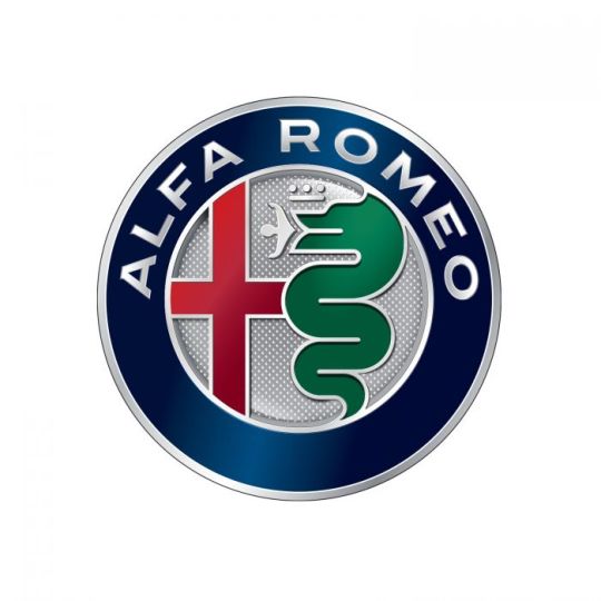


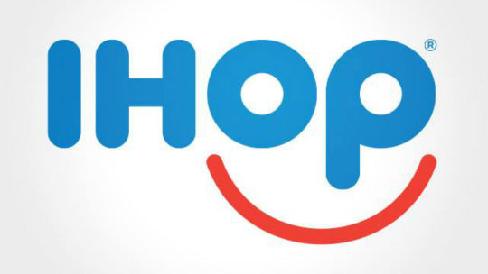
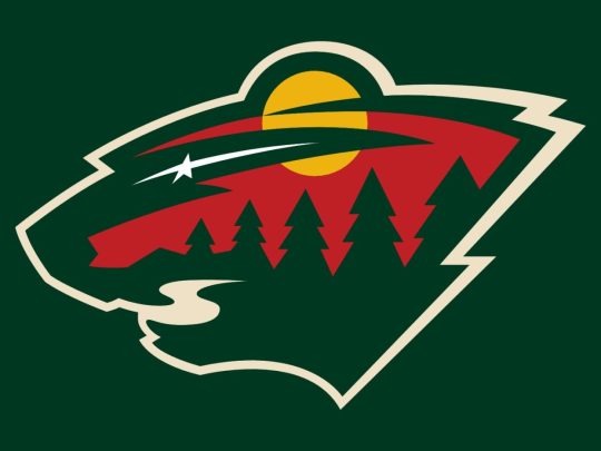
Logos are what makes the company's identify stand out. No matter how small or big, industries depend on these small images to give them something for people to recognize them by. All the logos above have caught my attention in some way. Some reasons might be the complexity of the design, the simplicity, or the use of their brand in the image. Also, some logos have hidden meanings such as the Baskin Robbins logo. The 31 in the logo shows the number of flavors that they have. These types of logos make you think and analyze them more.
Simplicity is one of the main things that I see in most of these logos. The Simple Health, Spotify, and LG logos work great with the concept of simplicity. They convey an image that people can recognize almost instantly. On the other hand, Logos like the Minnesota Wild and Alfa Romeo have meaning and lots of detail which can make people look twice and observe everything that is going. Overall, the logos are similar by the use of adding symbolism in their images. that in my opinion catches my attention that the designer took time to plan out and illustrate the wonderful pictures we have to look at today.
0 notes
Photo


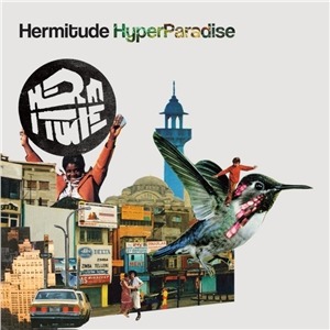
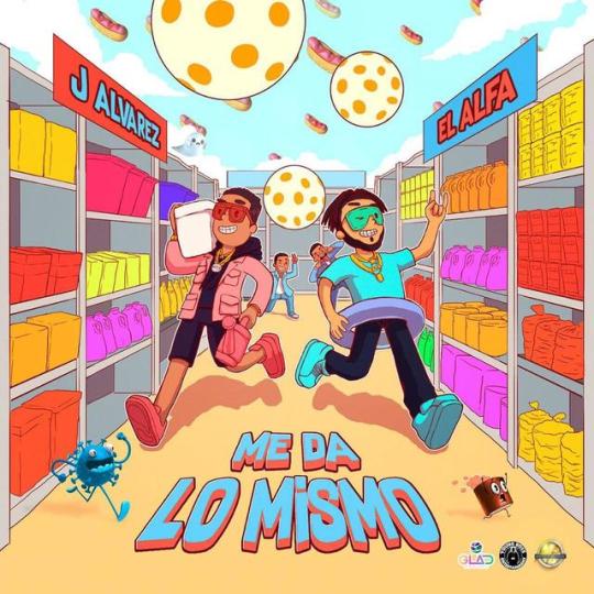
looking Around on Spotify, I realized that I have so many songs with great covers to look at. When I chose my 10 album covers , I chose the ones that attracted me towards it. No matter if it was the vibrant colors, the abstract images, or the typography, these were the ones that out of my 2,000 plus songs that I have manage to stick in my head.
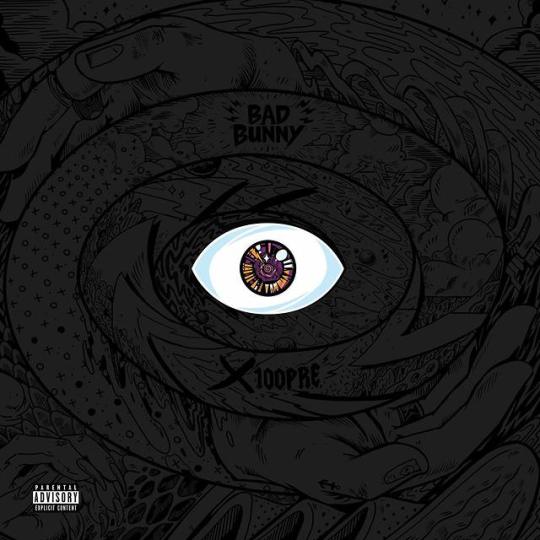
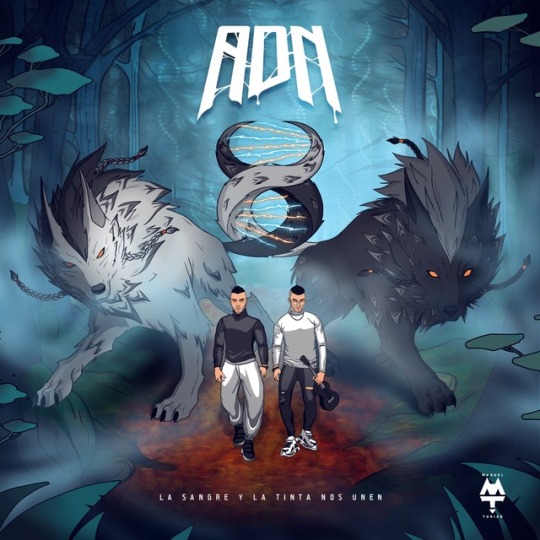
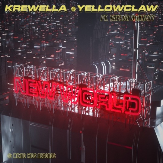
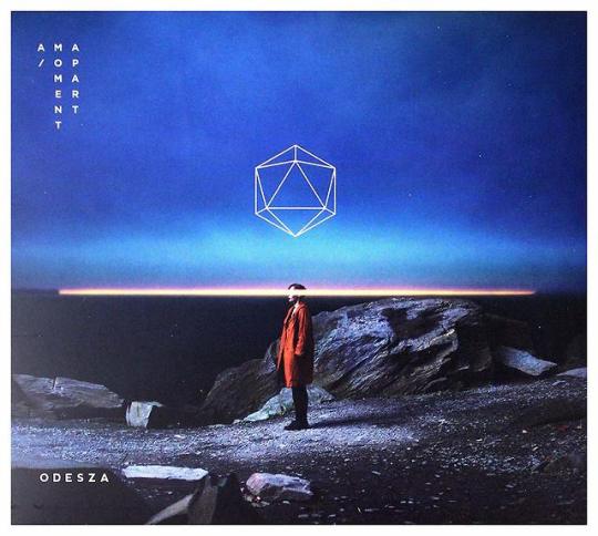
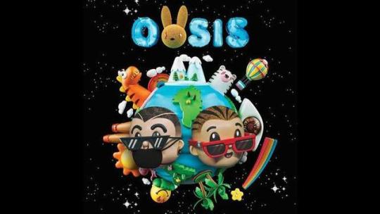
Illustration and drawings have show to be eye catching such as J Alvarez’s Album Me Da Lo Mismo and ADN. These covers have great composition that bring the viewer to a focal point. Also, covers like Oasis x100pre by Bad Bunny (1st image) really do a great job adding massive amounts of detail to get the viewer to look closer into the image.
Other covers on this list capture the essence of space, shape, and some typography. Krewella and ODESZA use fonts to help enhance their images and the fonts also help convey feeling to the cover. All of the artists here have chosen great designers to help give an image to their musical projects and they have propered because of the image presented seen on store shelves and online music streaming services.
0 notes
