
Last Seen Blogs

mercadotvec
MERCADOTV
kogalover1
Fire God Spirt

iamkert
I Am Kert

rch-commonplacebook
Otávio Leal - Cursos Grátis

sleep-nurse
oag
Photo
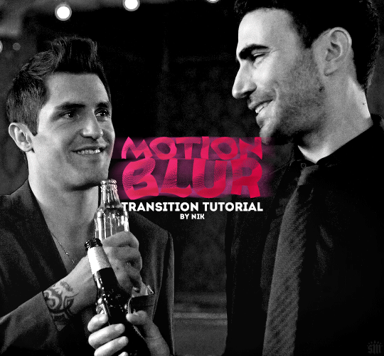
HOW TO: Do a Motion Blur Transition
Using Timeline or Frame Animation
Hi! Someone asked me for a tutorial on the transition effect in the second gif of this set (also featured in this set and the text on this set). So, here it is! This is one of the easiest and least tedious of the gif transition effects in my opinion — and I’m going to go over how to do it both in Timeline and Frame Animation (using the screencap method). Disclaimer: This tutorial assumes you have a basic understanding of gif-making in Photoshop.

Continuar lendo
788 notes
·
View notes
Text
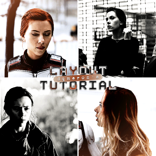
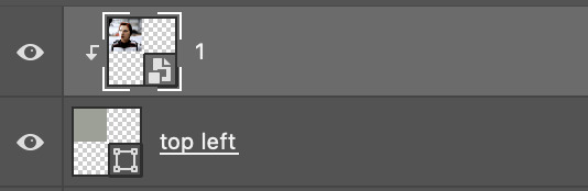
here's my quick tutorial for making layouts in photoshop! i'll be going over how to make this 4-panel square one!
↳ requires basic knowledge of photoshop
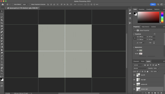
「 step 1: making your file 」
make a new file, 540 x whatever height you want (just make sure it fits within tumblr’s image size guidelines), and make sure the background is set to transparent. for this specific layout, i want the overall shape to be square, so my dimensions are 540x540!

「 step 2: mapping out 」
the best way to make sure your layouts are even and spaced equally is using guides! go to view > guides > new guide layout. the color of your guides doesn’t matter at all (i just like green so mine are green lol), and you can have as many columns and rows as you want. since this is going to be a 2x2 layout, i’ll have 2 columns and 2 rows. the general rule of thumb for gutter is 4px.

once your guides pop up, select the rectangle tool by pressing U on your keyboard. make sure shape is selected from the drop-down menu at the top (right by the home button in the top left), and make sure that you have snapping on (view > snap).
using the rectangle tool, trace out your layout panels! as long as you have snapping on, your path should naturally snap to the guidelines, making it a LOT easier to do this! when you’re done making your rectangles, you can turn off guides by going to view > guides > clear guides (i usually keep them on until i’m done adding in my gifs but this is up to you). i always name each shape layer after where it is in the grid to not get confused.

「 step 3: adding gifs 」
some quick things before i go over actually adding in your gifs:
1. make each of your gifs in their own individual files. you’ll be adding them into the main one later.
2. your gifs have to be the same length — you can cut them down to length in their own individual files or later in the main one. either way is fine, totally up to you!
now you have your layout set up, you can make and add your gifs! in order to make sure that they fit into the panels, check the dimensions of each shape you’ve created by selecting the layer and looking in the properties tab. my panels are each 268x268.

i’ll actually be making each of my gifs 270x270, just to make sure that i don’t have any weird gaps or anything (i’ll talk about how i’ll be getting rid of the 2 extra pixels on each side later).
once you have your gifs done, you can duplicate them into the main one. convert your gif and anything else (coloring etc) into a smart object (right click > convert to smart object), and then right click it and select “duplicate layer”. make sure the document you’re duplicating to is the one with your layout in it.
layers automatically duplicate aligned into the top left corner. since this is where my first panel is, i can just leave my gif there, but for the other ones, drag your gifs into place using transform and your mouse (once again making sure that snapping is on).
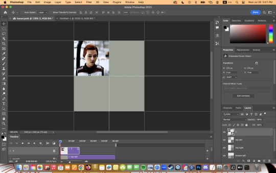
now to get rid of those extra pixels. this step also makes sure your gif is perfectly in line with the shape you’ve outlined the layout with. make sure your gif is right above the shape layer in the layers tab, and then right click and select “create clipping mask”. this makes sure your gif doesn’t go outside the limits of your guidelines. this is what it should look like in the layers tab:
「 step 4: exporting 」
exporting a layout gif is pretty much like exporting any other gif, but you do need to check your matte settings before saving. the wrong ones can make what should be the transparent dividers solid, which can throw off the look of your gifs. make sure matte is set to “none”, and then save as normal!

here's my finished gif:
happy giffing!
feel free to send me an ask/message me w any questions!
221 notes
·
View notes
Text
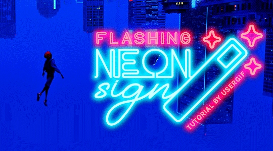
HOW TO: Make Animated Neon Text
Hi! No one asked for this tutorial, but this is one of my favorite typography effects as of late — so I thought I'd share how I do it. You can see this effect in the first gif of this *NSYNC Celebrity set and the last gif of this Anthony Bridgerton set. Disclaimer: This tutorial assumes you have a basic understanding of gif-making in Photoshop. It's also exclusively in Timeline and uses keyframes for the fading effect seen on the blue text.

PHASE 1: PREP YOUR BASE GIF
1.1 – Choose a dark scene.
This effect looks best contrasted against a dark background. You can definitely do it with a bright background, but just like a neon sign irl, you only turn it on in the dark/at night — so keep that in mind!
1.2 – Determine the length of your clip.
Depending on how much you want your text to flash or fade in, you'll want to make sure you have a scene long enough to also allow the text not to flash — reducing the strain it takes to actually read the text. For reference, my gif is 48 frames.
1.3 – Crop, color, etc. as you would.
New to gif-making? Check out my basic tutorial here!
PHASE 2: FORMAT YOUR TEXT
Before we animate anything, get your text and any vectors laid out and formatted exactly as you want them!
2.1 – Finding neon sign fonts.
It's easy as going to dafont.com and typing "neon" into the search bar!
2.2 – Fonts I used.
Neon Glow by weknow | Neon by Fenotype | Neon Bines by Eknoji Studio
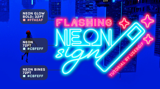
And to not leave my fellow font hoarders hanging, the font for "tutorial by usergif" is Karla (it's a Google font) 🥰
2.3 – Group your text layers. (Conditional)
If you plan on having multiple text layers like I did and you want them to appear connected (like how the last letters of "NEON" and "sign" intersect with the wand icon), I suggest putting the layers into groups according to color (the shortcut to group layers is Command+G). If you don't group your text and just apply the outer glow settings to each individual layer, you'll end up with something like this:
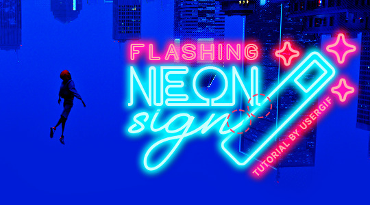
—where you can see the glow overlap with the line, instead of the smooth connection you see in my final example gif. I'm using 2 colors for my text, so I made a group for red and a group for blue.
2.4 – Apply Outer Glow.
Right-click your text layer (or your group if you have several layers) and select "Blending Options" to open the Layer Style menu. Check "Outer Glow" and feel free to play around with the settings until you like the way your text looks!
Your outer glow color should be darker and more vibrant than the color of the text itself. The text should be within the same color family but much brighter and, sometimes, almost white (see Step 2.2 again for my text colors).
Here are the settings for the Red Glow (the glow color is #FF3966) and Blue Glow (#00F0FF):
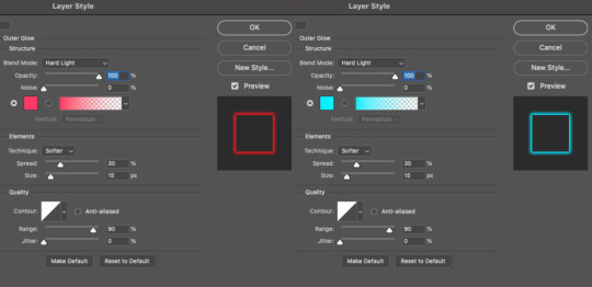
These aren't always my exact settings but they're pretty close to my standard. I always set the blend mode to Hard Light and usually have the opacity at 100%.
For every gif I use this effect on, I like to play around with Spread and Size. Spread will make the glow look denser and "expand the boundaries" (source: Adobe) and Size will diffuse the glow and blow it out so it covers a larger area (Adobe says it "Specifies the radius and size of blur").
2.5 – Duplicate your text layer/groups and remove glow.
We're only going to be animating the glow on our text, and since doing this affects its opacity/visibility, we want to preserve the base text by creating a duplicate.
I just hit the Command+J shortcut to duplicate my groups and delete the Outer Glow effects, making sure that the "No Glow" version is above the "Glow" version:
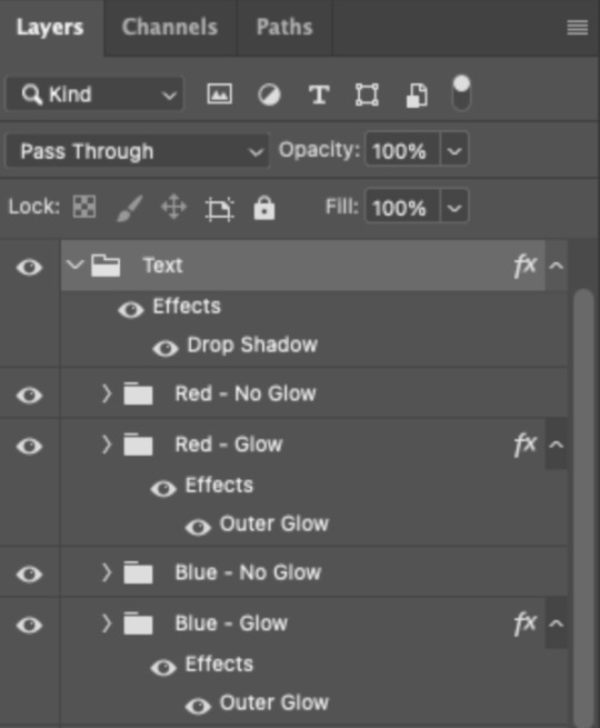
I also put all these groups into one group called "Text" for organization and so I could apply a drop shadow to all the elements for better visibility.
PHASE 3: CREATE THE FLASHING EFFECT
This is for the effect you see on the RED text in my gif!
3.1 – The 0.03-Second Rule
If you've read any of my animation tutorials before, you're probably already familiar with this rule. In my experience (and for reasons I can't explain), Video Timeline pauses every 0.03 seconds (try clicking the forward button a few times, you'll probably find a "duplicate" or paused frame). So, keep all your layers a duration of 0.03-second increments (e.g. 0.06 or 0.09 seconds can also work) and align them on the Timeline at 0.03-second intervals. If you don't follow this rule, you'll get duplicate frames when you export, resulting in a choppy final gif.
3.2 – Trim and arrange your text layers.
Only on the layers/groups WITH the Outer Glow effect, trim them into several segments of varying lengths where the glow will be "on" (visible) and leaving spaces where the glow should be "off."
Typically, I'll have a mixture of 0.06 and 0.03-second text. That's when the glow will be visible. Between each "flash" of visibility, I've got a 0.03-second blank space, baby *pen clicks* and I'll write your name:
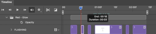
The layers shown above are arranged with a few flashes and two long segments of no flashing. This is the order and duration of each segment shown above (purple = visible segments):
0.06 blank, 0.06 visible, 0.03 blank, 0.03 visible, 0.03 blank, 0.03 visible, 0.03 blank, 0.24 visible (the long bit where "FLASHING" doesn't flash at all), 0.03 blank, 0.03 visible, 0.03 blank, 0.12 visible
(I only did this for the text that says "FLASHING" to give it a glitching effect. The other red text keeps the glow visible starting at the first long segment.)
PHASE 4: CREATE THE FADE-IN EFFECT
This is for the effect you see on the BLUE text in my gif!
4.1 – Animate using the Opacity Keyframe.
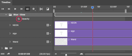
Again, we're only touching the layers/groups WITH the glow effect. If you only have one layer of text, you'll find the Opacity Keyframe by clicking the film reel icon:
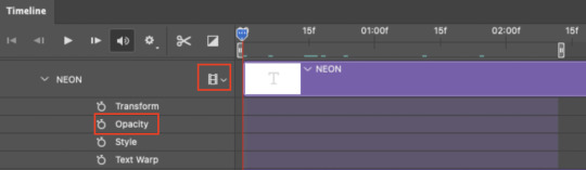
If you're working with groups like me, you'll find it in the Timeline panel under the group when it's expanded:
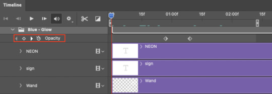
As you can see, I already added my keyframes (lil diamond babies). And luckily, it's super easy to do!
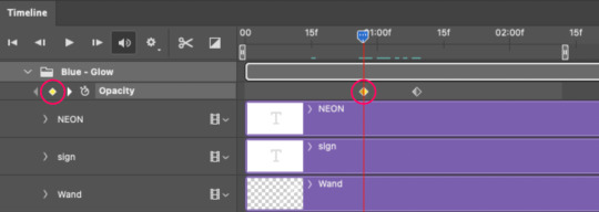
4.2 – Add the ending Keyframe first.
We're starting at the end because our layers/groups are already at 100% opacity. Drag the playhead (the blue arrow attached to the red vertical line) to a spot where you want the glow to be 100% opaque — this is where the glow will be fully "on" or visible. [Again, follow the 0.03-Second Rule. You will get duplicate frames regardless when using keyframes (this will be explained in the note in Phase 5), but abiding to the rule will mitigate the amount of dupes you get.]
Then, click the clock icon by "Opacity" to place a keyframe:
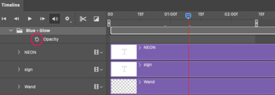
4.3 – Add the starting Keyframe.
Go backward from the ending Keyframe you just placed (I went back 0.12 seconds — but you can play around with the duration of the fade, just keep it a multiple of 0.03):
And drop another keyframe, this time by clicking the diamond icon by "Opacity":
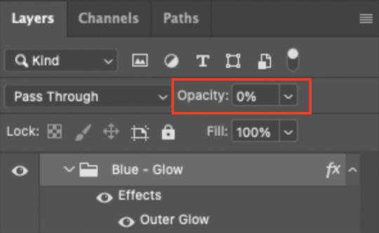
4.4 – Reduce the opacity on the starting Keyframe.
Keeping that keyframe you just placed selected, go to the layers panel and reduce your layer's/group's opacity to 0%:
Now, this Outer Glow will slowly fade from 0% to 100% opacity.
And just for a visual aid, here's where my fade-in keyframes are in relation to my flashing segments:
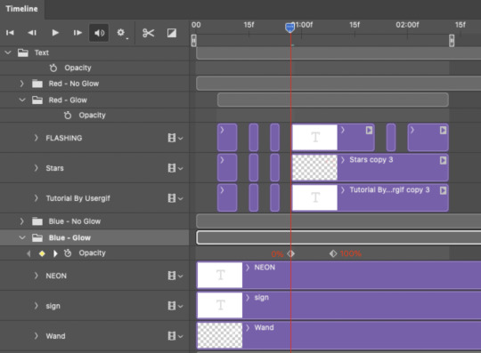
To refresh your mind, the 0% Opacity Keyframe starts when "FLASHING" is visible for 0.24 seconds (the first long segment of visibility).
With these keyframes, you'll get a smooth fade-in à la ✨light switch with a dimmer✨
PHASE 5: EXPORT
Yay, we're finished! Convert from Timeline back to Frames and export your gif!
NOTE: If you only did the flashing effect and followed my 0.03-Second Rule, you shouldn't have any duplicate gifs.
BUT if you included the fade-in effect using keyframes, you WILL have duplicate frames. 'Tis the nature of keyframes. 🤷♀️ I had 4 extra frames where the fade-in starts, which I deleted. So, as always, I recommend checking your frames when you convert from Video Timeline back to Frame Animation — and manually delete any duplicate frames.
Sorry this tutorial is so long 🙈 I over-explain so you're not just mechanically copying steps, but understanding the WHY behind each step! Thanks for bearing with me
If you have specific questions about this tutorial, feel free to send a message to usergif and I'll try my best to help! :)
More USERGIF tutorials • More resources by Nik • USERGIF Resource Directory
750 notes
·
View notes
Text
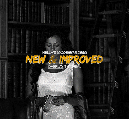
Hello!! A couple years ago I posted this tutorial for making gifs with a moving overlay effect. In the two and a half years since I made that tutorial, I've learned some new tricks for this gif effect but most importantly I've learned how to explain things better.
For that reason, I've created this new and improved tutorial for my overlay gif effect. The basics are the same but it's simpler, I go into more detail, give better explanations, and have more comprehensive instructions.
The easiest way to do this effect with this method is to use smart objects and work in timeline. For this tutorial, I’m assuming you know the basics of giffing like cropping, resizing, colouring, etc. If you need help with this I’d suggest you look at some other tutorials and guides!!
First, we’re going to start off with three things.
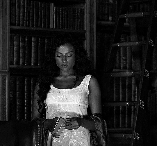
1. A completed gif converted into a smart object that is going to be the base gif. I'm going to call this "gif1". You’ll want this gif to be at least 3 seconds because it needs to last as long as the overlay plus a little bit of extra time in the beginning.
This is the base gif I’ll be using in the example (except I trimmed it so that I could meet the size limit).
2. A second completed gif converted into a smart object that is going to go over the base gif. We’re going to call this "gif2". This gif should be at least 2 seconds but I’ve made it work with shorter. Gif2 needs to be the same dimensions or bigger than gif1.
This is the gif I'll be using in the example (except I trimmed it so that I could meet the size limit).

3. An overlay in video form. These can be found on tumblr and youtube by search for overlay or transition packs. For this example, I'll be using an ink drop overlay I found on youtube.
Step 1: Turning the overlay video into an overlay gif
Most overlays aren’t going to instantly fit the gif effect you’re trying to achieve right away. This is the overlay I got from youtube and as you can see it’s too slow and needs a crop/resize to be usable.

To fix it, I sped the frame rate up, cropped the overlay, and resized the overlay so it fits over my base gif. I also sharpened the overlay (500% amount, 0.3px radius) so that the edges were smooth. This is the new overlay gif and the one I’ll be using for the gif effect.

A tip: I also like to add a brightness/contrast layer to get rid of the grey on the overlay gif. Because we’re working with blending modes to achieve this effect, any parts of the overlay that are grey will be a blended mix of gif1 and gif2. If you think this will look good for your gif effect then don't worry about it!
Another tip: try to get the entire overlay movement to fit into a 2-3 second window. Anything longer than that will likely be cut off when you have to trim your gif to meet the upload size limit and it would suck to only have half of the overlay.
Step 2: Creating the gif effect
Drag a copy of gif2 and a copy of the overlay gif onto the gif1 canvas. I like to use Ctrl+Shift+V so that the layers are pasted in the same position as they were on the previous canvas. MAKE SURE that both overlay layers are in the same position on the canvas. If one of the overlay layers is higher/lower/etc. than the other then the effect won't work properly.
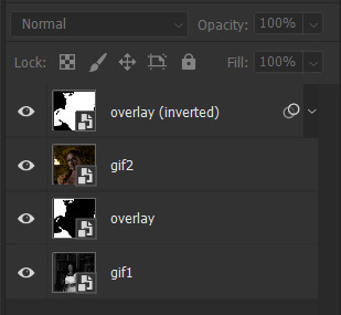
Then, make a second copy of the overlay and invert it (Ctrl+i). These are the layers you should have:

Before you go any further, trim gif2 and both overlay layers so they are all the same length.
Now, we need to rearrange the layers and set blending modes. The top layer should be whichever overlay goes from black to white. This is because when we change the blending modes, the white part of this layer will disappear and look like its being replaced by gif2. In this case, that is the overlay (inverted) layer. Then we want gif2, the other overlay layer, and then gif1.
A tip: this process can be done the other way where the top layer is the overlay that goes from white > black however, you are much more likely to have an error where there is a grey/black line around the overlay effect in your final gif. In order to avoid that, I always use the black > white layer on top.
Next, set the top overlay layer to darken. You should only see the black part from the overlay and gif2 should fill in the white part. Here’s how that looks in my example.
Next, select the top overlay layer and gif2 and convert both layers into one smart object. Your layers tab should look like this now.

Now, set the new layer’s blending mode to lighten and the overlay layer’s blending mode to darken. Once you do this, you should be able to see gif1 as well as the overlay gif.
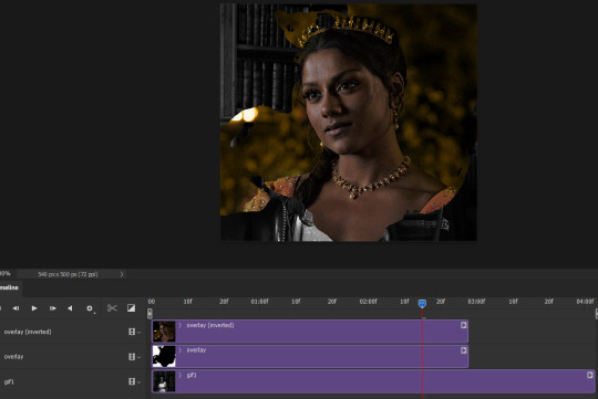
Step 3: Timeline and exporting
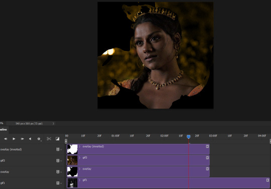
At the moment, gif1 is still significantly longer than the overlay gifs. Since this gif is just over 10 mb (which is pretty small for this effect) I’m going to trim about 1/4 of a second off the end of gif1 and then drag the overlay layers so they all end at the same time.

Now you’re free to export the gif! This is the finished effect for the example gif!

A tip: sometimes, when I convert to from timeline to frames, the gif becomes a little longer and slower. It has to do with different frame rates across the videos and photoshop but I'm not smart enough to understand it. If that happens, just set all the frames with the overlay layers to 0.04 speed instead of 0.05.
And we're finished! I hope that was helpful and made sense. If you have any questions feel free to drop them in my inbox or send me a message!! <3
1K notes
·
View notes
Text

Different designs call for different icon fonts. Some sets have thick, round lines, others have sharp, elegant lines. Some have unusual icons, some are lightweight and just have the basics. Instead of asking for everyone's favorite icon fonts in my discord groups 500 different times, here's my masterlist of icon fonts and icon font collections for easy reference.
While there are many icon fonts out there, the ones in this collection are easy to use and install. If your favorite icon font isn't on the list, reblog with your picks!
Icon Fonts
Note: some of these icon counts include all the different styles the individual icons come in.
Box Icons - free - 1,578 icons
an icon font with thick lines and round features
Cappucions - free - 1,078 icons
a sharp font with unique icons
Dripicons - free - 95 icons
a basic, friend-shaped icon font
Elusive Icons - free - 304 icons
a solid, sharp set of icons
Entypo - free - 511 icons
a mix of solid and outlined icons
Eva Icons - free - 480 icons
a simple icon font
Feather Icons - free - 282 icons
a customizable icon set
Fico - free - 78 icons
a lightweight collection of common icons
FontAwesome - freemium - 1,608 free icons - 7,864 pro icons
the go-to and most popular icon font
Foundation Icon Font - free - 283 icons
the basic+ icon font
Genericons Neue - free - 100 icons
generic-looking icons
Glyphicons - freemium - 2 free sets - 8 premium sets
pandemic and arrow sets are free!
Icofont - free - 2,100+
the complete set of icons
Iconsax - free - 6,000 icons
a round, detailed, and modern icon font
Ionicons - free - 515 icons
a softer, but still sharp icon font
Ligature Symbols - free - 250 icons
a minimalist icon font that can be combined to create ligatures
Linear Icons - freemium - 170 free icons - 1,001 pro icons
an ultra-crisp icon font
Line Awesome - free - 1,380 icons
sharp, modern, unique icons
Map Icons - free - 175 icons
an icon font with specific map icons
Material Icons - free - 900+ icons
a google fonts icon font
Meteocons - free - 40+ icons
a meteorological icon set
Microns - free - 108 icons
a lightweight, basic icon font
Open Iconic - free - 223 icons
a sharp, solid icon set
Phosphor Icons - free - 6,282 icons
a flexible, elegant icon font (and my personal go-to)
Pixelart Icons - free - 350+ icons
a cute pixel art icon font
Rivolicons - free - 132 icons
a sleek font with all the essentials
RPG Awesome - free - 495 icons
an rpg-themed icon font
Stroke 7 - free - 202 icons
a thin & modern icon font
Teenyicons - free - 1,000+ icons
a tiny, thin, minimalist icon font
The Elegant Icon Font - free - 360 icons
a simple and elegant icon font
Themify - free - 320+ icons
an iOS 7-inspired icon set
Typicons - free - 308 icons
a heavy, basic icon font
Weather Icons - free - 222 icons
a weather-themed icon set
Icon Font Collections
Many of the fonts above are included in these font collections! You just need to search for them.
Flaticon - freemium - 6.3M+ icons
to use svg's for icon fonts you need a premium account, but it's still a valuable resource!
Fontello - free
a collection of 11 icon families
IcoMoon - freemium - 5,500+ free icons - 4,000+ pro icons
a whole ass library of icon fonts
Icons8 - freemium - 33 free styles
to use svg's for icon fonts you need a premium account, but it's still a valuable resource!
Iconify - free
thousands of icon sets
Iconshock - freemium - 2 million
400+ icon sets in more than 30 styles
Streamline - freemium - 24 icon sets
modern and fun icon sets
to [icon] - free
a collection of collections of icons and icon fonts
We Love Icon Fonts - free
a collection of 10 font families
739 notes
·
View notes
Text
Todo el placer, todo el dolor — trama y rol

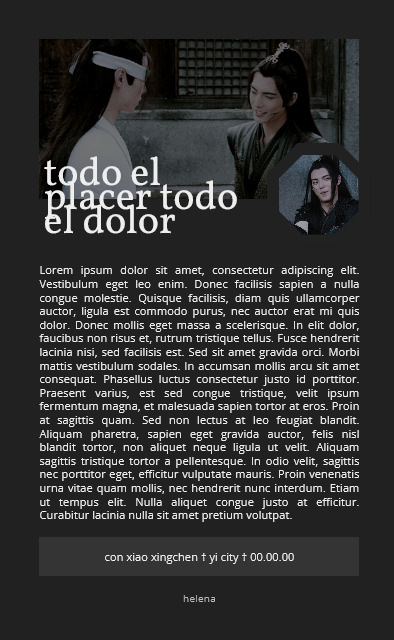
PREVIEW — DESCARGA
No hay modificación de colores porque es todo blanco y negro.
Las imágenes se autoajustan.
CSS externo.
Dato curioso es que ese es el título de un fanfic que escribí de Xiao Xingchen y Xue Yang de The Untamed
72 notes
·
View notes
Text
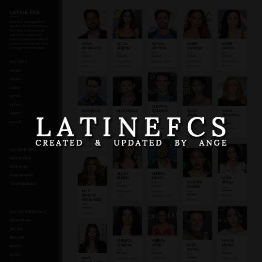
ANGE PRESENTS: A LATINOS FACECLAIM DIRECTORY
*while I prefer using the term 'Latin (e)', the tagging system is being weird about it and causing posts not to show when using.
It's pretty much what it says on the tin! A directory for Latinos. I only make notes of their Latino heritage and other ancestry of color or ethnoreligious groups. If they're part white, I'll make a note of that as well, though I don't go into any details. Please reblog so the directory can help as many people as possible!
IMPORTANT: 'Latino' is not a race; it's a culture. It encompasses many races, religions, and ethnicities. Being Latino doesn't automatically make someone a person of color. Latinos of color do experience racism and colorism, regardless of whether they're in or out of Latin America. Xenophobia is different, though often related, but shouldn't be confused as the same. Many white or white-passing Latinos can change their surnames in order to avoid the pitfalls of xenophobia in a new country. Latinos of color can do this, but still have to contend with racism and colorism.
NOTE: I'll only remove someone if they've been convicted or accused of a serious crime. I don't do thorough background checks on a person's life or what they've said in the past, and I don't plan to. This is merely a directory; please do your own research before using or making resources for a faceclaim.
Feel free to send in suggestions for people to be added - I don't really keep up with pop culture, so I miss new faces all the time. It'd be a tremendous help!
315 notes
·
View notes
Text
Tips for Roleplaying when you have ADHD
Roleplaying with ADHD can be a real challenge! As someone with ADHD, sometimes it can be very difficult for me to stay on-task, keep track of whether or not it is my turn in a thread, or stay inspired for threads. Here are some tips that help me roleplay even with ADHD!
Have a robust tagging system so that you can easily find whose turn it is, see inspiring images, or reread past replies. Give threads individual titles. Or, if you can’t think of one, try something like “(partner’s url): (character names)” or “(partner’s url): (thread number)”. This way, you can keep track of threads by tag, and look and see if you responded or not.
Find your favorite situation or location to write in, then stick to it. To determine what that is for you, ask yourself: do you like instrumental music? Do you like to type them out on the train to work on your phone, then copy-paste them into the posts when you get home? Do you like to sit at a writing desk? Do you like having a laptop in an armchair? Do you need some tea or coffee? And so on.
Consider using other platforms to type out replies and avoid distractions. The Tumblr dashboard can be very distracting. Maybe you are someone who keeps track of threads by copy-pasting all the replies into a private discord server, then typing your reply underneath and copying those into a post. Maybe you are someone who prefers writing replies in a physical wordpad and then typing them out. Maybe you prefer an old-fashioned word processor. Whatever the case, you don’t have to write out your roleplay replies on the dash or in the drafts if you find those places distracting or executive dysfunction inducing!
Use tools like spreadsheets or RPThreadTracker if you are someone with lots of threads or your notifications are busted.
Is there a certain step of the roleplay process that stops you from starting to write replies? Cut it out of the process! I find that I get hung up on finding the perfect icon, the perfect gif, or the perfect faceclaim for my replies and characters. What I did to get around this is I stopped using icons and started writing with only text. I also find formatting and icon editing takes way too long and therefore don’t do it. Maybe something else, like fancy tags or pretty post banners, stops you from writing your replies. Try going without those things and see if it helps you stay focused and motivated.
Remember you don’t have to write replies in logical or chronological order! If you think of a witty quip that would go in the end of your reply upon reading your partner’s reply, write out that quip, then work backwards to write the description. Or you can take simple bullet point notes and come back and write your replies properly out later when you are in your writing space.
Have a playlist handy for your muse or ship that you can pull out for a burst of inspiration. You can even have playlists by verse or mood.
Please reblog if you found this helpful! If there is anything that I missed, then please do not hesitate to add it in the reblogs!
389 notes
·
View notes
Photo

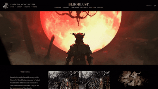
Theme [14]: Bloodlust by glenthemes
♰ ─── preview / code / guide / credits 。
BLOODLUST is a Bloodborne-inspired fansite theme with a header and 2 sidebars with multiple places for description and status text, affiliates, and links to other socials; header art by @snatti. 𝐌𝐚𝐣𝐨𝐫 𝐮𝐩𝐝𝐚𝐭𝐞 // 𝐍𝐨𝐯 𝟐𝟎𝟐𝟏.
♰ ─── theme features ‣
top bar: avatar (45px), custom titles, 6 custom links, searchbar
header: 60% of screen height (rec. dimensions: 1280 x 720px)
left sidebar: custom description, affiliates/blogs, social media links
right sidebar: 2 banner images, 2-column & single-column stats
posts: 400px ─ 600px; like & reblog buttons, optional click-toggle tags
♰ ─── how to edit this theme ‣
please read the guide I wrote, it tells you exactly where and how to edit the sidebar content and more ♡
♰ ─── terms of use / ask a question / tip jar ☕
4K notes
·
View notes


Text
PLS REPORT!!
a good soul at deviantart messaged me saying a girl called ana beatriz ([email protected]) shared some of my psds without proper authorization and also some from other resource blogs too.
click here to open the drive folder
please, report and spread this info to other resource blogs! we all deserve recognition for our hard work, even tho we’re doing it for free.
RESPECT
RESOURCE
CREATORS
here are all the psds she shared in her folder:
tear by @sacchanxs
decalcomanie, red glow by @seoulicons
orange juice, soap, spring day by @sunshinepsds
labyrinth, flower shower, yes i am, milkshake, soft honey, no lie by @sunflowerpsd
sakura by @cloudypsd
005 psd, 007 psd by @antarespastel (sttoneds at deviantart)
78 rainbow by @peachcoloring
call me, hey ya by @turquoisepastel (ilysherlock at deviantart)
cloud 9 by @eclipsepsds
dreams by @sistaround
future friends, serendipity by @burtteflies (explosivefeels at deviantart)
glow by @twilightpsds
i need u, it just comes automatic, where do we go by @artsyeolpsds
italian denim by @allscalliepsds
meadow, summer 98 by @bbyhyuck
mermaid, mirror by @wealphotoshop
266 by @opulenceps
profoundly by @itscolour
85 skin thin by ravenorlov (i only found the deviantart acc)
131, 287, 304 by @urbanflowergraphic
01 strawberry milk by @moreptals
74 bad liar by @itsvenue
1281, 1287, 1288, 1291 by @l-agallerrie (felicitymegham at deviantart)
sit next to me, surreal by @wildfireresources
sometimes i just wanna kiss girls by @mincdrop (pwerbts at deviantart)
231 notes
·
View notes
Note
¡Hola! Vengo con una pregunta ¿Que consideran un usuario toxico?. Ahora al parecer todos consideran cualquier acto que no le guste a administración, como toxico. Yo creo que ya hasta se esta usando mal la palabra. ¿Que opinan?. También ¿Que es un admi toxico?
Personalmente, cada cual tendrá su criterio, pero para mí un usuario tóxico es aquel que muestra comportamientos como montar drama innecesario solo porque no se le presta la atención que desea o cualquier otra excusa, acosa, intenta poner a usuarios en contra de otros solo porque existen o no les agrada, posesivo con otros usuarios, etc. En cuanto a la administración, para mí sería aquella que cambia las reglas (o se las salta directamente) para beneficio propio sin dejar que el resto de usuarios se beneficien también, ponen trabas a otros usuarios para que no puedan alcanzar sus objetivos y así nadie los supere, o que básicamente abusen de su poder como administración, vaya.
❅•°•❈•°•❅• ━━━━ 𝐽𝑎𝑛𝑛𝑎 ━━━━•❅•°•❈•°•❅
9 notes
·
View notes
Text
Que consideran un usuario toxico?.También ¿Que es un admi toxico? / Aqui mi aporte. Yo considero que todos hemos sido o somos “tóxicos” en alguna medida, pero le tenemos terror a esa palabra en estos tiempos, y como dice quien preguntó, se usa mal esa palabra, aunque en general concuerdo con la respuesta que le dieron aqui <3. Porque tóxico es algo que envenena y daña, y tan dañino es que montes drama por ser el centro de atención, como botarle las tramas a alguien porque si, o hacerle vacio a algún usuario solo porque a tu partner/amig@s no les agrada, o por comentarios que hayas leido de ellos en algún sitio. Ignorar tambien es un comportamiento tóxico (en las peticiones, en los sitios públicos del foro, no tiene que caerte bien todo mundo pero la educación es básica), saltarse a la gente, las reglas, desahogarse innecesariamente, divulgar alters o información privada de otros rolers o de los administradores sin su previo consentimiento, detesto eso, la gente indiferente a todo, creo que todos lo hemos hecho, al menos yo, lo admito.
La administración, me parece más delicado, porque ante todo debes ser imparcial, una administración amiguista a mi me lo parece, una administración pasota, o que por no perder usuarios permita comportamientos inapropiados, que no se preocupe por resolver dudas y conflictos de manera adecuada, que se tome demasiado a pecho eso de “el foro es mio y hago lo que quiero”, sin tomar en cuenta a los usuarios o avisarles el porqué hace o no hace las cosas.
Lo que yo creo es que no deberían tomarse tan a la tremenda esa definición. Asi como las alergias, lo que es dañino para unos, no lo es para otros y no porque yo haya tenido alguna mala experiencia con algún roler o staff, todo el mundo debe tenerla. Lo importante es que unos y otros sepan darse su lugar.
7 notes
·
View notes
Text
Hola, quería comentar esto porque últimamente me he topado con una satanización tremenda a los foros con temáticas que tienden al erotismo, y al sexo en general.
Hay muchos foros, en prácticamente todos roleamos gente adulta (al menos en su mayoría, pienso). Si aceptas meterte a un foro de corte erótico o sumamente violento, aceptas que te vas a encontrar con n cantidad de roles de ese estilo.
Sin embargo, hay algo que quiero aclarar:
* Está bien que no te guste un foro BDSM, de mafias, etc. A muchos no nos gustan ciertas temáticas, pero no por ello hay que tirarles tierra.
*No ir con el estigma de que en un foro de esos sólo se rolea sexo. Se rolean mil cosas, como en todos los demás. Y también sexo, eso creo que es obvio.
*Si entras, nadie te obliga a que busques tema sexual o romántico, yo al menos no he visto ninguno con una regla que lo ponga.
*Mucho menos estás obligado a practicar BDSM si entras en un foro de la temática, asi como si estás en uno de Mafias, no estás obligado a ser mafioso o criminal.
*No juzgues por pbs, seamos realistas, no importa el foro, todos usamos pbs que nos agradan o últimamente, que se salen de la norma. Eso yo lo veo en todos los foros de pbs reales.
*Puedes encontrar tan buenos rolers y obvio, personajes, como en otras temáticas. Que el estigma de “rolea en un foro de sexo” no te haga juzgar a los demás.
*Y como en todas partes, si alguien no te convence, le das las gracias y sigues. Si alguien te molesta, lo reportas con administración y sigues. Nada malo pasa.
*Puedes tener las tramas que quieras sin nada relacionado a sexo: Acción, familiares, intrigas, etc. No está limitado a una cosa.
*No te vayas con la finta de que es “gente necesitada”. A algunos nos gusta escribir erótica sin morbo, otros desean ser explícitos, que no te importe porqué. Si alguien no te gusta, hay más usuarios.
Con ello espero que sepan que no es diferente de otros foros de temáticas realistas, ni rolear sexo es el fin del mundo. Cada quien hace con sus tramas lo que quiere.
Peace!
36 notes
·
View notes
Text
PSA;
be nice to your admins
be nice to your admins
be nice to your admins
be nice to your admins
12 notes
·
View notes
Text
Tutorial: Cómo cambiar la clase de un post de rol y no morir en el intento.
Antes que nada, soles de mis ojos, este no es un tutorial para colocar colores según grupo, que para eso hay formas más fáciles. La idea de este es que podamos darle una clase a cada post según el grupo en que está, para poder no solo cambiar colores, sino que mover cosas, romper otras, etc.
Esto es por un ask pero prefiero dejarlo como publicación porque, you know.
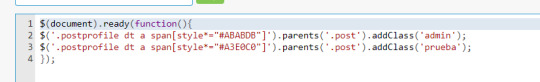
El código que vamos a utilizar será el siguiente. Les dejaré el código de pastebin al final, así que yo les recomiendo copiarlo desde ahí porque ya sabeís cómo es FA con las comillas.
$(document).ready(function(){
$(.‘DÓNDE ESTÁ EL GRUPO span [style*=“COLOR DEL GRUPO”] ’).parents(’.post’).addClass(‘CLASE’);
});
El default de Foroactivo se vería algo así:
$(document).ready(function(){
$(’.postprofile dt strong[style^=“font-size”] a span[style*=“#COLOR DEL GRUPO”]’).parents(’.post’).addClass(‘CLASE’);
});
Esto, por cada grupo que tengamos creado.
El JS se instala para que sea solo mostrado en mensajes. Nuestro resultado para este tutorial se ve algo así:
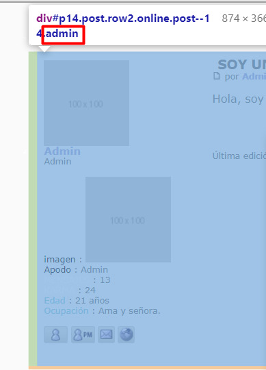
Esto agrega a nuestro de por sí innumerable cantidad de clases en el post una más.
Luego, para editar las cosas dentro, solo debemos utilizar la clase como antesesor para que solo las cosas dentro de ese grupo cambien. Idk, veámoslo con un código.
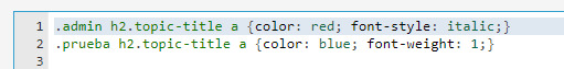
Lo que buscamos acá, por ejemplo, es que al título dentro del .post, se le cambie de color. Al admin le colocaremos la letra roja e itálica. Al usuario de prueba le colocaremos color azul y además le quitaremos el ancho de la font que FA pone de forma determinada para este título.
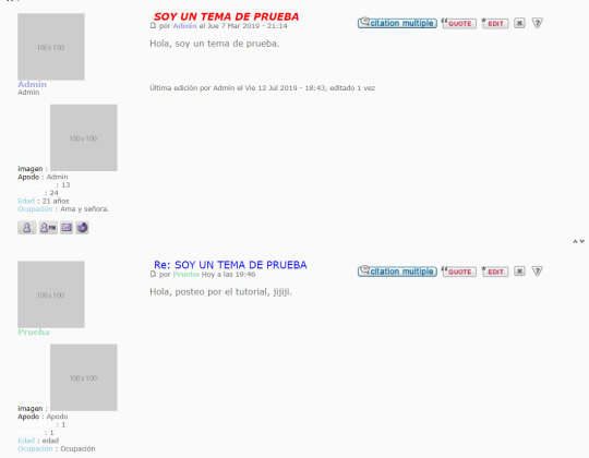
¡Y puf! Somos diseñadores con un excelente gusto y manejo de js.
Luego podemos cambiar las cosas de lugar si usamos positions, flex con distintas direcciones, transacciones poco éticas con seres demoniacos, etc.
44 notes
·
View notes
Text
stop placing dangerous and unhealthy standards on admins...
i see a lot of people trashing admins today. just a reminder that those nice and kind admins? they exist. i know plenty of admins that have rpgs that are over 7 months old and active. it’s a shame and plain laziness to throw all admins into a group where you feel the need to disrespect them as not only creators, but people. the fact of the matter is that you either join rps by GENRE OR TREND. we all know which ones die first. i was going to speak on the volume of members who don’t last a week from my personal view as an admin. it was only until one of you said a little something like:
“admins should aim to make us happy to help our mental health.”
an admin has a duty to provide a welcoming and inviting community. to place responsibility on your admin for the way you feel is extremely concerning. an admin is not responsible for your mental health. PERIOD. an admin is responsible for making you feel safe and comfortable. those are two entirely different things. do not tell another human being that they’re responsible for your mental health. that is straight up messed up.
as a person with ptsd i can tell you that if you are placing those responsibilities on one singular person you need to log off and seek professional help. do not invest your mental health on the internet.
“admins are the reason rps die”
a dying rp is not a failure. sometimes things don’t last, people move on and maybe a PANDEMIC happens? it doesn’t mean that an admin is a bad person or lazy. that’s a very gross way to think of admins because what does RPG stand for? ROLEPLAY GROUP. what is a group? do i have to go on? have you gathered the point that it takes more than one person to make magic happen?
so, you say “admins are assholes and don’t interact with members”, “nothing is in the tags” and that “i wish rp was what it used to be”. and you all wonder why people don’t want to make groups anymore? i wouldn’t either.
please, stop shitting on admins and see them as people. i don’t care if you knew one bad admin. do not throw all of us and our hard work down the drain. you have no right to do that. think about that…
253 notes
·
View notes