
Last Seen Blogs
kombiservisi11
kombi tamiri
realbona
여자 연예인 맨발

quadroople-a-battery
Welcome To My Mind Palace Timmy Turner

centralpaellera10
central paellera786
thepepestyle
José Navarrete Fotógrafo
Text
Bauhaus
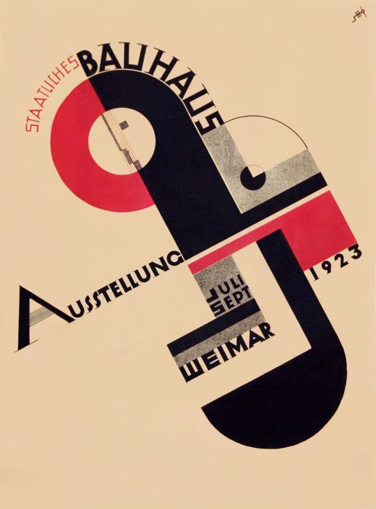
Bauhaus was arguably the single most influential modernist art school of the 20th century. Its approach to teaching, and to the relationship between art, society, and technology, had a major impact both in Europe and in the United States long after its closure under Nazi pressure in 1933. The Bauhaus was influenced by 19th and early-20th-century artistic directions such as the Arts and Crafts movement, as well as Art Nouveau and its many international incarnations, including the Jugendstil and Vienna Secession. All of these movements sought to level the distinction between the fine and applied arts, and to reunite creativity and manufacturing; their legacy was reflected in the romantic medievalism of the Bauhaus ethos during its early years, when it fashioned itself as a kind of craftsmen's guild. But by the mid-1920s this vision had given way to a stress on uniting art and industrial design, and it was this which underpinned the Bauhaus's most original and important achievements. The school is also renowned for its extraordinary faculty, who subsequently led the development of modern art - and modern thought - throughout Europe and the United States.
The Art Story. (2010). Bauhaus Movement Overview. The Art Story. https://www.theartstory.org/movement/bauhaus/
0 notes
Text
pop art
The term pop art was first used in 1958 to describe popular culture products.
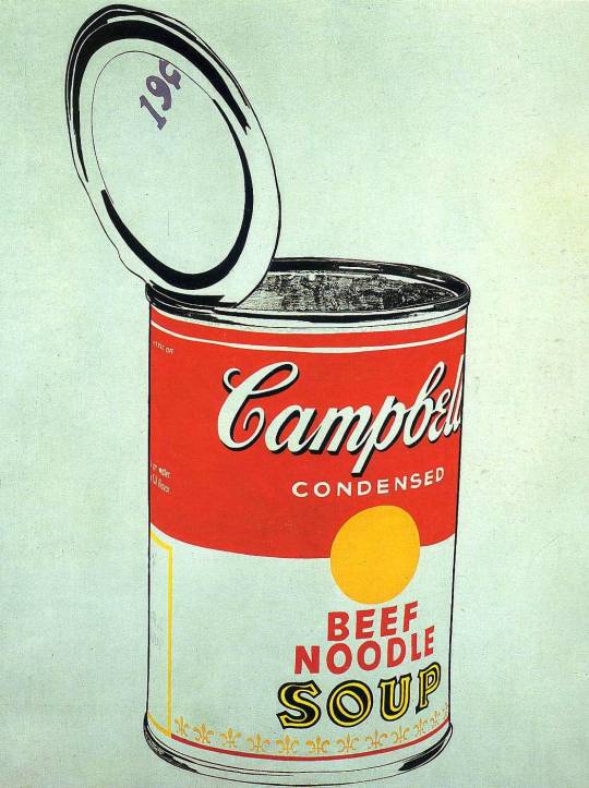
Andy Warhol/1968
Pop art movement photographs taken from newspapers and magazines, assembling non-important objects, human and individual signs, extreme measures of objects, mechanical signs in photographs and calendars, simple and vulgar motifs and techniques, repetitive use of the same objects or things, films, they used consumer-oriented images from illustrated magazines and advertisements in their works.
0 notes
Text
Color Phsycology
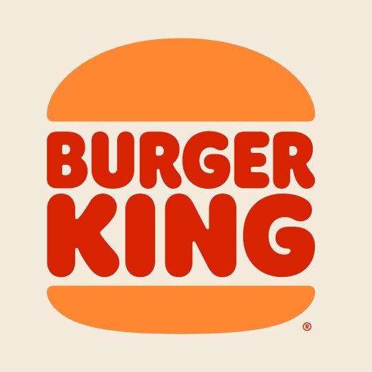
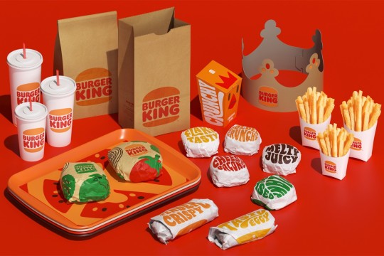
Burger King
Burger king has introduced new logo.
We use color everyday. It can be clearly seen that, while creating brands, companies are careful to combine the colors because, companies are willing to be noticable in their sector. On the other hand, we use color when we put the signs for the society such as pedestrian way, road lines and more. Also, we use color when we create common tongue such as traffic lights.
There is a huge link between colors and emotions, feelings. Many people associate red color with love, passion. Also green color reminds us nature and calming moments many times.
On the other hand, red color reminds us being hungry. That is why, many food chains use red color both interior design of the restaurants, packages and its logos. When we look at the new logo design of the Burger King we can see red color in the middle of the logo design.
0 notes
Text
Think small.
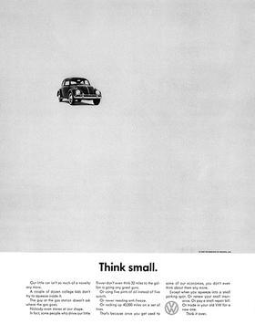
Helmut Krone and Julian Koenig/ Valkswagen advertisement/1960
The way of getting attention from customers in this advertisement design is the innovative and strange way to do. We can see many white spaces and bottom aligned text. Despite many a new kind of designing approach, this advertisement design was successful that time.
When we looked at from this perspective, I believe that designers should not afraid of breaking the rules and trying new kind of approaches and showing their inner world of design.
0 notes
Text
***Inspiration***
He When I start to create visual contents, first I do my mood board. I really enjoy looking at old masterpieces, visual contents. Thanks to old designs made by other artists, some creative clues are coming to my mind. Without doing my mood board by searching old designs, I am feeling myself, I am the only one on this planet who is struggling design. Earlier, I thought that I am doing wrong. I constantly used to criticize myself in a bad way. I used to associate getting inspired from old design pieces with design theft.
To contrast with this idea, now I know that it's the most effective way to start doing design. Many artists are inspired from each other.
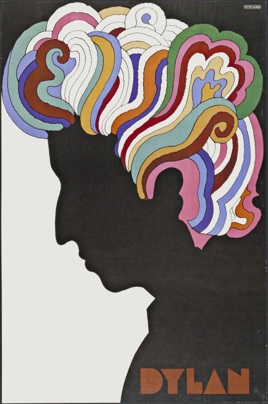
Milton Glaser/Bob Dylan Poster/1967
Here we can see the most iconic Bob Dylan poster. Here we can see the most iconic Bob Dylan poster. Milton Glaser explored a new kind of graphic techniques and influences. We can see a variety of different elements in this poster design. On the other hand, we can see this poster design was inspired by Marcel Duchamp's 1957 self-portrait.
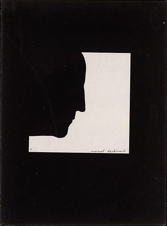
Marcel Duchamp/Self-portrait/1957
0 notes
Photo
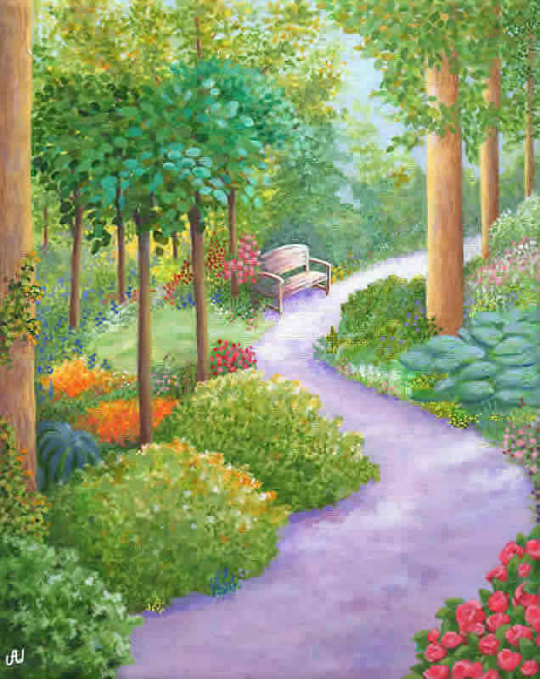
Julia Underwood, The Lilac Path, Rest AWhile, acrylic
Spirit of green
Julia Underwood uses feng shui principles when creating her artwork. About the color green she states, “The colour of nature, fresh energy and growth. Green is nurturing for the family and promotes prosperity and abundance. Feng Shui Bagua areas of your home: Wealth & Blessings and Family.”
Many Shades of Green in Art by Member Artists. (n.d.). Www.healing-Power-of-Art.org. https://www.healing-power-of-art.org/many-shades-of-green-in-art-by-member-artists/
Without doubt that, there is a link between colors and psychology. When we look at the color of green, it reminds us many different kinds of emotions.First of all, green color evokes nature. It gives confidence and peace. In hospitals, the use of uses of the color green is to take advantage of confidence. It can be clearly seen that he painting by Julia Underwood makes us calming.
0 notes
Photo
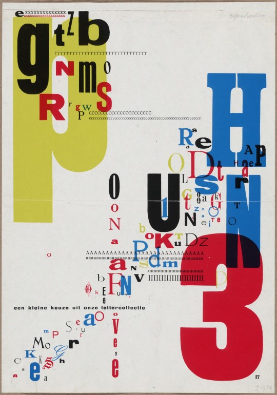
Piet ZwartEen Kleine Keuze Uit Onze Lettercollectie1932
Typography-----
Piet Zwart was an architect, however, he is a well-known graphic designer and photographer. He is called as “typotek”. He built pages with type. It can be clearly seen that, in the given poster design which is located above the text, he used lots of different kinds of typography forms in together.
No matter what the designing rules are, he opened a new point of view for typography. I highly inspired from this poster design, because sometimes some rules that we strictly believe can not be the only way when we doing something in the field of creative design.
Before I start working on my typography poster design, I tried to find inspiration by scrolling Pinterest, strolling around the library’s aisles. Furthermore, I started to think on the rules for typography, then ı decided to use more than 2 typography on my poster design thanks to Piet Zwart.
0 notes


Link
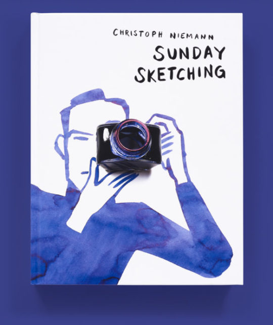
Christoph Niemann is an illustrator and author whose work has appeared in numerous publications, including WIRED, The New Yorker, and The New York Times.
In “Sunday Sketching,” Christoph Niemann Tells the Brutal Truth About the Creative Process. (n.d.). Wired. Retrieved December 17, 2021, from https://www.wired.com/2016/12/sunday-sketching-christoph-niemann-tells-brutal-truth-creative-process/
Nieman explained the problems of designers throughout his work, which I shared the internet link.
0 notes
Text
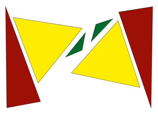
Exercise 1/ SHAPE
Triangle/Point
Triangle/Shape

Triangle/Line
Triangle/Colour
0 notes
Text
İkea/ Show card
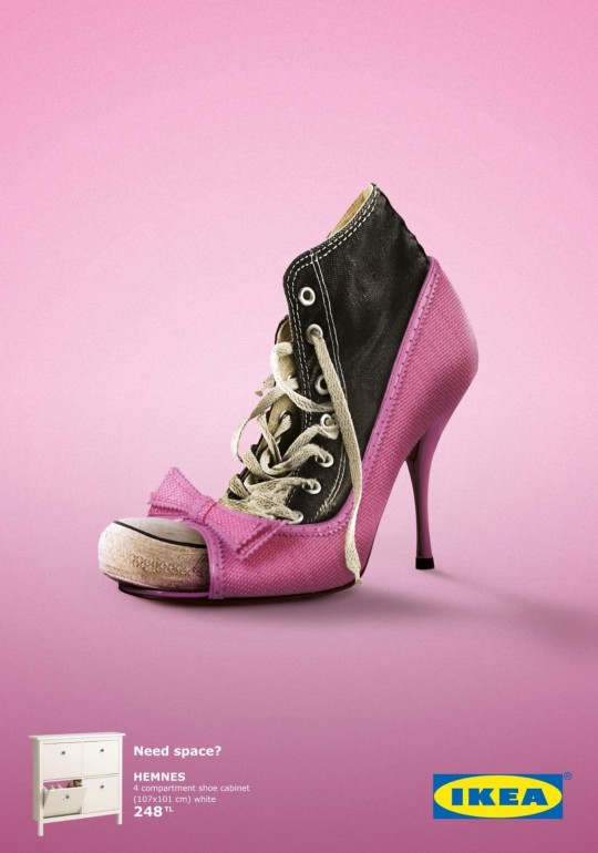
The showcard created by TBWA Istanbul, emphasises that lack of space to show us their organization solutions.
There are three main reasons to choose this showcard as a design which I liked
1. The colours which used on logo do not exist in this showcard. The brand’s official colors are blue and yellow, it can be clearly seen at the bottom right hand corner of the showcard. We can not see the official colours given showcard, it is such a courageous approach for me.
2. They nested two different styles of shoes one of them is casual and the other one has a chic style. It sounds interesting.
3. Nesting two shoes situation is come from our daily basis life practices. Mainly, we are all face with the same problem that could not find enough space to put our goods. So, people are obliged to put their new pair of shoe under the old dirty shoes.
0 notes