Last Seen Blogs

stardustedstories
We're all stories made of stardust

wings-liker
The Wings Liker Has Logged On

sl0wdiver
the declan rice fan club

ballad-of-bo-and-ro
ro better be getting paid for this
flugsammy
Sam

Photo

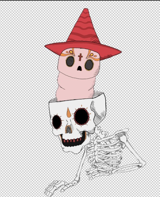
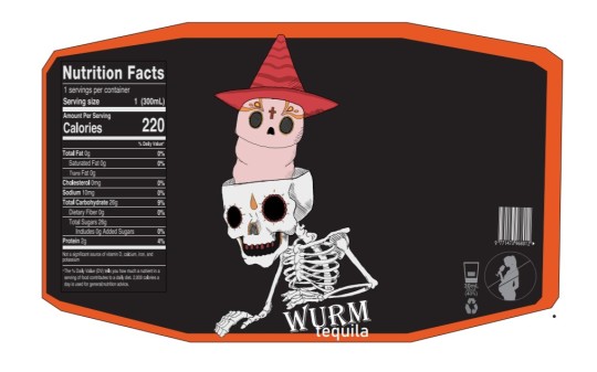
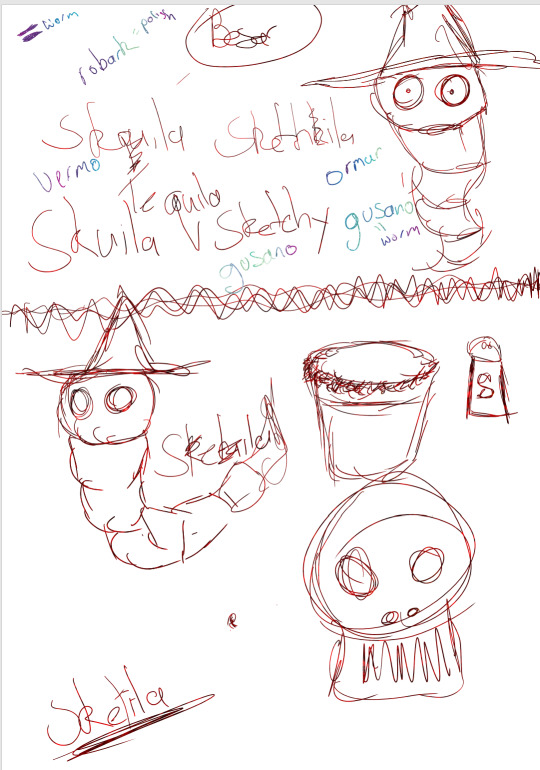
start of the logo with comic book style still finish the worm and then add the name of brand . first attempt then second changed the worm into thiner and bit more clour original was gonna just the skull and wurms going threw rib cage but didnt like idear looked weird
0 notes
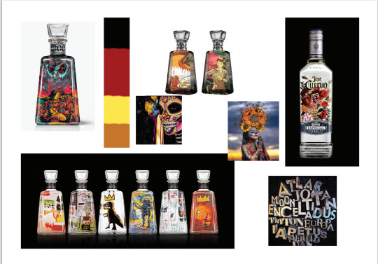
Photo

more inspiration for the the drink as comic book style artstyle concept two is one going for
0 notes
Text
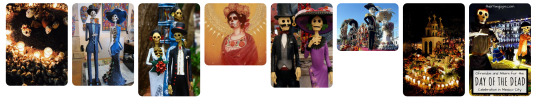
mood boreds concepts
‘wurm tequila’ is my brand in bord one the brand have more mild tones and uses dark tones mixiing art styles with mexican festival of the dead themes in both mood bored one follows a more bright and colourful modern art style mixed with comic book style why the other mood bored takes up same style but usues a dark more mild tones. mood bored conecp t for colourful one would attarct more peole as the younger more attracted to look of the brand lables the darker toones one follows a more dakrer tones but simlar design
0 notes
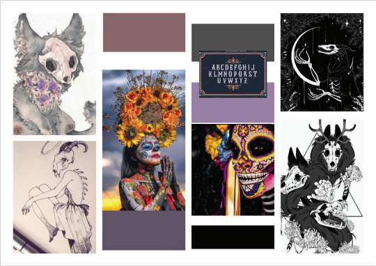
Photo
MOOD BORED 2
The concept is the comic book style mixed with the festival of the bed and more colourful version with modern twist for brand of tequila compared to bored one its more colurful, still simlar to first one just more bright colourful
0 notes
Photo

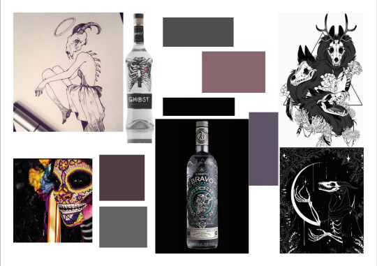
MOOD BORED 1
Mood bored more modern art style use more dark toneswhy using comic book style or dark style uses more dark tones and three phases mood bored gone threw to to get to the last one
0 notes
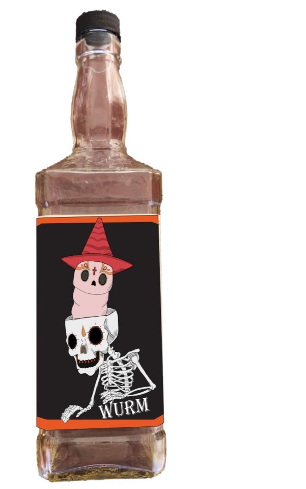
Photo
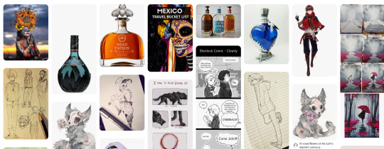

pintrest bored two and label design first idear originally worm idea came how in some bottles tequila u can find a worm in the bottle
the worm original idear came from how some times in bottom tequila bottle there like a worm in the bottom of the bottle
0 notes

Photo
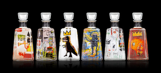

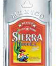
week 1
best drink easyer to see the logo is around top bottle while they used arty bottles to draw in buyers eye, and use colours and used a famouse artist style to witch can draw in th e buyers eye the first two are better designs , the bottom one reuins a little bit as a few brands use little hats but dosent nessaly draw in anyoe to buying its less modern and less likley to be picked up
1 note
·
View note