
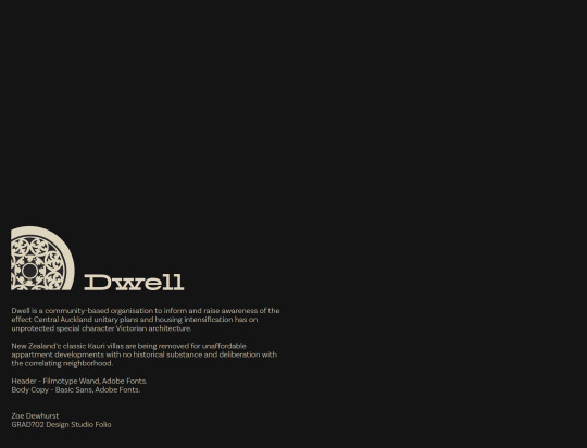
zoedewhurst-thefinale
Zoe Dewhurst GRAD702
Communication Design Semester 2
37 posts
Don't wanna be here? Send us removal request.
Last Seen Blogs
roscoe-me-and-this-fuckin-kid
Stressed, Depressed, MCR Obsessed

loveisalifestyleblog-blog
Love is a Lifestyle

groovyrebelgalaxy
Pseudo2

btllawpccanada
BTL Law P.C.

echovaultlocksmithnorthyork
Echo Vault Locksmith North York
Video
Click-through Animation
As suggested by both my tutor Marcos and peer Dylan, today I focussed on producing a click-through video of my website prototype. This way I can submit an animated version of my design studio folio in a way that is fool-proof to understand.
This was made in about 5 hours on Adobe After effects, after I had finished up some design and technical issues located during tutor feedback. These include, keeping the gutter of my pdf further away from the edge of the page, making sure my alignment is perfect, adding more contrast to my photography, and fixing a little mistake in a vector.
As of today, I have completed the prototype portfolio, website animation, and designed exegesis. All that is left is updates I gather from feedback. Additionally, my professional practice portfolio for design research has been submitted, ready for tomorrows due date.
0 notes
Photo
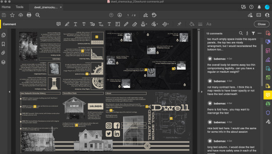
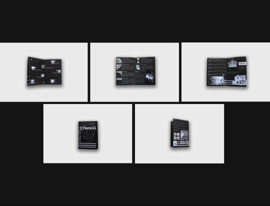
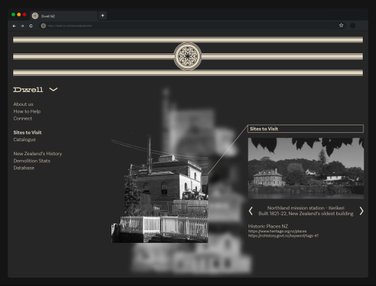
Zine Technical Feedback
As of today I have made updates on the body copy text, making it regular rather than light weight. I have also narrowed down some of the wide text boxes, shifted around some layouts, and moved the location points out of the fold gutter. When physically printed, all text and images should be more legible for more readability. Updated layout:
0 notes
Text
Technical Feedback
Today I had another feedback session with Tatiana.
These notes included:
Zine text columns and url links too lengthy
Widen zine gutters for physical production
Add the extra locations from the zine map to the web map
Try to find a map with no text in the backgrounds (Update: fail - nowhere to be found!)
Some sub-headers could do with being bold
Possibly more grey space at the edges. I personally disagree, as I enjoy the narrow, horizontal format, almost like a panorama
Possibly make the background blur less apparent in terms of text on top
Shorten down hyper link lengths on website, as these realistically would be clickable buttons and do not need the text
Drop lonely words down to the next line on some paragraphs
Time line could be narrower column-wise
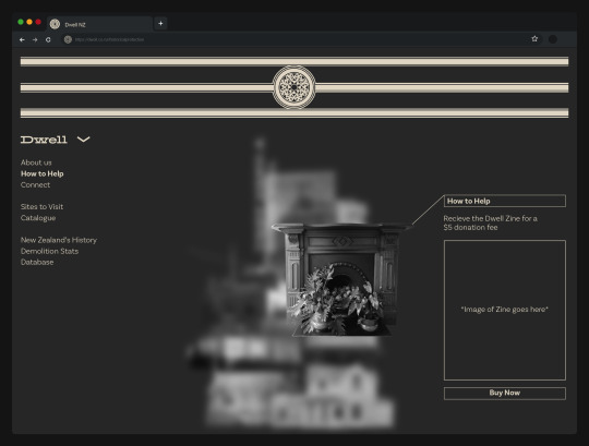
Spelling mistake: Receive
Consider putting the info side of the zine in the design folio, to show detail more clearly that the folded mock-ups.
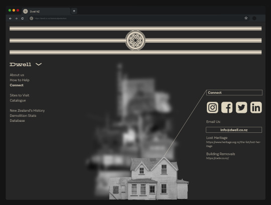
In due time, these edits will be made, alongside creating a brief social media presence for Dwell.
0 notes
Text
Formative Beta
Today we presented our developed prototypes to a breakout group via zoom. The aim was to display our work at 80% completion, with explanations and contextual connections to the exegesis. Our group was there to provide stakeholder feedback and suggestion on how to make improvements.
Feedback I received from my peers included:
Creating a video to show the click-through process of the website
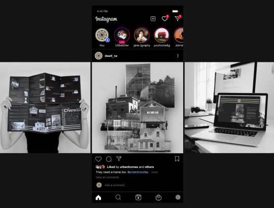
Suggest social media connections, how my media would be used on Instagram, etc.
Connections to native timber. I have already pointed toward this diaspora in my exegesis & have shown a materials section in the website.
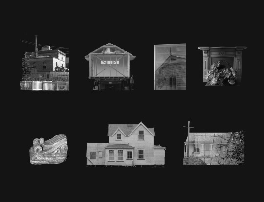
Hero the photography even more! Have one page to each image with explanations. I have already completed this below:

My next steps are to produce instagram mockups of my advertising being interacted with via social media.
As of now, I believe my blog workbook and exegesis are up to date. Improvements will be made after my feedback session tomorrow with Tatiana.
0 notes
Photo


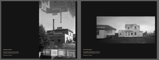
As per Marcos’ advice yesterday, I have changed the photographic elements I used for my project from cut outs to the full image. I believe this makes more sense in terms of the context of them being shown in the beginning of the folio. This way, viewers can see the full images I have taken previously, before they are used in my work. I also enjoy how having this formation of images first, becomes a simple starting point for the folio, without jumping straight into complex work.
0 notes


Text
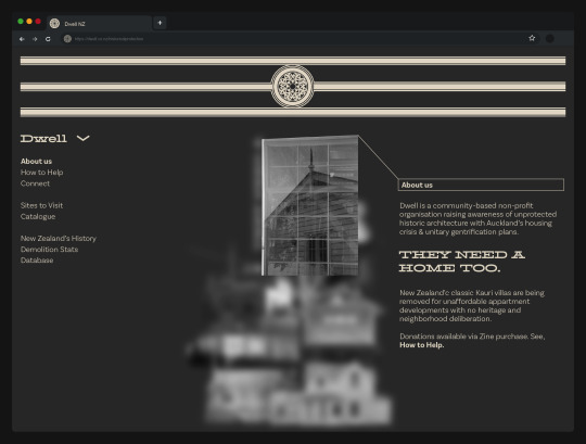
Feedback for website compositions, from Tatiana - 10.45am 15th Sep ‘21
Lighten floor-plan background, as appears slightly busy.
Narrow down text columns, quite wide and has lonely words.
Slogan decorative text is quite condensed, widen spacing.
Consider a text box outline like the title box.
Also consider removing titles above information, so it isn’t repeating the drop down menu text.
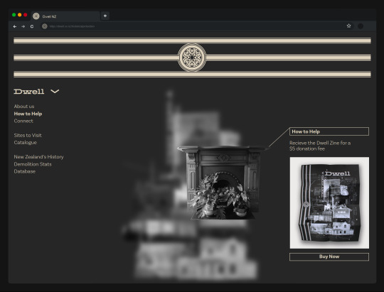
Add zine photo I recently took into donation section.
Move around info layout to make use of all the negative space
0 notes


Photo
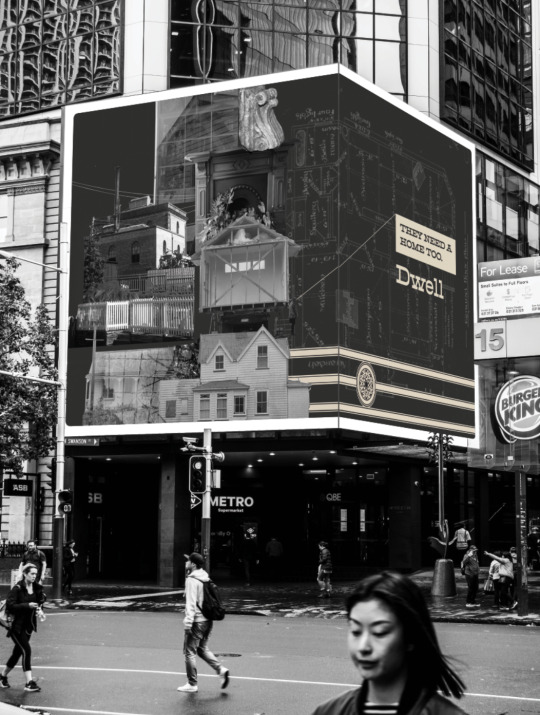
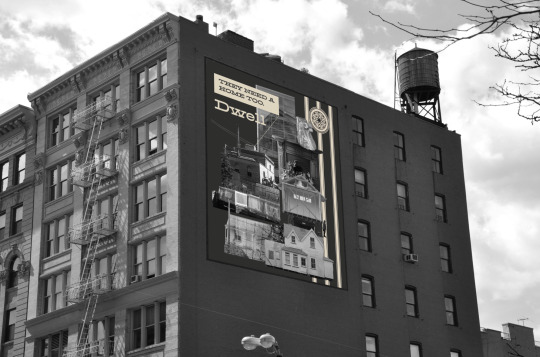
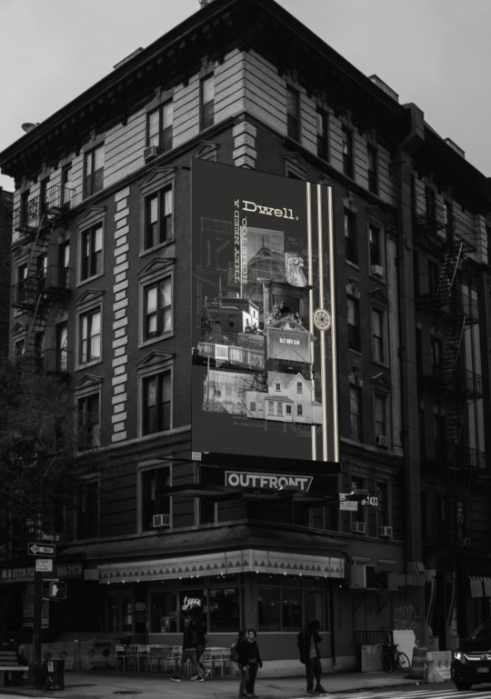
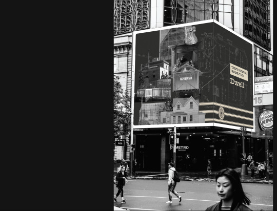
Quick Billboard Mockups
These are just different ideas of the way I would layout my key components on different billboard formats. I particularly like the way a landscape design can wrap around the Queens Rise digital billboard in Auckland CBD, I think this really elevates the concept.
From here, I would like to look at ways to make the designs more clear towards what they are advertising, and the ways viewers can access the website and social media once seeing the ad. Currently, it is just the collage, header, slogan, and ceiling rose motif. As these can also be shown as digital billboards, I would also like to play around with my original idea of motion graphics and animation. This could be done by making the components of the collage phase in and out, blur, enlarge, move around, which should be relatively easy by using After Effects. These pieces can again be super-imposed on these billboard mockups, as well as submitted just as 2d concepts.
Alexandre Lecocq - Queens Rise Billboard, Unsplash. Accessed 3/9/21
Ben Vloon- Square Canada, Unsplash. Accessed 3/9/21
Juan Ordonez - Vertical NYC, Unsplash. Accessed 3/9/21
0 notes
Photo

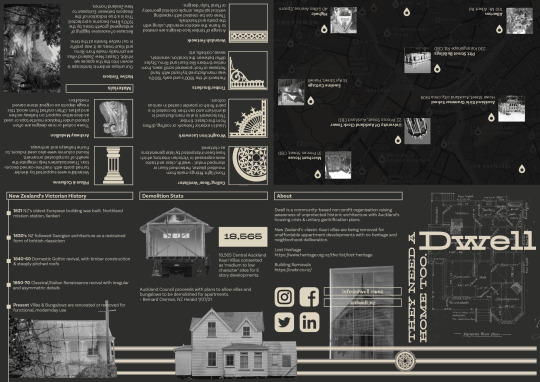
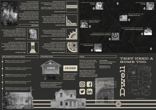
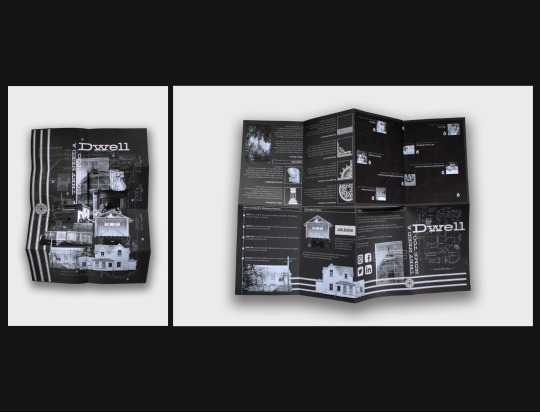
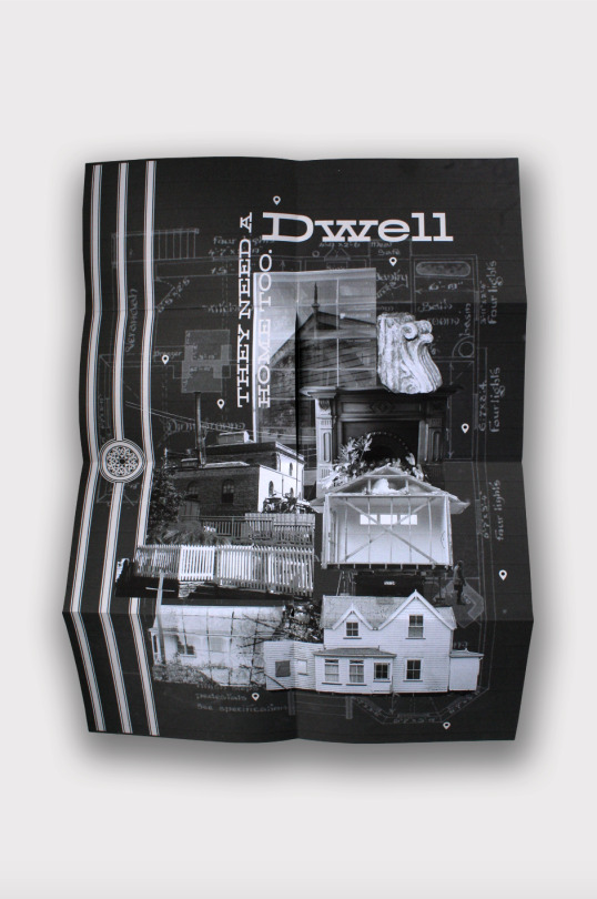
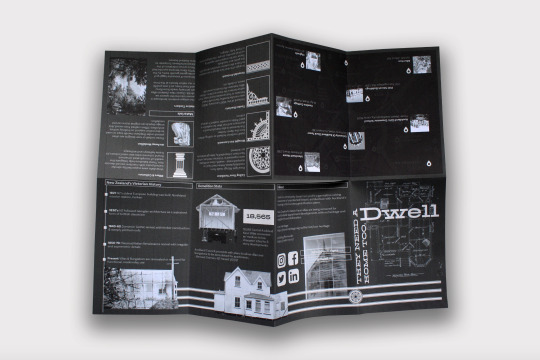
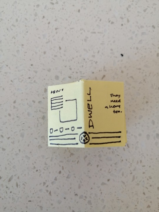
Zine Poster Development
After previously sketching out the ideas for the zine, today I roughly laid out all of my components and started to get an idea for what should be where. Once all pages were categorised, it was just a matter of grids and decoration.
I also struggled with the non-informative poster side, since I did not have much detail to work with. I ended up going for a scan of an original villa floor-plan, to create a slight pattern in the background.
Next, I will need to print out the zine and see if it is functional and legible by the format and type size - I often make elements too big when working on a laptop screen. Once finalised, I would like to print and photograph it nicely for the final campaign folio, since I cannot find any free zine booklet mock-ups online.
0 notes
Text
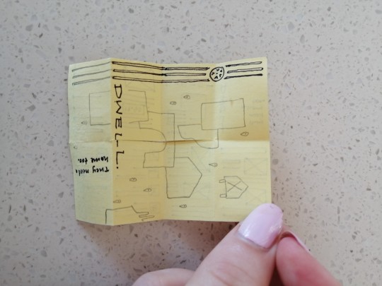
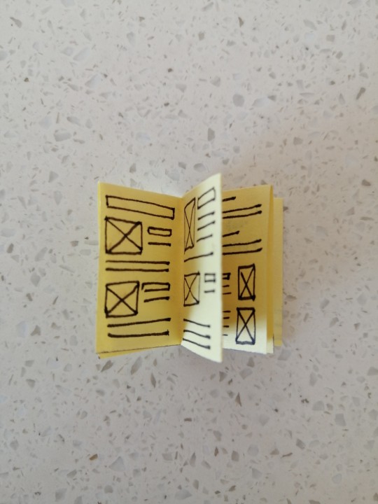
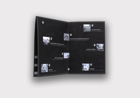
Info Zine Poster Planning
Mini postit note mockup, just getting an idea for the layout of elements so it is reasonably easy to throw together. This will make for an easily accessible physical piece of info, to be used when navigating the city and central Auckland. The info to image ratio should be relatively even, making the overall poster a funky display of patterns worth pinning up on your wall.
0 notes
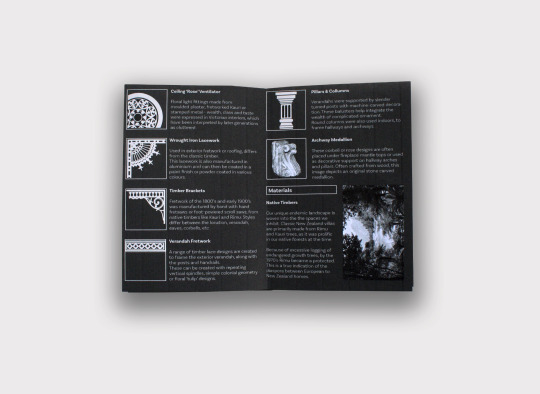
Photo
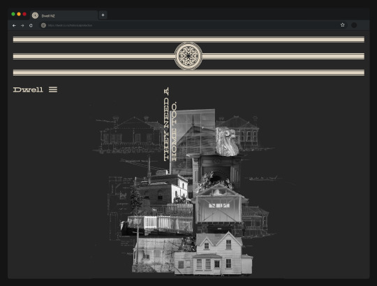

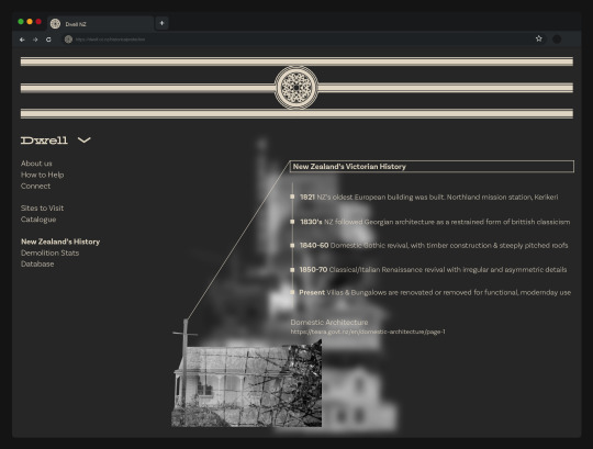
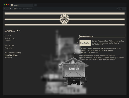
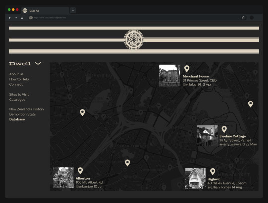
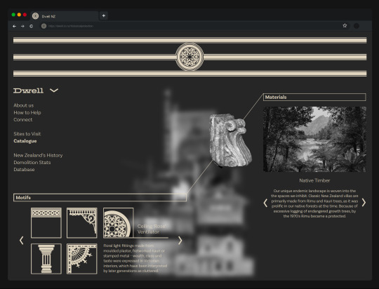
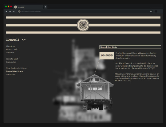
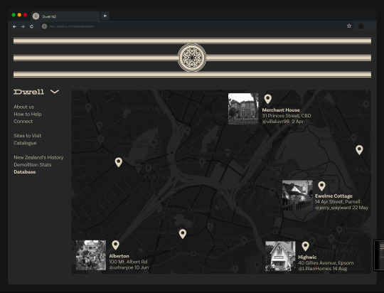
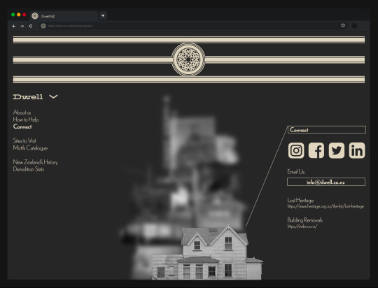
Website Updates Completed
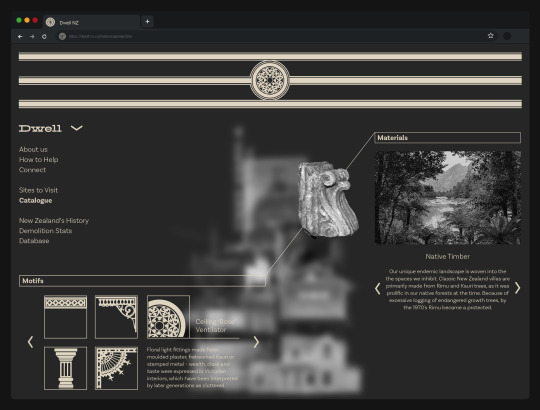
Interactive location database section
Material section with growth tree Rimu
Body copy legibility
Narrow down header graphic
Background texture floor-plan
0 notes
Text
Tutor Feedback
Today I had a call with Tatiana & Marcos to create feedback from my formative prototype. It was mostly positive, with some suggestions toward legibility and user experience.
It really needs to work on the type (lacks contrast) and the kerning is not working well. Consider changing the typeface for something more legible. Really needs to work with the distribution of text, margins and white spaces.
Love your motifs. Really nice.
Consider the user experience – tabs and how to find information. Finding information still seems quite hard (in terms of hierarchy – title, subtitles and body text).
History, knowledge, bringing photographs, music, — what are all the dimensions you can explore? Have a good idea about the selection of the elements.
The top is taking up too much space and we need some form of name for this platform and menu so it’s easier to navigate.
Connection with Google maps? Interaction of people experiencing physical and virtual?
Steps from here:
Body-copy typeface legibility
Narrow down header graphic
Victorian background texture/floor-plan sketch to extend collage further
Google map connection - Virtual Interaction, database where users can share experience via video post on location drop
Consider audio
0 notes
Text
Diaspora
Contextual Research
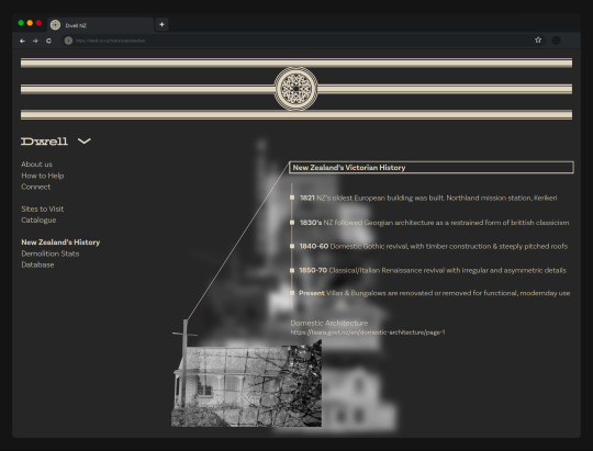
A diaspora is a scattered population whose origin lies in a separate geographic locale. Historically, the word diaspora was used to refer to the mass dispersion of a population from its indigenous territories, and is now generally used to describe those who identify with a "homeland", but live outside of it. This can be tailored toward the use of different architecture styles within New Zealand. After Maori buildings, came the European which is evidently developed outside the country itself, and migrated here along with early settlers.
After talking with my feedback group during the formative last week, we decided that acknowledging this prior indigenous spatial style before delving into the more common European, would be the most culturally respectful path to go, especially in terms of Iwi and land ownership. However, in terms of diaspora, the architectural ideas that were bought here by the European had to be tailored toward our landscape anyway.
Our classic New Zealand villas are actually primarily made from Rimu and Kauri trees, rather than basic timber, since it was widely available in our native forests at the time. Since then, because of mass urbanisation and the endangered nature of the plant, this is no longer an option - posing the importance of these buildings made from nation-specific materials.
These buildings are not only of historical importance, but ecological too as they are built from old growth trees that no longer exist. The European traditions have adapted in such a diasporic way that our unique endemic landscape is woven into the way we live and the spaces we inhibit.
Diaspora definition https://en.wikipedia.org/wiki/Diaspora By unknown, accessed 25/08/21
Because of this excessive logging, after housing construction materials shifted in the 1970s, rimu became a protected. Companies like Atelier Jones Design, utilised demolished Rimu homes for their wood based products. species.
The Story of Our Rimu https://www.atelierjonesdesign.co.nz/blogs/news/the-story-of-our-rimu 27/11/19 © 2021 Atelier Jones Design accessed 25/08/21
Architecture NZ Diaspora issue - Butterpaper https://www.butterpaper.com/cms/resources/2046/architecture-nz-diaspora-issue Peter Davies March/April 2011 issue, accessed 25/08/21
0 notes
Photo


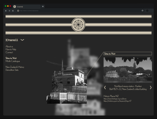
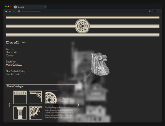
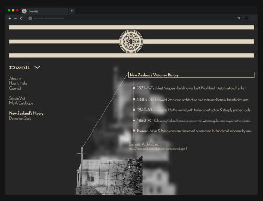
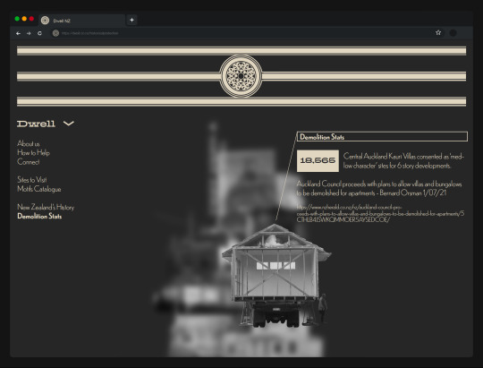
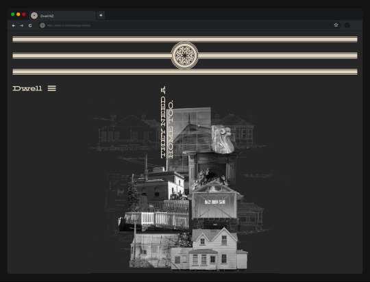
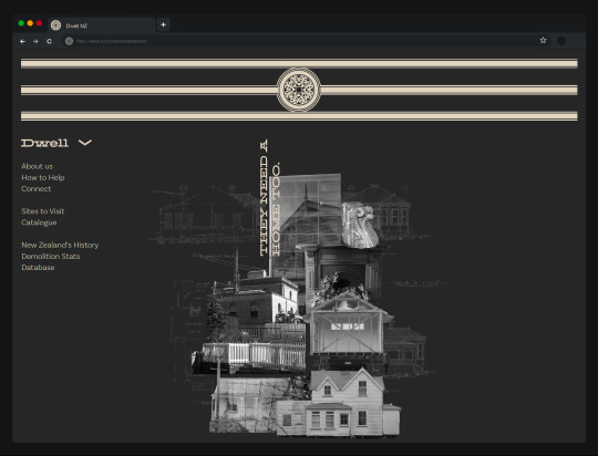
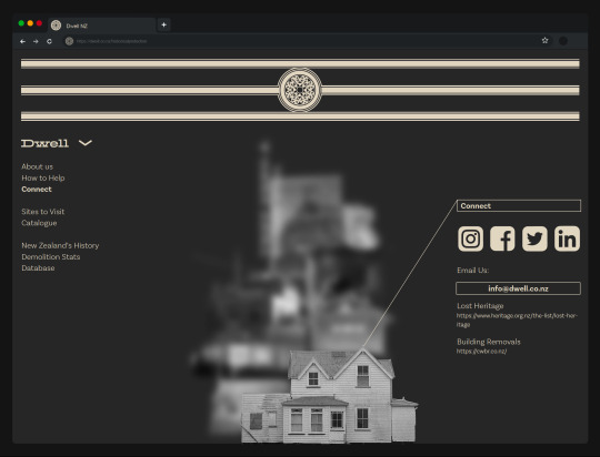
Official Prototype
Since the last post, I have further developed the different stages within the drop-down menu. Each image raises to the surface and the rest blur into the background, and corresponding information pops up in legible infographic grid systems. This is in the form of slideshows, timelines, motifs, etc. I believe the design is cohesive and the interactive nature of the collage with translate well as a mock-up.
Feedback
I presented this today in front of a breakout group that was focusing on a range of cultural and historical publications. My prototype was received well as a finished and well thought out design. There were a few ideas that were suggested to me that I would like to work through during my poster/zine, billboards and especially the exegesis context.
Iwi & Maori acknowledgment of land and buildings that predate European - Could touch on this but ultimately will focus on Victorian.
‘Diaspora’ - How this design differs from Europe and adapts to NZ & does it differ between cities?
Rimu! The buildings here were made from Rimu, once plentiful but now endangered. Poses the question that we should protect these buildings as they are made of old growth trees that unfortunately no longer exist.
Guardianship - Don’t forget to touch on my personal views, and make it a more people-based project.
0 notes