
2022-504-frances-ryder
2022-504-Frances-Ryder
37 posts
Don't wanna be here? Send us removal request.
Last Seen Blogs
umbane
NEMESIS

secedea-blog
~Come Get Your Ass Kicked~

mifreitinhas
Amada por Deus

nnhanman
鸟鸟韩漫
tanayan9130
松風
Video
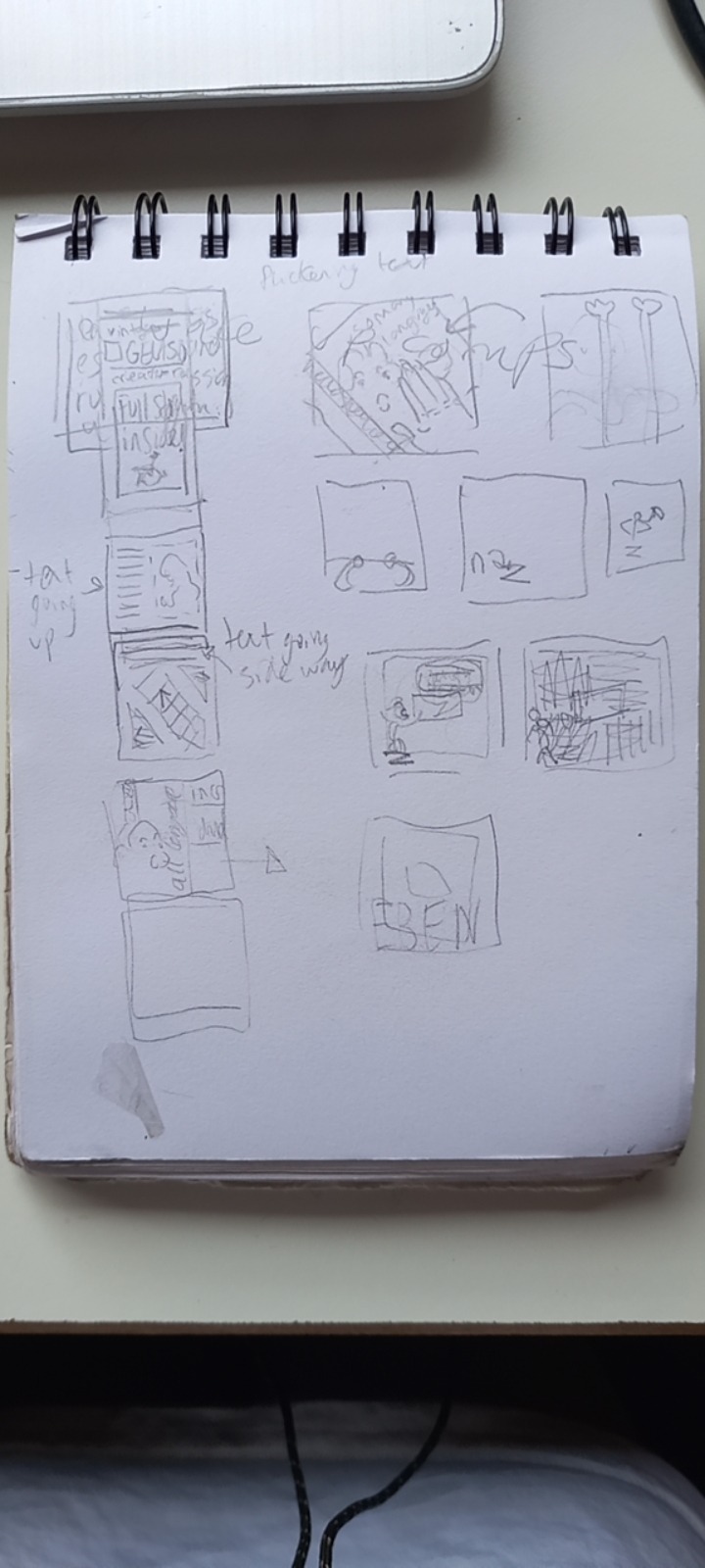
Added more glphs to background to enhance theme of this animation
make the opoups at the end pop down too
reduced text wriggling on Eben Sorkin's name so it wasn't so aggressive
1 note
·
View note
Video
finished the l falling off
made more of a glyph focus
It feels a bit empty at the end animaiton wise. maybe boxes pop down?
wanna make the jiggling text more readable
0 notes
Text
Rational
MP3′s in are only pictures to be compatible with tumblr text posts
My first mp3 animation “vintage title card” about the history of Gelasio specifically, who when where etc, presented like Saul Bass movie typography sequences. This connection wasn’t from direct historical influence of each other – Gelasio is from the 19th century, not the 20th like Saul Bass’s work. But many Romain du Roi style fonts appear in 20th century title cards and it sparked inspiration. I added classic orchestra music, which were often over these animations.
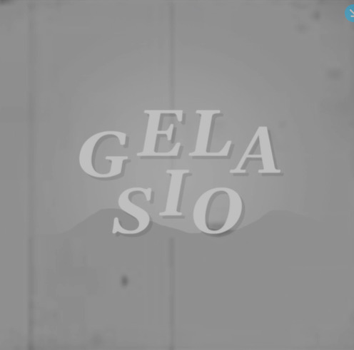
My first mp3 animation “vintage title card” about the history of Gelasio specifically, who when where etc, presented like Saul Bass movie typography sequences. This connection wasn’t from direct historical influence of each other – Gelasio is from the 19th century, not the 20th like Saul Bass’s work. But many Romain du Roi style fonts appear in 20th century title cards and it sparked inspiration. I added classic orchestra music, which were often over these animations.

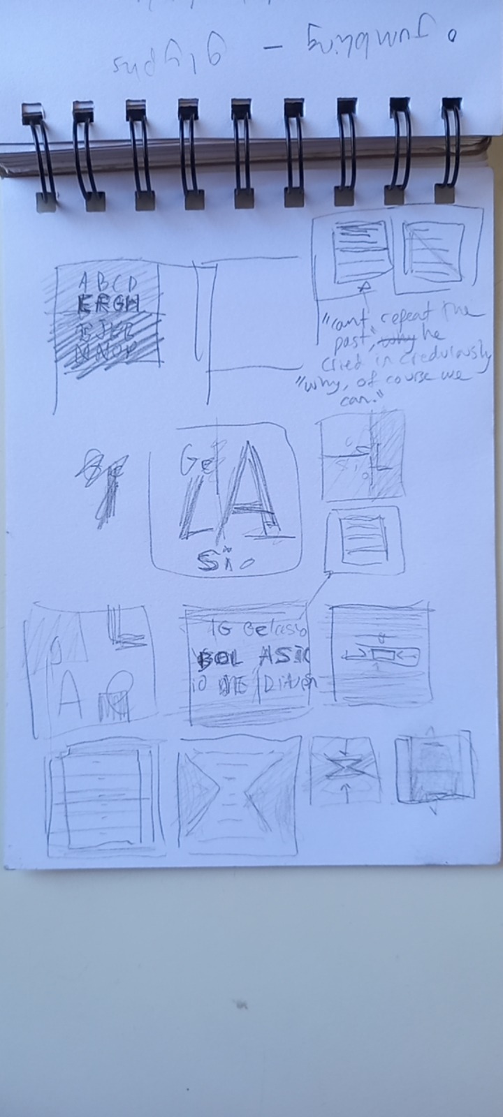
My second mp3 animation “jumbling text” displayed glyphs and iterated on my ideas from my type book. With the jumbled text and the thin lined boxes for contrast, which was originally inspired by the newspaper guides and boxes of the newspapers Romain du Roi was used in in the 19th century. Now without big body copy columns, these elements survive, creating tension between the lines of the newspaper and the jumbling of the font. I made this to show off Gelasios glyphs retroactively because I didn’t read the brief thoroughly enough. I could’ve integrated them more smoothly if checking in on the brief had been a part of my process earlier.

My first gif “history” details how Gelasio is linked to Georgia and Romain du Roi. I experimented with some minor hand icon animation. The layout was inspired by Romain du Rois layout sheets and seeing where they differed on a grid illustrates their changes. Animating them warping into each other showed their subtle differences. The drawn animation in this was the funniest part of the project for me.

My second gif “jittery” was more about Gelasio's colder side. More dark colours, subdued textures. I took reference from ‘edgy’ modern typographic animation, showing Gelasios contemporary side. But it still had the jumpiness of my previous animations (sans “vintage title card”) referencing Gelasios potential for looseness.

I stuck with black and white because that’s just where all my designs lead me intuitively and because my teachers gave me permission. I was very inspired by Gelasio’s history, where not a lot of colors would’ve been used
There were three scrapped designs. My first frame by frame design which had too many moving elements and difficult movements to keep in line. The layers were disorganized and confusing. The “candy newspaper” one which was too colourful, poorly timed and again had poorly organized layers. And the newpaper one which was just looking ugly, and I could tell it was too ambitious. Generally, ambition killed these animations. I didn’t have the skill to make them look good.
The two things that changed over time the most was my growing understanding of animation conventions and getting better at using the tools and organizing myself. Making checklists and settling into a rhythm for making animations. With every new animation I made I could tell I was growing used to it. I’ve learned a lot about animation.
0 notes

Video
changed the ‘languages avalaible’ number to the more accurate 130. For some reason one site said that. I should’ve double check on google fonts, its more official homepage
0 notes
Video
changed final card cloud video manual opacity fade to a transition one and experimented with transitions added dark outer glow to finale card text to make it stand out
After teacher feedback- added a video layer texture of old film grain set to soft light on light areas and darken colors on darker (slows up better)
Reworking it to be about Gelasios history. Who what when where:
changed the roating text from ‘made by eben sorkin” to where it was made. SO I could save the designer name for later as impact
changed “spotlight” section to be inspired by these two old style transitions


0 notes
Text

I wanted to access more of gelasio’s formal subdued side with a darker color pallet, while still keeping it jumbled with a hit of playful chaos and handmade texture to reference its handcrafted background
As the google page says : As a transitional type, it is marked by an interest in rational planning and it has a tension between rigor and expression. It feels generally formal and rational but its rounded terminals make it more contemporary and friendly. It also offers an occasional flourish, especially in the italics. “ https://fonts.google.com/specimen/Gelasio/about
The animation is about leading, tracking, point size and fonts.
workflow
-have a much better layer naming system and grouping. Much easier to edit now
-started a through check point system. Helps me stay focused and gives checklist dopamine
Quote
The quote ised for text exams “Can't repeat the past? Why, of course you can!” is from the great gatsby again. Referring to the past nods to gelasios historical inspirations. It also had a decent range of letters and punctuation. Maybe i should've "quick brown fox"ed it. but on asking a teacher they said it was fine


I explored Gelasios contemporary side with more contemporary inspirations:

https://www.behance.net/gallery/82906569/typography-rotate-and-intersect
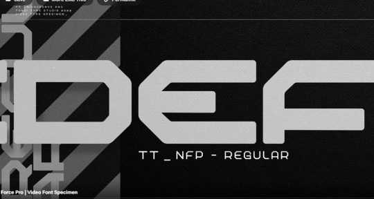
https://www.behance.net/gallery/153510715/Nicro-Force-Pro-Video-Font-Specimen
0 notes
Text
Gelasio’s Origins
Romain du Roi (Kings Type)
Romain du roi, translated from french as Kings Type was commissioned by King Louie XIV in 1692. It was intended for exclusive use of the royal printer. Since Johannes Gutenburg’s first true printing press in the mid 15th century, Blackletter (now called gothic) fonts were common. These calligraphic standards too longer to produce and took up more page space.
Kings Roman wasn't the first of its type, but it was the most influential. It was more readable, compact and simplified. It ignored common calligraphic standards, embracing mathematical practices. Some say this adherence to mathematics was influenced by what France called its "Age of Reason" a period where intellectual exploration heightened. It became very influential. Many French designers imitated it as much as they could without angering the crown.
The typeface was engraved by Philippe Grandjean. The set was ordered in 1692 and comeyed in 1755. With 21 different sizes in standard roman and italic fonts.
Sorkin Type
Sorkin type is adept at making functional, readable designs above all else. They create their type to be adaptive and specific to the mediums and briefs required.
Gelasio, for example, is adapted to screen. Gelasio was ordered to be comparable to Georigia, and so took from the same inspiration. That being Romain du Roi and the fonts at the period that were all adapting to it’s popularity. Gelasio is more formal than Gerorgia, but still retains flourishes. It’s this tension between form and function that makes Gelasio interesting and versatile.
Gelasio vs Georigia
Gelasio takes clear inspiration from Romain du Roi via Georgia and Romain Du Roi itself.
Unlike Georgia, it retains more of Romain du Roi's curvey lines. Both georgia and gelasio are thicker that Romain du Roi to make them more readable on screens. Which is especially important since their right holders bought or commissioned them for computer use.


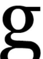
Gelasio Serifs, rounded
Georgia smoother terminal transition

Georgia serif. flatter, sharper, longer
Gerogia bulbus terminal

Gelasio axis: straight
Gelasio ear, flat one end, smooth transition on top
Neck: tapered

Georgia axis: straight
Gelasio ea4: straight out, blunt end
Neck: tapered
0 notes
Text

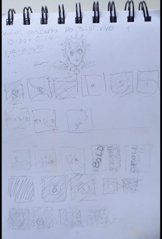
history of roman du roi aniamtion
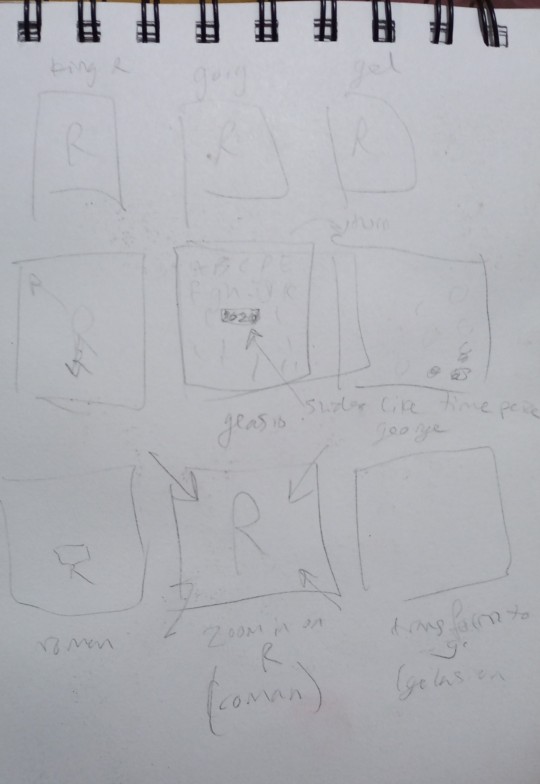

Sketches
Wanted it to feel handmade - referencing Romain du Roi’s original hand craft origins. The transition from shaky pencil tracing to digital vectors representing the evolution of its style.
The grid layout inspired by Romain du Roi’s most common presentation:

0 notes
Text
Romam du roi, translated from french as Kings Type was commissioned by King Louie XIV in 1692. It was intended for exclusive use of the royal printer. Since Johannes Gutenburgs first true printing press in the mid 15th century, Blackletter (now called gothic) fonts were common. These caligraphic standards too longer to produce and took up more page space.
Kings Roman wasnt the first of its type, but it was the most influencial. It was more redable, compact and simplified. It ignored common caligraphic standards, embracing mathmatical practices. Some say this adherance to mathmatics whas influenced by what France called its "Age of Reason" a period where intellectual exploration hightened. It became very influencial. Many French designers imitated it as much as they could without angering the crown.
The typeface was engraved by Philippe Grandjean. The set was ordered in 1692 and comeyed in 1755. With 21 different sizes in standard roman and italic fonts.
Gelasios inspiration
Gelasio takes clear inspiration from Romain du Roi via Georgia and Romain Du Roi itself.
Unlike Georgia, it retains more of Romain du Roi's curvey lines. Both georgia and gelasio are thicker that Romain du Roi to make them more readable on screens. Which is especially important since their right holders bought or commisioned them explicitly for computer use.
0 notes
Text
https://www.pexels.com/photo/woman-sitting-at-the-table-with-floral-wallpaper-background-8091469/ -- background floaral texture
https://freestocktextures.com/texture/stains-on-the-plaster,1316.html -- stained plaster texture
0 notes
Video

(Originally posted a week ago, reposted to add video format
My gif inspired after a classic movie title card. Its not 19th century, but its a font style many associate with the period.
There are plenty of tiny mistakes to clean up, but i want to move on to the next one before i come back
Timeline animation is much, much easier than frame, though there are still growing pains. This isn't a great gif, but im proud of the learning ive done. Hopefully the next will be even better
0 notes
Text
2 scrapped animations
need to make uniform sliding animation
need to make it hold on single frame longer
next step - zoom out, multiple titles sliding
This animation was later scrapped for being too vague. The idea was to make it like sliding newspaper layouts, but that became too complex and too far from my original context. The colors also had little to do with Gelasio- beyond red being one of the easiest rare dashed of color to put in old print (and the other colors being chosen to compliment it) I’m going colorless, but if i had done the idea I should’ve made red the standout color like it would be in print
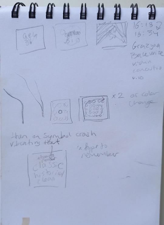
Storyboard

my second attempt at incorporating color and more texture. It was going to have more collage photoelements and newspaper like qualities. I just wasn’t liking the way it was turning out. It was going to be hard to animate too. It wasn’t worth it for me
Storyboard


0 notes
Video
1 note
·
View note
Text

work in progress
to do
the ‘drip stage’ still has text over it.
the falling square isn’t watched with the dark transition
the text doesn't fall of the square in the first part yet
ive left these unaddressed for now so i can keep trying new things, improve, then come back and do thekm better than i would’ve at the time
A small lesson: my empty video layer frame animation (the black squares trail) should’ve been a separate animation i imported so that it’s be easier to edit
Animation principles
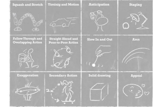
here, i started thinking more about timing in my animation. working on exaggeration, arks, anticipation and timing. You can see me thinking more about it as the gif progresses, though still at an beginner level
https://www.google.com/url?sa=i&url=https%3A%2F%2Fedex.adobe.com%2Fteaching-resources%2Fvb5d12604&psig=AOvVaw0vXw9hOxQIQOwyea0Npp3s&ust=1665396208540000&source=images&cd=vfe&ved=0CAsQjhxqFwoTCLj9r77y0voCFQAAAAAdAAAAABAD
Inspiration
I used red because it popped up as a secondary ink in a lot of news paper publications. And blue just to contrast it, despite it being a rarer ink.
My main inspiration was my previous type book and the fun was the letters stacked and jumbled. I want to make a moving version of that
0 notes


Text


(There is music, but it’s I can’t post a video on this post)
My gif inspire after a classic movie title card. Its not 19th century, but its a font style many associated with the period.
There are plenty of tiny mistakes to clean up, but i want to move on to the next one before i come back
Timeline animation is much, much easier than frame, though there are still growing pains. This isn't a great gif, but I'm proud of the learning I've done. Hopefully the next will be even better
0 notes