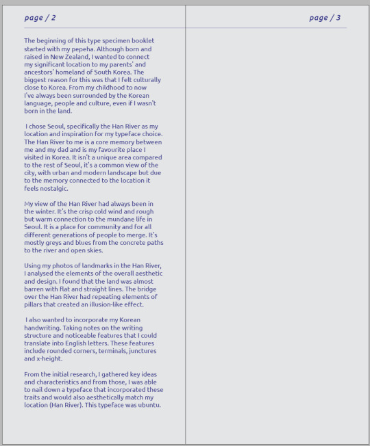
Text
WEEK 12 & 13
This is the final kinetic typography.
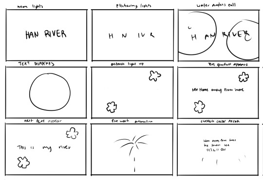
I first draw a messy thumbnail of the basic idea. I change the latter half of the thumbnails to a totally different idea but while on after effects and watching tutorials I was sucked in a flow and decided to do something else, and I think it turned out better.
Sound effects were something I've grown really appreciate. The kinetic typography itself isn't bad, but the addition of the soundtrack and sound effects really take it to the next level.
I chose a background noise of the urban city with people talking and car going by. This was the sounds I heard when I visited the han river. At the end I have a thunderstorm soundtrack. This was to more symbolize the river and water and less connection to my memories.
It's a darker atmosphere and the neon lights give the impression of the city lights. The environment changes throughout the video. First were outside in the rain under the city lights, next were in a bright room as the sound of keyboard typing fills the silence. At the end we're still in the room but now with the lights turned off, light from the outside shines inside.
I'm really happy that in this short time I was able to make a decent kinetic typography, especially with my limited knowledge on after effects. Something I would change or add in the future is :
Make the asterisk that light up bounce when the light changes.
Add a glitch effect to the last sentence of the typing section.
The window lights should have more effect
Change the colour from bright yellow to the grey
I don't have enough time to add these, but i my free time I would like to further develop it. I've really come to appreciate kinetic typography and after effects as a program. And most of all, I've been opened to a world of sound effects and the power they hold in video media.
0 notes
Text
WEEK 12
So I made the bare bones of this kinetic typography.
Feedback and thoughts:
The drawn animation itself is good, but the timing of it seems a little off
the camera following the word appear is a nice touch, but i with I could do a close up on each letter
the asterisk like stars concept wise felt like a good idea but maybe due to the size or number looks a bit off
I tried a text morph animation effect. Looks good, but I don't know it is for this typography.
The colours are way brighter than the type specimen booklet. A brighter tone could work but my version of the han river is always either the winter dawn or at night so these saturated colours just can't seem to match for me.
Overall, I don't think it's a terrible idea, but I still don't think this is the "one". I don't have a lot of time, but through this draft i've become way more comfortable with after effects.
This idea will have to be my final, so I really trying to add all the elements i liked and switch the things I didn't like.
0 notes
Text
WEEK 12
After some thinking, I decided to scrap the first idea.
I still want to incorporate some elements in the final kinetic typography, but as of now, shooting a clean video that fits my standards would take too much time and energy.
Instead, focusing on hand drawn animation or after effects would be much better.
Honestly, I don't really have a very solid idea on what I am envisioning. I'm sure I want to incorporate the asterisk as a light, water droplets in general some water like addition.
I quickly made a hand drawn animation of the HAN RIVER. The pouring letter is like water as it transition to the background colour. I want to try to use this, but I need to make a few thumbnails to rethink the video.
0 notes
Text
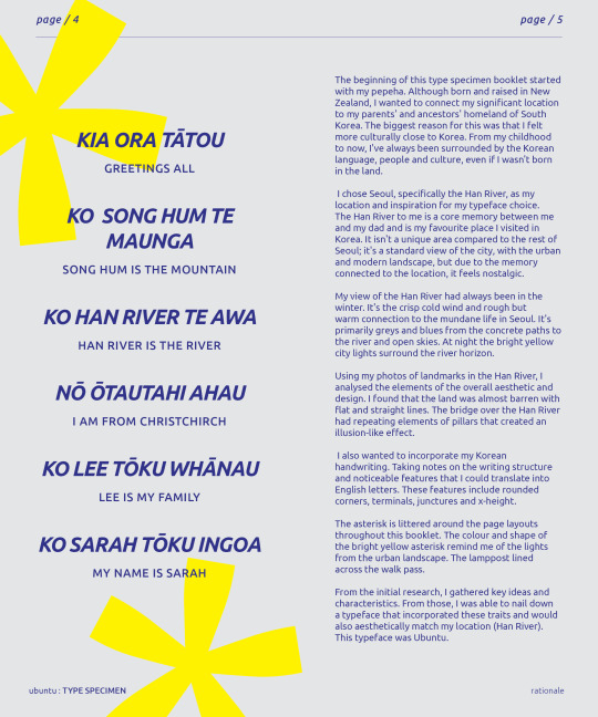
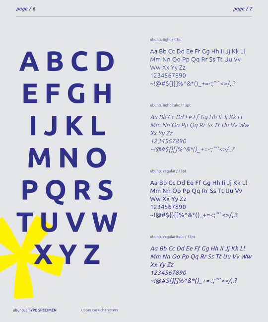
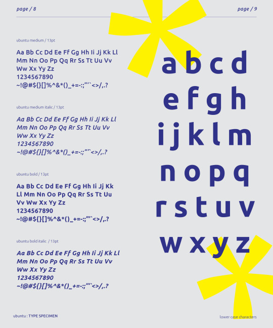
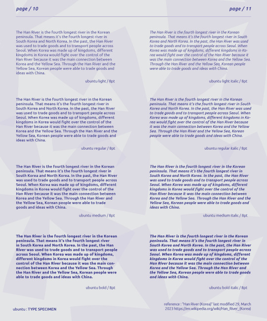
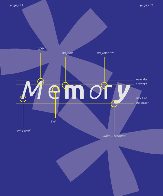
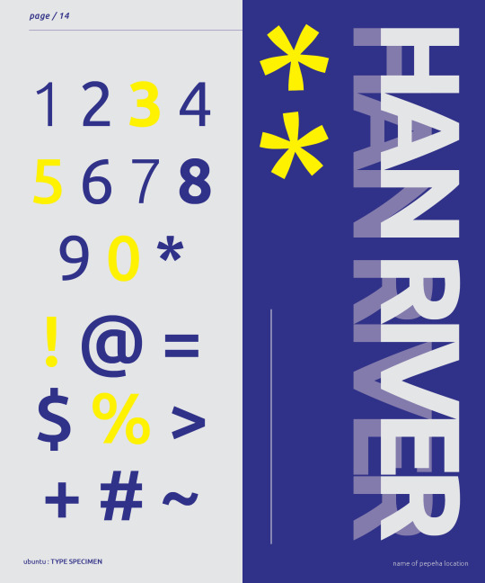
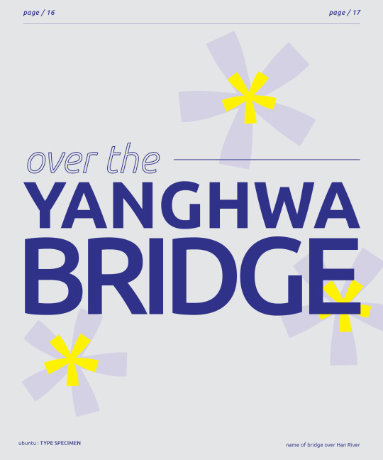

WEEK 11
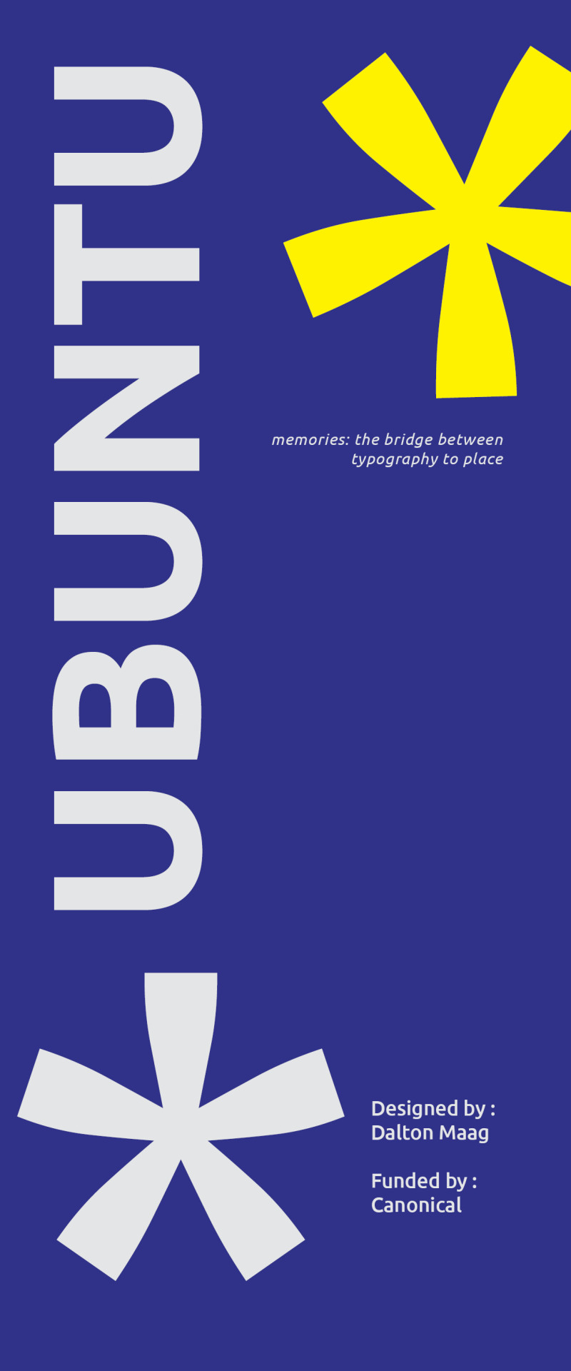
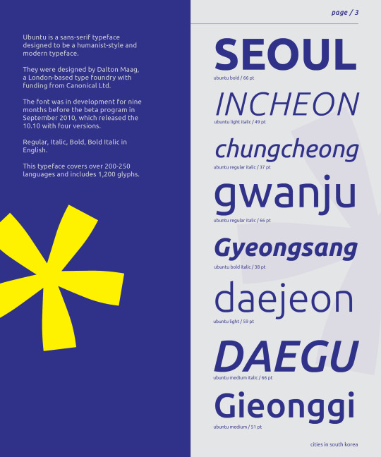
Going back to the booklet, I added the type anatomy to the word memory. I chose this because it related to the pepeha location reason, and it fit the booklet subtitle.
It looks a bit simple compared to the rest of the booklet, but I think it looks fine. In the future, I could tweak it to better fit the flow of the booklet.
I went overboard with the asterisk. Looking at it now, I need to remove some to leave breathing space.
I'm happy with development with how I used the asterisk as well as the layout overall. After playing around for a few hours, I got some new ideas flowing.
0 notes
Text
WEEK 11
My very first draft of the video. i quickly made some clips and stitched them together with the help of a few YouTube tutorials.
It's a very rough draft, and the clips themselves aren't the ones I want to use for the official video.
The purpose of this draft was for me to understand the premiere pro tools and the outline of what it could look like.
Some feedback :
The first section with the han river title should be longer
The transition is ok
The section with the sky clip should also be longer and maybe and more text after the "home away from home" text. Connect to the pepeha?
The sky clip would be better if it was a night cloudy sky to connect to the type specimen booklet, as the yellow represents the lights in the night.
To make the video more interesting, maybe add animation?
Or add distortion to text.
I should also think of what audio I could use.
Maybe, like the han river, I could have a muffled urban landscape noise. Like people talking and walking with the breeze? Those kinda things.
Overall, the idea was ok on paper, but now that I'm making it seems a bit so simple and the connection to the pepha seems weak. With better quality videos and more small addition, I think I can make this work. I've been watching tutorials for premiere pro for basically everything, and I think I'm starting to get the hang of it.
0 notes
Text
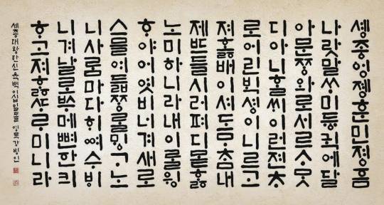
Recently I did some research on the creation of hangul.
In the fifteenth century, king Se jong created the first internation of the Korean alphabet for both the Korean and Chinese languages, but many of the glyphs for the Chinese languages are no longer used in the modern Korean alphabet.
The alphabet was created with the intentions of simple and readable shapes, as king Se jong wanted all the citizens of the josen dynasty to both be able to write and read Korean. Other reasons had to do with the fact the Chinese characters were unable to fully articulate the Korean language.
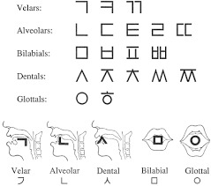
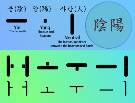
The basic consonants were actually based on the vocal organs and the shapes it would create when sounding the consonants.
The basic vowels was based on the idea of the universe.
The structure of the characters can relate to modern typefaces, as it's a sans serif typeface with both simple and blocky shapes.
Although I learnt this before I chose my Ubuntu typeface, I think it relates well. The connection between Ubuntu and the hangul is closer than before.
0 notes
Text
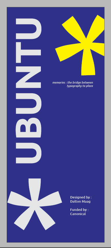
WEEK 9
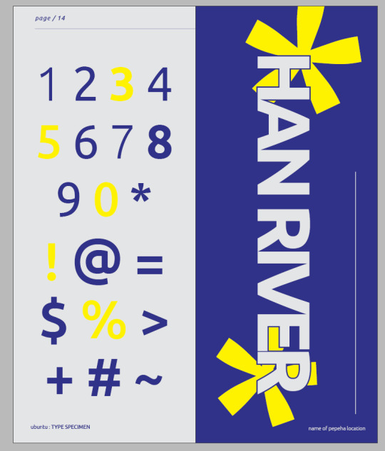
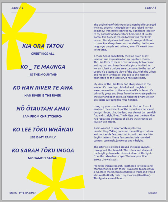
From the formative feedback, I went back to my type booklet to some grammar and spelling as well and add missing elements.
I added a subtitle in the cover of the booklet
Memories : the bridge between typography and place
I also added my pepeha, but the layout of the page still looks I bit empty, so I may have to play with the page a bit more before I get I right.
In my rationale, I added a segment talking about the motif of asterisks. As they reminded me of the lights from a lamppost. The star like shape looks like a light, and the yellow colour added to that effect.
My choice of yellow was also explained, as it was the colour of lights seen from the Han river at night.
I changed some page layouts to fit the pepeha as I plan to add another page on the anatomy of the Ubuntu typeface.
Some pages look a bit empty, but I don't know if this is because I've been working on it for too long. I think the simple layouts and look add to the effect of the font as well as the place I am trying to connect it too, but at the same time I wonder if it's boring to look at.
As a type specimen booklets purpose is to bring interest to the typeface and advertise its usage, I don't know if I'm able to fulfil this goal.
0 notes
Text
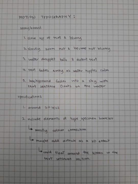
WEEK 8
last activity.
As I once used adobe after effects, I found the process easy to understand.
before I wanted to learn to distort my text to replicate a water ripple or wave but as I continued to think about the Han River and the area the perfect and smooth look wouldn't fit the look of the Han River.
My refined idea will mostly be made using an actual camera as I want to have the most realistic water effect, adding that touch of imperfections and humanity.
0 notes
Text
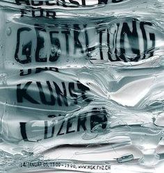
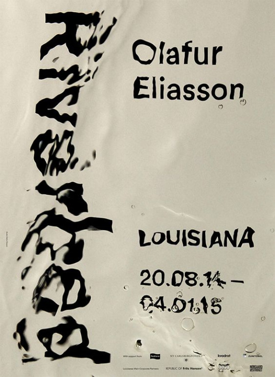
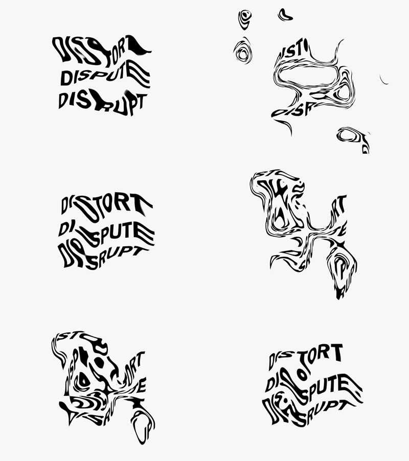
Some inspiration.
They are not the exact idea I am thinking of, but they reflect some of the elements I want to have.
The water and ripple effects on the text and the distortion could be a cool transition element from one text to another.
0 notes
Text
WEEK 7
WEEK 7
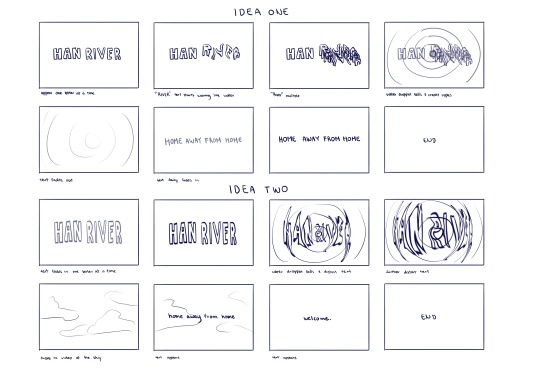
The first idea dump of my kinetic typography.
Connecting to my previous typeface specimen booklet and pepeha I chose the then river as the bid main text and used the text home away from home as a smaller sentence.
The sentence home away from home was first suggested to me in class, and I carried it with me as I like the idea.
my thought process first started with what remained me of the river. and obviously, I was reminded of the river, water. from this, I thought of how water moves. whether it be from the waves or water droplets I wanted to incorporate it into my idea.
The Han River is also a well-known location to sight view the sky. So in my second idea, I added the sky element to refer to a location.
As of now, I want to ideate a bit more on the storyboard and experiment with how the text would move.
0 notes
Text
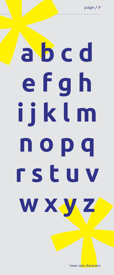
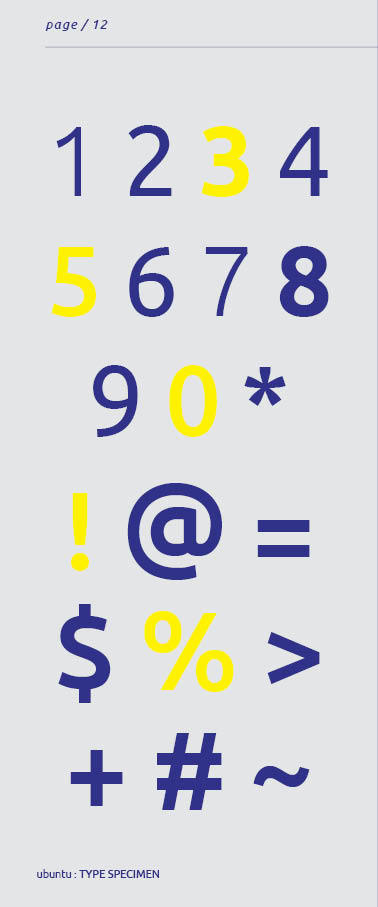

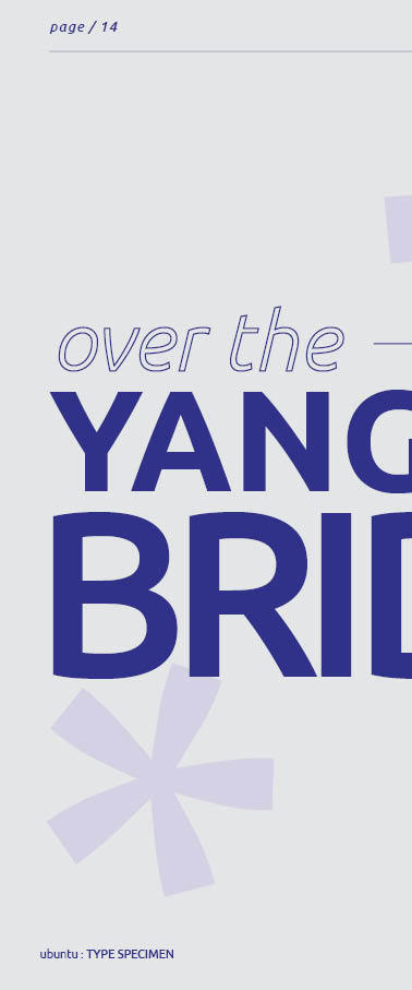
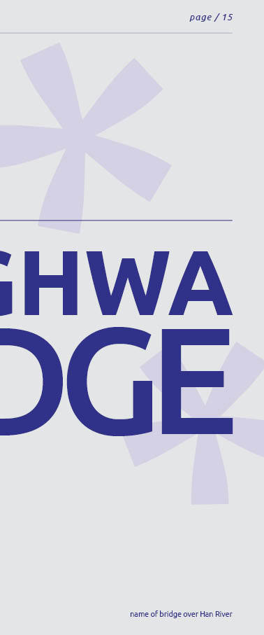
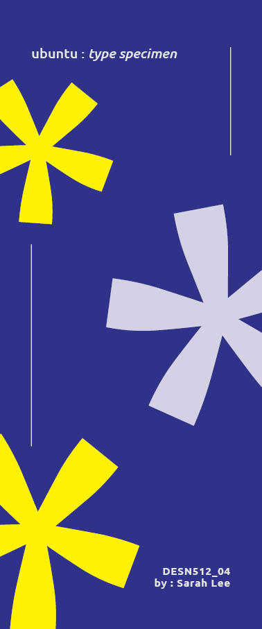
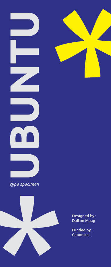
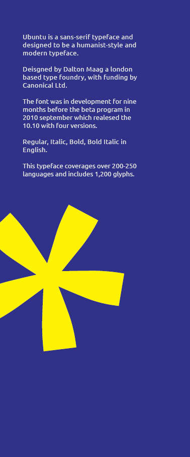
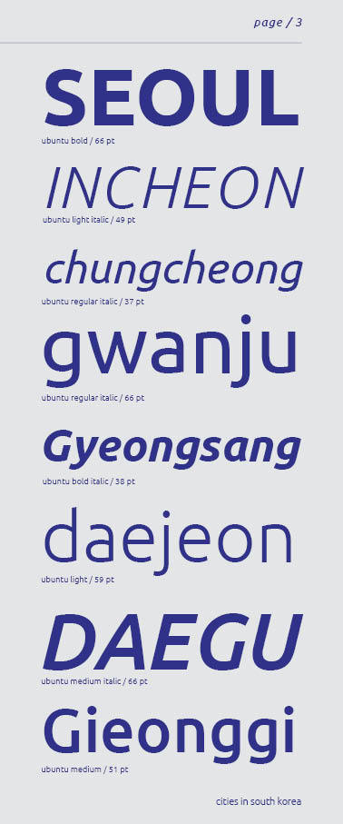
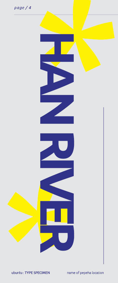
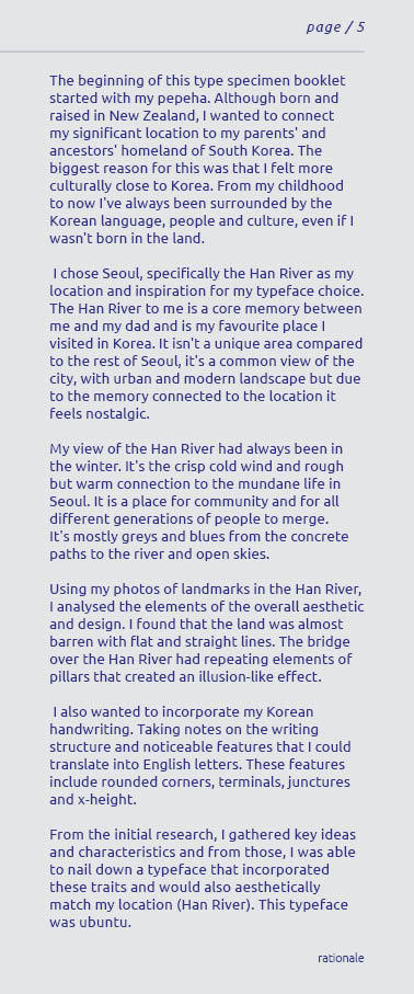
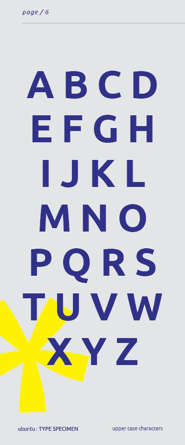
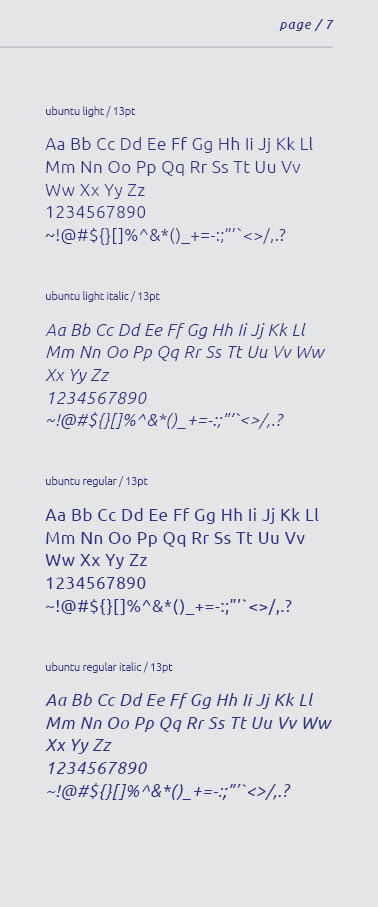
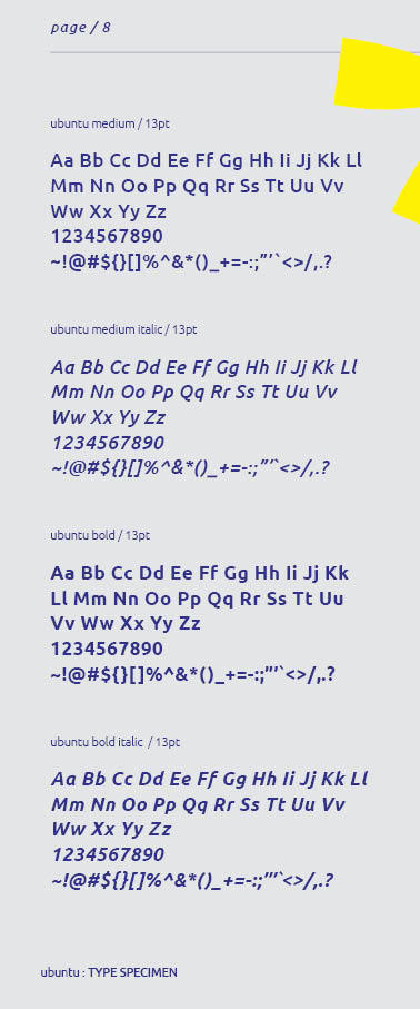
final type specimen booklet (not in order for some reason)
my final annotations for this booklet
From my first draft, I've made some subtle changes. Pages 14-15 of the spread were the most difficult to create an appealing layout for, but after adding the bridge's name that goes over the Han River. I was able to fill the pages to my standards.
As I mentioned, the layout is still very simple and aligned, keeping straight to the columns and margins. This style was inspired by how the Han River area is flat with almost no large landmarks or organic landscape.
I added more small details such as the ubuntu: type specimen at the bottom left of the booklet and a small indication of what I am showing.
I carried the asterisk glyph progressively through the booklet. This was a good element to use to connect the pages together as well as add a cohesive visual element.
Overall the type specimen booklet for Ubuntu came out well and is heavily inspired by my pepeha and me. I definitely could improve in more dynamic usage of typography, as my style is usually very static and clean. I found it difficult sometimes to have an idea to fill a page with only typography.
I think I strive in simple and clean style but would like to dive into a more experimental style later on.
0 notes
Text
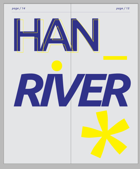
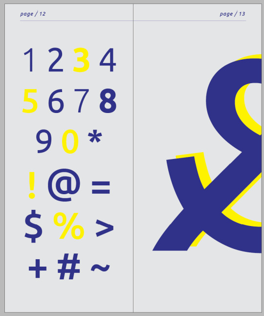
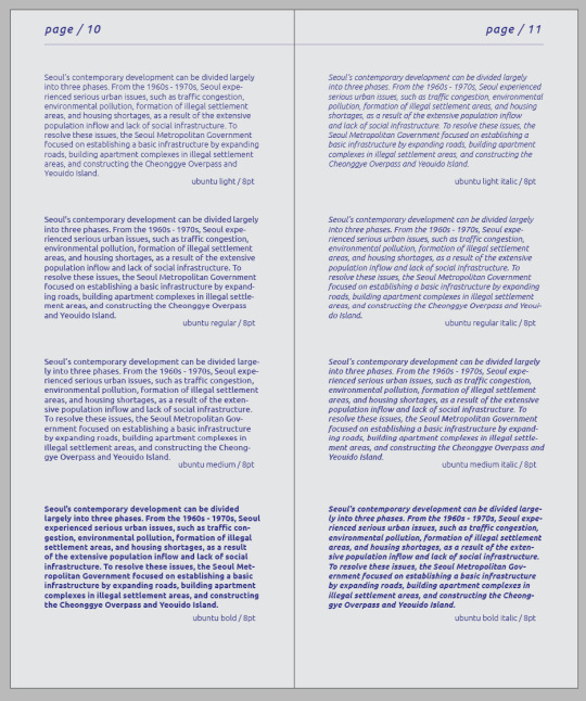
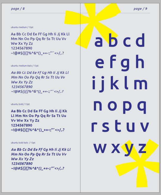
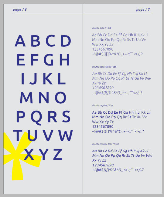
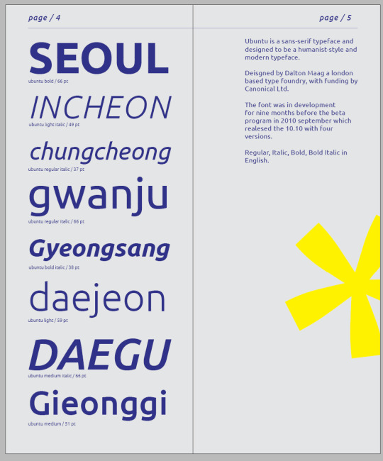


WEEK FIVE
first draft of booklet
I chose a more minimalistic and simple layout for the booklet as the location from my pepeha is an urban landscape. The han river is very flat from concrete paths and no building on the site as it's a park.
i felt like this was the best choice and making it more layers and complicated with different designs wouldn't fit my pepeha as well as the typeface itself.
I chose a very light grey to represent the concrete that surrounds han river, with blue representing the river and sky and yellow was a complimentary colour that I felt would help the typeface pop out more.
I'm so far liking the layout of all the elements, but page 13 - 15 is still underdeveloped. Maybe I could add another element from my location.
I also haven't decided if i should add photos or not yet.
0 notes
Text
WEEK FOUR studio activity.
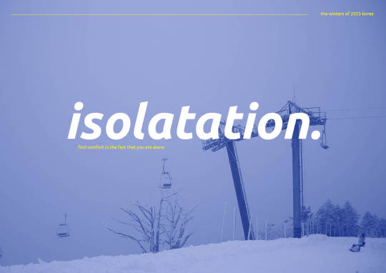
using my chosen font of ubuntu and an image from my camera I created a simple poster design
empathising the word isolation with lowercase and a full stop.
keeping in theme with the word chosen I've kept it simple with the text making the poster feel empty as the blue tone background adds a bit of story to the word, isolation.
for the little text, I made them yellow so they could contrast with the main text and stand out from the background colour. this is so they don't blend in as the text is relatively small.
I took many of my inspirations from Pinterest and made them into a style of graphic posters that I personally like.
0 notes
