
Last Seen Blogs

spookprincess
Reference Blog

nightlifeseriescc
NightLifeSeries-Custom Content

34613531-blog
Sem título

bollywoodbunny
Bollywood Bunny

Text
Reflecting on what I’ve learned from communication design studies
We’ve explored historical, social, political, cultural and artistic context of design. I’m humbled in that the more I learn I discover the less I know. I realise that I’m just scratching the surface and that there’s a whole lot more to uncover.
I enjoy studying and it’s an important part of my life. I’m excited to continue to learn more. With that, here’s a short reflection on what I’ve learned for comm des studies.
Exposure and inspiration
I’ve had exposure to a broad range of designers, movements, concepts and techniques. All on which I can now draw inspiration to improve my work. This helps me to understand where we’ve come from, where we are and where we might be going.
The value of design
It has helped me to understand the value of design, exposing me to the craftsmanship and beauty of design. Design is a powerful tool for communication. This helps me to see value in my work which makes me feel more fulfilled and confident in my path in becoming a designer.
Communication
Readings from the dig beyond selection, weekly lectures, discussions and reflection pieces have helped me to improve my ability to critically analyse and articulate theoretical design knowledge. It has allowed me to think and communicate effectively when observing and evaluating design. This tumblr has been an amazing way to reflect and share in a safe environment.
Design history and context
Learning about design history has helped me identify distinctions between art and design. It has helped me see where design fits in society and how it was used in different ways like propaganda, advertising and education to communicate ideas.
Collaboration and critique
I’ve enjoyed working alongside people, discussing ideas and sharing work. This has challenged me to be vulnerable and helped me feel more comfortable as a student. I’ll always be a student in some regard as there’s so much to learn. This mindset has pushed me to develop my skills and allowed me to feel comfortable making mistakes.
Guidance and leadership
I’ve enjoyed the delivery of content from my lecturers, Andy, Karen and Ben. It’s been inspiring hear them speak on the depth of knowledge they have and their ability to articulate that in a digestible and fun way. Ben puts in a lot of time to give feedback on my work and other students work which is nice. This makes me feel cared for and encourages me to work harder. These are leadership qualities I can aspire to moving forward.
2 notes
·
View notes
Text
Digital environment
We’re in the digital age of design. This present all kinds of new challenges for designers, particularly how people interact with digital products and their contexts. This encouraged me to learn a little about HTML and CSS. Understanding the possibilities and limitations with technology will help me be a better designer. It’s a good place to start. I consider it to be the like understanding print production techniques and best practices in order to produce the optimal outcomes.
Designing my tumblr
I’m certainly no developer but I know enough that allows me to style using CSS. I developed a type hierarchy, colour contrast and elevation on the content blocks for my tumblr. On the note of elevation, I particularly love the idea of material design to determine how elements behave in the digital environment. Graphic elements are considered to reflect physical properties, like layers casting a shadow, which helps users better understand digital environments and how to interact with them.
I referenced tips from w3schools.com and material.io/design which are awesome resources for digital design.

Image from Material Design captioned “Elevation in Material Design is measured as the distance between Material surfaces. The distance from the front of one Material surface to the front of another is measured along the z-axis in density-independent pixels (dps) and depicted (by default) using shadows”

A screenshot of a small portion of the CSS I used to design my tumblr
0 notes
Text
Generative Practice
by Jeremy Levine, Leonardo Solaas, Marius Watz, & Mitchell Whitelaw. In Digicult: Digital Art, Design and Culture, Digicult pp 1-14
I began to read this and I was confused because I know so little about it. I found this video which talks about the same thing (I think). It’s part of a broader series that walks through how to do it.
From what I gather, generative design/art/practice is “rule based decision making” with the output ranging from numbers, graphics, sound, and more. It seems complex and may potentially involve a lot of code? I feel in over head at the moment with this one. I’ll have to read more about the broader practice and come back to this.
0 notes
Text
How the physical limitations of lego created its charm in movies
‘How fan films shaped The Lego Movie’ by Vox is a video I found on YouTube that investigates and analyses the history of the lego movies. It talks about the character design was influenced by videos made by fans as far back as 1973, most notably The Magic Portal in 1989 by Lindsay Fleay. The Lego Movie has a scene that pays homage to the fans to embrace the idea that “amateur creators matter,” which encourages fans to continue play and create.
What I found fascinating was the character design and movement. The production designer Grant Freckelton from Animal Logic, a creative digital studio, talks about how they embraced the real-life limitations of the medium to determine the behaviour of the characters and sets. This pushed the designers to find unique solutions for the characters which is ultimately what gives the film its charm. The lego pieces are made of hard plastic and are animated as such in stop motion style, "like a kid animating in their basement." The Lego bricks were given profiles known as 'Maya brick modelling' which allowed designers to produce real-world details including fingerprints, dents, seam lines, scratches and dust.
youtube
1 note
·
View note
Text
Why design?
How can design help humanity? What’s next for design?
0 notes
Text
Racial propaganda
After the activism lecture, and in light of recent events, I had a look into some racial propaganda. Below are some examples I found from various dates ranging from 1860 to today; one being for a presidential campaign—what the actual f**k. It’s hard to believe this conversation is still ongoing today after all these years. It’s quite sad to see design used in such a horrible and hateful way. Artistically speaking, they’re executed well and their message is clear, though they are confronting and difficult to even look at.
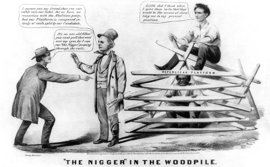
Anti-abolitionist cartoon from the 1860 presidential campaign illustrating colloquial usage of "Nigger in the woodpile"
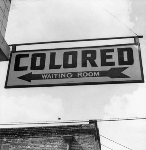
“A sign at a bus station in Rome, Georgia, in 1942 indicating a separate waiting area for black people under Jim Crow Law.” Source: britannica.com/event/Jim-Crow-law
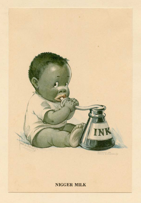
“Nigger Milk,” a 1916 magazine advertisement that Pilgrim bought in 1988 Courtesy of David Pilgrim/PM Press Source: motherjones.com/media/2016/02/david-pilgrim-understanding-jim-crow-racist-collectibles
“Let’s all be part of the change.”
On a more positive note. It’s good to see how far we have come as people. Here’s a post by Nike I liked where they are using their brand to endorse and communicate a positive message to promote equality. What are their motives? Are they only doing it to sell more product? Does it matter? I don’t know. Either way, I think it’s a good message and I support it. Their voice reaches far and wide. We still have a long way to go, but we’re moving forward.

Instagram post by Nike in 2020 #untilweallwin instagram.com/p/CAygJoHABcX/
0 notes
Text
Conceptualism, Post-modernism and Activism
Another banger of a lecture. I support design activism and think it’s a great initiative for starting conversations about important issues. It’s an opportunity for designers to use their skills to make a positive impact in the world. The extremes of which would have to be discussed on an individual basis.
A recent example of this is the design responses to COVID-19 and social distancing. Designers altered business logos, developed communications, and positioned messages to promote social distancing. The effectiveness is up for debate, but I think it’s good to see action supporting the cause.
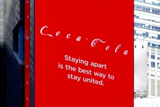
Billboard in Time Square by Coca-Cola
My favourite quote
"Life imitates Art far more than Art imitates Life"
— Oscar Wilde, 1989
My fave design
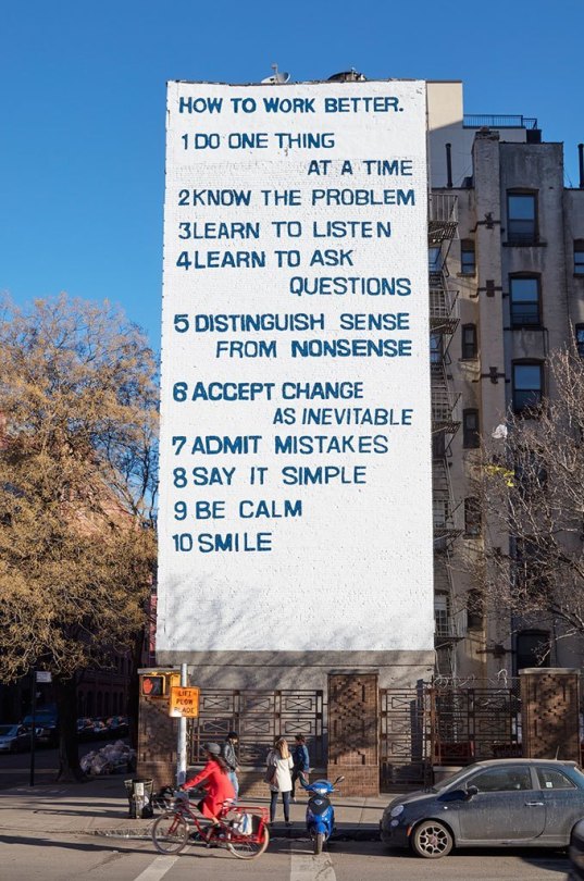
Fishchli and Weiss, How to Work Better, mural, 1991 from guggenheim.org
0 notes
Video
youtube
The rotoscope and the evolution of animation
This is a video by Vox that investigates and analyses how the invention of the rotoscope helped evolve animation from clunky movements to fluid and smooth motion. Max Fleischer is an american animator who invented the technique in 1915 also known for the creation of Betty Boop.
0 notes
Text
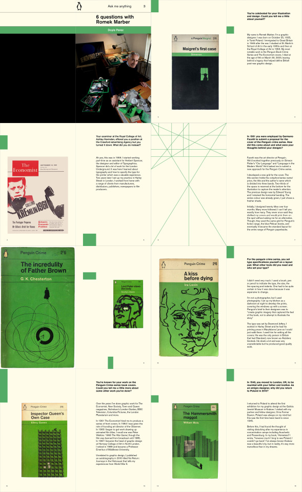
Romek Marber
This is a draft version of my publication for assignment 3. It’s been awesome learning about Romek Marber’s work, thinking, and influence. I put this together in inDesign using the marber grid that he developed for the Penguin Crime series books in the 60′s. I haven’t added my resources yet so will need to have a think about how I can add that in; maybe captions or a seperate page. From here I’d like to try out some varied layouts to see how I can push it creatively, read over and edit my questions and answers, and get some feedback on how I can improve.
Key points
'A' format 111 x 181 mm (original size for Penguin Crime Series)
Colour swatch based on Penguin Crime Series
Akzidenz Grotesk (original typeface/font for Penguin Crime Series)
Marber grid to determine the entire layout
Questions that speak about broader design practice like getting started, tools required, process, relationships, exhibition, confidence in work, non-related design influences/life experiences
Pieces of work to break up the text for the reader
Green blocks to emphasise the use of the grid, add colour and aesthetic
0 notes
Text
Fontana Modern Masters
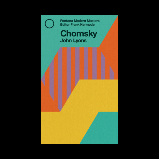
While researching Romek Marber I discovered the Fontana Modern Masters books. Wikipedia says the Fontana Modern Masters is “a series of pocket guides on writers, philosophers, and other thinkers and theorists who shaped the intellectual landscape of the twentieth century.” I loved the covers and noticed the consistent use of grid between the books. I did a little dig and found this website that documents every cover. It was awesome to see how these books developed over the years. This is one of the first designs from 1970.
I had a play around with the grid in illustrator and photoshop to remake one of the covers, which you can see above. This was good practice. I look for grids in everything now. I was a little more strict with the alignment of the type and set it in line with the vertical guide. I’m left wondering why the type wasn’t snapped to the vertical guide. The font looks like Helvetica Rounded and is the one I used on my remake. Though, the actual font is called Formula One by Letragraphica and can only be found as a dry rub letter transfer.
Designers have got it good these days in regard to accessibility of tools. I appreciate the craftsmanship of early print design. It’s inspiring what designers achieved with their limitations. I can imagine it would have been much more time instensive to our work together. It would have required a lot preparation and perseverance.
By Modern Masters we mean the men who have changed and are changing the life and thought of our age. Everybody wants to know who they are and what they say, but hitherto it has often been very difficult to find out. This series makes it easy. Each volume is clear, concise and authoritative. Nothing else can offer in such an acceptable form, an assured grasp of these revolutionary thinkers. The authors are themselves masters, and they have written their books in the belief that general discussion of their subjects will henceforth be more informed and more exciting than ever before.
— Frank Kermode
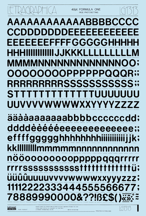
Formula One Letraset sheets, 1973.
0 notes
Text
Influence and appropriation

This is my collage from an in class workshop. It was fun to make. There’s no meaning, I was just putting images together. I used digital assets and spent a long time contemplating which ones to use. This makes me think of how your tools determine your outcome.
I liked what Ben said about influence and appropriation of cultures and context. Collage is a good way to communicate new ideas and change their original meaning. You could make something serious into satire. Meme’s are a good example of this and also a super effective way to get a point across.

All photos are from Unsplash: Moon by Claudio Testa, Apple computer by Jason Leung, Paper texture by Sharon McCutcheon, Astronaut by NASA, Landscape by Ryan Schroeder
Meme created on imgflip.com/memegenerator
0 notes
Text
Dieter Rams: 10 Principles for Good Design

Braun FS 80 (1964)
Dieter Rams (born 20 May 1932 in Wiesbaden, Hessen) is a German Industrial Designer. Most notably, he designed consumer products for Braun. In this video from 2011, he says that you can count the amount of company’s that take design really serious on your 10 fingers. The key company he mentions is Apple, driven by Steve Jobs. He says the main objective for the future should be, “less, but better.”
10 principles for good design
Good design is innovative
Good design makes a product useful
Good design is aesthetic
Good design makes a product understandable
Good design is unobtrusive
Good design is honest
Good design is long-lasting
Good design is thorough down to the last detail
Good design is environmentally friendly
Good design involves as little design as possible
My takeaway
How do these principles translate across to Communication Design? I think that communication designers must seek to understand their audience and context the same way an industrial designer does. I see these as a valuable principles to consider moving forward in my design practice.
Braun T 3 HfG Ulm + Dieter Rams (1958)
Braun TG 60 (1965)
You can read more about this here: https://readymag.com/shuffle/dieter-rams/ and https://www.interaction-design.org/literature/article/dieter-rams-10-timeless-commandments-for-good-design
Images: https://readymag.com/shuffle/dieter-rams/products/
0 notes
Text
Ask me anything
Testing out some ideas for assessment 3, “Ask me anything!” Romek Marber is most celebrated for his work on the Penguin books. From what I’ve found, the they were printed in A format which is 111 x 181mm. I thought it might be a good idea to recreate one of the books somewhat using the ‘marber grid.’ I’m not much an illustrator, so I’ll do my best using the type ‘Standard’ aka Akzidenz Grotesk, line and colours he used on his designs. I may include some photos of him and his work. His design was first used on the crime series, then moved across into the full range so that could be the progression of colour for my book. I’m not sure about using the grid for the whole book, but I’ll see how things go.

0 notes
Text
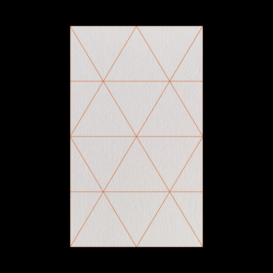
The Marber Grid
The Marber grid was designed by Romek Marber, a Polish born British emigre graphic designer. He’s celebrated mostly for his work on the penguin crime series in the 1960’s, in which he designed this grid for. It is divided into horizontal bands which leave two-thirds of the page real estate to illustration. The grid was such a hit that it went on to be used on hundreds of penguin books.
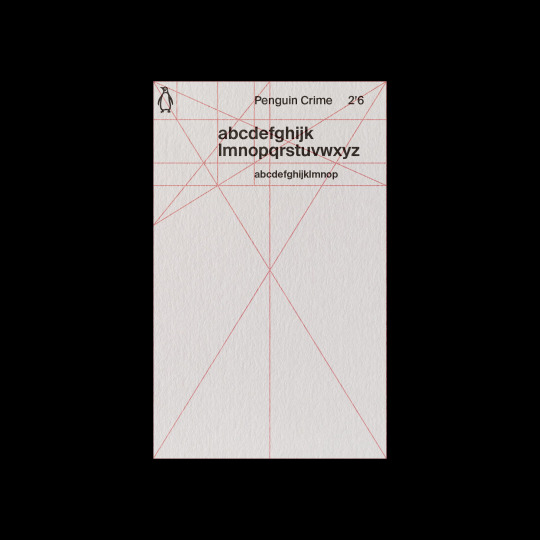
A mock up on paper of the Marber Grid I created in illustrator and photoshop.
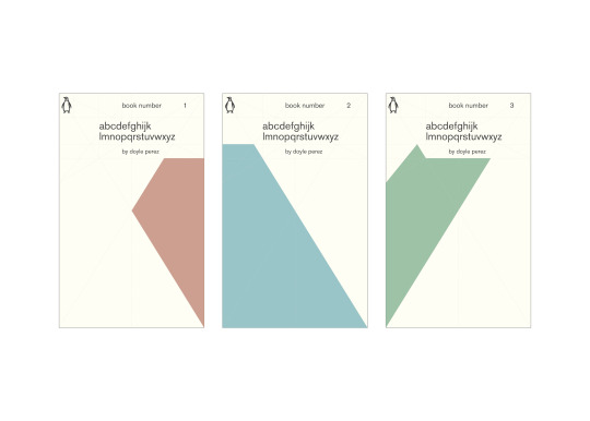
Some shape building and play of the grid to create a book series concept I created in illustrator.
Marber Grid Source Reference
0 notes
Text
GRIDS: “Ugly” vs “Beautiful”
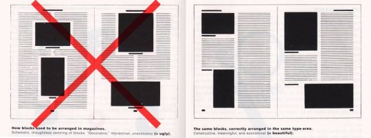
A small piece from the book The New Typography by Jan Tschichold. A manual for design teachers and educators that outlines the standards of creating balance with page space, page sizes, and use of empty space. The big red X demonstrates what not to do and is captioned as “ugly.” The opposite page shown demonstrates what to do and what is captioned “beautiful.”
Do I agree with this? With no context it’s hard to say. It’s a very restrictive and systematic approach that would certainly not suit all applications. From the examples shown, I do think that the structure of the one on the right feels better to look at.
What is a grid? What are its origins? What are its functions?
Grid systems are all around us. They are the foundation of our cities. In design, a grid is a framework that allows designers to create a system for efficient use of space.
“Designers became fascinated by grids the same way they did with letterforms; looking for symmetry and systems” (Andy Simionato, 2020)
Letter form grids are connected to the human form. Are page grids also connected to human form? How do grids affect human behaviour and which informed the other?
The grid system is an aid, not a guarantee. It permits a number of possible uses and each designer can look for a solution appropriate to his personal style. But one must learn how to use the grid; it is an art that requires practice.
— Josef Müller-Brockmann
0 notes
Text
"The Politics of Design (1981)" by Paul Rand
I read this text at digbeyond.com
This was a good read. I’m familiar Paul Rand as one of the most famous graphic designers. I felt the passion and confidence behind his words. I felt myself reading faster. He sounds like a strong advocate for designers, design practice and good design. He made solid points about the politics of design in the workplace. Written in 1981, I feel his words still hold much weight today.
I didn’t know before, but I needed to read this. Why are some designers happy to promote design as a commodity where others fight for it not to be? How can we not give in to these politics and pressures? I think this text presents a strong argument and a way of thinking that is beneficial for young designers to consider.
Image from www.paulrand.design
0 notes
Text
Gesamtkunstwerk
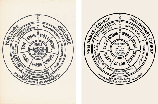
Diagram of the Bauhaus curriculum (adapted, right), Walter Gropius, 1922
Quotes I liked from this lecture
“Artists, sculptors, painters, we must all get back to craft!” — Walter Gropius
“The Bauhaus was not an institution… it was an idea.” — Miss Van der Rohe
“The future demands the whole person” — Laszlo Moholo-Nagy
Main Takeaways
Rules that govern design can become a style
Minimalism is not simplicity and still requires thousands of informed decisions
What we design on a page is also applicable to the objects around us
Is there is a truth to materials? In the case of origami, does paper want to be folded?
Bauhaus: efficiency of space, reducing to essential, craftsmanship
Women in Bauhaus
Sadly, the women in Bauhaus were not seen as equal to the men. The founder, Walter Gropious, believed women thought in two dimension. While the famous art school accepted women, the doors were really only open for weaving modern fabrics for fashion houses and industrial production. Gropiuos’ words stating, "no difference between the beautiful and the strong sex,” are sexist in their own right. I’d never thought much of the social and political aspects of design history. It’s only right to celebrate these women equally as the men.
The source of information summarised above was this article
These women studied at the Bauhaus and played a fundamental role in the development of the art school
/*Click their name to read more about them and see some of their work*/
Alma Siedhoff-Buscher (4 January 1899 – 25 September 1944), designer
Anni Albers (June 12, 1899 – May 9, 1994) textile artist and printmaker
Benita Koch-Otte (23 May 1892 - 26 April 1976), weaver and extile designer
Gertrud Arndt (20 September 1903 – 10 July 2000), photographer
Gunta Stölzl (5 March 1897 – 22 April 1983), textile artist
Margarete Heymann (August 10, 1899 – 11 November 1990), ceramic artist
Marguerite Friedlaender-Wildenhain (October 11, 1896 – February 24, 1985), ceramic artist
Marianne Brandt (1 October 1893 – 18 June 1983), painter, sculptor, photographer and designer
Otti Berger (4 October 1898 – 1944/45), textile artist and weaver
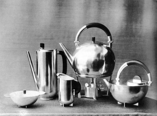
Coffee and Tea Set, author: Marianne Brandt, 1924 / photo: Lucia Moholy
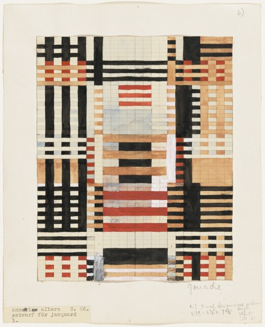
Anni Albers, Preliminary Design for Wall Hanging, 1926
1 note
·
View note