
Last Seen Blogs


ameliadennis
Amelia💋

beerdobaradoblog
TS4 - My Screenshot Collection
notso-daily-six-writing
Headcanon and stuff about six dead queens
Text
Fern Wiley at The Littman Gallery: Participation
Hannah Kennedy
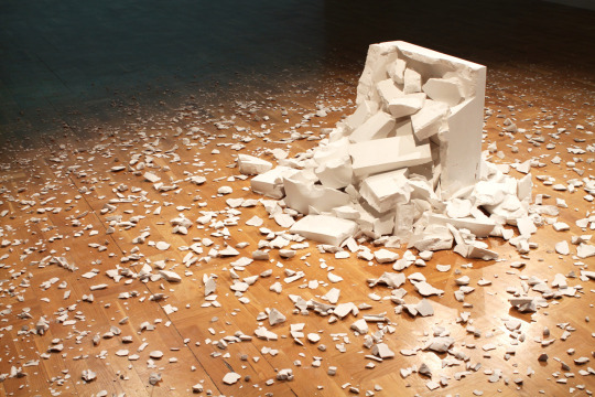
Fern Wiley’s Participation invites viewers to relate to the installation through common experiences of relationships, work, and emotional dedication. These themes are expressed in the ambiguous symbolism used in relation to her performance and the shattered white sculpture as the centerpiece of the exhibition. I am reminded of the emotional and mental dedication of those working in the creative field and the investment and sometimes disappointment felt towards the creative process. Wiley provides a space to contemplate and acknowledge the spectrum of emotions related to the creative process in order to find relief in destruction.
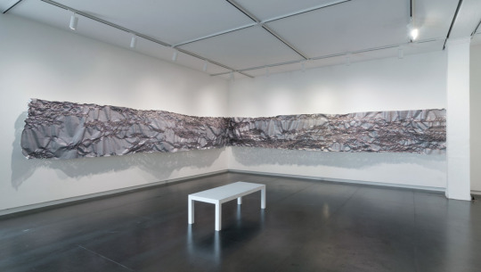
In the center of the gallery rests a shattered sculpture with its broken pieces basking under a spotlight creating an altar to the act of destruction. The plaster sculpture crumbles across the floor in a circle of shards that range from large chunks to particles of dust. The placement of each remnant from the sculpture speaks to the act of destruction almost as if the performance occurred in the gallery. While the installation recreates a violent process the fragments are arranged meticulously. The viewer is also forced to navigate the space in a circular fashion and step gingerly around the piece so as not to disturb where the particles have fallen.

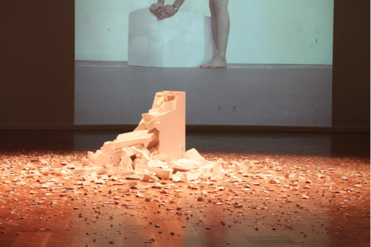
Two videos play on perpendicular walls documenting Wiley’s performance. One video depicts a woman dragging a sculpture to the center of the screen and meticulously examining it. The relationship between the box and the woman becomes intimate as she strokes, kneels, listens, balances upon, bows, and crouches within the box. The intimacy between the two demonstrates a level of dedication to or relationship with the object. After careful examination, the performer drags the box repeatedly across the screen fully expressing the exertion of the physical task. She heaves the block back and forth, breathing heavily with each pull and resting occasionally to catch her breath.
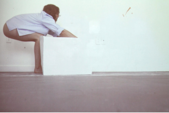
The second video plays simultaneously while the audio overlaps. As the woman breathes deeply with exhaustion, the audience hears banging and crumbling stone from the other video. This video portrays the development of the relationship between the woman and the sculpture. The exertion from continuously moving the box eventually breaks the performer’s dedication. She returns to the room with a sledgehammer and crashes it down upon the sculpture. Each blow brings a thrill of relief and satisfaction with the destruction. It’s cathartic to watch her destroy the sculpture while simultaneously watching her struggle as she drags the box across the screen with anguish in the other video playing across the room. Once the woman is satisfied by her accomplishment she sets to work picking up the broken pieces. She maintains her methodical practice even as she picks up the individual fragments. Each particle, no matter the size, has equal importance and is retrieved with care. A quiet sadness follows as she sweeps together the shattered fragments and lovingly recollects their original shape. The performer’s work continues and her relationship with the sculptures remains intact as she pulls the block across the screen once more bringing the video to an end.
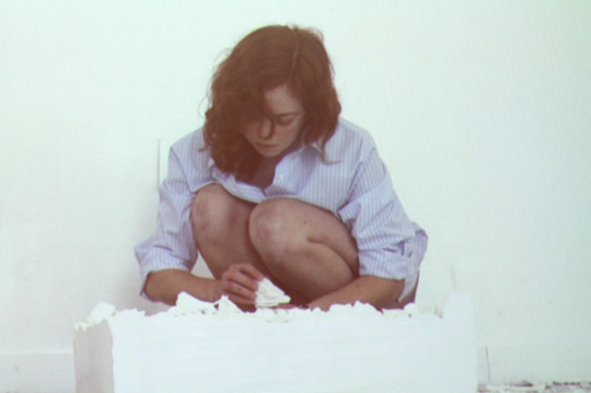
The ambiguity of the performance and the installation provides a space for the viewer to fully connect and build associations with their own experiences with the emotional turmoil and development of the relationship between the performer and the sculpture. She suggests an intimacy with the object as strokes the box and kneels against it with every inch of her body. She became the box as she dragged it with her and she worked tirelessly for the box. Eventually, she heaves the sledgehammer with a fury that suggests an exclamation of, “Fuck the box.” With each blow that she lands there is a sense of relief through destruction.

The work in Wiley’s Participation presents an emotionally relatable experience between the viewer and the artist. The viewer is offered an environment to observe and contemplate relationships, emotions, and challenging experiences. The artistic experience is fraught with work, dedication, and self doubt and Wiley uses this experience as a platform to explore the varied emotions that occur during the artistic process and finds healing in destruction. Wiley’s installation presents a shrine- like environment to the spectrum of emotions associated with challenging experiences. The work also acknowledges and honors the process of destruction.
Participation is on view at Littman Gallery through May 26, 2016.
Images courtesy of the Littman Gallery.
2 notes
·
View notes
Text
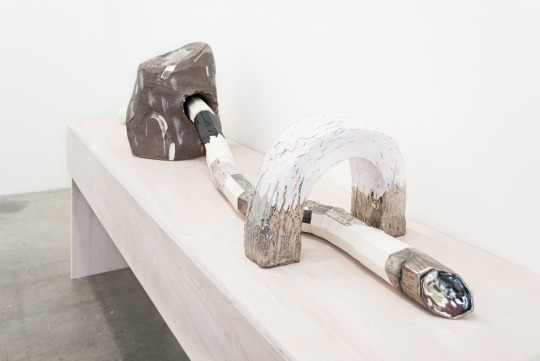
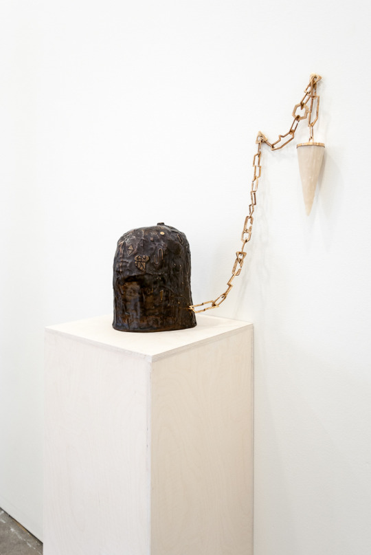
Emily Counts at Carl & Sloan Contemporary
Taryn Wiens
Emily Counts’ exhibition at Carl & Sloan presents big, bulbous ceramic forms stacked, draped, rested and passed through one another. Surfaces are covered with tiny repeating elements: relief circles, triangles, crescents, marks, holes. Never regular or mechanical enough to be perfectly repeated, they are non- patterns, almost-patterns.
Emily Counts, Subvert and Copy, 2016
Each link of handmade brass chains in three different works has its own unique shape, disrupting our expectations of uniformity without denying a chain-identity/chain-function. Like every piece in the show, the chains give unapologetic evidence of the hand: marks, textures, and irregularities serve as records of interference by a human body.
The objects throughout the bright and clean gallery contain a multitude of small surprises for the careful viewer, resulting in the comforting assurance that every element has been touched and considered. Presence of the human hand and focus on materiality are often found where the usual divides of “art” and “craft” are bridged by artists, craftspeople, and curators. However, Counts’ show disrupts the conventional art/craft separation in a new way by utilizing ceramic’s association with function, along with material, to approach abstract ideas.
Pottery shards are among the most plentiful ancient archeological artifacts – when other detritus of human lives is buried and decomposed, pottery vessels remain through tens of thousands of years. When we interact with ceramics, even today, even in a gallery, we understand intuitively the medium’s relationship to permanence and utility. Emily Counts’ ceramic forms carry a sense of spontaneity, movement and gesture along with that permanence, and combine an aggressive non-functionality with elements of utility. Counts lets us view opposing truths in a single object, and the result is undeniably alluring.
Emily Counts, Future Connect and Bind, 2016
Count’s simultaneous practice as a jeweler informs her sculptures, but the sculptures refer to a functionality beyond jewelry. “Bead-like” elements have been identified in previous discussion of her work as a link to her jewelry practice. Her thoroughly enjoyable show The Ins and Outs at Nationale last summer begged this comparison – where many playful sculptures appeared as overly large necklaces with exquisite, colorful, handmade “beads” hung on the gallery walls. With her show at Carl & Sloan, Counts pushes her sculptures farther from associations with “extreme jewelry” and brings darker conceptual complexity into the works.
The colors of this exhibition are more neutral than The Ins and Outs, emphasizing form, texture, and value. The “bead forms” are still present but appear more as a sheath or skin for the ropes. The sculptures are larger–the largest ceramic sculptures Counts has made to date–with clearer allusions to sex and violence within abstraction.
One may be tempted to link the work of Emily Counts to Constantin Brancusi, who, through exquisitely crafted wood carvings, managed to render abstraction safe for mass consumption. He disarmed skeptical audiences who might have otherwise found modern art frustrating in its apparent lack of skill. But the familiarity and appeal of exquisitely crafted ceramics employed by Counts is not meant to serve avant-garde art to the masses. Rather, it is a declaration that initial appeal or familiarity of craft does not negate conceptual credibility and strangeness.

Emily Counts, Basic Diagram, 2016
In Basic Diagram a large cylindrical shape, perforated with nearly-uniform holes, suggests the containment of some hidden thing which cannot pass through the tiny openings. The cylinder’s white domed lid is covered in small, also white, abstract relief shapes reminiscent of pictorial languages. Relieving the pressure of containment, a rope enclosed in black ceramic hexagonal/cylindrical “beads” ejaculates from the top of the dome, leaving a splash of black glaze. The black line, flexible, soft, draped but composed of rigid, glossy ceramic elements meeting in perfect angles travels twelve feet along the gallery wall, changing from black to a silvery metallic and ending in a collection of dangling ceramic knives. The non-functional knives allude to a passive violence through their would-be function. They are the consequence or end of the original explosion: disappointed expectations, perhaps an event of male sexuality or a battle carried on too long.

Emily Counts, Moves Moves (detail), 2016
Moves Moves starts with a large white drum-like form covered in a relief-shape surface similar to that of the lid in Basic Diagram, atop a concrete base. Thirteen more forms are stacked above, each slightly smaller than the last: a marbled sphere, a gridded cube, a cylinder violently punctured by a curved line of metallic bead-shapes; each element like a word in an unknown question, traveling upwards to a tiny silver-tipped triangle. The triangle might be the end of the line, or just pointing to an invisible continuation, the way a ray is depicted in a mathematical diagram. Counts says of the piece, “I was thinking about tributes, trophies and monuments. It was built after a few of my smaller sculptures that had the suggestion of funerary or remembrance objects.” Moves Moves could be a funerary monument to a life of unfulfilled expectations, each hope a little smaller than the last. It’s not as sad as you might think, buoyed by richness in texture and treatments found along the way, familiarity in shapes of domestic function, and an affirmation that one thing does indeed lead to the next.

Emily Counts, Disaster Kit, 2016
In these works, forms of containers, lids, vases, bowls and colanders are not acting out the functions their shapes imply, but those functional implications provide conceptual fodder in themselves. For example, within the idea of containment is a host of references to collecting or accumulating, preservation (saving for later), imprisonment, control, internal and external, visible and non- visible dichotomies. Counts collages together these functionalities – containers, chains, perforations – to manifest complex ideas, abstracted relationships, and paths of travel between points. Counts does use a material knowledge rooted in craft to create abstract sculptures but, more importantly, she uses craft’s ability to depict function as a method of communicating within abstraction. These sculptures ask us: ‘What steps does it take to get from one point to another?’, and, ‘Will we like what we find at the end?’
Emily Counts is at Carl & Sloan through April 17, 2016. Visit www.carlsloan.com for more info.
Images courtesy of Carl & Sloan
3 notes
·
View notes
Text
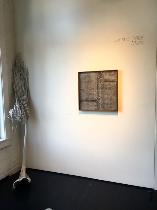
Jenene Nagy at PDX CONTEMPORARY ART: Mass
Sam Hopple
Jenene Nagy’s Mass at PDX CONTEMPORARY ART is an open invitation to challenge what we experience in our relationship with the physical world. What is painting? What is drawing? What is object? Through visual risk taking and experimentation, these concepts are investigated and become successfully re-defined. Primarily known for her ambitious graphite drawings and large-scale installations, the two disparate mediums are now beginning to merge and intersect. Nagy makes a jump in Mass, overlapping photography, printmaking, drawing, and sculpture to transport the viewer into an imagined space of a sleek Southern California desert with a Minimalist aesthetic.

The inclusion of a giant vinyl photograph of the desert landscape near Nagy’s home in the Inland Empire brings an unexpected energy to the space. The full color photograph dominates with its presence, separating itself from the sea of black, grey and white tones of the works surrounding it. The photo serves as a physical manifestation of Nagy’s desire to work and live in Los Angeles. Its incorporation into the exhibition has her navigating new territory, as photography is not something that comes to mind when thinking about her work. Ghost Palm, a white lacquered palm tree taken from her backyard also serves as a symbol of place and as a more subtle homage to the desert. Blending with the walls of the gallery, the piece seems to almost disappear. Perhaps this is the artist’s way of asking us to look harder.
A standout sculpture, temporary monument, raised on blocks of salt rock and a glass pedestal, is a geometric form made with graphite and paper. That these materials are recognizable as the foundation for Nagy’s laborious drawings indicates that the artist is testing something here. It brings to mind a quote from theorist and artist Robert Smithson, who in reference to Donald Judd’s work in 1965, wrote “The more one tries to grasp the surface structure, the more baffling it becomes. The work seems to have no natural equivalent to anything physical, yet all it brings to mind is physicality.”

Though it may be better not to over think these things, thinking is a tool that activates the work. The word “physicality” is defined in the Cambridge Dictionary as, “the quality of being full of energy and force.” The object, the platform, and the foundation all allude to this piece as something out of the ordinary. Could this piece be considered a drawing? While it is a bit of a stretch to think about the work as something it is not, there are rewards to embracing the mental push. In questioning the appearance of being, and contemplating what is in front of us, Nagy’s work eventually reveals itself as something unexpected, once you try to get on her level.
This mind-game of looking runs through the veins of all the works in the exhibition. In the same way we are asked to question object as drawing, we can question drawing as object. Nagy’s folded paper drawings have evolved contextually in Mass, along with the evolution of her own studio practice. Still referencing gemology and economic class as they did in brilliant at PDX in 2014, the drawings now have a stronger conceptual focus on form. Through physical manipulation of the paper and rigorous mark making, these drawings have undergone a metamorphosis of sorts, becoming three-dimensional, and sculptural. Small gestures lead to the creation of something present, and over time, dominant. This process, while meticulously repetitive in nature, is both meditative and transformative.

A suite of oil monoprints of varying size entitled Weight, are also included in the exhibition, and while Nagy does not consider herself a printmaker, the technical skill in this body of work makes it easy to disagree. The suite is created using a three dimensional silk collagraph plate, and the resulting images express a range of light and dark, like you’re walking through the Denman Ross Value Scale. These diamond-patterned achromatic gradients have a varying visual weight to them as they shift and change in their densities. The plate is also cleverly on display as a mounted sculpture, housed within a wooden frame and is a strong stand-alone piece. Its use as the object that produced the images surrounding it brings us back to process and the simplicity of the repeated act, a strong theme in Nagy’s drawings.
The works in Mass are a departure from what Jenene Nagy has shown in the past, and seeing an artist shift their practice and experiment in this respect is refreshing. Though it is unexpected to see the works in Mass together, the shift seems to be a natural progression into what upcoming shows could look like. There is a permanence in her work, and she seems to possess the rare ability to alchemically conjure things in the simplest way using the gift of time. In the same Smithson piece regarding Donald Judd he states, “Judd is not a specialist in a certain kind of labor, but a whole artist engaged in a multiplicity of techniques.” It seems Nagy is on her way.
Mass is on at PDX CONTEMPORARY ART til April 2. For more information on Jenene Nagy visit www.Jenenenagy.com.
Images courtesy of the artist and Sam Hopple
Excerpts from Robert Smithson: The Collected Writings, 1996.
2 notes
·
View notes
Text
Mike Bray at Fourteen30 Contemporary: light grammar/grammar light
Taryn Wiens
The all-white floors, walls, and ceilings of Fourteen30 accentuate the strong ties to minimalism in five new pieces by Eugene-based artist Mike Bray. Bray pulls materials and methods from minimalism of the 1960’s and 1970’s at every possible opportunity. Mirrors, neon, gridded compositions, ready-made elements, industrial materials, clean lines and undisguised materiality all contribute to the feeling that these works could belong at Dia:Beacon. Bray does present his own unique spin on this established aesthetic: where the minimalists utilized industrial materials in art, Bray takes the same approach with the film industry by appropriating tools used in movie-making and referencing sets and production methods. In stark contrast to cinema, however, Bray gives the viewer no narrative context through which to grasp the work.

Mike Bray, Day for Night, 2016
The sculpture in the front room, Day for Night, uses four production light stands to hold up wood and metal replicas of circular light scrims, which filter artificial lighting on movie sets. Like most of the pieces in the show, the work contains references to utilitarian objects that are indecipherable to anyone who hasn’t worked in movie production. Because of this opacity, the value of bringing the objects hidden out-of-frame in cinema to our attention in the gallery risks being lost in translation to the untrained viewer. However, there is still a certain formal charm and humor in the cluster of lanky, awkward objects in Day for Night even as the story behind them remains obscured.
Mike Bray, Intersect Theory, 2016

Mike Bray, The necessity to interfere with movement (detail), 2016
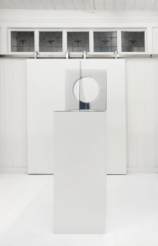
Transparency and reflectivity are found throughout the exhibition. The overlapping translucent effect of the mesh screens in Day for Night is replicated in Intersect Theory, a sculpture of intersecting two-way mirrors, and The necessity to interfere with movement in the next room. These two sculptural works and the prism featured in Bray’s video Angles of Refraction experiment with light as it’s own material–not a new concept, but potent when applied to the context of cinema as a system of modifying and commodifying light.
Mike Bray, Angles of Refraction, 2016
The video features a hand picking up, turning, and putting down a prism –this prism itself was presented as a sculpture in an earlier exhibition of Bray’s work at Fourteen30. Taking choreography from a Muybridge motion study of a hand picking up a baseball, the 22-second video feels more like an infomercial than a study. The high-definition manicured hand and glossy surface tells us the object is desirable, but not why.
Blocking out the Sun, composed of steel rods welded in a flat asymmetrical grid (which would, in fact, block hardly any sun at all) also uses minimalist elements of gridded compositions and sculptural two-dimensional compositions. In the context of film, it likely references and combines standard dimensions of another obscure film industry tool: light cutters – used to control light on a movie set. Or it might simply be a pleasing arrangement of welded, powder-coated steel rod leaned against the gallery wall.

Mike Bray, Blocking out the sun, 2016
Viewers curious to engage with the work at a deeper level are certainly left to fend for themselves without any didactic information to accompany the work. Only obtuse titles, dimensions, and materials give any additional hints as to the conceptual ethos of the pieces.
This lack of information seems to work against the power of cinema, which comes in part from the ability of narratives to transform ordinary objects into extraordinary objects. The absence of any language or story around Bray’s pieces, in the pure-white gallery space could come across as intimidating. The exhibition constantly alludes to a conceptual complexity that seems out of reach. Maybe our attachment to narrative, readily fulfilled by the film industry, is exactly what Bray is attempting to highlight with its absence. There is some pleasure in surrendering yourself to the formalist observation that Bray’s pieces invite, but overall the exhibition left me craving more access points to conceptual engagement.
Bray’s light grammar / grammar light is on at Fourteen 30 Contemporary til March 5, 2016.
Images courtesy of Fourteen 30 Contemporary and Taryn Wiens
1 note
·
View note
Text
Ellen Lesperance at Adams and Ollman: We Were Singing
Taryn Wiens

The prevailing ethos of contemporary art embraces the snarky, ironic, and disdainful. In this atmosphere sincerity and sentiment are big risks but Ellen Lesperance emanates both in We Were Singing with refreshing results. The show does not convey a false or easy fuzzy feeling, but rather a hopefulness that the best way to subvert a sexist system might actually be through deep, steady, feminine affection.
Much of the affection in We Were Singing is directed toward recently deceased artist Sylvia Sleigh, who was a central figure in the feminist art movement of the 1970’s. Sleigh was known for realistic portraiture, mainly of friends and compatriots in the movement, such as the members of her women’s gallery co-op A.I.R. She also often painted her husband, art critic Lawrence Alloway, in the nude, reversing the historically established roles of male artist-genius and nude female model-muse. For We Were Singing, Lesperance has remade many of Sleigh’s paintings as Polaroid pictures featuring her own partner Joseph McVetty, directly referencing the original works’ titles and loosely mirroring body positions, props, and composition.
As a regular part of her practice Lesperance identifies textiles present in significant situations of feminist activism — in this instance the paintings of Sylvia Sleigh — and transcribes the visual image of the textile into gridded gouache paintings that act both as a map for a knitted recreation of the textile and a visually autonomous work on paper. Every imperfection and exaggeration in Sleigh’s paintings of these textiles is faithfully transcribed by Lesperance, resulting in asymmetrical patterns with complex and jarring color combinations that seem to vibrate. The points of color-information which make up these paintings translate the aggressively analog activity of knitting but also recall digital pixels and other ways we store and process information. Lesperance’s gridded paintings in particular embody our human impulse to understand through ordering and categorizing.
Using one of these gauche patterns, Prop For A Turkish Bath, as a guide, Lesperance recreated the physical textile in the background of Sleigh’s original Turkish Bath painting. Through methodical craft, Lesperance gives value to the re-created object with its endearing imperfection and futile attempt to be the unknowable original. The object, painted by Sleigh, then mapped and subsequently re-knitted by Lesperance, exists simultaneously in four different ways through a kind of ‘telephone game’ process.
Lesperance’s textile translation moves between 2-D and 3-D, between the past and the present, between Sleigh’s location and her own. She shows that a knitted textile can be as much a depiction or rendering as a painting can be an object.

Ellen’s other knitting projects often recreate sweaters rather than flat textiles, and deal with identity and personas, as the wearer of her recreated sweaters assumes the identity of the original subject. Polaroid photographs maintain this element of persona in We Were Singing as Joseph McVetty wears the settings of Sleigh’s paintings and assumes the identity of her subjects.
Lesperance uses the textile as a backdrop in some of the Polaroid photographs, adding a fifth translation of the textile and strengthening the photographs’ imitation of Sleigh’s original paintings. The use of photography seems at first to be out of place in relation to Sleigh’s work, but with closer attention the sensibility of Sleigh’s paintings becomes obvious in the small, glossy compositions. Lesperance uses the tools, people, and settings available to her to recreate Sleigh’s concepts — giving light to both the similarities and differences between their individual frames of reference. The most piercing aspect of these photographs is the palpable intimacy between the photographer (Lesperance) and subject (McVetty). There is a sense of trespass, but perhaps only because we aren’t accustomed to an intimate female gaze made public.
Direct mimicry has always occurred in art, but while male artists like Jeff Koons often copy others with a sense of self-congratulatory machoism in how much they can get away with, Lesperance pays honest tribute, treating Sleigh as a friend, muse, mentor, and confidant.
The result of her direct conversation with Sleigh is twofold: she draws attention to a known, but not canonized, feminist artist of the recent past whose work is still highly relevant, and she highlights the ways in which Sleigh’s context is different from her own contemporary context. She is not afraid to belong to her own time, in conversation with the past. In literally knitting a new textile, she figuratively knits together actions across time, attempting to ensure that the life and work of Sylvia Sleigh is not lost in the past and a male-dominated history.

Lesperance denies common male-centered attitudes at every turn but she is not a “riot grrrl.” While activist actions often sprout of anger and aggression, sometimes rightly so, Lesperance’s resistance sprouts of its opposite: unyielding affection. For textiles, for flowers, for her partner, and most of all for Sylvia Sleigh. She calmly carves space for female sexuality, craft, sentiment, and sisterhood: an action that is more rare than it should be.
To learn more about Adams and Ollman visit http://adamsandollman.com. For more on Lesperance and her work click HERE.
Images courtesy of Adams and Ollman.
0 notes
Text
Avantika Bawa at White Box UO: Aqua Mapping
Eleanor Ford
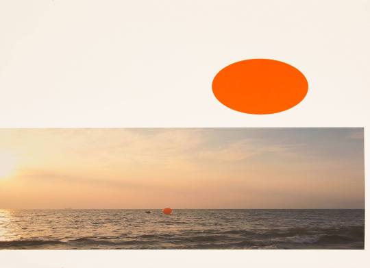
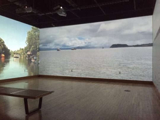
While Avantika Bawa’s Aqua Mapping was installed at the University of Oregon’s White Box through the month of September, the project itself has been alive and developing for the last three years. Taking on the historical and contemporary manifestations of maritime passage and mapping, Aqua Mapping consists of a series of voyages over three disparate geographies. The three routes engaged in the project include maritime trade and commercial routes in southern India (Kochi), commercial and military routes in the Inner Harbor and Chesapeake Bay (Baltimore and Annapolis), and the coastline of Astoria, OR including the “Graveyard of the Pacific”.
These routes were traced by Bawa with a team of videographers and sound recorders, while towing or carrying an inflated orange pontoon. The images and videos produced from these voyages as well as the orange ball itself make up the exhibition at White Box, creating a multi-media and multi-form show that attempts to encapsulate a large and multifaceted project into a small, two-room exhibition.

The physical presence of Bawa and her orange buoy is felt through the documentation of the voyages— producing near-surreal and pleasingly graphic images of the orange dot floating in an ocean, or bouncing along the horizon line. Videos of the journeys were projected in the Gray Box gallery, presented in a three-channel projection spanning three walls. As the footage plays the orange figure slowly travels along its route, bringing the viewer into the real-time rhythm of maritime travel. Bobbing through this footage, the sense of the three culturally and geographically disparate spaces linked by Bawa’s travels becomes palpable through the sound of the environments, as well as the people and boats we see populating the scene.
In its visual and conceptual manifestations, Aqua Mapping presents a simplicity of form alongside a scope and complexity of implementation that is more comparable to Odysseus than a conventional durational performance. The global scope of the project, ranging from India to the eastern seaboard, to rural Oregon, is of a scale that is frequently gestured to in contemporary art practices but so rarely (and literally) explored. It is because of this that the White Box presentation of the work inescapably felt like an excerpt of the project, rather than an exhibition of the project as a whole.
Aqua Mapping’s project at large presents an extremely difficult question to the exhibitor and viewer alike: how can one convey the wholeness of the journey, the complete circuity of a route, in a single show? The video works and prints of the White Box presentation served as a fantastic inroad to the larger whole of Aqua Mapping, but the sheer scale of the project implies an even wider universe of works that have or will emerge from Bawa’s experience.
The lived experience of Bawa’s excursions serves as the gravitational center around which the works presented at White Box orbited. The images and videos of this show display an abstracted and condensed picture of a project that clearly held monumental importance in its construction. The care with which she executed rooted in the lived experience of Bawa’s excursions, the care with which she retraced these military, commercial, and historic routes and the contemplation placed on the notion of mapping itself is what constructs.
This is not to say that the scale of the project is lessened by its exhibition at the University of Oregon gallery. Bawa’s project is one that I hope to see installed in many different locations and institutions, hopefully in as diverse of places as those traveled through in the work. The form Aqua Mapping will take in future exhibitions will shift and alter with each reformulation of its documentary pieces, and this capacity for reformulation being an advantageous trait that will hopefully give both Bawa and the project an opportunity to work in many different contexts.
To see more of Avantika Bawa’s work visit www.avantikabawa.net and for more on the White Box and its programming click here.
Images courtesy of the White Box
2 notes
·
View notes
Text
Eight Takes at Melanie Flood Projects
Josephine Zarkovich

Brittney Connelly Artist's Studio #2, 2014
Eight Takes, a group show at Melanie Flood Projects, features the work of Emily Wobb, John Whitten, Erin Mallea, Lara Kim, Genevieve Goffman, Kello Goeller, Brittney Connelly & Travis Beardsley. The exhibition, housed in the small, light filled space is a window into the practices of Prequel, a small group of artists who have met and critiqued each other's work every Monday for the past four months. The result is a slick exhibition, using a variety of new media and well crafted installation techniques with absolute confidence.
Each of the works in Eight Takes seems to function under its own abstract taxonomy, a precise set of rules of classification only the artists know in full. For example, the obsessive data crunch of Genevieve Goffman's Someone Has Died, with its minuscule footnotes dutifully informing an almost endless list of causes of death or John Whitten's museum-like vitrine, Constellations/Water Rescue, which contains sets of illustrations each paired and carefully rendered under unknown criteria. This attention to data and organization can also be seen in Erin Mallea's images of palms, which reference (if not explicitly) the plant’s history as a foreign species in Oregon, with the photograph of a book filled with neon notations indicative of some deeper exploration or study.
Throughout the exhibition, there is an order to each object, almost a seeking out of their individual ‘thingness’. In Emily Wobb's 747 Skin a video shows the artist running a model BMW through a wood chipper, the remains of which are then displayed on the outline of a plexiglass airplane. Lara Kim's Yoja connects spice filled kimchi jars in an organic web of hair and Brittney Connelly’s photographs are not mounted on the wall, but rest directly on cinder blocks, calling attention to the materiality of their works.
Rounding out the exhibition, Kello Goeller's animation Bone to Spaceship Transition is not only a video but also an installation in which the viewer sees their own reflection juxtaposed with the physical objects featured in the projection. Perhaps most strikingly, Travis Beardsley digital video BlkHat_EscapeMesh is shown mounted directly to a fabric piece that he manipulates in the animation. The result is a controlled mixing of performance and installation that highlights the physicality of the materials within the work.
Taken as a whole, Eight Takes is a showcase for a group of artists whose influence on each other seems both obvious and hard to pin down. The attention to detail and craft in the works underline a feeling that each gesture has been made with great intention. However, the limited selection of work, combined with the notable lack of didactic information or explicit connections between the artists, ensure that the method behind that intention remains a mystery.
9 notes
·
View notes
Text
Dru Donovan at Hap Gallery: Carving the Lung
Taryn Wiens
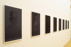
Hap gallery houses nine beautifully composed black and white portraits within ambiguous contexts. Dru Donovan, a Portland-based artist who received her MFA from Yale in 2001, uses her technical mastery in photography and the visual appeal of carefully crafted light, shadow, and composition–not as an end unto itself, but as a tool to entice viewers to engage with darker subjects.
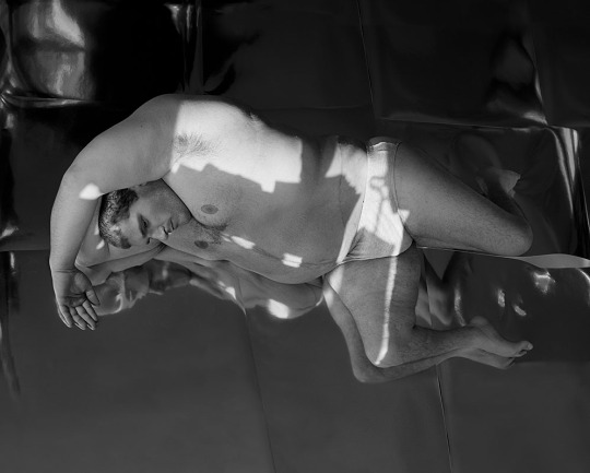
Dru Donovan, Untitled, 2009
The themes of Donovan’s works are blurry and complex, uncomfortable and familiar. They evoke the societal pressures we accept and transfer to our bodies, a line between self-inflicted discipline and loss of control, the inevitable failure of the human body to appear and act as one desires. In an age where we are inundated with images and information, the loudest, most confrontational art often rises to the top. Donovan’s work enacts another, equally valuable, function: a quieter (even colorless) space for honest examination, where conflict is acknowledged without being clarified or resolved.

Dru Donovan, Untitled, 2014
The works that make up Carving the Lung, Donovan’s exhibition at Hap, do not force viewers to engage further than a first glance, as Robert Mapplethorpe did with his large, explicit, immediately challenging black and white photographs of the body. Both artists use unconventional content, but Mapplethorpe’s photographs scream with sexuality and aggressively broken societal expectations, while Donovan’s speak quietly, only letting you understand every other word. More time spent with this exhibition will reap rewards of a conceptual richness and complexity, although little definitive clarity.

Dru Donovan, Untitled, 2009
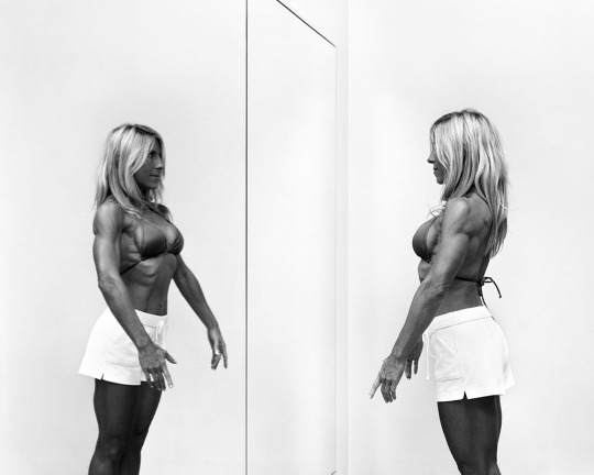
The photographs feel simultaneously staged and candid. The relationships between the subjects and the space around them is carefully orchestrated, and the models’ bodies themselves are often physically altered. In this deliberate posturing, a sense of vulnerability and authenticity slips acts as a unifying force for the series. We see a man lying on the ground, a woman flexing in the mirror, girls applying lipstick, a woman stuffing her face with fleshy dumplings. Even with such radically different subjects, there are obvious commonalities. Each suggests the enactment a familiar façade, and a crack in that image through which slips a counter-expression: self doubt, boredom, discomfort. The exact emotional content of the expressions is less important than their portrayal of a lived experience which is contrary to a projected identity. This gap between the lived experience and the postured image measures the strongest photographs of the series.
Dru Donovan, Untitled, 2007
The ambiguous narrative involved in each photograph accentuates a creepy feeling in the images, and encourages conversations about the content. When I asked, I learned that the woman eating dumplings is a competitive eater (this information is not written anywhere in the gallery). Filling in the narrative draws interesting parallels to the female body builder across the gallery. As the curator Iris Williamson puts it, “Bodybuilding, competitive eating, are male-dominated fields and contrast the ways women normally try to minimize their bodies. “ Although in some ways learning the contextual narratives of the subjects is interesting, and adds layers to the meaning, it is ultimately unnecessary in engaging with the work and secondary to the visible content. While Mapplethorpe made visible the hidden story of gay male erotics, Donovan makes something less tangible visible: she shows us personhood in the image of a body.
The only place where the work falters is in one-page artist book in an edition of 150 called Likes for Likes that accompanies the exhibition. One of the most unique aspects of Hap gallery is that they feature editions alongside the main works for each exhibition – anywhere from 10 to 200 smaller (and more affordable) pieces accompany each artist’s body of work. The edition aspect is a simple yet extremely smart model; it increases the accessibility of the work by providing smaller pieces at a lower price point, and simultaneously encourages the artists to explore new territory.
Donovan’s “Hap Edition” featured 16 additional photographs featuring one of the models from the larger photographs. Overall, the edition falls flat – the photographs are printed on cream-color paper, which tones down the shiny, crisp quality of the larger photographs. The conceptual content is not served by the form, and feels redundant to the rest of the show. The technical excellence of Donovan’s photographs is essential as a pathway to content, and it works against her in the edition: technical lapses and poor design choices block what might have otherwise been meaty concepts.
Likes for Likes excepted, this show will give to you as much as you are willing to give to it. If you only want to spend thirty seconds in a gallery, you will experience some really nice looking photographs. If you want to begin a long conversation, Donovan will provide the material, and you may be surprised to recognize bits of yourself reflected in the humanity of these strange bodies.
Images courtesy of HAP Gallery.
1 note
·
View note
Text
The Bronco Gallery Gets Around: An Interview with Emily Wobb and Maggie Heath
Sam Hopple
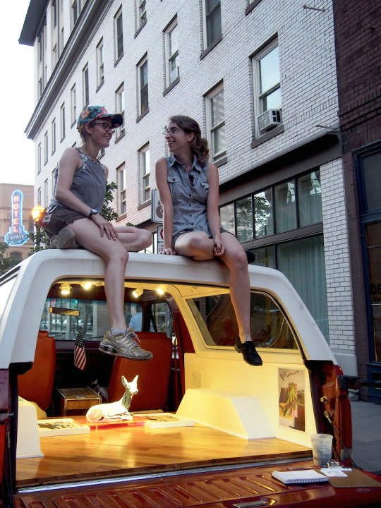
The Portland based Bronco Gallery is an ongoing curatorial project and mobile gallery founded by artists Emily Wobb and Maggie Heath. The Bronco officially launched at the Portland International Raceway in late July, where they tailgated the Thursday Night Motocross 49th Anniversary. I spotted the Bronco for the first time tailgating at the Seattle Art Fair, where they were grilling kabobs, exhibiting art from Tatyana Ostapenko, and engaging curious fair goers and loud drunken sports fans who had just gone to a Sounders game. We started chatting and I quickly realized the Bronco is something more than a faded red ′91 SUV with an air of humor around it. Maggie and Emily have a real desire to support emerging artists and engage the community around them. I sat down with the “Bronco Girls” to talk about the Bronco Gallery, hear their thoughts on alternative spaces, and learn more on the ‘art’ of tailgating events.
SH: I’d love to hear a little more about the history of the Bronco and why you think alternative spaces are important. It seems like more and more people are moving away from the traditional model of the contemporary gallery space in favor of something more unique and individualized.
BG: While moving our own sculptures with the Bronco and looking at them in the context of an SUV, we decided that it had potential to be a public viewing platform for other artists. We volunteer at Surplus Space, which sparked the conversation of alternative art spaces, creating your own institution, and de-commercializing gallery spaces.
During our very first interaction at ¿Por Qué No? we had the initial conversation of access to artwork, what our foundation is for making and who we wanted to show. Right away we started talking about the benefits of showing to a new crowd (for example, Wobb’s ideal exhibition space for her performances would be at a state fair).
Alternative spaces are important for the representation of young artists and curators. There is an opportunity to gain experience professionalizing work, developing a portfolio, and growing a support network between artists and viewers. Alt-Spaces allow for ideas to be experimented with and honed without intimidation of marketability.

SH: Besides the financial incentive of not paying to rent a space, why did you choose the Bronco as a vessel to show art? Is it because you are patriots and wanted an American made venue? (Emily prides herself in the fact that she is the embodiment of “Team America.”)
BG: The Bronco Gallery is a passport to all events. It’s an American vehicle accepted at rodeos, county fairs, as well as a white-walled gallery accepted at art institutions.
Most importantly, mobility. We sought to modify our audiences and viewers. With a mobile gallery, we are able to seek out our audience who are attending another event, planning to see something. They aren’t planning on seeing art in a bronco--especially non-saleable art. It also challenges artists to make work within a small space. It gives our artists a challenge of getting their viewers to understand their work outside a large room that people can walk around in. What does their artwork look like at a tailgate? How do 2D artists react to 18” walls?
We find it exciting that at each opening there’s no certainty of whether we’re going to have a crowd, a good parking spot, enough hot dogs (We grill grilled cheese now. You can only eat so many extra burnt hotdogs and be okay with yourself). These are challenges that not every gallery and their exhibiting artist have to deal with.

SH: What are your goals? I assume part of it is doing something different to bring attention to the artists you show, but as you mentioned, the Bronco also tailgates at other art and sport events (rodeos, motocross, etc). I think this is a smart move because you are guaranteed to have an audience of some capacity. This seems to create a type of intrigue and curiosity around the space.
BG: Ultimately, the Bronco Gallery is a social practice—which is interesting for our own practice as artists because we have had reservations about the complexity of art and social practice.
At art events, it’s almost easier to congratulate our success of large groups of people visiting us than it is at a motocross event, where we had a handful of people amongst a thousand walking by talk to us. Where does art belong in “non-art” venues and events? Drawing a crowd would be great, but we’re okay with only having 25 people visit us at a rodeo. We are more interested in having conversations and learn about circle-cropping in American agriculture in exchange for image transferring techniques.
There is always a reality that we are stepping into other communities, that we are not invited to, but we try our hardest to be welcoming by sharing with our neighbors and passers-by. We find that good grilling and Bronco jokes warm up the interactions.
We’re aware that we won’t change anyone’s opinion of art while tailgating a rodeo but we start by having conversations. We’re interested in having our opinions changed.
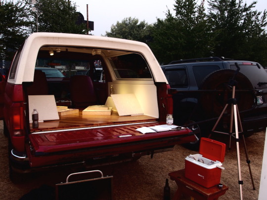
SH: I love the fact that the Bronco has hardwood floors and white walls. The phenomenon of the wood floors and white walls is the total embodiment of the standard contemporary gallery. The Bronco is not what it seems upon first glance...
BG: Thanks! We had conversations about leaving the Bronco as-is, it could be interesting to not take out the back seat and artists had to deal with it. But when we seriously started undertaking the Bronco Gallery, we wanted to be committed and got amped up about making a tiny formal gallery space in the back of an SUV.
We wanted to be taken seriously, we strive for humor but at our core we are a gallery: signifiers such as an oak hardwood floor, flat white walls, and track lighting, change the character of the Bronco. Beyond an attempt to avoid the question “what are you selling”—which we still get most of the time—it shows our investment in the project. Also, as sculptors, we found building the gallery to be fun!
Just like a contemporary walled gallery patches up nail holes to give their artists a clean slate we want to give our artists a documentable exhibition space and give our viewers a professional presentation.

---
The Bronco Gallery will be tailgating at this month’s First Thursday (September 3rd) and will be showing Artists Gabe Flores and Gary Wiseman near PNCA and the Museum of Contemporary Craft. They also have special programming for the TBA Festival Tailgating The Works. Artists include: Jea Alford, Taj Bourgeois Kelly McGovern, Chloe Alexandra, Ryan Woodring, Sarah Keeling + Anna Nelson. For more on Emily Wobb, Maggie Heath, and the Bronco, visit www.broncogallery.com.
All images courtesy of Bronco Gallery.
2 notes
·
View notes
Text
Everything We Ever Wanted @ Nationale
Sam Hopple
Portland is so hot right now. No really, from the 90 degree weather in the forecast lately it is clear that summer is officially here in PDX. If you find yourself waiting in line for an hour to get your hands on an ice cream cone from the Division Street Salt and Straw, consider this: Right across the street is an air-conditioned gallery and shop called Nationale, where a vibrant mix of paintings from Katie Batten, Jonathan Casella, and Sarah Mikenis have come together in the group exhibition Everything We Ever Wanted. These talented young artists bring us technically advanced compositions interwoven with bold color, shape and abstraction that energize the space, making it a perfect show to kick-off the summer exhibition season.
Ever since John Berger’s Ways of Seeing was pounded into my brain during my first week of art school, I’ve been fascinated by how others view artwork. The content of Berger’s text is an exact reflection of its title, explaining in detail how our perception of art is affected by the external factors we hold as an individual. Because I am a curious observer and not a mind reader, I like to take friends who aren’t “art people” to museum shows and then bombard them with questions like, “Are you really not going to read the wall text?” and, “How do you feel about this plank?” Usually, these questions are met with some seriously impressive eye rolling, but occasionally an interesting conversation will have manifested itself, which I love.
For me, the galleries are different and I always find myself a much more introverted person when I visit them. Upon entering Nationale’s exhibition space my usual tendencies to want to chat are hushed, and the only thing I find myself confronted with is the work itself. Everything We Ever Wanted is a surprisingly contemplative show and I quietly absorb each piece, gathering my own context clues based on what the artist has given me. Jonathan Casella’s paintings are like visual mazes and my eyes can’t seem to stop moving when I look at them. In a previous show at Open Gallery, Casella’s work was more sculptural and the different shaped canvases made his paintings seem object-like. This time, using the panel as boundary, the work plays with defining the shape of a paint stroke or blob, through collage-like abstracted fragments.
Jonathan Casella, What’s After the Great Escape? Loneliness and Something Else…, 2015
Casella also shares my interest in how the viewer sees his work and takes this into consideration as he paints. More specifically, he is “interested in the influence color and form plays in the viewer’s interpersonal association with memory and identification.” This statement is what got me thinking about John Berger in the first place, reminding me that the genius of abstract work is how everyone has a unique experience with it. We all have preconceived notions about what certain things mean and we hold on to these interpretations when relating to shape and color. Part of the fun of this exhibition is deciphering the iconography that presents itself in the work.
Sarah Mikenis’ work is reminiscent of German artist Charline von Heyl, who also uses classic patterns as background to her abstract forms. A rich pile of texture and pastels, Mikenis’ Everything We Always Wanted, is the most formal work in the show, with a wall of its own in the center of the main gallery. It is the most calming for me, perhaps because of it’s mostly neutral color palate, and makes me think of my grandmother’s boudoir that was filled with broaches, patterned scarves and frivolity.

Sarah Mikenis, Everything We Always Wanted, 2014
This work, and the less controlled Shifting Back, blend well with Katie Batten’s still-life paintings that are skewed just enough to make you linger. Familiar objects like a cup of coffee, a mason jar, an iPhone, and an issue of Artforum magazine are strategically placed throughout Batten’s pieces. The perspective is visually intriguing, and her use of literal representation interjects a nice break between the purely abstracted forms in Casella and Mikenis’ work.

Katie Batten, You Also Have a Pizza, 2014
With titles in the show like Galentine’s Day,You Also Have a Pizza, Confetti Party, and Jewish Girl From Florida. Her Nose. what’s not to love? Everything We Ever Wanted has been extended through July 6th, so there is no excuse not to go see it. The show is brilliantly curated, showcasing the way the works complement and converse with one another. Forget about the ice cream for now, art makes you smart.
Nationale is located at 3360 SE Division and is open from 12- 6p. The gallery is closed on Tuesdays. For more visit www.nationale.us.
All Images courtesy of Nationale.
3 notes
·
View notes
Text
Monolith. Regardless of the Millers @ Yale Union
Josephine Zarkovich
Willem Oorebeek, Local Heroes BLACKOUT, 2006
Willem Oorebeek's exhibition Monolith. Regardless of the Millers feels a little bit like walking into the middle of a conversation. His current retrospective at Yale Union continues his practice of showing and reconfiguring the same images that have populated his installations for decades, ordering and reordering, adding and subtracting along the way. While this might not sound like a recipe for fresh or timely work, an innovative use of architecture makes Oorebeek’s first solo exhibition in the US a particularly interesting place to pick up the artist’s narrative.
YU does not have a reputation for accessibility. Gallery hours have been limited, little interaction has been made with local artists, and the website is aggressively opaque. In fairness, the organization is working to address some of these challenges, while it seems determined to wear others as a badge of honor. What YU does have, however, is a stunningly beautiful barn of an exhibition space.
Flooded with natural light, it is perfect for large-scale sculptures, but presents multiple challenges to showing two-dimensional work like Oorebeek’s. To address these difficulties, YU and Oorebeek collaborated with Kris Kimpe, an architect from Antwerp, to transform the gallery into a labyrinth of corridors constructed of raw wood and intermittently hung drywall. This strategy places the works in a linear trajectory, revealing itself to viewers in a series of sections, but never as a whole. It’s an ambitious endeavor and reminds me why I will always love exhibitions more than I will ever love any individual artwork.
In one of the maze’s many corridors are groupings of black ink prints on black backgrounds. Called BLACKOUTS, the images are so subtle they are virtually impossible to capture on camera and can only be viewed from a few inches from the surface. Around a different corner are large scale printings of patterns that have a wallpaper effect in their installation. It’s in creating breathing room for these disparate bodies of work that Kimpe’s architectural vision really shines. It creates connections and divisions that reward repeated viewings.
The most interesting of these connections is between two groupings near the beginning of the exhibition. Starting at the entrance, the viewer is presented with a series of wall-mounted semi-reflective surfaces installed over textured rubber floor tiles. These works mirror the full body of the viewer, only distorted and pixelated. The experience is a visual reference to a series of works encountered in another corridor: life sized black and white figures enlarged from commercial printing, the dots of the images amplified by their size.
Willem Oorebeek, Vertical Club installation via
These isolated figures are part of an ongoing series that Oorebeek calls Vertical Club. At first, they are laid out on their own and then later the images are overlapped with text from his recent book project Vertical Klub. These works, which again have been shown by Oorebeek in almost the same format for decades, take on a very different meaning in the digital age. What once would have been seen as banal and everyday, now seems unavoidably nostalgic in the wake of print media’s increasing obsolescence. This nostalgic preciousness is amplified by the fact that Oorebeek only prints a limited edition of each figure. Members of the Vertical Club are pasted directly on to the wall and are destroyed during the de-installation process, creating a self-imposed scarcity for each figure.
On one level Monolith. Regardless of the Millers can be viewed as an exploration of print techniques. It speaks to the manipulation of visual language through copy and repetition, and how everyday images can be unmoored from their original contexts and presented for new consideration. Oorebeek uses a rich collection of sources including advertisements, images of Chinese communist heroes, magazines, A reference to La Femme 100 Têtes (100 Women Without Heads) by Max Ernst, Sigmund Freud’s couch, and Roy Lichtenstein to name a few.
Willem Oorebeek, More CLUB, 2010
There are also a lot of images of women. And just as pictures of women in the media are highly loaded, so too are they in Monolith. Regardless of the Millers. It is interesting to note that this show opened just as Hank Willis Thomas’ Unbranded: A Century of White Women, 1915-2015 closed at Jack Shainman Gallery in New York. Thomas also uses found images, submitting them to what he calls an “unbranding technique," removing the copy and leaving behind only the visual signifiers and his own veiled titles.
What Unbranded: A Century of White Women points to directly (the often problematic presentation of women’s bodies in media) hangs more ambiguously in Oorebeek’s installation. No amount of repetition can scrub away the blatant offers of pleasure and consumption presented in these images, and it’s not clear if Oorebeek’s work is capable of addressing those issues in any meaningful way.

Hank Willis Thomas, Haters gon' hate, 1960/2015. Courtesy the artist and Jack Shainman Gallery, New York
But it’s hard to tell. The male gaze is still the default position in our culture and so it makes sense that it also exists as the expected perspective in many forms of visual communication. Yet this perspective can often be an uncomfortable fit with viewers like myself. One of the requirements of the Vertical Club subjects is that the figure is looking into the camera, gazing back at the viewer. At the beginning of this exhibition I got to see myself as a member of this club in the reflective entrance pieces. I saw myself straight on, looking into my own eyes, not coyly turned or styled, but self possessed. It’s an image that doesn’t exist for the rest of the women shown in Oorebeek’s exhibition, which reveals a lot about the the artist’s curatorial choices.

Willem Oorebeek, Image from YU exhibition. Top text translation: “Hardly a member and we already see the difference.”
Despite this, it’s hard to deny the formalistic pleasures, attention to detail, and ambitious scope of Monolith. Regardless of the Millers. The old-school, semiotic critique of mass imagery is turned into a love story. One in which a printer, with ink stained hands, will continue to print black on black on black, until the images are unrecognizable and the equipment becomes impossible to repair. Even then, an Oorebeek exhibition will still be like walking into the middle of a conversation.
The show is open May 30–July 19
Thursday–Sunday, 2–5pm for more info visit yaleunion.org
1 note
·
View note
Text
August Muth at HAP
Sam Hopple

Polymorph #5, 2015
Holograms archivally laminated in glass, optical depth 14 in.
24 x 19 in. (image via HAP Gallery)
LIGHT-MIND, a collection of holographic works from Santa Fe based artist August Muth is currently showing at Hap Gallery. With over 30 years of experience under his belt, Muth has been trailblazing the field of holography, exploring its boundaries through innovative methods and experimentation. The result of his dedication is a body of visually mesmerizing work that engages viewers in a conversation of the existence of time though light and color. There is no photograph, or video for that matter, that does Muth’s work any justice. LIGHT-MIND is an exhibition that must be seen in person.
In a studio interview by Angela Landini from 2014, Muth discussed his use of homemade emulsion, and how by combining this with different colored lasers he is able to achieve colors and effects that other holograms do not. As the viewer, it is a treat to be able to see Muth’s, “volume’s of light-space”. At first glance, the work appears to be digital, and this in essence, is the phenomenon of the hologram itself.
Bright compositions of florescent greens, blues, oranges, and pinks line Hap’s walls. Shape, overlay, and texture are incorporated into several works while others take a more minimalist approach. Images with black backgrounds bring simple layers of bold circles and squares to the forefront. Other works on view incorporate a color change that is more difficult to decipher, and these subtle nuances invite the viewer to become intimate with the work. The physical act of coming in closer, and changing one’s angle alters perspective and ultimately the outcome of how the work comes across. Optical depth is also something Muth experiments with, where pieces in the show vary between three inches to over twelve.
Although there is a lot of content to process in this show, it is successful in bringing technically advanced, visually interesting, and well-constructed work to Portland. August Muth is also a very personable artist, as evidenced by his charismatic and infectious energy that transformed Hap’s environment at the opening earlier this month. Using a flashlight to demonstrate the way light could alter his creations, Muth had gallery go-ers “ooh-ing”, and “ahh-ing” as if Hap were a cabinet of curiosities instead of an art gallery. If you missed him at the opening, you will get another chance to hear him discuss his work on May 30th, when Hap will be hosting an Artist Talk with Muth for the closing of the show, beginning at 2pm. More information on Muth’s process and his studio The Light Foundry here: http://www.augustmuth.com/about/. Read more about Light-Mind and Hap at www.Hapgallery.com
1 note
·
View note
Text
Ben Buswell @ Upfor
Josephine Zarkovich
I Do Not Belong to the Sky (Horizon), 2015
embellished Lambda photographs, dimensions variable via
In the exhibition No One Above or Below, Ben Buswell uses photographic materials to create wall mounted sculptures, pushing the structure to the point of breaking. I Do Not Belong to the Sky (Horizon), horseshoes around one corner of the gallery, the photo paper twisted and lacerated like the metal of an automobile crash. Horizon No. 7 is literally shredded, the strips of the photo paper hanging like fringe down the center of the frame. In a series of water landscapes Buswell has reworked the surface of the images, creating an undulating texture, but even under this pretty effect there is a hint of violence, the instrument used has pulled up the actual print in places, leaving behind tiny white voids in the image.
Horizon No. 7, 2014
embellished Lambda prints and frame, 32 x 31 x 4 inches (frame 21 x 31 x 2 inches) via
Buswell was one of the artists represented by Upfor Gallery at the Paris Photo Los Angeles this month. But if this work is photography, it's photography deconstructed, the seams wrenched open and exposed. It brings to mind Susan Sontag, who once grumpily cautioned:
"Despite the presumption of veracity that gives all photographs authority, interest, seductiveness, the work that photographers do is no generic exception to the usually shady commerce between art and truth."
In the case of Buswell’s works, that authority of the photographic lens is disrupted. The artist's hand is ever present, the manipulation so tactile it cannot be ignored. As an audience member, I am reminded again and again of the physical “thingness” of them, of both their fragility and endurance under stress. While still unmistakably using the materials of photography, they do less to capture a moment in time and instead record the passage of time on the print itself.

The Same River (Celilo) (polyptych, detail), 2015
embellished Lambda prints and frames, each 18 x 12 x 4 inches via
The closing reception for No One Above or Below is tonight, Thursday May 7 at Upfor gallery and the Artist will being giving a talk on Saturday May 9th at 11AM. http://www.upforgallery.com/buswell-no-one-above-or-below
For more information about Ben Buswell you can visit his website here: http://www.benbuswell.com
2 notes
·
View notes
Text
Heidi Schwegler at The Art Gym
vimeo
Wrest 01, a highlight from Heidi Schwegler’s retrospective Botched Execution: Selected Works by Heidi Schwegler 2004-2015. Head to the Art Gym at Marylhurst before it closes May 15th. Great review of the show from Oregon Artswatch: http://www.orartswatch.org/no-seriously/.
Heidi Schwegler on Vimeo.
0 notes
Text
Vibrations Book Release & Installation
Sam Hopple
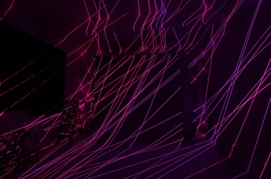
Image courtesy of the artist
Carl & Sloan Contemporary is proving itself a gem in the Portland art community by putting on some great programming between its exhibitions. The first of many interim events, C&S hosted a temporary one-night exhibition on Saturday celebrating the launch of Damien Gilley's photographic book Vibrations. The launch was accompanied by a site-specific installation that exposed viewers to Gilley's artistic process first hand.
The thirty-three photographs, on display and included in Vibrations, were taken in different artist studios, thirty in Portland, and three in Eugene. These photos shatter the environment of the everyday into absolute cyberspace with an overlay of static neon laser lights. The objects in the studios are transformed into an ambiguous mass, from which light bounces in different directions. The result is a distorting of visual chaos, and this transformation creates unique and exciting compositions of line and color.
The installation was an interactive experience where viewers had the opportunity to manipulate space in a similar fashion to the photographs of Vibrations. Specially equipped with red-tinted "laser enhancement glasses", viewers walked behind a curtain into what is best described as a futuristic space cave. The audience participated in reconstructing their environment by placing a collection of handheld lasers at different points in the space. Textured walls allowed for the lines to become warped and jagged, while the lines on the floor and ceiling remained clean. This juxtaposition created the immediate illusion of depth, altering one's perception into a digital playground of neon light, where reality is questioned.
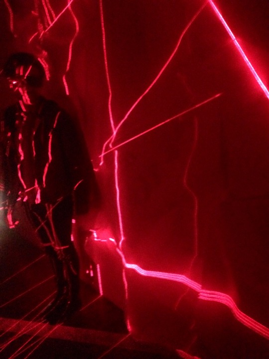
Image courtesy of Sam Hopple
Artists are challenged by the environment a gallery provides, and there are certain limitations they face in dealing with scale and form. With Gilley's installation, he was confronted with a small space to work in, and this challenge of confinement can either be exciting or daunting. By working with light, the space appeared less constricted, and he was able to break the rules of confinement by creating an illusion of expansion. Kudos to Gilley and C&S for pulling this off. Transporting people into a galactic sci-fi dream, Gilley continues pushing boundaries in defining what constitutes a drawing. Surely there are many more artist studios around Portland where he can put on his laser shows.
Carl & Sloan's events provide a unique opportunity for the Portland community to engage in the arts in different ways, and the cocktails aren't bad either. Their upcoming exhibition is a solo show with paintings from Tiffany Calvert that runs May 8–31, 2015. Get involved and stay in the loop with C&S at www.carlsloan.com and find out more about Damien Gilley here www.damiengilley.com.
Vibrations is available for purchase at https://squareup.com/market/damien-gilley.
Limited copies are also available at Carl & Sloan, open 12-5 Sat-Sun.
1 note
·
View note
Text
Thirty Times a Minute @ large in PDX
Josephine Zarkovich


Images courtesy of the artist (top) SW 3rd Ave & SW Oak ST (bottom 2) Reed College
I met artist Colleen Plumb a few evenings back in downtown Portland. I was watching the elephants from her film Thirty Times a Minute sway across the grey stone walls of the Armory Building. A moment after we began to talk, the generator running the projector stopped and she had to scramble back up the ladder and onto roof of Little Big Burger to nudge it back to life. Such are the perils of the guerrilla projectionist.
Elephants pepper so many childhood memories in the form of first trips to the zoo, playground equipment, and toys. They feature in films and as political mascots. In western culture, is there another image that better represents the exotic and the familiar at once, as the casual consumption of this massive creature from half a world away?
Plumb takes an unflinching and often heartbreaking look at our elephant obsession. Thirty Times a Minute explores elephants in captivity. Since 2009, the artist has traveled to fifty of the seventy-five zoos in the United States that keep elephants, making video of them exhibiting what biologists refer to as stereotypic behavior, also called “weaving.” Only captive elephants exhibit weaving, which includes rhythmic rocking, swaying, swinging the trunk, head bobbing, stepping back and forth, or pacing. She theorizes that this behavior might be caused in part by boredom, noting that in the wild elephants can travel up to 50 miles a day and live in large social groups.
The thing I found most interesting about the film was that, despite how truly miserable most of these elephants appeared, the people being captured as spectators continued to fall under the spell of seeing a life-sized elephant in person. Their faces transformed, eyes widening in wonder, lips curving in half smiles as they stopped to look. Recently, Plumb has begun to screen this work outside of a typical gallery setting, projecting on several buildings around her hometown of Chicago as well as during her visits to Portland.
What then is the relationship between those spectators at the zoo and the unsuspecting pedestrians that encounter the film being projected on a massive scale in an urban landscape? Is the wonder the same or different?
vimeo
video taken by Josephine Zarkovich
You can see Thirty Times a Minute and a selection of Plumb’s photography at Blue Sky Gallery through Sunday May 3rd http://www.blueskygallery.org/exhibition/colleen-plumb/#1
Find out more about Colleen Plumb on the artist’s website http://www.colleenplumb.com/
0 notes
Text
Clear Mind: You Can Move With the Truth @ The Lumber Room Mar 13- May 2
Sam Hopple

Top image: (left) Lynne Woods Turner, Twenty-One Untitled Drawings, 2013 (Right) Dorothea Rockburne, Indication of Installation, Hartford, 1973 Bottom image: Tacita Dean, Still Life, 2009 via
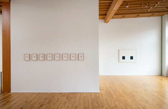
The Lumber Room is giving Portlanders an exciting opportunity this weekend to see the work of internationally recognized artists outside of a museum context. In its closing weekend, With a Clear Mind: You Can Move With the Truth is a group exhibition showcasing six well-known contemporary artists from the Miller Meigs Collection. Pieces by Tacita Dean, Sol LeWitt, Agnes Martin, Chadwick Rantanen, Dorthea Rockburne, and Lynne Woods Turner strive to represent the simplistic through line, shape and space. Located next to Elizabeth Leach in the Pearl District, the size and versatility of the Lumber Room makes it a perfect venue to host this carefully curated exhibition.
Upon entering the gallery, visitors are greeted by Tacita Dean's Still Life, a 16mm video projection from 2009. It is interesting to see Dean's work in such small scale, as my previous exposure to her work was FILM, a massive video installation piece that overtook the Turbine Hall at the Tate Modern in London in 2011-2012. Still Life pays homage to late painter Giorgio Morandi, who used pencil markings to outline his compositions before creating them. Dean produced Still Life after photographing Morandi's sketches at his studio in Bologna, Italy and rendered them into a continuous loop in black and white. The result is a captivating little piece that is strangely soothing. The visible projector produces a sound reminiscent of those heard on a sleep machine. As a viewer I was mesmerized by the subtle movement and change of the markings, and couldn't help but linger a little longer than I should have. Dean's piece serves as an intriguing gateway to the rest of the show.
Upstairs in the main gallery space are pieces from Lynne Woods Turner, Dorthea Rockburne, Agnes Martin, and Chadwick Rantanen. Though barely visible, my eyes were first drawn to LA based Rantanen's mixed media piece Loop (Sweet Bambi). This piece responds well to the space by utilizing the gallery's beams as its installation point. This decision created a defined outline in the middle of the room and served as a catalyst to break up the space.
Along the walls are Lynne Woods Turner's Twenty-one untitled drawings. Using pencil and colored paper, the drawings explore line, texture, and the tranquility of geometric shape in a small 3x3 inch scale. In the series, the thickness and contrast of line changes slightly, and the shapes continually morph themselves into something else. These works take up two of the Lumber Room's walls, while 30 framed screenprints by Agnes Martin are stacked in two rows on a wall of their own. On a Clear Day was created in 1973 and is a collection of grids in their simplest form. The boxes vary in number and size and took me back to the school days when we had to draw grids in math and science classes. The subtle changes in Martin's and Turner's series have a similar meditative quality to them as Dean's video projection. It is easy for the viewer to digest this visual information, which I believe is part of this exhibitions purpose.
A highlight in the upstairs space are two works from Dorothea Rockburne, Indication of Installation: Hartford, and Indication of Installation, Circle. The drawings are the only pieces in the show where color has a larger presence. Opaque dark blue shapes interact with those that are transparent, resulting in strong minimalist compositions.
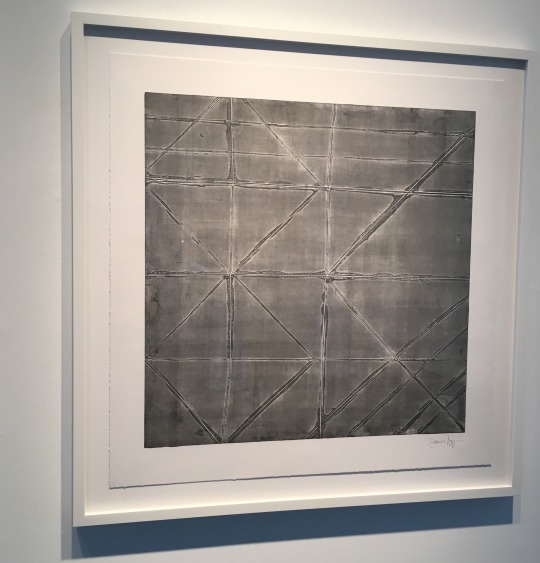
Taking over the back gallery, Sol LeWitt's Wall Drawing #109, originally from 1971, has been redone by Nobuto Suga, Lynne Woods Turner, Storm Tharp and Lumber Room founder Sarah Miller Meigs. This site-specific drawing uses 10,000 seemingly random lines to alter the perception of one's environment. By following instructions from the artist, meticulous markings are carefully and precisely constructed, over lapping each other diagonally. The labor intensive nature of this piece carries the themes of meditation and repetition seen throughout the show, relating back to the exhibition's title and tying it up nicely.
With the caliber of the artists involved and the impressive exhibition space, With a Clear Mind: You Can Move With the Truth is a must see. Instead of saying you saw an Agnes Martin in New York, or a Sol LeWitt in LA, head down to the Pearl and see them right here in Portland before it's too late.
More info about the Lumber Room and its programming at www.lumberroom.com.
0 notes