
Last Seen Blogs

angelika2701
kawaii(♥ω♥*)

40yocuckboy
Untitled
ccorinthian
I just wanna feel something real
filthyfundie
Sultry Sonnets For Mature Christians
ama979302
.A.H.M.O.S.
Text
Final Reflection
This class was a lot of fun. I truly feel like I learned a lot and was able to further grasp the importance of typography as it applies to design in so many different ways. My favorite project was probably the zine. I think that it helped me hone in more skills in further developing my balance of illustration and typography. It is fascinating to me how such little things like rag and right alignment can help with legibility. How white space can completely change the maturity and refinement of a piece. Honestly, reflecting on this semester and the growth that I have had is very exciting, and I can’t wait to carry on in learning!
0 notes
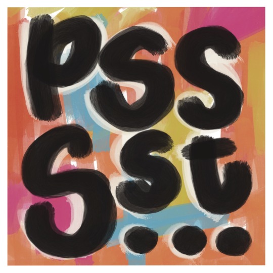
Photo


3.9.21 Reading Response:
The idea of type in motion is actually one of the first things that attracted me to design. When I was first studying in undergrad, one of my concentrations was in film, and with that came an in-depth study of a lot of movies from the 1930s until now. Early on in the history of film, title cards played an important role in setting the scene in a way that made the actors and directors not go unnoticed but also an attempt to stay true to the setting of the movie. Saul Bass, a renowned designer, was a pioneer in this realm, and his work has played an important part in my learning different standards in design.
Reflection:
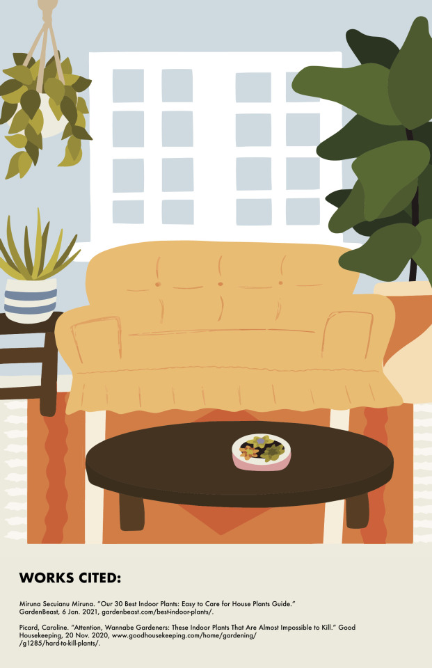
I thoroughly enjoyed making this zine. While making sure that my craftsmanship was up to par was difficult, I have always dreamed of working for a publication company or a magazine and this just let me peer into what that world is like. I discovered that I almost neurotically have the excellence reflex, adjusting rag and alignment down to the smallest decimal point over and over until I was happy with the end result. I do think there is a lot of nuance to learn to creating an overall engaging zine so that people not only pick it up, but read it until they finish it.
0 notes
Photo

March 12, 2021
Kelly Walters Talk:
I really enjoy the vulnerability in which Kelly represents her designs and brings them into the world. I feel like design is such an amazing access point to bring hard conversations to light. I think that it is so important to realize that they way people internalize beauty can also be a way for people to help process the ugly and hard in the world. It is so wonderful how helpful things like infographics, we can teach with, or how creation can show raw emotions in a palatable and tactile way that a lot of times can’t be expressed with words.
Reflection on Zine:
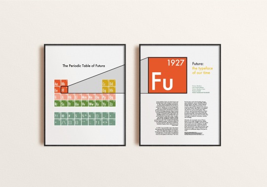
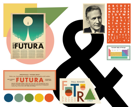
“Design is thinking made visual,” is my favorite quote from Saul Bass and one that sums up exactly what it is about design that makes me want to pursue it. I love that design can be that bridge between narrative and understanding in that information is more readily stored in your head when it is done in a visual way. It is why graphic design is so important. Why branding matters. Why infographics are so popular, especially now that they have a readily available sharable platform through social media. I have really been pushed to create better and more through this zine project in trying to simplify what I am communicating in a way that can be suppressed into images.
Reading:
And jumping off of the shareability of design via social media, you also have to acknowledge the struggle that is technological diversity of platforms and the way in which they affect typography. It is funny how many little things there are that you do not think of until you run into them in your career. I would have never realized just how tricky pixilation could be until pursuing this career in design. And now I face the rasterization of words and images almost daily. I think that the human brain is so amazing in that they can take this issue and create fixes for it like hinting or antialiasing.
0 notes
Text
February 19
Reading Response:
It is crazy how useful syntax is when doing any kind of design. How the general public typically reads different pieces of literature is based on syntax so it makes sense that anything their eyes would essentially be reading would need to have its own syntax too. I definitely feel like I needed to utilize the use of syntax and rag and columns in the typography poster and I am glad that I was able to put it into work! I think that it can completely change the outlook of a poster if you do it wrong so I will make sure not to!
0 notes
Photo
2.5.21
Reading Response:
I feel like inference is such an important part of design to try to tackle early. And by that I mean that you have to take your own inference out of your design work and try and look at it from an objective eye. The photo I am featuring this blog post is an example of what I mean. It was a poster I did for 245 and it needs help in being legible, and in order for me to better assess it, I have decided to take some time away from it so that I can come back with an objective eye. Because when you KNOW what you are designing, it is hard so separate your own inference from the design itself in order to have the experience of a first time viewer. And any design that you have to stare at for longer than five seconds to understand is, in my opinion, not in its final form. There is always a way around it, and the designer was just too lazy to find it. I plan to fix that with this design whenever I can separate my own inference from it in order for it to be more legible.
Weekly Reflection:
While sketching out our potential posters today, I realized just how heavily I rely on illustration in my design. That is not a bad thing, or even something I am not proud of. But I am excited to work on being able to strengthen my design skills in the realm of typography and using characters and letterforms to further their potential usage for me. It is going to definitely be a stretch of the imagination and I hope that it will grow my skills exponentially as I work my way through this class.
0 notes
Photo
Reading Response 1/29/21:
I think that it is just generally astounding how far design has come from the inception of written language as a whole. That we have moved past the banal basis of just needing to simply communicate and instead have moved onto this realm of conveying meaning through more than just words. That the organization and placement of characters can have its own form of body language is just mind blowing to me. Typography is like giving vernacular a fashion of its own. It puts tone and style atop language and it is really beautiful to me just how far we have come in ways to further push the envelope and develop more unique ways to present it.
Week Response:
While practicing all of the kerning exercises, I just kept coming back to the fact that I was astounded the time and effort that it had to have taken designers to create these new fonts as well as just posters or advertising or what not on its own before computers became super mainstream. Hand lettering is of course an art of its own, but the precision that was required (and still is in some aspects) is just mind blowing. My body gets super anxious when doing such tedious tasks so I have great respect for all of the designers who have taken and will take the time to meticulously plot out the structure of fonts to come.
0 notes
Photo
1.21.21 Reading and Lecture Response
I very much enjoyed James Victore’s talk in that so often we get distracted by how much money we want to make and jeopardize what truly makes us happy and gives us joy by doing so. As someone who gave up a career to go back to school, because I was miserable, it was really reassuring to hear those words and realize that it is possible for me to achieve livelihood while also enjoying what I put into the world. I love his quote, “the things that make you weird as a kid, make you great today,” because I was a truly weird kid. I mean weren’t we all? As my family likes to tell me, I have always marched to the beat of my own drum, and I am so excited to see where exactly that drum is going to lead me!
Because of his words, I decided to take a break tonight from doing something perfect (i.e. the kerning exercise) and just play and make something that felt GOOD. So that is what this image is: a design by me for me. I know there is a lot of perfectionism and technique that goes into being a designer, and I respect and appreciate the place it has in this career, but it was nice to just scribble and draw and be reckless after doing something with painstaking detail.
1 note
·
View note
Photo
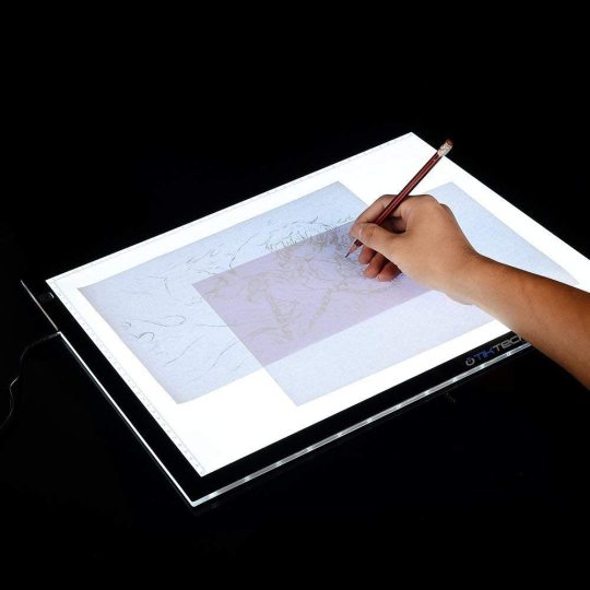
1.15.21: This is a photo of the light table that I purchased for the class in order to more accurately and technically approach the project. I think that it is quite wonderful and amazing all of the advancements that have been made in design but that there is still something so physical and relational to the page you are working with that still keeps it a tactile art. I feel like the manipulation of kerning for example is so deeply rooted in the principles and elements of design by negotiating the linguistic effects of negative/positive space, symmetry, and how contrast can drastically change the perception of the viewer.
0 notes
Text
Reading Response 1.15.21
This week’s reading was very focal on one of my favorite quotes by designer, Saul Bass. “Design is thinking made visual.” I feel like this very much incorporates typography in a way that more factually should be termed “speaking made visual.” Typography takes communicating linguistically and gives it a sense of body language, if you will. Through typography you can communicate much more than what the page says verbatim; you give the text its own personality or tone. It is granting a hard surface an accent or flair of its own to be discovered. Just like slang has changed throughout the years, typography has too and with it has come a whole new understanding of the print language.
0 notes
Text


I am using these images of inspiration. I am going to draw sharp utensils/objects out of line on the front and have a pulled tooth with blood and pliers on the back
0 notes
Text
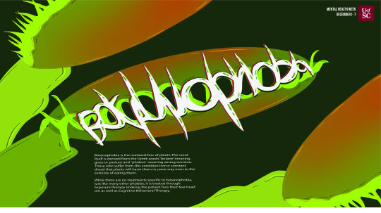
This week’s project was a mind bender of sorts for me. It was one of those tasks where you know exactly how you want it to look in your head but whenever you try to put it on paper it does not capture the je ne sais quois you were going for. Ultimately, I am happy with the results that I came to with my design, but I do think it might lack a bit of readability. Ultimately, I think it is a fun concept to take an idea and think about the effect it may have on the world (in this case how phobias affect individuals) and then to try and manifest that into an intriguing design. Fascinating. As the course continues, I find myself continually drawn back to Saul Bass’s quote, “Design is thinking made visual.” Time and time again this rings true and truer for me.
0 notes

Text
Reading Response 11.20.20
User Experience design is so fascinating to me. The designers who work in this field almost have to have studied psychology in order to be the best they can be. It is both a terrifying and fascinating field of work. On one hand there is the business side of things, the drive that keeps the designer focused on achieving goals, be it money, time, experience, etc. To be good at this job means that you have to treat people as more than just consumers, but also as products. So on the other hand there is a sort of moral obligation where you have to acknowledge the creation of an addictive substance. It is almost the new form of tobacco marketing. There should be a disclaimer on apps, stating “harmful if consumed in large doses.” I think that this field is incredible in its acknowledgement of societal norms and the implementation they have on holding a user’s attention, but at the same time, at some point we have to realize how harmful making it *too* good can be on an individual. On the flip side to all of the nihilistic aspects, I think it is beautiful to see the merriment of engineering and design into one ideal form. Making things work better under a guise of aesthetics is all the world can really hope for.
0 notes
Text
Reflection 11.12.20
This semester I have done artistic explorations into mental illness as well as phobias and I think that it is so fascinating to see the way in which humans take the sad or disorderly or confusing or scary and try and transform it into something beautiful and reassuring. In my print class, I am doing an alphabetical series of prints on the shape that mental disorder takes. So i think that this project of turning a phobia into a typographical image is a very fun arch of that collection of prints I am making.
0 notes
Text
Reading Response 11.12.20
I love branding. I think it was probably the first element of graphic design that I fell in love with. In particular, I love branding that takes the norm and twists it; the kind that ends up with concoctions like Greetabl (the sweet little foldable gift box made out of polaroid type photos and filled with treats that you can send to your friends). I think that branding is like a first impression. It can either be great, so-so, or really, really bad. Branding is the personality of a product. If executed well, your customer will fall in love with the culture that the branding promotes as well as the product. You get the initial oomph that draws customers in so that you product can keep them coming back. I know that personally when in doubt, if I do not know which product to choose, I typically go with the one whose branding speaks to me the most. Wine, deodorant, salad dressing, you name it and I’ve probably narrowed down my selection based on the branding choices. My favorite coffee shops and breweries are the ones whose product is not only delicious but the branding is done in such a way that I want to share it with everyone.
0 notes
Text
Reflection 11.5.20
I think this magazine spread project has just taught me the importance of working steadily along on a design project. I think that starting it early makes all the difference because after staring at something for hours on end it is good to be able to take a beat or a couple of days and step away so that you can come back with fresh eyes. It is so easy to get lost in the minutia that you lose innovation and then when you come back refreshed your imagination can be sparked yet again. Also, giving your hand some time to recover from procreate is also a good thing.
0 notes