
acepickuplines
Pick up lines- Puns and play on words Galore!
Just your friendly nieghboor hood ace/aro trying to help all you kids with the flirting! Will these work? I sure as hell don't know! But I hope you enjoy them anyway!
192 posts
Don't wanna be here? Send us removal request.
Last Seen Blogs

maritzascleaningca-blog
Maritza's Cleaning is a Local Cleaning Company in Hayward, CA

iclaimedmymom
I laid claim to my mother

healthydoser
Veteran & Texan

garciajey
garciajey817

mokukulanit
Moku =]

Text
CALL YOUR BOY LIBRARY BOOKS THE WAY IM CHECKING HIM OUT
74K notes
·
View notes

Text
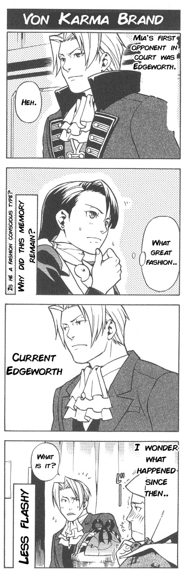
Gyakuten Saiban 3 4Koma Kingdom- “Von Karma Brand” translation
767 notes
·
View notes
Text
Hey babe, are you a book? Because I kinda wanna break your spine
9K notes
·
View notes
Note
Your art is extremely inspiring. Do you by chance have any tips for creating reflective highlights and their placement? It’s something I’ve been trying to figure out for so long and it’s just not computing in my brain. 🫠
First of all, thank you!
Ahh I'm not as descriptive with words, so let me give you a quick rundown.
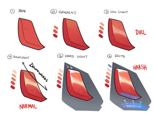
Once you have your base and all is good to go, you create the gradient in the direction of where your light source is (up -> down in the image). The direction will always depend on angle or 'curve' of the metal/material you're trying to work with.
Up top, I did a downwards reflection since my shape is more diagonal, rather than uniform and straight. There are times you'll have a round shape, in where this time you'll go ahead and create the highlight at the apex of it.
Next, you have to decide what KIND of highlight you'll be using. I usually work with multiple lighting layers, but for this example I'll only show 3.
The DULL lighting is just regular low lights that show the texture as reflective, but is most likely AWAY from a light source and/or is reflecting off something that doesn't have much shine.
The NORMAL is your regular highlights that is usually just a lighter shade than your base. Since most if the time it just follows your low light(think of it as the intensity of the reflective light source), you can just place it on top of the DULL lighting.
The HARSH lights are only portion that are directly in front of the light source OR are the most intense parts of it. Think of it as extreme sunlight etc, and it goes apart from your regular highlights.
Lastly, you can add more color to you material by taking in other reflective surfaces, specially those with different color. I added the blue as an example and just color the panel that directly faces it.
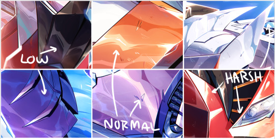
I added a few example of lighting from my works so you can kinda see what I'm talking about. They might not seem as different at first, but the placement really makes a difference once you start finishing your rendering.
I'm not great at explaining sorry, but I'll try to do another stream and walk people step by step? Would that be ok?
Hope this helps a little!
3K notes
·
View notes
Text
CALL YOUR BOY LIBRARY BOOKS THE WAY IM CHECKING HIM OUT
74K notes
·
View notes
Note
Are you a shiny pokemon? Because you are a sight to see
are you a shiny pokemon? i cant tell because either your coloration is 1 singular value darker than usual or its just the lighting
779 notes
·
View notes
Text
STOP. moment of gratitude for those precious times of breathing from your nostrils when you don't have a stuffy nose
125K notes
·
View notes
Text


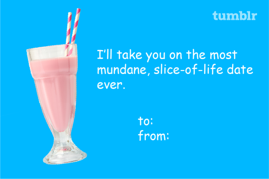
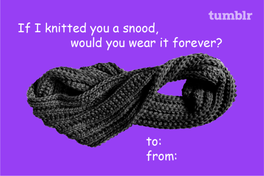

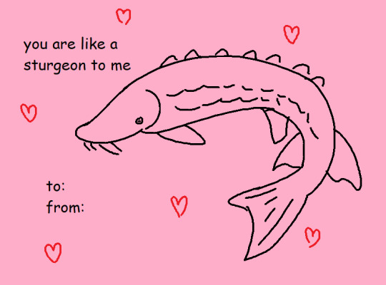
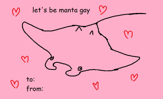
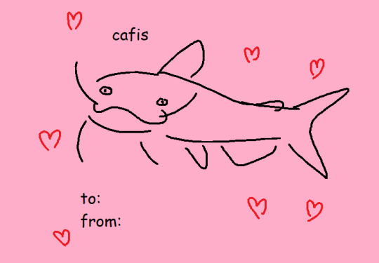
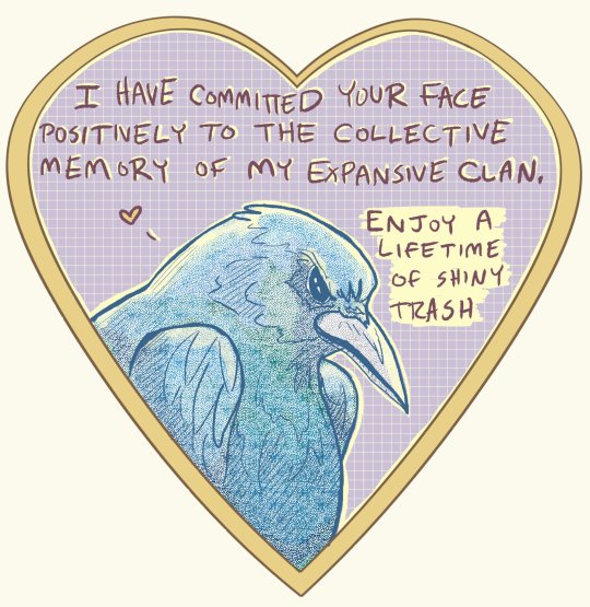
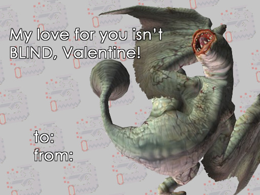
Another trip around the sun and we're back at the sweetest, mushiest day of the year. In true @fandom fashion, we made you some more Valentine's Day cards to share the things you love with the ones you love. Got a special someone who's fixating on something extra-specific this month? We've got individual versions right here for your reblogging pleasure. Happy Valentine's Day!
Love, the Fandom team.
7K notes
·
View notes
Text


big fan of blackquill being canonically strong enough to just pick people up (and shake them violently). keep it up
3K notes
·
View notes
Text
If you were a transformer you'd be Optimusfine!
If you were a transformer you'd be bumblebee because i want you to Bee mine!
1 note
·
View note


Photo

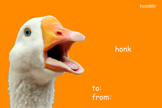
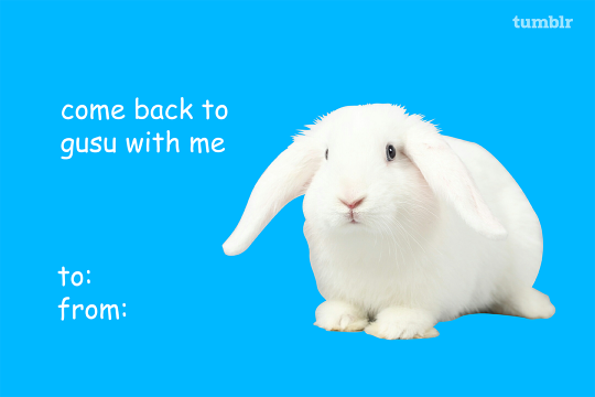
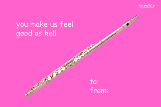
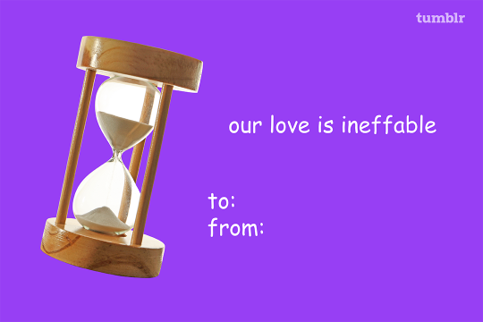

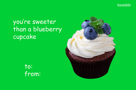
Happy Valentine’s Day from the @fandom team! We made you these Valentine’s Day cards featuring some of your favorite fandoms so you can share the things you love with the ones you love.
22K notes
·
View notes


Text
if you n i were bears we could hibernate together. think about it
104K notes
·
View notes
Text
Are you salt? Cause i Crave that mineral.
1 note
·
View note