Last Seen Blogs


Text
Dracula
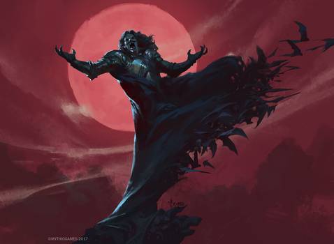
I am extremely excited for this project for creative freedom with the layout and artwork that i get to choose. I have always seen Dracula as a literature piece that is well respected, but I never see the scary side to it when i am looking at covers.I want to evoke the same emotions that Nosferatu did to the viewers when they first saw it without loosing the beautiful storyline by Bram.
I have attached images that i am currently playing with and manipulating to use as cover art. These are not definite but it is part of my creative process and it will most likely change down the line

0 notes
Text
Week 14
Chapter 17 covered User Experience Specialists, In an interview with Bruce Charonnant, He talked about the advantages that designers will have in their field if they have coding experience which is something that has never even crossed my mind but I would defently like to dive into that field a bit. He stated “ I would not say that programming skills are required as much as they are extremely advantageous to the user experience designer. Some people who gravitate to user experience design have more of a combination left -brain/ right-brain fluency “ I found this statement very interesting to bit comparing the artistic side of the brain with the technical side of the brain. Most designers have a little bit in both departments!
As for the project i am very excited to work on a book jacket. I have previously designed lots of slipcovers for blu-rays and i really enjoy doing so, i plan to take inspiration from works like this!

0 notes
Text
Week 13
This weeks chapter focuses on packaging design, my absolute favorite corner of the design world. I have been obsessed with Blu-Ray,vinyl,CD,cassette, and any other form of media layouts for so long so this chapter was right up my alley. Getting someone's attention from just the packaging of the item is so important.The article talks about iconic works that are eye catching, for instance.. the skull and crossbones that are so well known and used by pirates all throughout popular culture.
Project.
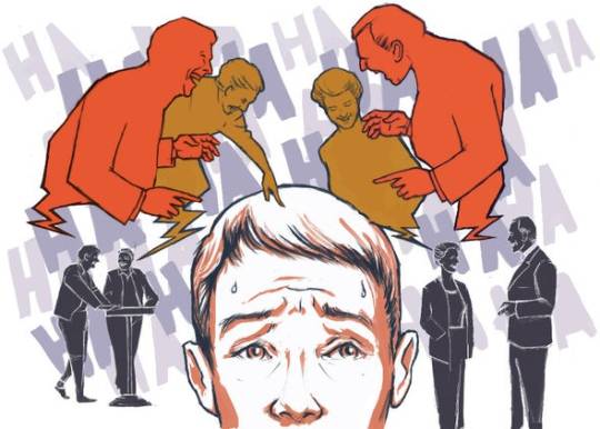
For this project i chose Gelotophobia- Fear of being laughed at. This project is going to feel very close to home with this phobia so im really going to try and relay the feeling of social anxiety through it
0 notes
Text
Week 12
Chapter 4
This chapter covers typography which is what I think i struggled with the most on this project. I have no prior experience to typography and it somewhat took me by storm. I honestly thought that not having rags was appealing but i have since learned that it is quite the opposite. In this chapter I fancied Roberto Cumptich. I read me before you a long time ago so it was very cool to see a familiar image in the works. I like how their work is not just limited to one field, not just book covers but labeling and advertisement and more.
Project
I did so many revisions on this project and was very annoyed by indesign at times. I constantly moved text and images and backgrounds that i didnt want to move trying to move other things. It felt clunky to me and i did so many revisions that i think i have “tom savini FINAL FR THIS TIME” saved as one of my files names. I feel as though the spreads came out nice but they definitely came a long ways from what they originally were.


here’s some work before it all got blasted
0 notes
Text
Week 11
Chapter 8
This chapter covers the topics of innovation
In this chapter we learn about an individual named Randall, he created WorldStudios, a nonprofit branding (and more) company. i enjoy Randall so much because of his politcal awareness, he loves artists that rely on politcally and socially charged works to make an impact in their community
0 notes
Text
Week 10
Chapter 5
--------------
This chapter went over logos and trademarks, something that most people just glance at and never take in how much work and thought goes into. This chapter was extremely short and took me off-guard. In the interview with Zach Fox, i particularly liked how he stated “ Innate talent is only a benefi t when there is a continual application of that talent” I feel as though this is very inspiring to aspiring artists and designers. I also enjoyed the phrase “pictorial stenography.” used to describe trademarks.
InDesign work
-------------------
This is my first time using Indesign and if i could ask Adobe one thing, It would be, why could you have not made all of your software more similar? I found InDesign and Illustrator to be so confusing because of how use i am to photoshop. The way images strech and how text is layed out. How you have to double click on an image if you want to resize it and not crop it. It is a lot to all take in and its hard to create something you are proud of when the software does not always make sense. I am learning and so far I am happy with my work

0 notes
Text
Week 9
Chapter 11
---------------
In chapter 11 we read about understanding change in the world of design. As a designer, its easy for your works to blend in with others. Often, it can be hard to stand out. Therefore, a designer must accept change and be diverse in their work to be the individual that stands out in a room full of adobe wizards. I particularly liked the section within the interview with Erik Adigard des Gautries where he said design can “reframe the information that matters most.” This is a very interesting statement. If pulled out of context or read into more we can interpret a lot of scenarios. For instance, a living arts work. We go to the exhibit and capture it through the medium of photography but then use design skills to simply highlight a smaller a smaller part of this work, or possibly destroy the whole thing and distort it enough to create something new.
Mood Boards
-----------------
It was honestly quite hard to decide on a color scheme for my layout, I wanted to do old black and white photos with a splash of red to give it that vintage hammer horror feel. But after digging and digging through photos of Savini i found that my favorite photos are grainy film photos. These have such a charm with their muted yellows/browns and deep reds. I will continue to dig deeper but i think i have found all of my favorites that are of a high enough resolution to use.

0 notes
Text
Week 8
tChapter 8
This chapter covered physical print, specifically books and their jackets. The chapter begins by explain off the different types of books, there are textbooks, trade, and professional. I found it very surprising that the larger trade companies can release up to 150 different releases every season. It makes sense because of their size but to think about layouts, design work, cover art, write ups, marketing, and much more for 150 titles in advance has to be such a stress. I found it very interesting that Kosofsky said that you cannot make a living off of designing books alone. you would think that with the large companies that produce so many titles having an on team exclusive group of designers would be ideal.
Project 3
I began my project by typing out my paper for Tom Savini. Tom is an absolute horror icon and if you love horror, you probably love Tom. He truly crafted gore in American horror films. I know there were plenty of others doing similar things. but not can compare to the likes of Tom in my opinion. i am exacted to get to put these words to use and create a magazine layout in his honor.
0 notes
Text
Chapter 3
This chapter covered Stuart Rogers and Sam Eckersley. These individuals were classmates that moved on to opening a studio together, They have great trust in each other but sadly their design work if very similar which often comes off unprofessional and seems as if there is just one designer on hand. They added that they would benefit with some business backgrounds in their circle.
Project 2
To finish my project i decided to completely restart. I took a new approach and defiantly learned how to use illustrator a lot better. I learned that the pen tool is my best friend and was almost driven mad with the idea of having no fill or paint bucket tool. I took an image of chwast and outlined it all in an attempt to create of a portrait of him in his simple sketch style, which i think sorta worked! i then chopped it full of information and laid out a polka dot background. fine tuned a few things and she was born!
0 notes
Text
Week 6
Reading
-----------
In chapter 2 we read about Studio Spaces or being in someone else studio. Which I'm sure is a topic all students want to relate to. we all want our place, but things aren't that easy where we can have that from the jump. I particularly liked Lynda Decker's mindset on the situation, She stated, “ Lynda, stop complaining about your job. I’m tired of hearing this. Start you own business. I did it, you can do it...” This is a very interesting take because im sure that most designers are not loaded and able to just say yeah im gonna open my own studio/workplace. not only are funds a problem, but you need a name, and not for your studio. Your name needs to be known in the design work if you expect your studio to stay open and amount to anything.
Progress
------------
Oh, illustrator, you cause me so much pain. I have been avidly using photoshop since i was around 15 and always put off Illustrator because 9 times out of 10 i can accomplish what i want on there. So its completly new software for me essentially. I hate that you can not erase parts of an image that you drag in and the whole placement interface confuses me quite a bit. creating a mask of an image on illustrator was very easy though and i would go back to that before i would do it on photoshop.
0 notes
Text
September 18 Check In
For project two i chose to study Seymour Chwast, out of all of the artists that were present on the list he was the only one that struck me in a different way. his work is so playful and childlike yet so effective and has such charm. In research i have discovered that his work was postmodern before the term was even coined, making him one of the forefront artists for the movement.
In chapter 15 we read about designers and their interactions with web designers. I found this chapter extremely interesting due to the documentation manager, Krupas. Krupas job is to is to make things work. Whether that mean change mediums or layouts. I find this process very interesting because Krupas gets to put his touch on the work of other artists so its like he is always do collaborative work which i find very fun. I think the biggest take away from all the individuals i this chapter is to just think ahead in your work.
0 notes
Text
September 11 Check In
In chapter 7 we cover editorial design, which is mediums along the lines of magazines or newspapers. This one threw me for a loop because for some silly reason i guess i just never thought about there being a dedicated newspaper designer, but when i started thinking about it and how chaotic newspapers tend to be i can only hope they are mentally stable after each weeks work. I found it very inspiring to see Len P.’s enthusiasm toward physical media and works doing nothing but increasing in the years to come due to people being tired of staring at phones and computer screens all day. This is something i constantly worry about with my profession because while i am a digital artist that relies on technology i strive to work for a company that produces my items i create to some form of physical media that sells.
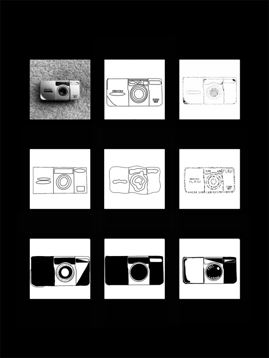
As for my project work. I redid my stippling because i created that one digitally which i was somehow oblivious to the fact that we could have no digital formats create these images. After i finished that and drew a bunch of tiny dots i moved on to simplifying over and over again which i’ll admit, got kind of hard. I didn't want to turn the camera just back into a line work drawing so i chose to just black out several spots and occasionally stipple a little bit. I then simplified that to no stippling and even less black out work to then create a final product that takes elements from all of the previous drawings


0 notes
Text
Work Progress Update and Readings Week 3
Project 1
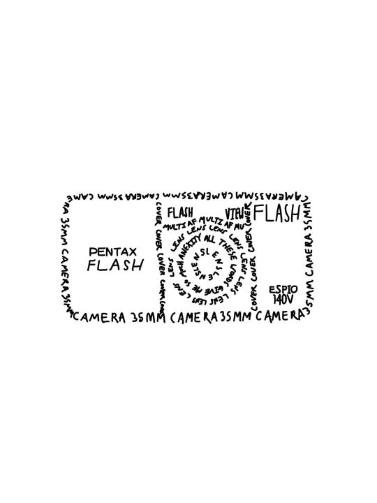
This week i switched from photoshop to procreate to work on my images. I found that procreate is definitely an easier tool to work with when having to do small line work and other strange variations on images. i really enjoy taking these strange twists on a singular image, i particularly fancied the one in which we had to make our item out of just text/words.This method also stressed me out a lot however, i am not entirely sure why, but as i zoomed out and saw a bunch of piled up words and letters it left me feeling uneasy... I cant be the only one, right?
Chapter 10
While reading chapter 10, i was most taken away by the works of European artist, Mirko Ilic. In particular, the work titled “ Not Much Has Changed in a System That Failed “.This work really gives illustration design a very interesting twist that I was not expecting to see. Ilic is one of the most well known poster designers in France and I definitely see why this happened. The diversity in his work is outstanding, from photo-like work, to pop art-esc work, to full on multi media transparent works, Iliac is truly an interesting artist.
Skillshare
I loved this course! This is the first time that I have ever used skillshare and I understand what all the craze is about. Aaron Draplin is a wonderful teacher and I love his laid back and playful style of teaching. I also appreciate the niche categories of things that he covered and that he poked fun at “making logos for bands that are going to break up in six months”, which i have done far too many times!
Alison Lecture
Learning about Alison Henry Avers was very interesting. When i began watching the lecture I was thinking that she was a designer of the clothes for Kate Spade but i was very pleased to see her magazine/online work. Her layouts are very minimalistic and clean and i really admire that style.
As for Vogues website design, this is exactly what I like to see in a website. The same simple design as i mentioned earlier but with an even more minimalistic view than the saturday works. She manages to pull off informational and clean layouts without them ever feeling busy or tacky
0 notes


Text
Blog Post #1
Reading Assignment
While reading the first chapter of our book, I found myself so interested in the works and statements of Stefan Sagmeister. Stefan opened his studio with a card showing his nude body. Stefan then states that his only client loved it and hung it with the statement “the only risk is to avoid risk” , which really took me by surprise.
I really fancy the diversity in Sagmeister’s work. I was initially thrown off by “SVA Poster” mostly because tentacles make me uncomfortable but as i scrolled down I was blown away by the neon sign works. I think diversity as an artist truly makes or breaks someones career.
( I also love how short he can be in some of his statements, as if he thought a question was somewhat silly, like when he just responds “good ideas and well executed” when asking for what traits he looks for in an intern.
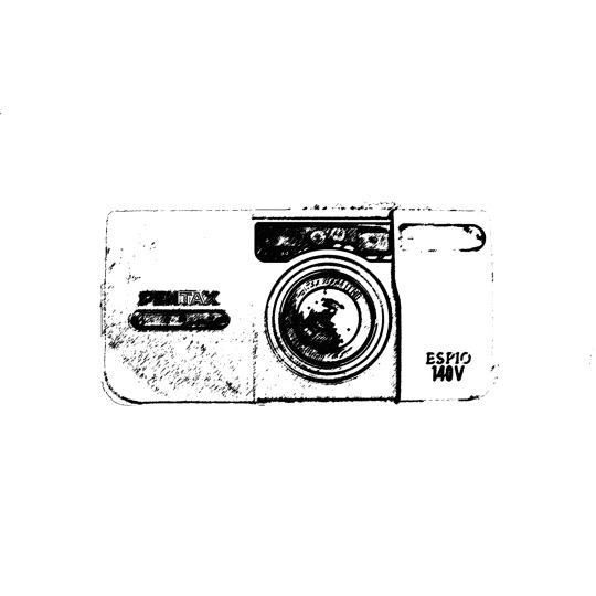
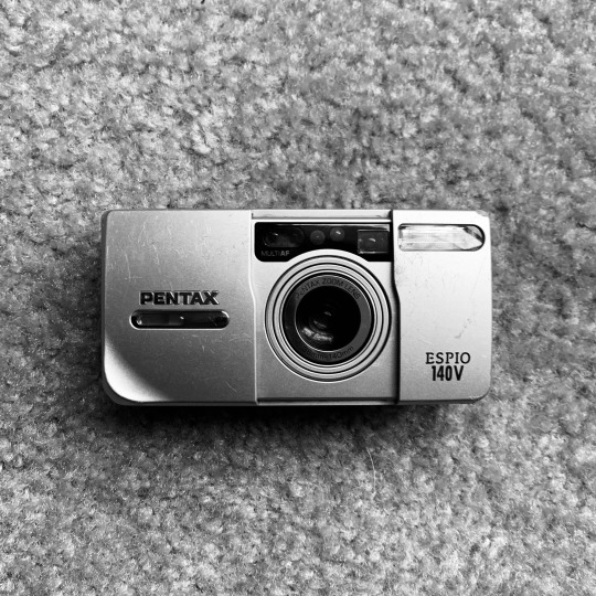
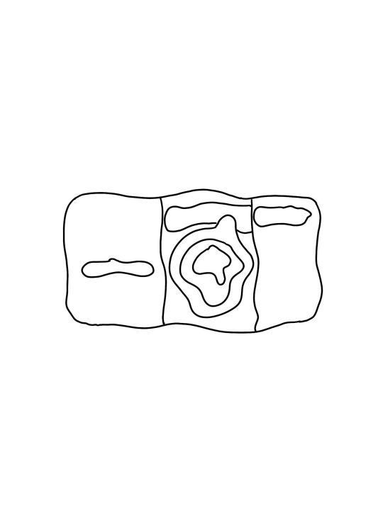
Project Response
For my object I chose my partners camera. She always has it on her and I find the idea to be focusing on and creating images of an object that’s soul purpose is to create images is kind of funny. I gray-scaled the photo in Photoshop and began toying with it. I thresholded it and played with levels and contrast to give it a strong outline but I am not pleased with that aspect so I am sure i will be re doing that part. As for the stippling process, it was very tedious process. I created a series of my own pattern presets by having 10 white 12x12 layers and applying the grain smart filter on each. the first one received a small amount of grain and the last was at 100%. i then saved each as a pattern preset and loaded my picture in to Photoshop. i created a black and white and posterize layer of my image and then placed a blank layer on top and used the magic wand to select the lightest color and then apply the lightest grain to that. from there i just increased the grain with the darker shades which gave it a very realistic and fun stippled effect. dot by dot it was done!
0 notes