Last Seen Blogs
jackisreallycool
Left intentionally blank

archoniluthradanar
ArchonIluthraDanar
staticnonapus
Here We Go Again
spicyfagatha
Spicy!
flurar-inuyi
Rules Are For Losers
Text
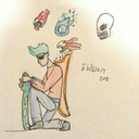
Final exhibition development - AS2
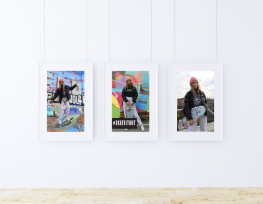
Final exhibition development - AS2
Here I have a final display of what I am hoping my exhibition will look like, along side other props such as the original skateboard, stickers and other objects.
I am hoping to create a display that suits my theme but also reminds the viewers of the brands I am collaborating. I have chosen a simple photo frame to display my work as I didn't want to make it too complicated with the photograph already being very busy in terms of colour.
I am pleases with how it looks over all, however I would like to consider maybe looking into printing onto white cardboard to display my work.
I will also be providing people with pre printed documents, which explain the purpose of my project so that people are able to understand my display with context.
0 notes
Text
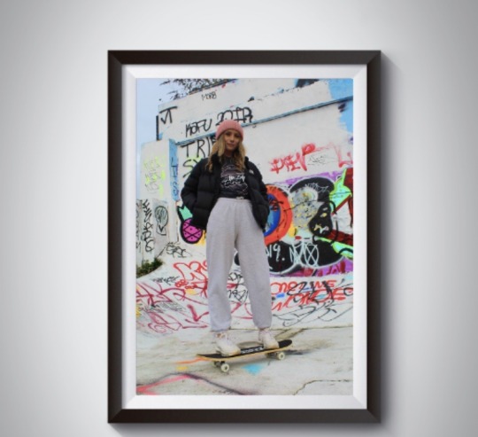
Exhibition development- AS1


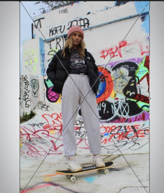

Exhibition development- AS1
Creating my exhibition has given me an insight to what I would like to do for my final showcase of work. Developing my ideas through a few mockups has given me more options to how I would like my work to look.
I managed to do this by downloading a PSD template and changing and adjusting my own photographs into the template. I used the crop tool to adjust the photographs and I also used the layers to adjust how the photo would sit.
After I found a template suitable for me this was easy to adjust on photoshopI have designed the exhibition so that my posters are hanging from the walls in glass photo-frames alongside props such as the original skate board used and stussy stickers
0 notes
Text
Promotional Lanyard development - AS1

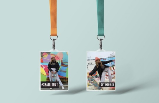
Promotional Lanyard development - AS1
When designing these lanyard I wanted something instantly recognisable to the consumer eye and something that would promote our event whilst wearing them too.
I decided to use the main posters as part of the lanyard because these could then still convey the main message of encouragement and power. They help me continue this theme through out my project whilst promoting the event itself.
I decided on lanyard becoming useful to the event when thinking of ideas to separate the competitors to the guests. This was to see who is illegible to food and freebies provided.
0 notes
Text
Informative Poster development - AS1
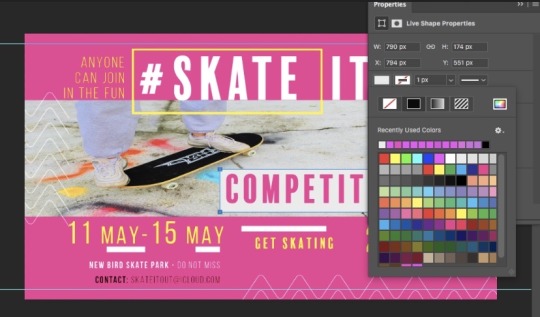
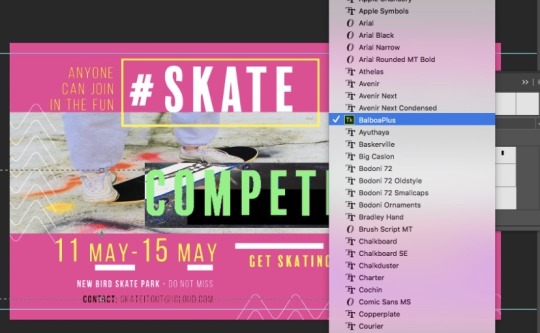
Informative Poster development - AS1
Here I am experimenting with colours and photo positioning, I have created poster designs using illustrator and then I have used photoshopped to edit my fonts and colours to suit my theme. The font ‘balboaplus’ has been used again through this informative poster to maintain the theme.
I have changed the colour of the fonts using the colour drop and colour swatches option on photoshop to suit the pink background, these colours work together to compliment each other aswell as the fonts.
I have placed my main photograph over the poster and have adjusted it to the right shape using a crop tool, I have chosen a photograph that is not as busy as my posters because I wanted the informative writing to be the main focus.
0 notes
Text
Photograph editing - AS1
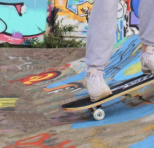
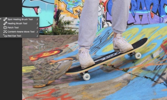
Photograph editing - AS1
Here I am showing development of editing my work, I hate used the spot healing tool on photoshop to edit out the foot that was holding the skateboard up. This helped to enhanace a professional look and movement in the photograph.
I am please with the outcome because I have used a blending tool to remove the foot and crate a clear space. This has helped me to achieve a look for my work that portrays professionalism.
0 notes
Text
Logo development - AS1


Logo development - AS1
After deciding on which font to use, above I am showing development of how I made my logo work
I have used the same font twice and I have filled one font in a block colour of white and then filled the other font with an outer layer of pink to create a simple design. This has helped me create a bold header for the poster that stands out over the grafitti.
0 notes
Text
Back up design development- AS1


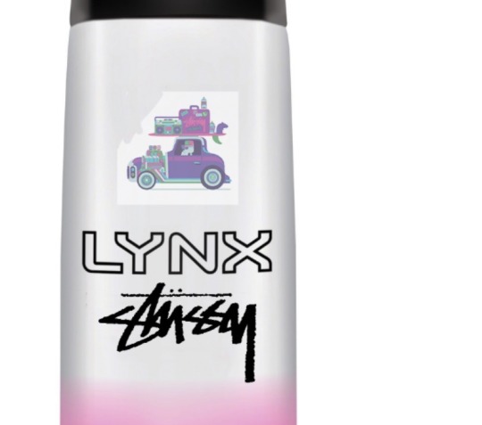

Back up design development- AS1
Whilst producing a back up design for an emergency, I have been able to gain skills when considering whether a product would be more suitable for this project. As my back up idea involves designing product I have gained more of an insight into how products are developed and the theory behind it.
I started off by finding a mock up of a lynx spray can, where I smudged off using a photoshop tool any unwanted designs.
I then placed a design from stuffy over to the can and adjusted it based on sizing. This then was able to fit into the bottle perfectly. After adjusting, I could smudge around the design to make it look more natural when incorporating it into the bottle design.
To finalise my design off I changed the opacity of the stussy design so that it wasn’t showing us too harsh against the bottle and looked realistic.
0 notes
Text
Photography editing - AS1

Photography editing - AS1
Here I have demonstrated a simple yet important technique when editing photographs. Brightness and contrast being one of the most simple tool, yet it makes the biggest differences. I have deleted the places I want to make darker and more contrasted because on the original photo they weren’t focused enough. I have selected facial areas and the stussy logo, these are both important features for my work.
The outcome improved the overall look and the stussy top became more clear to the viewers eye..
0 notes
Text
Instagram campaign development - AS1


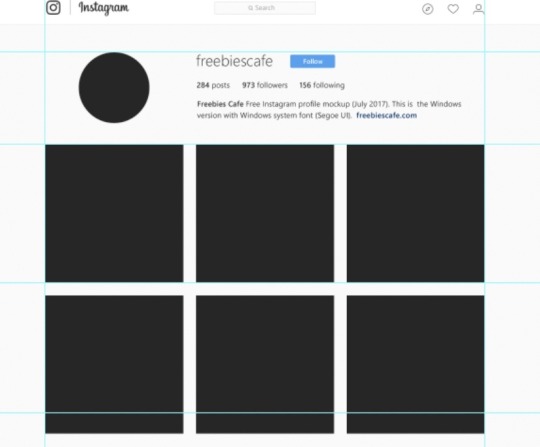

Instagram development - AS1
Through the journey of creating my Instagram page I have learnt many new techniques when using a mock up.I wanted to make my instagram campaign stand out like no other, this included image enhancing and specialising my written posts to the audience.
I have placed and adjusted images to fit the blocks and crop a few of my images to fit into the shape of the design (circular, rectangular). I have made my Instagram page look realistic by adjusting features and photographs to fit.
I have adjusted my tone of voice to suit the consumer, I have done this by bringing vocabulary together that will suit my purpose of the event and audience. I started off my listing these words and then researching into the meaning and gaining more on an understanding on these to include in my written posts. I wanted to make the audience feel involved by using vocabulary such as ‘us’ and ‘we’
0 notes
Text
Photo shoot evidence AS1 -


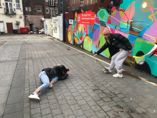
Photo shoot evidence AS1 -
Here I am providing evidence of my photo shoot happening, sometimes I think it is important to see how you shoot and the posturing you see yourself in. I was pleases with the outcomes of this shoot.
0 notes
Photo

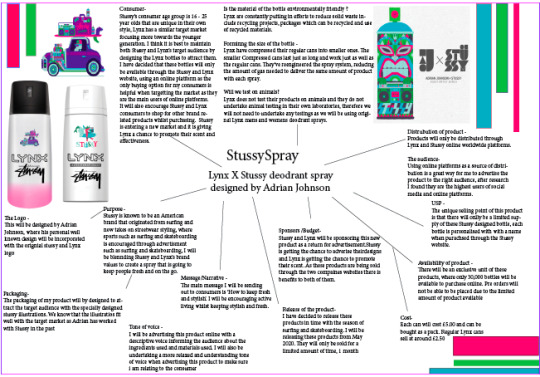
Back-up idea development AS2-
It is important to make sure during the process of creating my main idea for the project that I also have a back up plan to fall on. This will save me a lot of stress, and time in the long run knowing I have a plan to fall back on.
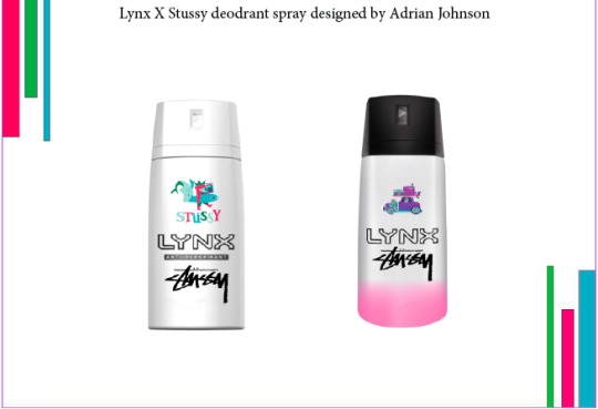
My first backup plan is a collaboration between Lynx and Stussy, where Lynx spray cans will be specially designed by a past Stussy illustrator Adrian Johnson, adding a touch of Stussy’s image to the bottle suited to the Stussy consumer. I will be blending Stussy and Lynx’s brand values to create a spray that is going to keep people fresh and on the go. There will be a limited amount of these designed cans, which will be sold online through the Stussy website.
I have explained and displayed on the mood board above the platforms of media I will be using, the target audience, distribution USP, purpose of the product etc.
Stussy’s consumer age group is 16 - 25 year olds that are unique in their own style, Lynx has a similar target market focusing more towards the younger generation. I think it is best to maintain both Stussy and Lynx’s target audience by designing the Lynx bottles to attract them. I will also be selling the product online through the stussy website because this is the best platform of media that will attract the right consumer, as the current younger generation is more familiar with online platforms.
I have created these final outcomes by the photoshop app where I have blended Stussy designs onto Lynx spray cans, they have turned out overall very well and I am pleased with the aestetic it brings. I have tried to use trendy designs to attract my age group.
0 notes
Photo
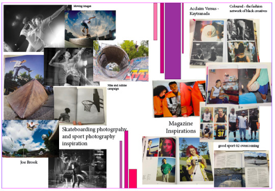


Event inspiration development board - AS1
Here I have included mood boards of inspirations I have taken up on when researching and possible ideas to move forward with. I have gathered inspirations from multiple sources, including physical books, recent campaigns and photography.
I first drew inspiration by looking through a few sporting books in class, I picked up a few that specialised in skating and many more all of these books focused on a few aspects of sporting such as the social side, the negatives, the hardworking, the training etc. I found this fascinating to read upon and it gave me an insight into what I wanted to focus my idea on; empowerment.
I also got to look into photography and recent sporting campaigns, I drew inspiration from sporting photography by looking at different lenses and movement with camera. I was also intrigued to look into recent sport campaigns and how they worded their campaigns. Many used similar words all falling under the category of power and encouragement.
I have also drawn inspiration from certain style’s, after researching into the type of clothing worn and taking inspiration from study model’s I have styled my own outfit suitable for this shoot.
0 notes
Photo
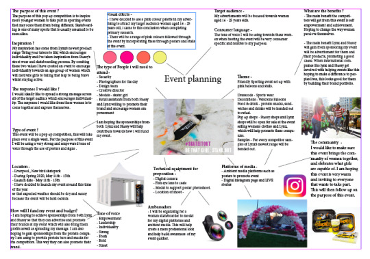


Event planning mood boards AS1-
Here I have planned thoroughly the inclusions of what my event will consist of, I have started out with how the event will look and how I will decorate it. I have included colour scheme options, where shades of pink is the main colour approached, I am carrying through the idea of using pink to make the event feminime. Decorations have been thought of such as balloons, protein food, pop up stalls and music speakers. All of which will create the event very welcoming to the public, it will also create a very fun vibe that people can buzz off. By providing food and drink for the competitors this will help set a fun mood.
I have also planned a mind map of the general thought behind this event, including how I am going to source the model, the date time and location, the target audience and platforms of media etc. This was my starting point of my journey where I pinned out the most important parts and started to branch them off,
I have included a moodpboard of possible model outfit options and skateboard options, where I have researched into what type of clothing skater girls wear, usually baggy clothes that slouch and beanie hats. I decided to use ‘Stussy’ tops to remind the public of the brands I am collaborating and a pink beanie hat to carry through the femininity.
0 notes
Photo

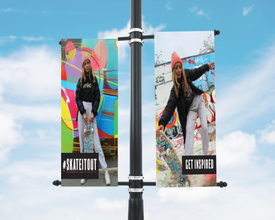
Final Promotional development - AS2
Here I have created a few promotional mock-ups of how I am planning on promoting my event to the public alongside my online platforms and posters.
I have decided to promote my event by using billboard around the city centre where I am able to come directly into contact with the target consumer. I have decided to place these in the city centre because that is the busiest part of town where I am most likely to pick up on students. I will also be personally handing out flyers and information leaflets about the event to the public, this is the best way to physically come into contact with my audience and talking to them.
Whilst doing physical site seeing, when visiting the skate park I noticed a few post’s that could be used to my advantage when welcoming the guests, I have decided to hang capes of posters from the post’s and the surroundings of the skatepark. This will create a welcoming yet proffesional feel to the event, which is what I am looking to do. I am hoping to create a fun environment for these women but also provide a professional feel so that competitors are inspired.
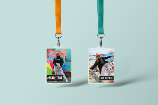
I have also planned a mock-up of the lanyards that will be a freebie handed out to the competitors, this will separate them from the guests and this will help them feel part of a community and something special. These lanyards will also be a help when promoting online making it easy to be seen by viewers of instagram, which will mean the audience will become more aware of what is taking place over that week.
0 notes
Photo

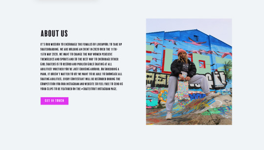

Website development - AS 2 -
As much as Instagram is the main social media platform I will be using to promote #skateitout, I also wanted to create a website that was easily accessible for the public to apply and join in on notifications. I have designed and created a very simple layout that is approachable to females.
On the first page I have used the same photograph that was used in the informative poster, something that isn’t harsh on the eyes and is superior to look at. I have carried through the same font and colour palette throughout the website to maintain the same message, I have coloured the main button features in pink to make it simple to use. On the first page I have featured an online application form for anyone that wishes to apply, this has been made simple with a fill out form you can submit digitally. After doing my research it came to mind that using an online application form would be better than a written application form, as the web is used more and is more accessible to the younger generation of women who are actively using their mobiles and computers. This is a promotion and marketing technique I have thought through when considering my target audience.
On the second page I have carried out a simple layout and included some personal information about the event and what is to come. This includes the reader and gives a sense of unity, brining the gang together.
By keeping the simplicity running through the website I have created another page where applicants are able to view where the event got it’s inspiration from and what it is trying to achieve. The purpose of demonstrating a story through similar groups of people trying to make a difference for women.
0 notes
Photo

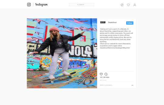
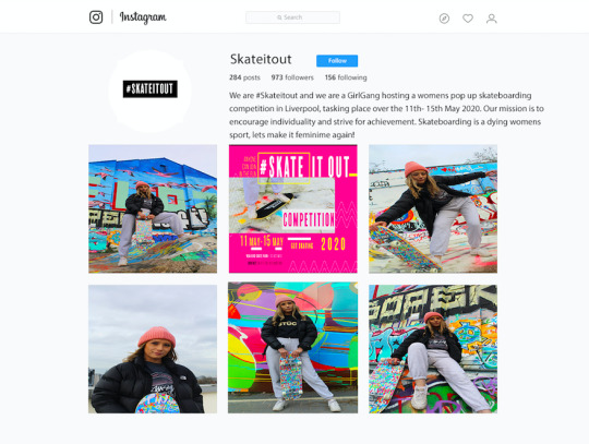
Instagram campaign AS2 -
I have decided to use Instagram as the main social media platform for my event to promote #skateitout. Instagram is one of the best social medias used to exchange and share visuals through photography, and it is designed for showcasing imagery. A facebook event page could also be set up and used as an approach to promote the event, however the instagram platform is used more by the younger generation and is therefore more suitable as Stussy is a big user of Instagram and has a high number of followers, meaning more people can reached the content and information. Instagram also allows for stories to be uploaded, which means I am able to upload inspiring videos of skaters for the public to be inspired by. Instagram stories also allow other people to upload photo’s, tag the location and go live at the event, which means the event is being promoted for free by us and the public where followers can see what is going on at the event itself as well as who is there.
I have decided to incorporate a tone of voice into the instagram feed and profile which follows up on the theme of empowerment. I have used the following vocabulary in the events profile; ‘strive’, ‘achievement, ‘individuality’, ‘encourage’ and ‘we’. All of these portray power and strength however ‘we’ portrays a sense of unity and community, which is exactly how I want the audience to feel. I want to make skating a more approachable sport by creating a sense of community within the skating completion.
I have chosen a few of the best photographs from my shoot to show in my instagram, the one that particularly grabs the viewers eye is photograph that is captured when skating, which bring the event more to life .
0 notes
Photo
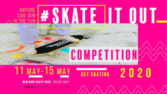
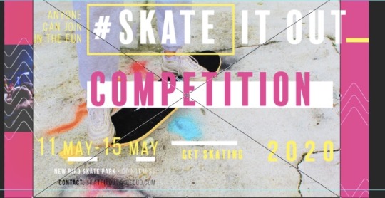
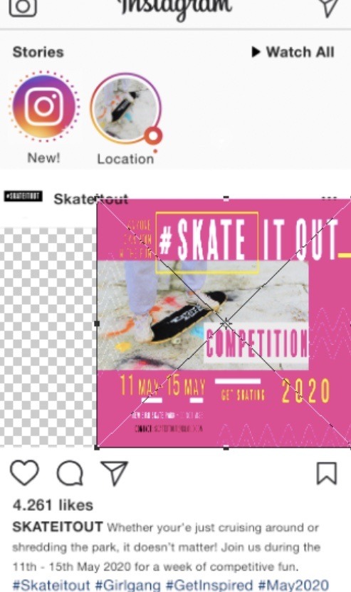
Final informative poster design - AS1
This poster was designed to pass on information to the target audience about the event, including; date, location and the general feel for what is to come from the event. These posters were originally planned to be handed out around student areas as well as the busy town centre, it was also planned to be pinposted as a banner to promote when this event will be happening.
The illustrator app has allowed me to use a bright shade of pink as the main background colour which is bursting with energy. The pink colour shade has shown through really well against the other white and yellow designs. I decided to continue with using the ‘Balboaplus’ font so that the same messaged is portrayed through my event, I brought the pink shade into the font and blended them into each other.
I have chosen a simple photograph for this poster as I was already incorporating a lot of words and information onto the poster, I didn't want to cram too much on to the page by making it too full. I decided on choosing a still photograph of the skateboard used in the shoot. This shot is simple yet demonstrates exactly what this event is, this will then help the consumer image what the event consists of.
I used white illustrations to give the poster a design which makes the event more approachable to women, this creates an inviting welcome to women. it also conveys texture and movement throughout the poster, the zigzag design has been created to follow up on the idea of rebellion and skate ramps.
The colour yellow has been on the dates of the event to capture that immediate attention which stands out to the eye, this the becomes a reminder to the audience.
0 notes