
antonioyearone
unit 04 + 31
ISSUE ONE - -
-
-
They're Real,
I'm Not Crazy!
137 posts
Don't wanna be here? Send us removal request.
Last Seen Blogs

adorable-catra
ADORAble-catra
ceo-kangjoon
Seo Kang Joon

vivsladywolf
Vivs Lone Wolf

falisboaadm
Interagir, Somar e Sorrir

toranjestanhostel
Toranjestan Hostel
Text
show case experiment
i posted this on discord, idk how discord did this i think it looks cool so i screen recorded it.
4 notes
·
View notes


Text
art direction


here is there is where will showed me how to art direct yusuf by showing to how to use the props and to show the pictures to yusuf to take the right passions that's because I'm really bad at explaining my self.
0 notes
Text
experimental
i dont know to do that and im behind in time due to bad time management.
0 notes
Text


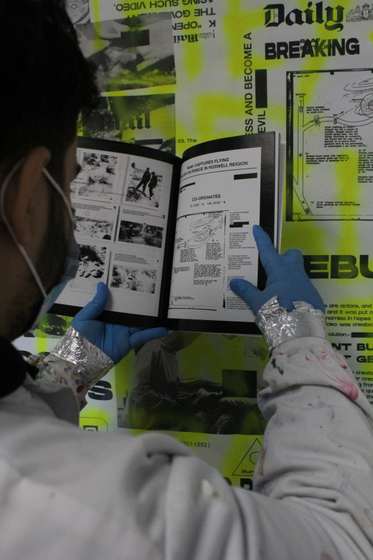
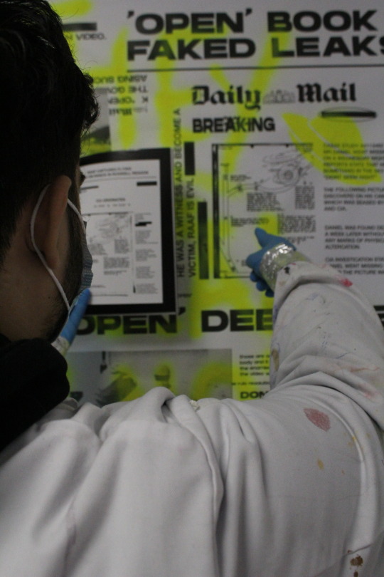
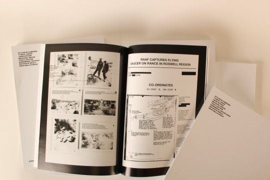
These are my main portfolio pictures, I don't like the graffiti on the pages I feel like it doesn't really match the vibe I'm trying to give, I feel like gradient fits better because it's more constant due to feedback the people believe that the black one doesn't fit aswell, however, I think it works with the black and white pages that I have to I decided to keep both, with black and white and the version with different gradient.
0 notes


Text
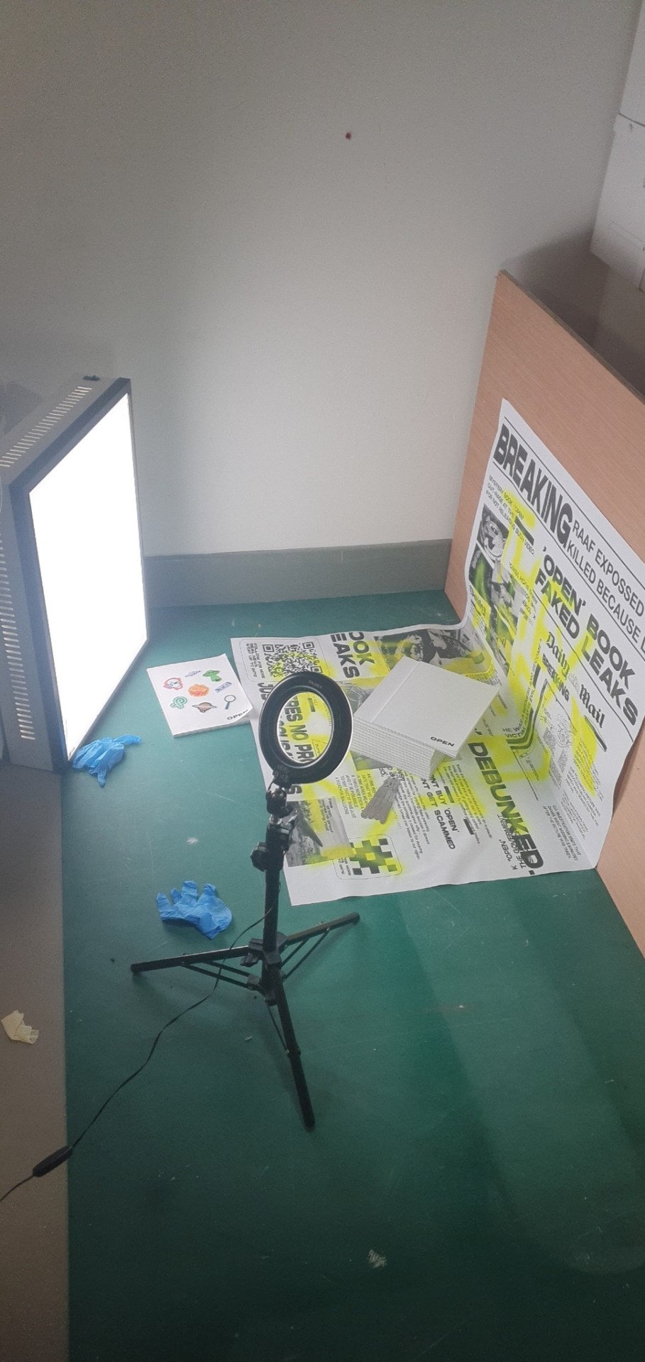
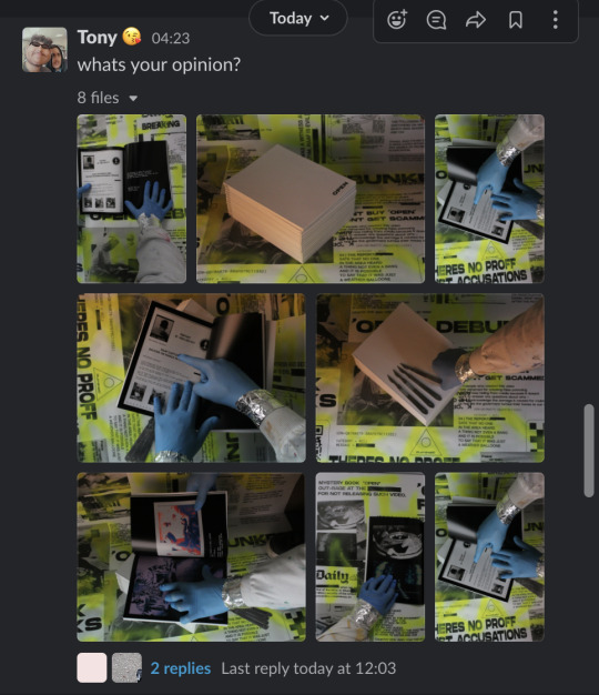
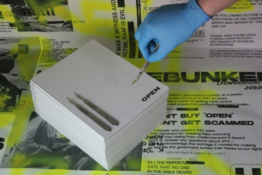
this is the setup of the pictures, I used props like the scalpel and lighting like the ring light and the lightbox, I didn't have access to the studio as it was fully booked out so I took pictures in the class inside.
0 notes


Text
studio pictures -


I took these pictures just in case my a00 print wouldn't be printed in time - I rushed these pictures they have no creative direction to them, the lighting is good but the pictures are terrible.
i called the printing place they said it was ready and when I picked it up - Manuel said its too late to use the studio everything is booked out in advance, so I have adapted and take my pictures in the class
0 notes
Text
does different perspective's change my story
The answer is yes and no, yes because i let of gaps in my story where its up for the reader to express their own opinion about what's going to happen next.
Is this a good thing or a bad thing?
I strongly believe its a good thing because it creates controversy and opinions which means people will start to talk more about my pages thus making it more popular and it creates theories in peoples heads which means its easy to remember.
And no it doesn't change the story because the main story is really easy to understand because the imagery i used is realistic, and it makes sense together - i feel like i created a strong and compelling story where the viewers have control to narrate the story as-well.
0 notes
Text
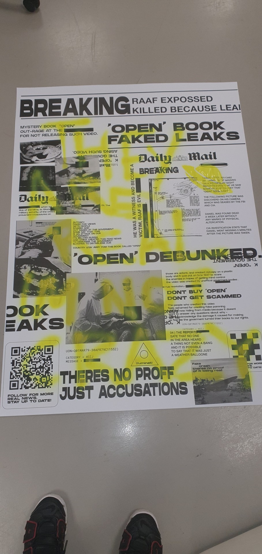
Poster

Here is my poster on the wall.
I received a lot of feedback on how the style of it works and how chaotic it is that works super well with the newspaper design idea that I was going for.
0 notes
Text
my second idea


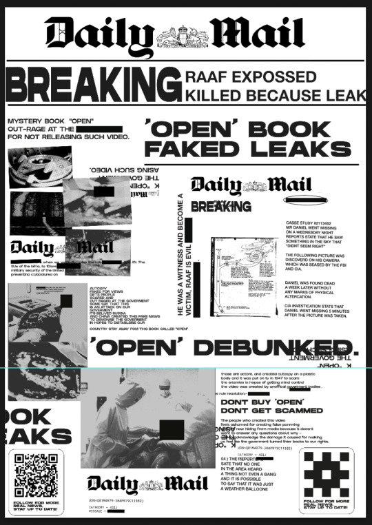

I showed will the second idea which was news style paper, however, I wanted it to be chaotic and be text overlaying on each other, I don't work with a grid system and I create my own structure so I think this poster looks great.
why chaotic?
I feel like it relates to my pages the most, have a straight simple storyline but the imagery is very chaotic because it's hard to understand if you see it for the first time and it has gradient and textures on top where the more you go through the pages the more intense it gets, you can see this by the gradients getting more and more pronounced.
i asked for feed back will said to remove the daily mail title at the top because its distracting, so I did and he was right it looks 100% better that way.
0 notes
Text
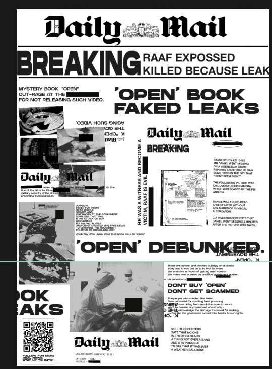
initial idea for poster


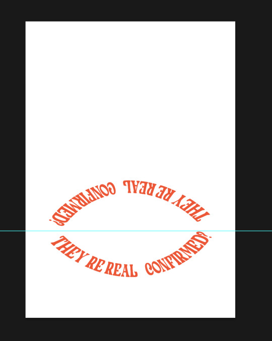
my initial idea is to work with perspective, if your photograph it from an angle the text start to stretch and if you photograph it from the top it looks normal, where the blue line is I was suggested to put the page a quarter on the floor and the rest on the wall to take pictures of the books on the page. my idea was to graffiti over it with the title of my pages, they're real I'm not crazy on the page.
However when I showed this to will he said to go with another idea and I showed him another style that I made, which is a newspaper chaotic style and he said to expand on that rather than this one.
0 notes
Text
photoshoot planning

my plan for this book photoshoot is design my own background for the book.
0 notes