
apekshacharan
Apeksha 🤎
Blog used for my Fundamentals class in Comms Design.
21 posts
Don't wanna be here? Send us removal request.
Last Seen Blogs
p-sicotica
Atlantha

guvukovisef
Untitled

anxious-lee
chill tickles

sapphicsparkles
Space Lesbian Agenda
Text
Course Reflection
challenges?
My biggest challenge was with Illustrator and Photoshop. I only had very little info about these two as i mainly used Adobe InDesign before starting this course. I enjoyed learning more about these two new softwares and building my knowledge on InDesign.
My main struggle with Ai was with the Bezier curves and pen tool.
For Ps, using the layers, masks, selecting was all very new to me which was a challenge to learn the most.
what have i learnt?
I learnt a whole range of new things, for Ps, i loved learning about image adjustments.
For Ai, i learnt a-lot about the pen tool mainly and how to create vector images. I also learnt how to make patterns, which i never knew how to do before.
In Id, i mainly refreshed my memory on documents setups, master pages etc, but i learnt how to wrap text around images correctly.
what i might take forward?
I will definitely take forward the image adjustment tools/skills that i learnt i Ps as i love photography and, love the new skills that i have learnt to enhance the photos that i take.
In Ai, i will definitely take forward the skills i learnt with Bezier curves, and i find myself using it very often especially in my graphic design classes.
In Id, i will take forward the skills of page setups, text wrapping, image scaling , paragraph and character styles etc.
what you'd like to learn more of within the three applications moving forward?
I would love to revisit Ps the most, this is mainly because i lack confidence in it, and i feel like moving forward i am going to need to use it more often, and i need to have more than just the basic skill set in it.
In Ai, i would like to keep revisiting my pen tool skills, and creating depth, shadow etc within my vector images.
In Id, i would like to explore more into how to use columns, and the grid system to my advantage. E.g. i only used the columns in my book design for my text, , in the future i would like to try and incorporate more of the grid system in other content e.g. images, shapes etc etc...
0 notes
Text
InDesign Shortcuts
w - preview mode
Shift + command + left, up, down, right, keys on keyboard to - select text.
Command A - select all text
For widows and orphans - shift command return - “soft return”
Command + x - cut
Paste in Place - SHIFT + OPTION + CMD + V
Type > Insert > Special Character > Markers > Current Page Number - to insert page numbers into A Master pages.
Shift + Option + CMD + V - Place in place (On another page)
Text box Mode:
CMD + Click - escape text box
Shift + CMD + Arrow Keys - Select paragraph
Shift + Return - Soft return
Image scaling:
CMD + Rescale - rescale image and frame
Rescale - rescale frame only
Option - scale from centre
shift + command - scale an image proportionally
0 notes
Text
Photoshop Keyboard Shortcuts
CMD + Shift + N - New Layer
CMD + N - New Document
CMD + E - Merge selected layers
I - Colour Dropper tool
E - Eraser tool
B - Brush tool
Option - Colour dropper (Hold)
[ - Decrease brush size
] - Increase brush size
V - Move Tool
Option - Duplicate
Shift - Restrain
CMD + Click - Auto Select (Hold)
Z - Zoom Tool
Space - Pan tool (Hold)
H - Pan tool (Toggle)
M - Marquee Tool
Shift - Add to Selection
Option - Subtract from Selection
CMD + J - Duplicate to Layer
CMD + D - Deselect
L - Lasso tool
W - Magic Selection tool
CMD + Shift + I - Invert Selection
A - Direct Selection tool
P - Pen tool
OPT + Click (On mask) - Focus on mask
OPT + Delete - Fill layer with background colour
0 notes
Text
Illustrator Keyboard Shortcuts
Z - Zoom
[Space] - Pan
V - Selection tool
A - Direct Selection tool
CMD + G - Group
Shift + CMD + G - Ungroup
O - reflect tool
P - Pen Tool
CMD + Click - Drop pen
CMD + J - join
L - Ellipse tool
M - Rectangle tool
CMD + [ - Send back
Shift + CMD + [ - Send to back
CMD + ] - Send forward
Shift + CMD + ] - Send to front
CMD + U - Toggle snap
CMD + Y - Wire Frame Mode
CMD + 2 - Lock
OPTN + CMD + 2 - Unlock
Shift + x - Swap fill and outline colours
CMD + x - cut
0 notes
Text
Final Assignment
WK - 10/11 - We had to design a 12 page A5 book. Including 5 or more nursery rhymes as content. We had to include, paragraph styles, Character styles, Images (at least one per song, and at least 2 of them hand-drawn vector), page numbers, custom margins and columns applied via the parent/master pages.
Document setup -
First i created a 12 page A5 portrait, print document by using the preset document settings when i first opened up InDesign. I made sure to set the bleed to 3mm as these would be used if the book was to be printed.
In this screenshot above, you can see i have used the master pages to create 4 column grid system across both seperate pages.


I also added in page numbers, by using my endpapers as inspiration and using the starts as page numbers.
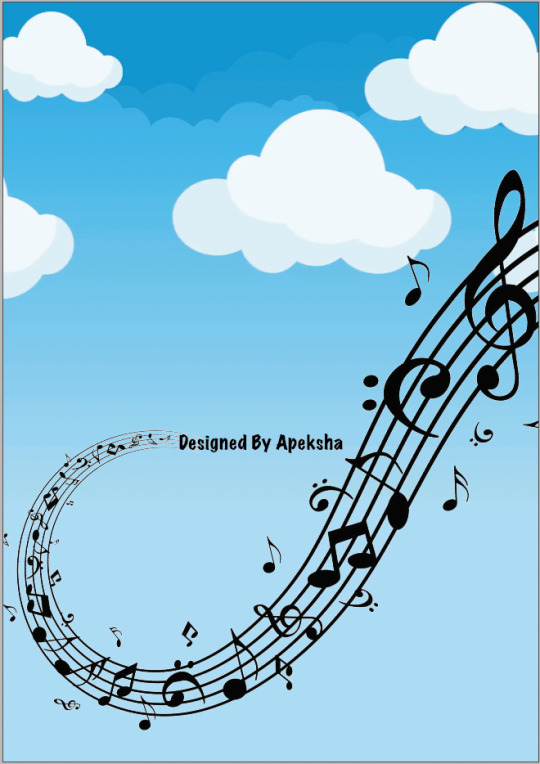
Page 1 - Cover
For the cover, i took two images from Google, the first one being the clouds image, and the music notes/symbols. I used both of these and then used another text box on the bottom as a background and used the eyedropper tool to get the same colour. I then used a nursery rhymes book cover from Google as well as inspiration for my book title. I named it “sing with Toby” - since my lecturer Toby (yes you reading this) always sings in class. I trialled many different colour combinations for the text but i ended up using different colours for each letter as i think this looked the most ‘kid/children’ aesthetic, and created a specific character styles option for this.


Final front cover design below:

Page 2/3 & endpapers -
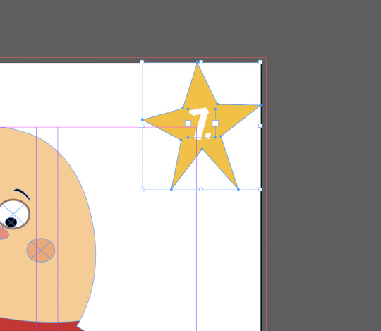
For my endpapers, i used the pen tool in illustrator and just drew a basic star, i ended up going back and using the A -direct selection tool to just make it a bit wonky and look like a kid drew it. I put a blue background on it and ended up changing it to a darker blue later. Then i grouped them together, dragged it into the swatches box, made a box and selected the star, which made a repeating star pattern throughout throughout the whole box.


Final endpaper design below:

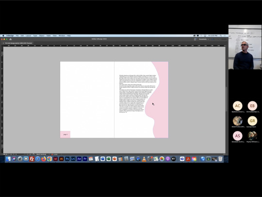
Page 4 - Contents page / Page 5 - First Nursery Rhyme
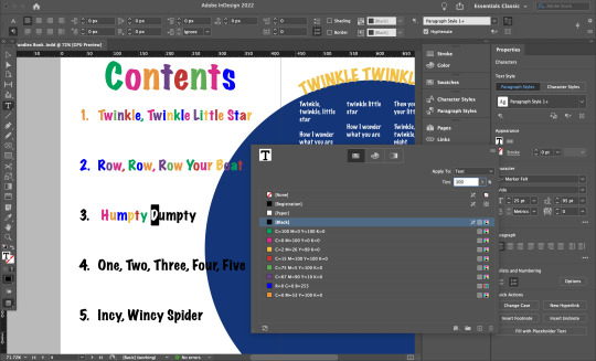
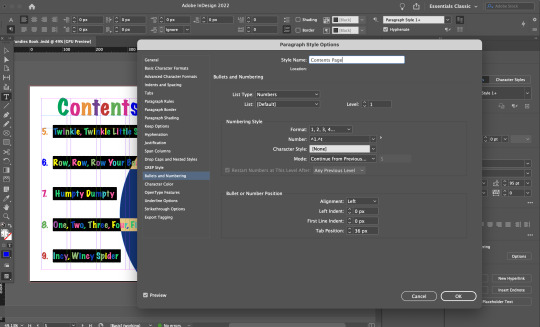
I made paragraph styles for my body texts and a seperate one for my titles. I did this by using the “paragraph styles” option and selected the text and then created a new style and saved it according to what it was e.g. “contents page” and “body text” or “song titles”. I also added in page numbers into the specific contents page and applied this in my “contents page” style.

Took an image from Google, used the pen tool to recreate, this was one of my “hand drawn vectors”.
Final spread of contents page and page 5 design:

I changed the star to two different shades of yellow and added in a blue circle in the background using the ellipse tool.
Page 6-9 - 5 Nursery Rhymes...

Row row - i used an image from Google, placed it into an ellipse that i created using the ellipse tool. I used the same blue background ellipse from the previous page. I also applied the “body text” paragraph styles into the lyrics, and the “song titles” into the title.

Humpty Dumpty - i used an image from Google as inspiration, then i created my own using the pen tool. This was my second ‘hand-drawn vector image’.
Final page 6-7 design:
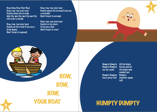
I used the blue ellipses again from previous page to keep the same flow throughout the book.

one two three four - used an image from online, placed it under the ellipse using the layers option.

Incy wincy spider - used an image from Google and placed it into an ellipse that i created.
Final pages 8-9 design:

Page 1&11 - Endpapers -
Used the same endpaper design from the beginning endpapers.
Page 12 - Back cover -
For the back cover design i used the same cloud image from the front cover, but i just used another image from google, to continue the music notes/symbols idea from the front cover.
Overall, i think i like parts of my final outcome, however i could have done so much more with it if i spent more time on it and i could have used more of the InDesign skills that i have learnt e.g. using the master pages more, using character/paragraph styles and using the ‘text around an image’ - which i did not include in this book design. I also only used the column/grid system for my body text, and next time i would try to use it more for the other elements/content on my page. I also did not end up putting my book into the mockup layout from Moodle, that we were supposed to present it in, as i tried to do it in photoshop and failed so i gave up and just used my final screenshots.
0 notes
Text
Adobe InDesign...
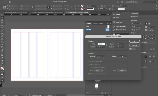
WK - 2 - Parent pages and column grids.
Parent pages -
Parent or master pages allows you to add things such as page numbers, or specific elements that you would like to repeat on each specific page in your book. This can be done in the ‘pages’ panel. To edit, double click on the specific page either left or right, or you can shift+click to select both. There is a + plus button on the bottom of the pages panel that allows you to add more pages and you can also shift around pages if needed in the Layout>pages>move pages, insert pages etc...

Here we added page numbers, by creating a text box, going to ‘type’ then ‘insert special character’ and then ‘markers’ and finally ‘current page number’ to add in page numbers and then you can specify when you want the numbers to start end etc etc.
Documenting margins and columns -
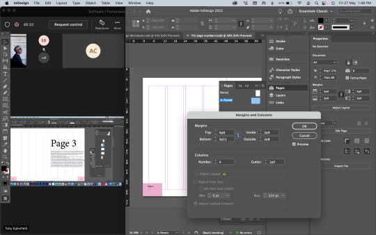
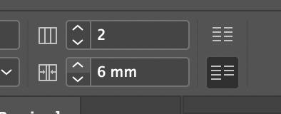
Here we were applying page margins and columns by using the ‘layout’ window and selecting ‘margins and columns’ and setting the columns to 4 to use as a guide/grid system for mapping out our content across the pages/spreads. To edit the margins independently, click the chain to ungroup all 4 different margins.
Another example of using the technique of “text around images”.
0 notes
Text
Adobe InDesign
WK - 9 - InDesign is popularly used when combining printed items with text, web, print, PDFS etc etc for digital use.
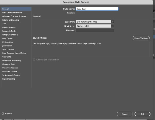
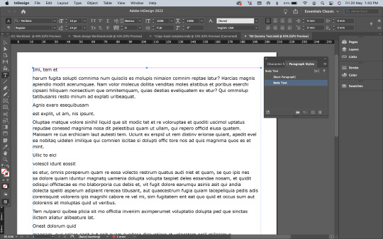
Paragraph styles -
We learnt how to set up both paragraph headings and body text in the ‘paragraph styles’ options tab which is located under ‘type’ in the top menu. First select the text you want to group together, then press the ‘+’ button on the bottom of the styles drop box, to create a new paragraph style. Then you can change the selected text to whatever you want e.g italics, bold etc You can also use a pre-existing style if it is saved in the document you are working on.
We created two different paragraph styles, one for body text and another for headings.
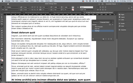
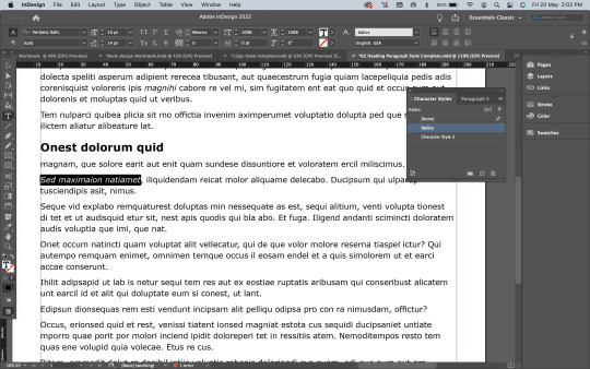
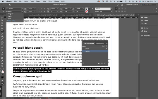
Character styles -
Character styles is unique to the specific characters, words within a paragraph whereas paragraph styles change the whole paragraph. The difference is quite significant as the you need to use character styles when wanting to change only specific parts/words in a paragraph. If you did not use character styles, you will end up changing the whole paragraph into that specific style.
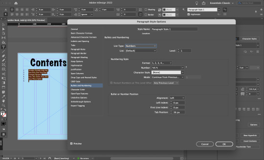
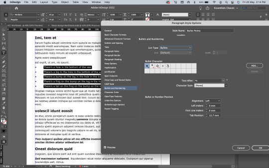
Bullet points -
Bullet points and numbering are added in the same way , by selecting text, adding in a new style and then selecting the bullet points and numbering option and then adding in ‘bullets’ as your ‘list type’. You can also change the alignment of where the bullet points are in the page, e.g. left indent and right indent.

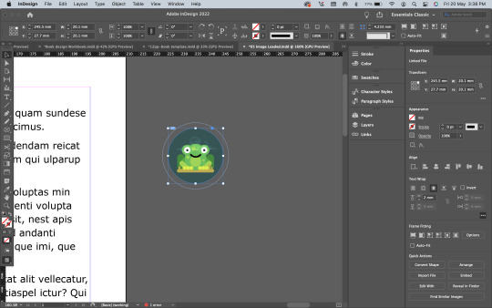
Loading images into InDesign - moving them around -
InDesign places all images as links, - into the folder located in your disk system. This allows you to link the image and update whatever changes happens to it on other platforms such as photoshop and illustrator and it will automatically update in InDesign. Linking files is good for saving storage space and most importantly keeping your file size smaller, as without linked files, image files are duplicated when new documents are created, creating larger files in the end. With linked image files, there is only one copy of each image file, and any edits made to it will show up in the file automatically.

Scaling images -
To scale/adjust the frame that only has the image which is the orange box in the screenshot below. Click the image, hold down SHIFT and OPT to scale the image from the centre.
To scale the image (orange box) and the frame that contains it (blue box). Hold COMMAND while scaling, or SHIFT and COMMAND together.

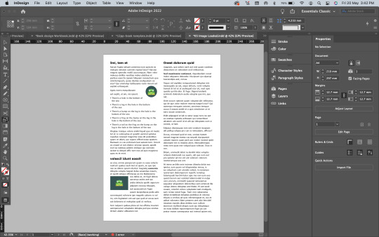
Running text around images -
To run text around images in InDesign, place the image where you want the text for it to run around, then use the properties menu. Go to the text wrap options, and set the text wrap around the image, which is the second option from the left. This allows the text to flow around the image, instead of behind, which would happen if the image was just another layer, and you placed it into the page.
Final outcome -
w - toggles in and out of preview mode without the lines/margins - to see the final outcome once exported as PDF etc.
0 notes
Text
Illustrator skills - show and tell
WK - 8 - Creating a silhouette of an object using skills learnt in Ai - I chose to recreate an image of a rabbit. This animal is not hard to create the silhouette of, however, it is hard to follow the ‘rules’ of bezier curves while creating this. For example, we were advised to keep the anchor points we made, to as few as possible, i did not as my rabbit had many little crevices that i had create more anchor points and handles for. We were also advised to follow the principle of placing our points at the apex, - i did not follow that quite so well and just placed my anchor points where i found it was easy enough to create the outline of the rabbit.
I took a photo of the drawings in my previous post and imported it into photoshop, I was then able to trace over it using the pen tool. At the end of this post is a screenshot of all the completed drawings. Below is an image of how I draw the shape over my sketch, I then placed lines over it for where I wanted to cut out. Using the path finder tool I was able to cut out the lines from the shape, leaving me with a silhouette effect.
Overall: I didn’t find this task too hard, however sometimes it was super finicky and took a while to fine tune the points. I’m pretty happy with the outcome, however, I do feel some of the curves could be smoother.
First - i lightly sketched out the outline of the rabbit, then i added in where i thought the anchor points would be placed (red), then i added in a black outline to show the outline of the rabbit better.
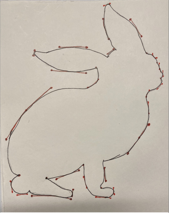
Second - i then transferred this image into illustrator and the original image from online and then started to create the outline using the pen tool.

Second image -
I was working on my Saul Bass book for my graphic design class and decided to include the vector drawing i did. First i traced it out on pro-create on my iPad and then i used illustrator and the pen tool to turn it into a vector image.


Overall - pretty easy stuff, definitely getting better at using the pen tool which is good.
0 notes
Text
Path selection
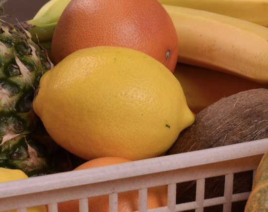
WK - 5 - Refresher on making selections - We went over how use the pen tool to make selections/of an object. After drawing out the objects outline with the pen tool, then from the top bar, select window, path, and it will create a path selection around the object. We did this exercise on the orange in the image instead of the lemon this time. Changing the colour from orange to pink, was done through adding a Hue/Saturation adjustment layer.
Using pen tool to create outline, adjusting anchors/handles:
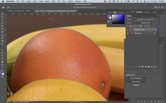
Creating a path, through the path window:

Applying a Hue/Saturation adjustment layer, turning my orange to pink:

Quick and fairly simple task that i would rate myself a 7/10.
0 notes
Text
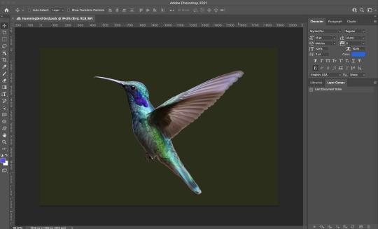
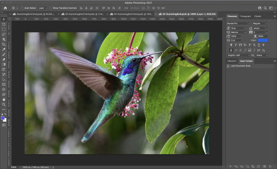
Hummingbird practice
Further practice on layers, masks and selecting...
We used a hummingbird image to further practice our skills in layers, masks and selecting. Selection: First we had to cut the hummingbird out from the previous background and place it on a new background. This part was a little tricky as the hummingbirds body had lots of little parts/crevices that looked a little rough on the edges once it had been cutout. We used the ellipse tool to cut out the circular parts of the birds wings and then used the ‘motion blur’ tool to blur it into new background and bring movement back into the birds wings.
Original image:
Cutout from background and adding a motion blur to the wing:

Placing bird onto new background:
This practice exercise was quite helpful as it was focussing on cutting out a moving object and how we could still apply the same motion effect when using layers, masks and selecting etc... i would give my skills a 5/10 on this task, as some parts were quite challenging but overall a fun task and very helpful techniques learnt for future reference.
0 notes
Text
Layers, Masks and Selecting
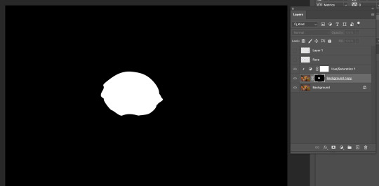
WK - 5 - Adobe Photoshop - Ps has an option to create masks on objects/images that can hide parts of an image. To place a mask on the image, select the layer, then select the “add a layer mask” at the bottom of the layers panel. To start, we used a lemon to cut out and then change the layer we could view the lemon on. First it was the original layer and then when you hit OPT + Click on the black mask thumbnail, it focuses on the mask. Next, we looked at changing the colour of the lemon by using an adjustment layer (Hue/Saturation) layer to the lemon mask layer.
Original image:
Cutting out lemon, onion skin view:
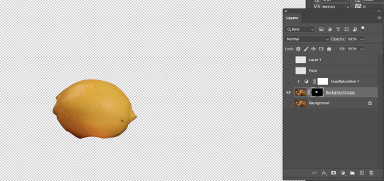
OPT + Click for a focused view on the mask:
Changing the Hue/Saturation of the lemon:

Final image:
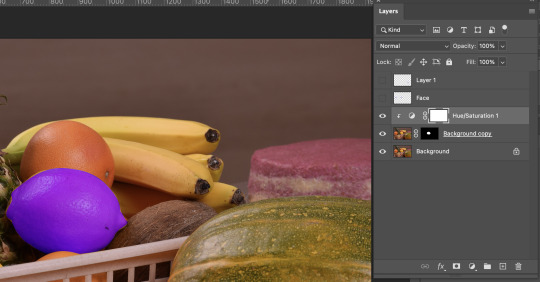
I would rate myself a 7/10 on this skill as it was quite easy to follow along. This is definitely a skill i would practice as it is really helpful when you are trying to change certain parts of an image and not the whole thing.
0 notes

Text
Adjustment Layers Assignment
We were told to find four images that would benefit in colour correction. Two in colour and two in black and white.
Black and white:
#1 Before/original:
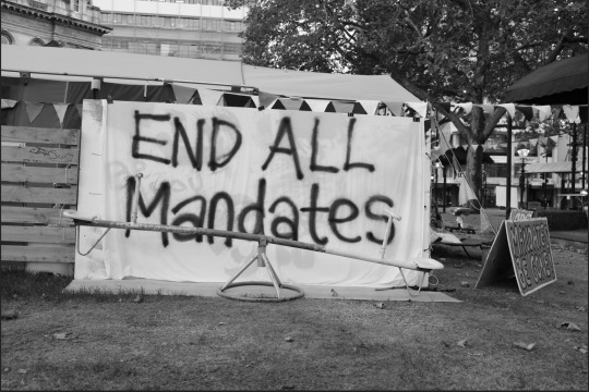
The original image is over-exposed and i thought the image could also be fixed to contrast the “end all mandates” text against the white background. I think the image is just very bland and one colour all over and the curves need to be adjusted.
After:
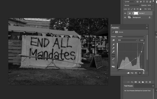
I tried to adjust the curves in this image to fix the over-exposure but ended up making the image too dark and i could not get the curves in this one quite at the perfect setting. However, i did manage to reveal the text that is behind the ‘end all mandates’, which is a good thing, but still failed in my mission of making the ‘end all mandates’ text contrast against the white background without over-exposing or making the image too dark.
#2 Before/original:
After:
Colour:
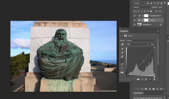
#1 Before/original:
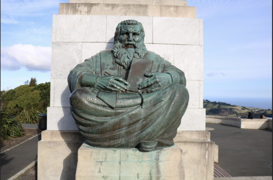
This image that i took myself at signal hill was quite over-exposed and the white tiles behind the statue made the sunlight reflect even more, causing the image to become over-exposed and lose details and the original/natural colours.
After:
Adding a Hue/Saturation adjustment layer:
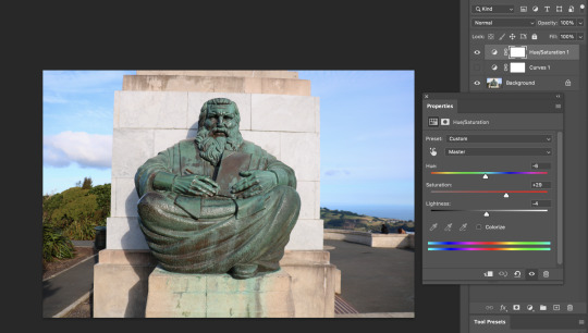
First i added a Hue/Saturation adjustment layer as i felt that there was a lack of vibrance in the image and it seemed just overall dull. So i first turned ip the saturation by dragging the scale pointer towards the right. Next i lowered the lightness, and then i tweaked the hue, by adding more green.
Adding Curve adjustment layer:
#2 Before/original:
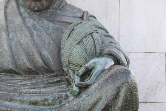
As you can see, the original image is quite dull and does not have enough colour/vibrance. This might be because the statue that i photographed is quite old, dirty/rusted. So i decided to try and bring colour back into it by using the Hue/Saturation and Curves adjustment layers.
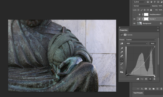
After:
Adding Curve adjustment layer:
Adding a Hue/Saturation adjustment layer:
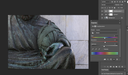
As you can see, after adjusting the curves by adding in a curves adjustment layer, i was able to fix the over-exposure from the original image, and then by adding in a hue/saturation adjustment layer, i was able to tweak the saturation, but i did this consciously as adding in too much hue/saturation and lightness make the images overall hue green, which is something i did not want as that makes the image unrealistic. By adding in only a little bit of saturation i was able to notice a slight but good difference. This shows how adding in these layers can make such small, but overall when combined it can make a huge difference.
0 notes
Text
Adjustment layers in Ps
By combining all three adjustment filters (curves, colour balance, and photo filter), you are able to edit images through changing colour, black/white, add warmer or cooler tones and alter the hue, saturation etc all at once. This might sound like too much photoshop, but when i was tweaking each different adjustment layer it all fell into place and the different layers had their own part to play into making the image look more appealing.
Before/original:

After:

Before/original:
After:

0 notes
Text
Colour balance & Photo filter adjustment layers.
The Colour Balance adjustment layer is: used for general colour correction. Colour Balance works with complementary colours that have inverse relationships: cyan and red, magenta and green, yellow and blue. This means that if an image has too much cyan in it, the cyan will need to be decreased, which will cause the red value to increase. - https://kb.plu.edu/page.php?id=91927
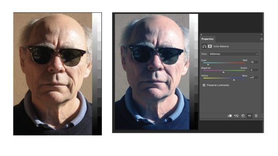
The Photo Filter adjustment layer is: used to make your image warm or cool. For instance, you can change the density of the effect easily using the Density slider. There is also the Preserve Luminosity box to check so that the applied filter does not darken your image. - https://helpx.adobe.com/nz/photoshop/using/applying-color-balance-adjustment.html

0 notes
Text
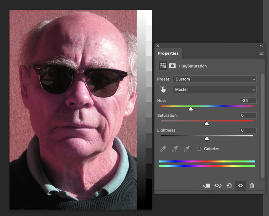
Hue/Saturation adjustment layer
Hue: refers to the origin of the colours we can see. Primary and Secondary colours (Yellow, Orange, Red, Violet, Blue, and Green) are considered hues; however, tertiary colours (mixed colours where neither colour is dominant) would also be considered hues. - https://www.beachpainting.com/blog/color-hue-tint-tone-and-shade/
Colour saturation: refers to the intensity of colour in an image. As the saturation increases, the colours appear to be more pure. As the saturation decreases, the colours appear to be more washed-out or pale. - https://www.techopedia.com/definition/1968/color-saturation

Hue and Saturation are also located under ‘adjustment layers’. This adjustment layer allows the image colour to change, whereas the curves adjustment layer was used to change the brightness and darkness of the image. To first start using Hue/Saturation adjustment layers, i needed to understand how the colour wheel works and how ‘hue’ cycles through the colour wheel, and changing the saturation is dependant on how strong the chosen colour is. Another addition to H&S is Lightness which determines the intensity of black and white in the image.
Before/original image below.

After - used the scale on the ‘Hue’ pointer scale and moved it to the left to make the image pink. As you can see, the images overall colour/hue changed to pink whilst the brightness, saturation, lightness etc is still the same.
0 notes
Text
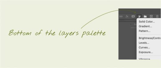
Curves - Ps
WK - 4 - In Photoshop there is a tool called ‘adjustment layer’ at the bottom of the layers palette. Under this section, you can add in a layer called ‘curves’. Curves is an adjustment layer that allows you to adjust and enhance images, specifically adjustments to an image’s brightness, contrast and exposure. The most common use of the curves graph is to add one or more points to the line, so it can be edited as a curve - this is an easy way to make changes to brightness and contrast, whilst maintaining the top and bottom end of the tonal value.
The most common use of the curves graph is to add one or more points to the line, so it can be edited as a curve - this is an easy way to make changes to brightness and contrast, whilst maintaining the top and bottom end of the tonal value.
��One of the mistakes designers can make when using curves is to blow out the highlights or have too much black in an image. These problems can be avoided with knowledgable use of the curves tool”.
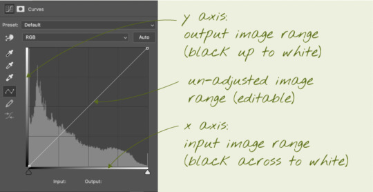
The x axis shows the available tonal range left to right from black to white.
The y axis shows the tonal range for the image that can be brightened or darkened
The pale coloured graph in the background shows the distribution within the image from dark to light (left to right)
Moving the triangles at the bottom of the graph inwards from the ends, will compress the image tonally - this can be useful if the darkest tone in your image is not black, or the lightest point in your image is not white. If the darkest and lightest are already black and white, moving these triangles will clip the dark and light ends of the image (which is generally not desirable) - this will 'blow out' the highlights or lose detail at the dark end.
Moving either of the end points up from the bottom or down from the top will adjust the brightness of the image inside of the range.
Image adjustments: One or more processes that are part of the colour correction / colour grading process.
Colour correction vs Colour grading...
Colour correction: 'Fixing an image' 'matching two or more images to fit together'. Colour correction can be seen as a checklist of processes to improve an image, or moving image footage to an optimal or close to optimal appearance. Colour correction will often seek to bring out parts of an image that would otherwise not be seen or not been seen so well.
Colour grading: Often applied to images or moving image footage creatively with a stylistic vision in mind, such as to enhance a certain mood or sense of history. Colour grading can be seen as employing colour correction, and using it to achieve a specific goal. The process of colour grading may reduce, or even remove certain information within an image, as part of achieving its goals - for example, tinting images.
The images below are before (left) and after (right).
Colour correction: portrait

As you can tell, the original image was very white/grey with mainly mid-toned black and white. By using the curves adjustment layer, i was able to add contrast to this image by increasing the intensity of the blacks and using the white to contrast and highlight the persons face/skin. Most importantly, when using the curves adjustment layer, i had to make sure there was a an even balance between the black and white contrast, as the image can become over exposed if i added too much white, and it can become under-exposed, dark and hard to see the image if i added too much black. By having a good balance between the black and white in the image, it allowed the details in the image to stand out such as the persons face, and make the image more captivating.
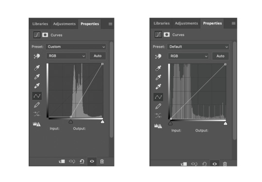
Below are the curve graphs for both the original/before (left) and after adding curve adjustment layer (right).
Cat
Before/original - left. over-exposed - right colour corrected - bottom

As you can tell, the original was very dark and then when i added a curves adjustment layer to add in brightness, it over exposed it. I then added in two more points simply by clicking on the top of the graph and one on the bottom. By doing this, it allowed me to set different brightness/tone levels in different sections of the image whilst maintaining the top and bottom end of the tonal value. This allowed me to brighten the overall brightness of the image but it allowed me to control the exposure and not over expose the white fur of the cats face.
0 notes