
Last Seen Blogs

jyotishsantanu
JYOTISHSANTANU

collinskitt
In Stasis And In Space

lynzshade
sloppy

gostauuf
Decadente

thaonenonlymiszj
LIVE.LAUGH.LOVE
Text
PLACE/DISPLACE
Drawings
I started on the 2 A2 drawings required for the brief. I started out by mapping, recording and drawing my impressions of place. I drew from that aspect of family, culture and materialistic items that made me feel at place within my own room/home. Most of my ideas were developed ideas from the drawing we did in week 2 or ideas that expressed atmosphere and sound. For displace I drew from ideas of isolation, identitiy and the unknown and tried to express these ideas through several drawings. I really liked the idea of isolation and created several drawing/atmospheric image that displayed this notion. Some of those drawings was the inspiration of my displace scene in my diorama.

0 notes
Text
TWO STRANGERS
WEEK 9
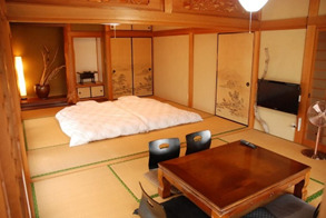
I will be placing Japanese furniture into these spaces to fully maximise the Japanese mood of the space. It will create a threshold in which the two strangers will leave the modern world and submerge themselves in a space that is unfamiliar and not your average everyday modern interior.
From my research I have found that many of the furniture found within traditional Japanese interiors are low to ground furniture with cushions as seating usually used in traditional tea ceremonies. Japanese interior design also embraces the minimalist design style, keeping the interior clean, simple and uncluttered is a must to achieve the Zen of Japanese taste. Keeping furniture colour coded (made out of wood) and making sure that there are no pieces that are out of place or there are any pieces that don’t serve any purpose, this will help me stick to the Japanese minimalist style. I also found out that the Japanese generally slept and sat on the floor with no bedding or cushioning The Japanese believed in the concept of ma, or negative space and the need to keep things simple. Japanese furniture served 3 main purposes, sleeping, sitting, prayer and storage.

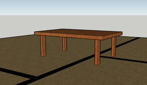

As I designed the Chabudai that would be situated within the living area I started out with a basic design and further enhanced an developed the design further while taking reference from multiple images. Trying to make the table aesthetically pleasing while sticking to the minimalist style while overall creating that Japanese atmosphere within the space.

Experimentation with rounded tables, works in contrast to the square box in which the house and rooms are designed, bringing a new shape into the space.
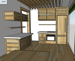
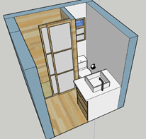
Kitchen
There were some complications that I ran into while designing the kitchen. When initially viewing the space I had so little space to work with that I thought I had to change the layout of the house in order to make things work. This was an option until I realised that changing the layout would result in the change in the amount of space within the other rooms, leaving me with the same problem. So therefore I played around and experimented to see what I could come up with, and luckily through the help of several images and research I was able to finalise a design that would cater to every need of the two strangers.
· Food/cutlery storage space
· Fridge
· Oven
· Shelves for more storage
Keeping to the Japanese style of the interior I designed the kitchen in a way that left as much space as possible to prevent crowding and allow that feeling that the two aren’t restricted. The garage door opens and leads outside which allows a seamless flow from the interior kitchen to the exterior garden creating a different and unique threshold. This also upholds to the traditional Japanese interior design in which they include a massive amount of indoor/outdoor flow which reveal the beautiful environment outside. I did experiment with darker wood to give the kitchen a warm atmosphere but planned to stick to the simplistic/minimalist style of just keeping to one colour scheme.


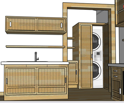
Laundry
I placed the laundry room next to the kitchen as this is where the bulk of the chores occur. The laundry room doesn’t have a door separating it from the kitchen and living room, this is done to create a spacious feel within such a small area. Placing the washing and dryer machines above each other is a common design but it is essential in my case as this allows space for a sink to be installed. But and then again in this case I think that the better option is to replace the sink area with an area that allows for ironing clothes. The only problem with this layout design is that when the machines are operating, due to the small space, the amount of noise the machines produce would be a disturbance to whoever is in the kitchen or living area. To battle this problem I made the choice to install double doors that would help reduce the noise heard within the other rooms. I still tried to stick to the simplistic design of the house and so the design would match the rest of the house.


Bathroom
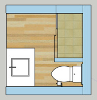
Designing the bathroom wasn’t easy as I faced the same problem, I had with the laundry room. The minimal amount of space forces me to work and place certain things and objects in certain areas to maximise the use of space all while catering to the normal functions of a bathroom.
From my research traditional Japanese bathroom aspects included a large deep bathtub, a separate toilet room, and separate washing and changing area. Due to the minimal space, I had to eliminate all these ideas. Instead I went with a more modern layout but still stuck to the Japanese minimal décor. There is a usual stand up shower that is enclosed by shoji doors. A skylight will be placed above the ceiling of the shower to allow a good flow of natural light into the space while taking a shower. The Shoji doors act as a threshold that transports the users of the shower from an artificially lit space into an enclosed private space with a great amount of natural light. Surrounded by the wooden designed walls it emits a feeling of being in nature. This helps create an atmosphere of peace and tranquillity. I will also be placing plants and a water feature into the space to further enhance the atmosphere of peace and nature alongside bringing a splash of green within the Japanese interior whilst being minimal.
I made some changes to the door that opens into the bathroom. Instead of it being a traditional swinging door built to look like a traditional shoji door. I instead turned this door into a traditional sliding shoji door that slides and hides away within the wall. Alongside saving space it further enhances that Japanese décor of the interior.
WEEK 10
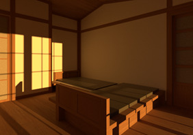
SLEEPING PLATFORM/BEDROOM
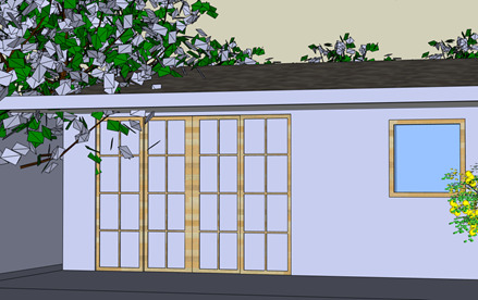
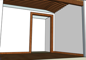
A change I made within the Bedroom was that I had added a shoji door within the room. Allowing a great deal of indoor/outdoor flow within the room. The Shoji will open out onto the carport providing a new threshold that allows the two strangers to move through the different environments.
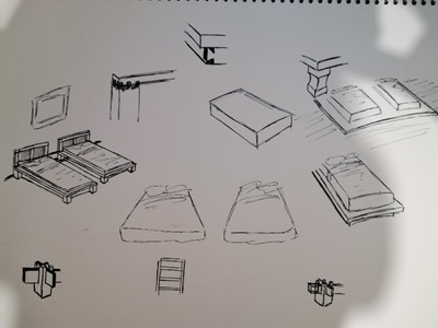
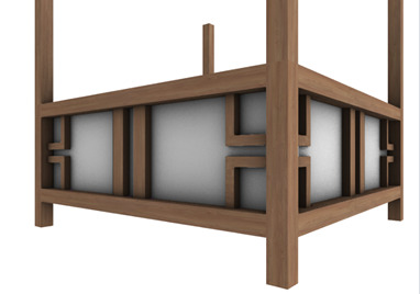
Starting my design for the sleeping platforms for the two strangers it was helpful to see that many traditional Japanese sleeping platforms are extremely low to the ground. Made from wood this helped stick to the colour scheme of the Bedroom.
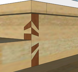
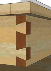
To create this sleeping platform, I will be using a series of traditional Japanese joinery techniques to keep the sleeping platforms together. Both will be extremely low to the ground.
.
Some of my concept ideas for the placement of the platforms did not really workout as the space within the room is minimal. To solve this opted in placing the sleeping platforms in an unorthodox way that would allow me to maximise the space.
Experimenting with different traditional joint techniques


This placement was extremely unorthodox, I did not like the placement as it did not work in harmony with interior. It did not suit the clean and simplistic atmosphere that traditional Japanese interiors had as I feel the placement is very complicated and not pleasing for the two strangers. This placement gives the strangers that cramped feeling as they sleep in close proximity with each other creating an awkward tension between the two.

Different arrangements of the sleeping platforms. I will opt for the second option as it does encourage conversation but also prevents the awkward tension that the first layout provides.
Different dovetail joints that could be used for the sleeping platform.

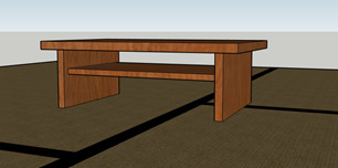
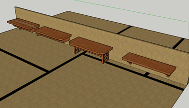
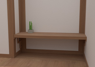
Work area will be situated within the bedroom, I though bout placing a full desk with a chair within the space but refrained as this would break up the atmosphere that I am trying to create within the room. So instead I maintained the traditional Japanese décor and opted in designing a low lying table with a seating cushion.
Different table designs

These designs were inspired by some drawings I had done while taking reference from different images.

LIGHTING
A lantern which hangs from the roof will provide light into the bedroom.
Design drawings
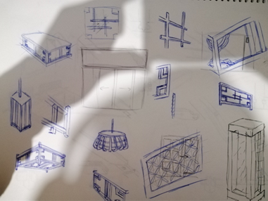
Here I tried to experiment with different lantern shapes and pattern designs.
Here is what I came up with through trial and error.
For the living/kitchen area the lighting will be hidden by the wooden roof feature. This maintains the Japanese décor as I feel if the light bulbs were visible it would be out of place within the Japanese styled interior.

BATHROOM ADJUSTMENTS


Concept idea for the Bathroom. Trying to design shelves and a towel holder to go within the bathroom.
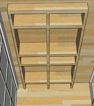
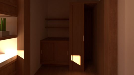
Eventually opted out for a simpler design that suits the Japanese aesthetic. Little compartments for towels and the bigger compartments for clothes.
TRADITIONAL JAPANESE PATTERNS
Japanese patterns and designs that I could use for certain areas or furniture pieces within the house. The wave pattern (Seigaiha) symbolises power and resistance while the Shippo pattern symbolises Interpersonal Relationships. These patterns can be carved onto furniture within the house to add imagery within the home but also help communicate strong messages.
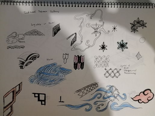
Some of these patterns could be used for the Chabudai table that will be situated in the living room, it would be a socialising but also a place to eat. This is perfect as most of the socialising occurs at the dinner table.
0 notes
Text
TWO STRANGERS
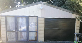
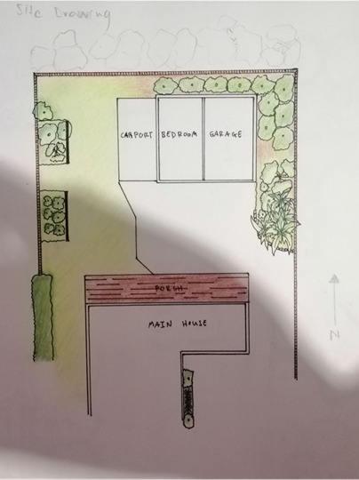
I have decided that I will redesign the sleep out for the two strangers brief. I have chosen this site because it provides a lot of room and space for the two tenants, surrounded by trees and vegetation it provides the space with a lot of chirping and natural environmental sounds, alongside that its connected to the garage with only a 2-meter high wall separating the two spaces. It also has an area that can be redesigned into a recreational outside area for the two tenants that stay in the space.

I then began to take measurements of the space and had an initial idea of removing the 2-meter wall that separates the room from the garage and create one massive area for the two tenants. But I didn’t know whether the wall was a structural or non-structural. I wanted to create a spacious feeling within the space without the tenants feeling like they are confined, so instead I decided to keep the wall but create a large opening within the wall that allows the two strangers to move flow from one room to another with out making them feel like they are moving from one room to another but instead that it’s one continuous space.
A few images of the room


Images of the garage


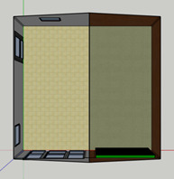
I took a rough draft of measurements for each room


Using these measurements, I began to draw a better version of the floor plan. In this new draft I identified where light switches and outlet plugs were situated.

I then made a 3D model of the space in Sketchup to show the space empty, using the measurements I was able to get a scale model of the space.

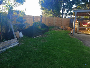
I then began to draw a site plan of the area surrounding the space. I realised that there was a lot of potential for the outside vegetation and greenery and realised that I could turn the carport into an area that allows for the two strangers to talk and hangout, an area that encourages interaction and conversation. What I thought would bring this altogether is the ability to draw the two strangers outside, what would make both of them want to go outside, I first had an idea to turn the carport into a swimming pool to that would draw the two strangers outdoors, but then therefore I would have to close off the space to provide privacy and eliminate the nature and green around them, so instead I wanted to turn the space into an area full of green and exotic plants that any tenant would appreciate. Of course, a table and a seating area would be situated in this area for comfortability and to encourage interaction, who doesn’t want to sit outside, enjoy the nature around them while being bathed in sunlight.
Here some images of the surrounding area of the site, it has a lot of potential to be turned into a beautiful garden

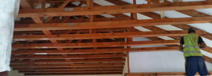
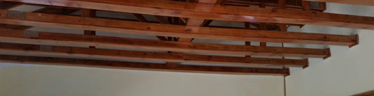
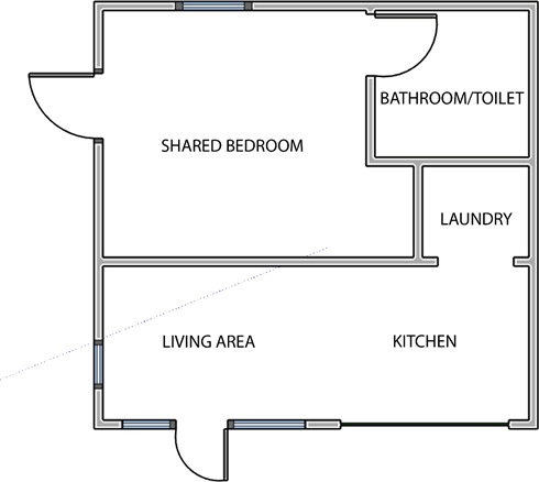
Within the house I wanted to create a space that encouraged interaction and conversation between the two strangers. Since they had already met, I wanted the space to allow them to further their friendship/relationship. From my research I decided to design the space into one massive area. What this means is that I would have to destroy the wall that separates the bedroom and garage, the problem here is the fact that this wall is a structural wall that supports the roof from collapsing on itself, so to work around this problem I will remove a portion of the wall. Only a little portion of the wall would be removed to allow some support for the roof. I wanted to create a massive archway that would allow free flow movement from room to room without making the two strangers feel separated or secluded in that part of the house. For example, I don’t want a wall separating the lounge and kitchen, I want whoever is in the kitchen to feel like they are a part of whatever is occurring in the living room. Whether the two are in deep conversation within the living room and one left to go get drinks from the kitchen, they will still be able continue conversation, something I had learned from Barry Berkus, a famous architect. Another idea I had was to fully remove the wall but place more bearings and support in the roofs framing. To prevent adding a ceiling and decreasing the height of the space leaving the framing exposed to the human eye would be a great feature if pulled off properly. This idea was similar to what we did with our house back in the islands it made the home feel more spacious as it was a high ceiling, alongside this I was hoping to hide the lights on top of the framing to make it feel like the house was naturally lit by an unknown source.
This also allows the two to cross paths more frequently encouraging interaction. Rooms would be placed in relation to sunlight and warmth and around the notion of making them cross paths more often to encourage conversation. I experimented with some layout ideas using bubble diagrams. I tried to minimise the use of corridors and walls due to the limited space. In these drafts I placed the Living room and Kitchen together because of the interaction between the two strangers. The kitchen is always placed to the east due to the sun always rising on that side allowing the two strangers to enjoy the morning light while having breakfast. The Living Room is also placed to the west of the house due to the sun setting on that side providing a warm glow to the space alongside providing warmth. I experimented with both shared/separated facilities and bedroom. From here I will develop a layout and use it to design the house. Notice how I also tried to design the layouts in relation to windows and the doors to prevent the need to change the exterior walls too much, I will add more windows though to allow airflow and light to certain parts of the house.

Using these layout ideas I hopped onto sketch up to make quick models of how the different layouts would work in correspond to where windows and doors are placed. Like I said if I place certain rooms in the right areas there would be no need to make changes to the exterior walls.
I also experimented with different arch ways that could give such a small place the impression that it is spacious. I tried to make the archway that separates the kitchen and living area as unnoticeable as possible. I want the living area and kitchen to be free flowing, allowing the movement through the two areas unnoticeable, as if they are one big space while still serving their different functions. Whatever happens in the Kitchen, the person in the living area isn’t secluded and feels included, allowing for conversation and interaction.
Here are some of the archways I had designed. Each with a different aesthetic to try inspire a colour way for the home itself.

I also really liked the idea of the roof framing being exposed to allow the two strangers to see the inner works of the house, it would be a nice feature to have that can help start conversation between the two. Also, I feel like it breaks through the normal square box that many homes have.


From first impression this is an extremely aesthetically pleasing design and feature to have. I have come to the conclusion that I will use this style to design the space for the two strangers instead of the arch. It brings that sense of warmth and stability within the two areas, and with the right use of colours there is no doubt that this could be one of the main features that could draw the two strangers into the living area/kitchen for further interaction.
Here I experimented with different layouts for this design, these were the finalised designs from my bubble diagrams. As you can see two of the designs (1 and 2) totally robs the two strangers of any privacy as they would have to sleep in a shared room. The third design on the other hand does provide the two strangers with privacy but would have to share the bathroom/laundry room so not totally allowing them to stay secluded within their rooms without seeing and coming into contact with each other. But if I was to choose the 3rd design, both bedrooms would be designed in a minimalist style as to not make the two strangers want to stay in their rooms all day, that there is more to see outside and in the living area. But in this case I will use design number 1 as it suits well with what I am trying to achieve with these two strangers and their relationship. Spending more time together would no doubt help the two grow a stronger connection and with the way the space is laid out there wold be nowhere to hide from one another. Most things are better experienced with others.

Now that I have a house layout and a start to a design process I feel it’s important to choose the colour palette for the house, from here I will use the colour palette to choose certain pieces/furniture that will occupy the space so it works in harmony with the style of the home.
WEEK 8
There were two styles I really liked and thought would fit nicely with the space, first was to approach the colours from a modern style, using greys, blacks and whites to immerse the two strangers into an environment that is familiar to them. On the other hand I wanted to approach the colour pallet from a more cosy and warm feeling, so the use of browns, whites and wood/brick textures. From this, I had thought about old Japanese architecture and how their homes allowed a great amount of indoor/outdoor flow and with the amount of windows/doors/garage door, I feel this aesthetic will suit nicely with the home, alongside with the use of wood it really brings warmth and that sense of home within the space. I would like to experiment with the Japanese styled colour palette to try and immerse the two strangers into a whole different atmosphere and see what I can come up with.


From my research I have found out that many traditional Japanese homes use soft toned or earth toned colours, they shy away from using anything too extreme such as shiny or glossy textures/paint. They do this to help create a calm, comfortable and natural atmosphere within the space. I also found out that the Japanese style is centered on the idea of minimalism, it’s simplistic and overall is extremely clean with its simple colours and décor. I also favoured the fact that it goes well with the lush green environment many of these homes are situated. With a little work I feel I can create the same atmosphere with my space, allowing the two strangers to feel comfortable but at the same time feel immersed in both spaces (indoor/outdoor) allowing for that indoor/outdoor flow that both strangers can experience and allow for better mood and conversations.

This colour palette provide a much warmer sense within the space due to the darker coloured wood, the colours also matched the wood feature on the roof and overall the colours worked in harmony. I have also decided to use the traditional sliding shoji doors as it matches what I am trying to achieve, it also helps save space.


This colour palette was my take on the Japanese style of Shibui, a Japanese aesthetic that uses the colours that reflect nature. Here I kept the darker colours close to the ground while the lighter colours were used on the walls that rises towards the sky while still keeping that style of simplistic and minimalistic.
I have decided to use the Shibui colour palette, it uses lighter colours, and would work in harmony with the natural light that would be let into the space by the series of windows. It looks more aesthetically pleasing and with the use of a lighter wood it communicates a sense of light, joy and calmness within the space, which is beneficial for the two strangers if they were to interact to keep up their moods and spirit.
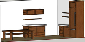
Materials and Fabrication
Due to the minimalist style of the home, all spaces will have white walls with ash wood accents. Ash wood will also be used for the Japanese Shoji doors, immersing the two strangers into the Japanese styled home. This allows the two strangers to be placed into an unfamiliar space and experience the space together allowing for more interaction.

0 notes
Text
SPAD FAB BLOG
WEEK 2
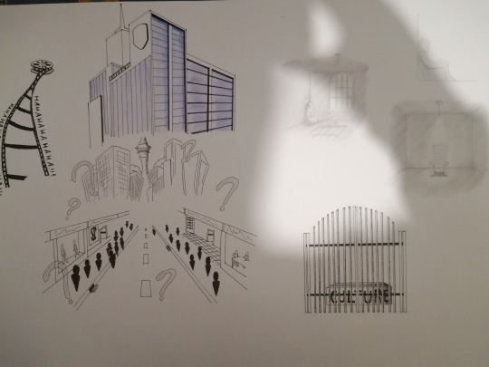
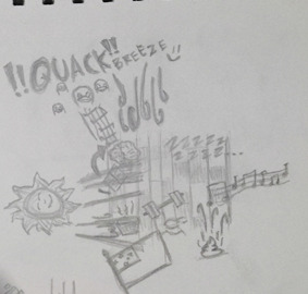
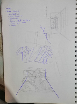
This week we were given a task to draw atmospheric images that either make us feel at place or displace. I found this A2 drawing a little challenging, I had no problem drawing but the complications occurred when I struggled to think up ideas of what to draw and how to communicate how these images made us feel through the images. Drawing feelings, sounds, mood and atmosphere isn’t easy to communicate through drawings as these are usually communicated by the use of words.
Here is my first drafts of my atmospheric images as you can see I had drawn words for the sounds as these are things that are complicated to communicate through images.
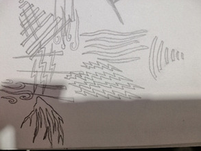
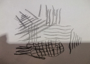
The next two images was my attempt at drawing what senses I feel within my room without using abstract images but solely depend on lines and how I could use lines to describe my senses within my room. The outcome was better in my opinion than using abstract images, it didn’t just tell the viewer what exactly I wanted them to know and feel but it left space for them to come up with their own interpretation of the space.
After I had finished my atmospheric images I moved onto my final A2 drawing and had a whole arsenal of images I could choose from as I had drafted and developed images I had drawn in my drafts. Here is what I had come up with.
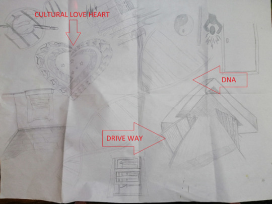
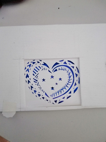
Majority of these images are images of what makes me feel at place within a certain space, DNA representing family and friends the cultural designed love heart representing my love for my country and my drive way representing the start of my comfort zone and where I step out into an unfamiliar space. These images all helped me develop my thoughts and ideas of what I wanted my diorama to look like.
WEEK 3
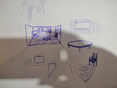
In week 3 I started to brainstorm some ideas of what my Diorama would look like, I started off by brainstorming how my ‘place’ area of my diorama would look like as this was the easiest one to do out of the two. I tried to incorporate my heritage and its environment into my design and tried to tie it towards a more modern New Zealand building interior. I did do a rough sketch of what I wanted.
Here I roughly tried to sketch what environment I wanted to display in my diorama, first I brainstormed some words of what makes me feel at place within a certain space and tried to incorporate them into one drawing, my first initial idea was to create an environment that was similar to my home in Samoa, green grass with an area of sand littered with a few coconut trees. I wanted to incorporate an island vibe into my diorama and place my New Zealand house within the environment. The only problem with this idea is that it didn’t allow me to play with any interior spaces and place other things that I wanted too such as tables, certain items that are special to me and make me feel at place. So I had to scratch this idea.
My second idea allowed me to play with a lot of interior space and allowed me to incorporate an island environment without it being majority of the diorama. It still held the same principles to my first design but allowed me to place certain things in an interior space.
I made up quick models of the two and posted them to photo shop to get a rough image of how things would look.

Wednesday class we were asked to present our A2 drawings in small groups and discuss it with our peers. It was very interesting to see other peoples work and have a little insight into what made them feel at place in certain spaces and areas. The way that each student displayed and drew their senses also intrigued me as this was a complicated problem for me. An idea I saw was that one of my classmates had used colour to describe his feelings and how light and air flows through his room. Where there are hot or cold spots and how the sun travels across his room with different shades of red this idea had never occurred to me and its surprising to see how everyone had their own styles and ideas of communicating senses through drawings.
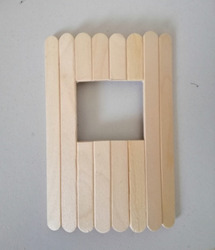
Now that I had a better idea of what I wanted to do I continued to brainstorm some materials that would help me design my diorama, not only allowing the diorama to be aesthetically pleasing but allow for strength/stability and meaning and purpose. The interior space I wanted in my Diorama was inspired by my room and so therefore I had to research some materials that looked similar to the materials of my room. For the floor I used pop sickle sticks and glued them onto a piece of paper allowing me to create a wooden floor, I had to darken the popsicle sticks to allow for a warm cosy feeling with in the interior space. White paper would allow me to create the white interior walls.
WEEK 4
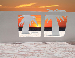
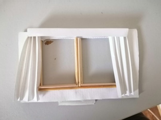
This week I went and picked up a few materials required to build my diorama I had thought about using wood (Popsicle sticks) to build the exterior wall of my, place setting that will separate the exterior island vibe beach from the modern interior. I re-framed from doing so as I realised it wasn't aesthetically pleasing, I found this out by testing this before with the little materials I had at home.
This wasn't done to its full extent but from this test I already knew that it wasn't aesthetically pleasing as I wanted a modern interior with a beach exterior separated by a wall. This modern interior wasn't going to work well with this island vibe wall and so I proceeded to redesign the wall so that it matched the modern interior and came up with this.
I designed this inspired by my bedroom window as it was one of the main features of my room allowing air flow into my bedroom.
I had a rough idea of what I wanted to do for my diorama and how I wanted everything to look, I also realised that since my dioramas in a closed box I feared that due to the lack of lighting the diorama wouldn't be appreciated the way I had envisioned in my head. So I proceeded to add precise cut out holes on the exterior panels of my diorama to allow light to flow into my scenes. One of those cuts allowed a piece of paper to be fitted on the left side of my diorama. This allowed a blue fluorescent light into my place scene. I used a pattern that I designed myself to give the modern interior an island feel so it would connect the exterior and the interior together.
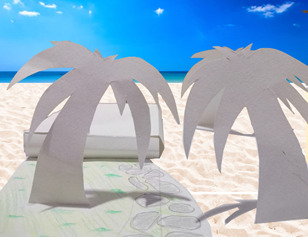
I experimented with the sand I had acquired from a sand pit and tried to make a quick mock-up of a sandy beach for my exterior.
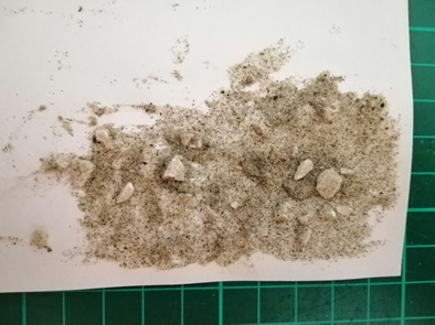
Using one layer of glue and sprinkling sand over wasnt enough to fully cover the paper as some white patches were easily visible through the sand, so I had to wait for the first coat to dry before I could add more glue and sand to the white areas that were showing through. This process was a little time consuming but I like the way it had turned out.
I started to plan out my ‘displace’ part of my Diorama, I have brainstormed and have come up with a few ideas. I played on that idea of isolation and loneliness as the driving stone of my displace ideas. Due to my Diorama having ties to my cultural background, I also tried to come up with ideas based around the idea of suppression. From my drawings I tried to create an atmosphere that was gloomy, sad and dark to communicate my ideas of displacement. I believe that lighting will be the main driving factor within this part of my Diorama, with the right lighting I will be able to emphasize the dark shadows of this part of my diorama. I wanted to keep this side of my Diorama simple with a minimalistic style to communicate emptiness, with the shadows I wanted to create an atmosphere where monsters or unknown things would be lurking within those shadows.
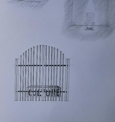
I planned to use black A4 paper as the walls, floor and roof for my ‘displace’ diorama as this will help bring out the emphasize of the shadows. Of course, for there to be shadows there needs to be light, so therefore I have created a little circle cut on the roof of my Diorama which will allow a little bit of light into the space. This also helps create that notion that within this place darkness is superior.
1 note
·
View note