Last Seen Blogs
cilekralicesi
Çilek 🍓

notkylewilliams-blog
NotKyleWilliams

atd-sportscars-blog
ATD-Sportscars
cilekralicesi
Çilek 🍓

the-hyperfixation-dump
welcome to ✨hyperfixation central✨
Note
I have two questions! First: have you ever thought of doing a tarot card suit for your characters? I think it'd work really well for them! And two: help me how do I draw legs
@gravitality
Hi!! I’ve absolutely been thinking about that, yeah, in fact I recently talked about that to my boyfriend just recently. It’ll likely happen after october! And to answer your second question! I made a thing on legs that i hope you’ll find useful!!
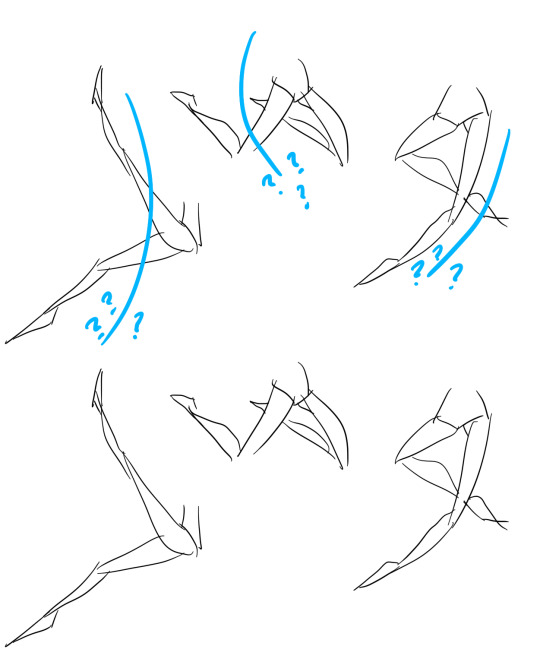
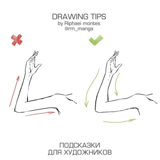
So. I’ve already explained basics on legs here, but I don’t think it hurts to go through some extra details to help you understand legs some more.
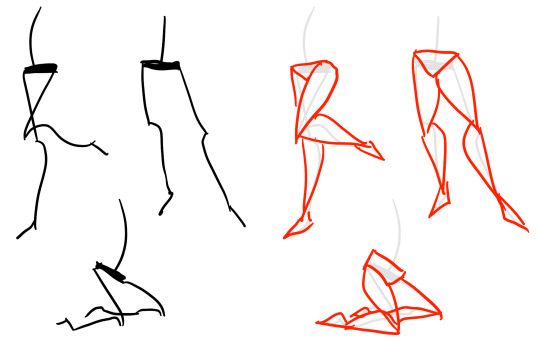
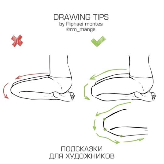
The very basic thing is to imagine legs as teardrops. Again, this has already been covered in said tutorial above, but I figured it’s still good to mention even the most basic thing that I know of. I still highly recommend you check it out to get in more detail and to see some other examples and practices that you do. But basically, think of legs in the shapes of teardrops, when it comes to shape. If you need a simple stick-figure to connect the legs in the first place, make sure that they bend at the knees a bit so that the legs don’t come off as stiff and unnatural.
As you can see, this method works perfectly for realistic legs as it does for stylistic ones. Remember to use these as a guideline, never to be the exact base of the legs you will be drawing. If you draw traditionally, remember not to draw these guides too hard, or they will be hard to erase/do freestyle!
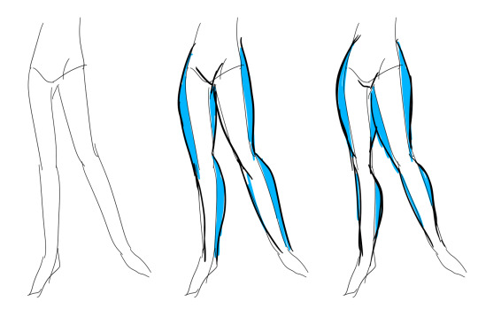
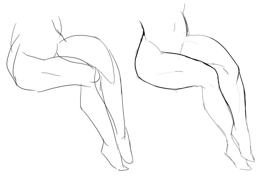
But how do you actually draw out the legs without drawing them perfectly straight, as shown to the left? The trick is to add volume to them, and how you do that can be winged to your own liking. The idea is to think in curves. As no leg is perfectly straight. You may make these curves minimal if you don’t want them to be curvy, but keep in mind, still, that not even your own bones are perfectly straight, so it is highly recommended that you make them bend, at least a little.
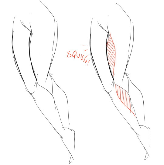
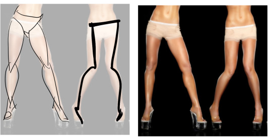
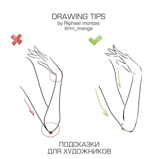
It all depends on how you draw them as well. Say you put your legs together, as shown in this picture, what happens to the fat and muscle? Naturally, they press together, much like how thighs squish on the surface when you sit down (I’m sure most people know what I’m talking about). Make sure this shows in your art! This is very important to keep in mind, because it makes it all look more natural and believable. Try to cross your legs or stand up and sit down again for real-life examples!
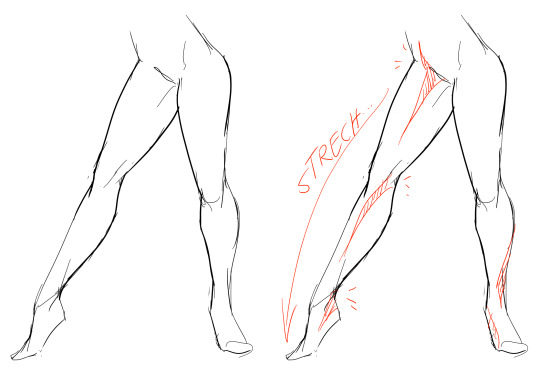
The same applies for stretching your legs, more or less, except they appear to become more ‘hollow’ and slimmer. They become less soft to the touch, too, and might show. Try stretching your legs and feel where the muscles tense and where it feels ‘hollow’. This is very helpful with your art.
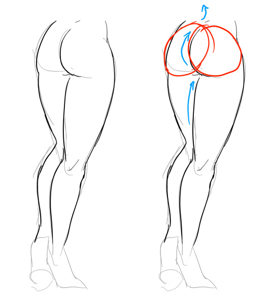
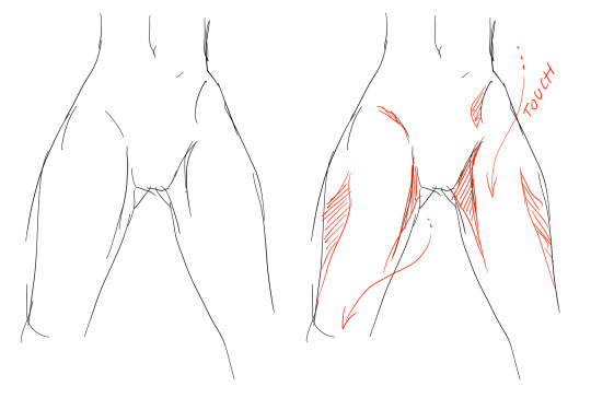
Many leg tutorials talk about legs without mentioning the behind. It requires a tutorial on it’s own, in all honesty, but this is the most simplest way to draw it connecting to the legs. Remember that it comes in many different shapes, and this is just a super basic guide! Two circles overlapping, while following the line and flow of the legs. Remember the muscle/fat as mentioned above!
Okay, so we got the basics of leg shapes figured out? What if you want o draw them in a certain pose, or with a certain silhouette, but perhaps do not have the reference for it? Or you want to blend your style into it? The key is to not shy away from doodling the form. Make mess, draw lightly and don’t care about the anatomy. That way you’ll get everything down without it appearing stiff. You can clean up the sketch later, always, and if you can, use a reference after you have drawn your pose, to correct your drawing.
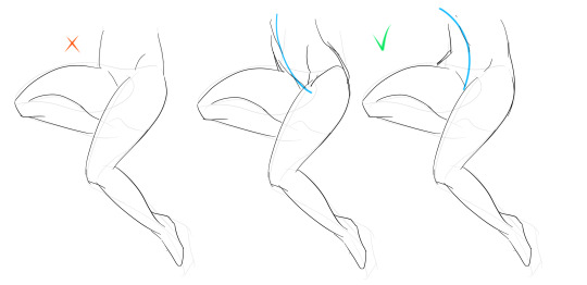
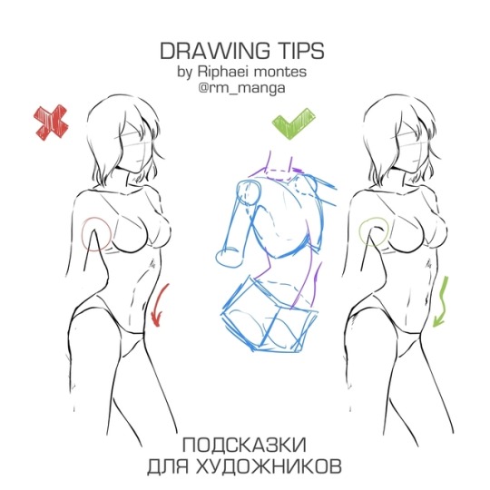
Remember that the hips do a lot to the pose of the legs! Make sure they are in flow with your legs, so that it can look more natural. Remembers that hips ‘rotate’ with the spine.
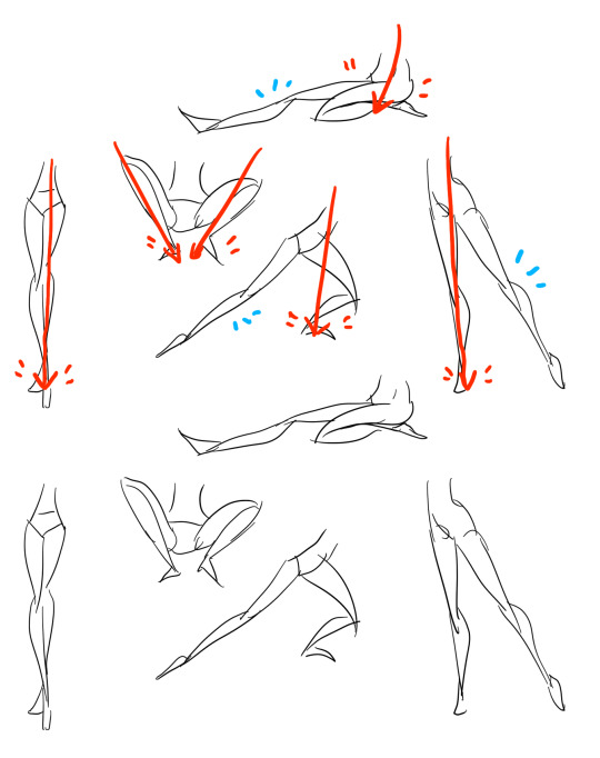
I’ve talked about this method before when it comes to posing, and the same applies for the legs. One way to make legs appear ‘steady’ is to picture them standing in a line, and one of those legs need not to stray from the lines too much, making it steady. If you want a dynamic pose despite the steady pose, you can always have the other leg stray from the line, since it only matters that one leg is steady. This method can create good, casual poses without making them appear boring. (also notice how the teardrop shapes are used here, despite the highly stylized legs)
Do you want a highly dynamic pose, or them to appear unsteady, then skip the line entirely and make both legs aim away from it completely. As you can see, the legs appear more moving, in action, as if they’re fighting, falling, or dancing. As you can imagine, this is not a pose that one could stay steady on, suggesting that it’s taken mid-movement. More about posing and this ‘line’ method is talked about in this tutorial.
Hope this helped you, if you have any questions let me know, and if you’d like to check out all my tutorials they can be found here!
28K notes
·
View notes
Note
hi! i love your art, it's so pretty ♥ and you draw feet really well, do you have any tips?
thank you a lot anon!! ( /)w(\) here, i made a few notes about the steps i follow while drawing feet:

^ that’s assuming you’re not drawing from a low perspective, as if the camera was on the floor or something like that!
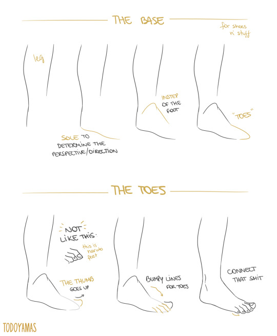
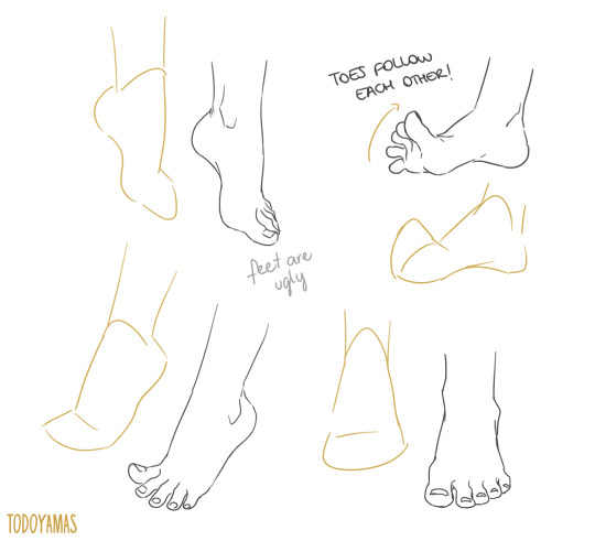
SORRY MY HANDWRITING SUCKS and i’m not really good at explaining things bc i don’t really follow a guide and stuff so yeah BUT I HOPE IT WAS HELPFUL TO YOU!!
92K notes
·
View notes
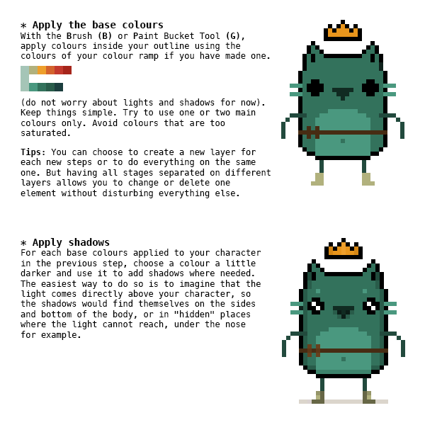
Photo


Late last year I wanted to start a series of short tutorials called Tip Jar, as a way of saying thanks to my fans and giving back to my patrons. This is the first of the series I have made, showing my technique on quickly filling in lineart so you can get to painting without coloring outside the lines faster.
Someday I hope to turn these into video tutorials when I have the income and the time, but for now I hope that I will be able to share useful tips in this infographic format.
Full tutorial image
Support me on Patreon
83K notes
·
View notes
Text
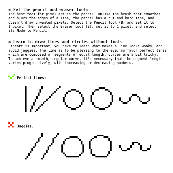
Some Photoshop Tips
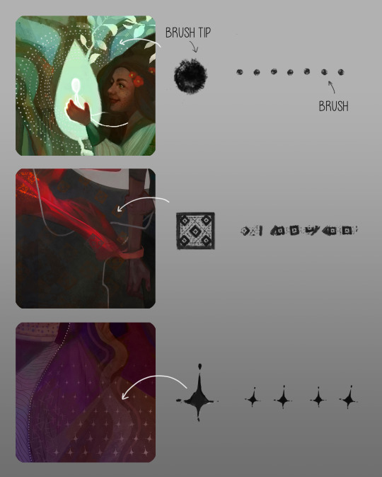
I’ve been getting quite a few asks about the process for the patterns in my stylized artworks, so I decided to put together a couple of tips regarding them.
Firstly, what you need are
— CUSTOM BRUSHES —
Most of the patterns I use are custom brushes I made, such as those:
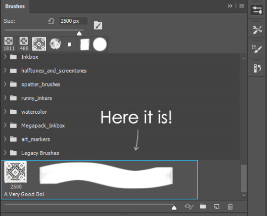
For the longest time I was convinced making brushes must be super extra complicated. I was super extra wrong. All you need to start is a transparent canvas (2500px x 2500px max):
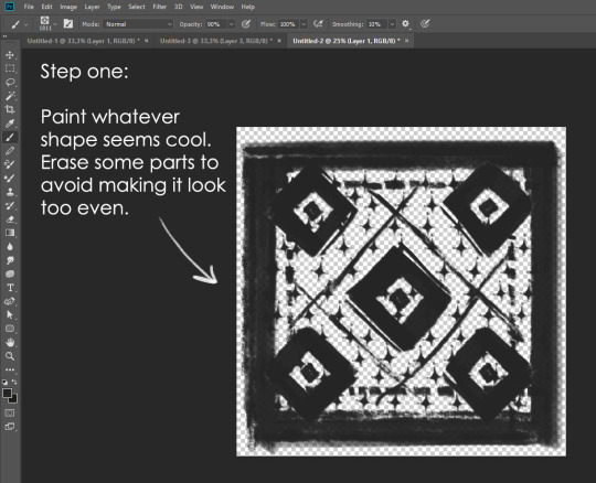
This will be your brush tip. When you’re satisfied how it looks, click Ctrl+A to select the whole canvas and go to ‘define brush preset’ under the edit menu
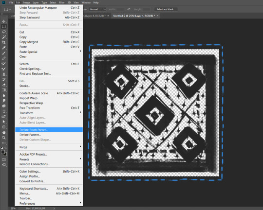
You will be asked to name your new glorious creation. Choose something that describes it well, so you can easily find it between all the ‘asfsfgdgd’ brushes you’ve created to be only used once

This is it. Look at it, you have just created a photoshop brush. First time i did I felt like I was cheated my whole life. IT’S SO EASY WHY HASN’T ANYONE TOLD ME
Time to edit the Good Boi to be more random, so it can be used as a Cool Fancy Pattern. Go into brush settings and change whatever you’d like. Here’s a list of what I do for patterns:
- under Shape Dynamics, I increase Size Jitter and Angle jitter by 5%-15%
- under Brush Tip Shape, I increase spacing by a shitload. Sometimes it’s like 150%, the point is to get the initial brush tip we painted to be visible.
- If I want it to look random and noisy, I enable the Dual Brush option, which acts like another brush was put on top of the one we’ve created. You can adjust all of the Dual Brush options (Size, Spacing, Scatter, Count) as you wish to get a very nice random brush to smear on your backgrounds

The result is as above. You can follow the same steps to create whatever brush you need: evenly spaced dots that look like you painted them by hand, geometric pattern to fill the background, a line of perfectly drawn XDs and so on.
BUT WAIT, THERE’S MORE
— PATHS —
But what if you want to get lots of circles made of tiny dots? Or you need rows of triangles for your cool background? Photoshop can do all of that for you, thanks to the magic of paths.
Typically, paths window can be found right next to Layers:

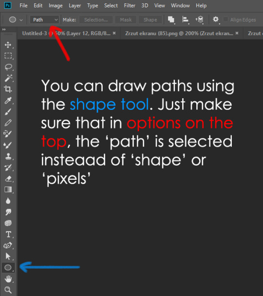
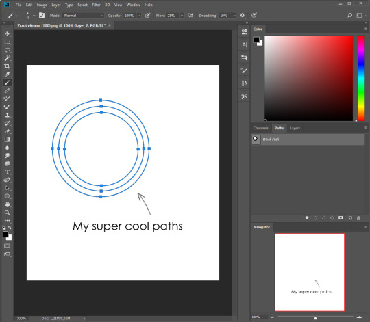
Draw whatever path you want, the Shape Tool has quite a bit of options. Remember, paths are completely different from brush strokes and they won’t show up in the navigator. To move a path around, click A to enable path selection tool. You can use Ctrl+T to transform it, and if you move a path while pressing Alt it will be duplicated.
Now, pick a brush you wish really was in place of that path you’ve drawn and go to layers, then choose the layer you want it to be drawn on. Then, click this tiny circle under the Paths window:

Then witness the magic of photoshop doing the drawing for you while you wonder how tf have you managed to forget about this option for the past 2 years
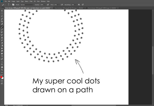
You can combine special brushes and paths for all sorts of cool effects. I mostly use them in backgrounds for my cards, but you can do whatever you want with them.
I hope that answers the questions for all of the people who were sending me inquires about the patterns. If you have any questions regarding this or any other Photoshop matter feel free to message me, I’m always up for complaining about how great and terrible Photoshop is C’:
93K notes
·
View notes
Photo
CLOSING THOUGHTS
- Start small.
- Make mistakes and try new things.
- Practice as much as possible.
- Share your work with others and get feedback.
- Study the work of the artists whom you admire.
- If you don’t have a tablet, get one. Small ones are cheap and easy to carry around.
- Have fun!
22K notes
·
View notes
Photo


Some drawing tips previously posted on twitter.
More drawing tips on my patreon.
Hope some of these can be helpful.
81K notes
·
View notes
Photo
Some drawing tips previously posted on twitter.
More drawing tips on my patreon.
Hope some of these can be helpful.
81K notes
·
View notes
Photo
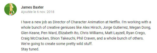
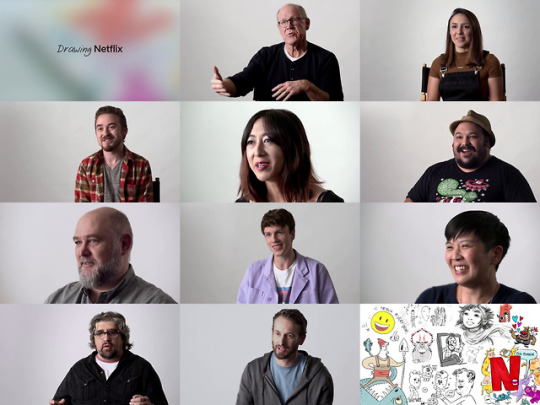
Ok, so Pendleton Ward (Adventure Time) is now working with Netflix.
And you can watch a video with 10 another great artists also working on new animated projects for this platform :
- Glen Keane
- Jorge Gutierrez
- Shion Takeuchi
- Alex Hirsch
- James Baxter
- Megan Dong
- Craig McCracken
- Matt Layzell
- Elizabeth Ito
- Chris Williams
>> https://www.youtube.com/watch?v=NRMazof6RMc
3K notes
·
View notes
Text
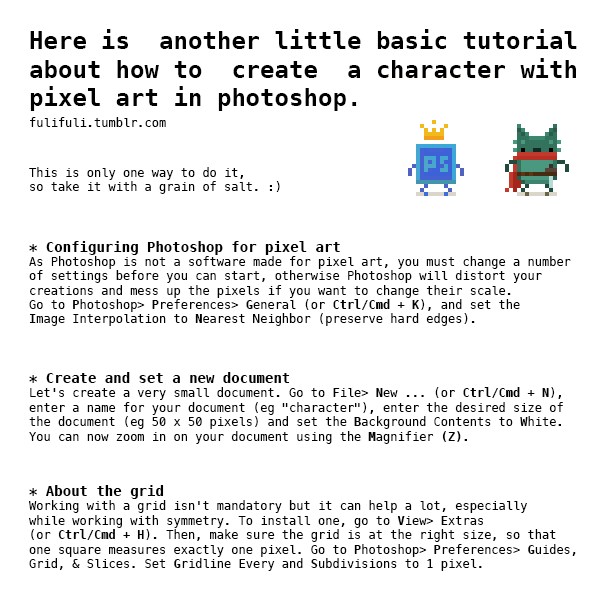
Top 12 alternatives to Photoshop for digital painters and illustrators
Hello there!
Yes, we haven’t done this in a while… but our inbox and chat are swamped with questions on the subject, so this article was very much needed.
it’s a simple list of art apps, but we know you love those :D
Enough with the intro, here it is, a list of twelve art apps you may want to check out.
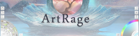
ArtRage is an art program for beginners and professionals. With its minimal interface, it’s easy to keep the essential tools at hand without stealing space from the canvas.
Panels can be moved around and tools can be customised. We all know how important it is for digital artists to be able to modify brushes!
Pros: easy to use; friendly interface; essential tools from professional apps available; available for iOS, Android, Windows and Mac
Cons: it may get sluggish with big files and when using big brushes, but performances also depend on the running machine; limited selection of editing tools if compared to Photoshop - ArtRage is more of a painting program rather than an editing one.
Paid
ArtRage Lite is a different version at a cheaper price, mostly for beginners, but also for professionals if they need the essential.
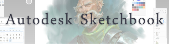
Now free, Sketchbook is the famous app created by Autodesk for various platforms.
Pros: clean, friendly interface; easy to use; professional features
Cons: lack of official tutorials; doesn’t offer as many tools as other apps (it’s down to the essential); paid subscription in Adobe style for the pro version
Free and paid
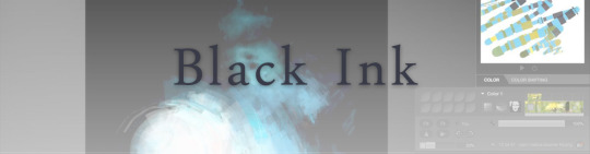
Black Ink is a powerful little program few actually know, but there’s a reason: this isn’t your classing drawing app.
What’s cool about it is the vast selection of special brushes, completely non-realistic, and definitely able to boost your creativity.
Pros: vast selection of customisable brushes; excellent performance
Cons: not very easy to use; non-intuitive interface
Paid
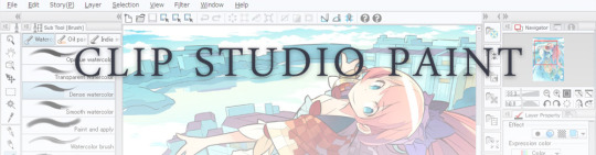
This is probably the most complete software for painting, drawing and animation. It was originally known as Manga Studio, but with its updates and addition of features, it became Clip Studio Paint.
This doesn’t say much about the quality of the features themselves considering the affordable price (if you haven’t used the app yet, that is), but among graphic apps, this one is the top seller.
Pros: professional features for illustrators; layout tools for comic/manga artists; 3D reference models; customisable tools; various sales with special prices
Cons: the interface may not appear intuitive at first; the program may lag (again, performance also depends on the running machine)
Paid

GIMP is the famous open source image editor originally created for GNU/Linux and available for OS X and Windows.
Best known as Photoshop’s main competition, this is a manipulation program for both beginners and professionals who love design.
It offers many professional features, making the program a powerful tool.
Pros: professional editing tools; supports different formats; supported by different platforms; active community
Cons: in spite of the simple design, many options are hidden and it takes time to discover all the features; slow startup
Free
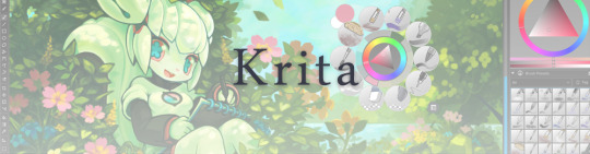
Krita is an open source painting app created by artists for artists.
Pros: easy to use; intuitive interface; great brush workflow; brush stabilizer; customisable brushes; general good performance; very enthusiastic, although small, community
Cons: it may be slow or even crash depending on the running computer and the app’s version; very few editing tools compared to Photoshop
Free
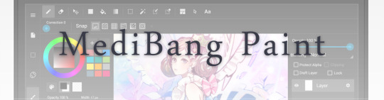
MediBang Paint is a free and light app for drawing and painting, perfect for manga and comic creation.
Pros: vast selection of brushes; cloud sharing; friendly, minimal interface (non-desktop app); also available for iPad, iPhone and Android
Cons: requires an account to use all features; non-intuitive interface (desktop version)
Free
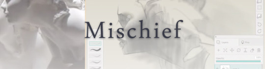
Mischief is a sketching app with essential tools, useful for brainstorming and ideation.
Pros: infinite drawing canvas; friendly interface; easy to use; cheap pro version
Cons: few updates; offers only the essential (but that’s the point); no editing/adjustment tools
Free and paid
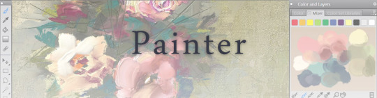
Corel’s jewel, Painter is the most famous software that offers digital tools able to give a traditional feel to brushes and canvas.
Pros: different selection of media; many professional features; PS-friendly
Cons: certain brushes may work slow; not easy to use at first; the software may crash (this is the most common report); pricey
Paid
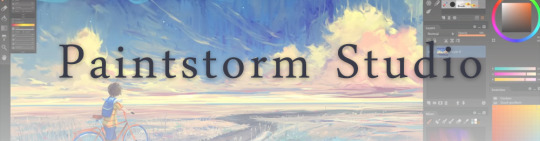
Paintstorm Studio is a professional software for digital painting. It’s focused on the use of brushes and blending, which makes the software a little gem in the digital painting field.
Pros: good brush workflow; brush stabilizer; “close gap” feature; customisable interface and tools; professional features; affordable price
Cons: non-intuitive interface (desktop version)
Paid
Procreate is the powerful drawing app for iOS.
With the very sensitive Apple Pencil, Procreate is so easy to use that many artists chose the iPad over the most famous graphic tablets.
Pros: friendly interface; makes it easy to organise files; excellent brush workflow; customisable brushes; video recording; affordable price
Cons: hidden features; only available for iPad
Paid
SAI is a simple app for artists who want to focus on painting and drawing.
It’s well known for its good pressure support and its essential tools for manga artists, but SAI can be used by any kind of artist who wants to paint.
Pros: easy to use; friendly interface; light software; customisable brushes; tons of (non-official) tutorials
Cons: limited selection of tools, even basic ones; limited canvas sizes and uses; it might crash from intensive work, especially with big canvases and brushes; supports only RGB colour mode; lack of support
Paid
We hope you’ll find this list useful.
If you think there are other apps that should have made this list, don’t hesitate to let us know!
Thank you and peace out,
G&M
Buy us a coffee ❤
Other articles:
10 inspiring and helpful YouTube channels for digital artists
6 inspiring Art Podcasts for digital artists
7 amazing Photoshop extensions and tools for digital artists
87K notes
·
View notes
Text
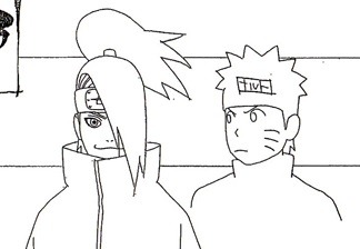
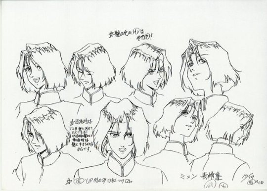
My favorite part of the model sheets is when they draw a little Naruto head to show the height difference.
Cause when he’s taller,he’s all happy about it.
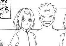
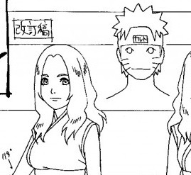

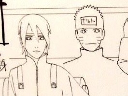
But when he’s shorter,he pouts about it.
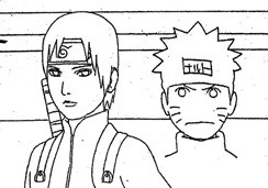
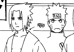
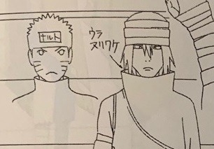
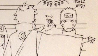
Though my absolute favorite is his face with Deidara
94K notes
·
View notes
Photo
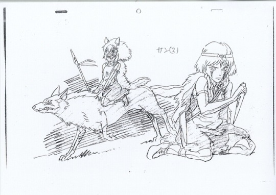
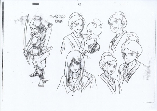
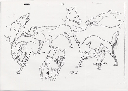
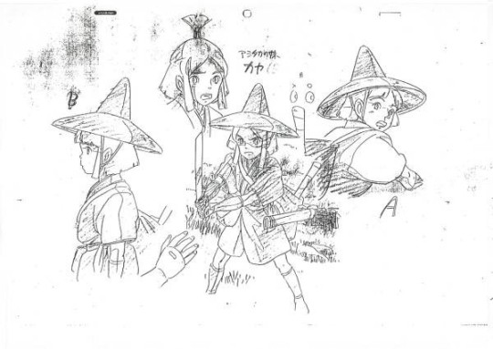
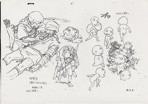
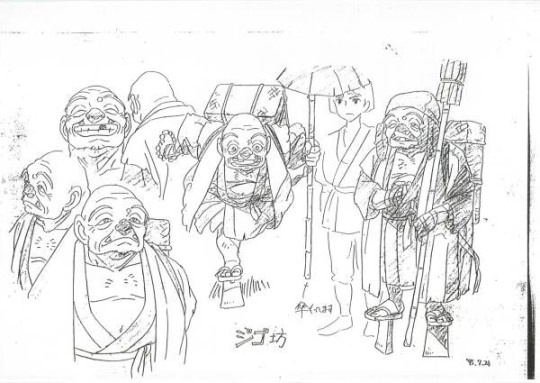

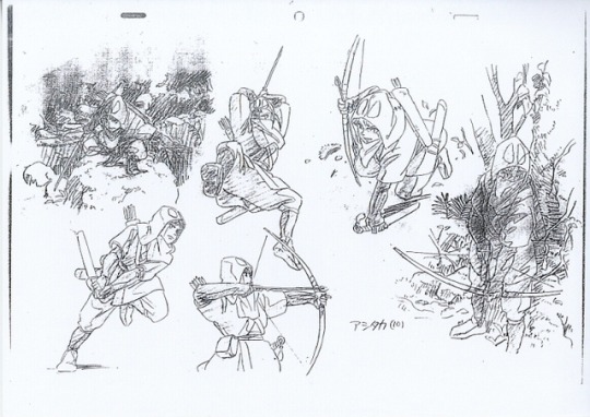
Character-designs by Hayao Miyazaki & Masashi Ando for “Mononoke Hime” movie (1997).
Full gallery :
https://www.catsuka.com/gengal/artworks//mononokehime
https://www.pinterest.fr/catsuka/animation-artworks/mononoke-hime/
( Gengal update 24/31 ) #AnimationArtworks
1K notes
·
View notes


Photo
Working on my Pride & Prejudice comic, and I have done a step-by-step gif :
a panel for the page 8, with Jane and Lizzy.
1) Rough.
2) Add frame and ballon.
3) Ink the characters with the Gpen brush.
4) Color main zone with flat colors.
5) Add paper texture.
6) Paint the background roughly with the soft brush.
7) Paint skin with the soft brush.
8) Add details on background with the round & soft brushes.
9) Adjust light/shadow.
10) Add decorations and highlights with the round brush.
11) Add shadows with the round brush (multiply layer).
12) Done !
You can download the brushes for free on Gumroad. :)
286 notes
·
View notes
Photo


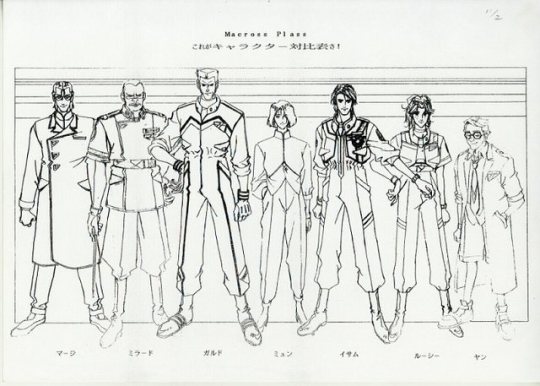


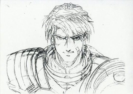


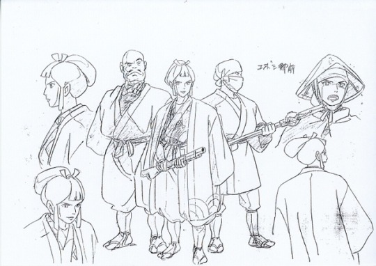
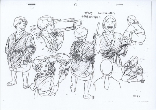
Character-designs by Masayuki for “Macross Plus” OAVs (1994).
Full gallery :
https://www.catsuka.com/gengal/artworks//macrossplus
https://www.pinterest.fr/catsuka/animation-artworks/macross-plus/
( Gengal update 14/31 ) #AnimationArtworks
610 notes
·
View notes
Note
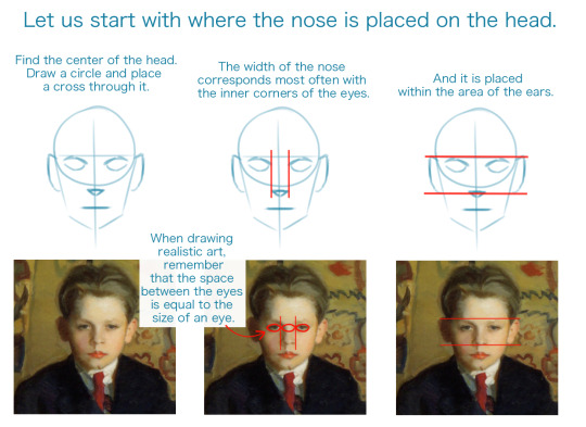
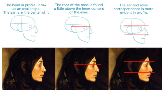
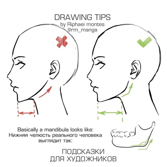
Got Any tips for doing profile view of people? I'm struggling man
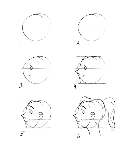
Tbh nothing I can say can help as much as looking at anatomy books and references. That being said, some general rules I follow are:
1) start with a lopsided oval (something that has the movement you’re trying to evoke with the face you’ll draw.)
2) roughly divide it in half horizontally. This will be where your pupils are.
3) divide it into thirds vertically. This will decide where your eye sits and your mouth ends.
4) carve out a nose and chin. dimensions will vary depending on the character/style you’re after.
5) your ears generally are as tall as your nose, so you can fill that in, and connect the inner ear to the chin to create a jawline.
6) you connect the base of the skull (behind ear) and the jaw to a neck and add in hair.
This is very stylized, so it’s not an exact science, but sticking to these general proportions should help! Here is an index I made of art resources you can use, as well.
2K notes
·
View notes