Last Seen Blogs
snxpdragons
FUTURE FAVORITE REGRET
urfushi
yippee
yoruio
Even if you're filthy I'd still hug u
silaswritesthings
Would you like to stop by for a quick read?
dirgni-suniva
☆¤▪︎Dirgni-◇♡
Text
Uno.

This is an image of the Uno home page, where you can find and download a digital version, having a digital version of a card/board game makes accessibility a lot better for players that might only be able to connect online over a large distance.
0 notes


Text
More Book Mockups

After running out of options from the covers we were given on google classrooms I went to find more options of book covers on the internet to use. I saw the websites that demonstrated their mockups and thought they had more unique angles I could use for better and more final outcomes
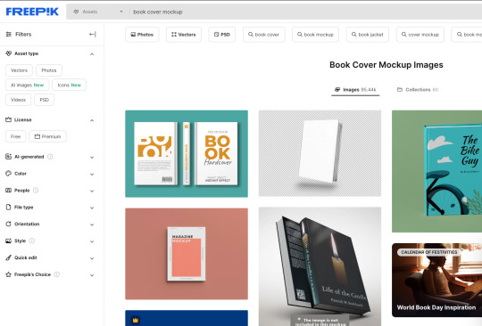
This is what the website looked like, the format of the mockups was incredibly professional, One issue I had with these mockups was the fact there were a lot of mockups that featured the back of the book however some of these did it in a way I could make it appear as if it was just multiple of the same books on top of one another.

As can be seen these are two books that are supposed to feature both sides of the cover however because I don't have a back to my book cover I'll use it to make it seem as if two of the same book are stacked on top of each other.
0 notes
Text
Book Cover Layout
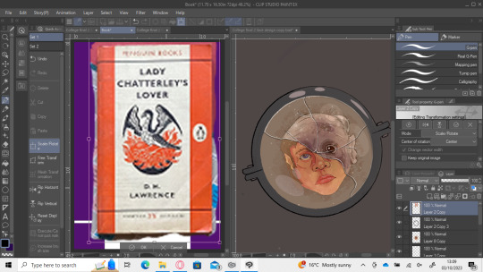
This was the main book cover I used as a reference from Penguin, I really liked the formal Layout of the cover as well as the somewhat circular piece in the centre seemed perfect for my work, I began by making it have purple streaks on the sides as well as replaced the dividing black lines with purple to match the streaks. I didn't feel like this worked as well as the colour I was using wasn't giving off the feeling I wanted, I wanted mysterious and evil however my initial purple comes off more friendly, after I realised this I changed it out for a darker purple, this did make it more mysterious however it still wasn’t sticking with me as a colour so I wanted to try more of a red and I feel like it complimented the lens a lot better. Red gave off more of an evil feeling then the purple so I decided to stick with it.
0 notes
Text
Lens Work

After having finished making my lens I decided that that I wanted to add a frame around it as it felt empty and too plain, Initially when I added the frame I wasn't sold on the idea however I believed that if I gave it more depth and make it appear more like a frame it could really help sell the idea.

My first idea for adding more depth to the glasses was to focus on the lighting, I have always used lighting as a way to add detail and depth to my work, I used an airbrush and a lighter colour to try add a highlight, This didn’t work in my opinion as it felt like it took too much space for my liking, It felt too smudged and wasn’t really selling the idea of lens frames.
I decided to change the highlight for a form of cell shading I feel like this made the work seem a lot more clean and worked a lot better at selling the idea of a metal; frame around the lens, Since it had worked with the frame I decided to add more cell shading to the lens itself, this didn’t have an amazing effect however I was still happy with how it came out

While working on the head I had my canvas titled, one of my tutors walked over and we began having a conversation on the work with how maybe a tilted version of what I was working on gave it more character, Almost as if the wearer is looking through this lens in a hurry and was making a hasty head tilt, or it could be seen as one of those curious head tilts used in many horror films such as the Halloween series. I did really like this concept and decided to keep add it to the final book cover.
0 notes
Text
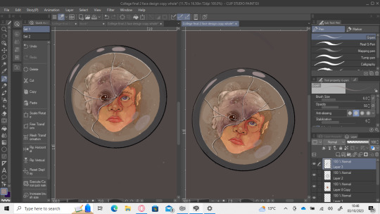
Polishing My Book Cover

I was really happy with the design I had came up with for the cover however I felt as if I could make it more polished for my final cover, For this I started by using my shape tool to make a perfect circle that I would use as the lens that my creature would be seen through, Something I changed after receiving some input from my friends was the way I had drawn the cracks in the glass as before it when directly down the middle, I changed it to be at a slight slant, I also made it a lot more wavy and unpredictable like how cracked glass would actually form, next wanted to redraw my creature and make it more polished and interesting, I did like my old creature however the line work I had done was far too messy for me to be a finished design so I grabbed my mood board and used some of the monster designs as reference and I settled with something that has a very humanoid appearance however I changed a few features like the ear size, made the eye droopy and created a bulging lump on the head, It is simplistic however I do feel like it works really well, The droopy eye makes the creature looks sad which is perfect for my idea of looking into a persons soul, almost as if he’s internally sad and in pain, I do feel like this adds mystery and will grab my audiences attention a lot more.

After having made my creature and I was happy with the design I began working on the glass lens, For this I wanted the lens to appear worn out and dirty so I immediately looked for images and noticed that there is often little dust particles and I wanted to integrate this into my work, In order to achieve this effect I created a new layer, lowered the opacity and used the droplet setting on my air brush, The first issue I was presented with was the fact that the particles were far too compact to give a nice texture large scale so what I did to try combat this was increase the brush size and see is the droplets would be more spread out, Another issue was presented, The size of the droplets was increased and made it far too distracting from the main piece, In order to work around the issue I settled with only giving hints of dust by using an airbrush with the size 10 and I used it in certain spots to give the idea of dust particles. I do really like how this came out and I do believe that it adds to the dirty effect of the lens. I also attempted to colour the lens a type of brown to add to the idea of the lens being dirty, This isn’t accurate to dirty lenses however I took some creative liberty as I do believe that it makes it a lot more convincing. I was happy with the colour however it didn’t fully convince me so I decided to add a fog the the lens as well, I achieved this by using the airbrush tool again and selected a brush with a nice texture which I then lowered the opacity of and kept layering over the centre, This worked really well and made a really nice texture that I feel perfectly gave the Idea of a fog.
After having made the lens properly I wanted to add a shine to the glass that way it bring out the cracks a bit more, I began by lowering the opacity of the cracks and lens linework to give it a more transparent look that glass cracks have, I then began adding a white outline to the cracks to sell the reflectiveness of the glasses as when glass reflects light it doesn’t have a tainted colour but rather a pure white glow, I had the reflected light be in sync with the rest of the illustration as the light from both my human and monster designs have the same direction of light, I wanted to keep this going with the reflection.
0 notes
Text
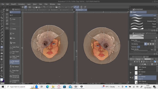
Book Cover trails

This is the first book cover trail I had made for my actual book cover, I do like how it came out however I do feel like I had forgotten my target audience when making this one as it’s very clearly a cover that would be more directed towards children as it doesn’t look like it takes itself seriously, it was meant to just be a sketch of an idea that I would try refine later on however the layout and the way I was thinking of doing the text would have made it appear as if it were a children's book no matter what I did. I did really like the idea of this book cover however it just wouldn’t work with the target audience I was going for.

After my first cover design I wanted to make this one a lot developed, My tutor had suggested I look at the layout of Penguin Classic style books, which I did and knew that it would immediately be perfect, while its simplistic it does cater towards more of the target audience I was going for. Their books seem to be more focused on the layout rather than the illustrative piece, Another detail I noticed with the penguin books where how they used colours for their books and I wanted to try play around with this idea and try out different colours, I picked purple here as the colour gives feelings of mystery and evil which I thought would work well with my story, I do love how it looks and I feel like it helps create interest in the cover.

I attempted to play around more with different colours so I wanted to make the cover green because I felt like that reminisce more with monsters and the damned. It did not give this effect however and so I decided to stick with the purple.
0 notes
Text
Head colouring

To begin with I made a brownish red base that I could start painting it with the airbrush tool and the pen tool, I use the Airbrush with a shadow setting as I really like how the brush blends shapes, I have used it for most of my works I’ve made in my free time, I do feel like it works well for trying to make complex shading like what I was doing here. I’m sure there is a much better way to paint it however this method works for me so I decided to attempt to use it on my project.
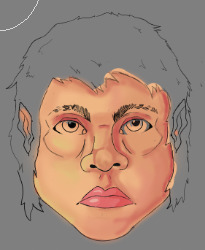
I was using my G-Pen to create solid colours and I was using my airbrush to create shading, If you look carefully you can see how some of the lighting and highlights were done with solid colours as well as I tried to add some solid colours on the nose, I do really think this technique works and can lead to some very impressive work like seen here, I love the way this as coming out. I suppose my only issue is I didn’t like some of the airbrush work I had done as the shading did look a little unnatural but I don’t feel it was that big of an issue.

I wanted to focus on getting the face work done before I began working on the hair as I believed that I would struggle with properly colouring that. I also began working on trying to colour the lips, I did try to use a reference however I feel like it came out too shiny as well as the colour was too bright, It also needed more details as our lips aren’t completely smooth, They have these kind of wrinkle lines, The issue I had with these is that they kept looking awful, So I decided that it would be better if I just hinted towards those being there.

As can be seen here I began working on the eyes, I had initially made them without the gray cell shading which didn’t sell the idea of the eyeball being round as it seemed flat and void of detail, After which my tutor came and explained how adding cell shading around the eye can really make the shape of the eye more noticeable that way it becomes a lot more believable. I do feel like this really helped and added to my work, I love the way the eyes came out as they were something I was struggling to do for an extremely long time, So to see them come together like this really motivated me in this project. Something else I started working was the hair colour.
For the hair colour I was originally going for a blonde, which very clearly wouldn’t match the character so I wanted to try a more brown colour and my first pick immediately stuck with me, I really liked how the hair came out although it did look too flat for my liking however I believe that some minor shading would help bring definition and make it feel a lot less flat.

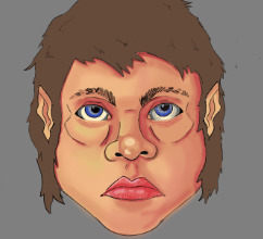
This is the final piece of my head I will be using for my project, I absolutely love how it came out and it is a great improvement from my first attempt I made on paper. The hair shading is subtle but it does greatly improve the feeling it has as I feel like it greatly helps with the texturing.
0 notes
Text
Worksheets

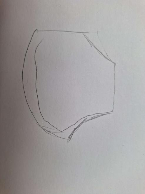
This is my first attempt at creating a side view of someone's head, There is a lot of noticeable issues, such as the way I’ve boxed the hair together, the structure of the nose, jaw line, eyebrow and forehead could be better. One of the most noticeable issues is the ear as I had done the shading using shapes which makes it incredibly difficult to image and view the ear as an in depth 3D object.

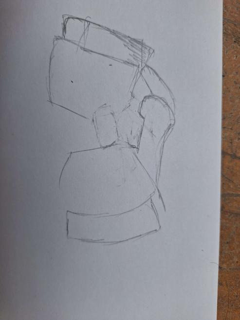
The head on the right was my tutors demonstration, Which you can see I was able to understand and improve the way I’ve been drawing heads immediately. I still had an issue with the ear however I still am impressed with the amount of improvement I have already made just after a some advice.
0 notes
Text
Hands
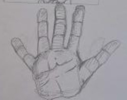
I made this hand using a method where I build the fingers from joint to joint. As can be seen the result wasn’t awful but it wasn’t great either. I added more details using my hand as a reference. It does definitely feel as if something is missing from this work.
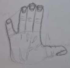
After my tutor had explained what I was doing incorrectly I began practicing this new method of using my hand as a geometric glove, This lead to me creating hands a lot more easier and quicker as well as keeping the fingers as a whole unit rather than dividing them with the joints.

I began moving out of drawing open hands and tried to use the same method in drawing hands to draw fists, This showed really good results however I needed to work more on my proportions which I assume is something I will just get better at over time.

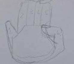
This was another attempt of me drawing a hand using the same method I was shown, As can be seen I was starting to improve on my proportions already, but something still felt off as the hand was missing the bone structure for the thumb.
This was the hand I drew right after my tutor showed me how to break a hand down into generic shapes by using my own hands as geometric gloves, as can be seen I did mess up this hand as I accidentally made the shape above the hand too big which lead there to being too many fingers.
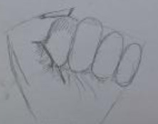
For this fist I am pretty happy with everything other than the way I have drawn the nail as I think I made it too sharp and overgrown. The fingers are all sized properly and proportioned correctly.
This is an example of me breaking a hand up into geometric shapes, this is the generic shape I use for all of my hands after I had been shown how to break a hand up into shapes. It’s incredible sketchy as I did struggle with the initial shape. I think that this will also improve with more practice .
This was my first attempt at drawing hands holding, As can be seen it was a disaster and was the flame that sparked me into trying to get better at designing hands that way I could understand how to draw them in different ways and be able to use them in my project later if I needed to.

This is the example my tutor made to show me how to shape and form a hand by breaking it down and not dividing it into joints. This greatly improved my method of drawing fingers of my hands.
0 notes
Text
Photoshop

In order to further develop my work I decided to download photoshop on my laptop just so I can work on my work after I had transferred it into a photoshop document so I could work in the mac room.

0 notes
Text
Lips improvement

My tutor had also suggested and demonstrated an improvement to the shape, sizing and texturing of the lips. I immediately began working on the shape and the sizing as when I begin working on the colouring I'll start adding texture to the lips.
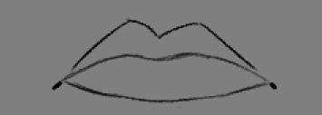
I am really happy with how the shape came out, the top lip could maybe be sized better but I personally believe that it's likely unnoticeable. I also believe the dots on the sides also give the lips a lot more depth and make them more believable, while the main part of the lips are convincing enough I believe those marks really help sell the idea.

I didn't get the chance to use these references as I had been given a demonstration before I started reworking my lips, however using them as a comparison I believe I was wrong, I think the top lip is perfectly fine just maybe it could be more symmetrical.
0 notes
Text
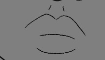
Lips

I started off by drawing lips according to the guide lines I made earlier, as can be seen they are far from desirable, I wanted to not give it much line work as my experience drawing lips in the past has always lead to unsatisfying results, so I wanted to try and just hint towards there being lips and obviously this didn't work but I still found it to be helpful practice.
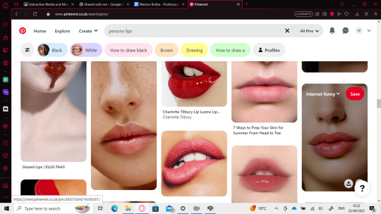
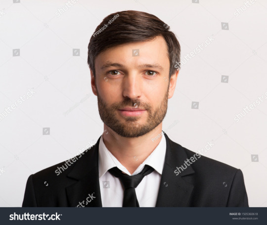
After this devastating result I went on Pinterest to attempt to find a good reference image I could use to understand how to draw lips, This was rather uncomfortable as most of the images were made with the intention of seduction however there were some good reference images in the mix.
I had not used a reference for this but rather I focused on the rest of the head before getting to the lips and I forgot to use my reference I carried over into clipart.
0 notes
Text
Head spacing and Cheek definition
I don't know why I wasn't able to notice this detailing on the face, after being shown by my tutor, It all clicked and I immediately knew this was exactly what I was missing on my work. The indent on the side that connects to the cheek.
The one for my character is a little shorter than usual however I'm not striving for perfect realism in this project, I want to make something that still looks slightly cartoony as well as I believe it gives my character a lot more personality. While I want a somewhat easy to relate to character I also want him to be his own individual with different imperfections from the next person.

I am over joyed with this improvement, As can be seen I'm also making it a little sketchy as I do really like how it can look in an art piece.
0 notes
Text
Eyebrow Work
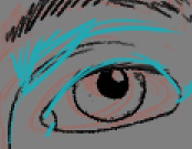
As I had stated before I believed that I needed to bring down the eyebrow and connect it to the arch, This is now confirmed from the demonstration my tutor gave me, It's clear that my eye brows need to be reworked slightly and be connected to the arch.

I brought the eyebrow down to the arch and I really liked the outcome, It had already made it a much more believable eyebrow.

I attempted to use eyebrow references however I came across a majority amount of art works and tutorials rather than a real persons eyebrow so instead I'll just refer back to an old references

It's not perfect and could still use a bit more work however I do still feel like its an improvement.
0 notes
Text
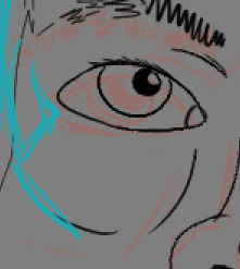
Eye Work

I also got a demonstration of what I need to do for creating my eyes, As can be seen I have made the outer facing part of the eye way too round when it should be a lot more sharp, and they demonstrated how I should only to the bottom of the eye rather than make it just as thick as the top of the eye, However I wanted to try a technique I do on all my cartoon characters where I don't give the bottom of the eye any line work.

I do believe I made the right call to have no line work to the bottom of the eye, It just feels a lot more natural to me, I believe this is just because of how I like to make my eyes in my usual art style, an issue I have is I believe I made the eye lids at the top way too boxy, I don't think is that big of an issue and I do still think it works however I do feel its worth mentioning.
0 notes
Text
Ear work

This was the what I was able to create after getting advice from my tutor. Here's the demonstration and a comparison between the ear I sketched and the ear I was able to make after getting advise.


It is definitely a great improvement from the original, I was shown how my ears were way more round then they needed to be, making the character seem a lot more simple minded and primitive where as the more clean and sharp makes him seem like a normal person and a lot more easier to relate to the majority of the readers. I'm very proud of the improvements I was able to make here and I believe this has helped improve my skill.
As can be seen the ear looks a lot more similar to this reference of a random persons ears.
0 notes