Last Seen Blogs
maxouchou
Welcome to my blog !

boringfaye-blog
FAYE

cherryblossomb7652
MarshmallowMischief
lemgroup
LEM
0104-vikita
Vikypoopsiekins
Text
Cinnamon Collective- Interview with Jane Anderson/Lucky Pablo
Interview With Jane Anderson of Lucky Pablo- 13.05.21
Conducted in the Parkside building of the BCU campus under safe social distancing measures.
How would you describe your style?
I guess the style is, you would call it abstract modernism. I don't know, It's, it's kind of illustrative modern English illustration.
Yeah, I saw you've got on your website you mentioned you were like folk inspired.
Yeah I mean it's it's a whole bunch of things like you probably already read the article where we say we cite influences from the original Pablo Yeah. Henri Matisse, you know, lots of influences which hark back to, museum collections. We're really interested in zoomorphic vessels and lots of the animals are based on time visiting the British Museum and all of that collection. Some of its problematic because it's all been stolen in colonial times, but the content is nice.
You're doing it in like a non problematic way you're recording the collections in an ethical way.
What do you say your core ethos is?
Just to play and have fun and just not stress yourself over where any of it's going. I mean, we really only started up to, to just play, you know, to really alleviate, a lot of the stresses that were happening when lockdown began. Yeah, I mean it wasn't me to start it, it was actually Ally. I was working on some freelance or some teaching materials. I turned round and she'd filled the whole table up with just loads of drawings and doodles, it looked fun. I said give me a Sharpie, give me some paper and I'll get involved. I suppose, it's always been a baton of, you know, passing it around and just not worry about it, its super collaborative and, yeah it's very sweet.
How do you generate ideas between the two of you?
Just by endless drawing. It kind of almost seems automatic,I don't know if you saw a fairly recent post where we're just trying to push, like we're always trying to introduce new shapes but there's the certain favourites that we really like drawing over and over again. So we've both got favourites like I love during the trumpet and I love drawing dogs and drawing the stairs, whereas Ally is really good at, lots of the other motifs and of the shapes.Yeah I think it's just that, you know one of us is always trying a different shape that we've not done before and you know we kind of poke heads over the table and go “Oh! I like what you've done there’’. And we, yeah it's It very much is that passing the baton and, both just having a go and seeing if we can improve on the shape or just, just play with it. I think we've got an openness to try and try lots of different things. So, you know, I suppose, for us, what we've loved doing is trying to create and populate lots of different surfaces. We never, you know, got into it thinking, oh, I want to do this and make some money but now we've got like a T shirt out of it. I'd like to do this, I'd like to do that and it's just, I suppose it's just evolved naturally,I guess.
Your style is so strong and everything you make, how do you make sure that you maintain this throughout your work?
Okay now I would like to see it evolve. But, you know, since we started drawing in this style we have found lots of other artists who do as well. God when, you know how long they have existed before us because I didn't realise I don't even know that person but it looks as if we've copied them. It's a lot of repetition,evolving, I mean it's really funny when I look back at my very first digital drawings because Ally is so much better at the straight pen and pencil whereas I'm the Digi kid. So, If it's, if it's a digital one, invariably, it's been drawn by me on an iPad but Ally can literally just, I don't know, she's got a really good eye for the grid on paper.
So that's interesting, but it's really cool that you've both got strengths and play to as well. It would be terrible if you both wanted to do digital work though.
I mean, you know, I suppose we've both got skills in different areas but we've we've tried loads of different things and some things work so we did try to try to make some zoomorphic vessels out of clay but that was just a disaster. I think, you know, you often think I guess as a creative thinking person that you could pick up anything and it translates really well. We also tried to do some line cut prints and they were also a disaster. We’re really open to collaboration, that is one of the things that we've really enjoyed.
Your collaborations are blooming lovely I especially love your work alongside Izzy Robinson. Do you have any advice for working effectively when in collaboration?
Of course, collaboratively, I mean we've just been really open to anybody contacting us. We’ve just had a brilliant French illustrator who we both really admire who wants to do a collaboration with us and it's like oh my god, she want to work with us. Crazy literally crazy we've just been given two public art Commission's to work on as well and although not collaborative in that element, its surprising to us that we just, you know, there's lots of things that keep on coming. But in terms of the collaboration I suppose we've been quite lucky with people who fit in with our style so easy, has got a really nice style and that, like our work fitted around it really nicely. And, and the stuff that we've just done with Tim Jones was a nice collaboration. And we are formally going to be doing something really exciting with Liam Bevin.
What core principles of design have influenced your work?
Grid systems, I suppose. Play is a big thing in our design and we don't give ourselves enough space to play. Well, Ally doesn't change, but her constant iteration is all about place I think, you know, play and happenstance is something that I think is really inviting and just actually making yourself sit down. If I had a bad day at work, not a bad day at work but you know it's tough or challenging, I just come back and draw and just forget about everything. Yeah, its massively refreshing, it's given us a huge purpose, yeah, yeah, which has lead to some good sessions.
What are your ambitions for the future?
Oh my goodness, big question. Well, I suppose, if we were even spreading any joy, we'd like to continue spreading more joy.
Oh, yeah.
Well, I'd love to do some big outdoor things look like I’dreally, really, really like to do that.
Yeah, a painting a wall somewhere, this is how the Awesome Merch collaboration came up.
I applied to do a wall in Leeds, that didn't come off but they said we'd like to collaborate with us, saying “can we print 150 bags for you and do 150 stickers for you for free?”
So yeah, I mean, more, more stuff like that, who knows.
I don't know, what do you think we can do?
I think, it would be cool to see more collaborations, see what mediums, you can play with even more because the idea you had with clay and pottery could really if you work if you worked with a specialist in pottery.
We often draw terrazzo, we’re obsessed with terrazzo pots, earthly things tactile qualities or tactility filters its way into both the print into the 2d into the like physic physicality of things.
I feel mildly embarrassed about.It was a lockdown doodling project that's now gone somewhere thatwe never expected it to go. But some days we get obsessed and we just want to do just that. and yeah, I mean it gives us such immense pleasure and we're like, oh yeah we could get more people just enjoying adding fresh shapes into the mix, and do lots of fun things, it's lovely.
Do you have any advice on how we could connect with creators and spread our name a little further?
Because we've got like the cinnamon collective and we want to carry that on beyond uni, so we're trying to work out how can we kind of carry that on without relying on the uni connection quite so much anymore.
I don't know, doing workshops, just any excuse to collaborate, and I suppose one of the things that we've enjoyed is like you say it's just working on lots of different mediums, you know, that willingness and openness to try lots of different things always pays dividends.But in terms of other things. I don't know I mean, I find social media really hard. Yeah, I think it's quite hard because I feel like you're never really capturing who you are because you're so conscious of, like, I need to be clean and sophisticated.I guess adapting to it like what working out how to like properly capture yourself without polishing yourself too much, I think. I think the integrity is important as well and doing doing something because you believe in it. Don't give yourself a hard time just enjoy what you do, invite collaboration. Don't feel bad if you're not posting on Instagram but making those connections is really important in terms of pushing who you are and your collaborative. I think one of the things that you started really nicely is kind of meet the team this is us and that I think people are genuinely interested in stories. Yeah, and seeing where it goes and progress and stuff.
0 notes
Text
Cinnamon Collective Artist Research: Lucky Pablo Case Study
Background
Started back in the first lockdown, in March 2020 Lucky Pablo was created to relieve the creators, Ally Standing and Jane Anderson, of the stresses of life in the Covid 19 pandemic. Based in Birmingham the pair started the company as a side project as way to unwind after work, in which they both teach design. They describe the start of Lucky Pablo being rather spontaneous, a result of doodling and drawing to pass the time initially.
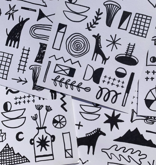
(Lucky Pablo ‘doodles’, curtesy of Lucky Pablos Instagram)
Their instagram displays a lovely portfolio of work, ranging from prints, to homewares to jewellery. This variety highlights their artistic backgrounds and versatility. With both of them having experience in fine art, it’s clear they are drawing on this expertise when thinking up and designing their products. As well as having an Instagram, they sell their work online through their Big Cartel website. Recently they have also taken to selling their work at local Birmingham based craft fairs, highlighting their love of their local community and connecting to the Birmingham design scene.
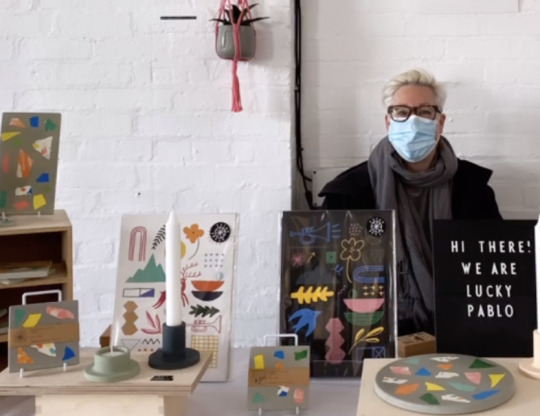
(Lucky Pablo at a Seasonal Market craft fair, curtesy of Lucky Pablos Instagram)
Influences
Their style is distinct, with the colours and sketchy fun drawings standing out for their freedom and flow. They state their influences being modernist artists like Matisse and Picasso, as well as renaissance artists like Heironymus Bosch. This influence is clear within their work, each piece looking rather like a spontaneous doodle, but with a well thought out grid system and heircharcy of the various elements. As well as the subjects being drawn being often inspired by their surroundings, often botanical and nature led, with a real charm, they call this ‘folk inspired’ artwork which is really well communicated in their work. They also bring in iconic Birmingham imagery to show their pride of being a pair of Brummies which creates a lovely sense of authenticity to their work, like they’re introducing the world to their bubble of inspiration.
Their mission by creating this company goes beyond being a distraction from the confusing and often distressing world of lockdowns, vaccinations and social isolation. They state that they want their images to be a ‘visual pick-me-up’ in these confusing times. Their use of colour really helps in this too, with bright playful combinations bringing a real vibrancy to their work. Its fair to say by looking at their work they embodied their strap-line perfectly: ‘Lucky Pablo= Joyful Designs for Uncertain Times’.
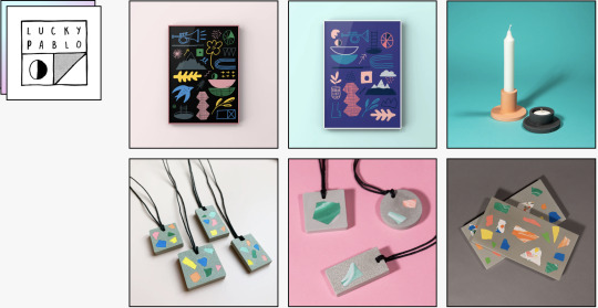
(Lucky Pablos online store front, curtesy of Lucky Pablo on Big Cartel)
Collaboration
They have also worked in collaborations with artists who share their vision, or organisations who they admire, which is a testament to their determination to promote fellow artists and be an active part the creative community. A perfect example of this being their collaboration with Izzy Robinson, a south-east Ireland based artist who specialises in woodwork and illustration. Both Lucky Pablo and Izzy have very distinct styles, but in the finished piece created they meld beautifully with a lovely contrast inn styles that created a really fun and experimental looking artwork. Lucky Pablos grid system and love of page furniture meant that Izzys illustrations could be worked amongst Jane and Allys recognisable imagery in a seamless way. As well as this the use of colour, a soft pink with a bright bold blue makes the work pop, once again the use of contrast brings the work to life. As well as this they have also worked alongside Design By Women in a limited edition t-shirt run and local artist Ted Jones, once again showing their style being perfect of collaboration and connection with like-minded creatives. It’s such an incredible example of a project that has both a distinct, clear style as well as having a freedom and flexibility to incorporate fresh ideas.
(Lucky Pablo x Izzy Robinson, curtesy of Lucky Pablos Instagram)
Reflections
I decided to research this lovely project as an inspiration for the collective I am a part of, The Cinnamon Collective. This is because we as a collective share a lot of the same intentions and aims, creating an outlet for creativity in an often overwhelming world. We also created out project as a result of the pandemic and being stuck at home in lockdown and we gained a lot of inspiration from Lucky Pablos clear vision and strong visual identity. When continuing work for our collective we will continue looking to Lucky Pablo, with their incredible work ethic and love of design shining through in their work, something we also hope to achieve.
Sources used:
https://www.instagram.com/_lucky_pablo/
https://luckypablo.bigcartel.com/about-us
https://www.instagram.com/scribble_iz/
0 notes
Text
Gallery 1988 Artist Research: Girl 1000 Case Study
Girl 1000
Background
A Birmingham based artist who sells ornate polymer clay jewellery. The shop was started around 2019, with her iconic ‘wiggle’ earrings really making her recognisable. She began selling her pieces on Depop, here she grew in popularity until she created her own website to sell her earrings. Her use of pastel colours and gothic themes make her really stand out, often her earrings look like art rather than simply being earrings as they are so considered.
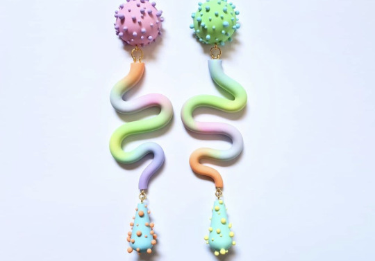
(Girl 1000′s iconic ‘wiggles’, curtesy of Girl 1000 on Instagram)
Influences
Her background in fine art is clear, with her jewellery bringing in elements of contrast between the colours used, balance of the various components used for example she often offsets a larger heavier piece with delicate tiny little studs that she applies one by one by hand, and movement, as her earrings often provide a fluid interesting movement when worn.
As she grew in popularity her techniques and influences expanded, with her jewellery incorporating more and more design elements such as gold leafing, beading work, marvelling and resin work recently. As you scroll through her Instagram profile which serves as a good portfolio of her work you can see the sheer variety of her work, with each piece being individual and different, showing her versatility but also her ability to stay true to her aesthetic even when trying something new.
the influence of pop culture
The reason I chose the research this jewellery designer for this project in particular however, is her love of basing earrings on pop culture. For example she is well known in the drag scene, often working alongside drag queens to create beautiful earrings to complement a drag look. This fits her brand perfectly, with the earrings often being loud and daring, often being a staple of the look. Her jewellery has been seen by countless drag enthusiasts and even recently got feature on Drag Race UK.
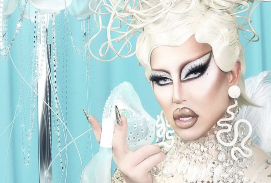
(Drag Queen Awhora, on Drag Race UK season 2, wearing Girl 1000 earrings, curtesy of Girl 1000′s instagram)
She often also creates earrings based on her love of film. She has created many pairs based on horror films, as her gothic extravagant style really speaks to this. As seen below she has made earrings based on Jaws and The Shining amongst so many others, that really speak to the aesthetics of said film. As well as this she has also created a series of earrings based on her favourite film, Alien, exploring various clay working techniques like using moulds and pressing.
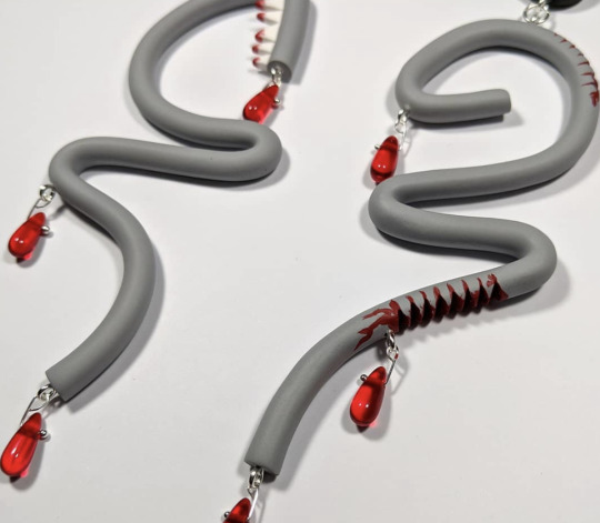
(Jaws inspired earrings, curtesy of Girl 1000 on Instagram)
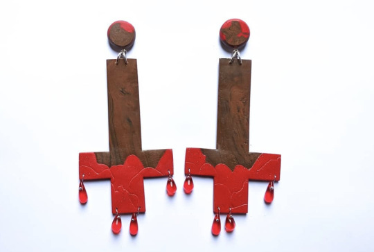
(The Shining inspired earrings curtesy of Girl 1000 on Instagram)
Reflections
I was massively inspired by her work within my own gallery 1988 outcome, in which I chose to make earrings based on the characters of the film ‘A Clockwork Orange’. To gain inspiration I looked into Girl 1000’s work and how she interpreted a film in a way which stayed true to her style. I think I will carry this into my own work, creating earrings heavily inspired by the film but also that play into my love of kitschy styles so that I can leave my own mark upon my submission and progress my own identity as an artist.
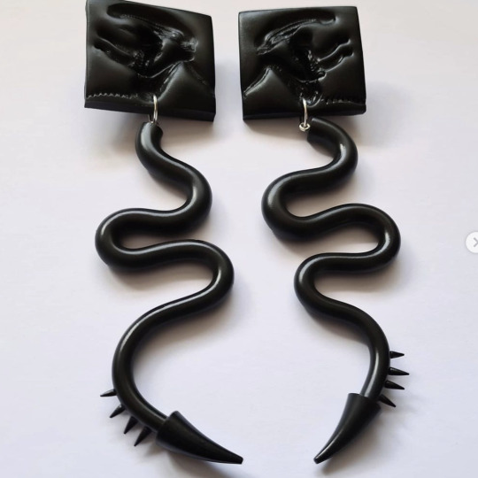
(Alien inspired earrings, curtesy of Girl 1000 on Instagram)
Sources used:
https://www.instagram.com/g1000jewellery/
https://www.girl1000.co.uk/
0 notes
Text
Pact Coffee- Venue Audience Research
https://acousticbrasserie.co.uk/For this we will be looking further into the various cafes the Pact Coffee brief pack list as its current clients. It includes cafes, eaters and venues across the UK all with varying audiences of their own. After looking into a few cafes we will then work out a few similarities between each to understand the typical venue audience so we can understand how to market to them in the best possible way.
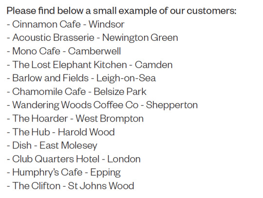
(From the Pact Coffee YCN brief pack)
Acoustic Brasserie - Newton Green
Based in Newton Green, London this Mediterranean restaurant not only serves quality hearty food but it also wants to touch the soul of its customers. The company was taken over in 2010 by the Kolcak family who rebranded it to what it was today, with influences ranging form Turkish, Greek, Italian, French and Labanese food, to create their beloved Mediterrian taste. The head chef and owner, Adil Kolcak has been in the restaurant scene of London for over 30 years and so brings prestige and experience to the resteraunt with a reliability its customers love. They state that their customers range from ‘well-known politicians and celebrities alike’ and so this is no everyday restaurant. They provide an atmosphere they describe to be rustic, vintage and cosy with decor to support this. The main themes to this being authentic, warm and inviting to its customers whilst also being up-market and appealing to higher society.
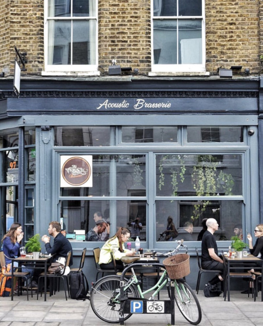
Sourced from:https://acousticbrasserie.co.uk/
The Hub- Harold Wood
Based in Harold Wood, Romford The Hub is a community centre which aims to connect residents in the surrounding area in a warm inviting environment. Serving hot drinks including tea, coffee and hot chocolate the centre aims to make the centre a place for people to come to relax and socialise, with a slice of cake too if they fancy. The community centre is a part of the local church but invites everyone, which makes it an accepting venue to visit and meet with friends. It also provides a children’s space to which allows for families to visit and for parents to have a bit of down time and relax. The menu itself is approachable with the drinks being accessible to those on a budget with their typical customers being local families, elderly folk and local club meetings. The main notable aspects to this venue are it being welcoming and inviting with a very relaxed nature, really encouraging socialising and connecting the community that surrounds it. You really get a sense of the warm, cosy nature of this and its value It must have amongst residents who visit it.
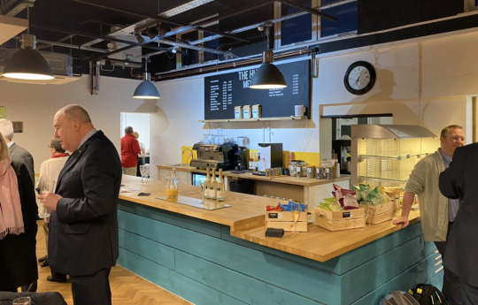
Sourced from: https://www.thehubharoldwood.co.uk/
The Clifton- St Johns Wood
Located in St Johns Wood, London this quaint local pub which was created as a safe haven for locals. Serving home-cooked style food and quality beer. Their menu consists of fresh and seasonal ingredients, created by a smaller team of chefs which creates a welcoming and approachable menu, in which they have daily changing specials which makes the food dynamic and exciting for regulars. The pub was actually restored by local brothers, Ben and Ed who loved the pubs history. The pub was oruonally a hunting lodge on 1846 before coming a pub, showing its long rich history with its local surroundings. They describe their pub as a ‘local hub’ for local families and visitors alike’ showing their inviting nature. The main themes of this local being again, welcoming, authentic in food and drink, cosy and a place for families to visit and relax all together. The decor also plays into traditional pub interior design which makes it seem rustic and homely too.
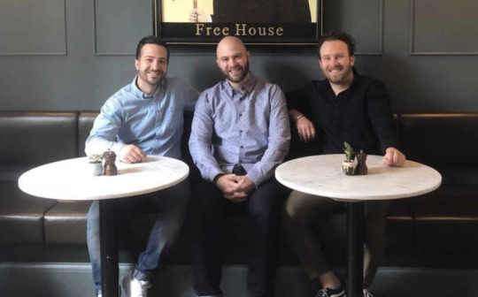
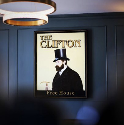
Sourced from: https://thecliftonnw8.com/about/
Conclusion:
The main aspects of each venue that sources Pact Coffee aren't immediately clear as they all have different price ranges and the venue styles vary. However there are some undeniable similarities between the three research above, a basic one being that they mainly seem to be based in the south of England, notably around the London area. This lends to most of the venues having a somewhat higher price range comparatively to the north, possibly just due to the fact rent and general living costs are higher especially in London. As well as this they all seem to really want to appeal to the local community, with The Hub especially making this their main focus. This means that each strive to be welcoming to locals, with The Clifton also noting that they want to extend their invite to visitors too. As well as this they all seem very genuine and authentic in their roots, all really basing their vision on what they know and have experience in which makes each venue appealing to customers. Finally, it seems each wants to play into the fact they want to make the environment of their venue a place to unwind, relax and connect to your peers, creating a cosy relaxed space for customers to do so. I think each venue is attracted to Pact for shared visions of their business. Both Pact and its example customers share pride in knowing their craft and wanting its customers to experience the product with the same enthusiasm as they have about it. As well as this pact also brings this feeling of community with its want to tell the story of its farmers and employees, and its customers also share this, with each really wanting to tell the story of its staff and its love of the local surrounding areas. All in all the research lead me to really appreciate the warmth of each venue and made me really understand why Pact is proud to say these are the venues who they supply to.
0 notes
Text
A Clockwork Orange- Set Design
John Barry
John Barry worked mainly as an archetect with an interest with stage design. Prior to his work on A Clockwork Orange Barry had a vast portfolio of work under his belt. His first work on a major film being a draughtsman on Cleopatra, and then an Art Director of Decline and Fall... Of a Bird Watcher. He first worked with Kubrick on the infamously unfinshed film Napeoleon, but he had chance to work with Kubrick again in 1971′s A Clockwork Orange. The outstanding work he did for the film can be seen even today with the stylised view of a dystopian world, from the perspective of the 1970’s being incredible, it has a vintage kitschy charm to it which is undeniable. Barry then went onto work on many other classic films, including Star Wards as a production designer for which he won an Oscar for best art direction, as well as The Little Prince and Superman 1 and 2.
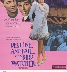
(Decline and Fall... Of A Bird Watcher, 1969, Art Direction)
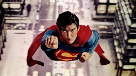
(Superman I, 1978, Art Direction)
Set Design
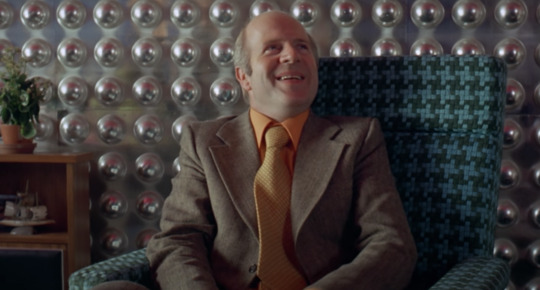
Interestingly, due to Kubricks dislike of travelling too far much of the film was shot just an hour to two hours away from Kubricks home in Herefordshire using mainly real houses and apartments. Meaning the budget for the film was relatively low, with only a few sets being built. This gives the set an eery familiarity, with the universe only being set in the near future. The design used throughout the film, to me at least really stands out within Alex’s parents house. This small flat displays such outrageous colour schemes and boldness it really encapsulates the rest of the films set design too. Its cited as being the ‘epitome of 70’s kitsch’. Its striking due to its conflict with Alex’s parents personalities, both of which are subdued and rather boring. In contrast the flat is attacking to the senses, notably in the wallpapers each having wild textures and patterns, like the bulbous spheres of the living room or the wallpaper checker that has shiny mirror squares nestled. It’s entirely captivating and wild all over, it almost desensitises the viewer to the horrors of the film as often its hard to know what the concentrate on. This carries through to the milk bar which contains tables that appear to be naked lady statues, the music store with its brazen colour scheme and space age inspiration and even to when Alex is committing crimes in his various victims houses. I bloody love this set design, its undoubtedly my favourite as it really embodies so much I love about design, a put-together yet carefree style, with bold entirely contrasting colours and kitschy odd details that make it hard to know where to concentrate.
(Alex’s Parents Living Room, look at the wallpaper!!!!, A Clockwork Orange)

(Alexs Parents Kitchen, A Clockwork Orange)
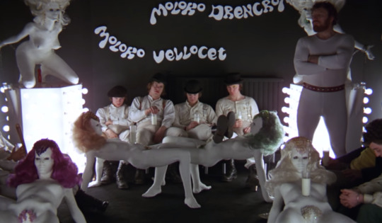
(The Karova Milk Bar, A Clockwork Orange)
Sources Used:
https://filmandfurniture.com/2017/10/film-sets-and-furniture-clockwork-orange-part-1/
https://www.researchgate.net/publication/319407843_Kubrick's_Neobaroque_Spectacle_An_Aesthetic_Analysis_of_Artificiality_and_Violence_in_A_Clockwork_Orange
https://faroutmagazine.co.uk/stanley-kubrick-explains-a-clockwork-orange/
0 notes
Text
A Clockwork Orange- Costume Design Research
Milena Canonero
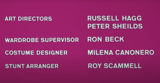
When it came to the costume design of A Clockwork Orange, Stanley Kubrick, the iconic director of the film sought out Italian fashion designer, Milena Canonero. After moving from Turin in Italy over to London to pursue her fashion work she began working on small theatre productions, its here its said she met Kubrick.
Although prior to this she had never worked within film, it quickly became her most iconic project with her stating that it was a ‘career highlight’ of hers. After recieving seemingly undeniable acclaim on her work within A Clockwork Orange she went onto costume design for iconic films like Barry Lyndon, for which she received her first Oscar, out of the 9 total nominations she has had with the Academy. Other notable films she has worked on include The Shining, Chariots of Fire, Marie Antoinette and The Gran Budapest Hotel to name just a few. In 2001 she even won herself the career achievement award in film, awarded by the costumers designers guild. Her influence on pop and film culture is undeniable, and this of course is ever highlighted by her famous work within A Clockwork Orange
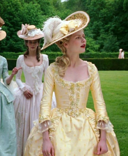
(Marie Antoinette, 2006 costume design)
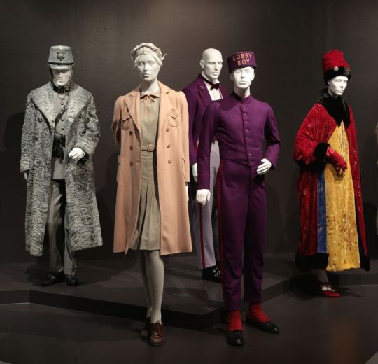
( A Grand Budapest Hotel, 2014, costume design)
The Droogs/ Young characters Costumisation
Milena states that her influence for Alex and his droogs uniform was informed by the youthful sub-cultures of the time. Drawing especially on the predominantly white working class elements such as that of the skin-head and mod culture. This carries through in the big boots and braces, very much reminiscent of the street styles of the 60’s and 70’s. After the films release, the films interpretation of the droogs style went as far as to influence the infamous ‘Bovver Boys’. They were hugely influences by the droogs of A Clockwork orange from the style down to the violence. This showing the massive impact of the costume design this film had among its fans and observers.

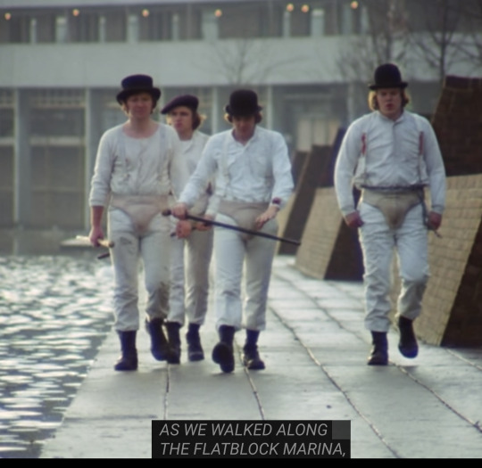
(A Clockwork Orange, 1971, costume design)
Sources Used:
http://fashionfilmstudies.blogspot.com/2010/09/case-study-clockwork-orange-1971.html
https://fashionatbrown.com/archive/2019/6/21/clockwork-orange-and-its-fashion-legacy
https://www.grailed.com/drycleanonly/a-clockwork-orange-style-influence
0 notes
Text
Cinnamon Collective: Etsy Audience Research
Who are the typical customers and sellers of Etsy stores?
Gender:
According to 2015 Fortune article, ‘Meet The 86%’ the vast majority of sellers are female identifying. But what about the customers gender identiry?! I hear you yell
This seems to be a consistently female lead demographic too, with Statista (an online statistics tool) showing that in 2017 81% of all buyers on Etsy being female and a mere 19% being male. This showing that the majority of customers are women, being sold to by other women. This pattern is successful too, in 2020 it was estimated that Etsy had roughly 2.1 million active sellers with 39.4 million active buyers, of which a staggering amount would be female identifying (according to this TechPenny article)
Age:
Of this 81% of females buyers In 2017 quoted earlier there is a clear marketable age range, with 15% being below 25 in age and the majority of buyers being between the ages of 25-40 (again according to this tech penny article) However, interestingly despite this younger audience it seems that the average age of a typical seller was 39 years old. (from Digital commerce) showing that it was mainly middle aged women who were marketing to those younger or of a simular age to them. This could show why Etsy is so successful, it seems that, by looking at these statistics, women are marketing themselves to an audience they understand, as by age and gender they are within the same demographics as each-other.
Trends:
According to CED Commerce article ‘Top Selling Items on Etsy 2012′ within 2020 art and collectibles were the areas that are the most with a 357% growth. Behind that being suits and ties with 179% and Beauty/personal care at 123%. It makes sense that art and crafts are thriving as Etsy was designed to bring a platform to those selling hand-made crafts and arts. In terms of categories with the best selling items there are three clear winners: craft/supplies, handmade items and wedding essentials. This aligns well with the platforms intentions and aligns well with Cinnamon Collectives hopes of selling. We would fit well into the craft and handmade categories and perhaps its worth us looking into creating event specific prints too, notably in terms of what’s trending, for weddings.
Reflections:
When going into what I call ‘stage two’ of our small business, this being selling our work on Etsy, there are a few things that this research shows we need to keep in mind. We are a collective made up of three creatives who all identify as female, as this seems to be such a strong phenomenon amongst Etsy sellers, if we made that a part of our marketing it would appeal to the vastly female buyers base. As well as this, we should keep into consideration that our buyers are most likely to be older than us, so we should try to avoid younger, immature content and try to appeal to young professionals, mothers and funky single 40 year olds. I think our collective really suits what the trends are within Etsy and so we should stick to our core vision of creating prints at home, by women for women.
0 notes
Text
YCN Pact Coffee Primary Research: Interviewing Barristas
As a part of my primary research I decided that I wanted to not only gain the perspectives of those who consume coffee (via the survey I conducted) but I also wanted to hear from employees of coffee shops and barritas. This was important as one of the aims mentioned in the pact coffee brief was to make the POS (point of sale) ‘ exciting, attractive and disruptive’ through the final outcome. To gain a better understanding of this it was important to reach out to those who work at such venues, to gain ideas and inspiration. In order to reach out to such employees I included a question within the ‘coffee lovers’ survey I created, which asked for those who worked in the industry if they would be prepared to awsnser a few questions separately.
The aim of these interviews is to connect with the industy on a more personal level, so that I can understand the enviroment and feel of the places te artworks would exist within. On a personal note I also want to create designs that please not just the customer, but also the employees, as they are the ones who help to sell the product and by creating a more vibrant workspace I hope this will encourage this.
Questions I plan on asking:
- Where do you/ have you worked as a barrista?
- what kind of environment would you describe this workspace? busy? quiet? was the decor minimal? friendly? etc
- Do you think that by including artworks and vibrant prints within such an environment there would be an impact? on you or your customers?
- Within your workspace what would be the best place to place artwork and tasteful adverting on? do you sell merchandise? or have take-away items which could include artworks? etc
- When introducing a new product, like a beverage or new range of products have you found its advertising/ promotion has helped in sales? this can be in a really small way like writing about it on a blackboard or talking to customers about it
- How would you like to improve you and your customers experience within your workplace overall? Again this can be on a small scale, like having more interaction with your customers
- I would love to hear anymore thoughts you have or if you would like to mention anything about your experience within your job role which isn’t included in the questions!
Thank you so much for helping me out
0 notes
Text
Portfolio with Paul Felton
Portfolio Review with Paul Felton
I booked a session with Paul Felton for an insight that’s more industry focused, as he is a founder of the design house Common Curiosity. I chose him as I had heard a talk from him previously and the work he showed was far more corporate than my own, which would give a really different perspective than what I have of my opportunities when leaving university.
When speaking he made a few key points about my portfolio:
-He suggested that as my work is so textural and hand- made it would work best if it was physically printed, this would show-case my work in a way which suited its style far better. He said he really enjoyed the design of it as it suits my work really well, he said I should now focus more on getting it printed and sent out to different agencies
-He suggested that as I want to go into printing, either corporate or traditional, that I talk to practitioners who work in a similar capacity, he gave me a few names of folks I could reach out to which he thought I would be able to relate to: Anothony Burril, Jim Sutherland, Counter Press studio, Bob smith
Reflections:
-As he sees my work as more of that of an illustrator I think my portfolio needs more adjusting and tweaking. I think with more consideration of placement and hierarchy my portfolio would look more planned and purposeful which would hopefully display me to be more of a designer.
-I’ll look into printing my portfolio for sure! This is a great suggestion, I would love to get one printed for my upcoming visit to a printers, I’ll look into getting it printed at Newspaper Club.
-I need to reach-out to people within the industry as a part of networking and getting my name out there and this would help. He suggested I email him for further advice which I will as I found this session so insightful.
0 notes
Text
Portfolio Review with Luke Tonge
Portfolio Review with Luke Tonge
II had a remote portfolio review with Luke, who is a freelance designer who is a co-founder of Birmingham Design Festival. I decided to speak to him as he has strong connections within the Birmingham design scene, which I would like more of an insight into. As well as this he was my first year tutor, meaning he has already an understanding of my style and how I like to work, as well as this he would be able to see how my work has progressed.
Thought-out the review he gave me a few useful tips:
Watch the layout of the portfolio, especially with the captions. They are a little large at the moment which means often the work can get overshadowed by the type, this is especially important with less visually impactful briefs such as the proletariat which gets a bit drowned out by the type. As well as making the type a little smaller it might also be good to add a little more clarification to them. Especially with larger projects with lots of elements like Cinnamon Collective where the short descriptions I provide don’t cover everything and aren’t able to encompass the various parts to the project.
At the moment my portfolio is a little too heavily stylised and lacks variety in projects. Whilst all the projects I have shown are the ones I feel most confident with style wise, they don’t show me as a widely capable creative. Try to include a more corporate project to show I can work to a professional standard and follow a more structured brief
Make sure to have multiple versions of my portfolio. This way when applying for different roles I have a portfolio that applies more to the work I would be doing at that job. For example, It would be good to have one that’s more catered for a printing based job, and one that’s for a more traditional design house, this way I’m highlighting the work that applies to them the most.
Reflections:
I think I just need to tweak the sizing of my portfolio to make it look more put-tougher and confident. I need to make sure my work is at the centre of attention, don’t let type and page furniture get in the way of that.
I have the Pact coffee brief that I very recently completed which shows I can apply my style and process to a more corporate branded brief, try to include that within my portfolio.
It would be good if I had a more generalised guideline/layout which doesn’t contain any projects. This way whenever I need to submit a portfolio, I have a base which I can simply drop projects into. I need to create a print focused one for when I speak to the printers in York for a possible job opportunity. It would be good to have a printed one for this.
0 notes
Text
ICONS: The Graphics Of Revolution and Emory Douglas 20.2.21
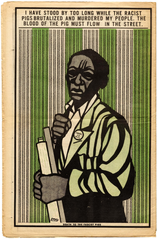
Emory Douglas had some beautiful work, he joined up early to the BPP and offered his services as a Graphic Designer. He went on become the minster of culture at BPP. They were very much aware of the importance of their image, with Power to the People being their main slogan.
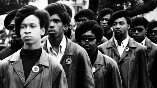
Why are black panthers so fucking cool it's the beret it's the leather jackets it's the sunglasses. Fucking amazing wow.
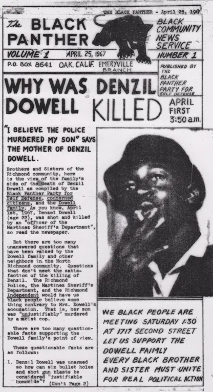
The Black panthers very carefully controlled their media image (early 1970s), often working alongside photographers. A huge part of the movement was community work, including breakfast clubs and school sessions for children. By 1969 they were feeding 10,000 kids everyday before school.
The Black Panther newspaper was vital for communication across the party and bringing news that mattered to it's communities. They used a simple typewriter and markers to make the first newspapers. This is where Emory Douglas with his experience of working at the local print center came in to make the newspaper look for more polished. He brought more imagery, type setting and margins to the paper. The hand-made, hand lettered and borrowed imagery really gave the publication a punky, urgency.
0 notes
Text
ICONS: Sonia Sheridan 27.2.21
She had a background in teaching and print making, which from there she landed an artist residence at 3M studio which was a major studio at the time. Check out Ellen Luptons 'thinking with type'.
Sonia really felt connected to the Bauhaus way of teaching with the focus on multidiscipline leaning and interconnected teachings! In the 70's when she was creating her core work there were so many cultural influences such as the hippy movement, the Vietnam war, science and technology were at a peak, student protests and rebellion There was an emphasis on speed, being ahead of time, with all of the technological advances of the time. From here the Xerox copier was born. This was revolutionary. It was developed in the 1939 which used electrostatic copy processes which was a lot quicker than the copiers at the time, in the 1940s they began to use thermostatic copying processes which again speeder up the process even further, this instantaneous production was inspiring to Sonia.
Sonia and her students made prints using the photocopiers, often exploring time capture and body form. This instant picture was completely new, capturing the present moment was exciting. She also played around with magnification, and enlargement. Famously she created a huge human body from many different pages. She then went on to play around with the idea of stretching and compressing time. To do this she distorted and contorted time, to create glitchy, blurry BEAUTIFUL work She also used the thermo-fax to create stunning images, often abstract shapes with bold colours. This exploration created fresh artwork, different from much of what was being produced at this time.
0 notes
Text
Portfolio Workshop Part 2
Task 3- Design a few spread of your portfolio, including a title page and project pages, try to aim for 5 pages
Talk with Joe (from the group discussion). Here me and joe talked about our practice. I leant a-lot about him and how he pitches himself, as he largely works with motion and 3d elements. He showed his portfolio to me for an example which was very helpful, his was clean and professional, with a consistent design layout.
A really useful piece of advice I gained from joe was to put my ‘hero image’ first, showcase the final product first, and then in the following pages display experimentation and process. As well as this he talked about the need for a design layout throughout. On his, he had his first page to showcase the final design, underneath he had his copy, which was split into: Project name and a link to the video, the client and the date of when it was completed and lastly a short description of the brief.
Overall I really valued this chat with a more experienced designer and fellow student, especially seeing his finished portfolio. It helped me to visualise how mine could look, and reminded me the need for organisation and restraint within the design.
What projects should I include? (recommened a minimum of 4)
- Bob Does Jewellery
- The Proletariat
- Boots and Braces Festival
- Sex magazine
- Secret 7
0 notes
Text
YCN Packed Competitor Research
Origin Coffee
Founded on the belief ‘to source exceptional coffee through a sustainable, triple bottom line approach’. Created 15 years ago in 2005 by Tom Sobey, this independent coffee brand aims to bring distinct design to its ethical production. Working alongside Cornwall based design studio, Aside Origin has a unique branding. Inspired by the east-coast skating and surfing scene there is a clear aesthetic present. The logo alone brings the feeling of the laid-back life, with type with soft curves and a certain retro playfulness.
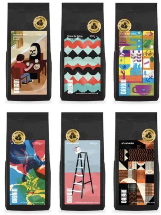
For the packing design Origin champions talented illustrators and designers in each series of coffee they bring out. So far they have worked with 6 illustrators to bring customised and throughout artwork to represent the various flavours. One example being the very first series which featured artist Jack Teagle, which depicted the grim reaper sipping a brew. This unconventional and fairly free conceptual illustration set the brand apart from those it shared the shelf with.
Links for resources used in research:
https://www.origincoffee.co.uk/pages/story
https://www.origincoffee.co.uk/blogs/journal/15-years-of-design-heritage
https://www.a-side.studio/
Ueshima Coffee
First began in 1933 in Japan by western culture enthusiast, Tadao Ueshima, to bring coffee to the people of Japan. He is often viewed as the ‘father of coffee’ in Japan, we wanted to bring the joy he had from coffee to his home county. The brand still speaks to this, with its branding lending to its Japanese origins. Instead of relying on a-lot of body-copy to describe its essence, Ueshimas branding shows this instead.
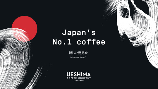
Using beautiful shapes and texture, the branding is fairly minimal and clean. The brand worked alongside famous calligrapher KASUU, who created beautiful brush stroke designs to compliment the brand with traditional Japanese culture. This handling of branding is thoughtful, it avoids stereotypical portrayals of Japanese culture and hints at it with subtlety, a real homage to the brands origins.


This beautiful design execution really speaks as well to a main point of the brand value: quality. The polished look shows that the brand is serious about its coffee. They themselves say that their brand and company seeks to ‘the pursuit of perfection’.
Links to sources used in research:
https://www.ueshimacoffeecompany.com/pages/our-approach
https://thedieline.com/blog/2021/2/12/ueshima-coffee-company?
https://www.kashuucalligraphy.com/work/
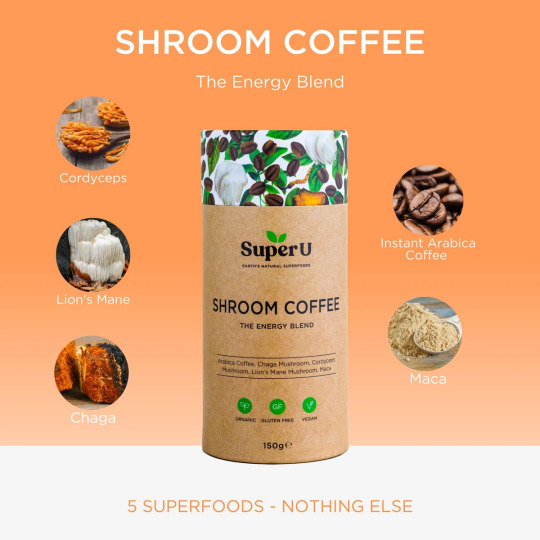
Super U Mushroom Coffee
Unlike the other examples this coffee is made by a brand which makes many other products alongside it. The brand itself, Super U brands itself as an organic, superfood, health centered food brand, providing different products for health-living fans. I chose to feature this as an insight to how they branded an entirely unique type of coffee. Their mushroom coffee, which boasts to be a healthy alternative to regular coffee, with all the benefits but none of the caffeine crash.
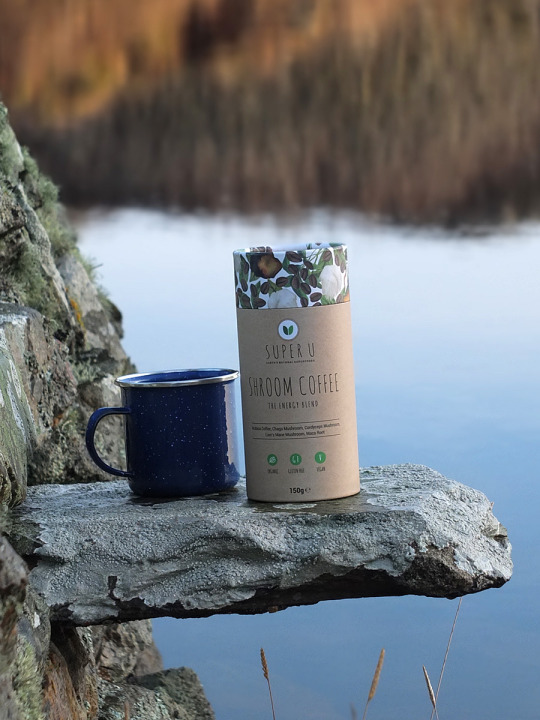
The design interested me as it was created by a design graduate. As it was a smaller company at the time, budgets were limited and so a new freelancer was a great idea. Lydia Trainer designed both the logo and the packaging to be applied across the various different products. The use of a gentle, hand-written style font works well with the healthy, wellness theme it speaks to genuine and approachability.
In terms of the coffee packaging, the coffee comes in a cylander. This practical packaging makes it easy to reach for. The beautiful unique artwork again works well, its quaint and nature focused, again drawing on the natural nature of the product. Overall the design work really works well with the main focuses of the brand itself.
Sources used in research:
https://lydiatrinerdesign.com/branding-packaging
https://www.elizabethskitchendiary.co.uk/mushroom-coffee/
https://superu.co.uk/collections/all/products/mushroom-coffee
0 notes
Text
Notes From Competition Brief Submission Masterclass
- you need to be solving a problem, is it listening to the brief?
- is it well executed? Is it a creative idea?
- a summary of your research approach
- what other ideas did you explore?
- SKAMPZ! sketches, prototypes, mockups
- create a video summing up the brief
0 notes
Text
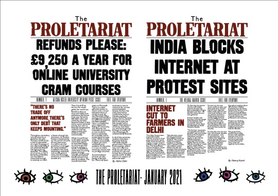
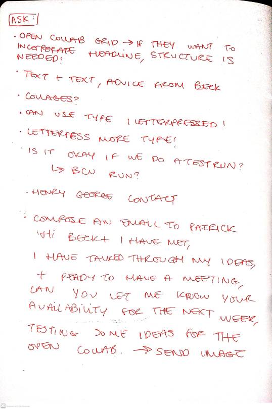
Open Collab x The Proletariat Ideas With Beck
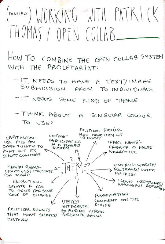
Me and Beck had a chat after I showed her my ideas page. We spoke about my concerns with the project such as how I should contact Patrick, what tone of voice to use and what ideas were the strongest. As shown below ,from my notes, my tutor Beck helped me to word an email to Patrick Thomas so that I could begin to push the project further.
Main highlights from the talk:
- Combining type and type for the two elements instead of type and image would stay true to my brand more
- Structure within the submissions will be important to a certain degree so that each contributors element will be clear and legible
- I need to do as much ideation and experiments as possible to make the session easier for the busy Patrick Thomas, and to show that I am professional and prepared.
- Think about how I will include the letterpress type I have made into digitised typefaces, and how they could be incorporated.
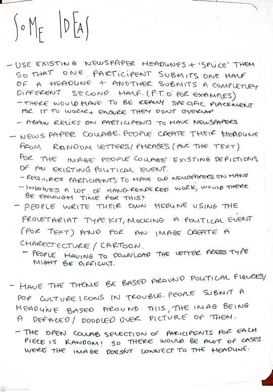
Notes from the session:
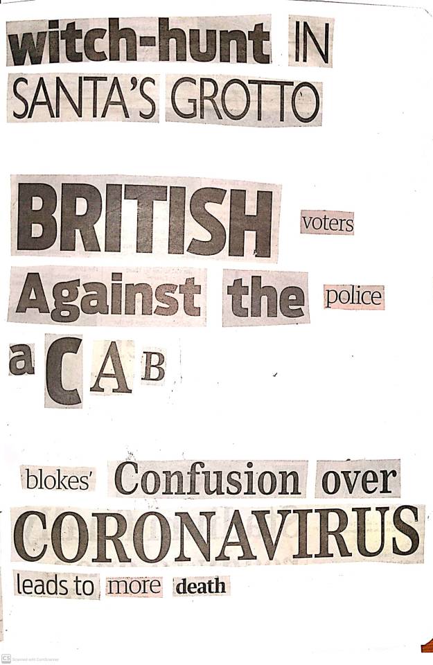
Initial experiments that I sent to Patrick to experiment with the possibility of deconstructing newspaper headlines to create new, random ones:
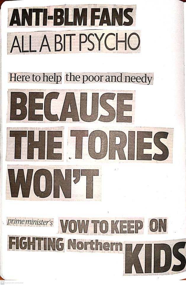
0 notes
Text
Open Collab Research
A Project by Patrick Thomas and Johnathon Auch.
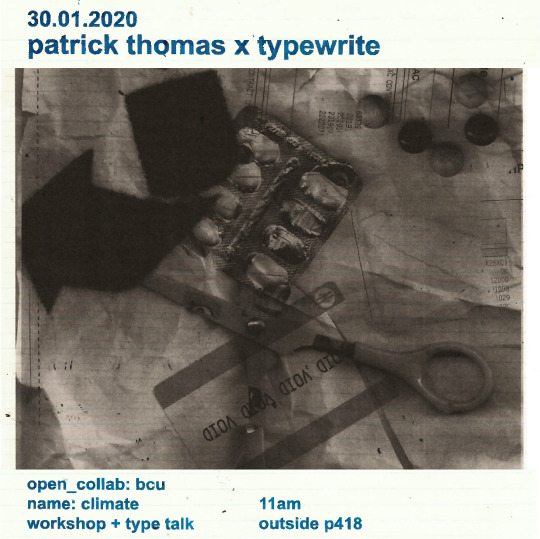
I first interacted with Patrick Thomas’s Open Collab when he visited BCU. He gave a talk for TypeTalks and held his very own opencollab workshop in person. In this version of an early version of open collab we were given a template to download as well as a few vector shapes and prompts to play around with. The theme was climate. We then went on to create text or image pieces which would then go onto be printed over and over with other peoples work being instantly put together with the power of the printer. Me and Beth even got the chance to create some of the posters to advertise the session:
When speaking to Its Nice That about Open Collab, Thomas said about students nerves when it comes to collaboration: “I am always trying to break that, to make them realise that when they finally graduate they will invariably have to embrace it, so they had better get used to it,”. Largely involving students and educators this collaboration now sees peoples work across the world being intermingled to create randomly created combinations of images and text.
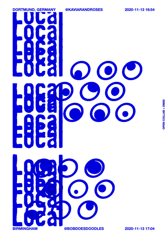
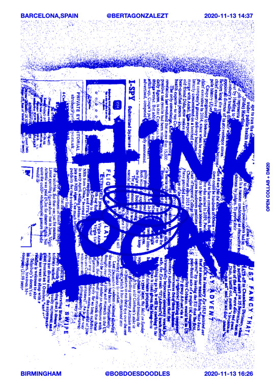
Having been to an online session of Open Collab its exciting to see how far its come. The digital version of Open Collab uses an algorithm that pairs a random piece of text with a random artwork submitted by participants. Not only does its online version allow for partipants to collaborate from other sides of the world, it also says a big ol BOG OFF to covid. Collaboration without the faffing.
Here are some of the results I had from the ‘Global/Local’ session a few months ago:
0 notes