Text
RESEARCH VECTOR ART / VIC LEE
Something I was wrong on my portfolio - which I am refining now, is that I specified that you cannot be abstract or rough on digital and that mainly be because I hate digital a little bit. But something I needed to consider was that eventually in time my work will be digitalize to be used for promotions and advertisements. As there is this indication that you don't need to be smooth with line work and how colors work with each other, that you can treat a digital canvas as an actual canvas, allowing the simplicity of digital be abstract and rough. Which is something I can consider in future projects and how I portray and design my work, how I use composition to create lovely visuals and paintings, etc. Another thing to mention is that this is what I need to consider in the future as I don't think I researched on vector artists as much as I should.
Examples
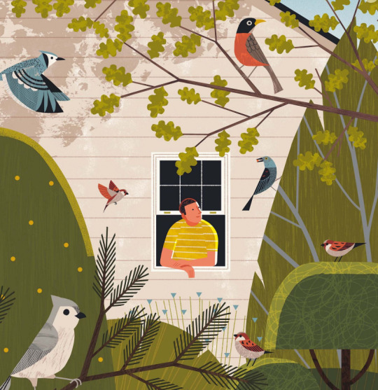


VIC LEE
One thing I adored about his work. is I love how he is so cleaver in using his typography and the way he maps things out, making his text bold, big bubbly that they have a clown essences to them, like a clown flyer or a poster that you're entering a circus. it was really cool to get to know him and learn what he does, how he does even in a short amount of time making sure no mistakes at all are noticeable to allow his work to pop and be observed by everyone.
0 notes
Text
ART ON THE 1ST FLOOR THAT IS ABSTRACT - CONNECTS TO MY WORK.

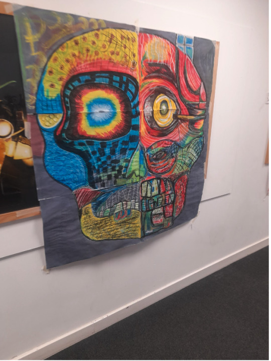
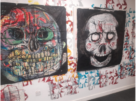


Something i really like about these, is the combination of colour and how abstract they are, kinda like a puzzle piece being put together to form something at first sight you wouldn't know what it is until you put it together. the simple and weird colours really work to create that semblance of weird, strange and almost mutated designs. With the black just bringing it forward.
0 notes
Text
ART COMMUNICATION (Talk with the one in charge, Photos of other students work)
This is something I want to do and agree with kyrstie with being an oppituinity to allow me and help me find a job and work with people - challenge myself and see what I can do and what I can't do.
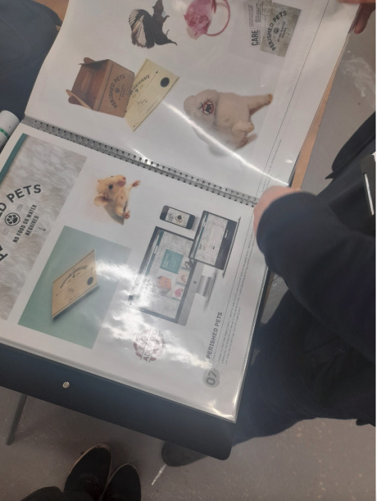
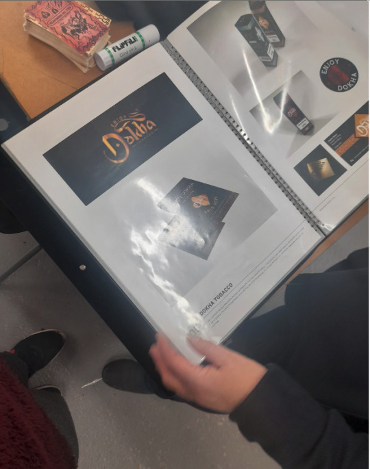
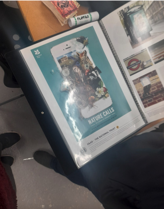
Talking to the boss of the graphics communication course. I took into consideration that this course is for me, as it allows me and will hopefully get me into the industry making art and getting a job, also a good way to teach me and learn from others and follow my dream of expressing my emotions and stories and creative ideas in a very abstract, simplistic and graphical art style. So I looked at these past students works which basically give me an idea, which brings another idea where I get to also focus on Typography which is also good. where i can play around with that and make cool and weird, maybe even creepy designs.
0 notes
Text
THE APEX TRIP
I really enjoyed the trip, I learned alot and was really inspired by some of the artists that were shown, I would have took pictures but i was a little afraid to do so especially when we were told not to have our phones out. So I sadly didn't get any visuals to show. But there were 3 Graphic artists that really made me think more on how typography works and how simple colours can work without any need for details just contrast and simplistic.
0 notes
Text
10 BOARD GAME (Which ones I like etc)

The Art work of this game, is very cleaver as I was immedieatly wanting to go and buy this version of the game, wiht it being very mischievously creepy and just full of vibrant halloween themed colours which makes it eye catchy, also the famous and iconic CLUE, which is just big massive words and yet it works as something that catches ya liking.

I just love the look and style of this cover, very comic book style, it just gives me awesome villain or super man vibes, makes me want to try te game out itself and see how it runs and if it is good, also some of the art remind me of ben ten monsters, so the fact that the characters kinda are reminiscing on characters that look like or are very similar in terms of context of other characters, which helps it kinda to get me thinking about what the game will be like if the art is good and eye catching, the Logo and type is also interesting very big, bold and symmetrical almost with the S's, just something for me to consider also, as with Typography you gotta make sure that you have something that will catch your interest, that feels grand or small; whatever ya going or striving for.
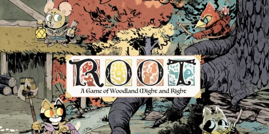
I love how mischievously and adorable it looks, with the type being very rough and sketchy and the colours behind them giving you a taste of what characters you will be playing as and how the game will work. I also like the simplistic colours and use for the black to add detail but not be overly formal of it , being rough and making it look like it is apart of the design itself instead of it just being a formal line to make it stand out, as if it is doing two things at once.
0 notes
Text
Wassily Kandinsky
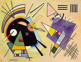


This art connects to my project, with that abstract depth of field, how you can make a circle a square into an actual, face monsters or symbol of something without detail and just it being a clear indicator of what it is and how it works and what it means. But it is very weird and strange and full of character. with the simple colours corresponding very well to one another.
0 notes
Text
Piet Mondrian


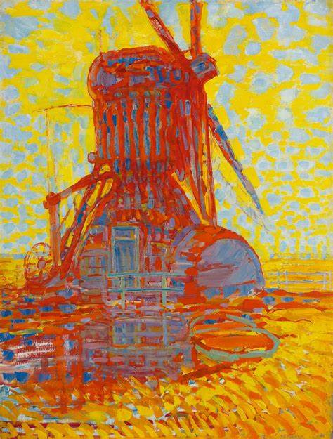
What I like about this one, is the great use of patterns and basic shapes, with different corresponding contrasts that work together to make a combination of colours or a scenery. Which makes it feel grander and so pretty looking like ya really there and looking it under that sort of lens.
Comparing it to the other artist, I will say it is more confined and restricted and more structured, where the other one was like splats trying to make a mix of colours and diagonals work well on a piece of paper.
0 notes
Text
Cy Twombly
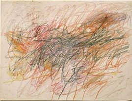

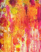

What this shows is my interest and love with the whole abstract and simplicity of art, how to convey emotions, actions and location with just being really rough and inconsistent with where pain goes and how it impacts the multiple layers of colour. Which is what I wanted to look into for a uni course to even get me into a job. Just so I can learn off from other people and gain experience and make brilliant symbolic and creepy representations, as I just love that whole idea.
comparing this to the artist previously before I looked at this one, I can say this one is more messy and more vibrant and out of control, as an agnry or depressed toddler just came over and made a mess, where The art bellow is more abstract, now I look again at this art and the others, they are very abstract and a little more simply than this
0 notes
Text
RESEARCH SIMPLISTIC ARTIST
Here this is me adding more extras
Joan Miró
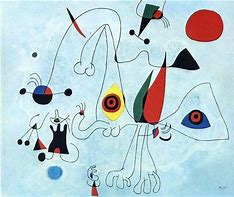


I really like this for many reasons, one It shows how going over things or around designs with a pen, really emphasises upon the surrounding area and the designs themselves, With it giving me very cbbc vibes, with its kiddie and wacky way, despite it being simplistic you can still understand what you're looking at.
0 notes
Text
RESEARCH REFINING RULE CARD / MOCK UPS
I changed the type and with help from chris I began organising and refining the style of the card, made it look neat, the type I used was PT SERIF.
Once I finished The Rule Card I then went to get feedback to see if it needs tweaking and improving if it needs to be more clarified or if it is fine the way that it is.


RESEARCH To compensaint to my work - Food Menus.
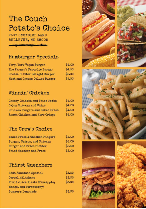


LOOKING AT LOGOS FOR CARD GAMES


PROCESS


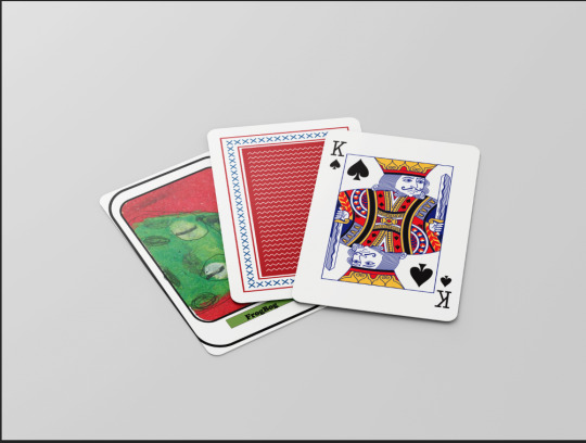
Going through possible titles for my game with chris
Master of chaos
Commander of chaos
Commander of chaos is the one I went with.
To make it work I looked at these examples deciding to have the font to be very sneaky, demonic and mischievously shown. Having a contrast similar to bicycle cards designs but more creepy looking.


PROCESS


DECIDING FROM EACH ONE
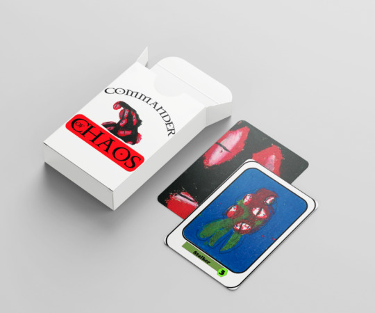
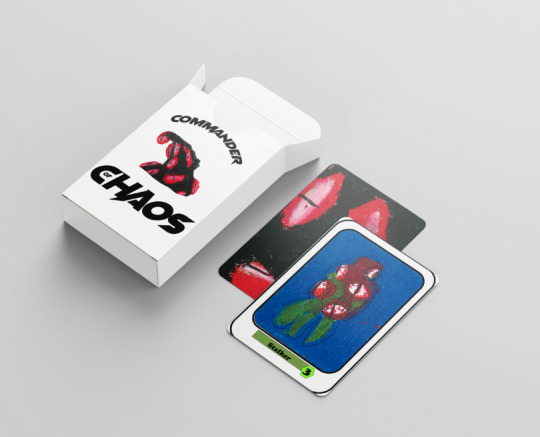
After getting opinion, chris said the last one, Just needed to make the top word a little stretched for it to work, maybe even larger.
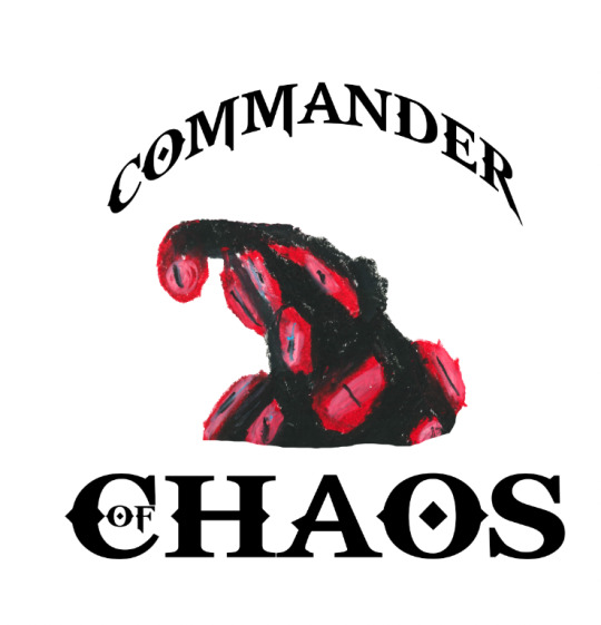
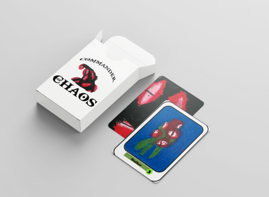
When I finished the outcome, really liked it and that is because I just love it on a white background, others would most likely disagree and see if colour behind the type and design wouldn't work as well, so i decided to keep it simple and plain.

0 notes
Text
MY PLAN FOR THE FINAL ASPECT OF MY PROJECT
To save time, as we only have one week left, is to make my project as simplistic and easy as possible, because my original plan was to have a board and the board game, but because of how long we actually have I've decided to make my game a card game with a box for the cards, still following the story and the rules of the game but it will act more like snap, than my first idea that I is players needing to colonise planets. So this will be a process of coming up with a title, Logo, making a rule card, finishing the outcomes, to then focus on my portfolio.
HOW TO LAYOUT MY BOX OF CARDS, in-terms of Logo on the box itself?
ART EXAMPLES
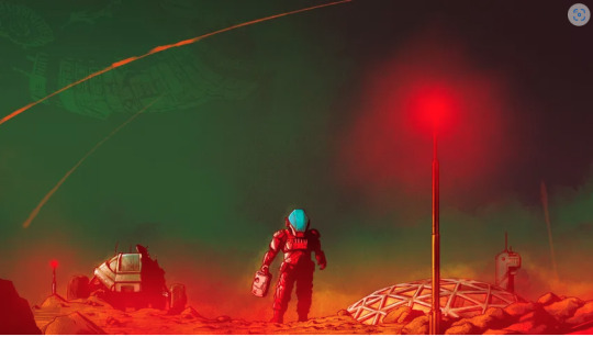

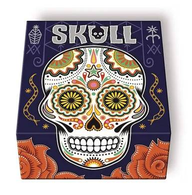
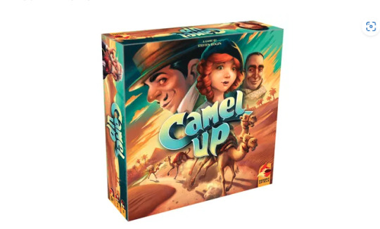

Because i am looking at card boxes and the cards itself, i will be scrolling through many many examples on how they position, use typography, good use of composition. White or a hint of a colour is good, for the aspect lf simplicity.


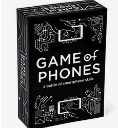

GAME NAMES
How my game works - At first I wanted it to be board game with cards and path way to colonise each planet, but for time reasons I lowered it down to be a sort of snap-like game, where the story of colonising, fighting aliens is a thing, however it is a little bit more simpler; so how the game should work is that the cards shown below
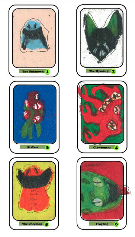
is that you have a collection of these cards repeated in a random order within your deck, one of these cards will be placed down at a random point as an issue and situation, either invasion or mutation. The villain (player) will place down one of these cards, where the other players need to look into their deck or take a card that is exactly similar to the card placed down, then each player must place down that execrate same card with no difference as their are some that are different 9including the name and number) - so you must really look at the design, but once you all place down that exact card that card will no longer be an issue, sadly if that isn't a case that card becomes or stays an issues, it gets swept aside, the more unfinished collection of that exact card you have on the side, you will fail. which is the same with the villain the more cards they have that have been dealt with they fail, so it is a balancing sort of race where both sides are trying to equal or disables the each other.
Snap (Not Snap)
Aliens
Chaos
"The Snap-Match Chaos"
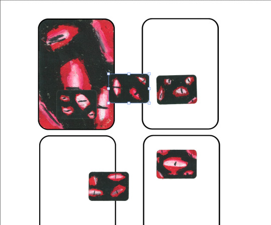
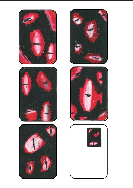
PROCESS OF BACK CARD



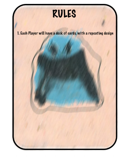
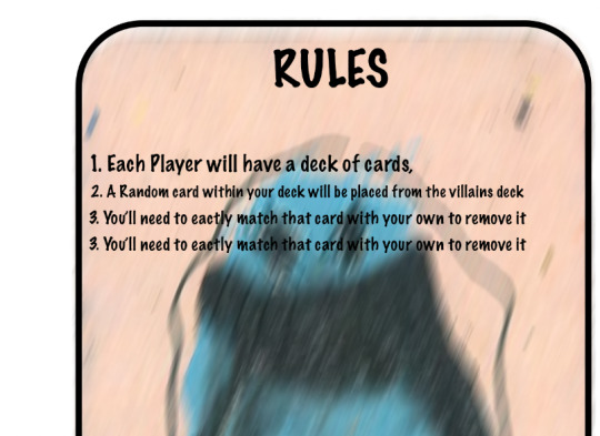
PROCESS OF RULE CARD




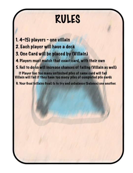
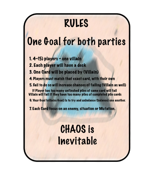
What i will be working on soon...


0 notes
Text
RESEARCH - HOW ARE WRITING ON CARDS ORGANISED - ARTIST PHILLIP GUSTON
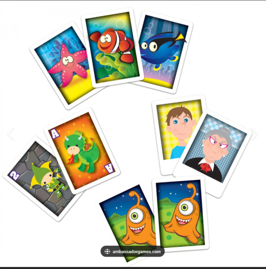
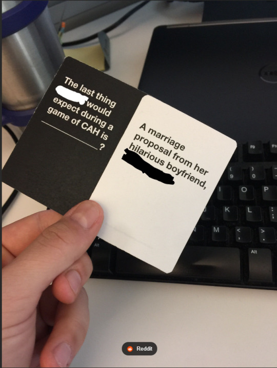
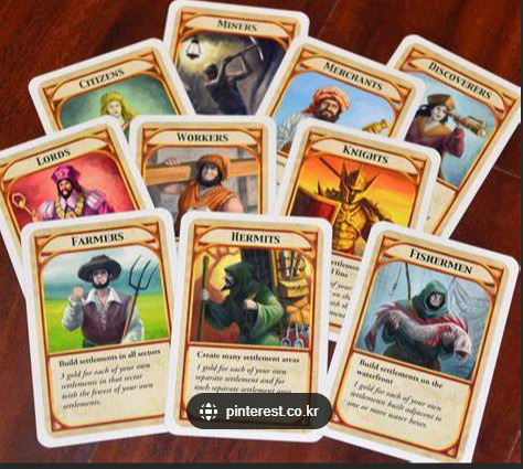
Just to give an example for future tense if I ever make more cards or ever make a game et, but these are to give me a contrast on how words, type and numbers, with the drawing are organized. A good example to show what I am doing wrong and what I need to improve upon.
PHILLIP GUSTON - This is an artist a member of staff gave to me to look at to give me a sense of what my style reminds them of, where also showing another artist who focuses on simplistic, childish, scary, etc and how it corresponds to my work.
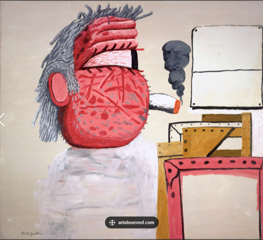
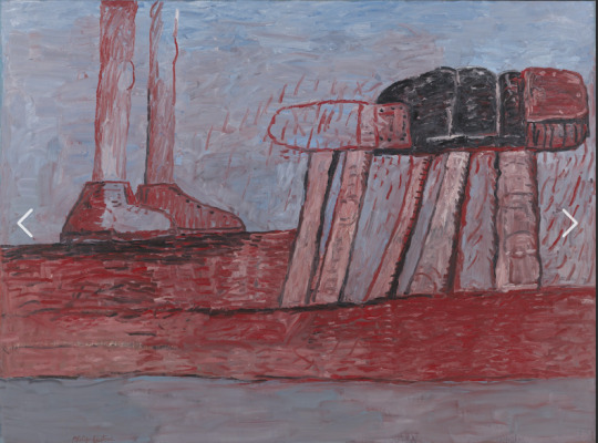

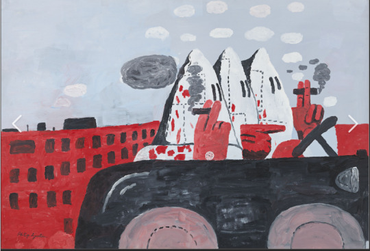
0 notes
Text
PROCESS OF MY REFINING ART
In this process I will be drawing over the creature and organizing the scanned in pieces of work, to see if it works being in oil pastel, as a photocopy or as a digital piece of work.
I began the process of putting pixel over it to see if it worked and it didn't feel right to me, tried with brush also and same thing didn't really work, as I felt that me doing it takes away from it where I want to keep that weird childish look to it, with a hint of refinement to it.

I even tried to make sure that both the original design and the digital work, corresponded to one another to see if it could work or not when using the paint brush but I still just didn't like it.
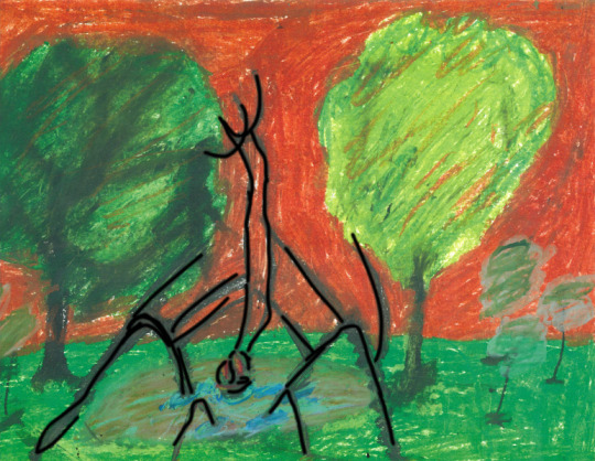

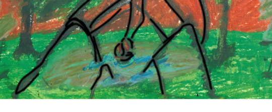
Yeh I ended up hating the design of it and tried something else so i began to see if I could mix the black and white one with the colour one and see how that would work.


did multiple trials with one that I mentioned down here and another that was more closer to one another to give a sense of colour being slowly taken away, but also strangely being added as well.
I ultimately like the look of it, I will see it isn't perfected and had ruined and removed the whole creature from the design, yet it gave it an almost other worldly feel to it, almost glitchy as the world was being seen by the eyes of a monster or someone in distress.
0 notes
Text
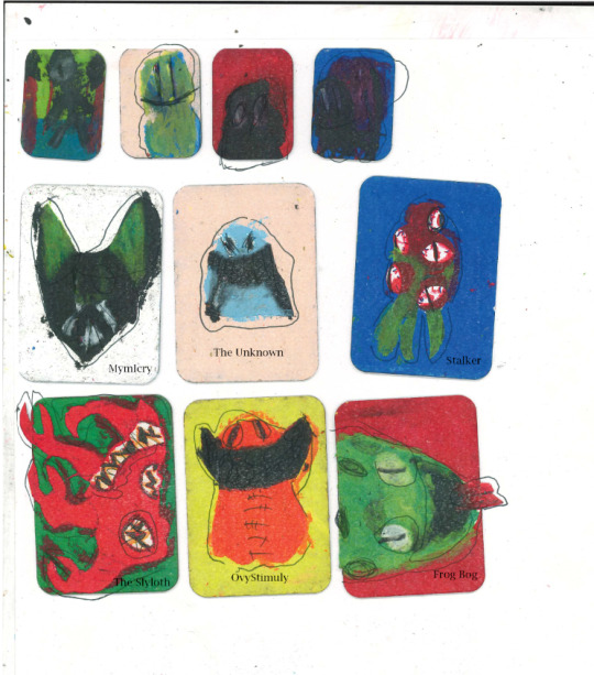
PRCOESS OF PUTTING SMALL DESCRIPTIVE DETAIL / NUMBER ON MY CARD DESIGNS (Multi trial process - figuring out what works and what doesn't, why and how)
During this process I will be trialing multiple types and boldness to see if the cards need type on them, descriptive or just number based or do they work with just being the designs themselves. These are trials just to give an idea of what will be on these cards not really what is going on them, more to see if the cards work better with type or is it best to leave them be.


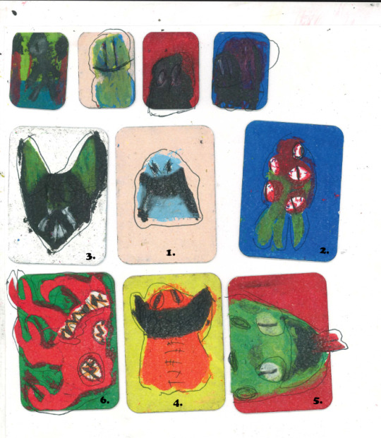
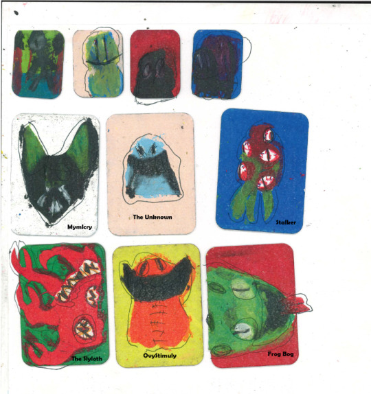
Comparing to the one that doesn't have any designs upon them

When I go back to this process and refine it or one of them I can then go back and ask for opinions.
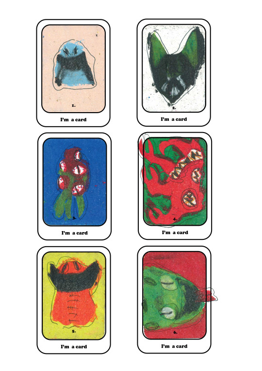
Then with opinion from one of the games course teachers, to be a little harsh I need to make more variations as I didn't really look in-depth enough on how cards are normally organized to be considered useful and easy to understand, to quickly take in the information and then know exactly what you need to do without it being confusing. So What I began doing is focused more inadeptly of variations of the cards making sure that I have enough to then sit back and compare, to then consider which one "I" like more then get an opinion from Kyrstie or someone to see if they agree also.
PROCESS - So what I did was basically repeated this process three times, one where the numbers were in the middle, one where they were in the corner, repeated that process with the type (Name of the aliens)


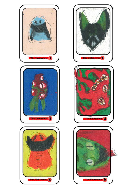
With some more opinions upon my idea and how my card looks, I was thinking instead of putting the words and writing on the design itself, I can leave it untouched and then focus on the bottom part of the card base and put the writing there to see how that looks and how that would work.
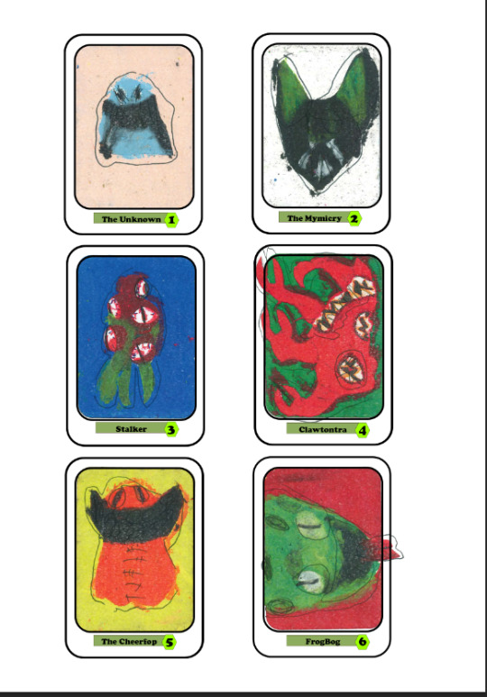
I then decided on whether or not I wanted a diamond of a hexagon and went with hexagon, to then place the type on all the cards change the names and numbers and looked at the final result.
Changing the colour to see that it is getting somewhere.

0 notes
Text
CREEPY OIL PASTEL ARTIST
Zdzisław Beksiński, - a Polish painter known for his dark and surreal paintings. Beksiński's work often depicts nightmarish and otherworldly scenes, filled with grotesque and abstract figures. His art can evoke a sense of horror and unease.
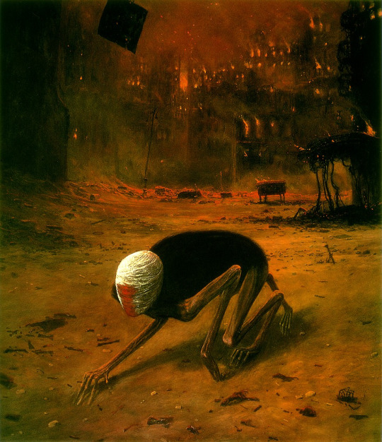


Now despite these not really being my style in terms of accurate Abstract, it is however a good contrast of my whole liking of making monsters and creatures / characters using this art technique, making dark insights on the world. Other than that I adore the art style it is really in my opinion symbolic of mutations as that is the entire style, depicting monstruous creations by nature or by accidents.
0 notes
Text
RULES
REFERENCE - Looking at different types of references on how Rules are laid out and seen for the actual Board game.
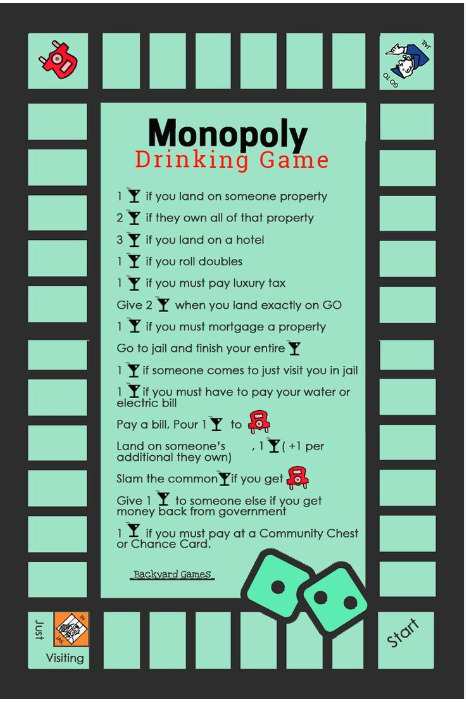
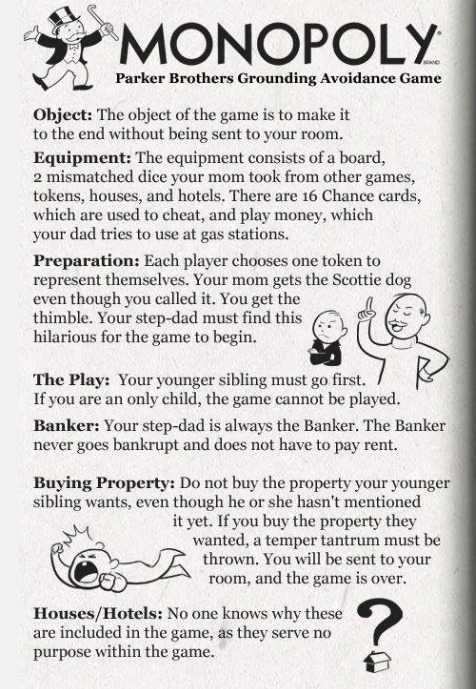

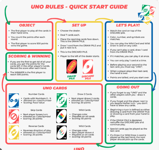
This just shows me how I could structure the rules making it similar to how the board is with the actual game on it is like, or keep it very descriptive very easy to understand and know where to look at first and last, what is important what isn't and how boring it is but also the importance to keep it simple, with the white background.
RULES - gonna write them out here and see if i can lay them out and design it (Simply) As a little add on task.
The aim of the game is to defeat the other team before they defeat you and prevent you from saving your kind, however there is also a chance the humans killing themselves, same with the aliens; as both sides need to keep a balance of how theya re dealing with their own issues and safety while making right choices to terraform a possible unsafe world, or colonise a one that is.
Each will be placed down randomly by one player, where that card will be an outcome card (the eyes), those basically indicate by visuals the threat and whether or not it is alien or a mutation, once that card is drawn Players must find that exact card within their deck to then place it on it and if the player has more of the same card they can take that collection take it aside and it is sorted, if no one has the card than that issue stays and adds onto the difficulty it will for humans to try and make it to the other planets. The aliens will do the same but their cards are more weapon based and travel base and the more they have allow them to either invade a planet a human as colonise or kill the humans before they do.
The game has a 50 / 50 chance ratio of something bad happening and something good happening, which causes trouble and issues for both sides if they don't draw their cards right. The Players have to gradually by each challenge they overtake slowly make their way to their targets and goals, with the humans needing to colonise the entire solar system to be able to have a better chance at defeating the aliens, where the aliens need to do the opposite an defeat them before they are able to do that.
To make it more challenging the cards including the same cards will have a different colour background and number, therefore you really need to have an exact match of that card pluss number for you to be able to deal with the situation properly, you can use odd ones however the odd ones have weaker affects to prevent the situation than the ones that match the corresponding card.
0 notes
Text
DESIGNING THE MAIN VILLAIN IN OIL PASTELS (Maybe even another Card Design)
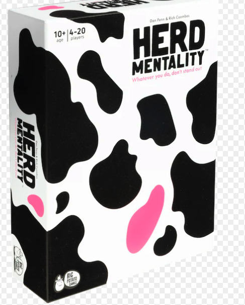
RESEARCH - Looking at different box cover art, how they organise, space things out, how big the Logo is corrupsonding to the character (Is he on the sides, middle in the corner somewhere or right beside the type) Also Remember white is "my friend", as it acts as some sort of conduct or element to the coloured designs and help them be layed out properly, cause it is a HIGHLIGHT So it helps with the contrast between the dark and bright colours on the design.



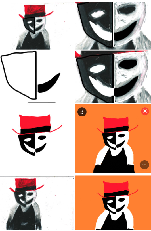
PROCESS / COMPAREING
I will then go over this character onto photoshop and see if I compare which one looks better to use on the board game and which one wouldn't.
Comparing to the digital one, to one done in Oil pastels I feel that The oil Pastel one works well than the digital version, as there is something that Digital cannot do and that is show rough and raw detail within itself to be simple and yet still come across creepy and yet work, as the digital is too simplistic where it loses that affect. I got an opinion from Chris and his opinion is that he likes the digital version, but for the actual pastel design it is too structured and the others seem to be more rough and sketchy, so how can I make this design look like a face without being too structured and having it like a face. I need to try and design it in a very abstract way, a monster deformed out of proportion.
ABSTRACT ART EXAMPLES TO GIVE ME AN IDEA HOW TO MAKE MY CHARACTER MORE FITTING IN THAT ASPECT - (As I still see my character as how he looks and instead of trying to make him fit into the theme of the board game)


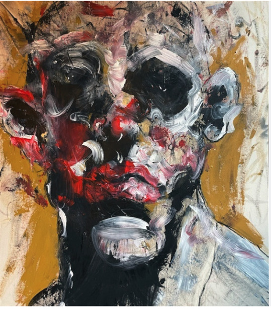
PROCESS OF ME MAKING THE CONCEPT MAKER INTO A MUTATION THAT WOULD WORK FOR THE THEME OF THE GAME


The one thing I kept with from these main designs (Sadly I do not have the updated version), but is the eye monster with multiple eyes mainly cause; it fits the whole card back aesthetic and theme or there might be something at large happening or watching everything play out.
0 notes