bykiramichelle-blog
Kat's Mastery Journal
My name is KiraMichelle but I go by the name of Kat. I am 24 years old and I reside in Philadelphia, PA. I graduated FullSail in March of 2018 for my Bachelor's in graphic design and I decided to come back to FullSail to pursue my Master's degree in Media Design. Follow me on: Instagram: by_kiramichelle
Facebook: bykiramichelle
Pinterest: bykiramichelle
LinkedIn: kiramichellekats
Contact me:
[email protected]
bykiramichelle.com
30 posts
Don't wanna be here? Send us removal request.
Last Seen Blogs

pabypu
Gamagama

synthic
synthic

pillowtalkdotaidi
Bantal guling tidurmu

lilleyilley
lily

malelovingmonsters
male loving monsters
Text
Thesis: Presentation of Design Solution
12.4.2 Week 4 Mastery
Mastery: Personal Development & Leadership
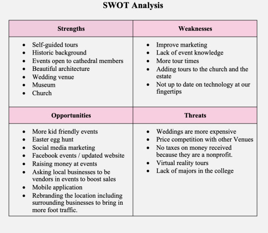
By using the SWOT analysis concept, I learned my strengths, weaknesses, opportunities and threats and I used it to work on all my problem areas throughout the MDMFA program. This course helped me hone my writing and research skills to begin my thesis.
Defining Client Needs
Defining client needs was the beginning of our first project. In my case, it was the beginning of the Reykjavik process. We began with research about the culture, traditions and geography. This class helped me learn the development of the vision board for my thesis project.
Brand Development
Brand development was the continuation of the Reykjavik Project. It dove into more research and with all that information, we created deliverables for print and digital purposes such as logos.
Effective copywriting
Effective copywriting was a difficult class for me. We went into ad development. The first version of the project I did not quite understand exactly what was being asked but the peer reviews from my classmates as well as my teacher, I was able to complete it with no issues. Brand strategy is the first one that I feel is incredibly trivial in this career path. Knowing the product, the consumer and the marketplace are incredibly important when doing any type of design or copywriting work. Research is necessary as well as asking questions and jotting down any ideas that come to mind. Certain things may or may not work and that is the trial and error of being a designer. Understanding consumer behaviour is also important and advertisements are supposed to point to something specific such as an achievement, exhibition in gaining public attention, dominance to display power over others, etc.
Design Research
Design research, a class where analysing previous work is required in order to improve the way we as designers think. Throughout the month, we had to explore our design choices in the previous classes and try to improve the work we began by doing a lot of research and taking into consideration what we learned and applying that to our work.
Organizational Structures
Organizational structures allowed me to work on a motion graphics project on my own but also with a group. We went over our ideas and collaborated with each other by brainstorming ideas for the video. There were a lot of things to discuss in the project which included different types of video transitions that could help bring the video together as well as grab the viewers attention.
Design Strategies & Motivation
Design strategies and motivation consisted of creating empathy maps which are used to distinguish a deeper insight into a persona or a targeted audience. Using the empathy map allowed me to open my eyes and write down things that could help with the specific project. Creating empathy maps allowed me to brainstorm strategies that would be best used to lay a base foundation on a specific project.
Design Integration
Design integration consisted of extensive research as well as interviewing local business owners and residents n the area. Doing these interviews helped me understand what the neighborhood was lacking and what was needed to fix those issues.
Multi-platform delivery
Multi-platform delivery consisted of creating designs that were meant to be used across different platforms in order to communicate or advertise the project, issue, or brand. It also consisted of distinguishing what people consider professional deliverables as well as describing the process and plan behind those deliverables and why they are the best choice.
Measuring Design Effectiveness
Measuring Design Effectiveness was to learn about what drives success in the design industry, understanding how those designs are perceived by a third party as well as applying higher level thinking. By creating a survey based on the designs created, it allowed me to gain the criticism that I needed in order to test the efficiency of the designs.
Thesis: Presentation of Design Solution
Criticism is the only way to test the effectiveness of the designs we create. In order to measure the efficiency, we need opinions and suggestions. Throughout the entire program as well as the thesis project, receiving feedback from peers and instructors was helpful in fixing issues that may have been overlooked and allowed time to adjust those mistakes. The experience map was created to give me the opportunity to look back at the entire program and reflect on everything that I have learned throughout my mastery journey.
0 notes
Text
Presentation of Design Solution Mastery Journal Reflection
Competency One –
Peer Reviews
As a designer, peer reviews are very crucial in our line of work. Reviews are great from the customers point of view however, reviews from your coworkers or other designers are especially important as they are the ones who can guide you in the right direction. The more critical the review is, the more you learn from it and take in the advice from your peers. I have found that when the reviews are sugarcoated, you can’t learn from them and it defeats the purpose of submitting a review. We need advice in order to improve and grow as designers and artists. Peer reviews are also difficult in a sense as they are meant to be written in the third person and not the first or second. Your opinions are irrelevant, but when there is factual information with sources included, that is when you can take the advice and do something with it.
Competency Two –
Fine-tuning Project Concepts
Looking back at everything that has been done within my mastery journey has been a fulfilling experience. Going through previous work and finetuning it for the final delivery has been interesting, challenging and rewarding. Looking through all the projects and changing certain aspects of it to fit the requirements of APA standards as well as displaying everything that has been taught was a great experience. It allowed me to really understand the amount of work I have put in as a designer and how rewarding it is to display all my hard work with everyone. While refining the work was incredibly challenging it required me to dive deep and really think about the ideas I had originally and make changes to the writing within those projects to remove any first and second person information and replace it with the third person to make it sound more professional to the client and remove all personal opinions and replace them with group descriptions and background information. This is something that I have had issues with as it is difficult to designate projects in a group aspect instead of the first-person aspect. Using what I have learned in this class will allow me to connect with clients a bit better and improve the way projects are displayed and written so that information is knowledgeable and factual and not opinionated.
Concept Three –
Portfolio Website
The portfolio website was something that I have done in the past however I did not have nearly as much background information for the projects in there aside from a small paragraph explaining the basics of the project. This website is more of a portfolio style with extensive background information that required a lot of thought to elaborate on the most important parts of the project and put everything together. Beginning by creating four wireframes for each page to get out some ideas on how to display the chosen content. Reworking those wireframes to display the content with uniform so it flows easily from left to right. This is something that will be used in the future as the internet has become something that we rely on. It is huge part of the world now compared to what it was in the past and most marketing is being updated to internet or digital marketing. It’s a big part of media design as a whole and will be used for many years to come. It means a lot to me as a designer because I mostly focus on freelance design work instead of corporate design because there is more opportunity to choose the work that you know you are good at. The portfolio website will help you find those freelance jobs as well.
0 notes
Text
Measuring Design Effectiveness Reflection
Task 3:
This months course was different and for me, probably the most difficult. While there wasn’t much work that had to be done in this course compared to others, wording questions for the questionnaire has never been my strong suite. I tend to blank out and not know what to ask, especially since I was asking people I was targeting but those are also people who may not understand the purpose of certain things. Despite the challenges, I have learned so much from this class that I will be using in future projects and client work. This stuff is essential and should be taught in all design programs as it is a huge part of graphic design in general.
0 notes
Text
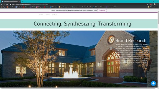
Connecting/Synthesizing/Transforming — What research did you conduct and utilize to arrive at the design decisions you present. How did you connect the research to your design work? What information did you synthesize and pull from the research and how did you transform the information into what you've presented this month?
Prior to this class, we conducted research on the area that was chosen, interviewed the residents and small business owners, as well as understanding what the area needed to begin to thrive again. Collecting that data helped gain a better understanding the expected goals of the rebranding and marketing by using a media matrix to define the pros and cons of potential design assets to distinguish what would and would not fit the criteria of the location/event.
Problem Solving — What design problem were you solving? What design problem does the medium you designed for solve according to the industry? How did you solve the problem? Restate your design problem to help explain this section. Remember: A design problem is not the same as a technical problem
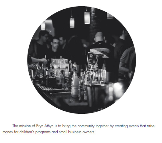
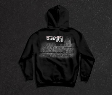
The design problem is that this area has no marketing to promote any events that happen in the area. There is little to no information on events that they have at the banquet hall that is open for the entire community but only those who are members of the church attend those events. The design in the area is also outdated and or not used properly. The only way to solve that would be to host an event and create proper marketing that would catch people’s attention when driving by or even sharing on social media. This includes banners, posters, flyers, social media ads, stickers, and apparel. I created a pole flag that had the website information of the location as well as the date of the event on a separate banner. There was a pullover hoodie design that had the logo on the front and the event logo along with an architectural design on the back. A sticker and button design with the logo, a social media ad and a backdrop design for photographs.
Innovative Thinking — How does your work compare to others in the industry? How did you approach the subject of innovation? How is your work innovative?
By using the data collected in the research portion of the project, I was able to incorporate that in a creative manner in the designs. The architectural portion of the apparel was the innovative part as it included part of the history of the area in a blue print like design. It is unique as it is not commonly seen in branding, it is mostly used as a rough draft for planning projects.
Acquiring Competencies — What did you learn overall throughout this process? Any new software? Techniques? Skills? Explain.
Learning to collect data that would be relevant for marketing was the biggest takeaway throughout this process. Trying to understand the client is vital in the design process as any work done for the client should in some way represent whatever it is that they are trying to sell or promote, in this case being an event to bring together community residents and small business owners.
In addition to demonstrating the above, reflect on your experiences in this course and state where you plan to go from here. Post your reflection in your Mastery Journal in 2-3 paragraphs. Include relevant screenshots from this month’s projects with short written captions for each.
With everything that I learned in this course and throughout this entire branding process, I plan to implement this with clients as soon as possible. Sharing what I learned with other designers is also something that has crossed my mind because it is vital in the design process. All the information that I have taken away has helped me understand marketing whether it be in a branding context or in a business context.
0 notes
Text
Design Integration Reflection
We had to do extensive research on the area that we chose as well as interviewing residents and business owners. Taking the interviews, we did and summarizing the answers, it was easy to understand what the neighborhood needed in order to thrive once more. The interviews were the most important in the project research as we were able to understand how people viewed the area and we could use their opinions and concerns to create a campaign to improve the area.
The design problem at hand was that the area has little to no revenue and that is visible by the amount of small businesses closing in the area. There are no tours going on at Bryn Athyn, and the only things that are seen are mostly weddings at the Cairnwood Estate. They do have some events throughout the year but those are only opened to donating members and they do not market those events to the public. In order to bring in business, the best method is to create events that the community could participate in whether that multiple events targeted for certain age groups or one entire event that can include everyone. Creating marketing content such as every day direct mail, posters, banners, flyers and even social media ads would increase the publics knowledge of the awesome events at Bryn Athyn and it would also help people come in from around the country to visit the beautiful architecture here. The cathedral does resemble the Gloucester Cathedral in Gloucester, UK. That minor detail would make a lot of people want to visit the castle alone.
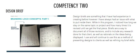
The entire process was incredibly tedious and felt repetitive for the most part. With that being said, doing the in-depth research that was required was the best skill to learn along with learning how to do a proper design brief. Design briefs were not taught in the bachelor’s program, so it is refreshing to learn when it is required in the field.

.
0 notes
Text
TASK 1: Mastery Journal Process and Reflection
Connecting/Synthesizing/Transforming - What research did you conduct and utilize to arrive at the design decisions you present
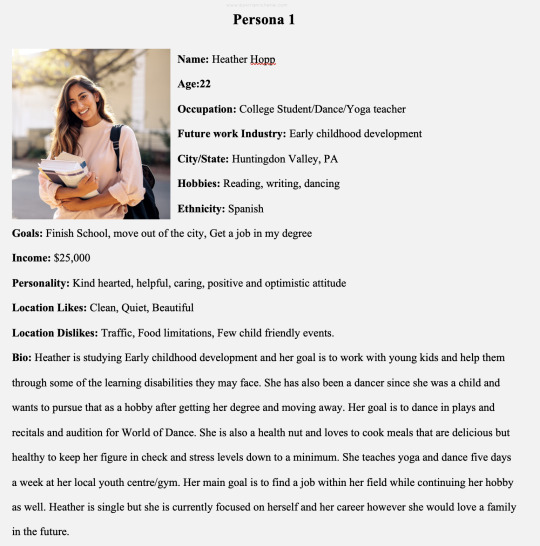
To reach the current design decisions begun with surveying the area and taking photographs to give a view of the area being spoken of. Then, came the exploration about the history of the area and also parts surrounding it. Next came the study of the demographic in the area which includes but is not limited to the number of residents in the area, real estate prices, approximate salary, and career opportunities. Interviewing people in the area and creating personas based on those interviews was the following step in this process. Finally, the SWOT analysis is where everything was put together to aiding the arrival of final design conclusions.
Problem Solving - What design problem were you solving? What design problem does the medium you designed for solve according to the industry? How did you solve the problem? (***Remember - a design problem is not the same as a technical problem***)
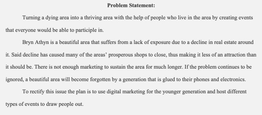
The design problem in this area is that there is not enough marketing to make this area thrive. To solve this issue was to use digital marketing to draw in the younger generation by hosting different events. As a whole, the area does not get a lot of attention as not many people are aware of the location or the history behind it causing small business owners to close up shop due to declining sales as a result.
Innovative Thinking - How does your work compare to others in the industry? How did you approach the subject of innovation? How is your work innovative?
There are many different forms of marketing but recently the most common has been digital marketing. This mainly refers to the use of digital marketing within social media. The younger generation has technology at their fingertips that some of us were not fortunate enough to have back in the day. Using that to our advantage in 2019 means getting creative with the way we approach marketing as a whole. By using all of the research that was collected throughout this project, I was able to present the information in a visionary view on challenges and solutions, persistence, persuasiveness, while also using efficient and effective means of communication between the business and the audience.
Acquiring Competencies - What did you learn overall throughout this process? Any new software? Techniques? Skills? Explain.
In addition to demonstrating the above, reflect on your experiences in this course and state where you plan to go from here. Post your reflection in your Mastery Journal in 2-3 paragraphs. Include relevant screenshots from this month’s projects with short written captions for each.
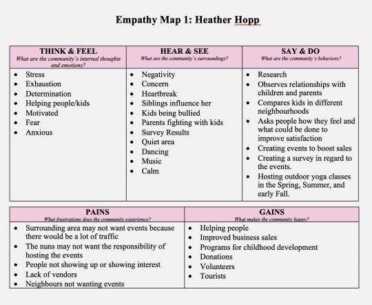
I was able to understand the true importance of researching the client. The SWOT analysis was the first thing that I truly learned the importance of as it gave a base foundation on everything that was on the table whether it was important or not. I was then able to create empathy maps on people that I interviewed to help form a base understanding of those that reside in the area and what they are looking to see improvement on. By using all of that information, I was able to come to a final problem statement as well as understanding the client’s final goals.
The course experience, for the most part, was pleasant. I was able to learn a lot of new tips and techniques for dealing with potential clients.
o Problem Statement - Identifying the issues that need to be addressed by solving the problem.
o Personas - A person’s character that is perceived by others.
o Swot analysis - A study identifying the strengths and weaknesses.
o Empathy Maps - a tool used to distinguish a deeper insight into a persona or audience.
The information was useful, and it opened my eyes on what I as a designer need to work on prior to dealing with clients. I do feel as though the instructions on the assignments were not clarified thoroughly and the grading was very harsh. I do understand that this is a master’s program however I feel as though if the instructions were carefully explained, the grading would not have been so harsh. Overall, I did learn a lot more than I initially thought I would despite the challenges, and I will be using this information well into the future.
0 notes
Text
Mastery Reflection
Connecting/Synthesizing/Transforming - What research did you conduct and utilize to arrive at the design decisions you present.
The research that was done was mostly animation tips and tricks as well as tutorials on how to animate certain aspects of the project. Learning what benefits animations have for businesses, locations and products were also very intriguing as it gave me an idea of what the viewers look for in order to captivate them. Using what I learned, I began to brainstorm ideas for the dynamic storyboard and at first, I had a travel idea where I was creating it for viewers instead of the client. That didn’t work out and I ended up reworking my initial idea into a new one that focused on presenting it to the client instead of a viewer.
Problem Solving - What design problem were you solving? What design problem does the medium you designed for solve according to the industry? How did you solve the problem? (***Remember - a design problem is not the same as a technical problem***)
The design problem I ran into was not quite understanding who we were designing the dynamic storyboard for. I got slightly confused because of the way the instructions were worded and I had to rework my entire idea to pitch the dynamic video to the client instead of the viewers. I solved my issue by including images, color scheme, and interesting animations to captivate the client and reel them into wanting to see what else can be done to build their brand. The only design issue that I feel I had trouble with was sound. I was not able to make it match the video no matter what I tried.
Innovative Thinking - How does your work compare to others in the industry? How did you approach the subject of innovation? How is your work innovative?
youtube
Many designers use animation in their designs depending on what the client seeks. I am not a professional motion graphics designer however, I was able to envision my design and figure out how to make the animation do what I wanted. I can only compare my work to newer designers and with having little experience with Adobe After Effects, I think I did a great job using different types of animations to make my video more captivating. I feel as though my work is innovative since it is quite different from others. It has original ideas that no one else had that I noticed as well as the video was very professional and not too long.
Acquiring Competencies - What did you learn overall throughout this process? Any new software? Techniques? Skills? Explain.
Learning to critique others in the third person has definitely been one of the hardest things of the class so far. I’m used to giving critiques based on my thoughts and not on what the person should improve on based on what we’ve learned or what is expected of us in the rubric. It has helped me so much and I noticed that when I was helping out someone outside of school. I was very thankful to be able to give that person suggestions based on what they need to work on and not based on my thoughts about the overall design. I also took more time into learning After Effects and not getting nearly as stressed out like I was when I used it for the very first time. It was still time consuming, but it was not nearly as difficult as I thought it would be.
0 notes
Text
5.4.1 Week 4 Task 4 Mastery Reflection
Design research, a class where analyzing previous work is required in order to improve the way we as designers think. Throughout the month, we had to explore our design choices in the previous classes and try to improve the work we began by doing a lot of research and taking into consideration what we learned and applying that to our work.
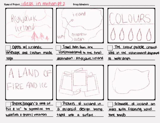
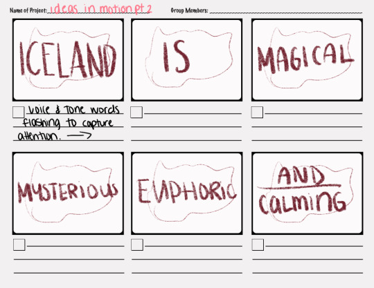
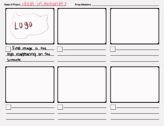
The first week of Design Research we were tasked with combining all three previous mood boards into one cohesive piece. The goal was to either create a new vision board, figure out a new path to take instead of the current one, or both. The vision board had to include a narrative for the city’s campaign, and also had to set the voice and tone that was able to be understood within that narrative.
The second week of Design Research, our goal was to use that new vision board we created as a guide and inspiration to develop wireframes and or mockups for the city’s campaign.
The third week of Design Research, we had to continue analyzing the narrative and voice and tone within that vision board and work on finding more data to validate our work thus far. We worked on our mockups as well as did some changes on the vision board and narrative.
The fourth week of Design research we worked on the final project which was to create an infographic that embodied our location of choice. This is where we were able to put all of our sketches and ideas in one piece and display our process throughout the entire month while paving the way that we would like our projects to go. The final infographic was meant to display the most essential information about the city as well as the design choices we wanted to include such as texture, color palette, images, voice and tone, and narrative.
Synthesizing:
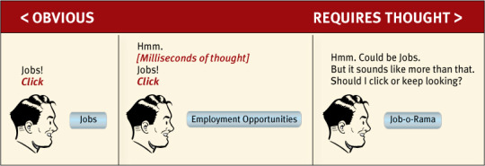
I combined Krug’s “Don’t make me think” method and applied it to my website wireframe but I also used that same thought process in my final vision board as well as my infographic. This is Krug’s first law of usability in design. It’s the overriding principle—the ultimate tiebreaker when deciding whether a design works, or it doesn’t. If you have room in your head for only one usability rule, make this the one. (Krug, 2013, chapter 1) This combination works because it can be applied to more than one design objective. Krug meant it in a UI/UX way, but it can be used in mobile wireframes, invitations, posters, even motion graphics. The point is to require little to no thought from the consumer's standpoint, it should be obvious what your final goal is, whether that is to sell something, display something, or teach something. The way that I synthesized this in my work was by applying it to my web design wireframe by making it as simple as possible while still easily being able to navigate as well as applying it to my infographic and making each part of it as obvious as possible so that little to no thought is required to understand what I’m displaying.
Problem Solving:
While working on the vision boards, I noticed that a lot of people overcomplicated the designs in order to include all the elements that were required. There was so much content that it was hard to figure out what was what. The first mood board that I created was large and had a lot of content as it had different versions of the logo as well as typeface choices and images. Even though the content was required, it was cluttered. When recreating the vision board this month, I went in a different direction. I was able to easily combine the content while also using a smaller layout and giving it more personality. This was something that was easily solved by sketching out a design prior to sitting down on the computer to put it all together. It’s a simple problem-solving method that has greatly impacted my work in the last couple of years and also reduced the amount of time I spend frustrated at how I want something to look. When sketching out the new design I was able to play around with how I wanted it to be positioned which decreased the time at the computer for the final product and also allowed me to brainstorm other ideas that could help as well.
Innovative thinking:
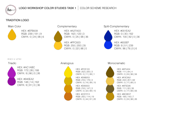
When looking at the way most designers display work, color schemes are often presented in a circle or square fashion with the color information beneath them. This is a standard way of doing things as it is how most employers or clients request it to be shown. I decided to go with a water drop to match the theme of my city. It’s different but it still gets the point across. I used the city as inspiration to create a color scheme not only that matched in color but also in theme.
Normal Color Scheme Design:
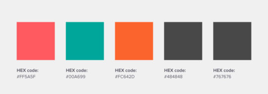
My color scheme design:

Acquiring Competencies:
I have been in the design industry for roughly eight years. I have taught myself a lot of what I know but I did learn some really awesome things throughout my journey thus far.
1. Sketching
Whenever I begin any design work whether it is for school or for a client, I do as much research as I can, and gain inspiration and I create as many thumbnail sketches as I possibly can. This goes for logos as well as layout designs. The reason I do this is that it gets the ideas flowing and I can get the bad ones out of the way and focus on the good ones.
2. Basics of Print design
I worked in the Staples Print and Marketing team for a very long time and I was fortunate enough to learn the basics of graphic design and print. Bleeds are very important as well as color. Every printing company works differently, and you want to familiarize yourself with how they work and where your client plans on getting their work printed if they are in order to format the designs properly. This has helped me tremendously because I know that I can create the designs and send them over to the client and I won’t have to worry about editing any of the work for the printer.
3. Keep it simple
When creating anything, I used to have a habit of overcomplicating designs. I would overuse typefaces or colors. I didn’t know how to limit the content I used, and I learned that less is better. I keep things as simple as possible with no more than two fonts. For color, I use adobe color to create color schemes if I have issues coming up with color pallets for my project. If I struggle with something I’m working on, I learned to step away from the design for a bit and clear my mind and then come back to it and see if I can resolve whatever issues I was having.
References:
Krug, S. (December 24, 2013) Don’t Make Me Think, Revisited: A Common Sense Approach to Web Usability, Third Edition. Publisher: New Riders. Retrieved from: https://ce.safaribooksonline.com/book/web-design-and-development/9780133597271
0 notes
Text
What have I learned in Effective Copywriting?
List 3 takeaways from what you learned in Effective Copywriting that you will apply going forward in your career as a media designer (acquired competencies).
I’ve learned quite a few things in Effective Copywriting that I will use in my career as a graphic designer and media designer. Brand strategy is the first one that I feel is incredibly trivial in this career path. Knowing the product, the consumer and the marketplace are incredibly important when doing any type of design or copywriting work. Research is necessary as well as asking questions and jotting down any ideas that come to mind. Certain things may or may not work and that is the trial and error of being a designer. Understanding consumer behavior is also important and advertisements are supposed to point to something specific such as an achievement, exhibition in gaining public attention, dominance to display power over others, etc. Doing so gives personality to whatever it is you are promoting. The final thing would be Testimonials: The Power of Personality. These are incredibly important as they are meant to exhibit a specific group or person that should be targeted. It gives a personality and a background to a point that you are trying to make the viewer see. It has a story and it should be relatable and understandable.
0 notes
Text
Revised Comps
Your 3 revised comps: discuss how you created a unique solution that exceeds the project expectations (innovation) and how you created an improved design solution to create a cohesively branded ad campaign for your nonprofit organization.
With the feedback I received, I decided to use images instead of clip art in each one of my designs. I felt that images would display the point a bit better and it would be more effective than the clip art was. I also aligned the content as closely as possible so that the ads appeared to be from the same organization to match the branding. I used a limited color palette so that I would not take attention away from the images and that I would get my point across easily between each advertisement.
0 notes
Text
Task 1: Initial Comps
Your 3 initial comps: how did you develop three strongest concepts and write copy that connects to your target audience? How did you write your headlines (Felton pages 195-218)? How did you write body copy (Felton page 128)?
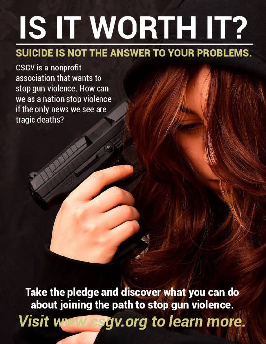
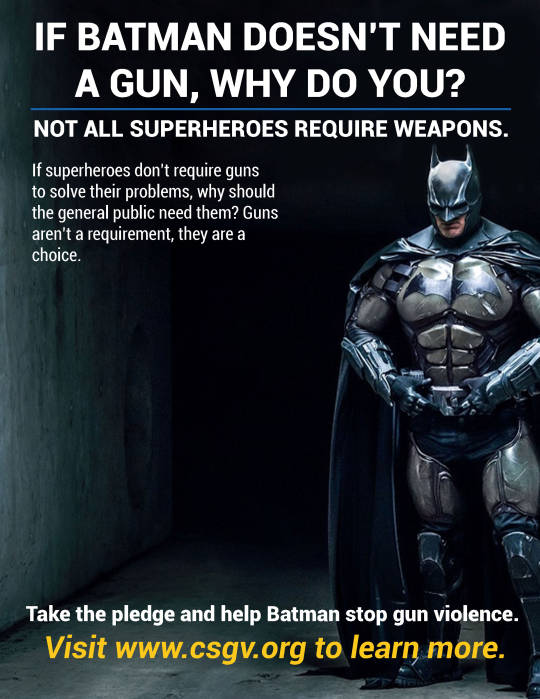
I developed the first three initial comps by doing a lot of research and writing a list of what I thought of when I was thinking of the type of testimonials we were given. I wanted to display what an expert user should be, what a celebrity could do without weapons and how he solves his problems, as well as a person trying to commit murder with the use of a gun. I used techniques that Felton described in the textbook. One of the techniques was highlight omission by asking questions that haven’t been answered or answering questions that haven’t been asked. Each one targets a different part in the audience. The batman one is meant to target children, the suicide and army one target a majority of the adult population.

0 notes
Text
Testimonials
Your 6 sketches: discuss your six types of testimonials, why you chose them (Felton pages 241-246) and how multiple approaches were considered and less approaches were rejected (problem solving) with evidence of reason that is accurate, persuasive and highly compelling.
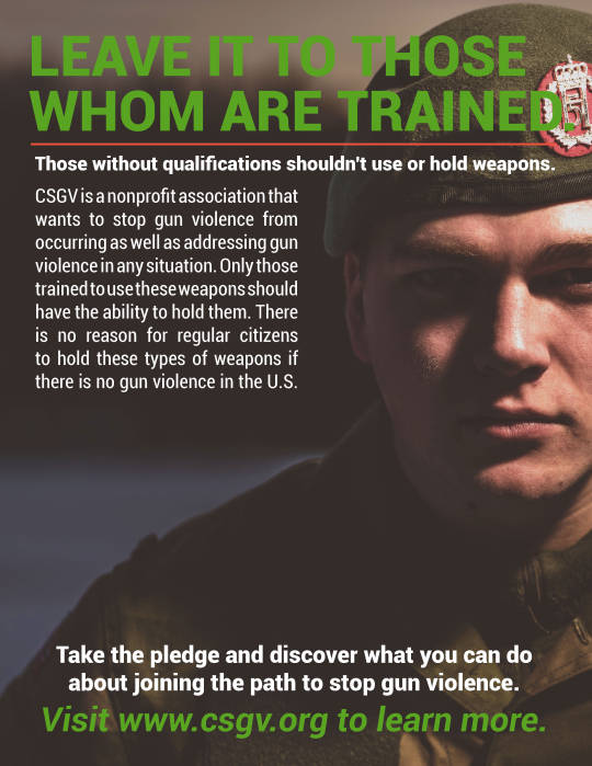
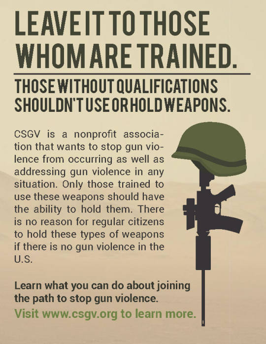
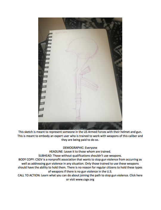
The first testimonial was based on an expert user. I chose someone from the US Armed Forces. They are government trained to use weapons and are trusted to keep us safe. The first thing I thought of was a gun and a helmet on top as a thank you for what they do but also that only those who are trained to carry these weapons should have access to use them.
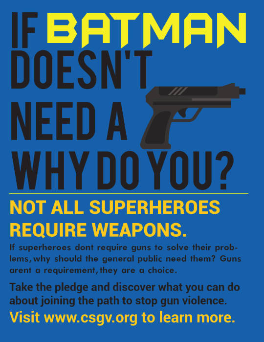
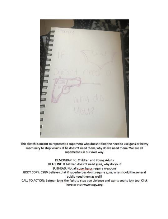
The second testimonial was based more or less on a celebrity known as Batman. It was meant to show that he doesn’t need to use guns to solve his problems and that we shouldn’t need to use them to solve our problems. Guns don’t solve problems, they create them. We are all superheroes in our own way. The first thought for this was to have a batman symbol and a gun and it was supposed to say, “If Batman doesn’t need to use a gun, why do you?” It should inspire kids to understand that deadly force isn’t necessary.
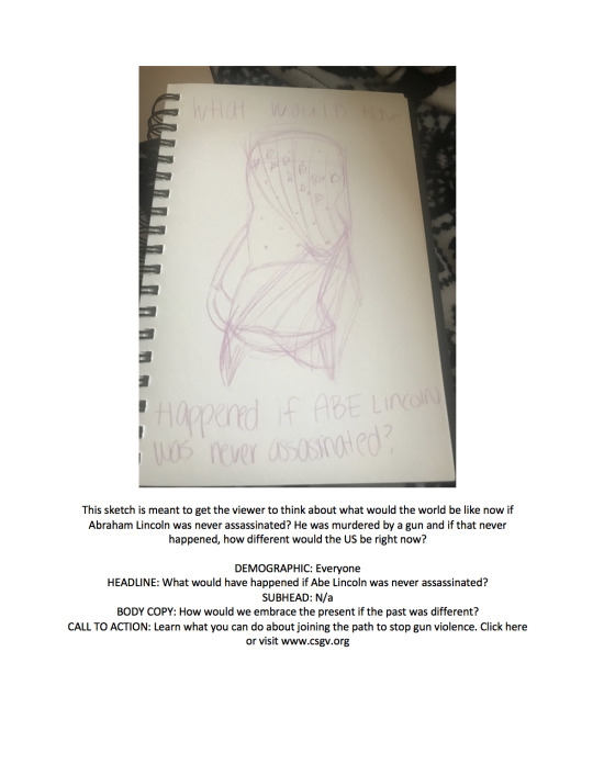
The third testimonial was based on a founding father, Abraham Lincoln. The main purpose I choose this was to have people think that if guns were not available to the general public, Lincoln could have lived longer, and a lot could be different in the present time. The same goes for JFK and Martin Luther King, Jr. I drew a chain to symbolize where Lincoln was sitting as well as an American Flag to symbolize it.
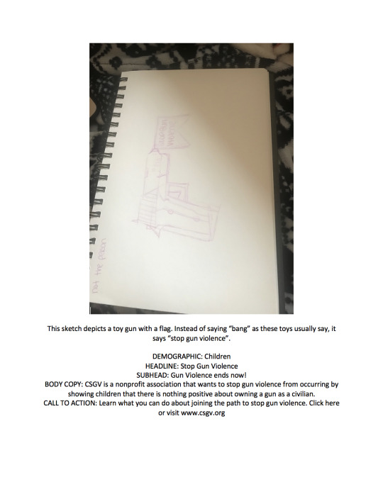
The fourth testimonial is not the person. A child holding a gun, but no one knows it’s fake until he accidentally pulls a trigger. When he does that, it pops out a flag that says, “Stop Gun Violence.” It is meant to be used as a prop when CSGV sends out guest speakers to inform students about gun violence.
The fifth testimonial is just plain folks. It’s meant to show a woman who is trying to commit suicide by a weapon. It’s supposed to be a very vivid and detailed and as this happens on a daily basis and is a big issue all around the world. The headline says, “This could be you.” As someone who suffers from suicidal tendencies, this particular ad hit home and was very personal. Many companies and organizations are afraid to promote ads such as this one, but it needs to be done to display what someone could be going through or thinking about with a weapon in their possession.
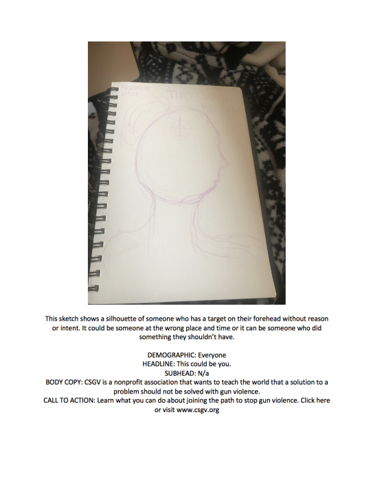
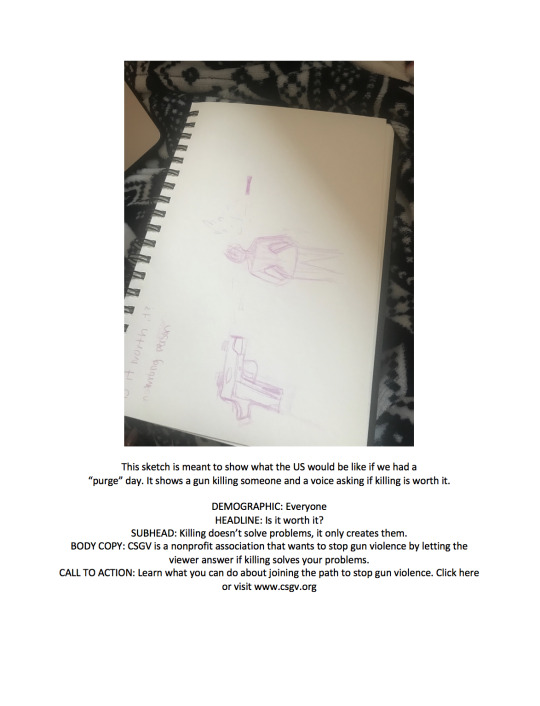
The sixth and final testimonial depicts the wrong person. It is meant to exhibit what the US would be like if we were to have a national holiday such as the Purge where it would be okay to kill for 12 consecutive hours without any consequence. It would be showing a reduced crime rate but at a price. It showing a gun shooting someone basically explaining that a gun can only kill someone when a person is pulling a trigger, thus explaining that guns don’t kill people, people kill people with the help of guns.
The reason I chose these testimonials were that they all meant something different but we're going after the same final outcome. Each one of these has a personality and story of its own. It should be inspiring others to understand the dangers of being a gun owner and the responsibly that comes with it. It should also show the world and the target audience that weapons are not a necessity and that we should be focused on stopping gun violence by changing the laws and making the gun process longer with proper training and mental health screening. Each one had different ideas but the ones I went with on paper are slightly different from the final outcome.
0 notes
Text
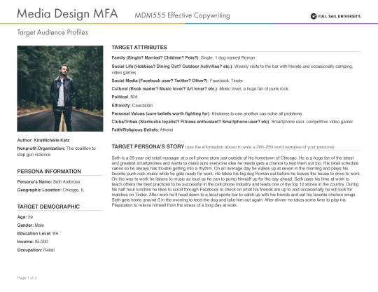
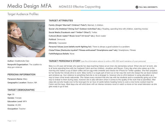
Audience Profiles
Your Target Audience Profiles: discuss your target audience and what you learned from your research: (Felton pages 26-31). Discuss how connections were made between the research and the developed personas (synthesizing). How does understanding the target audience help direct your campaign messaging?
Understanding the target audience helps direct the campaign message by relating to them. Someone who is married with children may take gun violence a bit more seriously than someone without children. It’s a safety measure that should be taken seeing as how there are a lot of shootings in schools. Ads can be directed toward the children to teach them the right and wrongs and why guns are dangerous. A single male could feel differently toward those ads versus ones that would directly focus on his mindset as guns can be violent when in the wrong hands. These ads should exhibit to gain public attention as well as recognize the issues going on thanks to these weapons in the wrong hands. (Felton, 2006, p.26)
0 notes
Text
Reflection
Considering research from the textbook and the tutorials with Craig Smallish and Ian Lurie, write a 4-5 paragraph reflection of your experience creating concepts and writing copy for your testimonial ads. Quote directly from the Felton book and the tutorials in proper APA Style. You need to discuss your process in creating concepts and comps of your testimonial ads.
When doing research for this class, I was never aware of how important copywriting is in our field. I was thinking that this class would be completely different than it was. “Build the best product, cause no unnecessary harm, use business to inquire and implement solutions to the environmental crisis.” (Felton, 2006, p. 96) and “The intent of a piece of copy is to project the client’s identity, not the writers.” (Howard Gossage, 2006, p. 100) These quotes are what inspired my work in this class. They gave me the insight and helped me think about the meaning of each quote and how to use that within the work that I did.
Creating the concepts was slightly difficult at first. I wasn’t sure in what direction I was heading with the testimonial ads or the personas. My topic was stopping gun violence and it was a lot harder to come up with concepts than I originally thought it would be. I say this because it is such a harsh and popular topic right now and I wasn’t sure what the best approach method would be.
I started out studying different ads for this topic and jotting down ideas that I was getting from them. I was trying to figure out the target audience that I would be going for. I started to think back to my years in elementary/middle school and I realized we had a program called “D.A.R.E”. I used that as an inspiration toward children and teens for the testimonial ads. I wanted to make them as vanilla as possible.
For the adult portion, the ads were more vivid and realistic. Knowing the shootings that we have had just this year alone, it needed to be as bold and blunt as possible so that people could understand the damage that it’s causing to families and loved ones. The ads were not only focused on shootings, but also on domestic violence, power, authority, etc. The main focus I had was to inform those who are uneducated that they cause more harm than good. I also wanted to use the copywriting to build a brand personality that could give just an image a voice to let everyone see that guns aren’t the solution to a man’s problems.
I kept the ads as simple as possible and tried to keep the alignment and fonts the same so that it was obvious that they were ads based on the same company. I used simple color schemes so that they wouldn’t take away attention from the images I decided to use. I also kept the wording as simple and to the point as possible. I didn’t want it to be overlooked in any way, I wanted it to pop right off the page.
Felton, G. (2013). Advertising: Concept and copy. New York: Norton & Company.
0 notes
Text
Final Vision Boards

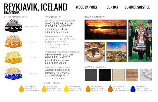

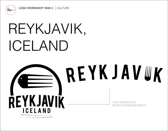
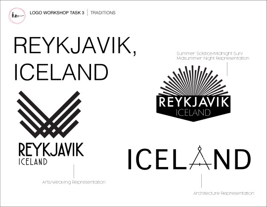
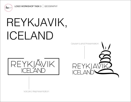
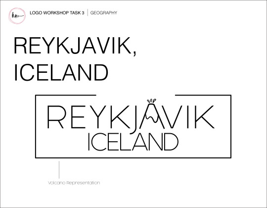
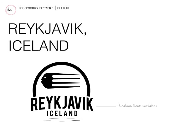
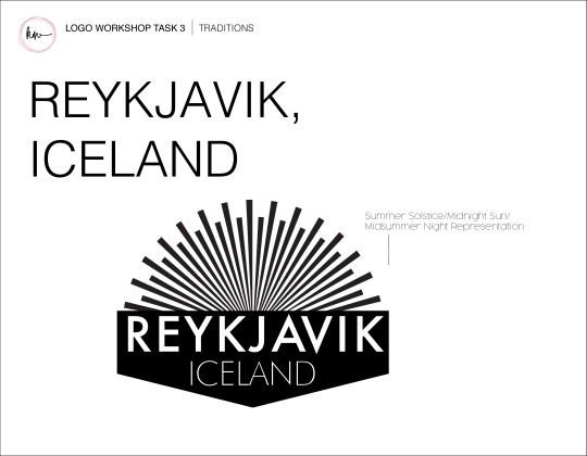
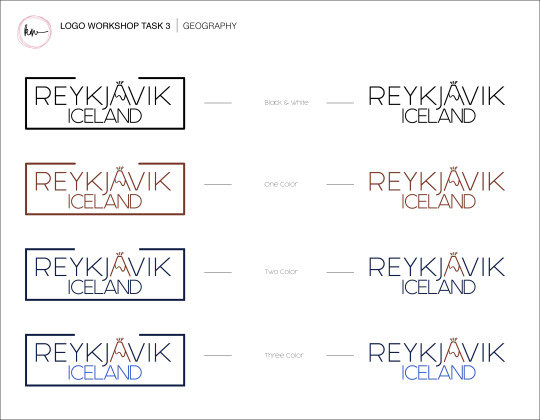
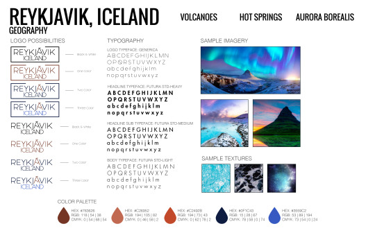
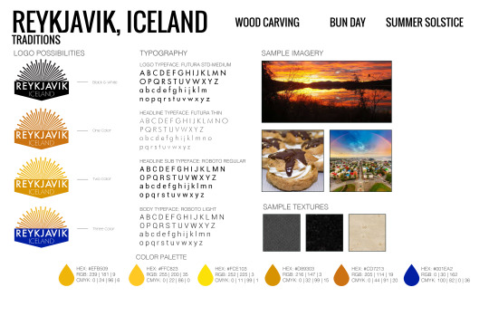
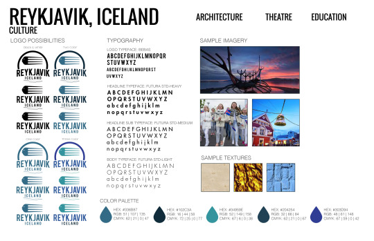
I do not see anything that I needed to revise for this project. I had a lot of research listed and use that to develop and synthesize the project to create it to what it is now. I documented all of the different approaches were taken and that includes the suggestions that were given to me in the video by Dr. Kratz regarding my logos. I included all color options for the logos as well as properly listing the color schemes in CMYK. RGB. and HEX. I was able to include different font types as well as textures and sample images. Each idea was unique in its own way. It depicted different things from each category. The geography logo had a volcano, the traditions logo depicted a sun that was meant to represent the midnight sun, and culture had a fish fork as a logo as they eat seafood quite often. Each of the ideas was new and different and I followed each of the design criteria principles from the tutorials. The layouts were clean and organized and included each part that was required.
0 notes
Text
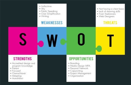
Research, Sketches, Logos, Vision Boards
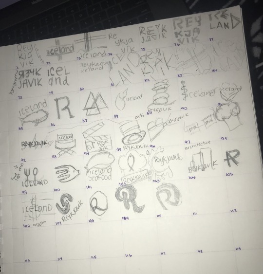


The threats I had for this particular project were mostly lack of information about certain aspects of Reykjavik. It was very difficult to find information on traditions and culture. Project specifications were very vague and it was quite a lot of time wasting and frustration to get from point a to point b.
The opportunities I had for this project were to be creative and brainstorm quite a bit. I was able to decide which points I wanted to develop so the vagueness of the project was a fantastic opportunity to let my ideas come to life. I was also able to learn about the country as well as expand my ideas for other projects.
The weaknesses I faced were lack of information on the tradition and culture of Reykjavik. Finding images was also difficult as there really is little to none about the culture or traditions. The color schemes were also very hard to pick out for some of the logos so I had to brainstorm a bit more to make the color schemes fit each subject/logo. The final weakness was lack of time. I did not expect to be stuck on certain parts of the project for as long as I was.
The strengths I had for this project was creativity and brainstorming and thumbnail sketches. It allowed me to throw all my ideas in small sketches and then pick out the ones that looked the best. I was able to create some unique logos that perfectly distinguished Reykjavik.
0 notes