catrinamcgregorcontextlog
Catrina McGregor Context Log
HNC CAP | Artist Research
18 posts
Don't wanna be here? Send us removal request.
Last Seen Blogs
fawnsavantrad
fawn savantrad

wachendlichauf
wach.endlich.auf

kidsworlddiscovery
Kids World Discovery

dery4rt
gigi ^․․^₎⟆

acemi-prsim4
acemi-prts4lookb
Photo

Fred Tomaselli
Multimedia artist.
Resources
https://www.jamescohan.com/artists/fred-tomaselli
https://www.artworksforchange.org/portfolio/fred-tomaselli/
1 note
·
View note
Photo

Phillip Gurrey
I really liked Gurreys unique take on portraiture but it was difficult to find biographical or artwork analysis on him. I wrote some biographical information i could find and wrote my personal opinion on the artworks and what i learned and could take forward for my own art practice.
Resources:
https://www.voicemag.uk/interview/3492/interview-with-artist-philip-gurrey
1 note
·
View note
Text
Chiharu Shiota 塩田千春
Born in Osaka, Japan. Shiota explores the human experience in the world, she gives her own view on complex queries like death, relationships and life. Yarn is a frequent medium of hers because “It is soft and i use it like a mirror of my feelings”.
Shiota’s academic life: Shiota went to Kyoto Seika University and an exchange to Canberra School of Art (Australian National University). She initially painted, but her interests shifted to performance and body. Shiota went to Germany after her Uni studies and was mentored by Marina Abramovic (Performance artist). Her time with Abramovic moulded Shiota’s concept preferences and interest of the human relationships with memory etc.

Uncertain Journey | 2019
“The installation is like one vast network, with the boats carrying us through on a journey of uncertainty and wonder”
Using 750,000 metres of thread from 5,000 balls of red yarn, stands a 10 metre high installation.
This installation covers the ceilings of the Southern Berlin’s Gallery, Gallery Blain. Her idea behind it was the journey of life and how it has no certain destination.
Shiota uses a limited colour palette, Red and black. She says the red symbolises blood and the intertwining yarn represents veins and nerves. She also says that it refers to the connection between people.
Boats are recurrent in Shiota’s work. She likes them because you don’t really know the exact destination you’re going, just like in life. Boats aren’t confined by roads, they can really go anywhere in the ocean or lake and you never really know how deep the water is below you, or what hides there.

I hope... 2021
rope, paper, steel
180,000 metal keys from all around the world. Shiota’s skeletal metal constructed boats and letters of peoples hopes for 2021.
this piece involves all of humanity and really captures what everyone in the world is thinking in 2021. All of humanity can agree that 2020 has been one of the worst years in modern times. So much went wrong in 2021; a worldwide pandemic, Australia on fire, The long overdue protest for the better treatment of black lives (It’s always been a problem but a protest finally got done about it), Trump almost starting WW3, the list goes on. We all hope for better in 2021.
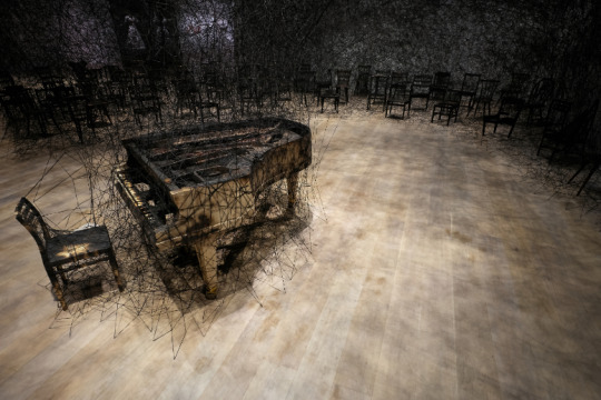
In silence | 2019
burnt piano, burnt chairs, Alcantara black thread
‘the work was a meditation on sound and its absence’
Shiota set fire to a piano and uses black thread to web around the remains of the piano.
Shiota often uses black when she’s referring to something dark like death, loss or nagativity. The inspiration of this piece comes from personal experience. When she was 9, she witnessed her neighbours house burned down and in the remains was a charred piano. She was scared and ran home to play on her piano, to fill the silence. She said it felt like her own voice had been burnt when looking and smelling the charred piano.
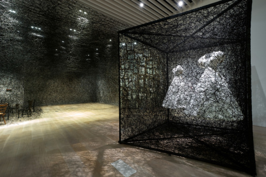
Reflection of space and time | 2019
white dress, mirror, metal frame, Alcantara black thread
Dresses symbolise the boundary of a persons exterior and interior. She uses Black thread, she often associates the use of black with loss. Shiota could be representing absence. It’s a very somber and ghostly piece.
Resources
https://www.mori.art.museum/en/exhibitions/shiotachiharu/04/index.html
https://ocula.com/artists/chiharu-shiota/#:~:text=Chiharu%20Shiota%20Biography,between%20feeling%20and%20language%20material.&text=Her%20newfound%20ethos%20was%20apparent,and%20out%20of%20the%20space.
https://www.chiharu-shiota.com/
0 notes
Text
Compare and Contrast
Bourgeois and Coley would both use a mix of cheap and slightly more expensive materials, i think Bourgeois relied more on expensive materials like steel and salvaged parts (which look expensive). Coley could feel comfortable using materials as cheap as cardboard but he too would use neon, steel and wood etc which are quite expensive.
Bourgeois' style was a lot more organic and unpredictable in contrast with Coley's architectural and structural approaches.
I think they both have a somewhat industrial style based on their colour palette of rusty bronze and silvers but i think Bourgeois' is more steampunk while Coley leans towards predictable structures with a hint of post-apocalypse.
Bourgeois' points of interest were usually more psychological and emotionally driven from memories and people while Coley's points of interest were typically cultural, logical, structural and religious. I think they both were fascinated by the human experience, Coley focusing on how structures impacted us and what it said about our culture. Bourgeois focused on the human emotions and personal experiences and how people and memories impact us.
0 notes
Text
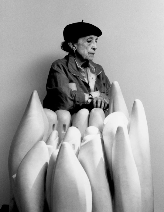
Louise Bourgeois
“Every day you have to abandon your past or accept it, and then, if you cannot accept it, you become a sculptor.”
Louise Bourgeois is a feminist French/American artist born in 1911 and died in 2010. She worked with a variety of different mediums like painting, drawing and sculpture. She helped change the way female artists were perceived by expanding on her female perspective through art, showing what the female artist is capable of. Not many female artists were tackling her subject matter or her style at that time.
She uses art as a tool to explore her own past experiences and psychology as a means of therapy or for the mental complexities to exist outside of her so she can acknowledge, breathe new life to a memory or possibly detach herself from it. I connect with her work because i too like to work myself out or remember something lost through art.

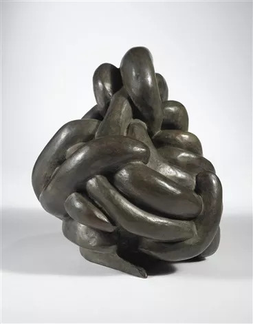
Spider (cell) | 1997
“The spider is a repairer. If you bash into the web of a spider, she doesn’t get mad. She weaves and repairs it.”
Materials: Steel, tapestry, wood,
glass, fabric, rubber, silver, gold, and
bone.
Spiders are a common theme throughout Bourgeois' work, She has made multiple sculptures and drawings of a spider because she sees the spider as a motherly figure - both a predator and protector. They represented her own mother.
This spider is unique compared to the other ones, it's the first time the web is also present. This work is also interactive because you can sit inside the web, becoming the art. She included tapestries to strengthen the connection the piece has to her mother because her mother worked as a tapestry repairer. Do you feel protected? Trapped? or something in between? its up to you to decide.

Cell (eyes and mirrors) | 1989 - 93
"The subject of pain is the business I am in. To give meaning and shape to
frustration and suffering ... The Cells represent different types of pain: the physical, the emotional and psychological, and the mental and intellectual. When does the emotional become physical? When does the physical become emotional: It’s a circle going around and around. Pain can begin at any point and turn in any
direction."
Materials: Steel, limestone, mirrors, glass and salvaged materials
This work is in the same series as 'Spider (cell)'. Many of her artworks in this series stem from involving the viewer, 'cell (eyes and mirrors) is no exception. The viewer can see themselves in the mirrors, trapping them and forcing them to face themselves. This created a very intimate experience between the viewer and Bourgeois' work.
Nature study | 1986
"The spiral is important to me. It is a twist. As a child, after washing tapestries in the river, I would turn and twist and ring them ... Later I would dream of my father's mistress. I would do it in my dreams by ringing her neck. The spiral – I love the spiral – represents control and freedom."
Materials: Bronze, silver nitrate patina
Spirals are a common occurrence in Bourgeois' works. They remind her of her families business, the tapestry repair her mother ran. Its the twisting tapestries she wrung in the river as a child. It represents ‘an attempt at controlling the chaos’, But it also comes with a danger for the spiral always has that threat of unravelling and losing control. The spiral can also be seen as never-ending and complicated.
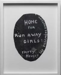
Home for runaway girls | 1994
"I was in effect a runaway girl. I was a runaway girl who turned out alright."
Gouache on sandpaper
Bourgeois refers back to her childhood in France. ‘Fille Mère d’Antony’ means unmarried mothers in french. Unmarried mothers were at risk of being kicked out of their homes at that time, she mimics the advertisements of housing these women at the time while also creating a sense of uncertainty and adventure for their future. The simple texts sparks a lot of questions about the treatment of women like why was this normal to look down on single mothers at the time? what made this normal? As well as being an ugly reminder of what use to be the norm.
0 notes
Text
Nathan Coley
Nathan Coley is a born and based Glasgow artist. He studied fine art at Glasgow School of art and worked in Dundee from 1998-2005.
He is well-known for his public sculptures but he also likes to use different medias like Photography and text. Coley takes inspiration from societies interaction with architecture and the relationship we have with it.
He was beginning his career during Thatcherism and considers himself a child of Thatcherism. The entrepreneurial spirit and you did not need to fall into the full-time job in means to survive.

Tate modern on fire | 2017
Materials: wood, cardboard and objects relating to the Tate building.
In response of the Glasgow school of art fire in which was his former place of study. He wanted others to feel the devastation the GSA fire did to students, former students and Glasgow's culture. It's always shocking to see a cultural building be destroyed and it even brought some viewers to tears upon seeing this exhibition. Coley likes to explore our interaction with buildings and architecture, how a structure originally meant for shelter can become so much more than just a survival tool, we grow attached to them.

The Lamp of Sacrifice, 286 Places of Worship, Edinburgh | 2004
Materials: cardboard
Coley created cardboard models of every place of worship in Edinburgh including mosques, churches and synagogues. He didn't want to include any religious symbols like crosses or stars of David to unify them as well as to diffuse the controversies surrounding the symbols, showing them only as places of worship.

Parade Sculptures | 2015
Materials: steel
The parade sculptures were apart of a series of architectural models relating to the terrorist attack on Thatcher while she was at a tory conference in the Grand Hotel.

Shaker boy meets modern girl | 2017
Materials: salvaged materials like wood, metal and plaster
0 notes
Text
Compare and contrast - Nancy Spero and Hannah Hoch
Spero was very politically charged and serious about getting a political point across in her work while Hoch was all about wackiness and non-seriousness, I think she was more focused on helping people escape gloomy politics. They’re both very important. We need art that’s politically charged and gives a voice to the people, but i think we also need an escape from all the mind-numbing politics.
Spero and Hoch both uses collaging in their work. Spero combined printmaking in her work while Hoch would mainly just use collaging, but she also experimented with different textures like fabrics or cardboard etc. I think that Hoch was more intricate with her collages while Spero was more minimal.
Both Spero and Hoch use the female body as subject matter, Spero always used the female body as her subject matter to empower woman while Hoch combined the female body with men, animals or objects. They both wanted to give the subjects in their paintings a new lease of life, Spero wanted that new lease to be mainly empowering while Hoch wanted it to be mainly wacky.
0 notes
Text
Hannah Hoch
Hannah Hoch was a German artist based in Berlin, born November 1st 1886 and died May 31st 1978. She trained at the ‘School of applied arts’ situated in Berlin, Charlottenberg, her study on glass design was short-lived as this was during the time WW1 emerged. She came back to the school in 1915 to study graphic design and painting. In 1918, she was introduced to Berlin’s Dadaism movement. She achieved great things for a woman of her time, she was the only woman allowed into the Berlin ‘dada’ group. She is best known for her affronted photomontages depicting ‘Weimar-era’ views on ethnicity and gender.
Hoch would often fuse bodies in her collages, like male and female bodies to create a new lease of life to basic pictures as well as coming off as quite daring and rebellious for a woman of her time.
Hoch experimented with non-objective art. Objective art is about creating a sense of simplicity and purity through collaging, painting and printmaking etc.
Hannah Hoch was the only woman associated with the Berlin dada movement. Dada was created after WW1, it posed as a reaction to it. It was all about having fun and being silly - they rejected aestheticism and reason.
Hannah Hoch lived through the WW1, you’d think this would dampen her spirits along with her art, but it didn’t! She kept spirits up after the war by creating wacky and bizarre collages that helped people forget about the horrors that war brought for just a little while.

Watched (1925)

Indian Dancer
With Seaweed

Untitled (Dada) 1922
Resources
https://arthistoryproject.com/artists/hannah-hoch/german-girl/
https://www.moma.org/artists/2675
https://www.britannica.com/biography/Hannah-Hoch
0 notes
Text
Nancy Spero
(1926 - 2009) Nancy Spero was an American Visual artist based in Chicago. She studied at École Nationale Supérieure des Beaux-arts in Paris, after her studies she returned to Chicago. She was a figurative artist as well as an out and proud feminist. Political, social and cultural themes were often explored in her work. The Vietnam war and the exploitation of the human rights of woman, minorities - these themes were commonly explored in her work. She is a powerful figure in the woman artists community because of her unapologetic female-orientated work as well as contributing to the founding of AIR (Artists In Residence) - the first of it’s kind, all woman’s cooperative gallery in SoHo.
In Spero’s youth, she’d paint and print but rheumatoid arthritis halted that practice. She turned to collaging in which she’d create paper friezes and murals, helping her to continue her art career and not letting arthritis stop her.
She sometimes works directly on the wall as well as adding text to her work to create a sense of timelessness.
She looks to the old masters using techniques like mosaics. Mosaics are tiny pieces cut up and put together again like a puzzle, they’re usually made with glass or stone.
For collaging and printing, Spero often repeats her prints and found paper, muddies them up with paint etc ‘to make them look bloody’ and combines the images and prints together to make a larger piece.
Spero was a feminist, activist and very politically charged. Her main themes in her work revolved around giving historical woman in art back their power. She knew that women did not have a voice in art for a very long time and that their portrayal in art was almost always in the control of men, they’d often be painted as objects. Spero takes back their power by portraying them (in historical art styles) as powerful and independent.
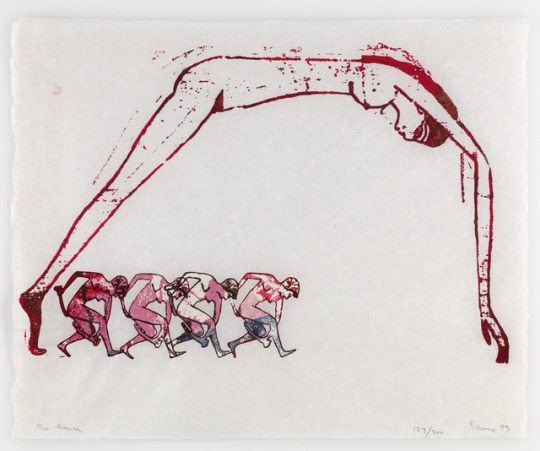
The Dance
Cri du coeur (2005)

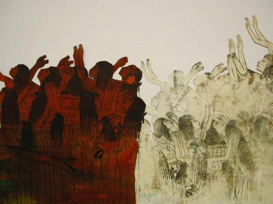
Frieze
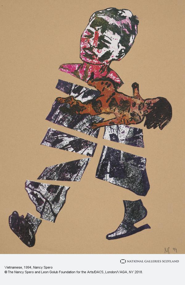
Vietnamese (1994)
Resources
https://www.tate.org.uk/art/artists/nancy-spero-2399
https://www.galerielelong.com/artists/estate-of-nancy-spero/slideshow?view=slider
https://www.nationalgalleries.org/art-and-artists/99837/vietnamese
http://www.artnet.com/artists/nancy-spero/biography
https://www.theguardian.com/artanddesign/2011/feb/26/nancy-spero-serpentine-rachel-withers
https://www.theartstory.org/artist/spero-nancy/
0 notes

Text
John Cage
John Cage was an American composer, music theorist, artist and philosopher. Cage was one of the leading figures in the post-war avant-garde. He studied at Pomona college for a little while and then traveled to Europe before returning back the United States. His work would consist of unorthodox compositions by experimenting with tape recorders, prepared pianos, 12 tone etc as well as composing choreographies for dance.
The Beatles ‘Revolution no.9′ was composed by John Lennon and Paul McCartney but was heavily influenced by John Cage. It was seen as very abstract at the time and still is thought of that way. Lennon described it; "an unconscious picture of what I actually think will happen when it happens, just like a drawing of revolution". Many tape recordings and television sounds can be heard in this composition - something Cage used as well as the all-over-the-place sounds.
Cages ‘4′33′ has become comedic blip in music lovers lore. During the whole composition, despite all the orchestral instruments present, no one played anything. Cage wanted the audience to be the music - the awkward grumbles, repositioning and coughs the audience makes while they wonder what on earth is going on was the composition. Some people think he is a daring genius by playing absolutely nothing, other’s think he’s just a lazy narcissist.
Cages ‘imaginary landscape’ consists of 24 performers on 12 radios. Cage liked to have no control over his work to allow the listeners to have a genuine emotional appeal to his music. The radios determined the music, not Cage. his allowed his ‘Imaginary landscape’ series to have multiple emotional outcomes.
Cages ‘Three dances (Dance no.3)’ was created by using a prepared piano. After creating the composition of Bachanale - solely using prepared piano, he realised the multiple potentials of using this technique. Hence he created Three dances series to explore the prepared piano compositions.
Cage liked to borrow from the past. He’d borrow past literature and artwork to revamp and create his own spin on a classic work whether thats literature, cultural traditions or art.
Cage would use a prepared piano to create otherworldly sounds. A prepared piano is when objects are placed between the strings. Cage used objects like forks and spoons etc. He first tried this technique when composing music for bacchanale a dance by Sylvia Fort - He realised that only a piano could be used during the composition, so he came up with the prepared piano. “to place in the hands of a single pianist the equivalent of an entire percussion orchestra...”
Another one of his techniques is to not play anything! his 4′33 composition consisted entirely of silence and the audiences grunts and groans, a whole band of musicians like flutists, violinists, drummers etc all grouped together to give the impression they were going to play something, but they played nothing.
Early in Cages career, he used the 12 tone method borrowed off his teacher Schoenberg. A 12 tone technique means you must play all 12 tones equally, no single tone can outshine the rest.
In conclusion, Cage paved the way for the new 20th century avant garde music. He brought many unique and unorthodox ways to the music world and shook up our perspective of what music should be. This unorthodox approach to music is more and more common in the present day, for example Death Grips is modern band popular in the alternative/unconventional music scene and i can see they must have been influenced by the liked of John Cage.
youtube
Revolution no.9
youtube
4′33
youtube
Imaginary landscape No.4 (1951)
youtube
Three dances (Dance no.3)
Resources:
https://www.tate.org.uk/art/artists/john-cage-845#:~:text=John%20Milton%20Cage%20Jr.,post%2Dwar%20avant%2Dgarde.
https://www.tandfonline.com/doi/abs/10.1080/07494460100640301?journalCode=gcmr20
https://en.wikipedia.org/wiki/Prepared_piano
https://en.wikipedia.org/wiki/Revolution_9
https://en.wikipedia.org/wiki/Imaginary_Landscape_No._4_(March_No._2)#:~:text=Imaginary%20Landscape%20No.-,4%20(March%20No.,the%20series%20of%20Imaginary%20Landscapes.&text=It%20was%20composed%20in%201951.
https://en.wikipedia.org/wiki/Works_for_prepared_piano_by_John_Cage
0 notes
Text
Compare and contrast - Ken Currie and Paula Rego
Currie uses oil paint in his artworks and usually works large scale, for reference he creates casts, works from life or he uses sketches he made in the moment. while Rego prefers to use pastels (hard and soft), for reference she always tries to work from life but occasionally uses photographs.
Currie’s style is semi-realistic and painterly. He often has very dark backgrounds with little detail and a ghostly figure(s) in the foreground. while Rego has a scratchy, waxy style. Her paintings usually consists of textured backgrounds of interiors or outdoors with a waxy figure(s) in the foreground - her paintings are typically much brighter and has more attention to the background than Curries. In the past, Currie’s style looked similar to Rego’s because he used linocuts and his style was a lot more illustrative than it is now. Rego use to use paints like acrylic and oil similar to Curries current work but she found that pastels gave her more freedom in her style.
both Currie and Rego do figurative artworks, Currie usually has male figures while Rego usually has female figures. I’ve noticed that Currie’s themes for artworks usually stem from violence, mortality and disease. Rego’s themes for artwork usually stems from feminism, storybooks and domestic situations (of course both artists have made artwork outside of these themes but these are usually what i’ve noticed they gravitate to) - They both make artwork with heavy and controversial themes.
0 notes
Text
Ken Currie
Ken Currie, born and based in Glasgow. He is a member of the New Glasgow boys and is the most politically outspoken amongst them. His work often focuses on themes of mortality, disease and politically charged violence in Glasgow.
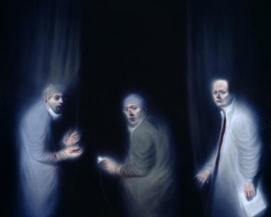
Three Oncologists (2002) | Oil on canvas | 1950 x 2430 mm
Summary
Models in the painting are surgeon’s Professor RJ Steele, Professor Sir Alfred Cuschieri and Professor Sir David P Lane
analysis
The three surgeons are the only subject matter in the whole composition, heightening their presence and importance. The background is black and empty, like a void - this immortalises the figures, they look otherworldly. I think Currie wants us to look at the men like saints, or something beyond mortal - better than mortal to emphasise the miracles these surgeons do.
The light misty fade coming from them make them look ethereal. The soft, white mist directing upwards from them make them look otherworldly, like they’re spirits or angels, this fits because these men have brought many people back to life in their career, much like a resurrector or even a necromancer.
techniques
Julie Lawson suggested to Currie created casts of their faces to remember their shape because he couldn’t sit them down and paint them for hours on end because they were busy men.
Currie had to go into theatre with the two surgeons (Steele and Cuschieri) to watch them work and sketch down positions they were in while at work.
Currie then painted it with oil paint on a large scale canvas. I think he used oil paints slow drying to his advantage when creating the mist, he must’ve used a very thin layer of paint and smudged it in thoroughly.
context
The men were in charge of an oncology unit in Dundee, Currie had to get to know them individually to capture their essence. David Lane said people view cancer as this darkness and their job was to save people from the darkness that is cancer. Currie sees it less as a portrait, and more about his experience meeting these people. He thought it was a much deeper process for him because he didn’t just capture what they looked like, he spent time with them and their work and got to know these literal miracle workers as people, not just a portrait.
I think Currie was trying to shine a spotlight on those who basically do Gods work, their ability to heal and bring people back from the dead would've been seen as a miracle - Currie wanted to place them at the same power of God.

Black Backed Gull (2018) | Oil on canvas | 3050 x 2130 mm
Summary
Currie was initially inspired by the composition and shape of a deceased gull he saw.
analysis
The composition looks like a religious mural. The gull’s crucified shape hanging above the butchers reminds me of Jesus’ crucifixion, and the culprits (romans). The gull is large and in the centre hanging above the two butchers, the gull looks like its glowing because of the bright white, the positioning is similar to other depictions of the crucifixion of Christ, like ‘Christ crucified - Diego Velazquez’
The tone is very sorrowful. Not much is seen in the background except the dark blue sky and a hatch of mayflies surround the gull, the butchers are bowing their heads, it could be seen as them mourning the loss of such a majestic creature even though they were the ones that killed it - its a sorrowful atmosphere.
techniques
Currie did an etching of the gull when he saw it hung dead amongst crows and later developed it into this larger painting.
Currie then painted it with oil paint. He likely started with a thin layer and built up the layers on top of the thin layer to create a sense of dimension.
context
Currie is quite pessimistic when it comes to death and mortality - he thinks this is a good outlook to have. It helps him cope with what happens in the world today. He was more interested than the composition than any deep theme, he saw the gull hung, he wanted to capture the composition and let the audience make their own interpretations - I think it quite Biblical.

Panel 3, Down In The Woods (2018) | Oil on canvas |
Summary
‘Down in the woods’ is the last panel of a 3 panel piece.
analysis
The composition is quite theatrical. It looks staged, the man hovering over him has made sure the victim is in view of the audience, the way he is holding the bat looks exaggerated and their is no sign of swift movement meaning the man must be holding this stance for a while. The red backdrop looks like a curtain as if they’re on a stage.
The red backdrop adds to the drama. The curtain emphasises the colour red, the colour of blood. Red is often associated with danger and violence so it fits, red is also seen as blood dripping down the mans back. The large body of red drags more attention to the violence that is taking place.
techniques
Currie then painted it with oil paint. He likely started with a thin layer and built up the layers on top of the thin layer to create a sense of dimension.
context
Currie wanted to portray organised violence. The man with the bat looks as if he is clubbing a seal, not a human being. The victim seems to be accepting his fate - like it’s deserved or expected. It reminds me of the brutality of factory farming or harming animals in pursuit of food of skin. We often gloss over the way the meat on our table has gotten there, or how our leather boots are made, it’s made in such an awful and brutal way - killing and animal but we don’t want to think about that. Seeing humans being treated like animals sends a powerful message on the organised violence we let happen to animals.
“He’s got a laurel leaf thing around his head like he’s been selected to be martyred or sacrificed. But the whole thing has got a theatrical feeling to it. This isn’t taking place in a real forest. It’s an imagined, theatrical event that’s happening.” - Ken Currie
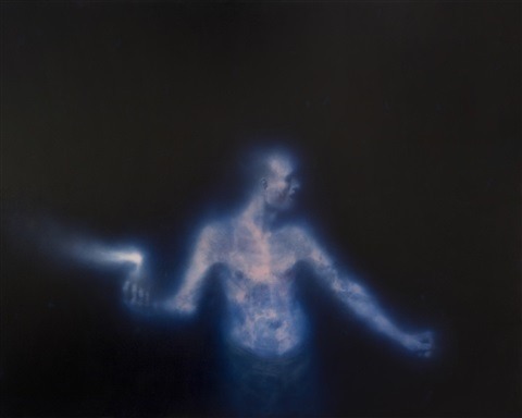
Study, Man With A Petrol Bomb (2001) | Oil on canvas | 1820 x 2290 mm
Summary
Ken Currie’s study of a man with a petrol bomb.
analysis
The colour is very cold, adding to the deadly atmosphere. I think the figure looks like a grim reaper of sorts, ready to kill. You can see his bones and the blue in his skin makes him look cold, like a corpse. He is about to bring death like the grim reaper.
Currie uses light to create an impactful and ghoulish presence. Currie once again uses an all black backdrop with nothing but a glowing, blue, skeletal figure ready to throw what looks like a petrol bomb, its very ghoulish and quite terrifying.
techniques
Currie then painted it with oil paint. He likely started with a thin layer and built up the layers on top of the thin layer to create a sense of dimension.
context
A person all too familiar to Glaswegians, especially those from the rougher areas like the EastEnd and parts of town. Gang violence is a problem in Glasgow especially during the 2000′s. This piece could be relating to Glasgow’s drug feud which took place in 2001, turning the streets of Glasgow into a war zone. It is still relevant today as it is still common for Glasgow’s gangs to start fighting with weapons like these.
Resources:
https://consideringart.com/2019/02/22/ken-currie-red-ground/
https://www.flowersgallery.com/artists/174-ken-currie/
https://www.nationalgalleries.org/art-and-artists/65127/three-oncologists-professor-rj-steele-professor-sir-alfred-cuschieri-and-professor-sir-david-p-lane
https://www.artlyst.com/reviews/ken-currie-protest-defeat-victory-revd-jonathan-evens/
https://news.stv.tv/west-central/1437736-gangland-drugs-feud-that-turned-glasgow-into-a-war-zone?top
https://www.culture24.org.uk/places-to-go/scotland/art13981
0 notes
Text
Paula Rego
Paula Rego was born in Lisbon on the 26th of January 1935. She studied at Slade school of fine art. She is currently based in London. Rego creates beautiful pastel works usually based on storybooks and nursery rhymes. She portrays feminism and female roles in many of her works.

The Dance (1988) | Acrylic paint on paper and canvas | 2126 x 2740 mm
Summary
Rego developed 11 preparatory studies of the dance before settling for the composition of this final piece.
analysis
Rego’s use of gloomy colour adds to the dreamlike qualities of this piece as well as providing contrast for the figures in the foreground. The dark blue moonlit sky, sea and ground helps set the night time scene and dreamlike quality that is often seen in Rego’s work. She also uses colour to create contrast, the background is mostly dark blue colours, while the figures begin to have warmer colours, this helps them to stand out from the background.
Rego uses scale to make the lonely woman dominate alongside the figures to her right. The woman on her own at the left is much larger than the other figures, this makes her stand out and in a way, compensate for being the only one alone. She appears confident and independent, she’s doing just fine on her own - in addition, she is looking directly at the viewer with a smile on her face, this further pushes the narrative that she is a strong, happy independent woman and she does not need a man or a family to complete her. I think this sends a very positive message to women, seeing a happy woman being her own person, it challenges the expectation that has been drilled into many women’s heads that you can only be happy and complete if you have a man, or a child.
techniques
Rego heavily diluted her acrylic colours at the beginning of the painting. she used dull pinks and browns to mark tone, she outlined the forms in diluted paint. Rego began to apply thicker strokes of paint once she had her tone and outlines down. she left some areas of the painting with the thin pain application, for example, in the sky.
For the face of the men, Rego referenced her son who sat for her and a photo of her husband. Rego likes to work from live models as much as she can.
context
Rego explores feminine roles that are often expected or sought after by young women and society. These 4 roles are; loneliness, finding someone, having a baby and taking care of you family for generations - it makes me think that the roles expected are centred around reproduction and that a women has the responsibility to care for those she creates.
Perhaps Rego is showing the cycle a women is expected to be in, hence why they are dancing in a circular form. The lonely women becomes the woman with the man, then the pregnant woman, then the grandmother, mother and child - then the child becomes that lonely woman and the cycle repeats itself.
Another way to look at this is that Rego is trying to communicate that women have multiple routes to take, you can be a mother, apart of a couple or just being your own company, any path you choose is good as long as it’s what you want - you can find fulfilment in any path.
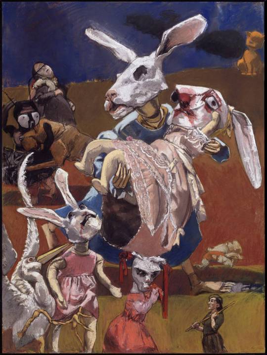
War (2003) | Pastel on paper on aluminium | 1600 x 1200 mm
Summary
Rego made this in response to the early stages of the Iraq war, she saw a photograph of a little girl screaming and running away from and explosion while a woman and a baby stood still.
analysis
Rego bands the colour to create depth. In the composition, there are 3 bands of colour, plum blue for the background, dark brownish orange for the middle ground and a muddy yellow ochre type colour. The figures are standing on the yellow ochre band, creating a strict divide between the middle ground and background - this creates depth.
Rego uses scale to drag attention to the Rabbit holding the little rabbit. These two rabbits are the largest figures in the whole piece, as well as them being in the centre of the composition. They tower over the other figures, making them seem like the most important in this battle scene, its the first thing that catches your eye when looking at it.
techniques
Rego used pastels because ‘it’s like painting with your hands’ - Paula Rego. She starts by priming her paper with gesso the draws in her forms and tone with hard pastels, then gradually moves to soft pastels.
Rego likes to work from real life, her practice involves referencing live models.
context
This is a very powerful piece, It triggers my fight or flight response because of all the chaos. It is distressing to see the bunny figures with blood on them, the distressed face of the little bunny in the pink dress, it’s as if she’s yelling, similar to the photograph Rego took inspiration from. In addition to all the other characters in the scene where you have to squint to try make sense of whats really going on. It’s all captures the fear and terror that war does to people.

Dog Woman (1994) | Pastel on Canvas | 1200 x 1600 mm
Summary
Rego took inspiration from a story her friend, Degas wrote her. It is part of Rego’s ‘dog woman’ series
analysis
The figure is takes up the majority of the composition to emphasise the presence and emotion of the figure. The woman is seen on her hands and knees as if she has just lunged down with her mouth wide open, this is a very unusual pose for a woman and provokes a lot of questions - is she territorial? is she mad or excited? It makes the woman have a very impactful presence.
The gritty, muddy colours and mark making helps invoke the downtrodden and animalistic portrayal. Rego’s use of fleshy, earthy colours (seen on the skin, clothing and floor) along with her rough mark making seen on the hatching of the top, floor and blending of the face help communicate Rego’s intention for the woman to be very animalistic in her qualities.
techniques
Rego used pastels to create the gritty mark making. She likely used hard pastels first, the soft pastels later on like she usually does with her pastel work.
Rego had a good relationship with this model, Lila Nunes. Nunes posed for her live.
context
“To be a dog woman is not necessarily to be downtrodden; that has very little to do with it,” She explained, “In these pictures every woman's a dog woman, not downtrodden, but powerful. To be bestial is good. It's physical. Eating, snarling, all activities to do with sensation are positive. To picture a woman as a dog is utterly believable." Paula Rego
The girl in this work as well as the ‘dog woman’ series is someone Rego knows really well, Lila Nunes took care of Rego’s husband when he was dying as well as helping him paint. She looks at Lila Nunes and sees herself - “She’s like a self portrait (of herself)” Rego stated in an interview. Nunes is someone Rego loves and heavily admires, it makes sense that Rego sees Nunes as a perfect candidate to be the model of an empowering female series like Dog Woman.
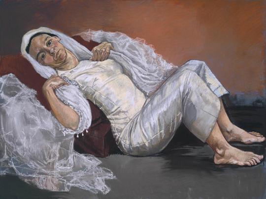
The Bride (1994) | Pastel on paper on aluminium | 1200 x 1606 mm
Summary
The bride is also part of Rego’s ‘dog woman’ series
analysis
The positioning of the bride creates a bit of tension. The bride is oddly leaning on what looks like the side of the bed with sheer fabric beside her. the positioning of her hands, she’s gripping onto herself. The way she’s leaning doesn’t look comfortable with her her oddly bent neck and back and that she’s looking directly at the viewer as if waiting for instructions or just waiting, it gives off tension.
The light white of the wedding dress highlights the figure. The background is dark, muddy warm colours while the bride pops out from the scene with a bright white and silky wedding dress. This highlights the bride.
techniques
Rego used pastels in the same fashion she used on her previous pastel work; she used hard pastels first then soft pastels.
Rego had her daughter pose live.
context
The bride truly does give off dog characteristics. The way she is sitting, its like she is waiting for instructions from her owner - her lover. I think she’s laying at the bottom of the bed, why isn’t she laying on it? is she not allowed? must she wait until her owner says so? Rego originally made this series to also express the absolute love and devotion someone has to their lover and that it’s similar to how a dog loves. I think this painting portrays this devotion to a lover very well.
Resources
https://www.tate.org.uk/art/artworks/rego-bride-t06959
https://www.saatchigallery.com/artists/artpages/rego_paula_dog_woman.htm
https://www.thewhitereview.org/feature/interview-with-paula-rego/
https://www.tate.org.uk/art/artworks/rego-war-t12024
https://www.tate.org.uk/art/artists/paula-rego-1823
https://www.tate.org.uk/art/artworks/rego-the-dance-t05534
0 notes


Text

I started with exploring anxiety but decided I wanted my theme to be focused more on recovery.
1 note
·
View note
Text
Marlene Dumas
Marlene Dumas is a contemporary South African artist that paints controversial and somewhat haunting portraits and figures. She is currently based in Amsterdam, The Netherlands. born in Cape town 1953, she grew up Kuils River, South Africa. Growing up, Dumas didn’t know much about the world as TV did not arrive in Africa until the 1970′s, when she realised how corrupt her country was, she wanted out. She moved to the Netherlands to further pursue art, politics and controversies have always been a deeply rooted theme within her artworks, probably because of her late realisation of politics around the world. She is now known as one of the most influential artists of the 21st century.

Wall weeping, oil on linen, 2009
Summary
Dumas painted this from a photo of Israeli soldiers searching Palestinian men in front of a wall.
Analysis
Dumas cropped the original reference to create a different context from the original photo. The original had Israeli soldiers, Dumas cropped them out to manipulate the context. The image can now be anything, prayer, surrender or execution - this makes the painting open for more interpretations.
form - Dumas creates depth with the line and shadows. The men are lined up against the wall, the men on the left are bigger and have more shadows than the right. The right men are smaller and lighter than the left. This creates depth.
Dumas uses a muted colour palette to create a moody atmosphere. The only colours seen is black, white and hints of warm tones, the lack of multiple colours creates a dull and moody tone because multiple colours is associated with energy and positivity, the lack of colours is associated with negativity and gloominess.
Techniques
Marlene Dumas takes reference from photographs, magazines and media. She got the reference for this painting from a photograph. She cropped the image to make it her own - she got rid of the soldiers, making the context of the image much different from the original photographers context. She also used a limited colour palette and more figurative forms to make it almost unrecognisable from the original image.
Dumas uses the wet on wet technique. She applies a layer of oil paint on wet linen before it dries, this allows her to complete a painting in one sitting - she usually works fast, like within a night.
Dumas applies heavy brush strokes and smudges her work, she applies her paint heavily and is not afraid of unblended work. She likes painting in oil because she can smudge her work as she goes.
Context
‘Wall weeping’ is an example of one of Dumas’ politically charged paintings, she likes to paint politically controversial subjects from magazines and media. Dumas’ ‘Wall weeping’ reference came from a photo of Israeli soldier searching Palestinian men. She cropped the soldiers out to just show the men. The absence of soldiers allows a change of context, if the soldiers were there, it would make it easier to assume these men as war criminals, victims or the soldiers would steal the show. The absence of them makes us focus on the men - they are no longer war victims/or criminals, they could be interpreted as praying, weeping or surrendering - but for what?
Dumas turns the original reference photo meaning into Universal suffering. The absence of soldiers takes away the original context. These people could be anybody, on any side. They are sharing the same human emotion of fear.

The neighbour, oil on canvas, 2005
Summary
This portrait is apart of Dumas’ political series, ‘Man kind’.
Analysis
Dumas has a very up close and personal portrait to create an intimate atmosphere between the man and the viewer. The top of his head to his beard is cropped a bit, he is very close to the viewer and looking directly at us. This creates an intimate relationship between the neighbour and the viewer.
The form is quite rounded to make him look very human and similar to us. The round shape of his head, eyes, nose, mouth etc promotes feelings of familiarity - promoting the idea that he is just another neighbour.
Dumas uses a limited colour palette to further harness the focus on the man, particularly the eyes. The majority of the mans face is black and white, except for the swatch of yellow at his right eye - this puts more focus on the eyes that are looking right at us.
Techniques
(Similar to previous works)
Marlene Dumas takes reference from photographs, magazines and media. She got what looks like a mugshot and manipulated into looking like a normal portrait.
Dumas uses the wet on wet technique. She applies a layer of oil paint on wet canvas to harmonise with her fast working time - she can finish a painting in a couple of hours.
Dumas uses the smudge technique to manipulate and alter her paintings. When she decides she doesn’t like a part of her painting, she will smudge it and paint over the spot.
Context
At first glance, the photo just looks like an ordinary man, a neighbour - the title states. This is actually referenced from a photo of a murderer. Mohammad Bouyeri - responsible for the 2004 murder of Theo Van Gogh, dutch filmmaker and journalist. At the time, the news created a lot of fear, islamophobia and xenophobia in the Netherlands. Dumas attempted to make the murderer appear as just another one of our neighbours with the title and that the figurative painting style is hard to pin-point an actual person. The painting raises questions about racism towards bearded Arab men.
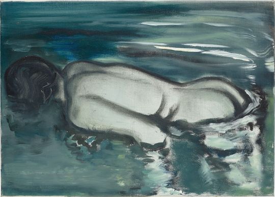
Losing (her meaning), oil on canvas, 1988
Summary
‘Losing (her meaning)‘ is from Dumas’ solo museum show at the Kunsthalle zu Kiel in 1988.
Analysis
The figure takes up the majority of the painting to emphasise the figures importance. The figure dominates the composition by taking up the middle left to right, the figure is also the only figure in the painting - creating further emphasis on the figure.
Dumas applies her strokes heavily to create the illusion of texture. She thickly applies her paint and uses little blending to create a visually impactful and textured painting. For example, you can see the distinct lines of the woman’s spine and contour lines as well as the heavy blots of white to mimic the waters reflection.
Dumas uses colour to create a gloomy atmosphere. She sticks to a cold colour palette to create a dark and gloomy atmosphere as cold and dark colours seen in the water, skin and hair etc are often associated with negativity.
Techniques
(Similar to previous works)
Marlene Dumas takes reference from photographs, magazines and media. She referenced a photo found by gallerist Paul Andriesse.
Dumas uses the wet on wet technique. She applies a layer of oil paint on wet canvas to harmonise with her fast working time. (What she uses in all artworks talked about here).
Dumas also used the smudge technique as well as heavy brushstrokes. Her paint strokes are applied heavily and confidently.
Context
This painting is different from her paintings previous before her 5 year hiatus. She often painted portraits of people forward facing but perhaps after returning from her hiatus, she came back with new ideas. "After having used confrontational and frontal compositions for a long time (the big eyes and faces), it was time to turn the gaze away. 'The death of a beautiful woman is unquestionably the most poetical topic in the world,' said E.A. Poe…and a naked one even more so Roger Vadim could add" (Marlene Dumas, ‘Waiting for Meaning’). She explores the theme of death in this painting and the fact you can’t see the woman’s face, makes it much more mysterious and eerie. Who is this woman? Why is she naked, face down in a pool? The more you try to find a reason for her position, the darker it gets.
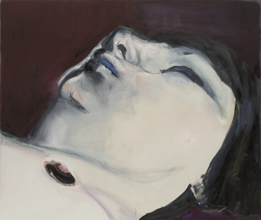
Jen, oil on canvas, 2005
Summary
‘Jen‘ is part of Dumas’ death theme series.
Analysis
Dumas crops the image to a closeup of her face to create unsettling intimacy. She crops close to the face, similar to what she did with the above ‘neighbour’ portrait. It’s provokes unsettling feelings because you are so close up to a vulnerable, probably dead woman.
Dumas uses colour to create contrast for a moody atmosphere. She uses a very dark red, almost black in the background, hair, eye and shadows. This contrasts against the very pale skin - creating a ghostly portrait.
Dumas uses a cold colour palette to create a haunting look. Her face is ghost white, with some blue on the lips and eyes and some red on the chin and nipple. She looks like she’s dead, or very sick - this relates to her theme of death series.
Techniques
(Similar to previous works)
Marlene Dumas took reference from a screen caption of the 1970 film ‘fly’ by artist, Yoko Ono which featured a fly walking across a naked woman’s body.
Dumas uses the wet on wet technique. She applies a layer of oil paint on wet canvas to harmonise with her fast working time. (Uses in all artworks)
Dumas uses the smudge technique to manipulate and alter her paintings. When she decides she doesn’t like a part of her painting, she will smudge it and paint over the spot.
Context
Without context, the painting looks quite provocative because the woman is naked, but because of the series its in (death theme), the subject is very likely a corpse. It turns into something haunting, disturbing yet also peaceful. It’s haunting to realise that it is a pale corpse, quite disturbing to be so close to a corpse and peaceful because she looks like she’s sleeping, and is resting in a sense.
Resources
https://www.theartstory.org/artist/dumas-marlene/artworks/
https://onlineartschool.com/art-school/oil-painting-techniques/wet-on-wet-oil-painting-method-explained/
https://www.phillips.com/article/44094741/marlene-dumas-and-the-eternal-search-for-meaning
https://www.tate.org.uk/whats-on/tate-modern/exhibition/marlene-dumas-image-burden
0 notes