cd3v3r
Ihi Wehi
Design Studio VCD, Matt Clapham & Jacquie Naismith - Ihi Wehi Monday & Thursday 9:00 - 12:00
17 posts
Don't wanna be here? Send us removal request.
Last Seen Blogs
eleanordoescosplay
There isn't much time

groovycreatorsportsfriend-blog
Untitled

floradevereaux
Most days I don't recognize me
floradevereaux
Most days I don't recognize me
thiccandpatheticc
Putting the femme in blasphemous
Text
Reflection
Out of all projects that we have done so far this year (Puna and Kaitiakitanga) I thought this one wasn’t going to be easy per say, but the easiest compared to the other two we have done because we had so much visual freedom and could literally create anything that we wanted on any inequality issue. But I have to say for me it was the hardest. I struggled a lot on creating designs that I liked and struggled getting into the motivation to create posters. This project for me has taught me a lot about myself and the way I design, iterate and comprehend inequality in New Zealand. I definitely need to work on that and try to improve and get better within myself in those aspects. I have struggled to produce designs that I am proud of and that I want to show my friends and peers which to me is something that I’m not happy with. I struggled in this project with the concept of inequality and trying to portray that through Ihi and Wehi. I would create posters but there wasn’t a deep enough feeling or meaning to it that was needed and that the teachers and project asked for.
Time Management again like always is something that I need to work on, I am always doing homework but the time that I spend on posters is not always reflected and when I come to look back at the work create, I am sometimes disappointed that it took me that long to do it because still so much time was spent on it and I wanted to get as much as I can out of every minute. This project really expected us on producing a lot of posters, iterations and also concept sketches constantly and quickly, which I can say is not something that I am good at or do in my projects, specifically when it comes to concept thumbnails sketches. I have learnt through this project that I need to let lose in sketch terms and not be such a perfectionists and that the sketches can be rough and not perfect lines, as they are just to get your ideas from mind to paper. Even though it was challenging for me I did find it interesting in what I could produce in specific time frames specifically the word challenge task. I didn’t compete a lot of them but I did think and really try.
Something else that I learned about myself and really need to step out of my comfort zone and do more of is not always relying on my Laptop and iPad for the illustrations and my work. I would really like to do more hands on things and create things visually that I then incorporate into my work, to create an element within the design that isn’t illustrated and vector like.
I enjoyed the daily poster exercise as they made me think quickly and try produce posters rapidly, I have to say that the first daily exercise the Pictionary challenge made me produce a lot of posters quite quickly as I tried not to spend hours and hours on the poster challenges as I had other homework to do and wanted to begin researching this project, making me let loose. I really enjoyed coming to classes at the beginning of the lessons and see the wall of posters in the hallway and looking at them. I found it really interesting to see what people would create with everyone working under the same guidelines but producing such a wide range of posters.
The work that I have produced in these six weeks has not been as much as I would of like in terms of iterations and producing concepts in my Inequality of sport concept but it is good enough. Producing more iterations and concepts I have now learnt allows you to get a wide range of ideas and also for a lot of people to give you feedback about what is working and not working in each and the possibility of combining working elements in each. I am happy though to see where I was at the beginning of the six weeks to see where I have ended up because personally it has been an improvement, at the beginning the posters were very basic, flat and I only did illustrative, vector style (they weren’t vector images I drew them but same style) concepts but by the end I ended up incorporating photography and visual effect elements (learnt in the lab) into my designs and I have to say made the posters a lot more visual interesting as they had depth and texture. I always tend to get caught up in trying to do topics or issues that are unique and not a common idea through the classes, this is how I got to female inequality in sport. But I have to say if I was going to do it again I think that picking something that is generic and very popular has a lot of images and visual precedents already out there creates a lot of ideas, but also comes with the issue of higher risk of plagiarism.
If I was to do this project again I would try to be more experimental earlier on and maybe research a bit more visually of all the different ways that issue can be portrayed through different mediums. I need to not be afraid to take risks and be bold and do something quick even it doesn’t look amazing that is what iterations and developments are for.
Something that I wasn’t obviously intending that caused quite a ripple in my design process in the development of my posters was that I got very sick in the last week and a half of the assignments. This caused a lot of issues, getting sick meant I wasn’t able to work on my posters and develop them into refined, stronger ideas as much as I wanted to, meaning I couldn’t get any current feedback. Earlier on in the week before I had created posters that I liked but what I was intending to show and what I was showing wasn’t being shown so I changed my idea and the weekend beforehand in was the weekend that I intended to create new ideas and get feedback in the last class before printing, but I didn’t due to sickness which really stressed me out and put me way behind schedule. But anyway the prints that I have ended up handing in and produced I am happy with there are lots of things that could be improved on and changed but under the conditions and the time frame, I’m happy. The only issue is the final prints they are a way to muted and actually supposed to be quite bright, which obviously was not in my control so something must have gone wrong in printing/ uploading.
0 notes
Text
Rationale
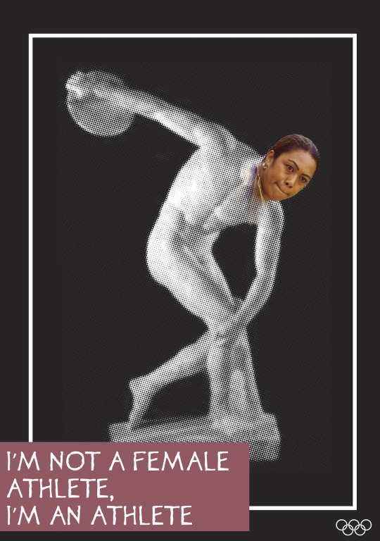
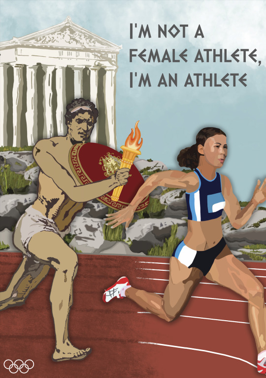
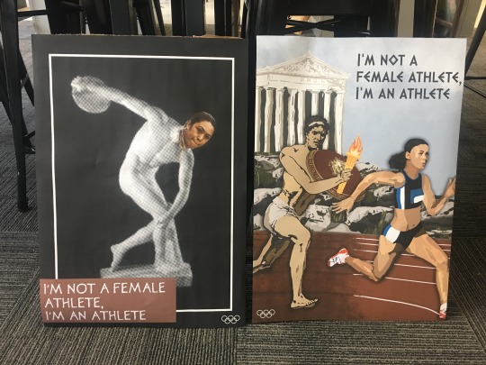
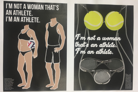
My overall concept for my posters is Inequality in Sport for females in New Zealand. I wanted to look and compare females in the sport today with the ancient Olympians, particularly the way they are portrayed and their attire. To illustrate this, I have incorporated modern females paired with ancient Olympic objects to show different times in history. My goal in these posters was to incorporate the old and the new together to show the element of time. I did this in both posters, in poster one I used the popular marble statue in a discus throwing pose photograph that has been edited, paired with a photograph of Beatrice Faumuina, a famous New Zealand Discuss Thrower. I have chosen to try and blend the head into the body to show that females are exactly the same as males, there is no need for them to be portrayed as a female athlete, they are just an athlete. With the text, I choose to ring in the aesthetic of the ancient font but modernised it pairing it with a block pink colour. In Poster Two, I have created a scene that merges ancient male to modern track running. I wanted each side of the print to have a different drawn style, the male is flatter and simpler illustrated where the woman is illustrated to a higher quality. In this poster I was trying to look at the attire that they wear, in the ancient time's men wearing nothing but a small covering and in today’s world its hasn’t been changed but women are now wearing very little when it comes to certain athletic event attire. Like Poster One I wanted to use an ancient style font to bring together the idea of past vs present. The first poster is a posturized photographic poster, whereas the second poster is a complete illustrated drawn poster.
0 notes

Text
Week 6.1: Monday 19th August
In today's class because of myself being very sick the whole weekend, I came to class in a state that was not helpful and was at this point very behind. In today's class, I talked to Matt about my current progression and we discussed future ideas going forward that would be quick, easy and effective as time was not my friend moving forward.
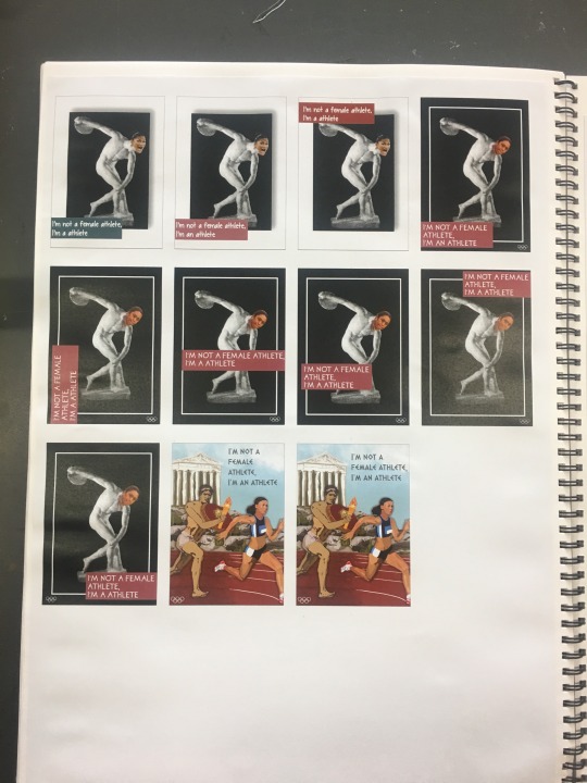
Lucky enough I got an extension which allowed some more time, below are the iterations of my final two posters. Originally I had used Valerie Adams head in my first poster but after looking into Valerie Adams I realised she doesn't do discus just shot put so that would be incorrect for me to use her. I looked up famous woman New Zealand discuss players and came across Beatrice Faumuina who has one medal involving discus.
0 notes
Text
Week 5 Overview
From the feedback that I got from Jacquie, I created this mood board of inspiration for my posters relating to ancient Olympians and female vs men attire. I ended up getting very sick with a virus so this weekend was not very productive in getting work done, unfortunately, this was all I could get done, not very good coming into the last week of uni and hand in week.

0 notes
Text
Week 5.2: Thursday 15th August
Iteration & preproduction
After last lessons interim presentation feedback I printed out another sheet for sketches and started doing some more designs just to get what I had floating in my head onto paper. It was said in my feedback session that the line of the female body was working well so I wanted to look more into lines and different lines on courts.
I created a mood board of sorts looking into sports posters and advertisements just to get some more inspiration visually on what I can achieve.
After last lessons interim presentation feedback I printed out another sheet for sketches and started doing some more designs just to get what i had floating in my head onto paper. It was said in my feedback session that the line of the female body was working so I wanted to look more into lines and courts and trying to merge the two together.
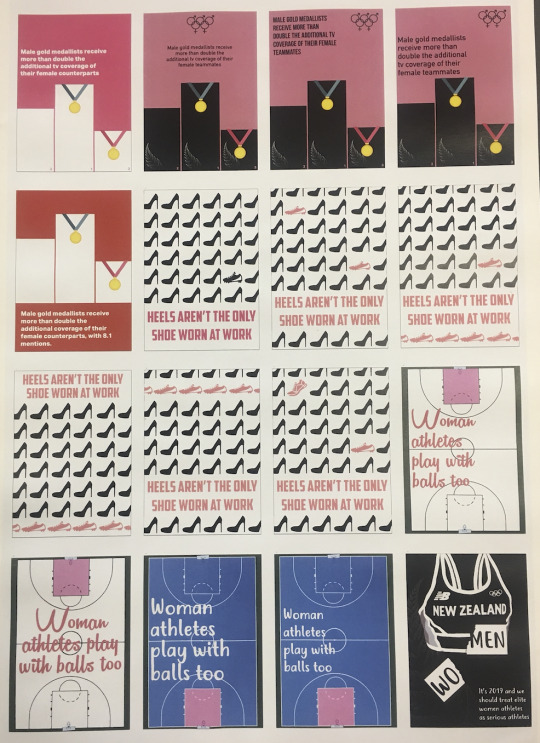
Below are some new concept designs that I created with the intention to try and add more colour to my posters and also trying to incorporate the female figure into sport-related items.
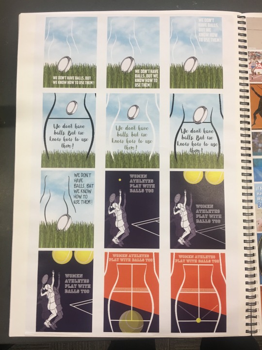
I showed these concepts in class today to specifically Jacquie. The feedback that I got from her was that these designs and what I'm trying to portray with my ideas are a bit different and it isn't 100% working. The quote “Women athletes play with balls too” has a different meaning and the way that the quote is used isn't really bringing across female inequality in sport in the way I had hoped. We looked back at the two designs that I handed in for the interim presentation and it was said that the poster with the tennis balls and rackets are currently looking like the reproductive system which is not what I want and kind of sexualising them a bit. The second poster, the one with the man and the women is good because in this poster I was looking into how females are represented in sports specifically in the way that they dress. An example that I said was that females, especially in beach volleyball that the men and in t-shirt and shorts and women are pretty much in a bikini and looking at them in that way. Because i said that it was then suggested that i look into the ancient times and the way that the men were portrayed back then as they did the athletics naked or pretty much naked.
0 notes
Text
Wk 5.1: Interim Presentation 2
Above are the two posters that I handed in for the interim presentation. Overall I think that they are good designs, however, there is alot more improvement that needs to be done until they are good enough for final printing. The feedback that I got for these two posters down below.
Poster One
There is no need for the male figure
Male sportswear - bikini cut out of the sportswear
Rugby Posts - female figure - belly button is a rugby ball
Mouthguard
Visual Metaphor
Change the slogan ... (I'm not a female athlete, I'm an athlete)
Play around and look into the advertisement style posters.
Fix the body copy text to chunky
With the body copy text add a rule/ body area
Add call to action
Poster Two
The sideways text doesn't work - less body text
pixelated figure
not cursive
racket behind ball
make her body a court?
play around with tennis net - underwear - caught
pink tennis ball
sports bra straps instead of tennis rackets
call to action ??
From the feedback that I have got given and also seen around in my peers work there is still a long way of iterating, developing and refining to go. So I think from here it's needed for new concept sketches and to develop from the idea of the figure as it seemed to work.
0 notes
Text
Week 4.2: Thursday 8th August
I was absent in today's class, but I got told by my friends what to do and what i should be working on. It was obviously just refining my posters and exploring them in A1 and A2 sizing and getting used to portraying them that size.
Design refinement and development consider the following:
What does each element within your composition bring?
What does it represent? > literal, symbolic, metaphoric.
What does the combination of elements say?
How does the arrangement of the elements affect meaning?
What tone / atmosphere is emerging? Is this appropriate for your message?
Look at the Fundamental Design Principles > which are you using? How can they be used more effectively?
What hierarchies are you ultilising? > dark/light, bold/sketchy, detailed/simple. large/small, foreground/background. Contrast provides interest.
Are you using negative space? Contrasting busy/quiet. Use the cropping Ls to find strong/interesting compositions within a busy cluttered wider composition. De-clutter, edit.
Above are questions and considerations that I got from stream that I think would be very good to look at and take into consideration when designing.
Before next class... the interim presentation need to have two posters printed to A2 sizings. Below is the contact sheet of all the designs that I created two of them being the designs I show at the interim presentation.

0 notes
Text
Week 4.1: Monday 5th August
Aim > concept > strategy
In today’s lecture, we looked at the different ways that you can show the same idea using different mediums, imagery and visual designs.
aim noun;
a purpose or intention; a desired outcome.
something intended or desired to be attained by one’s efforts; purpose.
verb;
have the intention of achieving.
to direct efforts, as toward an object
concept noun
an abstract idea; a general notion:
a plan or intention; a conception.
an idea or invention to help sell or publicise a commodity.
strategy
noun
skilful use of a stratagem a
plan, method, or series of manoeuvres or stratagems for obtaining a specific goal or result.
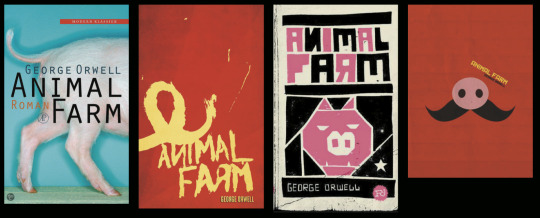
In the lecture, the example that was shown to us was Animal Farm a visual mood board was shown to us (seen below) and it was really interesting to see all the different ways that people represent this book and movie and how there interpretations are shown visually.
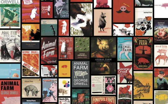
Within the lecture, I really liked this group of four that was shown because it was interesting to see that just buy cropping and using one feature (the snout and the tail) that just from those two things you are still able to tell its about a pig. I also like that compositionally they are really simplistic and have a good valance between positive and negative space making it feel balanced and thought about.
Back in class, it was individual time, developing and refining time, meaning that we could get one on one feedback with the teachers and spend the lesson working on our posters. I spent the lesson printing out another thumbnail concept sketch sheet first, which helped get any new ideas down from mind to paper. I also spent the lesson researching a bit more about how women are represented in the sports and also the Olympics.

0 notes
Text
Week 3.2: Interim presentation
In today’s class, we had to have four concepts design ready and printed for an interim presentation, meaning that there was no lecture in the pit today.
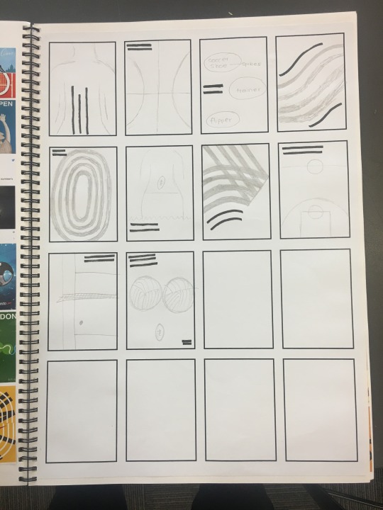
Below are the concepts that I created in terms of iterations, When iterating I was trying to change things around with fonts, layouts, colours to try and see what worked the best and what visually was the nicest
Below are the four concepts that I created and showed for interim presentation. When going around looking at the posters, classmates would tick the design that they like the best or that they thought were the strongest. The 2nd and 4th concept (the two on the right) both had alot of ticks next to it. I liked that people ticked it, as it was interesting and thankfully I have to agree with the strongest two.

Feedback about the posters was very helpful and I pretty much agreed with all the feedback. It was stated that the 2nd design is visually very interesting and a good concept, it is just a bit flat and could do with some dimension and depth and also that there needs to be an aspect of New Zealand within it. It was said that they liked the two different shoes in the design. The 4th poster was another strong one, out of the four of them, very clear that it is about new Zealand, really clear that it is about a runner without the need for an actual figure or woman characteristics the sports bra is enough. feedback about this design though was that there is no need for the fern in the background, maybe put it on the bra instead and remove the NB. Also, there is a need for the phrase to be replaced as it isn't as strong as the image. I would say that the weakest poster is the graph style one, I do like the design it is just a bit basic and be more interesting. the third poster however I think has potential, it was said in our feedback group that the phrase is good but just needs to work better with the image as it feels very plopped on and could be rearranged to look and work better.
0 notes
Text
Week 3.1: Monday 29 July
The lecture in the pit today was about Word + image and the relationship between the two of them and how they work together on a page or a poster.
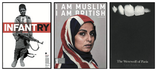
Words are powerful vessels that contain meaning. In visual communication design, words can be used to emphasise, change, contrast, contradict, and/or question the meaning of the messages conveyed through images. I found this lecture because it was kind of a guessing game but what do you see, to just say the first thing that you see and what that can mean and represent. Because sometimes what you see and the meaning are right and sometimes it isn’ t but that is what is intriguing.
I chose these three images because visually they are all impactful through different forms of mediums, framing and also overall composition Visually and layout-wise I really like the first image.. the infantry soldier boy. I really like the use of the black and white image and the bold use of red, which I am thinking is to represent blood just because he is holding a gun and the intention obviously is to shoot people. I also like admire the way that the artist has sectioned the words so it makes to words but one more impactful than the other.
In today's class, we had to have all four of the daily exercise posters that we have created in the past for lessons but with no type. The intention was to see what it looks like without the text and to see what the message is without the type and what new information arises because of that. It is also personally interesting to see what it looks like without the text and my own interpretation and whether it stills show what I want it to.
Myself, Caitlin and Claire, decided after looking at the four posters without the type that we would do a group brainstorm on each other's ideas. We would each get five minutes each and that would rotate between the three of us until we have exhausted all ideas. Below is the brainstorm that we can up with as a group. I found this brainstorm to be extremely helpful because sometimes when you try and overthink or constantly thinking or looking at an idea you can’t produce good ones, so a clear fresh mindset is always helpful. there were alot of ideas in this brainstorm that I had never thought of and it made me inspired to move forward in creating some designs.

After class from the brainstorming session that we had, I created and printed out a thumbnail sheet, and started to jot down alot of ideas that I had and that came to mind during the brainstorming session and after. The black lines within the concept are where the phrases would go, just need to find them throughout my articles that I have accumulated throughout the current week and a half. These thumbnail sketches will be handy for inspiration as we have to have four designs done by Thursday.

0 notes
Text
Week 2.2: Thursday 25 July
Citizen designer
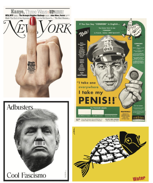
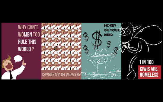
In today's lecture, we looked at examples of advertising and posters that are created as a voice for change. This lecture was very interesting as I like to see examples of works that have been created with a clear intention, meaning and voice that they want to share. It's also very interesting as to how they portray visually these aspects without offending or making a mockery of these events and not making it overdramatized, brutal or sugar-coating it because that would be very insensitive. Below are four of the many images that we got shown, but these four I really like mainly because of the composition, the layout and the effect that it had when I understood it or we discussed it in the lecture, mainly the two photographic one.
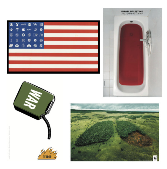
After the lecture in the pit, we went up to the classroom and got into groups of 4 and discussed the set of photos that we were given. Out of all the four pictures we had alot to say about the top two ones, not as much for the two bottoms. My favourite was definitely the first one, I think that it is visually really interesting and alot more information comes to light about it when you look into the poster more deeply. A few things that we said about each poster was (more in my workbook)
Poster 1:
ring finger,
parody of seeing the classic middle finger, even though it isn’t.
fuck you to the government,
She’s an independent woman who can speak for herself
Only ring fingernail painted, no others
Red is a very aggressive, bold colour
Poster 2:
Punny, but also political because of the number on his hat
Play on the wartime posters… we want you poster
Bit aversive
A parody
Poster 3:
Sort of unclear but also understanding what it is about as it is Donald trump
Seem to be comparing him to Hitler with the barcode moustache
Poster 4:
Representing the drought, comparing the drawn style and the photographic used’
Juxtaposition - The pairing of two or more elements to create a contrasting or new message
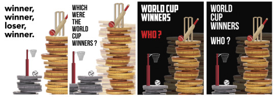
Below is the daily challenge exercise. For this exercise we could do anything we wanted, there were not really any guidelines. During that lesson, I came across on the New Zealand Herald and article on the Silver Ferns winning the world cup. It was saying that even though they had won the world cup that was being held in Liverpool they go no extra money for winning, but not before the Black Caps had come in second in the World Cup and they got 3 million dollars in prize money that they split between the team.. Crazy. This interested me alot and that is the inspiration into these posters and also the article that decided and solidified my topic being inequality in Sport Moving Forward. For the daily exercise, I submitted Poster 3.
0 notes
Text
Week 1 Overview
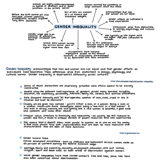
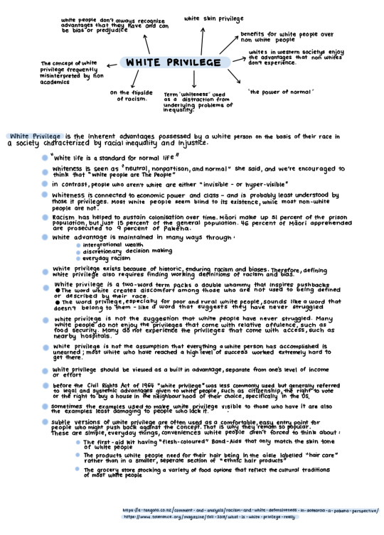
From Thursdays class, I looked I researched into some more topics of Inequality, at this point, end of week one, I still don't really have any idea of the path that I am going to go down but the research into the different categories is helping with the decision. Out of all of the topics, I am currently interested in Gender Equality and White Privilege.
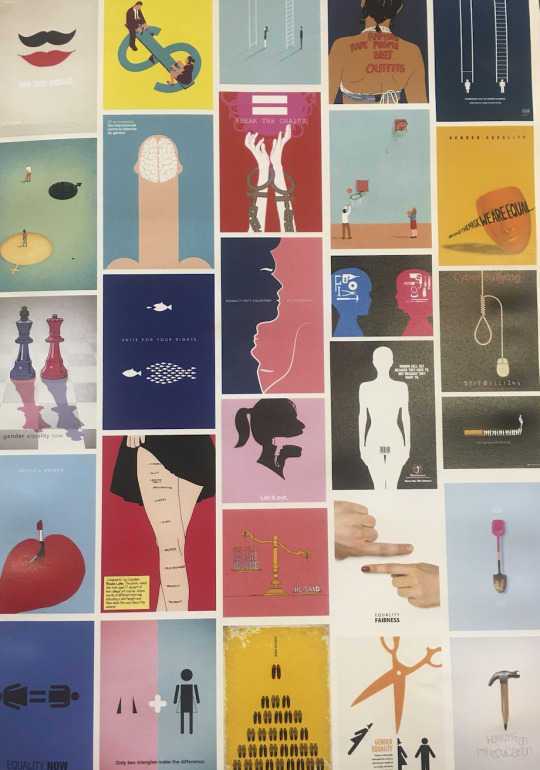
I have also begun collecting posters and visual precedents that interest me and that I feel inspired by, I have created a Pinterest board but I have also printed out pages of inspiration in my workbook so that it is easy to flip and look at during classes.
I have also collected two artist models at this time when I was looking for artist models I wanted to find artists that had a range of ideas so that I could see what their overall style was and how they show that through key FADP’s.
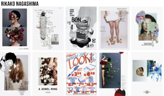
Below is artist Rikako Nagashima. For this assignment, we have to create one concept that is shown two different ways in two posters, so when looking for artists that were in my mind. to try and find two different poster mediums. I chose Rikako Nagashima because I really like her variety on the way that she uses her photographs, and also the way that she overlays the photographs and adds more visual elements to it. The layout was also something that I wanted to look at, in terms of image and text relation.
The second artist that I looked at was Shigeo Fukuda. I wanted to get one photographic poster inspiration and one illustration and I have succeeded. I Shigeo Fukuda because I always like the simplisticness that these posters can produce but there still being alot of meaning, visual interest and impact. All these posters are simple and only have one or two colours that have been paired with black and white.

0 notes
Text
Week 1.2: Thursday 18 July
For homework, we had to select three works and repeat the process of analysing the Ihi and Wehi in these images. I choose these three images because when I was searching looking for poster design these three caught my eye because they were all very impactful with clear representation on their issues. They are all different in design, photograph, flat illustration and silhouette and to me, they are all as impactful as each other but visually convey very differently.

At the beginning of today's class, we had a lecture on Visual Rhetoric or Rhetoric. This lecture told us about pictorial or graphic strategies used to persuade in pursuit of a desired outcome and persuasion. I enjoyed seeing all the different styles of posters for inspiration and different visual precedents Visually I quite like the homage, subversion and dynamism posters due to them having bold contrasts either between colours or photographic and drawing designs. They are all visually interesting and have interesting composition and placement of text.
As a class, we began brainstorming about inequality in New Zealand, I found this very helpful as I wasn't very aware of all the different types of inequality in New Zealand and it was insightful.
In groups, we got given a couple of topics and expanded on it in more depth we got Gender, Groups/ Individual and Environmental, We expanded quite well on gender and environmental and we all contributed nicely within the group on these three topics. But the topic that I found personally the hardest to contribute to was the groups and individuals one, as I couldn't quite grasp the concept of it or what this particular group was talking about. Below are some photos of other group brainstorms that I photographed to help with the development of my research.


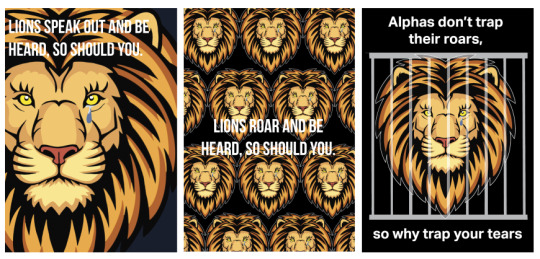
After the lecture, we went back to class and did an exercise that would generate alot of ideas quickly. We got three words and for each word, we had to generate 9 quick concepts relating to the word that round. My words were Raw, Glasses and Lion. Out of all the three words that I got given I found glasses and lion the two easiest with raw being the word out of all three that I found very hard to create 9 concepts, so it was needed to be finished for homework cause I had only got a couple of concepts done in the 10 minute time frame. From this task, I would really like to improve on the speed on which I get my ideas from mind to paper as that is an issue of mine, as I am such a perfectionist I need to let loose a bit more.
From this word list, we then created designs for the daily poster challenge to be submitted. Below are some of the concepts that I came up with. The third poster is the poster I submitted for the daily challenge.
0 notes
Text
Week 1.1: Monday 15 July
Introduction: Ihi Wehi & the project brief
Beginning of the new semester we had a lecture in the Pit. This lecture was an introduction to our new brief Ihi Wehi. In the lecture, we learnt about the difference between Ihi and Wehi which will be very vital for the progression of our designs so that it has the impact that is needed.
In class, got into groups of four and completed exercise 1: Ihi Wehi in the environment. As a group, we got given Set B photos and had to answer the questions. We got given five photos that we had to answer the questions. When doing this exercise in class and then when finishing for homework it took me a while to make sure that I was talking about Ihi and Wehi. Also trying to think beyond and a bit more in-depth about the images being shown is something that I would like to work on.
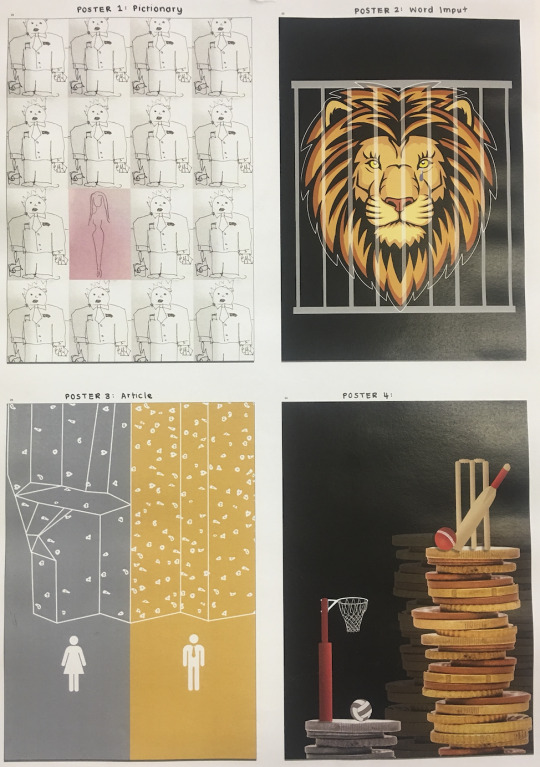
Another exercise that we did in class was Pictionary, we got into pairs on our table of about 10-12. This task was very enjoyable as it was a type of quick-fire challenge but also a bit challenging and definitely made you think. I was trying to think of the simplest way that I could portray the word without giving it away because we weren't allowed to use symbols or numbers. This was something that I kind of struggled. I would take to much time on specific elements which in the end by looking at the other pairs drawings were not even necessary. Also trying to guess what Claire, my partner was drawing was also a bit tricky, due to at times you would need to think a bit outside the box and not think so literal was challenging.
Below are some of the many different drawings that came with the Pictionary exercise associated with different words. I picked these photos because I thought they could represent alot of different inequality issues for the daily poster exercise task.
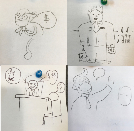

For our daily poster task, we had to create a poster that incorporated the sketches in their raw state and put them into a poster promoting an inequality issue. Below are a few of the designs that I created in regards to inequality.

1 note
·
View note
Text
Week 2.1: Monday 22 July
How Posters Work
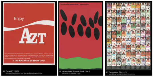
In today's class, we had a lecture about how posters work and all the different elements that you can do, techniques and also design principles that you can use to create visually interesting posters. Below are three posters within the lecture that I really like and found visually were most appealing. These three images come under different techniques the first being Double the Meaning, Second being Manipulate Scale and third being Make A System.
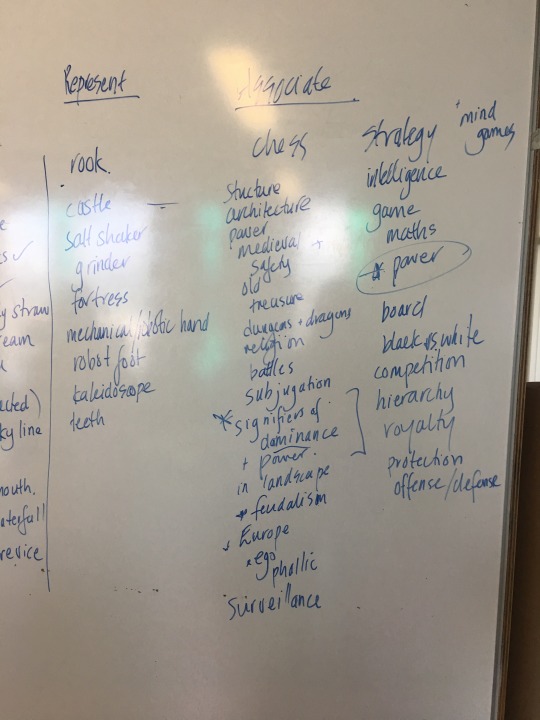
In todays class back from the pit we gathered around the wall and did exercise 1: Castle & Zig Zags. We looked at how different symbols, in this case, a castle and a zig-zag can mean so much individually but when they are paired together, the meanings change and there becomes so much more depth within the image. The teaching was to not look too closely at one thing and how there can be so much when you look beyond and to not think so literally.

Below are two photos that I took referencing the task above and the ways of thinking and the ideas that as a class we have.
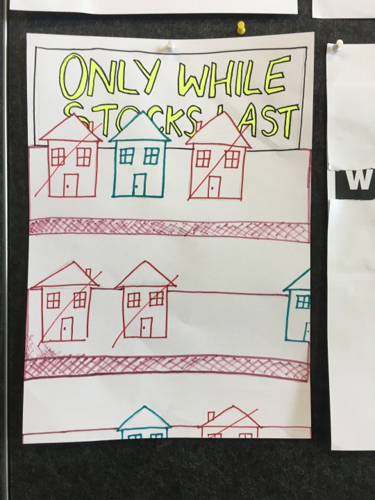
After this task, we got into pairs and created a poster from an article that we got given, it was about homelessness. This was a fun exercise as we were able to bounce ideas off each other and create a poster that I really liked and thought was quite clever. First we brainstormed all the good quotes and lines that we found in the reading, from there we did a couple of very quick sketches to show ideas.

Below is our final poster and also the posters that the rest of the class did all together on the wall.

Today’s daily exercise was to like the task we did in class, was to find an article, on a topic (preferably our chosen topic) and find a quote within the article to create a poster that references what your imagery is.
https://www.hays.net.nz/press-releases/HAYS_1831933 - This was my article
Below are some designs that I created relating to this article and the information I found in it.
0 notes