
centrepieceart-blog
David McDonnell
- Interactive Mutlimedia Design Student -
17 posts
Don't wanna be here? Send us removal request.
Last Seen Blogs

shaneegirlo
Untitled

efastforward
Fast Forward Magazine
shaneegirlo
Untitled
shaneegirlo
Untitled

diemdiem
Cúp pha lê giá rẻ hcm
Text
Art History
For this process of researching art as it evolved, influencing architecture and graphic design, I decided to analyse two artists of these decades to contrast their work and delve into their historical implications.
Clyfford Still
1930s – 1980s Abstract Expressionism
California, Virginia, New York
Historical Background
Clyfford Still is known for being a pioneer of the Abstract Expressionism art movement, developed after World War II by Still and his contemporaries, such as Jackson Pollock and Mark Rothko. Despite this legacy, Still never considered his work to be associated with this movement and was sensitive to his work and how others interpreted it. He believed that no other individual could fully understand his paintings expect himself, hence his reluctance to sell and display his work. For many artists it is about finding any exhibition space to display your work, however for Still it had to meet different requirements for himself to be satisfied. This included his work being displayed solely, with no other artists alongside his work. Although these facts may paint Still as a bitter man, it highlights his love for his art, as well as his perfectionist nature. This nature is difficult to detect within his work, due to the chaos conveyed upon the canvas. However, most of compositions were planned, each mark was added to contribute to the outcome, Still believed each brushstroke was very deliberate. "Each painting is an episode in a personal history, an entry in a journal," Still required his work to be displayed together and never separated as he felt that his atmosphere and feeling of his painting would not be successfully conveyed within each present form. Each painting does not contain its own narrative; each painting contributes to the concluded outcome. It is further apparent of this significance for Still based on his naming titles for his works which often featured characters and numbers to organize his works.
The time period of the Abstract Expressionism art movement was developed a few years after World War II, and thus was an extremely difficult time for some, due to struggles which occurred during the conflict. These events within our history directly inspired and influenced Abstract Expressionists including Still. Within this movement, painting often depicted struggles, life and death, within their visual context due to their significance during this time. In contrast to this, hope and positivity were also being adopted by some due to the end of something which was horrific, offering a new fresh start at life. Still was inspired by both spectrums, relating more to struggles due to the lasting effects of war. In 1948-C (1948) his work showcases a mature application of his ‘abstract expressionism’ style with contrasting colours of lights and darks within its composition. His light yellow subject and dark black subject represent life and death, present together instead of apart. "Life and death merging in fearful union." The painting also highlights a characteristic of Still’s later works during the later 40s, in regards to his choice of colour which dominates the majority of the canvas, in this case it is yellow, an extremely warm colour. This indicates that there are happier occurrences within the world despite the rough visual division of the canvas. Black only cracks through in small areas, to suggest a disruption in life, perhaps a death, or other negative outcome.
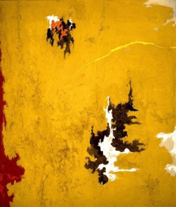
Clyfford Still - 1948-C (1948)
Influence/Inspiration
Although Still believed his style of work is original and his own, it is inevitable that different aspects of art history influenced and shaped his form of painting. Still was known for establishing the Abstract Expressionism movement, however he did not believe this to be true. His painting did follow an abstract expression style and thus are associated with this movement within art history, despite disregarding himself it is apparent for his work that Still was an essential part of movement in regards to conceptualising and contributing to the movement. His journey to developing and adopting his later expressive nature began with influence of other artistic movements including Cubism and Surrealism. In Untitled (1935), Still’s painting interprets the human head and hand in a linear fashion, almost extinct from its previous form. Untitled (Indian Houses at Nespelem), 1937 however, follows a more Regionalism style to his outcome for its glooming, rural scene. It interesting that Still is perhaps known famously for his abstract expressionist work, yet his exploration and works expand into other movements before this. This showcases his range as an artist as he did not limit himself to a particular style during his early, explorative stage, however slowly but surely he settled with the abstraction expressionist style. Still was also inspired by a range of artistic during his artistic journey, ranging from Pablo Picasso to William Blake. However, Paul Cézanne is an artist who has appeared to inspired him during his early work, and continued to later abstract expressive works. When contrasting Clyfford Still, Untitled 1935 and Paul Cézanne, The Boy with a Skull 1898, they appear to be visually different in terms of style. In that Still follows a surreal approach compared to Cézanne’s realistic outcome. However, when contrasting colours and compositions, the two begin to become noticeable similar. Their facing positions are alike, in addition to their use of warmer colours for the subject and foreground, and cooler within the background. It is clear that Cézanne has influenced Still in this piece.
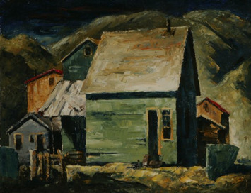
Clyfford Still - Untitled (Indian Houses at Nespelem) (1937)
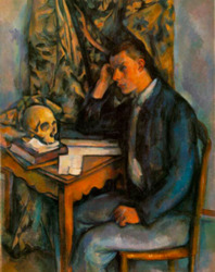
Paul Cézanne - The Boy with a Skull (1898)
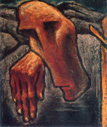
Clyfford Still - Untitled (1935)
Significant or Important Features
With Still and many other contributors of the Abstract Expressionism, they each share different attributes with each other despite being visually different. A common feature which is often expected within an Abstract Expressionism piece relates to movements. Although this is true for many of Still’s contemporaries, Still did not follow a process of physically reacting with his canvas, however his application of paint often suggested a sense of motion due to the thick range of marks found, as well as his compositions which often directed viewers’ eyes based on colour, contrast and areas of thicker or sparser paint. There is not a single focal point within most abstract expressive painting, and it is via an artistic technique that viewers’ eyes are directed.
The idea behind the abstraction expressionism art movement is to enable artists to produce abstract works with no limitations to how this is achieved. This meant that this movement removed rules often found within traditional art, and allowed any tool to be used as a ‘paintbrush’. Therefore, works are often understood by viewers based on the motion they captured as opposed to their actual subject matter. This is especially true with works by Pollock, however Still’s work could still be viewed and interpreted in relation to its sense of movement, due to his limited amount of inclusion of expressive and motion during production. It’s true that Still wanted his work to be experienced as opposed to being viewed, hence his need for works to be displayed together. As well as this, scale is another important feature of Abstract Expressionism which contributed to users experiencing work and not seeing it. If a work is larger, then viewers can be greater immerged into a painting, this is especially true for Still, whom required his series of painting to exhibited together leading to a large collection of larger works each sharing the same artist. This would obviously have a much larger impact on its audience oppose to a single painting.
Working Methodology/Process
Within the Abstract Expressionism movement each artist created their outcome via a different method to each other. Although they are each different visually, they often share different attributes in terms of their application of painting, as well as physical properties such as scale. Still was known for using a trowel or palette knife within his outcomes, using a thick application of paint, plastering large areas of paint on his canvas, in contrast to his lighter, sparser areas. Still also used more traditional tools such as brushes at times; however, they were not essential for the production of his painting. Unlike his contemporaries, Still was unique in that he prepared his own pigments to be used within his paintings. This idea further suggests how important Still’s work was to himself, as he applied himself to each aspect of the painting’s production. His technique for applying paint followed a jagged application, and often used uneven and imperfect ground to apply his paint to. This contributed to the outcomes overall texture, and the rough nature of his work. Once completing a work, Still would varnish his outcome to prevent it from becoming “too dry.’ I feel that his act was a way for Still to tell himself when his work was completed, to close off a project.
Personal Evaluation
I was personally interested with Still’s work based on his dynamic compositions which I found represented old, decayed, textured surfaces. I enjoy his use of bright colours in contrast with darker ones, as well as areas which are left unpainted showcasing the white of the page. However, after my research I found my interpretation and view of his work very different to both Still and other artists. Still did not like others interpreting his work, and this is a view I respect from the artist. I feel that Still was an artist who loved his craft too much, to the point of struggling to share a part of himself with others. This did slowly unravel as he aged, however a number of works have still and never will be seen by the public. This idea is sad, however it also keeps his legacy alive, as it ensures that his interpretations and views remain with him forever.
Juan Gris
1900s – 1920s Cubism
France
Historical Background
Gris was an early adopter of the cubist style, founded by Pablo Picasso and Georges Braque, however his contribution to this movement allowed him to develop his own visual identify within the style. The Cubism style relates to simplifying a composition into an appearance which captured their vision, known as the first movement of abstraction in modern art, and ultimately one of the most important movements of the 20th century. As an early form of abstract art, Cubism featured both abstract and semi-abstract pieces under its style, which was often deciphered depending on an artist’s chosen theme. In Still Life with Open Window, Rue Ravignan (1915), Gris gathered inspiration from a still life arrangement as the basis for his painting, which can be noticed within his outcome after inspection. The use of still life as a basis for Cubism during its initial stages was common amongst artists, as still life arrangements consisted of objects which are easily recognized once translated and simplified into the Cubist style. The overall appearance of Gris’ painting appears to have a design aspect, similar to that of a poster. The style is truly modern, and is often used in today’s society to inspire graphic designers for its simplistic approach, but dynamic appearance and message. Unlike other examples of Cubist art, Gris followed a level of precision when producing his work focusing on each formal element. In this piece alone it is apparent, based on his transitions of colour and complexity within his foreground compared to his cool, calm background. This complexity suggests the clutter present on the windowsill, as each colour symbolizes memories associated with each object. Perspective is an essential component of fine art pieces; however, cubism does not follow a single pane of perspective. Unlike traditional painting which is designed to a real life viewpoint, cubism promotes implementation of several perspectives within a single outcome. This enables a fuller sense of objects and forms within a scene to be established, showcasing the intricacy of our real life subjects which is often misrepresented in single perspective outcomes.
Influence/Inspiration
As well as contribution to cubism, Gris was also directly inspired by this movement, and thus influence by its founders, Pablo Picasso and Georges Braque. This is particular visually highlighted with Braque’s Pedestal Table, when compared with Gris’ Guitar and Flowers. Although they do not share similar colours, their overall compositions follow a similar layout. The two outcomes showcase a visual contrast between analytical and synthetic cubism, with Braque’s outcome following an analytical cubism style with a limited palette and monochromic outcome. Gris however, contains a range of colour suggesting a synthetic cubism painting. However, his influence and inspiration enabled him to apply himself to this movement, from which he shaped and evolved the style to further inspire other artists for year to come. In addition to this, Gris was also directly inspired by artists Jean Metzinger and Robert Delaunay. Metzinger was another Cubism artist whom produced a range of pieces which are considered distinct outcomes from the movement. His piece Le Goûter (Tea Time) (1911) is known as “The Mona Lisa of Cubism.” Gris produced an outcome entitled, Portrait of Picasso (1912), inspired by Metzinger’s outcome. Gris’ piece follows a higher level of abstraction as opposed to Metzinger, with distortion within the face of his figure. The colours used are light greys and blues, with a small amount of adoption of Metzinger’s warmers tones within his background. They both share the approach of limited colours, with Metzinger using warm colours compared to Gris’ cool colours. Lastly, Gris displays his Picasso subject in a large fashion within his canvas, suggesting his energy and confidence, compared to Metzinger whom displays their entire subject within their frame, displayed in a stiff aesthetic, relaxed and content. Despite their various differences, their opposites are directly inspired. Metzinger on the other hand, follows a much fluid and real style which is relaxed and distinctive. Delaunay inspired Gris based on his choice of colours used, opting for brighter colours and a similar to palette to complete his abstract style.
Georges Braque - Pedestal Table (1911)
Juan Gris - Guitar and Flowers (1912)
Jean Metzinger - Tea Time (1911)
Juan Gris - Portrait of Picasso (1912)
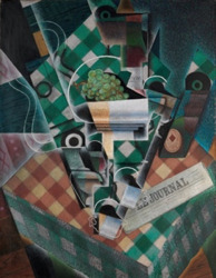
Juan Gris - Nature morte à la nappe à carreaux (Still Life with Checkered Tablecloth) (1915)
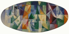
Robert Delaunay - Windows Open Simultaneously 1st Part, 3rd Motif (1912)
Significant or Important Features
Gris’ Flowers (1914) was one of his first synthetic cubism outcomes, incorporating newspaper and wallpaper within the final piece. However, each outcome highlights Gris’ transition from analytical to synthetic cubism, in terms of adoption of brighter, as well as a wider range of colours within his outcomes. His works follows a flat aesthetic, yet showcases further form from his imagery via shifting perspective and viewpoint of each object within his paintings. I found particular interest in Gris’ still life paintings which are often complex, and thus full of colour. The technique of Cubism allows dynamic colours and patterns to be applied to a single subject as present on Portrait of Picasso (1912) or a busy scene as showcased in each of his still life outcomes including Flowers (1914) and Still Life Before an Open Window (1915). Gris is believed to be one of the main contributors of the synthetic movement within Cubism, due to his use of colour and mixed media. Although he was not an original founder of Cubism, his dedication and contribution to the movement placed him as an iconic figure within our art history, as well as the title of ‘the third cubist.’
Working Methodology/Process
Gris worked within the analytical cubism style initially, before transiting to synthetic cubism, which consists of a wider range of colour and inclusion of other elements and collage within his works. Many of Gris’ works are directly inspired by still life and thus required his direct observation skills to interpret his vision into art. With Cubism however, this required Gris to communicate and deconstruct objects into simple geometric shapes in order to present them within their most essential form. When considered, this format of art is a lot more complex to compose compared to a traditional painting, as sections have to be divided and coloured appropriately to support the final outcome. The Cubism movement was open in regards to mixed media, and thus Gris used a range of media throughout his career, with oil being his main choice for painting outcomes.
Personal Evaluation
Gris did not live long for the impact he left on the art world, especially the Cubism movement. Without his contribution, many factors of cubism would have been left unexplored, including the expansion of the synthetic style. I researched a range of different individual artists related to the Cubism movement, including its main founders and adopters. However, I found Gris work most relatable. Initially, the Cubism style felt simplistic and lacking clarity when viewed, however, now I understand its beauty and message which it conveys. Gris’ Cubist work drew me to the movement due to his range of contrasting colours, often focusing on palettes from both sides of the spectrum. His work suggested a sense of luxury with his warm dominated paintings, and a relaxed aura with his colder ones. The precision which Gris expected within his work, truly shines through when viewed. Each line is solid and transitions are contrasting, resulting in an aesthetically pleasing outcome. Despite his short life of forty years, it undoubtable that Gris has had an impact on both Cubism as well as art history. In commemoration of his 125th birthday, Google produced a Google Doodle adopting a similar aesthetic to Gris’ work, highlighting his continued admiration from communities to this day.
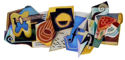
Google Doodle Commemorating Juan Gris' 125th Birthday (March 23, 2012)
0 notes
Photo
Design Essay - Massimo Vignelli
Annotated notes based on Vignelli’s interview with Big Think.
View the essay
youtube
0 notes
Text
Michael Bierut: Artist Profile
Michael Bierut
Contemporary
New York
Contemporary Background
Born in Ohio in the late 50s, graphic design wasn’t promoted to young adults as a potential career path. However, it was Bierut’s love of art and music, which directed his attention toward design present on vinyl records. This led to his interest in their production, ultimately resulting in his reading of the subject, as well as his decision to study and pursue this industry. After finishing college, Bierut moved to New York. This was one of the major decisions of his career, moving from a quiet, restricted area, into an area submerged within the art scene. This opportunity was to work for Vignelli Associates, which was founded and maintained by Massimo Vignelli and his wife. These individuals would soon become Bierut’s New York parents, due to their influence and guidance they supplied, in light of his new journey.
Inspiration/Influence
Having stated Massimo Vignelli’s maternal approach to Bierut, it is understandable why Bierut would find himself looking up to someone whom he respected, and appreciated for their kindness and consideration when transitioning into a new city, especially New York. However, much deeper than this, Bierut was captivated by Vignelli. Although this may have not been clear initially, Bierut has since reflected and discussed how simple concepts and wisdom has arrived to him years later as an adult, and fully developed designer. The redesign of New York’s subway system is one of Vignelli’s most recognized projects, due to its significance in modern culture. Despite his lack of interest in his younger years, Bierut has since recognized its true implication. As a well-travelled man, Vignelli has an understanding for other cultures, and could gather and implement ideas from overseas to his local projects. This was no different, considering both London’s Underground and France’s Metro visual appeal, to develop a design which shared similar weight. For many, their first thoughts of New York may refer to its subway, picturing visible signs; imagery Vignelli designed. This simple scenario clearly highlights Bierut’s point of how any design, regardless of scale, has the power of association. In Vignelli’s work this evokes feelings of New York, and its rush and life. Similarly, each logo represents a business, alongside personal associations from viewers. For example, Apple’s logo acts a simple visual representation of this brand, however for those with a bad experience with their products or services would also attach additional meaning. This same premise applies to all areas of design, varying from flags to crests.
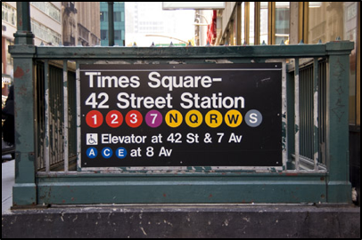
From idea, design to implementation, Vignelli’s design choices for New York’s subway relied on clarity, using Helvetica font for clearness, and basic geometric shapes for simplicity. The New York City Transit Authority (NYCTA) Graphics Standards Manual was home to Vignelli’s different design decisions, documenting standards established to ensure a clear transport system. This artefact of history was recently subject to a Kickstarter project to reproduce the manual to commercial success. This commission is an ideal example of problem solving within graphic design, as New York was faced with a colossal issue during and prior to the 1960s, as their transport system lacked consistency, and transparency. Vignelli’s solution was simple, direct and also provided the city with its own visual language.
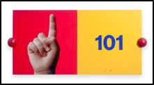
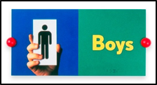
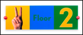
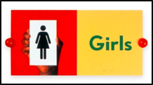
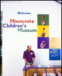
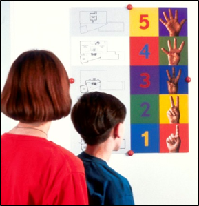
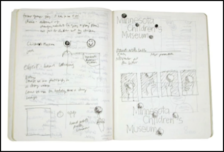
Bierut also considered Vignelli’s implementation of a visual language within many of his projects, adopting a similar approach when commissioned to redesign Minnesota Children’s Museum’s interior and branding. Beginning with a simple sketch and notes from one of his meetings, his initial vision is almost unaltered within his final outcome. This decision to implement hands as a primarily part of their visual language, enable this to be used in a number of clever ways throughout the buildings to represent different things. Physically, the hands could represent each of the five floors present within their building, as well as hold objects for representation, such as the imagery used for the bathroom facility signs. The overall aesthetic of this visual language does transition from Bierut’s norm of monochrome, however I believe this change occurred based on his client’s needs and target audience. As a museum for children, a colourful aesthetic is key.
Vignelli himself was a modernist, and thus opted for focusing on minimalism within his work, relying on geometric shapes to create all designs he created. Clarity was essential for his visual identity, and thus the decision for Vignelli to redesign New York’s subway system was ideal. Vignelli was fixated with the font of Helvetica, using it extensively throughout his career. This font has since become a staple of design, being used by most beginning and modern designers to this day, Bierut being one of them. Furthering his practice as a minimalist, Vignelli believed that only a few typefaces were appropriate for his general style, and for graphic design in general. He felt that in light of modern technology, many consider too many fonts when only a small selection will achieve what is required. Bierut is also selective with fonts he uses, often opting for Helvetica in many cases. However, he has also expressed others when necessary, such as Saks Fifth Avenue rebrand when he adapted their older variant of their logo with calligraphic qualities.
Significant or Important Features
Bierut’s style has varied and changed throughout his career, however he has remained consistent with regards to monochrome, adopting a black and white palette for many of his works. Unlike many art forms whereby an outcome is often determined by its creator, graphic design restricts meaning and messages to the client, allowing graphic designers to identify how to visually tell their story, or in some cases uncover the meaning. For many businesses, their visual identity and brand may be unknown or created with no internal meaning. Many aim for meaning due to added significance to something which is essential to their brand.

Bierut’s design for the Massachusetts Institute of Technology (MIT) Media Lab was one of the first projects of his work I was exposed to. I personally was captivated by his simple design, and adoption of a visual framework which extended throughout the buildings, enabling each sector to have their own creative identity. Furthermore, Bierut also stated how each sector had control on this appearance, and could work with himself to change their design to be better suited. As with many of his projects his early vision is truly reflected within his final result.
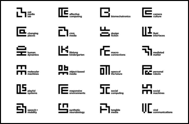
I’ve personally found that Bierut is invested with history, considering their client’s history as a company to consider past design and historical importance to their practice. This has occurred in two cases I studied, firstly with MIT in which he implemented a similar Bauhaus inspired visual language for MIT Media Lab, influenced by Muriel Cooper’s earlier logo for MIT press. Their intention was to create a unique and new logo to attach to their lab. However, Bierut also went an extra step, making individual sub logos for each sector within the lab using the same basic framework. This enabled each segment to be unique, yet unified by their matching aesthetic and adoption of their main logo’s 49x49 scale. Secondly, Saks Fifth Avenue, an American department store, had the problem of lack of recognition from their bag designs, being overshadowed by competitors. His solution resulted in looking at past logos and designs from the company, choosing a previously used calligraphy piece, re-mastering it and separating it into sections. From which, each section could be printed onto different bags creating a range of variation, as well as interest from their abstraction. Both of these cases are examples of implementing historical imagery, as well as considering variation. However, ultimately they solved the problems which they were commissioned to achieve.


Muriel Copper’s logo for the MIT Press, designed in 1962. The visual appearance is reminiscent of modern graphic design, showcasing an abstract ‘MITP’ to indicate the organisation it representation (bottom). In addition, its imagery is also evocative of books being taken off a shelf, as well as imagery which suggests a digital essence.

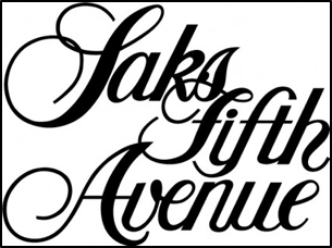
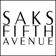
Inspired by their older logo variant, Bierut adopted and altered this imagery to introduce their new logo. Due to its complexity, when divided into section the logo provided a range of abstract patterns. This considers the idea of variations, and allowed Saks Fifth Avenue to have a visual language which was “consistently inconsistent.”
Working Methodology/Process
Unlike traditional fine art, graphic design is almost exclusively developed with a client in mind, meaning that consideration for their needs is superior. Unlike many graphic designers whom focus on leaving their mark and aesthetic to design work they pursue, Bierut identifies that he is commissioned to solve problems for his clients, and thus a solution which solves their problem is vital. He has stated that he doesn’t rate his creative integrity high, and requires client feedback and information in order to render ideas. For him, along with many other designers, ideas are easy, but execution and implementation is hard. When considering any projects, its overall aesthetic and premise can be dissolved into a single, simple idea. In an age of logo design, businesses expect complexity and variation for the prices they pay for design, however when considering recognized and established brands, their designs relates to simple geometry to create something familiar and instantly identifiable. This highlights successful companies such as Apple and Target. Although their imagery is simple, what it represents is much more. The client is a very important part of Bierut’s process, as they shape his final output. Before a meeting he has no ideas, it is not until he is told information that he begins to consider different possibilities. This is especially important in this industry, as many arrive to meetings with a bias to a particular design without fully listening and understanding their client and their needs. Graphic design is problem solving, designers are there to provide solutions to these problems. Therefore, it’s vital to remember what is important and who their target audience is. Another interesting factor about Bierut’s development process relates to his lack of ‘educating the client’ which is often considered necessary by many designers, in order to explain different choices made, and colours chosen. However, Bierut finds this to be condescending to his client, as they are often don’t require a lesson but a solution to their problem.
The actual implementation of ideas collected is achieved using Adobe’s creative suite, using his notes and small sketches within his sketchbook to determine his initial idea, adapting if necessary. This process is often less time than what is spent with his client, as context and weight to his imagery is superior than actual content. Without knowledge of what is required, it is impossible to create a solution.
Personal Evaluation
I’ve personally enjoyed studying Bierut, due to his extensive knowledge of graphic design and its history, enabling his many different talks to feature unique perspectives, filled with informative content. As a designer, his work is the precise definition of graphic design, due to his in-depth research and understanding of his client’s needs to solve their problems. His designs are often very simple, and are derived from a rudimentary idea. However, complexity is overrated, especially in graphic design as it shifts focus away from what is important; the brand. Simplicity sells, graphic design is an essential part of promotion and can determine the decision between a consumer buy a product or not. Overall I learnt about the development process of design, many consider simple shapes to be straightforward and easy, however this is intentional as well as symbolic in many cases.
0 notes
Photo
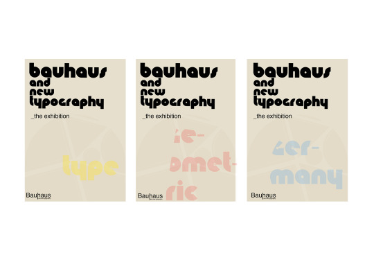
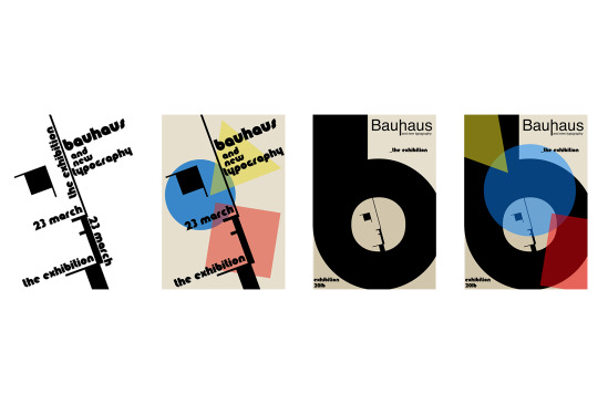
Concept Seven: Trio
Within graphic design I have always been fascinated with this idea of producing variants within a campaign; similar to a collect them all business model. In this example, the three posters are visually similar within one main difference; their keyword and colour used.
0 notes
Photo
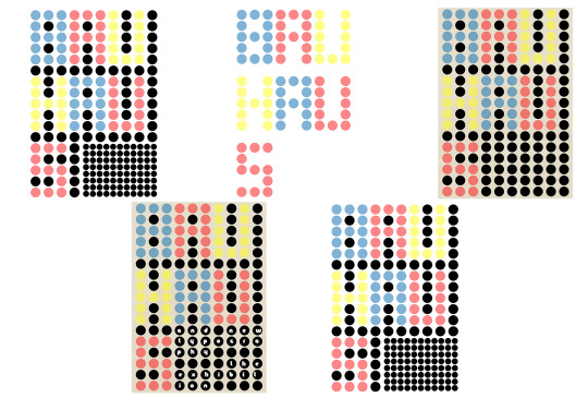
Concept Six: Dots
Inspired by prior use of the primary colours, I applied this to a circle based grid to spell our “Bauhaus” in a large, interesting manner, especially appealing from a distance. As a poster this aspect has both positive and negative outcomes, as it benefits viewers from a far, whilst lacking the same appeal to closer subjects.
0 notes
Photo
Concept Five: Linear
Suggested to explore the work of Josef Müller Brockmanm for layout reference, many of his compositions consist of strong lines layouts. In this case, I felt that this was distant from Bauhaus, however explored this prospect equally.
0 notes
Photo
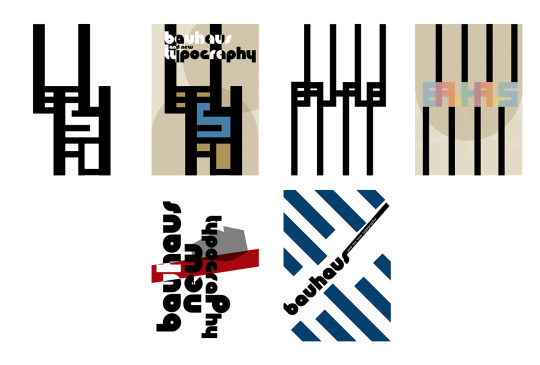
Concept Four: Generating Shapes
Another early idea I considered was a using typography to generate imagery. In this example a plane shape was achieved, to be incorporated in reference to taking a journey back to the Bauhaus Movement. The final, solidified designs relied on the architecture of the Bauhaus school, surrounded by type and provided prominence from the negative space from the form.
0 notes
Photo
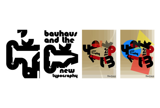
Concept Three: Large Focal Point
Not necessarily a factor of Bauhaus, by adding emphasis to either their logo or distinctive typeface, it adds a level of interest whilst also separating the composition into natural areas.
0 notes
Photo
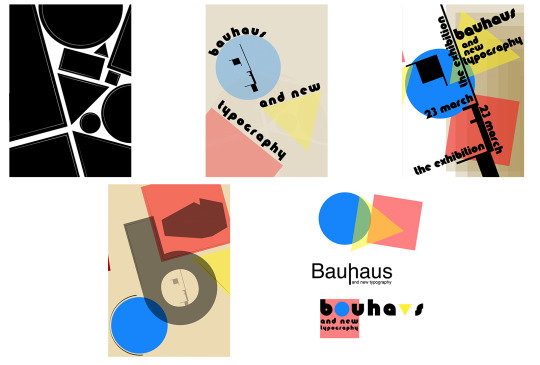
Concept Two: Shapes
After research and Meggs’ History of Graphic Design for reference, I acknowledge the importance of basic geometric shapes within compositions, in addition to bold use of negative space. The chosen colours of blue, yellow and red were also decided upon based on reference material, selected due to their prominence and purity as primary colours; avoiding complexity.
0 notes
Photo
Concept One: Initializing...
Starting with a fresh perspective and lack of Bauhaus knowledge, I considered a few simple ideas incorporating a Bauhaus style font (Knuckle Down).
Idea Development
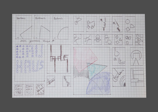
Pen to paper before hand to mouse. These ideas help speed up the digital process, whilst also enabling a free, unbiased exploration of ideas.
0 notes
Text
Bauhaus and the New Typography
A German design school from 1919 - 1933, The Bauhaus was an extremely influential contribute to contemporary design shaping architectural design, product design and graphic design for the twentieth century and beyond. The prospect of an exhibition celebrating Bauhaus and it’s lasting impact can be applied in a range of different ways. These different concepts each offer a different look, whilst maintaining a signature bauhaus orientated aesthetic; true to this era.
0 notes
Photo
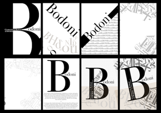
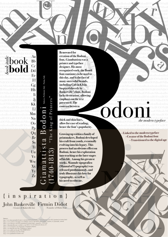
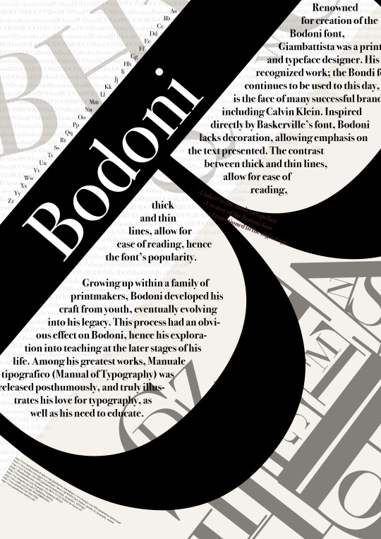
Initial Ideas for Bodoni Type Specimen Poster.
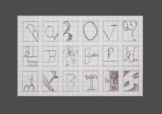
Beginning on paper I typically use the graph variety as it provides ease when drawing multiple boxes and for considering scale. These examples of known as thumbnails as allow an artist to compose their outcome within a small window. Visually, if it withstands in this smaller factor, it will also be successful in a larger scale. This process of developing ideas involved use of the internet to research examples of type specimen poster of both the Bodoni font and any other variety.
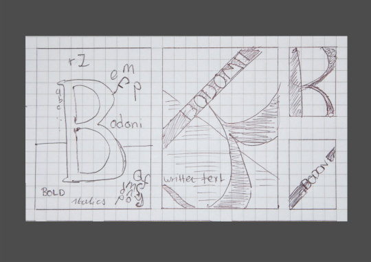
To finalise ideas, two bigger windows allowed the ideas to be scaled up and consider further details including positioning of text, foreground and background elements.
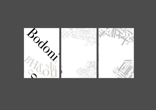
The transition from paper to the computer can either be a set process or can also adopt a sense of spontaneity. This was true for the composed backgrounds of Bodoni characters which was produced using the transform opinions and experimenting with what could be achieved.
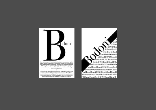
Although the internet can be very enlightening, it can also be blinding. In this case, I wanted a poster which reflected the font and the era of it’s use. Bodoni is a typeface of simpler times and basic, honest layouts.
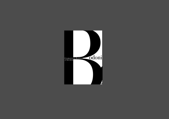
Despite this, when contrasts with modern design it can be difficult to achieve an era specific aesthetic with justice. Therefore, I considered modern design ideas and approaches adopted by many, including the use of scaled text to emphasis the curves and architecture of the character.
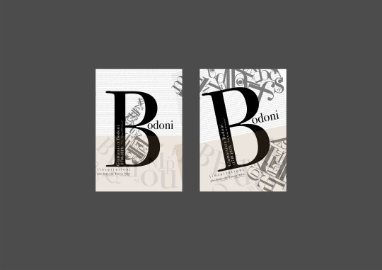
Ultimately, I resolved back to their traditional presentation, opting for a simple design which was simple, present and legible, similar to it’s use during it’s era.
0 notes
Quote
The man who asks a question is a fool for a minute, the man who does not ask is a fool for life.
Confucius
Group Work Project Design
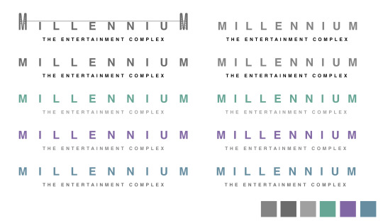
In preparation of our first client meeting, I produced a range of very simple and clean logos for Millennium, using colours associated with luxury.
The original idea was too simple, to produce something which related to Millennium, the imagery of the Peace Bridge was selected due to the location of L’Derry and also to link to their motto of joining people together, ahead of Derry previously damaging past.
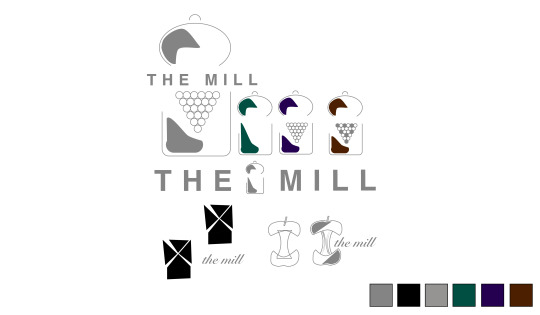
The Mill was our new restaurant to be placed within Millennium, and thus branding also had to be developed for this. We considered a windmill opinions and eating apple aesthetic, however this didn’t associate with our perception of high end dining. The imagery of a pepper mill was used instead, relating both to the name and also providing a unique brand.
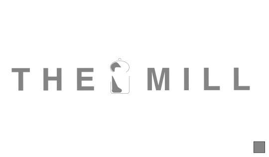
The final logo for The Mill
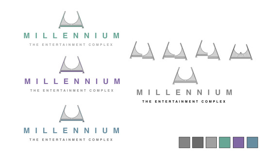
An early idea was to develop a visual language for Millennium using their Peace Bridge inspired logo as a basis. This used related icons which could be placed within the empty space present in the centre of the icon.
Final visual language concept
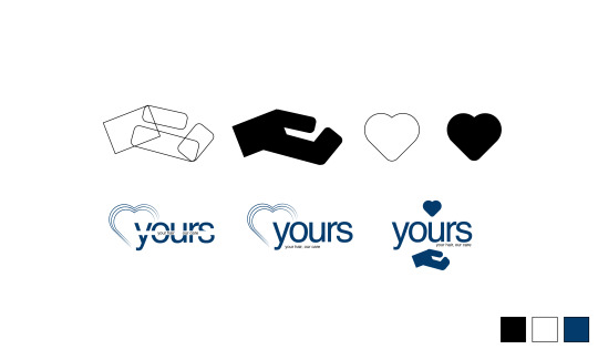
During the middle of the semester we were providing with a practice pitch to help prepare for our official Millennium presentation. The task was to create a new brand of shampoo which we opted for “yours” as it directly relates to the consumer. The initial design involved a hand and heart to symbolise care. The design selected uses the heart imagery presented to resemble strands of hair.

The final design for “Yours”
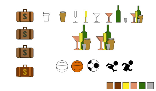
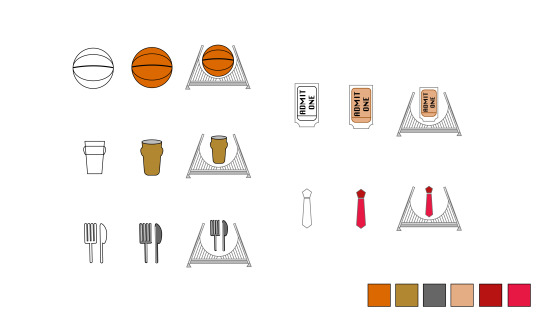
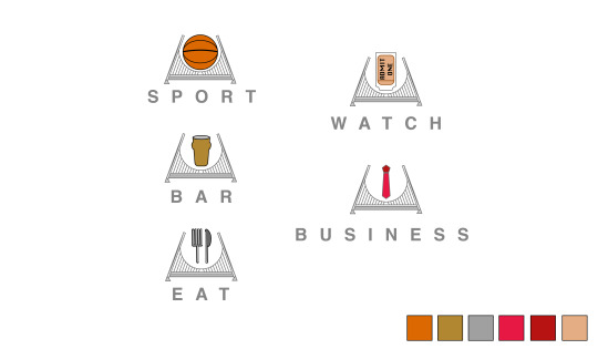
From our client meeting, our use of a beer glass and tie imagery to symbolise both bar and business respectively were poorly received, as they can be perceived as gender specific. Therefore, we combined multiple different drinking glasses and mediums into a composed image which relates to all genders. The tie was replaced with a briefcase as it visually better suited for business. Our sport icon was only a basketball, and thus wasn’t a true representation of what Millennium was offering. This was replaced with an active, running individual.
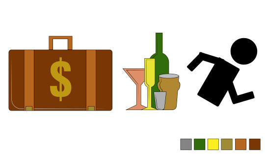
The changed icons for business, bar and sport
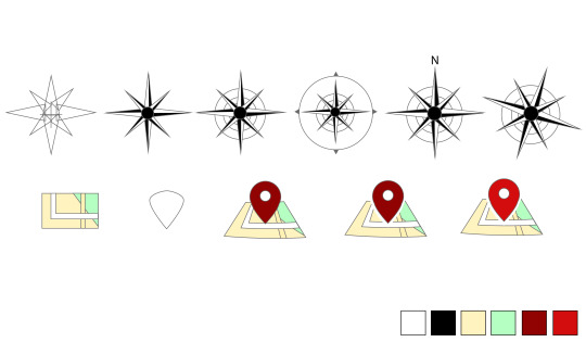
The location icon was something we considered initially as a compass, however this was confusing due to its reduced use for this purpose. As well as this, it did not fit within the final design due to it’s complexity. The replaced version is a very simple, flat pin placed on a map. The inclusion of a white border along the pin was a major improvement to the design which could of easily been left out.

The final location icon
0 notes
Text
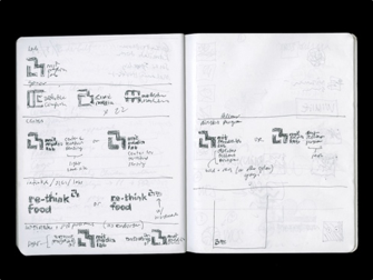
Michael Bierut: 5 Secrets from 86 Notebooks
vimeo
Listen first, then design
When designing, having an understanding of a client’s needs is an essential requirement to ensure that works are catered to their necessities, whilst also being an appropriate solution to their problem. Bierut’s approach to design is one I can relate to, as it ensures that the focus is kept, without redirection into different approaches which may meet the designer’s mind-set, but not their client. In addition to client meetings, Bierut has also been directly inspired by external research, such as the architecture of the Minnesota Children Museum’s new building, which incorporated square, ball shapes within their décor.
Don’t avoid the obvious
In many cases, clients are not trying to completely reinvent themselves from the ground up, as they may already have a foundation and following. Therefore, although the obvious solution may appear as a simplistic, easy option, it could be the sufficient and right one for the client. Although this may not appeal to every client, it is definitely a mind-set to adopt, as it enables designers to start from the most basic, obvious foundation and build upon that. Bierut’s analogy of Tibor’s rejection of his grand selection of predetermined ideas and solutions, coincides with the previous point, as Tibor was aware of a solution and it was up to Bierut to listen and execute this.
The problem contains the solution
When met with limitations, often enough we look other ways to overcome this. However, in Beirut’s example this became the foundation for the project. Although we may be tempted to approach in a traditional way, sometimes it is worth experimenting with the conditions set. In many cases, the conditions will have to be met, and it’s about implementation; insuring that these circumstances are met, without effecting the by-product.
Indulge your obsessions
Contradictive to the past few points, Bierut is stating that although client’s say ultimately is the final result, does not mean that designer cannot experiment and try out different ideas which they feel will contribute to their solution. It is often forgotten that clients hire designers to create their works, whilst also providing advice. As designers we have further knowledge and information of what does and does not work in the real world, and although some may use this to their advantage, many still find their ideas superior.
Love is the answer
Although not every project will be a dream, it’s important to remember why you choose this career path. This point can be split into two sections, regarding your love for your art, as well as love for the work you do. Even though only certain project will cause an attachment due to their message, practice or work, love your art can continue to fuel you through any project. Bierut also touched on finding others who love what they do; allowing a fluid connection between two passionate individuals to develop ideas which they are both enthusiastic about conceptualising. This doesn’t mean only working with those who share this excitement, but rather to excel when encountered with these client types.
0 notes