
Last Seen Blogs

desptxdude
Untitled

newtoes
𓆏

jumbledgoverno73-blog
Untitled

bancal-webzine-blog
Bancal
melymelalunita
˚₊‧⁺˖Mely˖⁺‧₊˚
Text
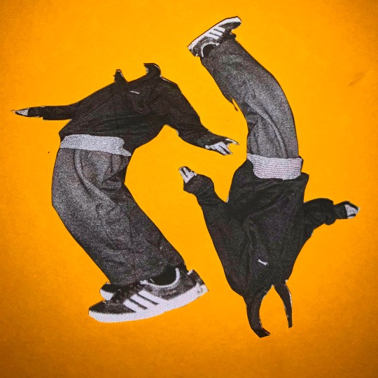

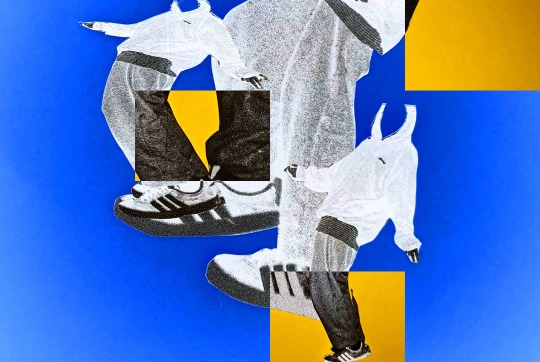
These were physical arrangements from cut out sections of the photos on coloured paper. I then used photoshop to alter colours and patterns. I’ve never really experimented with fashion aesthetics and trying to capture a specific era or style. This was fun to try out and I’d like to do more of these style.
0 notes
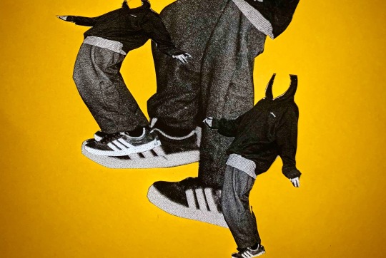
Text
I was looking on Pinterest and came across this old 90-earky2000s skate magazine and was inspired by the use of collage and style in the photography. I had the idea of taking a series of photos, with flash which I could cut up and mix and match in different ways.
0 notes
Photo
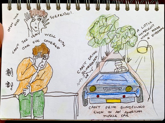
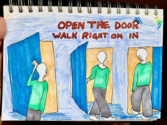
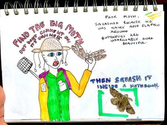
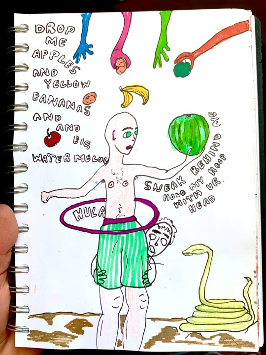
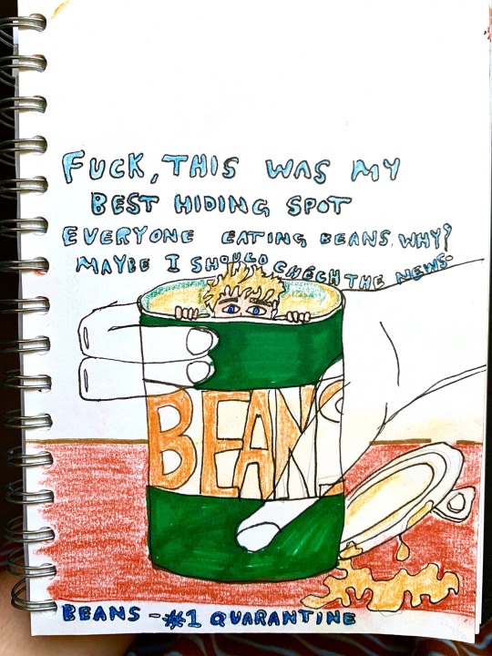
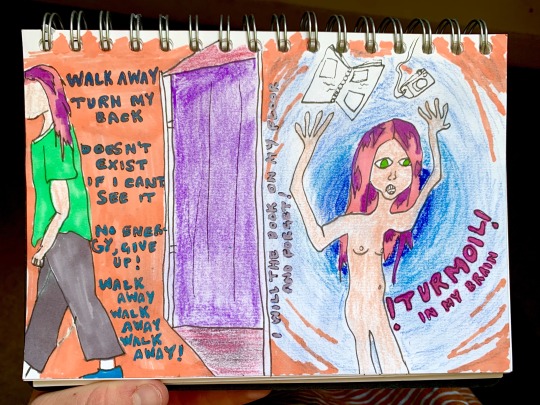
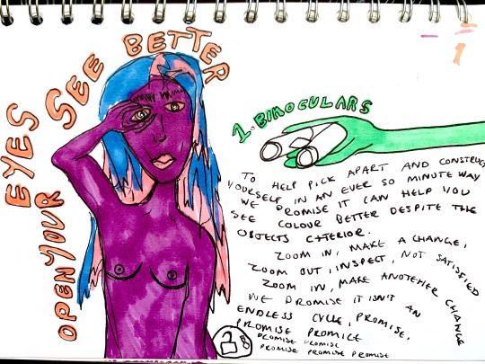
I have been really struggling still with finding photographic inspiration but I’ve been trying to draw more. I don’t know why I draw what I draw, and they are mostly all nonsense messages but I’m enjoying being free with colours and combining text and imagery. This is keeping me fairly productive creative at the moment. I am shooting a lot of 35mm film at home, documenting my time and work at home but who knows when I will be able to get that developed.
0 notes
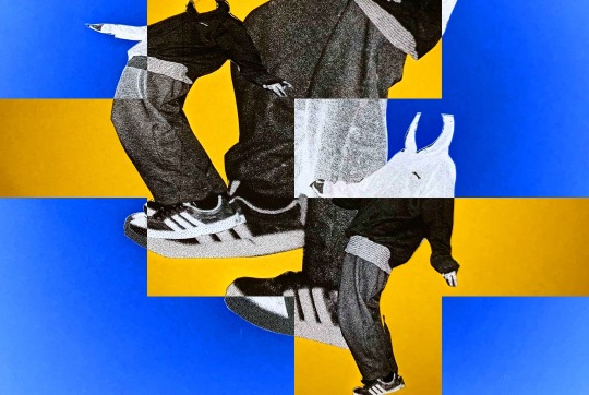
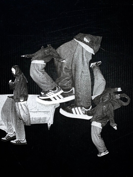
Text


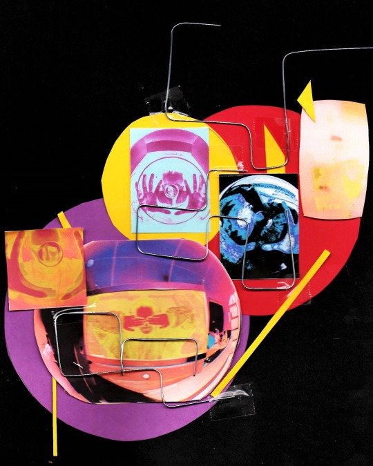
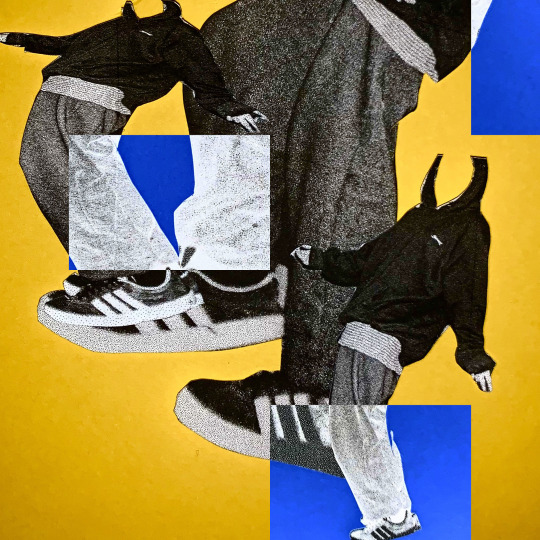
Experimenting with cutting out photographs and layering them physically then using the printer to manipulate the shapes and colours
0 notes
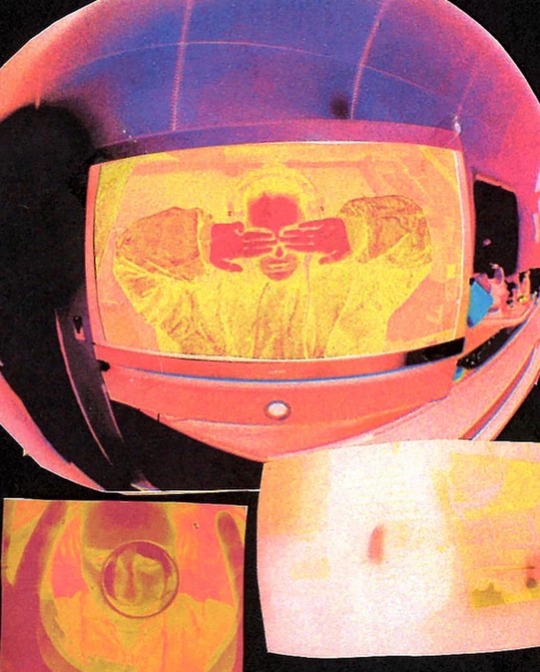
Photo
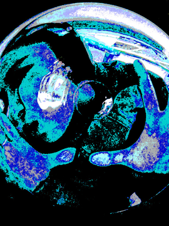
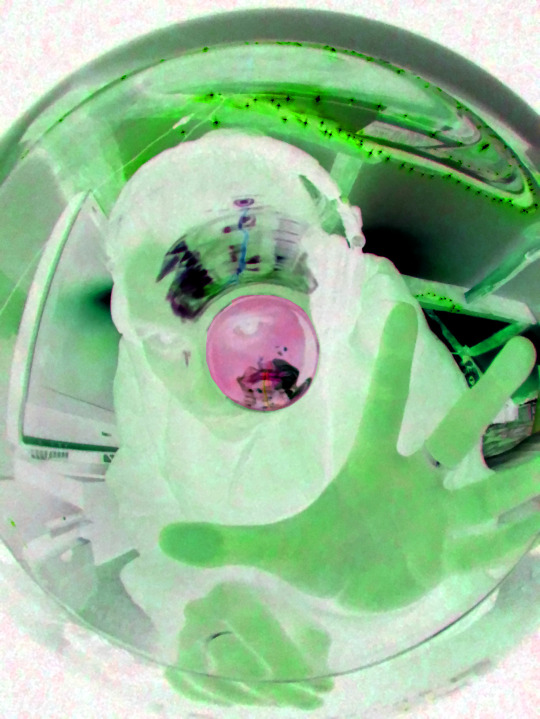
Using the fisheye lens again and experimenting with hue and saturation tools. I enjoyed playing around with these tools, however I don’t think that I could adapt this any further in terms of using the same techniques in photoshop.
0 notes
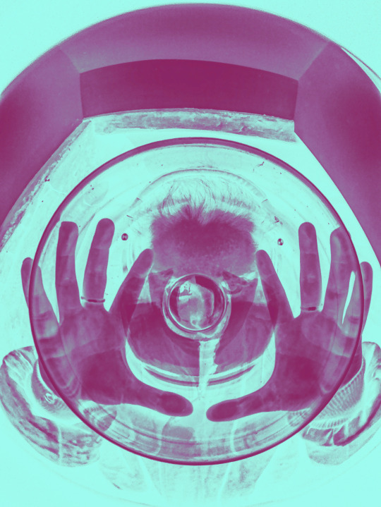
Photo

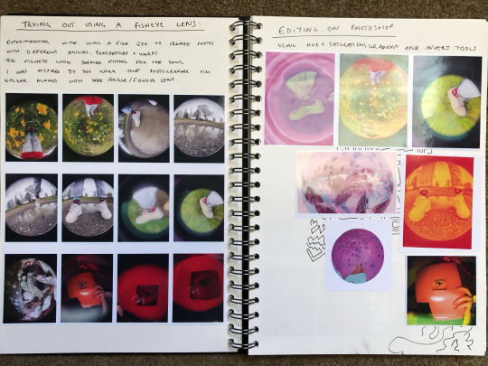

Photoshoot and a few edits, all taken on my iphone using a fisheye lens
0 notes
Text
week. 3
I struggled a lot this week and I haven’t done much work. I found my motivation to continue took a big fall this week and so instead of pushing myself to do work I have been trying to focus on myself and getting back on track. Saying that, I have done work, however I am in the process of putting it all in my sketchbook which I didn’t do at all. I know now that this doesn’t work for me, and if I continue with the weekly projects I will need to document in my sketchbook otherwise I feel a bit lost. Due to having to backtrack all of the work I produced I doubt there will be as much annotation and planning for this project, but I’m hoping to continue with this in whatever I do next. It’s been difficult, and I’m toying between starting my own project or continuing which I want to do but I feel like it’s a bit of a demanding idea considering my mindset right now. Anyway, thats what happened.
0 notes
Photo
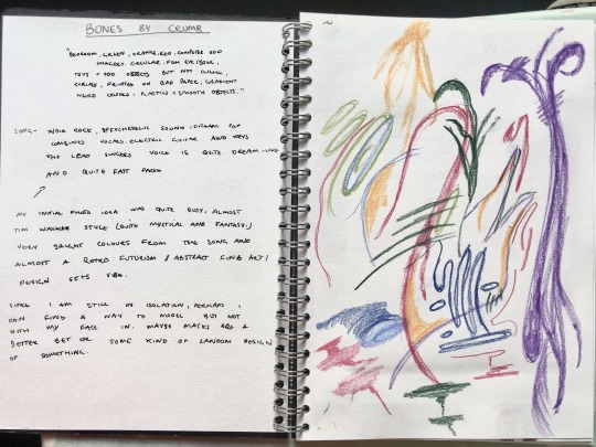
WEEKLY PROJECT 3 - SONG: BONES BY CRUMB
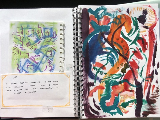
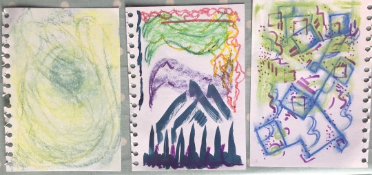
I started off with a few drawings, one in chalk pencil and one in paint. When we were still in college, I asked 3 people to draw this song for me, in the hope that i could develop my idea of it. The bottom photograph shows these drawings and how similar their colour palettes are. It’s interesting because none of them saw each other drawings before hand yet all of them used blue and green and 3 out of 4 (including mine) had green blue and purple. My initial notes show how I was intending to use blues, greens but also oranges and reds which are less apparent in the other drawings. The other drawings are from other students and even though I wont be using them directly, its interesting to see how other people react to the songs in terms of colour and shapes also.
0 notes
Text
REFLECTION/EVALUATION OF THIS WEEK
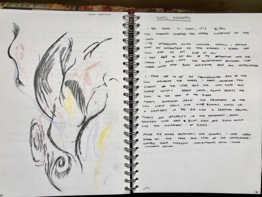
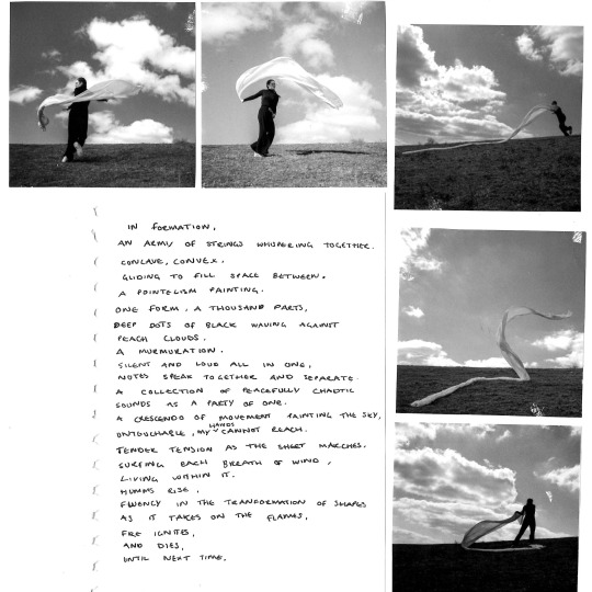
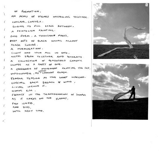
This weeks project, more so than the last one has a much clearer progression from the drawings to the photographs through the shapes and movements that are common in all stages of this project. I started with the drawings which started with the initial drawing (similar to the other project) but then I wanted to continue drawing and I ended up producing 3 drawings using different medium. I experimented with using charcoal which felt right for the song and also using a stencil cut technique to create cut out shapes of which I placed against black paper. The drawings really helped me understand how I could use the drawn form and shapes in my own photography and helped me link this song to the movement of a birds. I wanted to continue with the black and white theme in my work as I believe this is how the song feels to me and because of this, I began research on the photographer Irving Penn, who’s work combines both fashion and fine art photography through very simplistic but captivating black and white images.
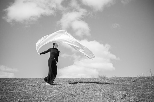
From my research on Irving Penn, I progressed to think about how I could use fabric to imitate the movement of a bird murmuration/recreate my drawings similar to how Irving uses fashion fabrics to elevate his images. I started by testing using material in the wind to see how I could create shapes in a very simple way. I found that this worked really well, however taking photograph of a sheet no a washing line perhaps was not as elegant or impactful as I’d hoped it would be. This did highlight the fact that fabric can be used and actually works really well in creating these shapes and especially white fabric, which, on an overcast day, not only stands out against the sky but can also create shadows in the photograph.
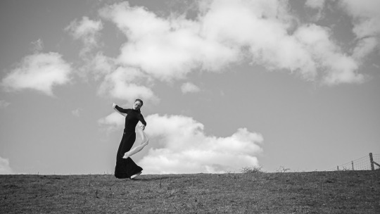
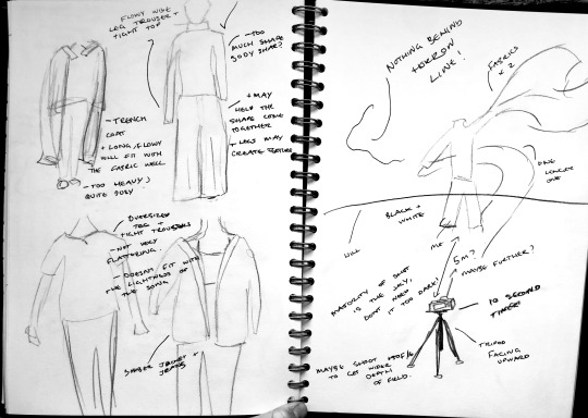
I began by planning the photoshoot, which involved planning the composition and poses I would be doing but also planning the outfit which seemed essential for this project. Doing this was quite fun, as I was able to properly think of how colours (tones) and fabrics could work together. I decided on wearing an all black outfit, combing both tight and loose clothing to create that contrast swell. The black ended up working really well against the white fabric, and in photoshop, I was able to bring the shadows down slightly which enabled the clothing to stand out as one piece almost like a silhouette. The photoshoot was very difficult, because like before, I had to use self timer and I was up on a hill meaning I was having to run between the two, however, I do think this worked really well. I was able to stick to the plan of not having anything behind the horizon line which allowed all of the shapes created to stand out like silhouettes. There is a certain elegance in the photographs that I wanted in my photographs but for some reason, didn’t think that I’d be able to capture (because I am the model, and not very elegant). But I think they turned out very well.
In development, I didn’t want to do too much to the photographs because I think on their own, they work really well. I played around with the photocopier and scanning my images in different ways. I discovered that the it looked good placing the fabric on top of the photographs as its created a texture that is not present in the photographs. I also included a piece of wiring that I did at the start of the project about the song which I think was a nice addition. I would definitely like to work with including text in my work in the future and also experimenting with using the photocopier in different ways.
Overall, I think this project was very successful, I allowed myself to be free and fluent in my work with I think definitely shows. I like working in black and white which I would like to experiment more with in the future. I also really enjoyed working with using the photocopier to create different effects and to layer photographs, this was a nice change from photoshop and I would definitely like to experiment with it again. Similar to the previous project, I do like how the progression from start to finish is easy to follow and I would like to continue setting out my projects using this format in the next project. Even though I didn’t think that much development was needed in this project, I would like to experiment with more development in future projects, perhaps working with weaving/stitching again or painting over photographs.
0 notes


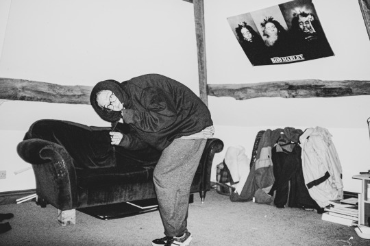
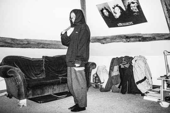
Photo

Because of the nature of the photographs, I don’t particularly want to manipulate them any further as I think the photographs on their own show what I was intending to show at the start of the project. I like how the writing goes alongside the photographs however I am aware that I am not a very good writer and that this is just a test that maybe I could work on in the future.
0 notes
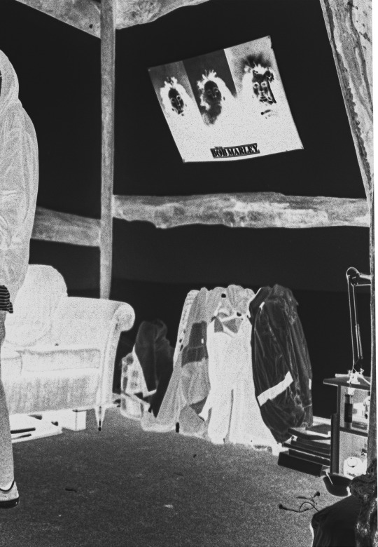
Photo
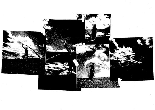

Experimenting with using the photocopier to scan images in different ways. Here I have used the white materials alongside the photograph to create added texture and I have also experimented with layering and arranging the photographs in different ways. The black and white one (which was a scanning fail) actually looks quite interesting and I like the ambiguousness of it. Next I might try putting photographs alongside a piece of writing I had done about the song.
0 notes
Text
PHOTOSHOOT REFLECTION AND PROGRESSION OF IDEAS
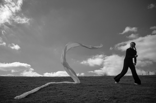
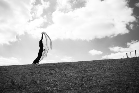
I think that the photoshoot was very successful in producing a series of photographs that somewhat resemble the shapes and movement I originally drew as observation sketches whilst listening to the song. I shot the photographs in black and white, which I think give a simplicity to the photographs and elevated the shapes. I also like working in black and white as it leave a lot more of an experimental side in terms of the tones and contrasts which I do think worked really well. I like the contrast between the person and the fabric and the colour contrast here as well. I think the movement of both me and the fabric works well together and adds the idea of the relationship between us and the space around us. Having nothing behind the horizon line in the majority of the photos means that the main focus is on the shapes and the movement in the photograph which I think elevates the photographs. I’m happy that I was able to stick with the plan in terms of composition and movement.
Although I do think think that the photoshoot was very successful, I did come across some problems such as having to navigate the self timer. It took a lot of effort to run back and forth between the camera and the hill and alongside this, having to manually focus the camera and be in a certain position to be in focus did prove to be quite difficult and I think I would have been much more experimental with the poses and I would have been able to include more of a fashion side to the photographs. I also think that if I had video’s myself and then take screenshots, I maybe could have got some more interesting shots.
Progressing on further, I think that the photographs on their own show the still very movement contrast I originally intended, however I would like to be experimental with combining photographs with written pieces of combining photographs together. I have done a few pieces of writing about my idea around the song, I could maybe find a way to include this into the piece. In addition to this, I could try and work with materials and try combing material with photograph to create a complete shape or feeling. I would like to try using the photocopier or scanner to create different shapes and maybe work with folding photographs or layering materials atop of photos. However, unlike the previous project, I think the photographs quite accurately portrayed my original idea, and therefor I think the experimental development side to this may not be needed as much as the previous one.
0 notes
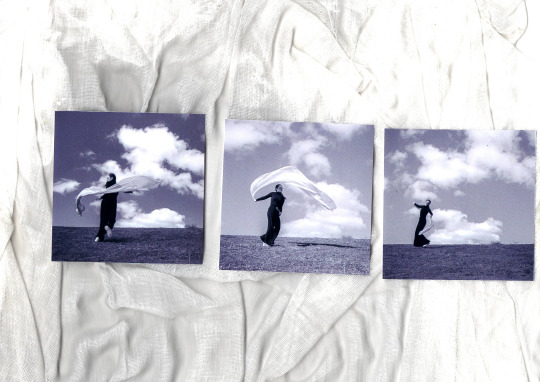
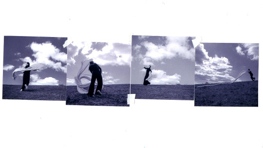
Photo


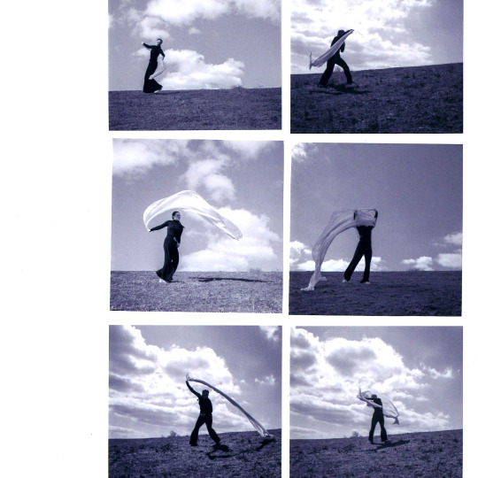
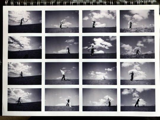
PHOTOSHOOT OUTCOMES (5 OF 38)
Here are 5 out of 38 successful photographs form the shoot. These haven’t been edited very much, all I have done is increase the contrast and the clarity of some of them. The photoshoot in general was very successful. I got many photographs which I feel confident about. I do think that I stuck to the plan very well in terms of the setting (no horizon line etc) however the poses in my plan sketches were not possible because I didn’t factor in the wind very well. The photoshoot took a lot of effort because I was having to run back and forth between the camera after each photograph due to having to use the self timer. I think I had a model this would have been much easier. The most successful photographs are those shot against the white sky, creating the strong silhouettes and shapes in the photograph. On the other, the photograph shot with trees behind shows more similarities with fashion photography and I think the shapes in this one are very interesting the way that the fabric appears to stand up.
0 notes
Photo
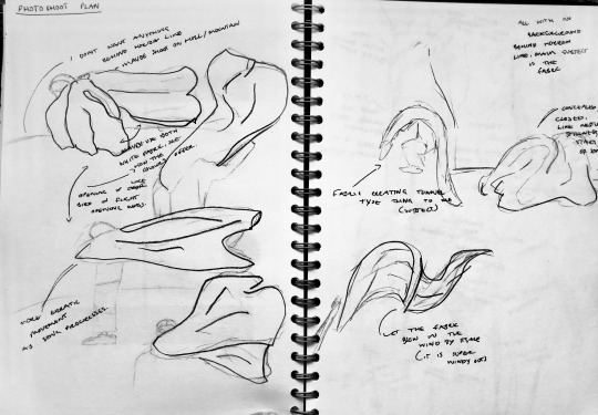
PHOTOSHOOT
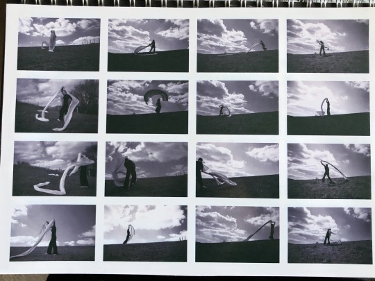
Two pages of sketches planning the photoshoot to take place. In the sketches I have included composition, poses and styling to try and properly have an idea in my head. Half of the sketches were not possible because of the wind and the difficulty of self timer but I did gets lots and lots of photographs.
Here are the majority of the successful photographs on a contact sheet layout. From here I will pick some of the best and begin developing them somehow.
0 notes
Text
PLAN FOR PHOTOSHOOT 30/03
My plan for the photoshoot is try and replicate the movement of my drawings and marks I have made through photography. I experimented with using fabric on a washing line which helped me choose this technique for the photoshoot. I realised that fabric when blown in the wind of swayed by holding it, behaves similarly to a flock of birds during a murmuration.
For my photoshoot, I would like there to be a clear distinct horizon line, of which I, being the model will stand at the top off. I would like there to be nothing beau d the horizon line, this is because I wasn’t the shapes created by me and the fabric to stand out against the sky, similar to how Irving Penn often shoots against white background and not busy settings. I would like a variety of shapes and movements to be present in my photographs, both of me and the fabric as I want to bring the fashion side into this shoot swell. On the other hand, I’m unsure of how successful this will be because having the navigate self timer and a complicated movement or shape will be difficult. I’m going to have to set the exposure and focus before hand and keep it similar throughout the whole shoot because I will be using the self timer. This means that I won’t be very experimental with the setting but will collect a series of photographs with similar tones in.
In terms of styling, this is very important for the shoot as I will be the main subject of the photographs (and I am uncomfortable with this so I need clothing to take the shape and interest instead of say face or arms etc. I think what will work best is probably quite a dark outfit to contrast against the sky. I’m unsure on whether a tight or loose outfit would work best to create shapes but I’m thinking that if I have quite a loose outfit (wide leg trouser etc) then perhaps they will also create similar shapes to the fabric in my hands/air. I don’t particularly want my face to be in the photographs so I will try and use the fabric to conceal my identity, but again I don’t know how plausible this will be.
I’m planning on shooting the photographs tomorrow as it is forecast to be quite windy and overcast which is good in terms of creating movement in the material and having a flat tone base to work on. I would like there to be a presence of shadows and contrast in the photographs so perhaps I will wait until golden how to trying and get some shadows in my work.
0 notes