
Last Seen Blogs

juuuunox
juuunox

bchill22
BLAKE

luckyseven30
Lucky Seven

faceofmalawi
Faceofmalawi.com

maevewalkerorchestre
J a r d i n d e g i v r e
Photo
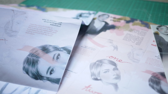
Minor tweaks and finalization of details.
Test Prints on different paper stock and sizes.
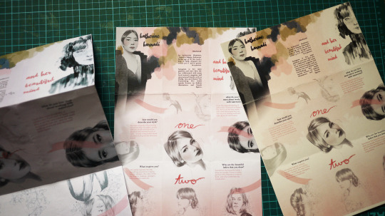
Left - normal paper stock in A3 and A4 (a bit shiny and too thin and flimsy, lacking structure and elegance).
Middle - 110 gsm uncoated paper in A3 (good texture, matte)
Right - 210 gsm uncoated paper in A3, ivory (A bit too yellow, too thick, loose color payoff)
Project Reflection
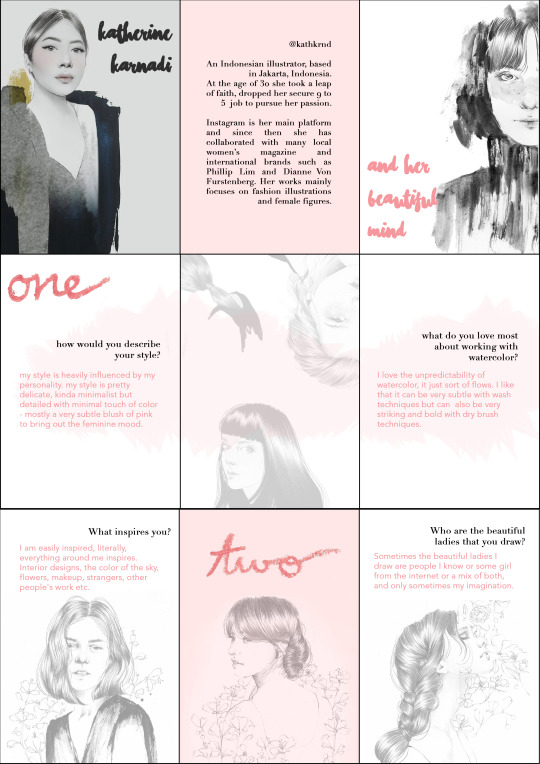
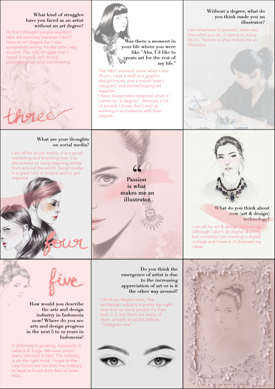
In hindsight, this project gave me the opportunity to interview one of my favorite artists of all time from back home, Katherine Karnadi. Coming up with the questions and interviewing the artist was the easy part. However, the editing process proved to be quite challenging. With the unlimited option of ways to present her thoughts and after going through different methods of presenting, I settled with a zine format. I thought this media best suited Katherine because she is an illustrator and her works are mainly printed on publications and she has collaborated with local and international fashion brands. Furthermore, it was a challenge to stop the work from becoming about myself and my style and let the end product reflect and focus on her work and her style. Therefore I used pink shades and headings written with lipstick throughout the zine. Once all concept was settled, a zine on its own did not feel like it was complete work. I consulted with Bromwyn and she suggested that the zine could be be an insert on a fashion magazine, and it was perfect with what my artist was doing. And the last step was finalizing on designing the whole experience of the zine, and really making it a finished and refined product. From choosing the type of paper printed on to the ribbon used. All in all, the project consolidated my design thinking, asking and curating questions and crafting an end product.
5 notes
·
View notes
Photo
Evolution of my work.
It is going to be an insert on a fashion magazine.
7 notes
·
View notes
Text
Week 10 Lecture
Ethical issues associated with design - design ethics
Laszlo Moholy-Nagy, an instructor at Bauhaus, had a holistic approach to design.
He believed a person should be whole, should master a wide variety of design; photographers, architect, painters, ballet.
Laszlo moved towards designing for industrial purposes - Bauhaus became known for the versatility of their designers in the 1920s.
Design and design inventions moved towards a more structured, standardized, symmetrical design.
3 notes
·
View notes
Text
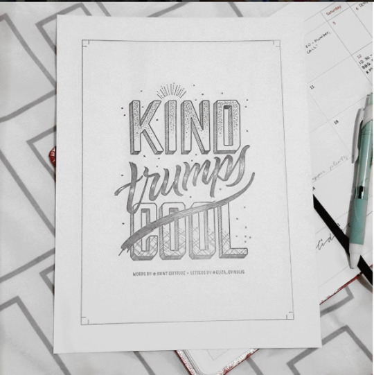
Work Progress - Franken Model
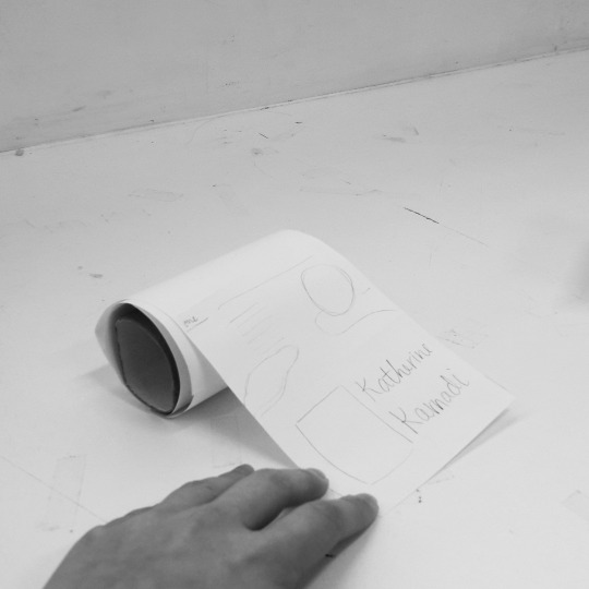
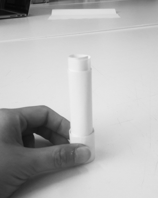

Amongst other ideas, the two main ideas I had to present my interview are either a zine/map like print or a paper lipstick. Both ideas are based on my artist’s personality. The paper roll tissue was for the lols (this idea sparked in the mornings as I wake and proceed to my morning ritual).
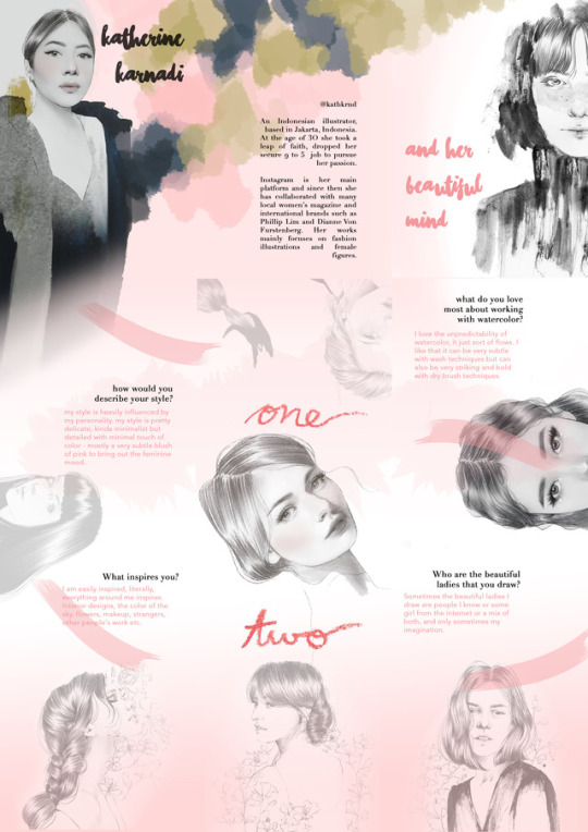
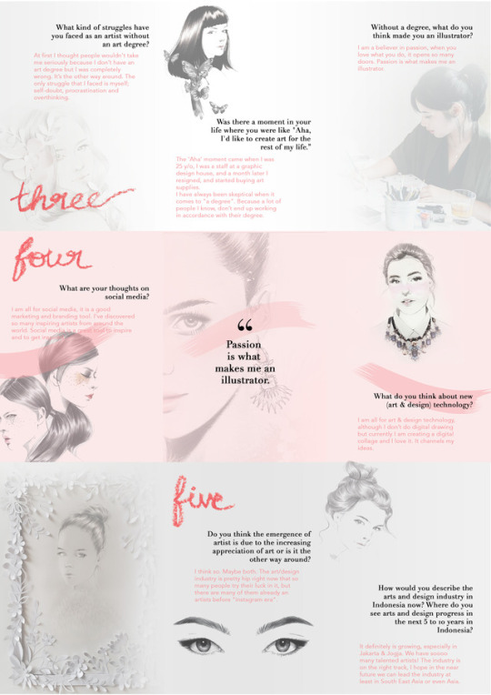
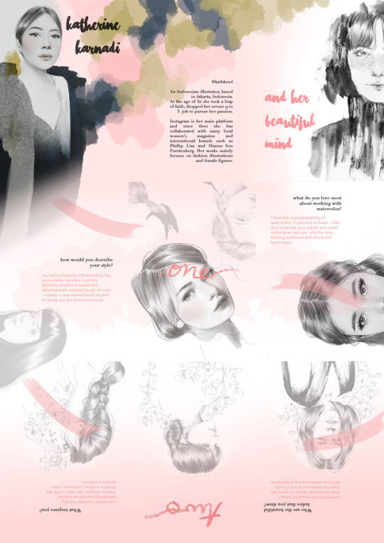
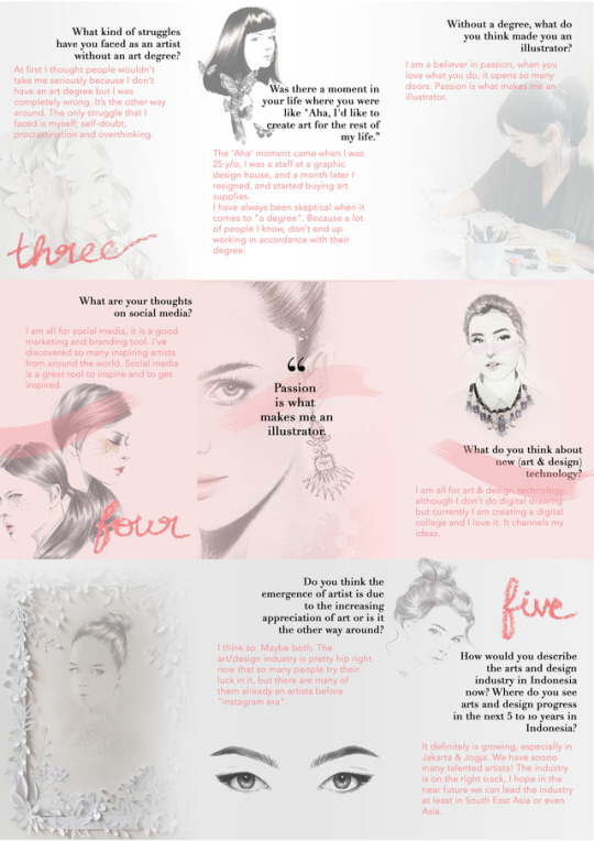
The artist I interviewed is Katherin Karnadi, her style is very delicate and feminine. Therefore I had the idea of presenting the interview in a lipstick paper, where the answers would roll out of it. And this idea would be more concept driven. On the other hand, I had the idea of making a zine/map like print which would be more graphic driven. However, if I were to pursue this idea, I would have to have good resolution of her work.
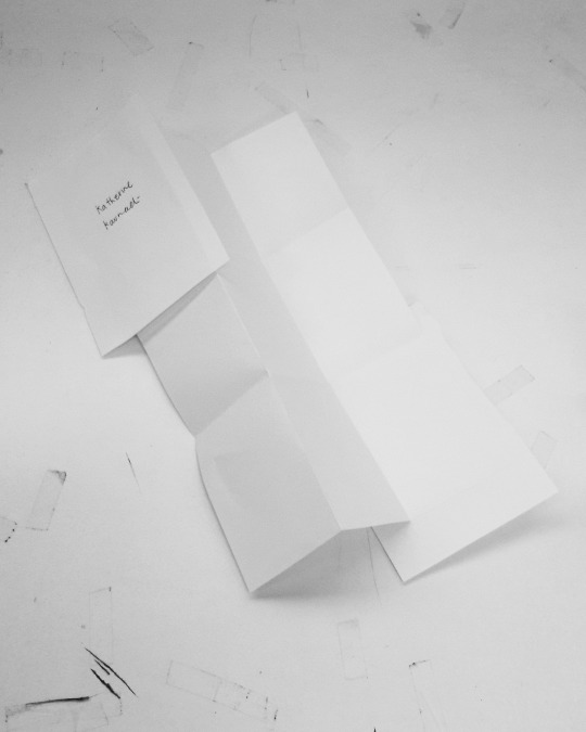
I then did test prints of her works on A3, at quite large sizes. The images performed very well, therefore I proceed to pursue this concept.
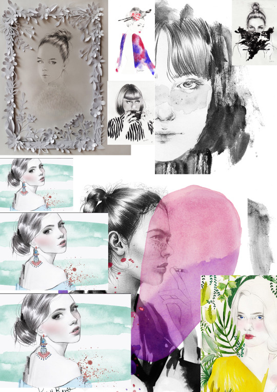
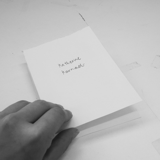
I then edited Katherine’s response, chose my favorite works of her and started curating my zine. I wanted the end product to really complement her work; feminine and delicate.
I had the idea of making type by writing with lipstick; which is a very feminine and typical lady-like actions.
And here is the first prototype of the zine.
The type I used is a mix of hand lettering, serif, and sans serif type. I used hand lettering font for the heading as it suits her style and personality. The serif for the questions and profile because it adds a touch of elegance. Complemented by a sans serif type for her response in light pink as well; again to emphasize her feminine and delicate personality.
1 note
·
View note
Photo
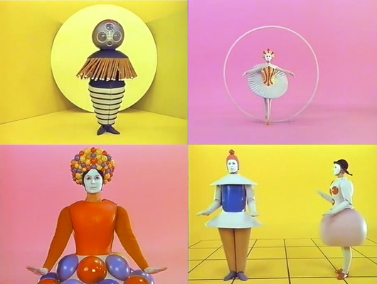
Oskar Schlemmer Das Triadische Ballet
The epitome of the human body as a new artistic medium, which presented the Bauhaus ethos.
6 notes
·
View notes
Text
Week 9 Lecture
To put simply, Bauhaus is a constructing house, where people go to make things.
It is a German art school operational from 1919 to 1933 that combined crafts and the fine arts. It provoked the Russian revolution and influences multiple aspects of design in the west, consciously or unconsciously. What the group of mainly architecture dudes (and one woman) did was a foundation of how design schools are set up. Ironically, you couldn’t go and take up an architecture course.
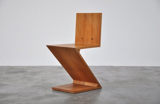
Zig Zag by Gerrit Thomas Rietveld.

Le Corbusier LC1 - inspired by bikes to make the frame of a chair. Increased of industrial process and taking the idea to do something poetic.
Bauhaus Typography
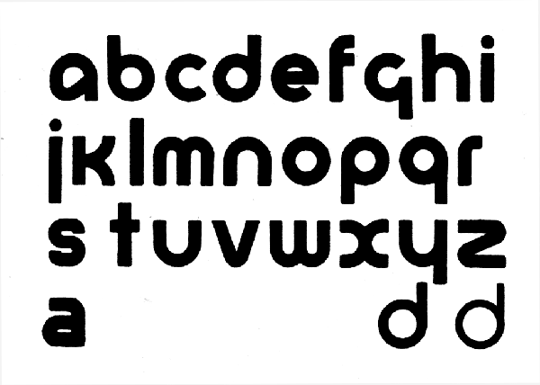
Universal typeface, Herbert Bayer - Sans-serif
The emergence of extremely, highly rationalised, standardized, typography. He developed a modernist design, which at the time is considered bolshevik, alien-like, and ultimately ugly.
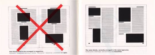
Jan Tschichold - got chased out of Germany because anybody who doesn’t use serif was an enemy of the state. But Tschichold - called for rationality. What started a modern design, published a book, the birth sans serif fonts. No to symmetry, be asymmetrical. Guttenberg inspired Tsichold, in which the Golden Mean and divine proportions. FIbbonaci Numbers -- all these concern were taken into consideration into making a typeface. These people were the rebels of their time who boldly said no to all things “German”; symmetrical, heavy blackletter typography.
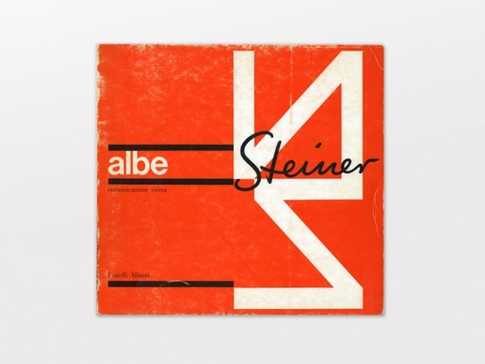
Tschicold influenced a number of people including Albe Steiner 1913 - 1974 - gridlike pages. And reflected in Josef Muller’s highly standardized and consistent.
However in later years, these very champions of Bauhaus said; slow down on the rules, they soften their stance and just CREATE and FORGET THE RULES.
9 notes
·
View notes
Text
Week 7 lecture Part 2: The Golden Ratio
In our lecture Andy also touched on the studies of Luca Paccioli of the Enlightenment period, who was heavily interested in the application of the golden ratio. This ratio uses a mathematical relationship that is said to provide connections to higher powers. It is also widely understood to produce visually pleasing patterns and can be found in music, art, architecture, design and even nature:
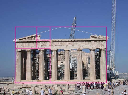
Ancient Greek architecture used the Golden ratio to create an aesthetically pleasing relationship between the width and height of buildings and the positioning of columns. These entirely proportional buildings also had an influence on the neo-classical architecture movement.
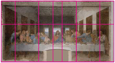
Leonardo da Vinci extensively used the Golden Ratio in his works to create pleasing compositions. In his painting of the last supper, the canvas is split into golden rectangles and the figures are carefully arranged in the lower two thirds and Jesus is strategically placed in the centre.

The golden ratio can be observed all around us in nature- flowers, sea-shells, honeycombs, oceans, space, etc.
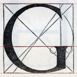
Grids and ratios also began to influence the shape of letterforms, “on a microscopic level and more and more towards a macroscopic influence”- Andy. Here we see the golden ratio influencing the geometric structure of letters.
—
There has also been some research into the fact that humans are naturally hardwired to be attracted to images that have proportions similar to the golden mean. This may explain why we are often drawn to many objects in the natural environment or may find attractiveness in people with facial proportions close to the golden-ratio.
This idea of objects and visuals being structured by such proportions is really fascinating to me as I had never really taken notice of it before… I might try using the golden mean to structure my future designs and see how it turns out.
Erica 23.4.17
9 notes
·
View notes
Photo
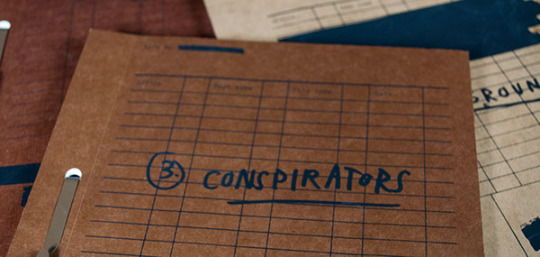
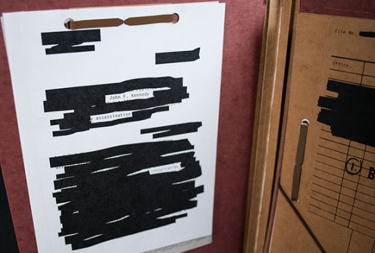
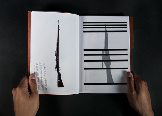
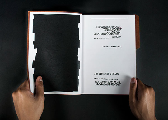

Eleni Agapis (Maryland, Baltimore)
JFK Assassination Conspiracies
106 notes
·
View notes
Text
Clara’s Unrealistic Wish List of Insanely Creative, Cool and Incredibly Talented People to Interview
The following is a list of people I’d like to interview in no particular order of level of difficulty because I don’t have any connection to any of them so all are equally hard and almost impossible to interview. Praying for the best. Fingers, toes crossed. #blessme
1. Chloe Bennet of Yeah Yeah Chloe (@yeah.yeah.chloe) - Graphic Designer
Chloe is a Queensland based artist, her works are just marvelous and I admire her creativity. Her works have been published internationally and is definitely not for the faint-hearted.
Her style is very unique because she uses what is conventionally considered as feminine and sweet colors, as you can see are majorly in pastel shades, but are combined with images that are bold, eclectic and at the point of disturbing. However, there is a simplicity and a sense of familiarity because she uses normal everyday objects and is closely related to popular culture BUT with a twist, and that make us stop and stare.
So I wonder, Is this intentionally done? What message is being conveyed here?
Her works below, be careful, you may fall in love with her.

I warned you. Click here for more.
2. Amy Constable of Saint Gertrude (@saintgertrude) - Letterpress Queen
I fell in love with Amy last fall when I visited her studio as part of RMIT Link’s program. Going in I had no clue about the art of printing press. However, Amy really drew me into this dying world of Press Printing. In that few hours, I have learned so much and I’m excited to see the changes within the year.
Amy Constable is the founder of Little Gold Studios. With her works, she redefines the dying art of printing press in modern communication by creating work that is too beautiful to ignore. And bonus points for her being a girl boss #feminist <3.
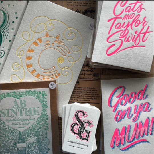
and my personal favorite, one that was made the day of my visit.
More of Saint Gertrude here.
3. Katherine Karnadi (@kathkrnd) - Illustrator
I think she is one of the first artists that truly inspired me. I even had an artwork back in Year 11, absolutely inspired by her style of delicate and unbelievably realistic illustrations. Her main medium is a pencil, just a humble pencil. But her artwork is no less than amazing.
She is a Jakarta-based Illustrator:’) I look up and admire her incredibly. However, I do not know much about her background or her story at all, but what’s interesting is that her biggest sharing platform is Instagram. And that since then has gained international recognition (she deserves it 1000%). She has recently gained work collaborations with both local and international brands such as Dianne vonn Furstenberg and Phillip Lim.
4. Sha'an d'Anthes of Furry Little Peach (@furrylittlepeach) - Illustrator
She literally broke my heart when her pins sold out (cri).
ANYWAY, she is one of my favorite artists of all time. Sha’an is a Sydney-based illustrator. What I love about her style is the simplicity of it. However, it still looks like a complete and whole work, instead of unfinished (which is what I usually end up with every time I try to go minimalistic. pretty sure I’m doing something wrong, I don’t know the formula ok).


World’s cutest pins that are currently sold out:’)
Check this out for more.
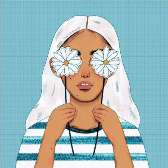
5. Manjit Thapp (@manjitthapp) - Illustrator
Out of all the people in my list, she is the most unreachable (in my opinion) and I just love her work and style so so so so so so so so much. Her style is so unique and quirky and not traditionally beautiful. And I love that about her work. Her illustrations were featured in Frankie magazines and she has done a wide range of collaboration, and she is just 21 years young. That is crazy inspiring.
Her illustrations don’t end up flat, but it has been reproduced to various items such as tote bags and t-shirts.
Now that I’m done with the list, I’ve just noticed a pattern. They are all women. (???)
1 note
·
View note
Text
A list of Andy’s collectors...
Abake (founders of Kitsune!? OMG!)
Andrea Crews
Assume Vivid Astro Focus
Chto Delat
Club Real
Dearraindrop
DIS
Friends With You
Instant Coffee
LuckyPDF
Metahaven - Uncorporate Identity
Paper Rad
Project Projects
Ruangrupa
Slavs and Tatars
Superflex
This Is A Magazine
Tokyo Picnic Club
36 notes
·
View notes
Photo
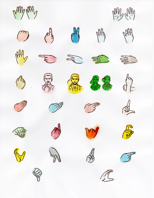
This is something I drew for the Wall Street issue of Vice which was cut. It’s all the different hand signals that stock traders use.
77 notes
·
View notes
Text
Week 6 Exhibition
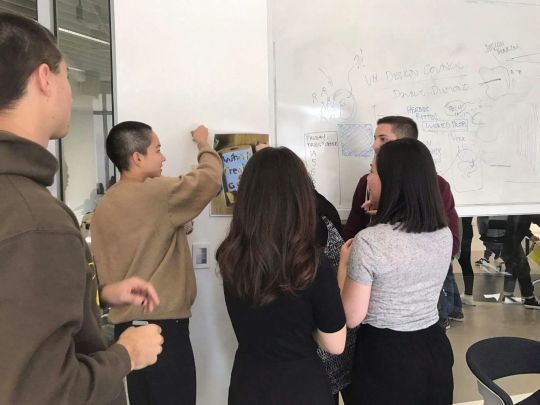
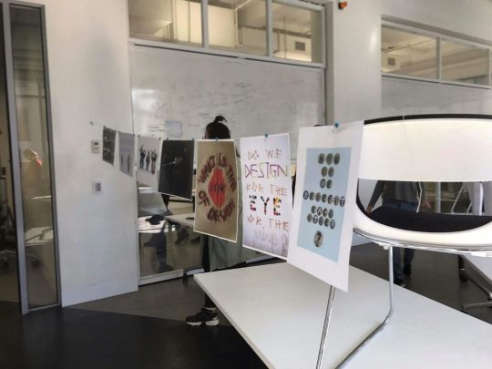
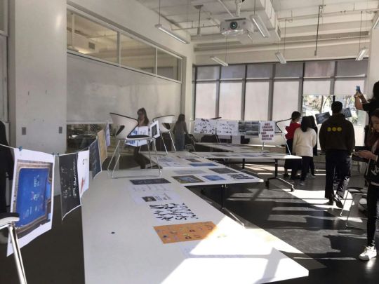
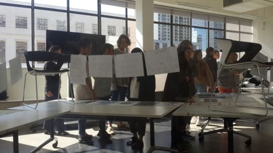
Today, in class we were asked to think about the exhibitions we’ve been to; what it was like, how space was used, how the work was created, the concept, etc.
We then were asked to make a set up our own exhibition of our work from Hello My Question is... project. Tt was interesting to see that both our groups’ exhibitions were so different. We had similar space, but we had different ways of curating the artworks. Ours grouped the posters in different categories based on the type of questions they were. Whilst the other group grouped the artwork based on the materials used to create the letterforms. However, we had very similar ways of setting up the flow and use of space. We both used very singular, single line kind of exhibitions. And Andy mentioned maybe the flow would have been better had we freed up some space for people to wonder around.
1 note
·
View note
Video
This looks amazing.
something from this time last year, experimenting with traditional script.
10 notes
·
View notes
Text
week 5 lecture
Pictograms and Ideograms
Pictograms - valuable for the spreading of a language because they are easy to read if you don’t know the sound of a language (cuneiform, Trajan’s column)
ideogram - valuable for passing on that culture’s stories i.e. in religious writings, mythology, cultural stories (Fuxi, a Chinese diety)
Cangjie - Named after a deity who was believed to have created letters. Consisting of over 50,000 brush strokes. Caligraphy
Arabic Script - written from right to left, in a beautiful cursive style, consist of 28 letters, originally with only consonants. Decorative style
Medieval Italian Script - a distinctive style, it is quite formal.
There is a standard, that it has to fit so that more people can understand the code, thus easier for language to spread.
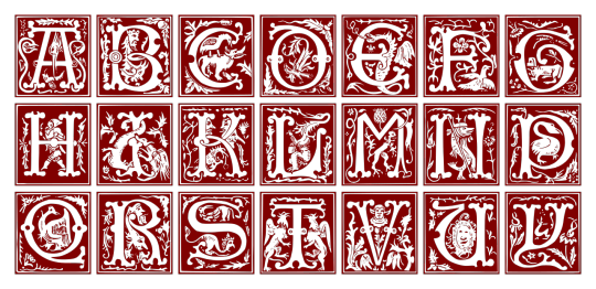
Decorative vs. Distinctive letterforms
Blackletter emerges; decorative letterforms, one with decorations surrounding the page, would be expensive and inefficient. It would only be accessible by certain people; churches, universities. Books became prestigious and valuable and a luxury item and many would not be able to afford it.
Contemporary Scribal Activity - Graffiti
Because the nature of the activity needs speed, practice is needed to be efficient.
Handwriting as a style of artwork, a style, which was built on ancient culture.
Things to explore:
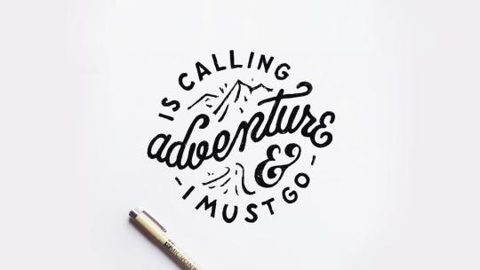
- Calligraphy, hand lettering.
4 notes
·
View notes
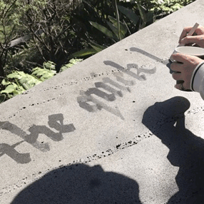
Video
This is timelapse of our group trying to create our pangram. Sadly, I was the designated videographer, but I did help at the start up, before we decided to take a time lapse of it.
0 notes