conveyinformation
Introduction to Design 1 2019
Class blog for NYU Winter Session
128 posts
Don't wanna be here? Send us removal request.
Last Seen Blogs

corporationsarepeople
corps 'r' people

nuruddindzulkarnain
Gallery of Paradise : The Lost Macro World

flippermitico-blog
FlipperMITRICO
synthetic--nightmare
One slice
artistotel
arts
Text
Binding—Jingyi Zhao

This Yoga book has a very special binding. It is not just loop binding. But its cover wrap over the loops which makes the loops invisible from the outside. The benefit of having loops binding is that the pages can be flipped really easily and teared off easily.

Each of the three books is binded by glue. But I find that separating one whole book into three and keep it together by a side-open box with the book cover is a cool thing to do. This way of binding books gives me a sense of collection and makes me want to keep it home.
0 notes
Text
Video: Paula Scher
This is a reminder to check out designer Paula Scher in episode 6 of the Netflix series Abstract: The Art of Design. You can read more about Scher here.
0 notes
Text
Tutorials!
Bezier Tool
https://bezier.method.ac
Blackletter
https://calligraphypen.wordpress.com/2009/04/13/demystifying-gothic-lettering/
http://www.loopsandtails.com/blackletter/blackletter/
http://www.calligraphy-skills.com/gothic-alphabet.html
Illustrator
Beginners: This tutorial will walk you into working with type in illustrator. Open Illustrator. Help > Illustrator Tutorials. Try starting with "Get to Know Illustrator," "Create and Edit Shapes," and "Add Text to Your Designs."
http://www.creativebloq.com/graphic-design-tips/typography-tutorials-1232719
https://helpx.adobe.com/illustrator/how-to/design-logo.html
https://helpx.adobe.com/illustrator/how-to/work-with-type.html
Point Type vs. Area Type
https://helpx.adobe.com/illustrator/how-to/illustrator-point-vs-area-type.html
Type on a Grid
http://www.wiki.digital-foundations.net/index.php?title=Chapter_4_CC18
Drawing Shapes
http://www.wiki.digital-foundations.net/index.php?title=Chapter_6_CC18
Kerning and Tracking
https://helpx.adobe.com/illustrator/using/line-character-spacing.html
Alignment
https://helpx.adobe.com/illustrator/using/formatting-paragraphs.html
Retro Text Style in Illustrator
https://blog.spoongraphics.co.uk/tutorials/create-editable-retro-text-style-illustrator
Vintage Film Title Text Effect in Photoshop
https://blog.spoongraphics.co.uk/tutorials/create-vintage-film-title-text-effect-photoshop
Gold 3D Type
digitalartsonline.co.uk/tutorials/adobe-illustrator/create-gold-3d-type/
Wireframes
Lynda tutorial parts 5 and 6:
http://www.lynda.com/InDesign-tutorials/Print-vs-web-Understanding-importance-templates/105366/115311-4.html
Indesign
Digital Foundations, Chapter 13: Creating Unity
http://www.wiki.digital-foundations.net/index.php?title=Chapter_13_CC18
Lynda Indesign Typography: Chapter 5
http://www.lynda.com/InDesign-tutorials/InDesign-Typography/101959-2.html
Lynda Indesign Managing Pages and Text:
http://www.lynda.com/InDesign-tutorials/Inserting-deleting-moving-pages/368575/412982-4.html
Lynda
http://www.lynda.com/InDesign-tutorials/Printing-small-booklet/120609/137604-4.html
How to layout a book in Indesign
http://www.creativebloq.com/print-design/design-and-lay-out-book-indesign-4137471
Alternative guide to the Print Booklet
https://www.youtube.com/watch?v=NQAUiKpvaLc
Lynda Indesign Typography: Chapter 5
http://www.lynda.com/InDesign-tutorials/InDesign-Typography/101959-2.html
Lynda Indesign Managing Pages and Text:
http://www.lynda.com/InDesign-tutorials/Inserting-deleting-moving-pages/368575/412982-4.html
How to Design a Fixed Layout Epub
https://helpx.adobe.com/indesign/how-to/ebook-fixed-layout.html
EPUB Fundamentals, Sections 3 and 4: Preparing the InDesign Publication for EPUB Export and Optimizing Text
http://www.lynda.com/EPUB-tutorials/Learning-basic-prep-steps-most-InDesign-files/143324/160837-4.html
Photoshop
Follow one of Nigel French's Type Projects on Lynda. You can choose Punk Album Art, Swiss Style Poster, Grunge Poster, Constructivist Poster, Dada Poster, Art Nouveau Poster, or Victorian Ad:
https://www.lynda.com/Digital-Illustration-training-tutorials/42-0.html?author=nigel-french_57
Repetition and Cloning
http://www.wiki.digital-foundations.net/index.php?title=Chapter_10_CC18
Screencasts
http://www.wiki.digital-foundations.net/index.php?title=Chapter_11_CC18
Layering and Collage
http://www.wiki.digital-foundations.net/index.php?title=Chapter_9_CC18
Foundations of Digital Art
PDF is in your Drive Folder > Chapter 8 > Select, Copy, Paste, Collage
After Effects
Start on this page, choose Beginner, and follow the first three tutorials: Get to Know After Effects, Work With Compositions, and Create and Animate Text
https://helpx.adobe.com/after-effects/tutorials.html
Text-based guide
https://helpx.adobe.com/after-effects/user-guide.html
Elements of Motion
http://www.wiki.digital-foundations.net/index.php?title=Chapter_18_CC18
Glyphs
https://glyphsapp.com/get-started
https://glyphsapp.com/tutorials/sketching
Wireframes and Web Design Basics
http://www.responsivegridsystem.com
http://designmodo.com/responsive-design-examples/
http://www.creativebloq.com/netmag/create-responsive-html-wireframe-41411377
https://www.youtube.com/watch?v=3iVVM_DgWY4&spfreload=10
http://webdesign.tutsplus.com/articles/a-beginners-guide-to-wireframing--webdesign-7399
http://www.rubbercheese.com/a-wireframe-template-for-responsive-web-design/
Kinetic Type
Kinetic Type Tutorials
https://www.youtube.com/watch?v=TmaajgiikO0
https://www.youtube.com/watch?v=ynsakNGWHvU
Intro to Motion Graphics
https://www.youtube.com/user/mtmograph
Kinetic Type Example
https://www.youtube.com/watch?v=iwIy0enG6uU
Making Online Books
http://www.creativebloq.com/indesign/how-create-ebook-part-1-101413218
http://www.creativebloq.com/graphic-design/how-create-ebook-part-2-101413226
http://www.creativebloq.com/graphic-design/how-create-ebook-part-3-101413227
0 notes
Text
Exercise: Wordmarks
Design six professional wordmarks. Use your name for each design. To be clear, your wordmark will only be your name -- not your name plus your title. You must communicate what you do with only the type selection and layout of your design. Type only; no images or illustrations.
Here are your six jobs:
Designer
Lawyer
Gardener
Professional race car driver
Librarian
Your Choice
Consider type selection, kerning, and alignment in each of your designs. Stick to Bembo, Garamond, Janson, Caslon, Baskerville, Bodoni, Serifa or Rockwell, Futura, Gill Sans, or Univers. You can use any or multiple styles, including Roman, Italics, Bold, Light, Condensed, or Extended. Each one should be on its own artboard.
0 notes
Text
Homework: Final Project
Your final assignment is to design six high-definition wirefames for an iOS or android app. You are not creating an actual app, but a polished mock up of what that app would look like on a small screen. Your focus should be spent on the look of your screens more than the user experience or information. That said, you are welcome to upload your files to something like InVision to create a working prototype.
This assignment will require several skills that you have picked up throughout this class: kerning and line spacing, type combinations, basic layout and alignment, and a custom typeface.
Here are some questions to get you started:
What is the purpose of this app?
Who will use it?
What do you need to communicate to your user?
What content needs to be on each page?
How will you establish hierarchy?
Here are Apple’s interface guidelines for iOS, which will be very useful for designing your app (especially Visual Design > Adaptivity and Layout.
And the somewhat more complicated Android guidelines:
You may use Illustrator or Indesign or whatever program you like for your wireframes. Please print out all of your designs and bring them in for critique. The final project will be submitted as a PDF via drive.
You can design your own app, or you can create designs for one of the following (fake) apps:
Unicorn Rainbow, game
Mutiny, game
Days and Weeks, calendar app
Paparazzi, photo app
Netwerk, social
Mews, cat news
Your own project
The deliverables of this project are somewhat flexible, but I am firm on one issue: You may not use more than one image. This is a typography class, and I want to see type-based designs. (Geometric design elements like boxes, circles, triangles, and lines are fine.) This is another way of saying that you should probably start this project by thinking about a logo or an icon.
Here’s a deliverables checklist for the final project:
* A custom logo or wordmark for your app. 1024 x 768 pixels. Possibly using your custom type.
* Icon for your apps, one at 180 x 180 pixels and one at 1024 x 1024 pixels (app store), or one at 192 x 192 pixels (android).
* Six high-definition wireframes.
* At least one wireframe must include a chunk of type (maybe three paragraphs).
* At least one wireframe must include a list.
Here are your deadlines:
Wednesday: Digital Files Only; No Print Outs.
A custom logo or wordmark for your app. 1024 x 768 pixels. Possibly using your custom type.
Icon for your apps, one at 180 x 180 pixels and one at 1024 x 1024 pixels (app store), or one at 192 x 192 pixels (android).
Two high-definition wireframes, at least one wireframe must include a list.
Thursday: Print Everything for Critique.
A custom logo or wordmark for your app. 1024 x 768 pixels. Possibly using your custom type.
Icon for your apps, one at 180 x 180 pixels and one at 1024 x 1024 pixels (app store), or one at 192 x 192 pixels (android).
Six high-definition wireframes.
At least one wireframe must include a chunk of type (maybe three paragraphs).
At least one wireframe must include a list.
Friday: Digital Files Only; No Print Outs.
A custom logo or wordmark for your app. 1024 x 768 pixels. Possibly using your custom type.
Icon for your apps, one at 180 x 180 pixels and one at 1024 x 1024 pixels (app store), or one at 192 x 192 pixels (android).
Six high-definition wireframes.
At least one wireframe must include a chunk of type (maybe three paragraphs).
At least one wireframe must include a list.
Here are two possible scenarios:
Mutiny (i based the following screens on the games 2048 and threes)
1. game screen with icon and score. buttons for best score, menu, and leaderboard
2. menu screen with the following buttons: keep going, new game, multiplayer co-op, multiplayer vs, how to play, and rate.
3. how to play screen: swipe right to kill, swipe left to love, love your friends, vanquish your enemies.
4. high score screen: 56476, 44136, 35044, 27236, 15892
5. options screen: music, sound effects, colors, show status bar, main menu
6. special thanks screen: special thanks to those who went out of their way to support us: mom, dad, and jeff stark. voices by: Harold Lloyd, Douglas Fairbanks, Clara Bow, Theda Bara, Lillian Gish, Charlie Chaplin, Buster Keaton, and Greta Garbo.
7. about screen (adapted from wikipedia): Mutiny is a single-player puzzle game created in January 2019 by NYU developer xxx, in which the objective is love your friends and vanquish your enemies. It is a type of puzzle game, and is very similar to several other games, but better. XXX created the game in a single weekend as a test to see if she could program a game from scratch, and was surprised when his game received over 4 million visitors in less than a week, especially since it was just a weekend project. The game is free to play and makes the world better every time someone spends an afternoon mindlessly swiping, swiping, swiping. The game runs on open-source code and has led to many additions to the original game, including a score leaderboard and improved touchscreen playability. Spinoffs have been released, but none of them are as good as the original.
Paparazzi (i based this on Hipstamatic, with a shout out to Lady Gaga)
1. Paparazzi App Icon
2 Launch File (can be animated)
3. Captioned photograph screen: Add caption. Sample caption: Sarcasm is the lowest form of wit, but the highest form of intelligence.
4. Edited screen: No edits. Photos you have edited with Paparazzi will appear here
5. Store screen: Featured: Retropak 9. With buttons for “featured,” “search,” “print lab,” and “my gear.”
6. Art School Film. Angular and moody. Popular back when photographers spent more time in the darkroom than the studio. Makes everything look more interesting.
7. about screen (adapted from wikipedia): Paparazzi is a digital photography application for the Apple iPhone and Windows Phone. It uses the phone’s camera to allow the user to shoot square photographs, to which it applies a number of software filters to make the images look as though they were taken with a vintage film camera. The user can choose among a number of effects which are presented in the application as simulated lenses, films and flashes. Several of these are included with the application, while others may be acquired through an in-app purchase. The application has sold four million copies as of January 2019. Paparazzi is part of a retro trend in photography, which has seen a rise in the popularity of cheap and technically obsolete analog cameras (such as Lomography and Polaroid instant cameras), as well as software filters and smartphone software that emulate such cameras. Other vintage photography applications include CameraBag and Instagram. Like Hipstamatic, they often include social networking features. Some phones include similar built-in filters.
1 note
·
View note
Text
Type on Screen
Lecture notes from Typographic Design:
When designing for the Web:
simplicity
type with elemental shapes
type with less extreme stroke contrasts
elaborate typefaces can get lost
san serif is simpler than serif
some designers say readers are moving faster on the web -- you should acknowledge that as a designer.
workhorses: Helvetica, Univers, and Futura,
san serif with a little more personality: DIN, Franklin Gothic, Gill Sans, Lucida Sans, Meta, and Rotis Sans
Font size and line height are declared in pixels for the tag in HTML. All other type is sized and spaced relative to these values via ems, rems (a root em), or percentages.
The subtlety of typographic variation that can be achieved in print goes unnoticed when viewed on screen.
On screens we are still constantly losing typographic detail, which in turn lowers contrast. Because of this, all shifts in typesetting and typeface selection must be further emphasized. Make at least two typographic shifts for contrasting text items on screen. These properties can include typeface, size, weight, posture, orientation, margin, and color.
Line spacing:
60-75 characters per line optimal for scanning websites
35-50 for smartphones
Generous interline spacing is recommended for displaying text on a computer display: 140 percent of the type size for websites, and up to 160 for phones. standard for print is 10-12.
On screen, short paragraphs and the introduction of small units of text invite readers into the content. Text can be structured with the goal of bringing clarity and understanding to ideas, and preventing the monotony of vast seas of text, which severely inhibits the reading process
0 notes
Text
Tutorial: Wireframes
This is what wireframes look like:
http://webdesign.tutsplus.com/articles/a-beginners-guide-to-wireframing--webdesign-7399
This is an Illustrator wireframe template for responsive design:
http://www.rubbercheese.com/a-wireframe-template-for-responsive-web-design/
Lynda tutorial parts 5 and 6:
http://www.lynda.com/InDesign-tutorials/Print-vs-web-Understanding-importance-templates/105366/115311-4.html
0 notes
Text
Tutorial and Exercise: After Effects
After Effects is massive and there are several ways into the program.
I suggest keeping it very simple and following Adobe's own tutorials. Start on this page, choose Beginner, and follow the first three tutorials:
Get to Know After Effects
Work With Compositions
Create and Animate Text
https://helpx.adobe.com/after-effects/tutorials.html
When you have finished two of the above three tutorials (including each section) you can move on to the After Effects exercise.
This is a text-based guide:
https://helpx.adobe.com/after-effects/user-guide.html
Exercise:
Create a five-second clip animating your first and last name. Start with the Ipad preset, use at least two sets of key frames, and set your composition to music or sound.
0 notes
Text
Binding Report

This binding is a case binding which includes two editions of the book. I found this binding particularly appealing because it gives ability for the designer to have more dimension in their cover. It also gives a dimension to the books that makes it seem more elegant or expensive -- attracting a different kind of audience

This book was a spiral bound with plastic/cardboard grip around it. I think that this kind of binding makes the book or magazine seem very personal. It also is a very readable spine and allows for easy page turning -- the reader can keep any selected page open as long as they like.
0 notes
Text
Experimental binding review (Cynthia Liu)

Saddle bindings are always my favorite, no matter they are designed for books or notebooks. Simple, convenient and neat, saddled books own usually no more than 100 pages. The goal is to help their audience with easy reading. Saddle binding allows readers to browse sufficient information and clear pictures, because the edges of those books are not limited by stabs or glue. Although the example I found here was a sewn bound, the advantages of this binding is similar to those of saddle binding. On the other side, both saddle and sew are not compatible with thick contents. However, this disadvantage might become an advantage for quick readers, since the requirement for content is conciseness.

Hardcover, or case binding, is usually adopted when classic content requires durable protection. That is to say, this kind of binding, like the one I found on the book A Wild Life (an animal photography records that is in need of celebration and commemoration), can last for generations. The hardcover itself, with high qualified binding, represents professional importance. Broadly used for classic fictions, memorial album, grand academic achievement, and so on, hardcover, although heavy in weight, is also heavy in the state of memento.
0 notes
Text
Final Project Preview
Your final assignment is to design six high-definition wirefames for an iOS or android app. You are not creating an actual app, but a polished mock up of what that app would look like on a small screen. Your focus should be spent on the look of your screens more than the user experience or information. This assignment will require several skills that you have picked up throughout this class: kerning and line spacing, type combinations, basic layout and alignment, and possibly a custom typeface.
Here are some questions to get you started:
What is the purpose of this app?
Who will use it?
What do you need to communicate to your user?
What content needs to be on each page?
How will you establish hierarchy?
You may use Illustrator or Indesign for your wireframes. Please print out all of your designs and bring them in for critique. The final project will be submitted as a PDF via drive.
You can design your own app, or you can create designs for one of the following (fake) apps:
Unicorn Rainbow, game
Mutiny, game
Days and Weeks, calendar app
Paparazzi, photo app
Netwerk, social
Mews, cat news
Your own project
The deliverables of this project are somewhat flexible, but I am firm on one issue: You may not use more than one image. This is a typography class, and I want to see type-based designs. (Geometric design elements like boxes, circles, triangles, and lines are fine.) This is another way of saying that you should probably start this project by thinking about a logo or an icon.
Here’s a checklist for the final project:
A custom logo or wordmark for your app. Possibly use Glyphs or Fontstruct or Illustrator to create or manipulate custom type
Icon for your apps.
Six high-definition wireframes.
At least one wireframe must include a chunk of type (maybe three paragraphs).
At least one wireframe must include a list.
0 notes
Text
Homework: Due Tuesday
(No class on Monday.)
Your assignment is to design your own font. It’s due on Tuesday, and you can start on it in class. The actual deliverable is a one-page font specimen that shows off your work.
Font editors are often incredibly complex programs that help with a lot of the detail work of creating type. They also allow you to import letters from illustrator files and similar programs. I recommend you try a good program for this assignment. The following are all good programs, and will walk you through the process of creating type from scratch:
Glyphs Mini. Free 30 day trial.
https://glyphsapp.com/get-started
https://glyphsapp.com/tutorials/sketching
Font Lab Studio standard mac, pc. Free trial.
FontForge open source unix app. Free.
What kind of typeface do you want to make? What type classification? Will you base it on an existing type? Letters on the street? Adorable animals? What kind of details?
Consider something experimental or weird, like Sonya Clark's Twist, based on curly hair, or Jérémy Barrault's original font for the invented language of Klokobetz.
If you want to start working ahead, consider whether or not you want to use a custom typeface for your final project. Now would be a good time to start.
(By the way, you should use Glyphs Mini. If you're really ambitious you can use Font Lab Studio.)
0 notes
Text
Alternative Binding (Shivani Mathur)

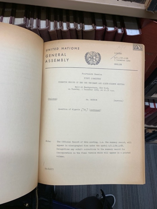
This was a UN book from the General Assembly. It was a record of the one thousand and sixty-eighth meeting in 1959. The binding had a black tape texture with no lettering or information on it. The cover is completely plain, representing the historical/confidentiality of the record perhaps. It looks like the binding of a memo of that era.

This is the THE PUBLICATION OF ANCIENT LAWS AND ORDERS from Belgium. The binding was this cloth material which gave the book a very old and classical feel. This was a collection of several volumes and had engravings of those volumes on the binding. Encyclopedias and other collections of books tend to have thicker bindings. The type on the binding was in all capital letters, whereas the volume was in lowercase letters.
1 note
·
View note
Text
Exercise/Tutorial: Font Editor
FontStruct is a simple font editor with a web interface. You can use it to make your own typefaces and share them with others. For this exercise, I want you to use FontStruct to design the title font for an iphone or android game. Imagine the game is new, but it deliberately invokes the retro aesthetic of video games from the 1980s. You do not have to develop a full alphabet, but it might help you make some informed choices about the letters you need for your game title.
You have four choices:
Mutiny: A scrolling shooter that requires you protect earth from aliens.
Carnival Creep: An RPG adventure game set in a decaying amusement park
Unicorn Rainbow: A fighting game targeted at young girls
Your own game
http://fontstruct.com
0 notes
Text
Exercise: Bitmap Font
From Thinking With Type, via every design program ever:
The exercises and tutorials today go through three steps.
Create a prototype for a bitmap typeface by designing letters on a grid of squares or a grid of dots. Substitute curves and diagonals of traditional letterforms with gridded and rectilinear elements. Avoid making detailed staircases, which are just curves and diagonals in disguise. This exercise looks back to the 1910s and 1920s, when avant-garde designers made experimental typefaces out of simple geometric parts. The project also speaks to the structure of digital technologies, from cash register receipts and LED signs to on-screen font display. Print your own graph paper. Each letter must be at least 2 inches tall. You must create the following letters:
hopnuqd
plus three of your own choice
In honor of Jason Engdahl, consider beginning with the letter R.
Use this site to print your own graph paper:
http://www.printfreegraphpaper.com
0 notes