conveyinformation2022
NYU Design 1 Winter 2022
115 posts
Don't wanna be here? Send us removal request.
Last Seen Blogs
canyounot246
Welcome to the weird side of my mind
jadethest0ne
always with their head in the clouds
iloveyoudotcom
LET ME ASK YOU A QUESTION.

hwiyoungies
wingless and brainless

Text
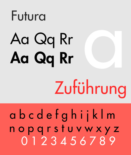
Futura was designed and released in 1927 by Paul Renner, known for his attempts to fuse Gothic and Roman typefaces. Future is a sans serif font, but retains the curved nature of other serif fonts, which are often more rigid and bold. Renner rejected other forms of sans serif fonts, based on painted signs in search of a design more focused on geometric form. I think this intention comes out through the font; it feels modern and new, but also retains its similarities to fonts I would see in a classic book. This is an interesting take on the spirit of modernity: As we look to create newer and newer designs, how can we maintain the fruits of past aesthetic/artistic work?

Verdana too is a modern take on older typefaces. Unlike Futura, however, it feels more futuristic. I can almost imagine it as the header for a sci-fi novel. It was designed by Matthew Carter of the Microsoft Corporation with the specific intention of legibility on a small computer screen. It’s straight and narrow strokes seem to embody this idea of the computer; it’s wide counters and longer strokes make it resemble something seen on a screen, not on a paper printed page.
0 notes
Text
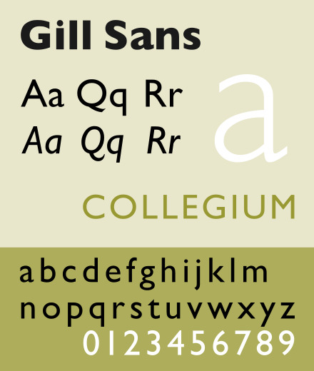
Gills Sans is a sans serif typeface released in 1928. It is based on the font Underground Alphabet, the font used for the London Underground. It’s sans serif design makes it easier to read than most serif fonts, and holds a certain modern quality that makes it the perfectly designed typeface for corporate/government designs. It brings up an interesting question regarding serif v sans serif fonts: At what expense do we lose the more “eloquent” designs of old-style fonts in lieu of readability? Might we lose expressiveness if simply only trying to make a design legible and noticeable?

Times New Roman is regarded as the quintessential serif font. You can find it in many an academic paper; it is the standard format, easily readable, and rigid/uniform. Despite it’s iconic look, the font is a relatively new conception, designed in the 1930s by Stanley Morison. Eventually, it became one of the most recognizable and popular typefaces used today, when it became a staple of desktop computers in the 1990s. It’s ubiquitous nature perhaps takes away from its incredible clarity; I’ve seen it so much that I almost forget that there is a reason I see it so much. It is the quintessential readable typeface.
0 notes
Text

The Baskerville font was invented/designed in the 1750s by none other than John Baskerville, and English business man remembered for his work in printmaking. Baskerville is classified historically as a “transitional” typeface, seeking to refine the old-style designs that preceded it, mainly by sharpening the font’s serifs, and increasing the contrast between the strokes. Much of these new design techniques were impossible without the advent of printmaking technologies, something which John Baskerville attempted to express in his new font.
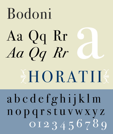
Bodoni is a typeface designed by Giambattista Bodoni. It is classified in the “Didone” or modern family. Bodoni took much inspiration from another designer, John Baskerville, increasing the stroke contrast to reflect the changing morées of printsetting technology. Perhaps because of its age - designed in 1798 - the font is seen as sort of classic, often found in classic novels and old-style designs, despite it’s Didone classification. In my opinion, I regard this font, and others similar, with a sort of respect for how long they have lasted. Bodoni can be seen as one of the first experimental typeface designs; and yet we harken and play off of it when we think of the new, sans serif fonts of today’s age.
0 notes
Video
My GIF design, inspired by: https://digitalsynopsis.com/design/type-in-motion-typography-animation/
0 notes
Text
Homework: Due Friday, January 21
Revise your final projects based on feedback from our critique. Here is the final list of deliverables:
* A custom logo or wordmark for your app. 1024 x 768 pixels. Possibly using custom type.
* Icon for your apps, one at 180 x 180 pixels and one at 1024 x 1024 pixels (app store), or one at 192 x 192 pixels (android).
* Six total high-definition wireframes (including revisions on the previous four).
* At least one wireframe must include a chunk of type (maybe three paragraphs). At least one wireframe must include a list.
* A custom gif that could be used as a load screen or for marketing purpose, 480p, six seconds max.
* Upload everything as a PDF to our class drive.
I will be hosting an Ask Me Anything in our final class. Please submit any hard questions to me before class, or prepare a question for our session.
No reviews.
0 notes
Link
0 notes
Text
Tutorial: Type Gradient
https://www.youtube.com/watch?v=Wg1lL6tgq3c
0 notes
Text
Erin Utter - App Review
One app that has good design is Spotify. I think that Spotify makes it very easy to be able to navigate through the app and find songs and music. I also think that the style, color, and type makes it very easy to read and high contrast while also being different from a lot of current apps. The way that everything is laid out on the screen is also very clear and easy to read.

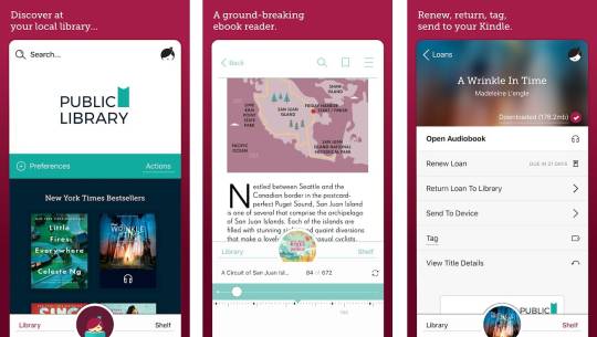
Another app that I think has good design is the app Libby, which is an app for borrowing ebooks from your library. I think that the type is very easy to read, which is great because it is an ereader app. I think that the navigation is also easy in terms of getting around the app and searching for your holds, your shelf, for new books in the library and everything else. I think that the layout of the app also makes everything very clear.
2 notes
·
View notes
Text
Homework: Final Project
Your final assignment is to design six high-definition wirefames for an iOS or android app. You are not creating an actual app, but a polished mock up or prototype of what that app would look like on a small screen. Your focus should be spent on the look of your screens more than the user experience or the actual content. That said, you are welcome to upload your files to something like InVision to create a working prototype.
This assignment will require several skills that you have picked up throughout this class: kerning and line spacing, type combinations, basic layout and alignment, and a custom typeface.
Here are some questions to get you started:
What is the purpose of this app?
Who will use it?
What do you need to communicate to your user?
What content needs to be on each page?
How will you establish hierarchy?
Here are Apple’s interface guidelines for iOS, which will be very useful for designing your app (especially Visual Design > Adaptivity and Layout:
https://developer.apple.com/design/human-interface-guidelines/ios/overview/themes/
And the somewhat more complicated Android guidelines:
https://developer.android.com/design/
You may use Illustrator or Indesign for your wireframes. If you'd rather use something like Adobe XD or Sketch just let me know know in advance. The final project will be submitted as a PDF via drive.
You can design your own app, or you can create designs for one of the following (fake) apps:
Unicorn Rainbow, game
Mutiny, game
Days and Weeks, calendar app
Paparazzi, photo app
Netwerk, social
Mews, cat news
Your own project
The deliverables of this project could be somewhat flexible, but I am firm on one issue: You may not use more than one image. This is a typography class, and I want to see type-based designs. (Geometric design elements like boxes, circles, triangles, and lines are fine.) This is another way of saying that you should probably start this project by thinking about a logo or an icon.
Here’s a deliverables checklist for the final project:
A custom logo or wordmark for your app. 1024 x 768 pixels. Possibly using your custom type.
Icon for your apps, one at 180 x 180 pixels and one at 1024 x 1024 pixels (app store), or one at 192 x 192 pixels (android).
Six high-definition wireframes.
A custom gif that could be used as a load screen or for marketing purpose, 480p, six seconds max.
At least one wireframe must include a chunk of type (maybe three paragraphs).
At least one wireframe must include a list.
Here are your deadlines:
THURSDAY, JANUARY 20:
A custom logo or wordmark for your app. 1024 x 768 pixels. Possibly using custom type.
Icon for your apps, one at 180 x 180 pixels and one at 1024 x 1024 pixels (app store), or one at 192 x 192 pixels (android).
Four high-definition wireframes.
At least one wireframe must include a chunk of type (maybe three paragraphs).
At least one wireframe must include a list.
FRIDAY, JANUARY 21:
A custom logo or wordmark for your app. 1024 x 768 pixels. Possibly using custom type.
Icon for your apps, one at 180 x 180 pixels and one at 1024 x 1024 pixels (app store), or one at 192 x 192 pixels (android).
Six total high-definition wireframes (including revisions on the previous four).
A custom gif that could be used as a load screen or for marketing purpose, 480p, six seconds max.
At least one wireframe must include a chunk of type (maybe three paragraphs).
At least one wireframe must include a list.
Here are two ways of elaborating on some of the fake apps suggested above:
Mutiny (i based the following screens on the games 2048 and threes)
1. game screen with icon and score. buttons for best score, menu, and leaderboard
2. menu screen with the following buttons: keep going, new game, multiplayer co-op, multiplayer vs, how to play, and rate.
3. how to play screen: swipe right to kill, swipe left to love, love your friends, vanquish your enemies.
4. high score screen: 56476, 44136, 35044, 27236, 15892
5. options screen: music, sound effects, colors, show status bar, main menu
6. special thanks screen: special thanks to those who went out of their way to support us: mom, dad, and jeff stark. voices by: Harold Lloyd, Douglas Fairbanks, Clara Bow, Theda Bara, Lillian Gish, Charlie Chaplin, Buster Keaton, and Greta Garbo.
7. about screen (adapted from wikipedia): Mutiny is a single-player puzzle game created in January 2022 by NYU developer xxx, in which the objective is love your friends and vanquish your enemies. It is a type of puzzle game, and is very similar to several other games, but better. XXX created the game in a single weekend as a test to see if she could program a game from scratch, and was surprised when his game received over 4 million visitors in less than a week, especially since it was just a weekend project. The game is free to play and makes the world better every time someone spends an afternoon mindlessly swiping, swiping, swiping. The game runs on open-source code and has led to many additions to the original game, including a score leaderboard and improved touchscreen playability. Spinoffs have been released, but none of them are as good as the original.
Paparazzi (i based this on hipstamatic, with a shout out to Lady Gaga)
1. Paparazzi App Icon
2 Launch File (can be animated)
3. Captioned photograph screen: Add caption. Sample caption: Sarcasm is the lowest form of wit, but the highest form of intelligence.
4. Edited screen: No edits. Photos you have edited with Paparazzi will appear here
5. Store screen: Featured: Retropak 9. With buttons for “featured,” “search,” “print lab,” and “my gear.”
6. Art School Film. Angular and moody. Popular back when photographers spent more time in the darkroom than the studio. Makes everything look more interesting.
7. about screen (adapted from wikipedia): Paparazzi is a digital photography application for the Apple iPhone and Windows Phone. It uses the phone’s camera to allow the user to shoot square photographs, to which it applies a number of software filters to make the images look as though they were taken with a vintage film camera. The user can choose among a number of effects which are presented in the application as simulated lenses, films and flashes. Several of these are included with the application, while others may be acquired through an in-app purchase. The application has sold four million copies as of January 2022. Paparazzi is part of a retro trend in photography, which has seen a rise in the popularity of cheap and technically obsolete analog cameras (such as Lomography and Polaroid instant cameras), as well as software filters and smartphone software that emulate such cameras. Other vintage photography applications include CameraBag and Instagram. Like Hipstamatic, they often include social networking features. Some phones include similar built-in filters.
0 notes
Text
Tutorial: Wireframes
This is what wireframes look like:
http://webdesign.tutsplus.com/articles/a-beginners-guide-to-wireframing--webdesign-7399
Illustrator for Webdesign
https://www.linkedin.com/learning/illustrator-for-web-design-1/wireframe-overview
More on wireframes:
https://www.rubbercheese.com/insights/why-wireframes-are-the-most-important-part-of-web-design/
And XD for Designers (section 5, creating a mobile prototype):
https://www.linkedin.com/learning/adobe-xd-for-designers-14366415/
0 notes
Text
Rosa Application Review
Yelp is an application that allows users to find and comment on the restaurants they like or don’t like. All the typefaces, with consistency, are readers friendly and easy for users to communicate with each other to find their favorite restaurants and services. The photos with high qualities can be viewed and zoomed out clearly, showing the way that the designer wants to provide users a better and more convenient experience.
Sephora provides the design of black and white that brings people a consistent view and highlights the main color of the whole store to give users a strong visual impact. The “new for you” is at the front when users open the application which attracts users' eyes to not only view the new products but also sense the desire of purchase. The pages of the application are clear and the two main colors form a contrast with the colorful makeup products that satisfy the preferences of people, especially young consumers.

0 notes
Text
Black Designers, Black Typographers
Black Designers: Missing in Action
Black Designers: Still Missing in Action
Fonts in Use: Designs by African Americans
Vocal Type
Typography as a Radical Act in an Industry Ever-dominated by White Men
Saki Mafundikwa: A Typophile’s Twenty-Year Adventures in Zimbabwe
0 notes


Text
Ranti - App Review
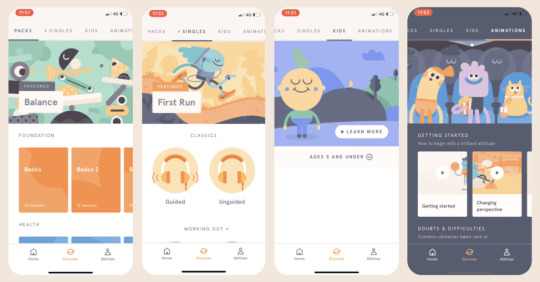
Headspace
The Headspace app is really well-designed and has a strong UX and UI. The colours used in the app are really inviting and friendly that both children and adults can use it. From a UX perspective they use gamification to keep people engaged with the app as they walk you through the basics of meditation and you work you way up to longer meditations.
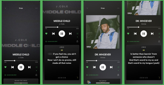
Spotify
Spotify’s UI is also really strong. It has a variety of features such as finding music and podcasts and looking at the lyrics of the songs you are listening to as well as being able to look at other peoples playlists and create your own. They have a strong contrast between type and background which is good for accessibility reasons. It makes the text easier to read. They don’t use a lot of colours in their app but are able to arrange the layout of their elements to make it really user-friendly.
0 notes
Photo

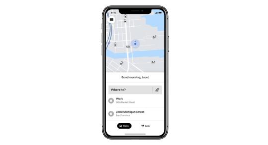
I wanted to compare two apps in this review: Uber and Lyft. These two apps are the most well-known rideshare/taxi on-demand applications. I would say that almost every person in New York City has one or the other downloaded. Ridesharing is a necessity in a city where the main means of transportation is walking or taking the subway. Calling an Uber or Lyft is simply more efficient, and worth the cost.
That being said, it is imperative that the user interface of these apps is accessible and easily understood. In essence, the two apps share the same function: Plugging in a destination, a driver is called to your location, and you are alerted when he/she has arrived. For this fact, these apps do their job well. They are free to download and easy to use. The only difference between the two seems to be their presentation to the consumer. Uber puts on an air of sleekness and chiqueness (not unlike Apple’s iconic branding). Uber Black and Uber Pool are examples how the company has tried to diversify and expand its capabilities while still maintaining its intuitive interface. On the other hand, Lyft attempts to be more colorful and vibrant in its portrayal, appealing not only to the user-friendly nature, but also the sort of democratization of transportation. Where Uber tries to maintain a certain exclusivity, Lyft portrays itself as “the other option,” open to everyone. They are both the same price though; after all, I’d argue that their differences are but a matter of branding.
0 notes