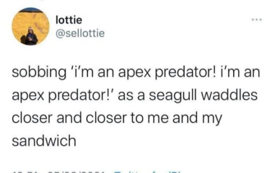
Text
it’s wild how the same complex task can have a completely different number of steps depending on the day.
for example making tea, it can be
boil water
brew tea
or it can be
open kettle
take kettle to tap
turn on tap
wait for kettle to fill right amount
put kettle back
put lid on kettle
boil kettle
get teabag container down
open container
tear off teabag
close container
put container back
get mug down
put teabag in mug
fetch kettle
pour water in
wait for tea to brew
open drawer
get teaspoon
take teabag out of tea
decide if teabag can be used again
put teabag in food bin/ get little plate, put teabag on plate
process dirty spoon
0 notes
Text
they changed the recipe of my toothpaste
0 notes
Text
Reminder that, at least as far as my personal observations go, most chronically ill people don't even know that they're chronically ill. Yes, including severely disabled ones.
3K notes
·
View notes
Text
If you support disabled people, please stand with us against Discord’s redesign.
...and do more than reblog this post about it.
Chronic migraines. Dyslexia. ADHD. Autism. Vision impairment. Visual sensory processing disorder. Colorblind. & Neurotypical. Abled.
These are aspects of people that are affected by Discord’s new update to its color scheme and font, and there very well could be more I didn’t mention. Yes, you read it right, abled people and neurotypical people too. You are not immune to eyestrain.
What are the issues?
A font which is both overly uniform and overly squished, with many letters that have essentially the same silhouette as others and could easily be flipped and look the same as another.
▻ This is dyslexic-unfriendly, as well as generally harder to read and an issue for people with visual impairments who may find that letters bleed together or that their eyes ‘skip’ over letters or words at times.
A color scheme that is so highly saturated that it both immediately draws your attention and also makes you want to immediately look away.
▻ This is generally unfriendly, affecting people with sensory issues the most (ADHD/Autism, migraines, processing disorders), but it’s also colorblind-unfriendly. Due to the differences between the colors being exclusively the part that changes the named color (hue; “green” vs “blue”) instead of both that and the colors being different intensities (saturation; “neon green” vs “leaf green”), they look practically identical.
Aren’t there more? No. This is pretty much all that was changed.
Discord changed TWO THINGS and pretty much managed to land every single person possible to genuinely hurt with a visual design change that doesn’t add or remove any elements. Including abled and neurotypical people!!!
Discord is currently a good number of people’s lifeline and way to connect with others. And with this change, they just made using their app hurt. They know that we can’t leave their app without leaving our friends and communities behind. They know that if they can just sweep this under the rug, they won’t have to do a thing.
...So we can’t let them.
Why would Discord do this?
It’s actually fairly simple. Discord was hemorrhaging money from its very conception. Discord only exists because investors think it’ll make money in the future. If Discord doesn’t do as well, investors will push to make it “better” or they’ll drop their funding. Discord was probably forced into this situation, they probably knew exactly what would happen.
We have to show their investors that Discord was right.
What can we do to fix this?
DON’T:
Reply to Discord’s tweet about the design change.
▻ It gives Discord more attention, and if any complaints are acknowledged they are directed to Discord’s accessibility forums.
ONLY post on Discord’s accessibility forums.
▻ It gives Discord stats to work with, but it also means the outcry isn’t public. We need everyone to see this, not just Discord.
DO:
Reblog this post.
▻ Spreads the awareness, and all.
Retweet, reply to, and/or like this tweet: https://twitter.com/KarklesMarx/status/1393223369571586053
▻ This tweet is part of our and our friends’ initiative to get this big and get this public.
Make your own posts about it on different social medias.
▻ Tumblr, Twitter, Discord servers, Instagram, Facebook, TikTok, whatever ground you have, use it. You can help make this change too.
Find other people doing the same thing.
▻ One initiative is never enough. Look for other people making posts like these and boost their posts too.
Wait, don’t you have pictures of what’s going on?
We do. They’re under the cut, to prevent causing issues for people reading the post.
This compilation post of the smaller problems:
https://support.discord.com/hc/en-us/community/posts/1500001066342-Fix-Your-Stuff-or-ALLOW-CUSTOM-CLIENTS-or-BOTH-
Images that show some of the changes:
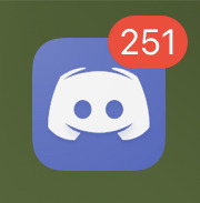
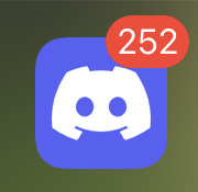
[Two screenshots of the Discord icon on an IOS device. One is a cool indigo gradient, the other is a solid, brightly saturated indigo.]

[The words “gaming central” twice in Discord’s new font. One is bold, the other is not.]

[The words “reddit fart reddit smell” in Discord’s new font. Underneath, the highly saturated indigo as seen in the icons, stretching across the screen to indicate new messages.]

[Discord’s old indigo, icon, and stylized font displayed above Discord’s new indigo, icon, and stylized font.]
30K notes
·
View notes
Text
If you support disabled people, please stand with us against Discord’s redesign.
...and do more than reblog this post about it.
Chronic migraines. Dyslexia. ADHD. Autism. Vision impairment. Visual sensory processing disorder. Colorblind. & Neurotypical. Abled.
These are aspects of people that are affected by Discord’s new update to its color scheme and font, and there very well could be more I didn’t mention. Yes, you read it right, abled people and neurotypical people too. You are not immune to eyestrain.
What are the issues?
A font which is both overly uniform and overly squished, with many letters that have essentially the same silhouette as others and could easily be flipped and look the same as another.
▻ This is dyslexic-unfriendly, as well as generally harder to read and an issue for people with visual impairments who may find that letters bleed together or that their eyes ‘skip’ over letters or words at times.
A color scheme that is so highly saturated that it both immediately draws your attention and also makes you want to immediately look away.
▻ This is generally unfriendly, affecting people with sensory issues the most (ADHD/Autism, migraines, processing disorders), but it’s also colorblind-unfriendly. Due to the differences between the colors being exclusively the part that changes the named color (hue; “green” vs “blue”) instead of both that and the colors being different intensities (saturation; “neon green” vs “leaf green”), they look practically identical.
Aren’t there more? No. This is pretty much all that was changed.
Discord changed TWO THINGS and pretty much managed to land every single person possible to genuinely hurt with a visual design change that doesn’t add or remove any elements. Including abled and neurotypical people!!!
Discord is currently a good number of people’s lifeline and way to connect with others. And with this change, they just made using their app hurt. They know that we can’t leave their app without leaving our friends and communities behind. They know that if they can just sweep this under the rug, they won’t have to do a thing.
...So we can’t let them.
Why would Discord do this?
It’s actually fairly simple. Discord was hemorrhaging money from its very conception. Discord only exists because investors think it’ll make money in the future. If Discord doesn’t do as well, investors will push to make it “better” or they’ll drop their funding. Discord was probably forced into this situation, they probably knew exactly what would happen.
We have to show their investors that Discord was right.
What can we do to fix this?
DON’T:
Reply to Discord’s tweet about the design change.
▻ It gives Discord more attention, and if any complaints are acknowledged they are directed to Discord’s accessibility forums.
ONLY post on Discord’s accessibility forums.
▻ It gives Discord stats to work with, but it also means the outcry isn’t public. We need everyone to see this, not just Discord.
DO:
Reblog this post.
▻ Spreads the awareness, and all.
Retweet, reply to, and/or like this tweet: https://twitter.com/KarklesMarx/status/1393223369571586053
▻ This tweet is part of our and our friends’ initiative to get this big and get this public.
Make your own posts about it on different social medias.
▻ Tumblr, Twitter, Discord servers, Instagram, Facebook, TikTok, whatever ground you have, use it. You can help make this change too.
Find other people doing the same thing.
▻ One initiative is never enough. Look for other people making posts like these and boost their posts too.
Wait, don’t you have pictures of what’s going on?
We do. They’re under the cut, to prevent causing issues for people reading the post.
This compilation post of the smaller problems:
https://support.discord.com/hc/en-us/community/posts/1500001066342-Fix-Your-Stuff-or-ALLOW-CUSTOM-CLIENTS-or-BOTH-
Images that show some of the changes:


[Two screenshots of the Discord icon on an IOS device. One is a cool indigo gradient, the other is a solid, brightly saturated indigo.]

[The words “gaming central” twice in Discord’s new font. One is bold, the other is not.]

[The words “reddit fart reddit smell” in Discord’s new font. Underneath, the highly saturated indigo as seen in the icons, stretching across the screen to indicate new messages.]

[Discord’s old indigo, icon, and stylized font displayed above Discord’s new indigo, icon, and stylized font.]
30K notes
·
View notes
Photo


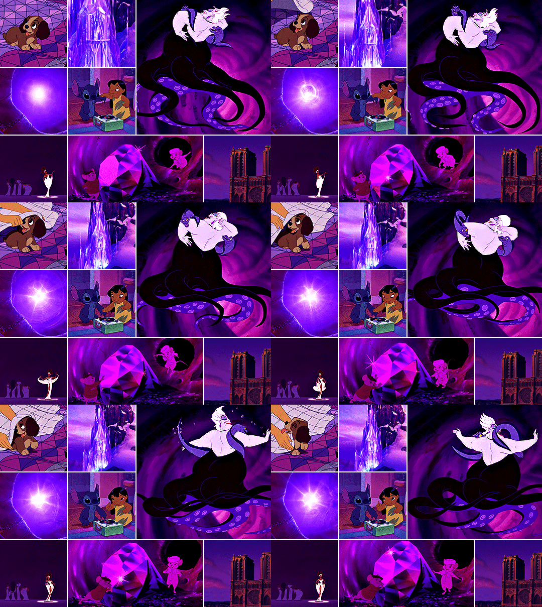
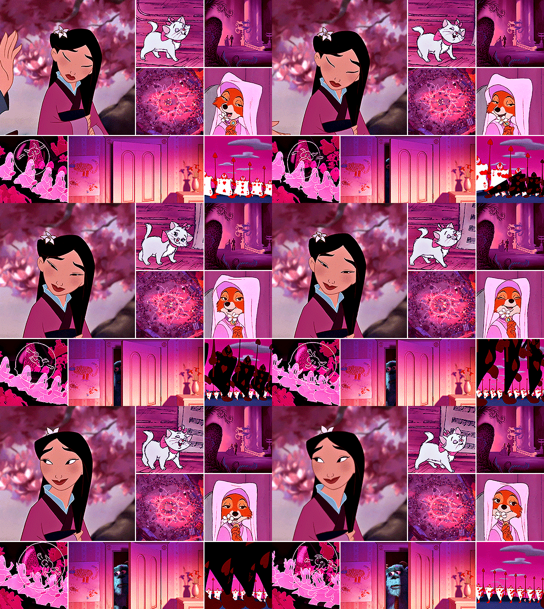

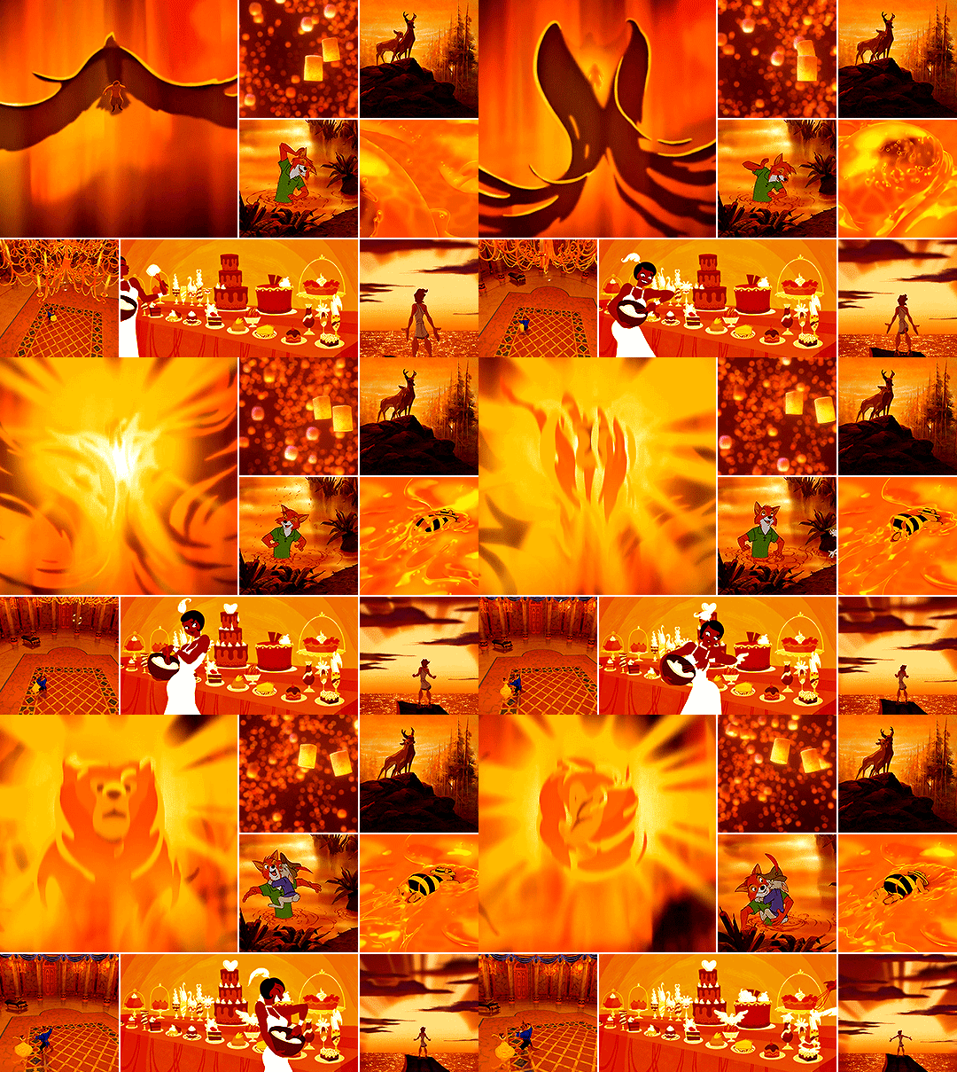

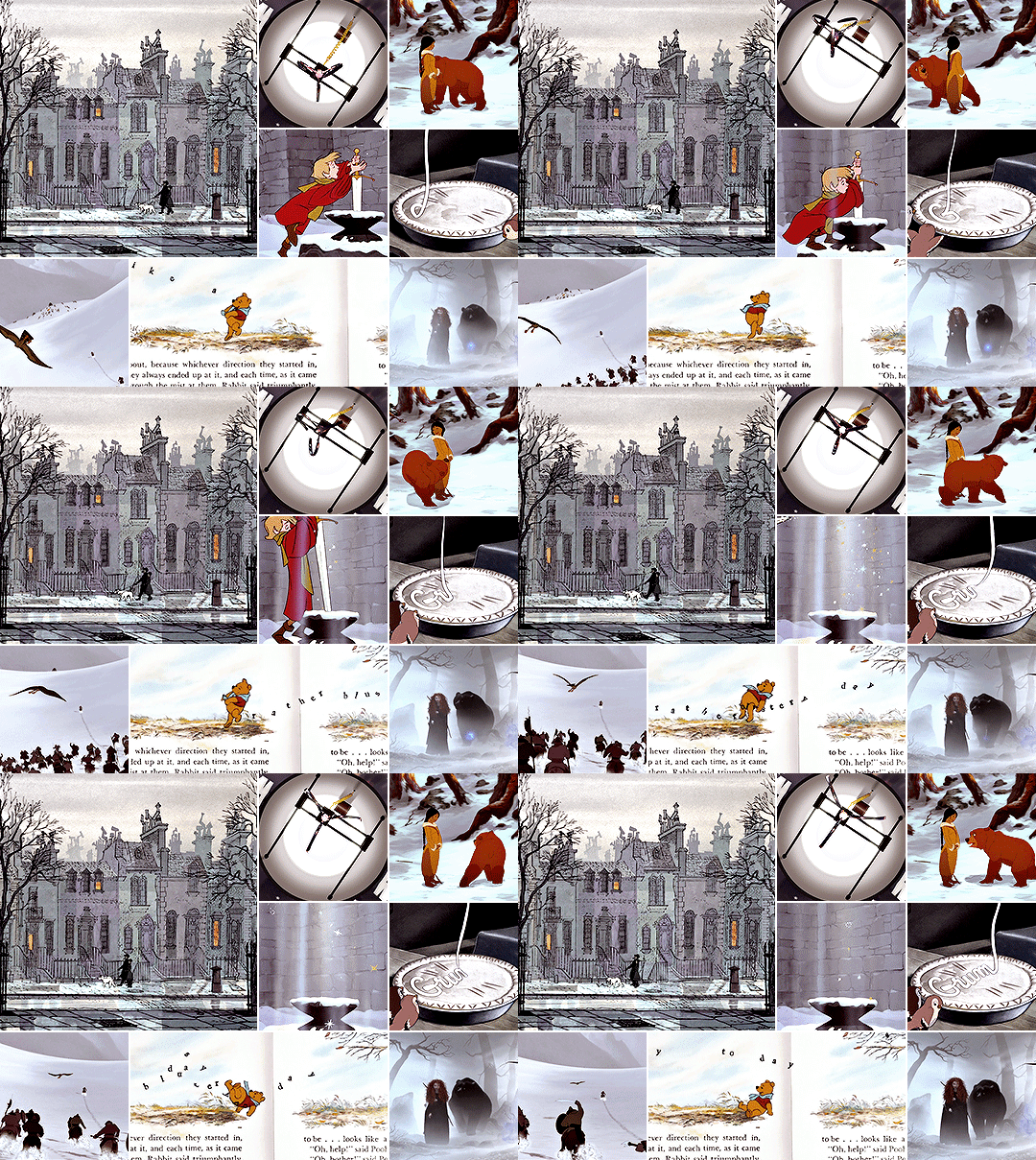
Now, think of the happiest things. It’s the same as having wings.
DISNEY + RAINBOW COLOURS
[ studio ghibli version ]
45K notes
·
View notes
Text
diversity win! the ghosts trying to drive you out of the old house you inherited are queer!
317 notes
·
View notes
Text
actually the main difference between tumblr and twitter is how people deal with their posts getting unexpectedly popular. if a post blows up on tumblr you delete it and stick a note on your blog saying “if you’re here about That Post please know that i will shoot you in the kneecaps without hesitation.“ a post blows up on twitter and suddenly you’re doing an acceptance speech at the oscars
60K notes
·
View notes
Text
it’s been like ten years and im still so devoted to the weird little angel from the unwatchably bad tv show. why, u ask? it’s simple: there are a lot of shots of him in frame alone, looking up
2K notes
·
View notes
Video
Me practicing this housewife thing for when I drop out of uni
159K notes
·
View notes
Photo
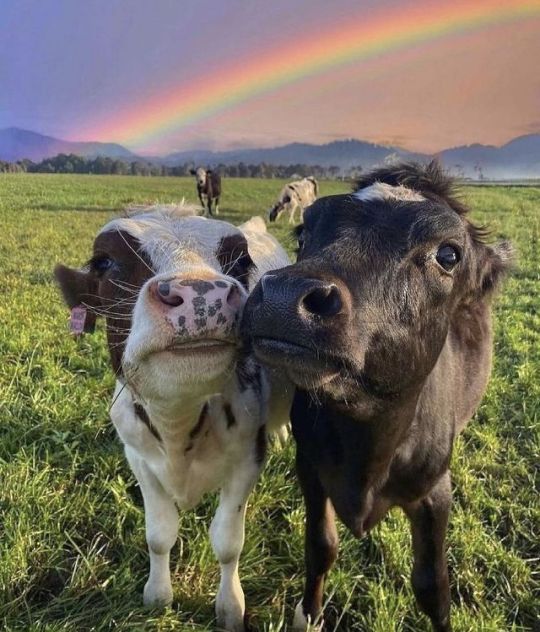

Happiness is a mental disposition and predisposition, cheer up and you will see the results.
3K notes
·
View notes
Text
a series of minor catastrophes after one another
4 notes
·
View notes
