Text
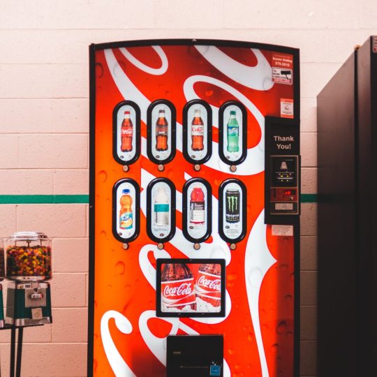
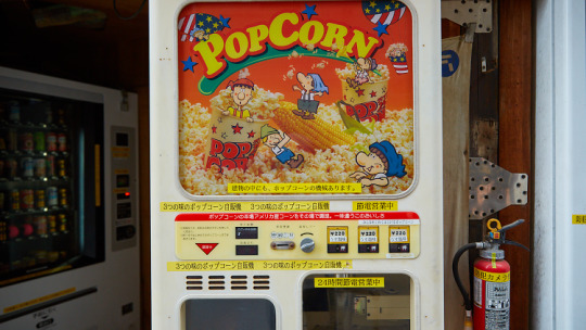
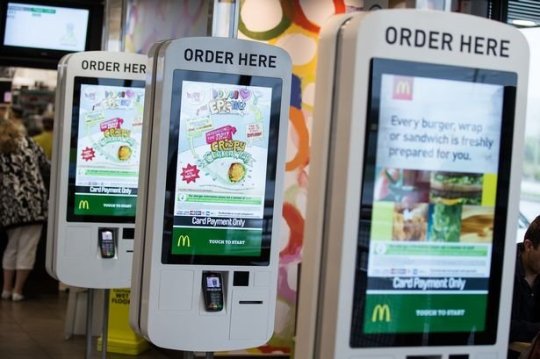
coke put their logo on their vending machines to make it noticeable and also to make them think of coke and buy a coke bottle instead of anything else, it is the secret way of selling products more.
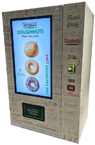
everyone loves a krispy kreme donut, so making this vending machine is a good idea for making it faster and easier to run. the branding on the vending machine is the same as the coca cola vending machine as it makes it more visible.
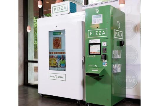
NOT DONE
0 notes
Text
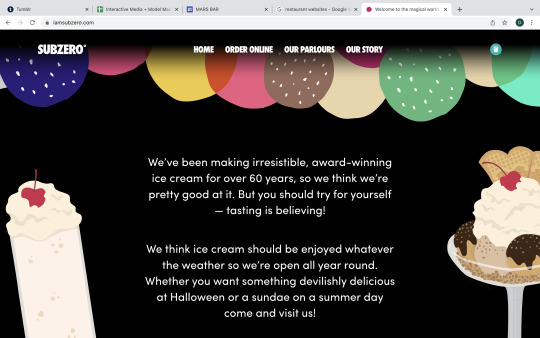
sub zero ice creams website has really nice art as dividers as they use lots of balls of ice cream. i really like how they did this as a them, if i was them then i would make a more detailed background instead of the colour black.
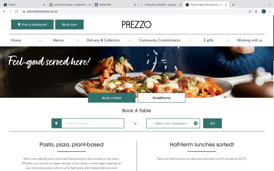
prezzo is an italian restaurant and they have a very simple sharp look to their website. there is not much they can do for the website which is why they made it look plain.
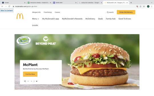
mcdonalds uses bright colourful pictures and sections to make theirs stand out, it suits the fast food style.
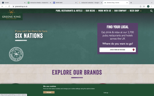
the green king uses the colour green as their main theme... fitting. i like the rough texture in the font that they use. i like this website the most as it is full of patterns and detail.
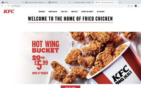
same as mcdonalds, kfc has simple fast food look but the difference between the two is that kfc uses bold fonts and mcdonalds uses thin letters.
0 notes
Text
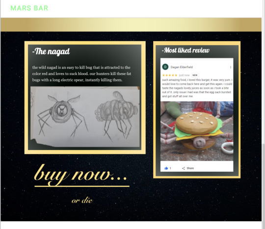
i decided to update my website page by making the bottom section of the page look more posh and rich as it has gold sections and fancy writing. i really like this style and im very happy that i updated it.
0 notes
Text
this is 50 logo animations, these are mostly 2d which is not what i want, i want to make something more different
youtube
0 notes
Text

these two animations are very simple and clean but i do not like this, my food is a disgusting food that i dont want to look tasty, so i want to go for the realistic 3d approach as it make it look gross.

0 notes
Text
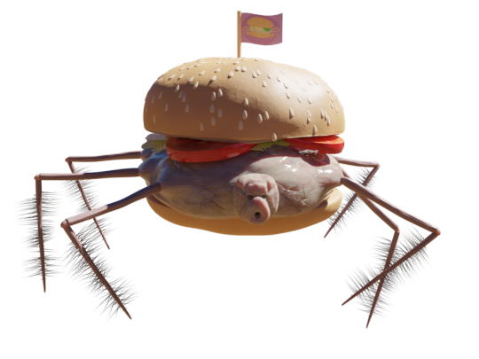
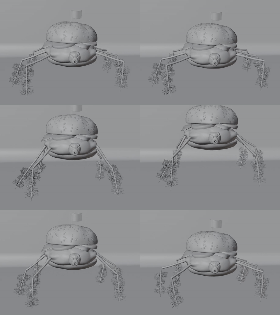
for my animation i wanted to do it in 3d so that it gives it a realistic not cartoony feel. i started by making my bug and making it squished like he has been put into a bun a squished down to fit. i then gave im ugly veiny slimy textures to make it as gross as possible. the buns where very simple as they was just a rough texture with slight cracks and sesame seeds. the lettuce and tomatoes where easy as they are just image textures projected onto an object.
i made the legs while adding a ik rigging system to each leg so that it is easy to animate. i made the body move up and down and then moved each leg to look like it is springing into the air.
0 notes
Text
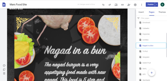
for my website i wanted to have the classic look with the birds eye look onto some ingredients and the food. i made this in blender by making the bug thicker making it more alive. i then scattered the ingredients that are in the burger and put them all over the place. in photoshop i made the text that is on the ground and added scratches. if i did this again i would add some more ingredients and other parts to fill the scene more.
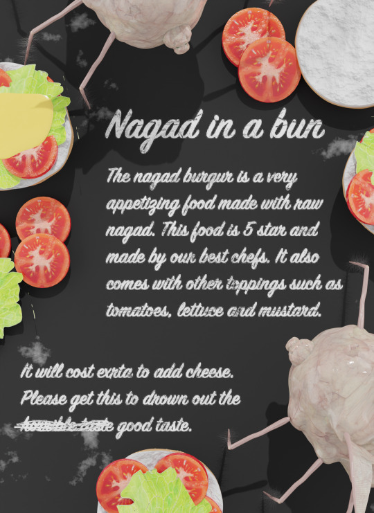
after i rendered the image i needed to make it a lot more vibrant as it looked boring, i also needed to fix the shading and textures of some things. i started by removing the small glitches that where made by the texture. and then getting a picture of the insides of bread, i masked it to fit the bun in the top right, and i turned the opacity down. i then copied the shading of a tomato to the tomato that had a flat look, i did this by using the clone tool. i used burn to add shading around the bugs as they looked flat and didn't blend.
the mustard on the left looked plain with no texture at all. i wanted to give it some bumps and shade. so i got a picture of mustard and just put it over the top of the mustard i made, i then masked it to fit the space i needed it to fit and then turned the opacity down.
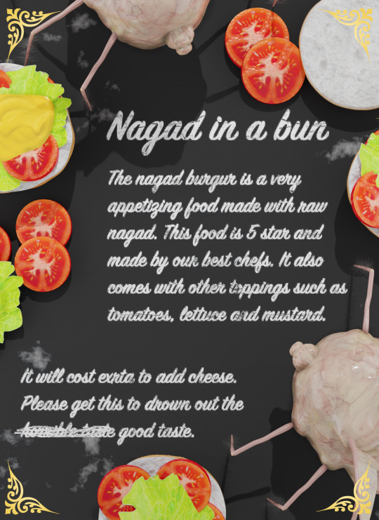
all i had to do after all that was make it more vibrant and add golden designs in the corners.
when i uploaded it to the website i had trouble fitting it into their without losing any detail so i decided to place it as an image and make it as big as possible and adding a dark plain background.
I wanted to add a fake review for the food and make a small description on what a nagad is. so i tried to find an easy place to make a fake review and decided to do it on google maps as it was the easiest food. i made the review for asda but added an image for my burger. i then took a screenshot of the review and then deleted it.
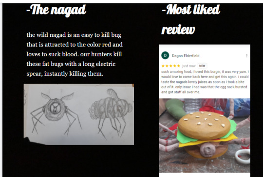
all i needed to do after that is make the description of the nagad which i then put my drawings on there too.
0 notes
Text
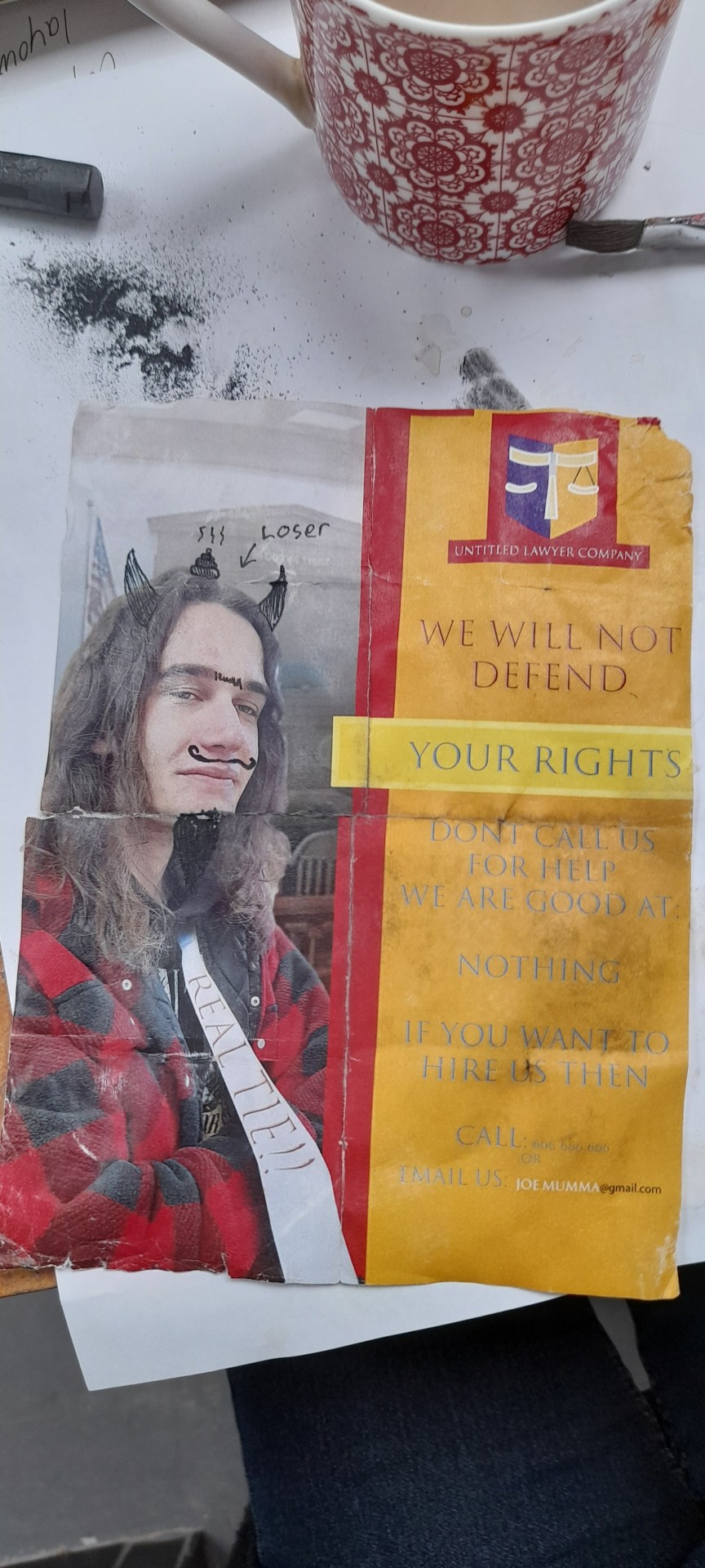
I needed to age the advert that I had made. I started by folding the advert which gave it creases. I used sand paper to roughen up the crease lines and give it little cuts. I crumpled bits of it and gave it some tears into the corners.
I used coffee to add an older look to it but I feel like it hardly did anything. But then I added graphite which completed the look.
I had a problem with the paper being too wet so it ripped a bit, so I added tape which made it way better while also keeping it together.
0 notes
Text
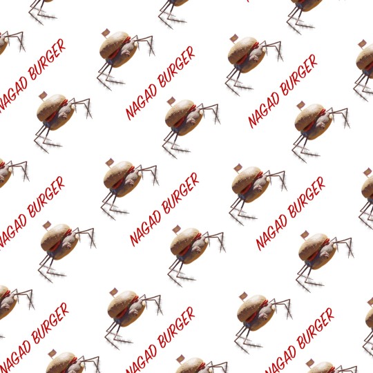
This is the wrapping paper design I have gone for. For my design I decided to have my bug that I made in blender and then add the name of the burger repeating underneath.
It's very simple but I think it gives a classic fast food look to it.
0 notes
Photo
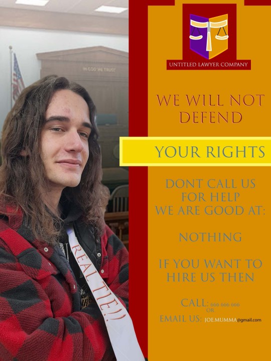
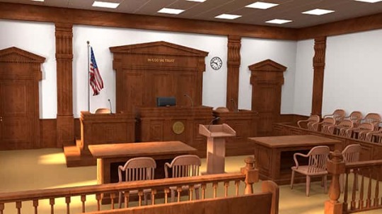
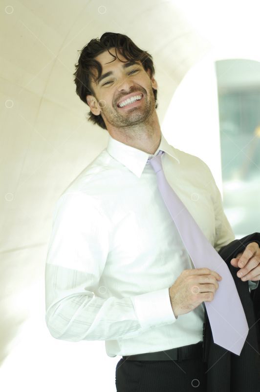
for this advert that I needed to make to stick onto the stall front, I wanted to have my friend Liam to be the lawyer and then make the advert saying how bad he is at being a lawyer.
I made the logo to the company in illustrator then I made a box for the description of the company. on the left I put the picture of Liam in and cut the background out. I then added a background which was a courthouse.
I wanted to make it more funny by photoshopping in a tie onto Liam, I needed to fund a good picture that has the correct angle. I found a stock image but the only problem was the hand was on the tie. I used the patch tool to get rid of the hand and place it on Liam. I added shading and then warped a text that said “real tie!!”
0 notes
Text
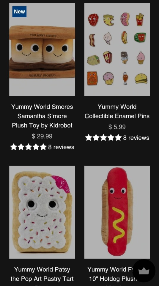
This website is perfect for the designs that everyone is doing. They all have eyes to make them cute and they all are really good looking plushies. This website does not help me in any way tho as I am going for creepy and disgusting not cute and friendly. So this website is useless to me.
0 notes
Text
Hr giger is an artist that made a lot of different science fiction scary alienated designs of weird creatures. His designs are scary looking and cool.
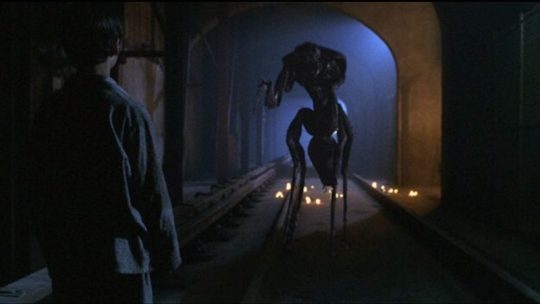
This alien design is very heavily influenced by bugs, it gives it a very scary look as giant bugs would be horrible and disgusting so making an alien out of it is the perfect design.
0 notes
Text
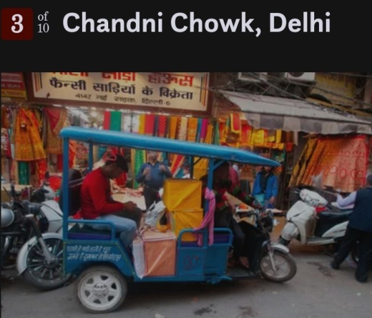
This market in Delhi shows us how colourful they can be as they have so many different products and types that it fills each stall with colour. There is a fabric stall in the image, this can suggest the variation of products as it doesn't have to be food and it can be art supplies too.
0 notes
Text
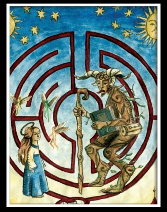
This is a design for pans labyrinth. It shows the princess and one on the creatures. This is the mythology of the labyrinth.
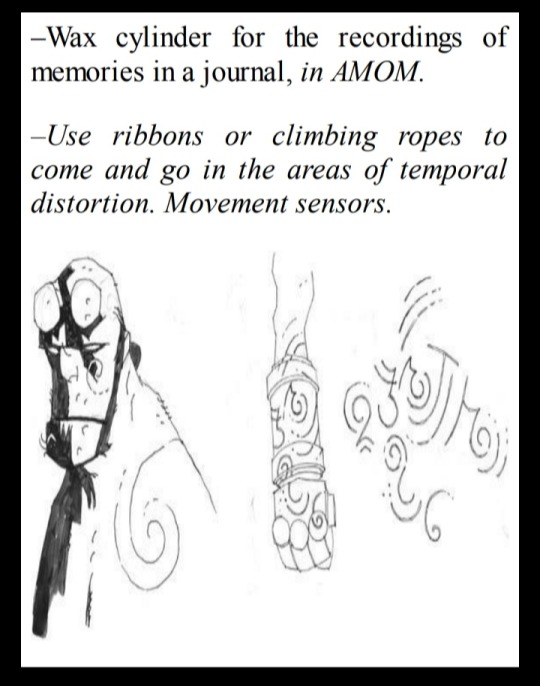
This is for hellboys design, its how they do the spirals and weird patterns on his skin and gloves. They made little spirals and then applied them to the character and arm.
0 notes
Text
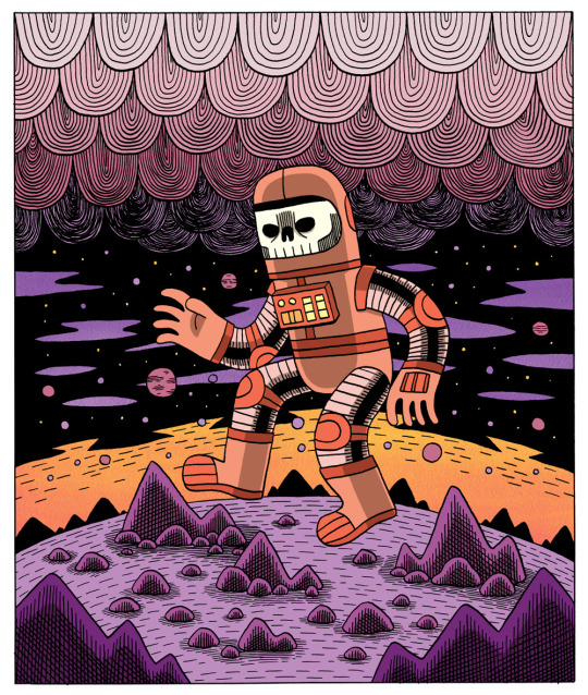
Jack teagle does these space designs that look really cool and show an alien planet. His style also would look good as logos or other bits and pieces for the foods.
0 notes
Text
In hellboy there is a part if the film where the characters go to a market area with a bunch of different monsters.
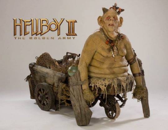
This is a monster called the legless goblin blacksmith. This character is fun concept and I really like the disgusting looking face. I like that it's way of getting around is also like a backpack and storage.
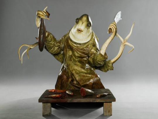
This is the fish seller, I like that they made this character look like the food he is selling. It makes it feel like murder everytimr he cuts a fish open.
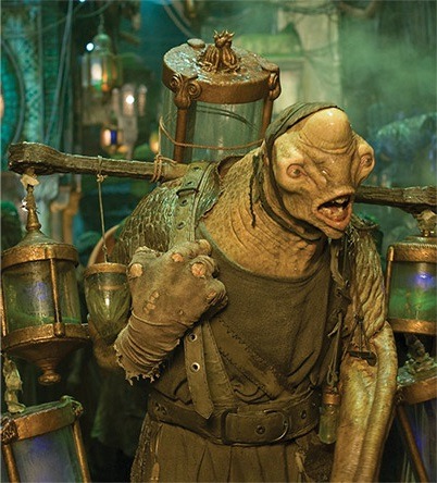
I like that they made this monster look really strong to show that he carries around things on his shoulders. They also made him look really stupid looking like he gets told what to do and he is just a strong slave
0 notes
