
Last Seen Blogs

bloglizziekamiya
Demon Pineapple

dicequisitor
Dicequisitor

theinsomniacindian
Stars Shining On Still Waters

sarahhippieangel918
FortitudeFit

anime-judge
Anime World
Photo


Project 3
Static Digital Mockups
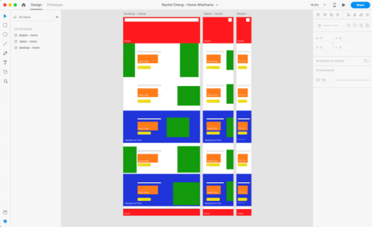
Pictured here are examples of the static digital mockups created for the home page and a project page of my portfolio. I created a desktop, tablet and mobile version for each page to help when figuring out the break points needed to make the webpage responsive.
1 note
·
View note


Text
Project 3 - Responsive Portfolio
Web Design
For the final project in Web Design, we were tasked with creating a responsive portfolio. This portfolio was to house several projects that we had already created so a necessary part of the project was to collect assets from previous projects and either update them or take pictures of them. The projects that I decided to include are Solar System Memory, a Type Spec Book, a Type Grid Poster and Irish Insiders from the Observer.
1. Research
We started this project by researching design portfolios. I looked at a variety of different sources to get an understanding of what a “good” portfolio and an unsuccessful portfolio looks like. From my favorite portfolio’s, I tried to draw upon elements that were used such as parallax scrolling, grids, and an emphasis on photos.
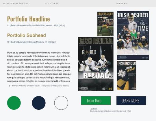
2. Style Tiles
For this project, I created style tiles after researching portfolio’s and collecting my assets so that I could figure out what I wanted my own portfolio to look like. I made 4 different style tiles all very different and ended up drawing from all of them to create my portfolio.
3. Example Wireframes & Project Wireframes
I created wireframes in Adobe XD modeled after three of the best portfolio’s that I found when doing research. This allowed me to find where the breakpoints for the website were and to understand the overall make up of the website. After creating example wireframes, I created wireframes for how I felt I wanted my own portfolio to look.
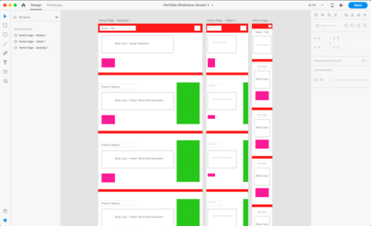
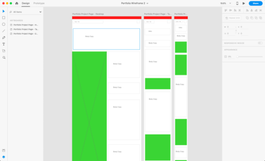
4. Static Digital Mockup
Static Digital Mockups were created before diving into the HTML and CSS to create a basic framework of our portfolio. In the Static Digital Mockup, I decided where I wanted to put headers, body copy and photos so that it would be easier to code.
5. Interactive Wireframes
An interactive coded wireframe was created as the frame for the final portfolio. In it, I blocked out spaces with colors and boxes to figure out spacing and the overall layout.
1 note
·
View note


Photo


Project 2
Pictured are six different ideas that I originally had for this project. I chose to continue working with the Solar System Memory idea.
1 note
·
View note
Text
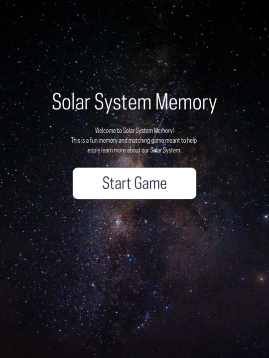
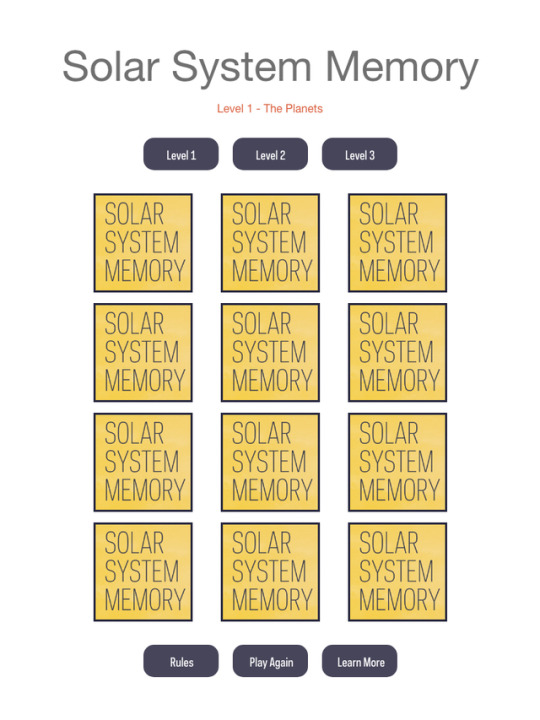
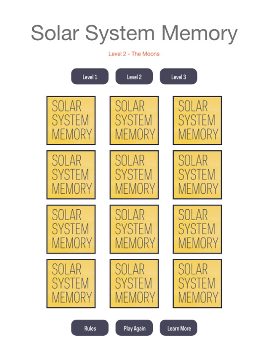
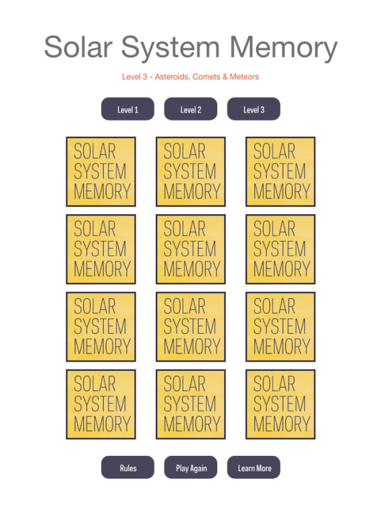
Project 2 - Interactive Game/Learning Tool
Web Design | Solar System Memory
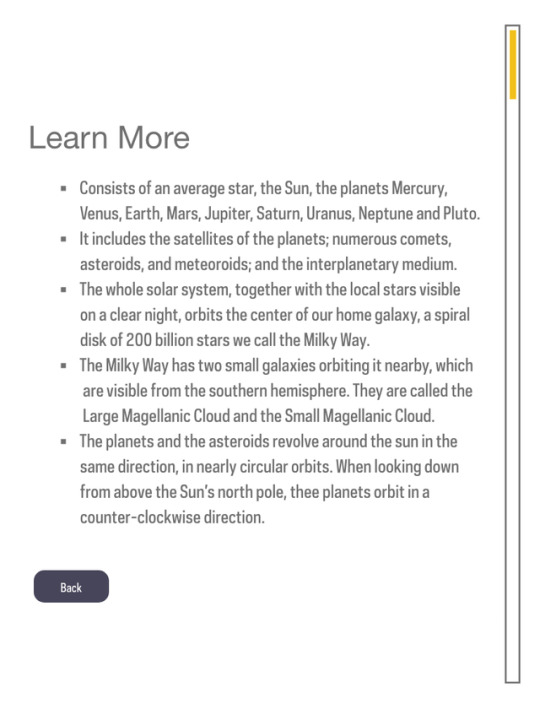
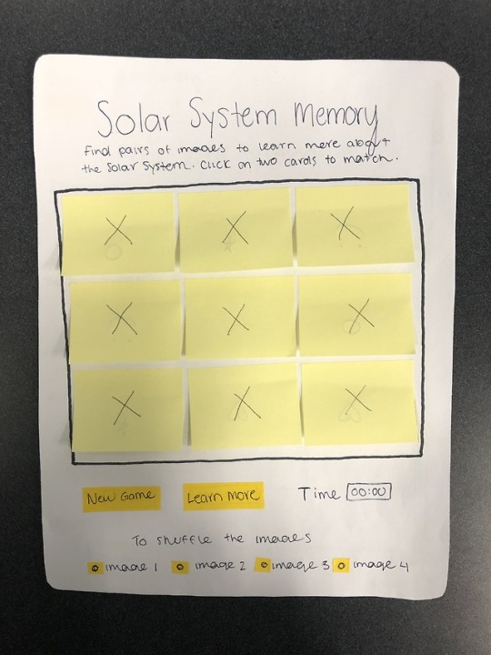
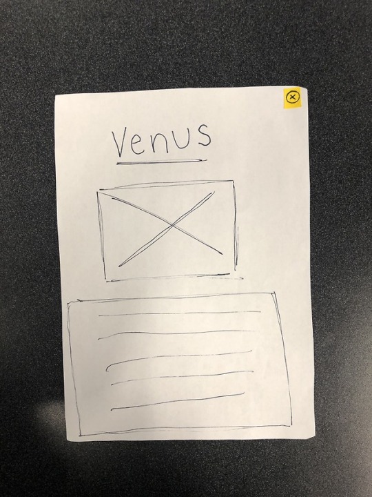
For this project, I chose to create a memory/matching game based on the different components of the Solar System. There are three “levels” to the game. The first is Planets the second is Moons and the last level is on Asteroids, Comets and Meteors.
1. Sketches
The sketches for this project explore multiple ideas I had for different games. After deciding to do Solar System Memory, I focused my sketches on what the layout of the game would look like.
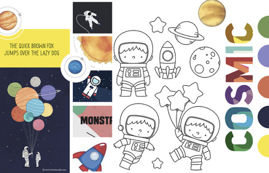
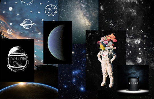
2. Mood Boards
I have created two different mood boards for this project. Since the game that I wanted to create was aimed toward younger children, the first mood board has bright colors and cartoon style illustrations. The second mood board is a mix of things that reminded me of space and the solar system and different illustrative styles. Together, these mood boards helped me create the aesthetic that I wanted for Solar System Memory.
3. User Testing Notes and Videos
Making a paper prototype and testing it on different individuals allowed me to see the issues I had in my interface as well as things that were working really well.
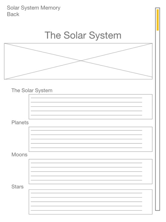
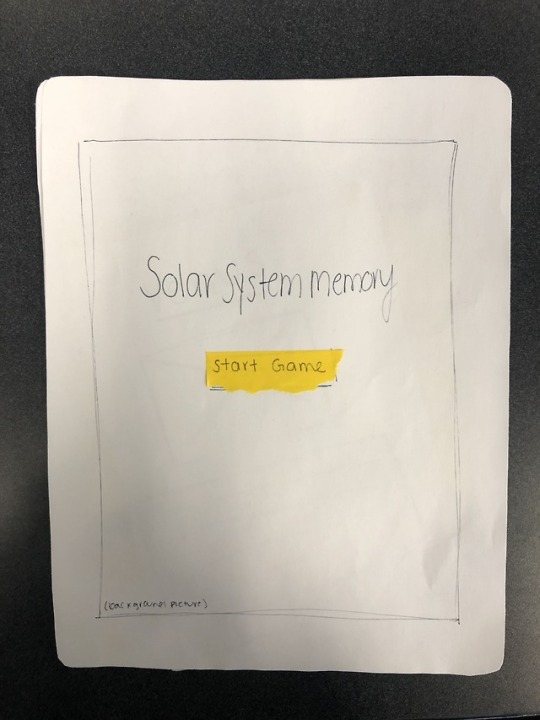
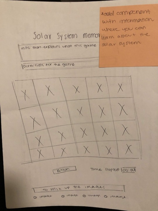
4. Static Digital Wireframes
Included here are two different versions of static digital wireframes that were created to help me figure out exactly how I wanted my game to look. The first version was primarily to get a rough outline and set of dimensions so that I could start to code and the outline of the first version was used to create the second version. The second version is more similar to the final product that I produced.
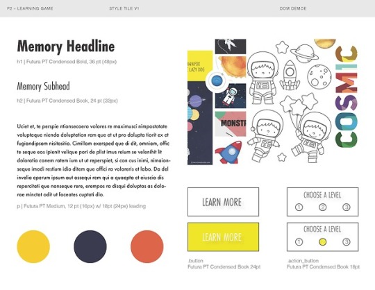
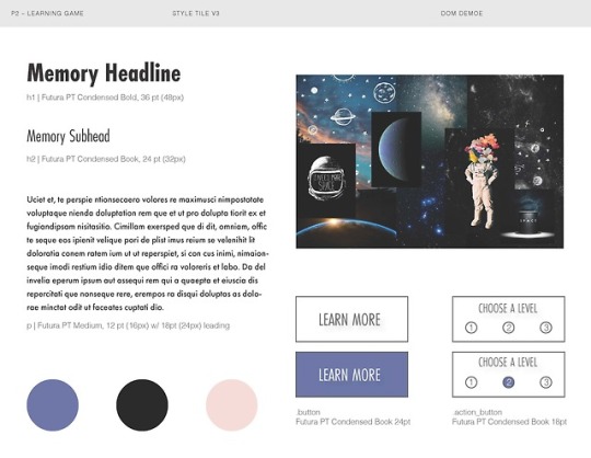
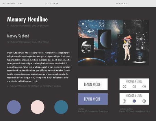
5. Style Tiles
I created style tiles to figure out what fonts, colors and interface elements that I wanted to use in my final product. I created the style tiles after the first static digital wireframe and before the second. The style tiles helped me to communicate what I wanted the overall visual to look like.
1 note
·
View note


Text
Project 1 - Letterform
Web Design | Futura PT Condensed Medium | Adobe Fonts
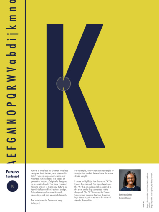
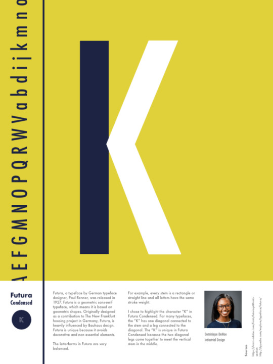
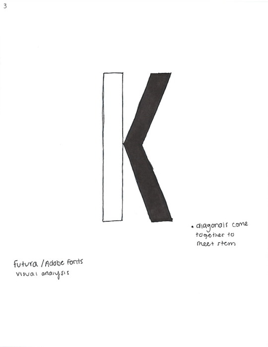
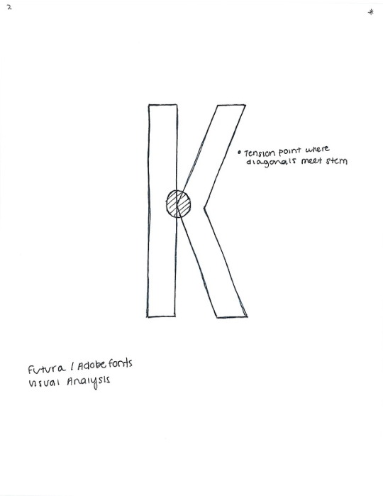
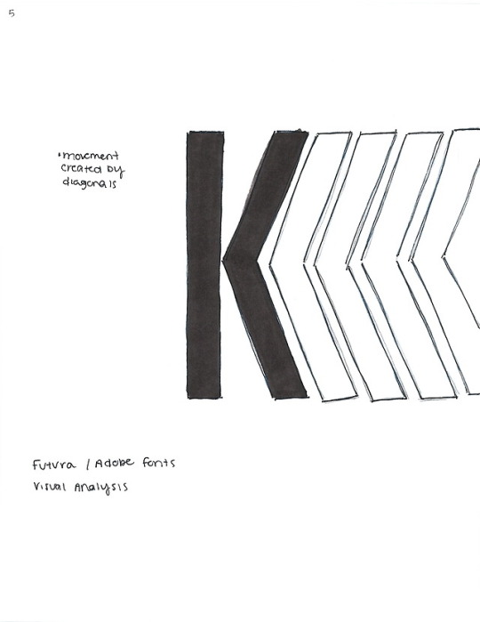
For this project, I chose to explore the typeface Futura PT Condensed and the character “K”. I chose the character “K” in Futura PT Condensed specifically because of the tension point created when the two diagonal legs meet the stem.
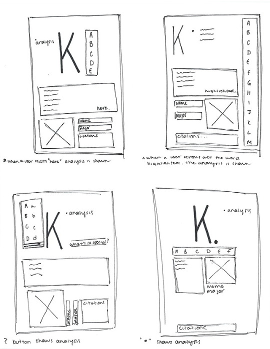
1. Sketches
My sketches are an exploration of the character “K” and different ways to express the interesting aspects of it.
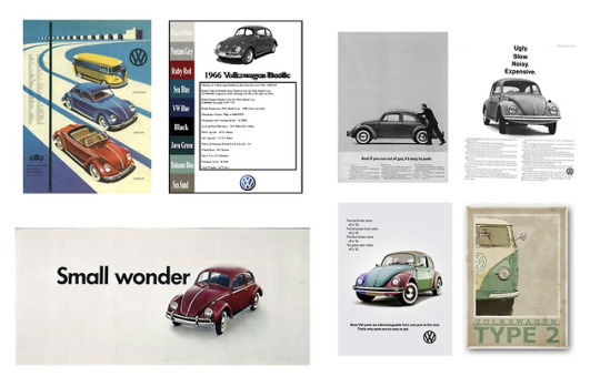
2. Mood Boards
Futura has been used in many ways since its creation. The most notable way are the early Volkswagen advertisements for the VW Beetle.
3. Static Digital Layouts
The advertisements for the VW Beetle inspired the layout and overall design of my project.
Documentation
Paragraph
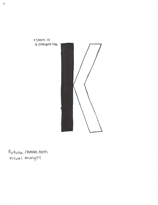
Futura, a typeface by German typeface designer, Paul Renner, was released in 1927. It is a geometric sans-serif typeface and it was designed as a contribution to the New Frankfurt housing project. The typeface, Futura, is based on geometric shapes, and is heavily influenced by the Bauhaus design style that was popular of the time. Futura is unique because it avoids decorative and non essential elements. The letterforms are very balanced, for example, every stem is a rectangle or straight line and all letters have the same stroke weight.
I chose to highlight the character “K” in Futura. For many typefaces, the “K” has one diagonal connected to the stem and a leg connected to that diagonal. The “K” is unique in Futura because the two diagonals come together to meet the vertical stem in the center.
Research
Adobe Fonts // Futura PT Book
Character
K
Designer
Paul Renner
History
Futura is a geometric sans-serif typeface designed by Paul Renner and released in 1927. It was designed as a contribution on the New Frankfurt-project (public housing in Germany). It is based on geometric shapes, especially the circle, similar in spirit to the Bauhaus design style of the period.
Renner was not associated with the Bauhaus but he shared many of its idioms and believed that a modern typeface should express modern models, rather than be a revival of a previous design. Renner’s design rejected the approach of most previous sans-serif designs (now often called grotesques) which were based on the models of sign painting, condensed lettering and nineteenth-century serif typefaces, in favour of simple geometric forms: near-perfect circles, triangles and squares. It is based on strokes of near-even weight, which are low in contrast. The lowercase has tall ascenders, which rise above the cap line, and uses nearly-circular, single story forms for the “a” and “g”, the former previously more common in handwriting than in printed text.
Futura was extensively marketed by Bauer and its American distribution ar by brochure as capturing the spirit of modernity, using the German slogan “gie Schrift unserer Zeit” (“the typeface of our time”) and in English “the typeface of today and tomorrow”.
Futura has a low x-height, reducing its stridency and increasing its suitability for body text.
The design of Futura avoids the decorative, eliminating nonessential elements, but makes subtle departures from pure geometric designs that allow the letterforms to seem balanced. This is visible in the apparently almost perfectly round stroke of the o, which is nonetheless slightly ovoid, and in how the circular strokes of letters like b gently thin as they merge with the verticals.
What makes the “k” unique?
Diagonal strokes
Usage
Ikea
Supreme
Volkswagen
Crayola
Sources
https://fonts.adobe.com/fonts/futura-pt#fonts-section
https://en.wikipedia.org/wiki/Futura_(typeface)
https://www.behance.net/gallery/5837639/Futura-Font-Study
https://www.sessions.edu/notes-on-design/type-in-history-futura/
http://typedia.com/explore/typeface/futura/
https://typography01futura.wordpress.com/2014/10/11/characteristic-of-futura-font/
https://www.behance.net/gallery/5837639/Font-Study-FUTURA
2 notes
·
View notes