
Last Seen Blogs


Text
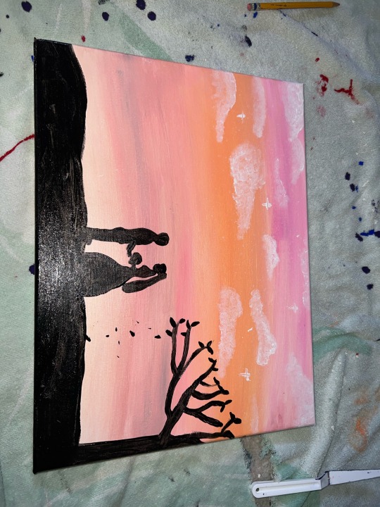

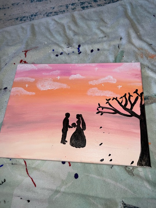
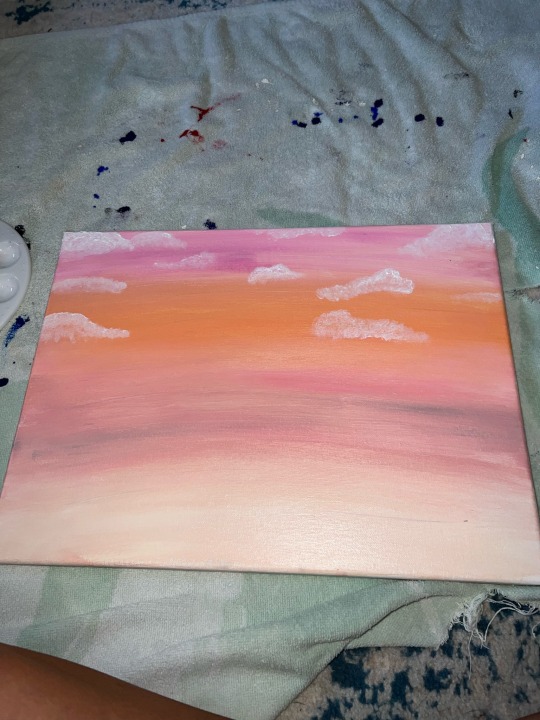
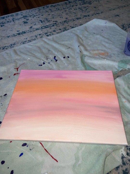
The title of my piece is just married. My sister is getting married next week so I used her marriage as inspiration for this art project and also a gift for her. A simple painting with acrylic paint and cheap paint brushes.
0 notes
Text
virtual sketchbook 4 PT.1
WRITING, THINKING AND LOOKING CRITICALLY – Jackson Pollock moved out of New York to escape his drinking habits and old lifestyle. He was a simple guy with an expressive mind. He wore denim and smoked cigarettes like most common people would. It was when he moved that he stopped using abstract imagery in his painting and started making his famous drip paintings. He used the drip paintings as a way to express his feelings rather then illustrate them. He took all technique out of painting to express his feelings on a canvas. He would use foreign objects like sticks or glass rather then a paint brush in his paintings and he would paint on the floor rather then an easel. This was his way of expression through the world itself rather then illustrating the world.
0 notes
Text
Virtual Sketchbook 3

WRITING AND LOOKING – our senses emotions and memory will come together with knowledge.
How will you communicate with WORDS what you SEE and FEEL?
DESCRIBE PHYSICAL QUALITIES (THE FACTS)
What is it made of?- colored lithographed cards
How big is it?- 4.1" x 2.8"
(Include details as if you were using words to help a blind person “see” it.)
What colors and shapes are used?
There are a numerous amount of colors and shapes used in this image. There are two girls in green leotard swinging upside down. from a trapeze. They are holding a brown wand which one girl is holding out and passing it to the other. The background is full of green walls that hold cells in them where people are sitting in and watching the trapeze girls for entertainment. Below the swinging girls is a flower pot equal in dimension of the girls. The flowers are pink and orange with green leaves coming off of them. In the left corner of the picture is a tan colored image of a girl and what could be the trademark of the trapeze girls.
What subjects (if any) are represented? The subject of a circus is represented by the trapeze girls.
How was the work designed? The work was designed as a trade card type of picture very similar to baseball trade cards.
Is it balanced? In my definition the picture is not balanced because of the size difference of the flowers and the trapeze girls. The flowers are about the same size as the girls and are placed right next to them.
What is emphasized? Rhythm? Proportion? Rhythm is emphasized as well as proportion.
Contrast? Does it have unity and variety? There is color contrast between the green, red and orange. The image has a wide range of variety from the background to the trademark girl symbol.
THIS PART IS ALL ABOUT YOU:
How does the work make you feel?
The work gives me a feeling of fun and entertainment but it also makes me think that if people were using this picture as a trade card then it is weird that the girls are not named or why isn't the audience applauding. It shows talented girls and how people used to get their entertainment in this era.
How or why does it evoke these feelings? These feelings are evoked from the illustration of the image. The trapeze girls make me feel like i am watching a real live circus just in a still picture.
NOW RESEARCH:
THINKING:
What movement is the art work associated with? color lithography movement in the 1800s. This was commissioned by the Liebig Company, earlier printers and traveling salesmen routinely produced and circulated stock cards.
What does the artwork say about the artist that made it? The art says the artist either loved the circus, especially the trapeze, or the promoter of the circus wanted spread word about it in an illustrative way.
Can you tell what the artist was trying to say? - these were used as coupon but i am not sure exactly wha the artist was trying to say.
THE LAST (most important) PART:
Use what you learn in your research and by looking closely at the artwork to form your own critique of the work (your informed opinion) based partly on the FACTS. Make sure you think about and answer this in your conclusion: based on your research, and everything you have learned so far about art and artists, what is the importance of this work of art to society and/or the world. Be specific. Why did YOU pick it?
I picked this piece of work because at first all of the colors caught my eye but as i looked deeper into it, i realized that the art was a great representation of entertainment in the 1800s and that people wanted to trade these picture of money or as a coupon into the circus. The still picture of the trapeze girls is one that was appreciated in the 1800s as a symbol of what people loved to watch as entertainment. The Liebig company showed this as a way to promote the circus and these were used as advertisement back then.
0 notes
Text
2. Writing and looking
Elisabeth vigee- Lebrun self-portrait in a straw hat.
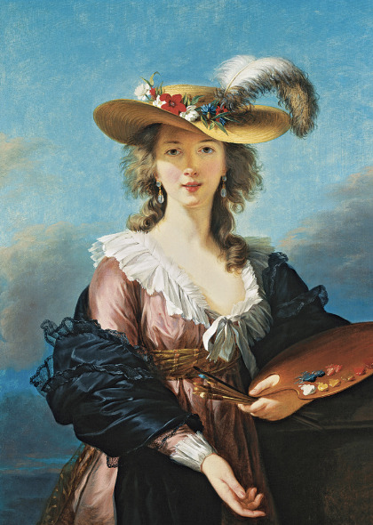
in order to do a portrait you need to assemble a background that is going to bring the focal point to the person in the picture. in this painting, it is a sky blue. The sky in the background places the girl in an outside setting.
The color of her skin is bright until it reacted the clear shadow of the hat on her face. to create this shadow the hue of the skin color needed to be darker.
The hat and the art supplies are example of accessories to her painting. It was well thought out that the colors on her painting sheet in the picture match the color of the flowers on her hat to show that it is a self portrait of the artist.
The colors of her dress create a dramatic effect and a detailed expression of texture. The proportions of the body to the head and the eyes to the nose are what makes it the best expression of a portrait. Without proportion, this portrait would be just a confusing piece of work.
0 notes
Text
3. connecting art to your world.
My room is a mix of blues and yellows. i would say a color scheme for my life would be complimentary. A mix between cool and warm tones and softer hues. A time color has affected me would be when i go to see sunsets on the beach. The intense colors of pink yellow blue orange and purple make me feel at piece as i look out to the ocean and just breath. The beach at sunset is my happy place.
0 notes
Text
4. Art project (painting)
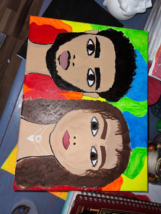
Portrait of me and my boyfriend .
0 notes
Text
Virtual sketchbook 2/journaling
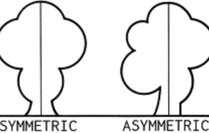
1.A symmetrical balance- balancing of elements of art but they have no symmetry. (asymmetry-lack of symmetry)
Symmetrical balance- Use of elements to be balanced and evenly displayed on the left and right side of an art piece. (symmetry-identical form on opposite sides)
Balance- arrangements of parts creating a stage of equilibrium
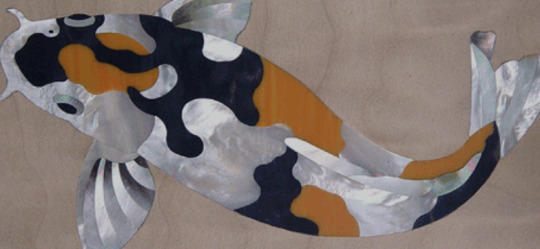
2. variety- diverse elements composed in one art work.
pattern- All over design created by repetitive ordering of design elements
design- the process of organizing visual elements and the product of that process
This work uses different colors and different sided shapes to create a pattern in the fish design.
3. Unity - Opposite of variety, The appearance of similarity.
Rhythm- ordered repetition of dominant element or unit with a design of related variations.
repetition- recurrence of visual element
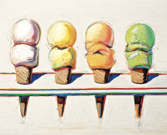
This picture of the ice cream cones represents unity and rhythm in one design to create an appearance of similarities in repetitions.
4.subordination- The use of size, color or placement to rank certain areas as less important or surrounds a focal point.
emphasis- The use of high contrast, bright colors, large size or placement to create a focal point. (focal point- principal area of emphasis)
scale- the size relation of one thing to another
This picture demonstrates subordination as dark grey , smaller sized circles to blend with the background and emphasis on the large complementary colors in the big circle. Scale is represented by the big circle compared to the smaller circles.

5. composition- the organization of visual elements in an artwork
format- The shape or proportion of a picture plane.
directional forces- pathways that embeds in a work of art for the viewers eyes to follow.
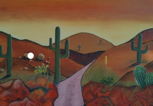
This picture shows composition of cactuses and mountains along side a path which is a directional force creating a format of shapes in nature around the path.
6. proportion- the size relation parts to a whole
contrast- dissimilar elements creating dramatic effects ex. white on black
proportion is shown in this picture as the closer objects are bigger and the ones farther away get smaller. contrast is shown between dark and light colors.
0 notes
Text
5. Photo/ design- Logos
1.Converse
2.Lulu lemon
3. Kate spade
4. urban outfitters
5. tommy hilfiger
5. nike
6. Adidas
7. puma
I know about logos threw shopping brands in the mall and at stores. each brand creates there own logo to call their own.The value of a logo can be understood by the core idea of the brand. It is the first thing people see and what people will remember.
0 notes

Text
3. WRITING A SELF-PORTRAIT
My name is Debra Barbour but most people call me Debbie. I am 20 years old, soon to be 21 and I like to believe that I have a young soul. I am a female who identifies as a female and I am from sarasota Florida born and raised. My ethnicity is mostly white with some polish and Italian. For fun I watch tv shows, cook, hang with friends and I love to paint and draw. My occupation as of right now is a sewer at a restaurant on siesta key. I believe some things like make me uniquely me are my taste in music, my free time activities listed above and just trying to stay as healthy as possible by working out and eating healthy. with some cheat days of course.
0 notes
Text

2. Art and writing
This photo of the snow leopard is my favorite piece of art in my room. It is a painting combined in 3 different canvas. I did not paint it however it still catches my eye every time I walk in my room. My favorite animal is a snow leopard so it just serves as a remind of a beautiful animal in this world that are not found in Florida.
0 notes
Text
virtual sketchbook 1 writing and researching
hi my name is Debra Barbour. I just recently picked up cooking. I learned how to cook about 5 months ago and my favorite thing to cook is steak and mashed potatoes.
Jackson Pollock 1950 Autumn Rhythm (Number 30). Enamel on canvas; 105” x 207”
1. This is a drip painting that the met acquired the year after Pollock passed.
2. This painting is worth $140 million
3. Autumn Rhythm is 207 inches wide. It assumes the scale of an environment, enveloping both for the artist as he created it and for viewers who confront it.
4. Pollock created this feeling by relinquishing all conscious control of his work. This notion of abandoning personal power to the artistic process is Pollock's great contribution to modern art.
5. Autumn Rhythm (Number 30) is a 1950 abstract expressionist painting by American artist Jackson Pollock in the collection of the Metropolitan Museum of Art in New York City.
The first thing i noticed was all the colors going everywhere almost like it was not on purpose or not placed perfectly. There was not a specific pattern to this painting. After learning about the artwork i thought a little differently about it. Pollock had a purpose for the abstract of the pattern that was not placed on purpose.
1 note
·
View note