
designmanifesto210
Ryan's 210 Manifesto
My manifesto for ARTG210
17 posts
Don't wanna be here? Send us removal request.
Last Seen Blogs

coloringstudiess-blog
Coloring.studies

ashu86
nottyyyyboy🍑💦
ogrepoppenangleaksofficial
Ogre Poppenang Leaks

cosmic-limbo
★ Cosmic ★
truecantaloupelove-blog
Fan Fiction, Theories, and Random Thoughts


Text
Summary #6
summary #6
In Don Normans piece on designing for all, Norman discusses the struggles of accessibility in design in regards to the elderly and how this form of accessibility tends to be over looked. People don’t take into account things such as eyesight or mobility issues when considering if the design that they’re creating is accessible. Norman states that most difficulties experienced by the elderly are also experienced by younger people and if designers were to take these factors into account they would be able to appeal to and help each demographic more efficiently.
In JP Williams article Design Issues: The State of the Ballot, Williams outlines the whole fiasco regarding the almost illegible Florida ballot. Guiding the reader through the story, Williams shows us how the ramifications of bad design can effect an entire election, with the awful format of the ballot genuinely discouraging people from voting. Williams discusses how the layout of the ballot actually violates Florida state law which dictates the six to the right of the ballot must be marked for voting. We’re given many other examples of overlooked design such as airport signage and such, the main point form Williams being the importance of intelligent deign and the consideration of the target audience.
The ballot redesign, although slightly more functional is still confusing to a reader, with the pre existing stress of voting already weighing on the users mind, this ballot brings more chaos to and already chaotic situation. The reader has a difficult time quickly drawing a conclusion as to which box to check in either rendition of the ballot which is completely impractical regarding the previously stated circumstances, not to mention the small font.
In the RGD handbook we’re provided with many different ways that graphic designers can implement accessibility into their work in order to consider all possible audiences. Them message conveyed is that although these resources are available to them, many designers still choose not to use them as they tend to consider accessibility as an option and not a requirement. Many large corporations don’t consider the future of their deign or the users it may have when creating and so accessibility becomes a trailing thought.
The accessibility example I chose was this jar of pasta sauce, particularly the expiration date. As I was making dinner I picked this jar up, looking in the normal places (top and bottom) for the expiration date, after a few minutes of searching I realized it was printed in small gold font font on the top right hand side of the bottle. As the text was gold, it almost blended in with the oils built up on the side of the jar. As someone who works professionally in the culinary industry I can say there’s almost nothing more annoying than going to check an expiry date while you’re cooking and struggling to find it, especially if you have eyesight issues on top of that.
If its an option then opt-in.
Don’t you, forget about me.
Design should be for everyone.
Don’t make excuses for laziness.
Practicality over practice.

0 notes

Text

Manifesto #5 "Communication is Key"
Type + Texture + Colour
0 notes
Text
Take Away Statements
Accessibility is not an option
design because you want to, not because you're told.
communication is key.
create for your audience not your client.
Do better.
0 notes
Text
Summary #5
In Joyce Lee’s blog article “What do Dinosaurs and Good Healthcare Design Have in Common? She discusses the importance of good pill bottle design. Lee begins her discussion by showing the reader some examples of bad pill bottle design before outlining some of the main mistakes made in their production, such as unnecessary information taking up space, font below required size and overly large logos. She discusses the U.S. Pharmacopeia, voluntary standards for prescription medication, which are clearly not followed in the examples. Lee goes on to tell us about the ClearRx pill bottle, which focused more on the user than the seller in it’s design and how it near revolutionized pharmaceutical categorization. This bottle was later used in all of targets in store pharmacies before target sold its pharmacies to CVS who later discontinued the bottler due to price and stock convenience. Lee finishes her article by stating that this bottle was one of the few endangered examples of good design left in healthcare, which is now sadly extinct.
In the first 8 pages of the RGD’s Access-Ability Handbook they start off by discussing the books audience purpose, purpose and the target group it aims to help. They talk about the AODA act and the positive aspects of accessible design before kicking off the section by introducing the topic of planning and management. This section discusses the need for graphic designers to have a. Knowledge of accessibility and accessibility problems in order to share them with their clients. Clients don’t understand just how much accessibility options can effect their business, and its the responsibility of the designer to share this with them. 100% accessibility is impossible when it comes to any project, but its the goal of the designer to ensure accessibility protocols meet at minimum the AODA standards.
Following the theme, the article “Visual Accessibility in Graphic Design Communication Failure” starts about the same as the previously summarized RGD Access-Ability Handbook, discussing accessibility’s importance and effect, as well as bringing light to the many people suffering from accessibility issues and the graphic designers responsibility to consider it. The article goes on to talk about direct link between graphic design and visual communication, stating that the paper will focus solely on graphic design. Continuing on it is discussed that client designer communication is vital in good design, and that often clients don’t feel the need to discuss forms of accessible design as they believe that the designer will take it into account anyways. To make good work, we must have good communication. In the research conducted within this article designers and clients were asked a series of questions about their relationship with accessible design and it’s value, they found that on average 4.4 out of 5 designers and 4.1 out of 5 clients agreed that accessibility is important in their day to day lives. They also found that on average designers recommended accessibility be considered on 51.5% of projects, and clients reported that same request on 49.4% of projects. The running themes in this article were that there is a lack of communication in terms of visual accessibility between clients and designers and clients’ importance of visual accessibility decreases with more experience commissioning graphic design projects. The article continues to discuss these topics and different ways we can change the statistics, the main one being the development of accessibility checking tools in the design industry as well as personal responsibility within designers to consider accessibility when they work. The article concludes shortly thereafter, with the main take away being that poor client - designer communication could be the thing preventing accessibility from being considered in the industry, although this is not the only cause it is definitely a big one and everyone needs to thoroughly understand the importance of accessible design.
Finally, I felt there were many cool accessibility solutions from the list of RGD designers such as Meggan Van Harten’s website ArQuive built to make LGBTQ+ history more accessible to curious parties or Denis Leclerc’s interactive PDF. But I think my favourite has to be David Bermans clear covid masks to make lip reading during for deaf people during the pandemic. All astonishing examples of the innovation of designers when they really consider accessibility.
0 notes
Text
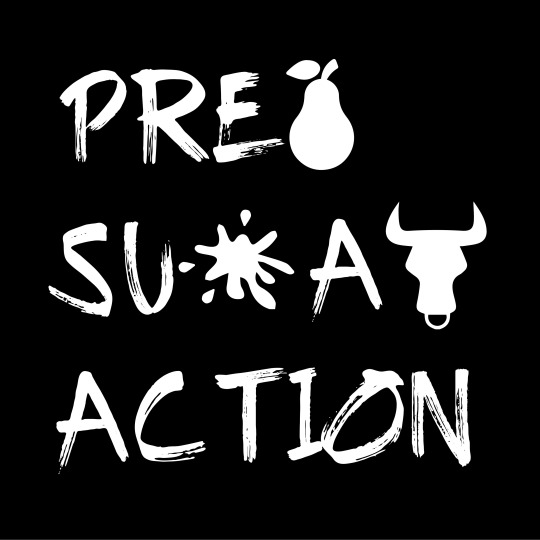
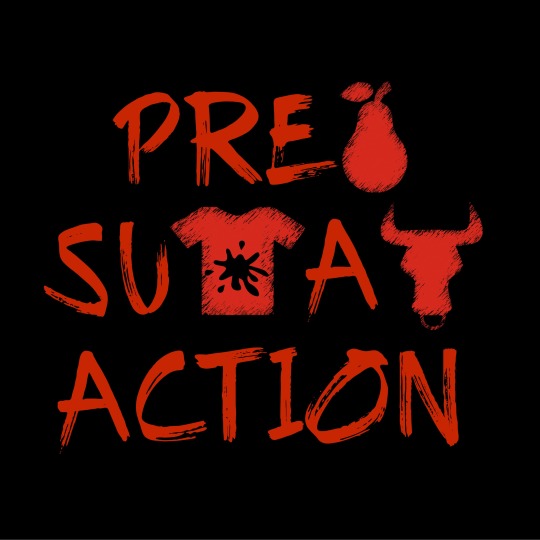
Prepare Sustainable Action
Randomizer: Rebus Type + Type + Reverse Type
0 notes
Text
Summary #4
From first glance at cradle to cradle vs cradle to grave strategies it seems that cradle to cradle is the more sustainable, eco-friendly option. Involving an infinite chain of production and re-use. Cradle to grave appears to be the monitoring of environmental impacts throughout the entire linear life of a product, from the moment they’re created to their unfortunate disposal.
From the gore-tex video we learn how the cradle to grave strategy really functions in depth. The steps that professionals using this strategy take in order to monitor the lifespan and environmental impact of these products and reduce it in certain areas. In using a cradle to grave approach the company is focussing on the sustainability of their product, in order to reduce emissions, for instance gore-tex producing more durable products in order to manufacture less.
Cradle to cradle involves the re-use and the flow of materials. Instead of just monitoring problem areas of waste we make sure everything that would be wasted is reintegrated as new materials. Taking inspiration from the circle of life (decomposition and nutrient use in nature) this approach is about producing sustainable products that can be separated for re-use easily in order to fluidly move on to their next use. Cradle to cradle is more about forethought than anything, thinking about what you’re producing and hoe it will effect the environment before you even release it.
In Bermans final thoughts on how to apply sustainability practices in our work, he starts off by discussing our current usage of generic disposable products. After this he goes on to discuss how important sustainable practices are and how they are very quickly becoming the new norm, tell tells us to get educated on them or we will inevitably fall behind as designers, even if it’s small things such as suggesting different sustainability options in design meetings or avoiding certain single use products that have negative effect on the environment. Berman goes on to discuss the importance of certification in some countries and designers commitment to do at least the minimum in terms of professional and ethical conduct. He continues to discuss a variety more ideas and stories regarding sustainability before returning to his core point being that we as designers must do our best, we must stay true to ourselves, our profession and the world around us. We have the ability to fix it so it’s up to us to use that ability. Berman states that it’s up to us, “ we must make sure that our inventions are not just clever but also wise;” we must design our future, and it starts with our commitment not just to implementing but understanding sustainable principles.
The red checklist has many ways I can apply sustainability to my practice be it at work, regarding physical goods, digital design and resources such as keeping clean code, encouraging clients to remove unnecessary content from their websites, buying locally sourced snacks for the break room, using sustainable vendors or avoiding using materials like glue and plastic. There are way too many fore me too list here but the red checklist has a solution for most any sustainability problem that could occur.
Terra movements article on sustainable graphic design outlines what sustainable design is and different ways in which we can implement it. They start off by discussing why we need sustainable design stating that a designer needs to consider the impact their design will have on the world. They cover points such as the type of material, amount of material, is it recyclable? Asking us to think about our project and wonder does it even need to be printed? They give us a variety of tips to make our work more sustainable even going on to discuss eco-friendly websites and servers.
Take away Statements
Either it's a sustainable cycle or you’re sustaining the cycle.
From cradle to a grave future.
Small change can have big impact.
Would you sell your kids this future?
Forethought is the prerequisite of greatness.
1 note
·
View note
Text
Summary #3
In “Foreword” Erik Spiekermann discusses the initial signing of the First Things First manifesto and his excitement to do so, stating that the original signatories were pretty much all his heroes. He goes on to talk about the paragraph he added about his misgivings, asking many questions surrounding commercialism and sales. He asks the reader what is wrong to design, and details different ways bad design can affect us. In relation to the he tells a story regarding sixteen people who died I na fire due to badly designed and placed signage, he finishes off his article talking about the power that graphic designers hold and states that the rules need to be rewritten. And finally leaves us with the advice that charity starts at home, it’s not all about how we treat the commercial world but those who share it clients, employees, peers and suppliers and most importantly how we treat our process.
In Bermans manifesto and 3 step pledge he invites us to imagine what would be possible if designers did not participate in the export of over consumption. What the world would be like if designers pandered not to beauty and money but to something deeper than aesthetic appeal. Bermans first step, be true to your profession (e.g ethical conduct and commitment. Bermans second step, be true to yourself, let your morals and beliefs guide you, it’s okay to say no to a job you may deem unethical but your union doesn’t. And finally the third, “I will spend at least 10% of my professional time helping repair the world.” If we can all spend at least 4 out of our 40 hour work week to help make the world a better place, we will inevitably end up with a more sustainable, more caring civilization.
In design to re-nourish the main topic of discussion is sustainability and systems thinking. Designers must consider all parts of a system in order to understand how everything/everyone around us is effected by our work. Designers must grasp a better notion of the impact of their work, both socially and biologically, therefore learning to understand biological systems they effect (biomimicry) once designers fully understand the amount of our design impact only then can the world start to heal.
In dieter Rams 10 principles for good design, he asks the reader the age old question being, what is good design? Rams believes design should be both pretty and effective and states that both are important in making good design. Although all design should be predominantly functional, looks are equally important in order to sell product. Rams tells his reader that good design is as little design as possible, meaning that we need to focus on essential features so as not to overcrowd and undervalue the product itself.
Objectified outlines our complex relationship with heavily manufactured objects and therefore the people who manufacture them. In the film we speak with many informants of different professions including designers, critics, journalists and museum curators regarding their thoughts and process when it comes to sustainability. The overall message from the majority of interviewees was that design shouldn’t be complex or permanent. We design beautiful labels that just end up in landfills and even before that don’t fully do their job. Design should be effective, minimal and environmentally friendly, and it’s the job of the designer to create a better future for those within the industry and those outside of it.
Takeaways
Be true to you.
One world, one life, one opportunity.
Sustain sustainability.
Design our future.
Nothing should be permanent.
0 notes
Text
Manifesto Statement #2
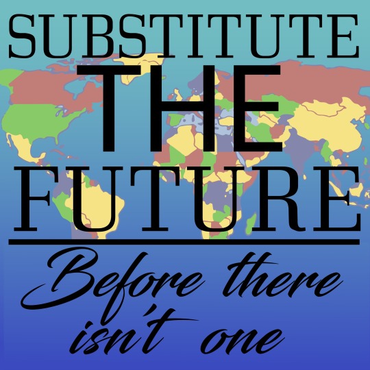
constraint: type + image
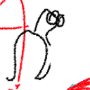
I wanted this manifesto the bring a little light to the worlds rapidly disappearing resources, hence the fact the countries/continents are disappearing once hitting the line, the line which I intended to represent the bottom line of sustainability. We as designers have the ability to substitute the future, the question is will we do it in time?
0 notes
Text
Summary #2
In “Do Good Design” David Berman discusses the many ways that media/advertising has influenced our societal norms, and some of the unethical techniques they’ve used to do it. He begins by discussing the use of women in advertising and their sexualization in order to sell and manufacture goods. Berman gives us many examples of lazy advertising, relying only on the sex appeal of the woman portrayed and not on the product itself. He goes on to provide more examples including men being used in similar scenarios, before diving into the ugly gutter that is child advertising. Berman explains the ways in which corporations get their claws into children and use advertising to shape their whole world. Through advertising many children are taught to expect and associate certain things, like pre-teens wearing cologne cause it will “get them laid” these ugly stereotypes of design flood the minds of people and children all over the world without us even realizing.
In “Design to re-nourish'' the author discusses the “triple bottom approach” and the implications we as graphic designers have on this and the environment. They talk about how effective and positive design can have a positive effect on not just people but the planet as well. When we practice effective design it can impact the world around us in many ways, effective design being not just the design itself but the means in which it is created. The author tells us how beneficial it can be for designers to choose more environmentally friendly means of design such as solar energy and sustainable paper substitutes, but also addresses the harsh reality in which most companies put money and time first preventing these from being effectively used. The overall message in this portion of “Design to re-nourish” is that it’s the job of designers to work in effective harmony with the triple bottom approach (people, planet, profit) and respect the environment and the people within it as well as the economy when designing.
In the article “Should designers take responsibility for the ethics of their clients?” James Cartwright begins by discussing the irritation he feels in designers' lack of personal responsibility. He says that many designers talk about making change (or wanting to) but then proceed to work with large unethical companies instead of charities and NGO’s. During his article, Cartwright interviews a handful of designers who all tell him the same thing, that it is NOT the responsibility of the designer to account for the ethics of their clients. Although designers can do their best not to work with big corporations, or unethical clients, the designers quoted in this article all agree that it’s on the clients to take responsibility for their ethics and not the designers. Cartwright concludes his article by issuing a challenge to designers, telling them that they’re “better than that” and that they should constantly remember that they are not reperate from the deeds of their client.
Take away statements:
Why should sex sell?
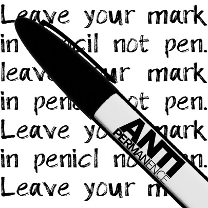
Your mark? Your marketing.
Time kills ethics, while money murders both.
Do we really own any of our special moments?
Are you a product of marketing?
Substitute the future.
1 note
·
View note

Text
Design Manifesto #1 Constraints: Reverse Type + Colour
I wanted this manifesto to embody a designers forethought in approaching a project, or the lack thereof, in an almost itemized way. We can follow project lists and design practices in logical organized ways, but when it comes to our moral approach many designers tend to look at it in the wrong order. Design should never stem purely from monetary gain.
1 note
·
View note
Text
Summary #1
In Debbie Millman's ted talk she discusses the societal implications of design and the effect on and by the consumer. Whilst in ancient history symbols were designed, by people, for people, a lot of branding over the past few decades has been created for the sole purpose of misleading or selling products, and has been pushed onto people by corporations also known as a top down model. Talking about the “plethora of choice” found on the market today, Millman brings up the many different brands that have become so familiar to us today. Although we have so many choices being pushed upon us, Millman talks about the exponential change we’ve had in the last 10 years due to the internet. She states that the ability to connect like minded individuals so easily through different platforms has given people the power to control their own branding and push their own agenda onto the people who once pushed them so freely. There has been a revolution in the way our branding is produced and perceived and it’s in the hands of the people and designers of our world to perpetuate that change. In Millmans the words “the highest benefit of branding, to unite people in the communication of shared ideals.”
In chapters 3, 4 & 5 of do good design the author discusses the insane implications of over branding in our world today. Showing and discussing many examples from how coca cola has essentially taken over african signage. The discussion covers how companies like coke will brand almost anything, they’ve sponsored street signs, hospitals, schools all just to apply their branding to them. Although a lot of these strategies may seem smart, the social implications of these are more than you’d expect. In Tanzania the price of an anti-malaria pill is equal to the price of a bottle of coke, and due to the constant commercialization of these areas as well as borderline brainwashing of coke's “greatness” most times it’s not the pill that’s purchased. The author informs us that coke has been doing things like this for decades and for some places, decades too long. A handful of cities and states across the world such as São Paolo, Brazil and Vermont have outlawed signage/billboards all together due to the social and environmental implications.
In the introduction to the conscious creative, Small discusses her personal experiences with ethicality in design, listing off some of the things she has done/witnessed that crossed certain ethical boundaries. She shares with us how her realization of the struggle to be a both ethical and profitable designer lead her to severe depression, and how herself and many other creatives feel “stuck” in this situation. She later goes on to talk about the lack of regulation in terms of design ethics and how this can affect society as a whole. Although as mentioned in the article there have been great strides towards a more ethical creative center, the overall message that smalls is trying to portray is that designers and creatives must take this responsibility into their own hands. Instead of sitting idly by and focussing only on their income, creatives should self-regulate themselves on the type of advertisement and propaganda that they’re designing and who they might be designing it for, as well as constantly considering the societal and environmental impact they may have.
Is it the mark? Or the marketing?
Branding is not just a tool of capitalism, branding is the profound manifestation of the human spirit.
Logos and symbols are the closest we’ve come to a universal language.
Advertising buys your brain.
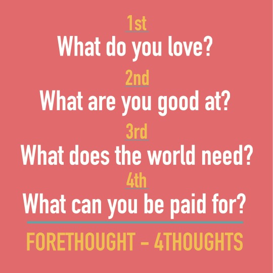
What do you love? What are you good at? What does the world need? What can you be paid for?
1 note
·
View note