Text
Case Study 2 - Wizards of The Coast
Wizards of the Coast is a board and card game studio known for massive tabletop roleplaying games such as Magic : The Gathering and Dungeons and Dragons. Due to my love for their games, I wanted my second case study to be a deep dive into how their design department functions and who some of their notable designers and design leads are.
With the wide range of games developed by wizards of the coast the studio is split into five departments with different story, Studio typically has a Product Lead who designs a large portion of the final work, chooses who designs the rest, and works with art directors to establish the product's look and feel. The most notable product lead appears to be Jeremy Crawford, rules master game designer and lead DnD project director.
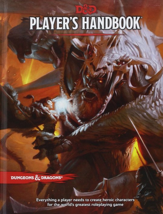
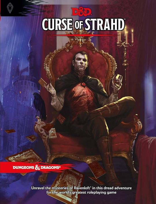
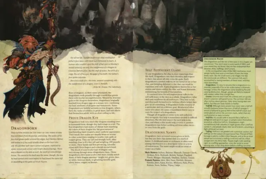
While Jeremy Crawford is lead designer of the DnD games, another notable name is Mark Rosewater, who carries the same job but for Magic : The Gathering. Mark also publishes the companies yearly "State of Design" report, where they discuss the year of design at Wizard of The Coast.
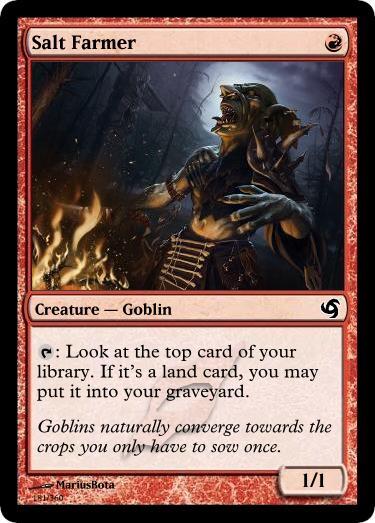
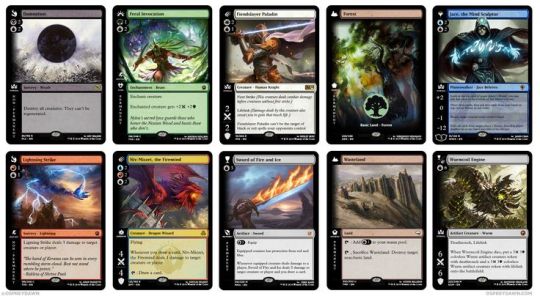
Surprisingly enough despite the massive amount of illustrations needed for the immense output of Wizards of the Coast, Wizards does not have a large illustration team, instead they have the lead designers previously mentioned, who are in charge of drafting up the designs, and balancing writing the rules. the illustrations are gathered via contract work and commissions from regular artists, who although do regular work for Wizards, are technically not employees.
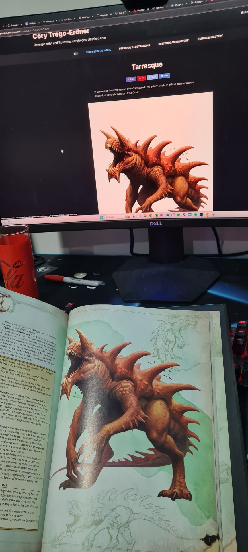
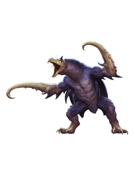
This makes it reasonably difficult to find their artists, as they are not listed anywhere, although one such artist I found was Cory Trego-Erdner, who has a portfolio showcasing many of the illustrations that have been commissioned from him, including the monster designs of some incredibly iconic and famous DnD monsters, such as the Tarrasque, who is incredibly famous for being the most powerful monster in DnD canon.
I've found it incredibly interesting to properly look into the designers and artists that shape one of my favorite hobbies, and dissect how the overall entities design studio function. The entity outputs and insane amount of design and art on a regular basis, and the ability to pull off such a feat is no easy task. I would love to work at Wizards when I graduate and this case study has offered extra insight as to how non-studio based design entities create large bodies of work.
0 notes
Text
Case Study 1 - Watermark
Two weeks ago we were lucky enough to get a lecture from Benita and David Way of Watermark creative. Their work and studio dynamic stood out to me from the rest, their attitude to design and workflow really standing out to me, so I decided to look deeper into their work.
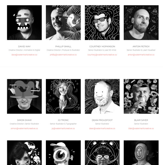
Watermark Creative is a design studio in the Auckland CBD that describes their team as ‘a collective of visual problem solvers’, with a wide range of styles and work due to their unique studio style. Looking at their linked in I was very pleased to discover that at least 6 of their employees are listed as having studied at AUT. I was also surprised to discover that they have alternative locations in both Sydney and Melbourne, making their reach far further than I realized.
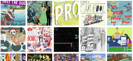
Looking at their website I was astounded by the wide range of work they do, and how they create a wide variety of styles, even going so far as to categorize their portfolio by style.
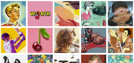
This is due to their 'agency' style studio environment. Hiring a range of different designers from drastically different fields and specializations and putting them together in an environment where they can combine their skills, as well as continue their personal practices.
In that sense they are less conventional than your average design studio as rather than hiring the studio in general, you are hiring a team of designers that would be put together to work on specific projects that are suited to them. David Way shared that this style was inspired by the Game company Valve, a company I have always looked up to for this reason and wanted to work for throughout my childhood. This is reflected by the fact that every designer has their own private portfolio showcased on their website.
A fun note I discovered while browsing their portfolio is that they designed the Monteith's Hazy IPA can, which is only funny because the same can is sat next to my desk as I type this. Whenever I browse portfolios it always makes you think deeply about the industry we are involved in, and how people like Watermark affect the world around us every day in ways that if done right, we never even notice.
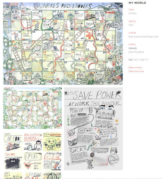
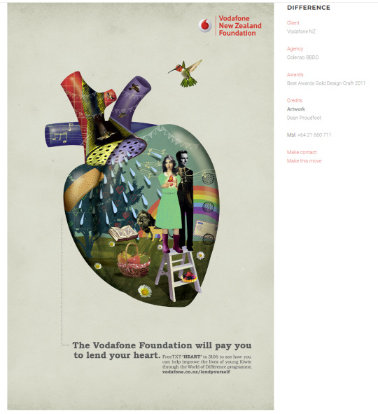
I would say my favorite designer there is Dean Proudfoot, whose work has an incredibly fun and unique vibe to it. Mixing Photography and Illustration together in an almost collage type way for their designs such as their work for ‘Vodafone’. When their work is illustration exclusive it still carries through a sense of individualism, with some drawings being intentionally ‘crude’ to give off a very friendly aesthetic, such as their designs for ‘NZ Post’. I always love when a designer's style is so strong that big, usually to the book, corporations trust them to get experimental.
The combination of interesting styles, and fun unique studio environment they are fostering has made me instantly fall in love with this studio, and has instantly elevated them to the number 1 Studio I would love to work in the future.
0 notes
Text
Hand In Checklist
As I start making the presentation, I need to address what I need to crack on with?
Cover Page - X
Table of Contents - X
Personal Review - Done
Swot Analysis - Done
Design Industry Mapping - X
Experiential Report - In progress
External Engagement Reflection - In progress
Feedback Report - X
Case Study 1 - X (Done)
Case Study 2 - X (Done)
Profile Statement - Needs Upgrading
Visual Identity - In Progress
Guidelines - In Progress
Design Portfolio - Needs Upgrading
CV - Done
I have a lot to do, and tracking this way will help me check off my requirements.
PRIORITYS
Finish My Internship so I can discuss it in full.
Start my presentation, alongside my personal design system.
Case Studies.
0 notes
Text
Ethics in Design
This week we read through 5 papers related to ethics in design. I found myself very fortunate to intern at a place that upholds these ethical values. My experience with Little Miss Designer has been highly positive in regards to my treatment, with a strong understanding that I am a developing designer and I have other priorities outside of the internship. I have worked exclusively with Pupuke Golf Club, which I don’t believe creates any ethical dilemmas and is a well respected company.
I believe a lot of the points in the ethical guidelines were both reasonable, and common sense. Although much like any other set of guidelines their existence is highly important, as keeping yourself and others accountable is instrumental in any field or environment. I do however not fully agree with “Ethics Cannot be a Side Hustle”. While working in activist groups as your career path is incredibly noble and admirable, it is not an option for everyone, and as long as the organization you are designing for is not notably immoral or ethically questionable, I disagree with the notion that your design “cannot be neutral” as this would remove your ability to work in the vast majority of the field. Ethics are incredibly important in design and it is essential that we take a look at and respect these guidelines laid out for us.
0 notes
Text
Elab 2 - LinkedIn Check Up
This morning I went to my 2nd E-Lab meeting, the Linked In Check Up.
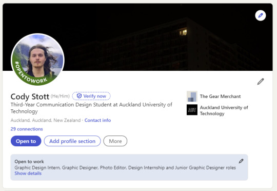
We talked briefly about a wide range of small changes, such as spelling mistakes and bios. However the main notes were in regards to the tone created by my two images.
The header image, although a good showcase of photography work, is too bleak, as the photo was made to reflect solitude and loneliness, not the type of environment you want to create on your profile.
The profile pic, is fun and shows a more interesting style than a headshot, however I look raggedy and overly serious/chill in it. Either I need a photo that has more approachable emotions, or we discussed getting someone in my Photography class and taking headshots of each other in the studio.
in general, I need to be coming off as more professional and approachable.
0 notes
Text
INKAI GUIDE
What You Love? up
Poster Design
Video Editing
Photography
Photo Manipulation
Dark Art
What The World Needs? >
Activist Design
Design Systems
Logo Design
Social Media Design
What You Can Be Paid For? down
Web Design
Social Media Design
Video Editing
Logo Design
What Your Good At? <
Poster Design
Photo Manipulation
Social Media Design
Dark Art

Overlapping focus ones were
Poster Design, Photo Manipulation, Dark Art, Design Systems and mostly Social Media, something I have developed a growing interest in this year with my internship, my studio project and a potential job I have coming up.
0 notes
Text
Learning Vision vs Client Compromises
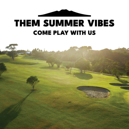
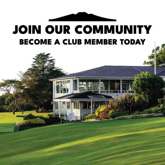
Original Set
One of the briefs on Instagram slides became an interesting learning experience on how designers and clients compromises can create the best outcome. Above is the style of hand in I submitted for the slides.
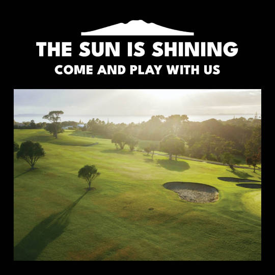
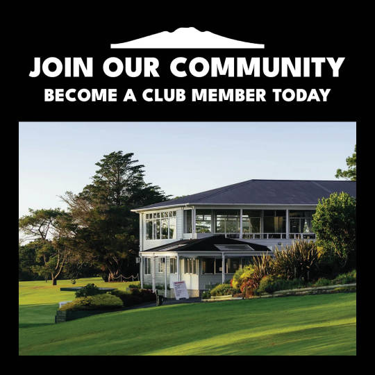
Client Recommendation
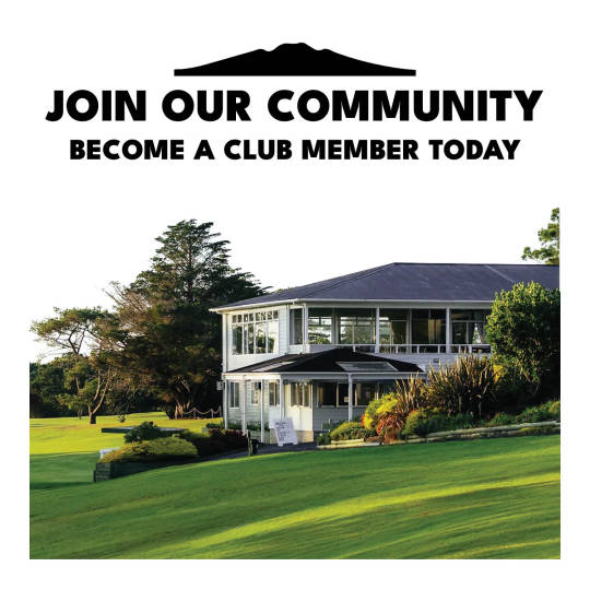
The client then asked for something more inline with their gallery type Instagram, explaining an idea closer to the the drafts shown above. I thought these looked shockingly mediocre, however I appreciate the fact the design should fit in with the current style of the instagram.
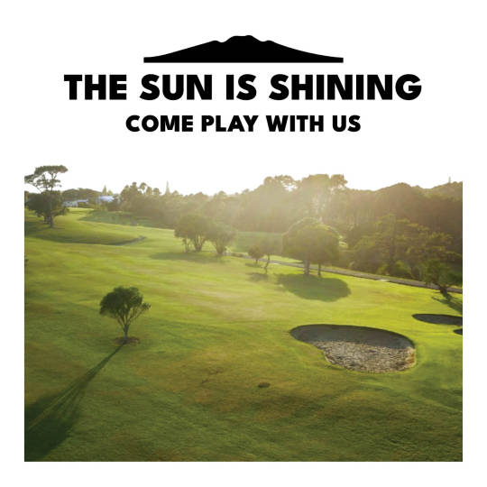
Final Outcome
The final outcome was a mix of both, blending the white sky style of mine, and blending them into the same frame background as the client asked for. This compromise meant that the design was still inline with the current system, while being unique and interesting looking, and I actually prefer this design to my original pitch.
0 notes
Text
Being a T-Student
The lecture from Watermark was insightful in many ways, especially regarding the different structures of the design studio.
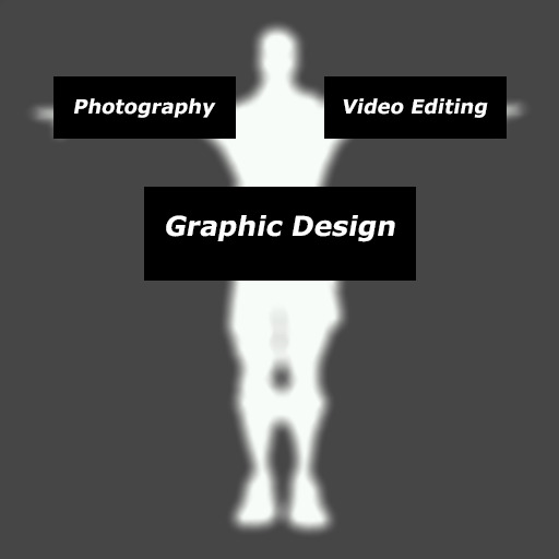
The concept of having a "T Skillset" stood out to me as , although it wasn't necessarily what it meant, it made me think of the idea of having two supporting talents to your core talent.
I have always thought of my skillset as being a designer with a photography element to support, however the lecture made me think, what other supporting talent have I started to develop and could then grow into something proper.
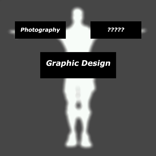
My first thought was web design, as I have recently started my own online business. Although this felt too closely linked to Graphic Design anyway.
Then it occurred to me. It should 100% be Video Editing. I have gained a fair amount of familiarity with Premiere Pro, and video editing skills, through the creation of memes, TikTok's and video essays. And I have applied these skills to a few of my projects, the font showcase video, my 'test your s#!t' campaign and my speech to text animatic. Developing my Video Editing skills in the same way as I am developing my Photography could open a whole world of opportunity to me.
0 notes
Text
Communication Beyond Meetings
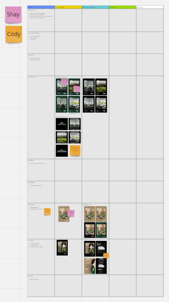
As I was a remote Internship worker we wanted a way to communicate effectively between meetings and emails. Reminded by my university projects last year, I created a Miro board for discussions. Although a very simple idea, It was a short learning experience as to remote learning, and alternative forms of team work and feedback.
0 notes
Text
My First Posters
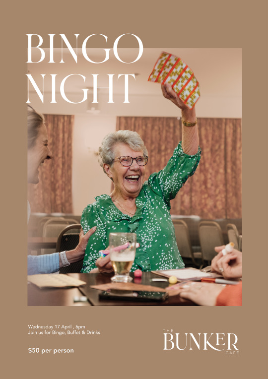
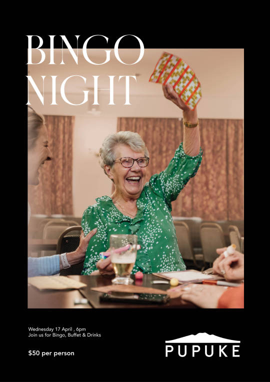
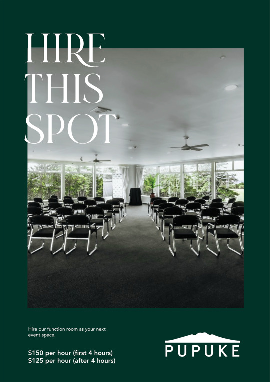
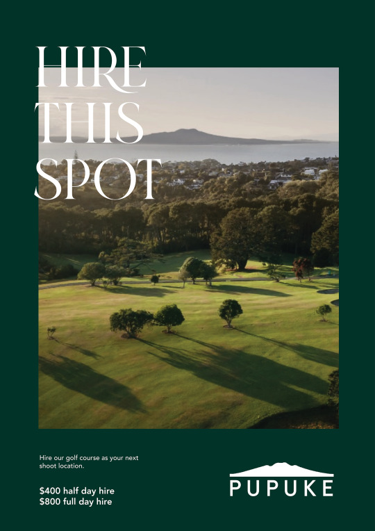
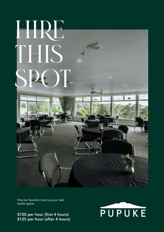
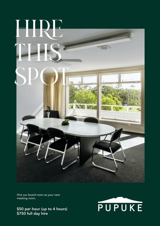
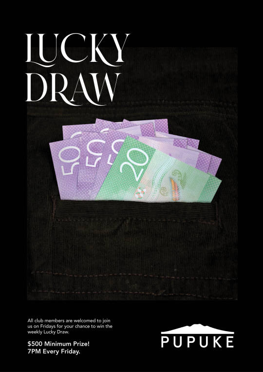
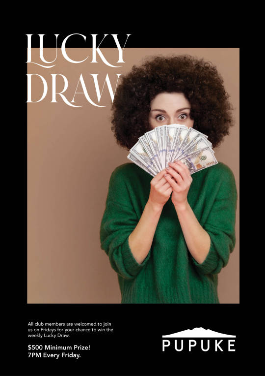
I was given 10 briefs to work through for my Internship, I decided the best way to work is to familiarize myself with a design system of one deliverable at a time, therefore I started work on many of the posters I needed. Both me and Pupuke Golf Club were very happy with these posters, and I felt far more confident to work going forward.
0 notes
Text
Instagram Brand Rework
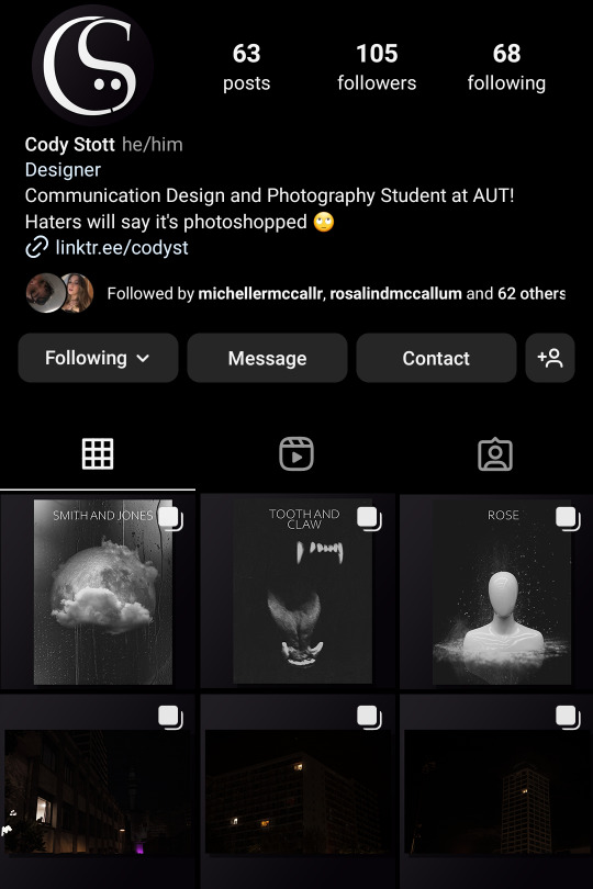
While awaiting the "real start" of my internship, I decided to work more on my own brand identity. I was looking at my 'art' Instagram i had been using up till this point, and decided it was finally time to focus it in to a 'design' instagram, starting with a light design system to change it.
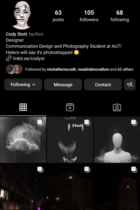
This is what it looked like before, all the posts are not visible fully on the grid as they don't fit the 1*1 ratio. Currently the only aesthetic credibility the grid has is the 'three posts in a line' motif, which i will be continuing through the rebrand.
to fix this, I will be implementing a border system, a dark purple gradient in the backdrop and a drop shadow to highlight the art piece. i also changed the Instagram name from 'codysturbed' to 'codysigns'. A temporary name for my design 'studio'.
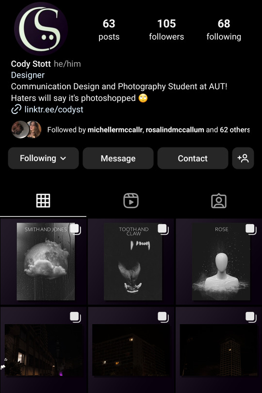
i decided that the purple was far too distracting and prominent, so i toned it down and desaturated it. i feel like this aesthetic represents my branding well, and I will be continuing it going forward, to make my Instagram stand out as far more professional.
0 notes
Text
My First Brief
The first brief I achieved was the Ladies night poster and social slide, although this was a very rocky start, and a small failure.
We were still starting out when this was needed to be completed, and I had not received the assets yet needed. This meant i had no brand guidelines, no frame of reference and no understanding of what outcome was expected, and instead I had to design blindly.
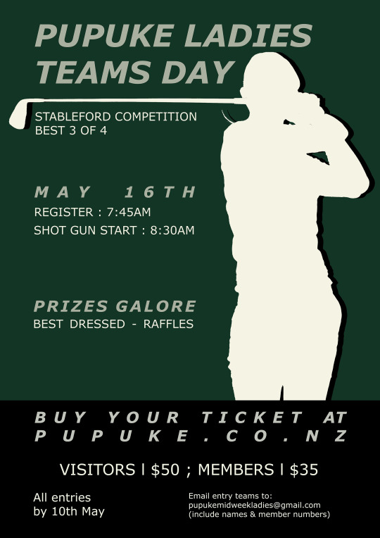

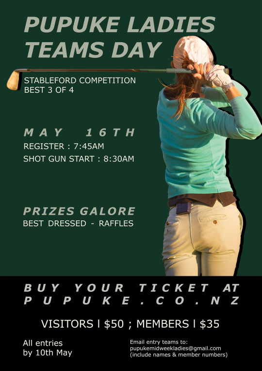
Regardless I designed based on 'vibes' and tried to get the brief complete. The studio congratulated me on finishing the brief independently and were impressed at my get go, although for obvious reasons, it did not fit their design system / criteria.
We decided to put a pin in it until we could have a meeting to discuss intent and share assets such as the design system and fonts. This experience was a great learning moment in the importance of communication and ensuring everything required has been organized in advance.
0 notes
Text
Little Miss Designer
I got an internship at Little Miss Designer. A small design studio run by a woman named Shay Bruce. The studio works to make branding and design systems for small independent company's in New Zealand.
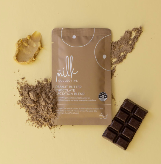
They also have an ongoing partnership with Pupuke Golf Club, creating all of the posters, social slides and branding for their company. It is this part of the company i will be assisting with for my internship.

I have been sent 10 briefs to be achieved over the next 6 weeks, working out to approximately 60 hours. They are to be achieved remotely with several touch points to reconnect with the client and designer, to offer their guidance and assistance.
0 notes
Text
E-lab 1 - Job Search
My first E-lab was on Job Search. This had a double up purpose for me. Both to aid me in my future design job search, and current internship search. And also to give me some pointers of my current part time job seeking.
Some main take aways we discussed.
Simplify my CV - Each job has too long of a description that will not be read, and the job descriptions should be shortened to bullet points.
Make a hand in-able availability sheet - Makes it as easy as possible for employers to see you availability, and shows you are well prepared.
Check back with unread design firms - unless you got an outright no, try re-emailing design firms already applied to with your new portfolio. Many may not have even seen the first one.
0 notes
Text
My Upgraded Portfolio
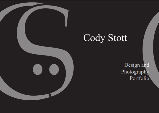
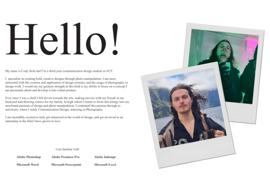
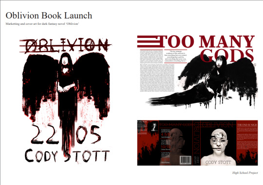
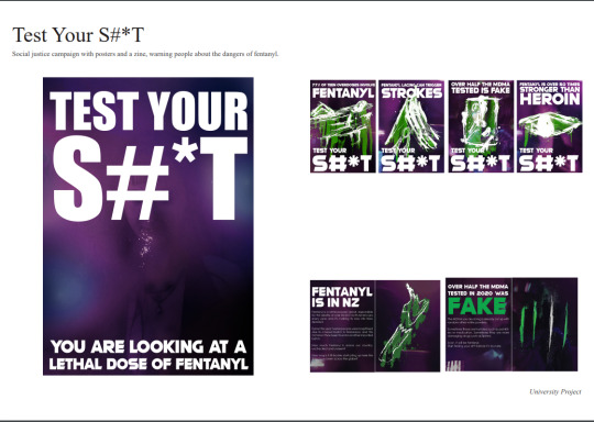
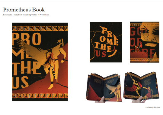
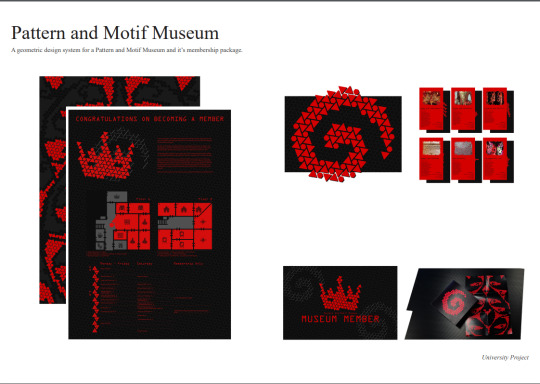
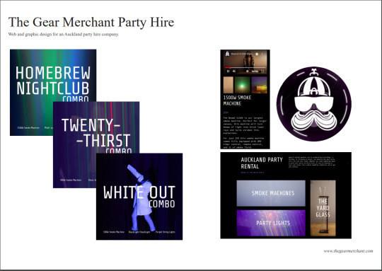
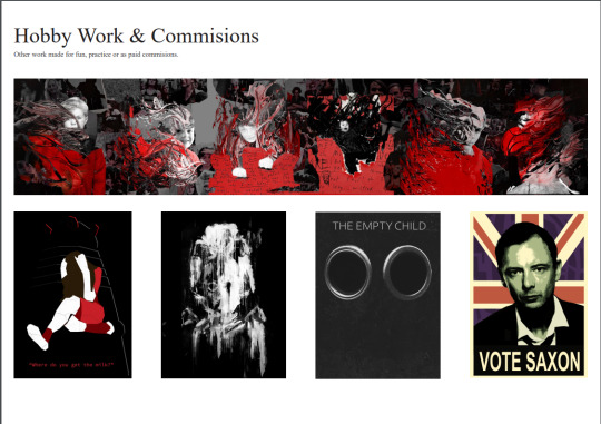
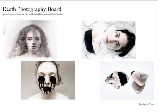
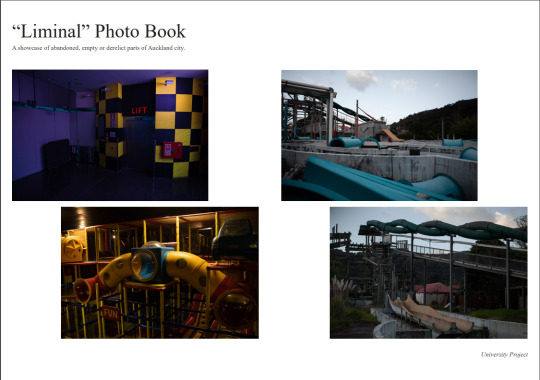
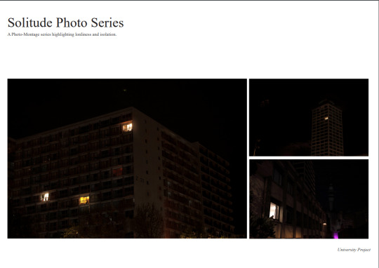
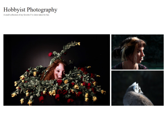
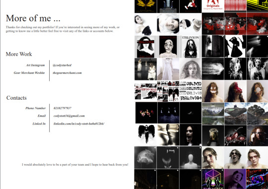
After discussions with both Raul and Emil I got three major pieces of feedback on my portfolio.
It needs to be a story, introduce yourself and close it off.
You have too much work per project. Give every project a hero image to focus on.
Every project needs a full spread.
This new portfolio takes all of this feedback into account and I definitely feel it is a drastic improvement.
0 notes
Text
My Designer Logo
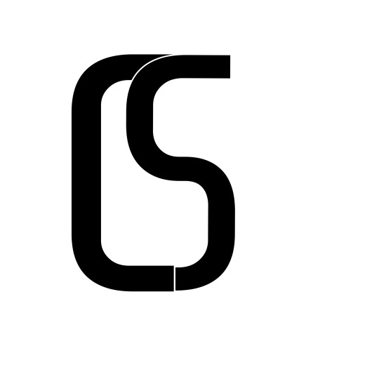
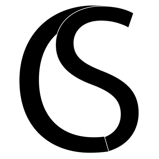
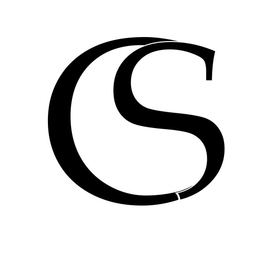
First i started by experimenting with a monogram, the tear drop shape that emerged when you put the two letters of my initials together seemed like an obvious direction. However it felt too simple and boring for a experimental young designer.

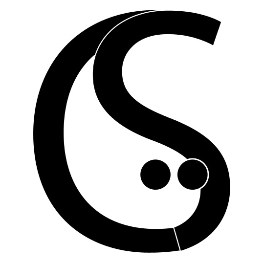
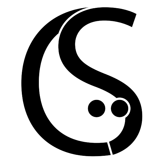
I added eyes to it, and i felt this added a lot of character, creating almost an icon/mascot figure for my design.
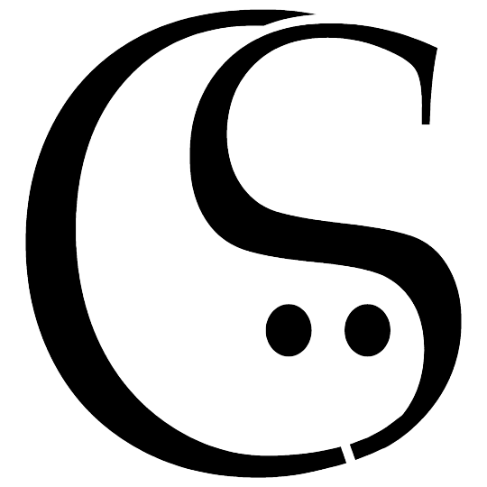
I then decided i had chosen the wrong font to develop, so i went back and adapted the serif font I had chosen instead.
0 notes